Bitcoin Traders No Longer Extremely Greedy: Rebound Signal?

Data shows that Bitcoin investor sentiment has cooled to the lowest level since February, something that could facilitate a rebound in the price.

Bitcoin Fear & Greed Index Now Points At Just ‘Greed’

The “Fear & Greed Index” is an indicator created by Alternative that tells us about the general sentiment among investors in the Bitcoin and broader cryptocurrency sector.

This metric uses a numeric scale from zero to hundred to represent the sentiment. To calculate the score, the index considers the data of five factors: volatility, trading volume, social media sentiment, market cap dominance, and Google Trends.

All values of the indicator above the 53 mark suggest the presence of greed among the investors, while below the 47 level implies a fearful market. The region between these two corresponds to the neutral sentiment.

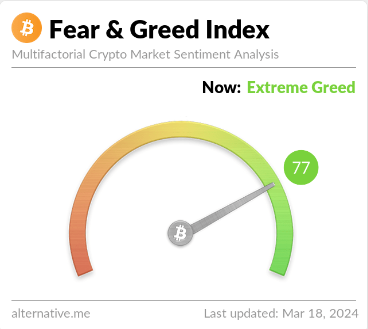
Here is how the latest value of the Bitcoin Fear & Greed Index looks:

Bitcoin Fear & Greed Index

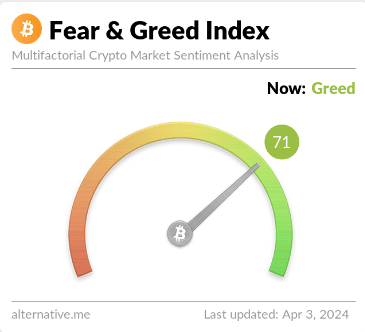
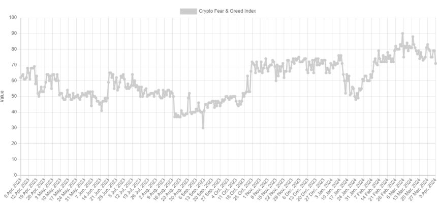
As is visible above, the Bitcoin Fear & Greed Index currently has a value of 71, implying that the investors share a majority sentiment of greed. Just yesterday, the index’s value had been notably higher than this, implying that there has been a bit of a cooldown of sentiment in the past 24 hours.

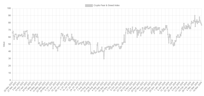
Below is a chart that shows the trend in the index over the past year.

Bitcoin Fear & Greed Index

Besides the three core sentiments, there are also two “extreme” sentiments: extreme greed and extreme fear. The former occurs at values above 75, while the latter occurs under 25.

The Bitcoin Fear & Greed Index was 79 yesterday, implying that the market had been extremely greedy. The indicator has been regularly inside this zone for the past month, so the current normal greed values go against the trend.

The sentiment among investors has naturally been so high recently because the BTC price has gone through a sharp rally in this period and has explored fresh all-time highs (ATHs).

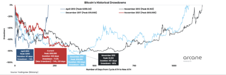
The Bitcoin price has historically tended to go against the majority’s expectations. And the stronger this expectation has been, the more likely such a contrary move will occur.

Due to this reason, the extreme sentiments have been where reversals in the asset have been the most probable to take place in the past. For instance, the current ATH of the asset formed when the index was at a value of 88.

With the recent price drawdown, sentiment has also taken a hit. The fact that it has fallen out of the extreme greed zone, though, may be conducive to a bottom forming. The earlier bottom, around 20 March, also formed when the index exited the zone.

The current level of the Bitcoin Fear & Greed Index is not only lower than it was then but also the lowest since 11 February, when the asset was still trading around $48,000.

BTC Price

Bitcoin is now down to the $65,800 level after facing a drawdown of more than 7% over the last few days.

Bitcoin Price Chart

Bitcoin Sentiment Cools Off, Price Rebound Soon?

The Bitcoin Fear & Greed Index shows that the sentiment around the asset has cooled off a bit recently, something that could pave the way for a rebound.

Bitcoin Fear & Greed Index Has Gone Through Some Decline Recently

The “Fear & Greed Index” is an indicator created by Alternative that tells us about the average sentiment present among the investors in the Bitcoin and wider cryptocurrency market

To determine the trader mentality, the index takes into consideration for these five factors: volatility, trading volume, social media sentiment, market cap dominance, and Google Trends.

The metric uses a numeric scale that runs from zero to hundred for representing this sentiment. A score of 46 or less implies the presence of fear among the investors, while that of 54 and above suggests greed in the market.

The territory between these two (47 to 53) naturally corresponds to the neutral mentality. Besides these three sentiments, there are also two extreme sentiments called “extreme greed” and “extreme fear.”

The extreme greed occurs at values above 75, while the extreme fear takes place below 25. Historically, these two sentiments have been quite relevant for BTC’s trajectory.

Tops have generally tended to form when the investors have held the former sentiment, while bottoms have been probable to happen when the market has been in the latter region.

At present, the traders are holding a mentality of extreme greed, as the latest data of the Bitcoin Fear & Greed Index shows.

Bitcoin Fear & Greed Index

As is visible, the indicator’s value is 77 right now, meaning that while it’s indeed inside extreme greed, it’s only so just. This is a fresh change from how it has been recently, as the chart below displays.

Bitcoin Extreme Greed

From the graph, it’s visible that the Bitcoin Fear & Greed Index has mostly stayed deep inside the extreme greed region recently. On the 14th of this month, the indicator hit the 88 mark, and alongside this high, the BTC price registered its current all-time high of about $73,800.

Since this peak, though, the asset has plunged, and it appears that alongside it, so has the sentiment among the traders. As mentioned earlier, tops have been more likely to occur when the market has shared a mentality of extreme greed and this probability has generally only gone up the more extreme levels the metric has hit.

This could perhaps explain why the recent top occurred when it did. Another top this month, the one that took place on the 5th, also coincided with high values in the Fear & Greed Index (a peak of 90 this time).

Shortly after this earlier peak and the plummet in the cryptocurrency that had followed, the asset found its bottom as the metric briefly exited the extreme greed region.

As the Bitcoin Fear & Greed Index is once again looking to dip outside this territory, it’s possible that a bottom may be near for the price this time as well. It now remains to be seen if the sentiment would cool down enough in the coming days so as to leave the extreme region behind, at least temporarily.

BTC Price

Bitcoin had plunged towards $64,500 during the weekend, but it seems the coin has made some recovery in the past day as it’s now back at $68,000.

Bitcoin Price Chart

When Will Bitcoin Downtrend End? This Signal Could Be One To Watch

An analyst has explained that a futures market signal could be one to wait for before the latest Bitcoin drawdown can finish.

Bitcoin Funding Rates Are Still In The Positive Territory

As pointed out by an analyst in a CryptoQuant Quicktake post, the BTC funding rate has been reducing recently, but it’s still at positive levels. The “funding rate” refers to an indicator that keeps track of the amount of periodic fee that futures contract holders are exchanging between each other currently.

When the value of this metric is positive, it means that the long traders are paying a premium to the short holders right now in order to hold onto their positions. Such a trend suggests that a bullish mentality is dominant in the futures market.

On the other hand, the indicator being negative implies a bearish sentiment may be shared by the majority of the traders as the shorts are outweighing the longs at the moment.

Now, here is a chart that shows the trend in the Bitcoin funding rate over the past year:

Bitcoin Funding Rates

As displayed in the above graph, the Bitcoin funding rate has been almost entirely positive since mid-October, suggesting that the longs have been the dominant force in the sector.

Around the start of the year, the metric’s value had hit especially high levels, but after all the volatile price action BTC has seen since then, the indicator has considerably cooled off.

The funding rates have still been at positive levels recently, however, implying that traders haven’t given up on their bullish sentiment just yet. This may not entirely be ideal for the asset to rebound.

According to the quant, for the ongoing Bitcoin downtrend to end, “we need to wait for a capitulation signal from market participants.” In the chart, the analyst has highlighted the last few instances such a capitulation signal appeared for the cryptocurrency.

Such negative spikes for the funding rate imply that the traders have become overly pessimistic about the market. Historically, BTC has tended to move against the expectations of the majority, so it’s not surprising that bottoms have been more likely to form when the traders have been highly bearish about the asset.

Red spikes in the indicator like those shown in the chart may not always perfectly coincide with a low in the price, but they are still nonetheless a sign that tides could change for the coin.

At present, the Bitcoin funding rates are still at positive levels, so some more downtrend may need to occur in the price, before these longs are liquidated and the futures balance shifts towards the other side.

BTC Price

Bitcoin had plunged under the $39,000 mark just yesterday, but the coin appears to have bounced back today as it’s now once again floating above $40,000.

Bitcoin Price Chart

How Low Can Bitcoin Go? CryptoQuant Head Reveals Target

In the midst of Bitcoin’s recent price struggle, CryptoQuant head of research has revealed the level Bitcoin can potentially sink down to.

Bitcoin Might Go Down To As Low As Realized Price Of 1 To 3 Months Old Hands

In a new post on X, CryptoQuant Head of Research Julio Moreno has discussed how low the BTC price can go following the latest correction. “To evaluate this I like to look at the realized price of 1 to 3 month-old holders,” explains Moreno.

The “realized price” refers to an indicator that basically tells us about the average price at which investors in the Bitcoin market acquired their coins. This metric uses on-chain data to find the cost basis of holders, by assuming that the last transfer of any coin in circulation was when the coin changed hands.

When the spot price of the cryptocurrency is above the realized price, it means that the investors as a whole are carrying some unrealized gains currently. On the other hand, the price being lower than the metric suggests the overall market is underwater.

Naturally, when the realized price and spot price are exactly equal, the average investor in the sector could be assumed to be just breaking even on their investment.

In the context of the current topic, Moreno hasn’t applied the realized price to the entire user base but rather to just a segment of the investors: the 1-to 3-month-old holders.

The below chart shows the trend in the Bitcoin realized price for this particular holder group over the last year:

Bitcoin Short-Term Holder Realized Price

The 1 to 3 months old investors make up a part of the wider “short-term holder” (STH) cohort. The STHs are defined as investors who bought their coins within the last 155 days.

Thus, the holders who bought between 1 and 3 months ago would be on the younger side of this group. Generally, the STHs behave in a fickle manner, reacting to any significant changes in the market, like a rally or crash.

The more mature a holder’s coins become, the less likely the investor turns to show any such reaction. Since the 1 to 3-month-old hands, although not the youngest, are still young STHs, they are likely to react to price changes.

According to Moreno, the realized price of these STHs has “represented a support level historically and during 2023.” The reason behind the level being supported is likely the fact that these investors would closely watch their average cost basis and move to buy more when the price dips around there if the general mood around the market is bullish.

In times when the prevailing Bitcoin trend is bearish, the level can act as resistance instead, as these STHs would be willing to exit the market at their break-even point.

At present, the realized price of the 1 to 3-month-old STHs is $36,700. Given the historical pattern, it’s possible Bitcoin might dip to around there before finding support, if the current correction continues for long.

BTC Price

Since the asset’s price plunged under the $45,000 level a few days back, the Bitcoin price has been trading sideways around the $42,500 level.

Bitcoin Price Chart

Bitcoin Bottom: BTC Not Fulfilling This Historical Pattern Yet

On-chain data shows Bitcoin is currently not satisfying a condition that has historically occurred alongside major bottoms in the price.

Bitcoin Supply In Profit Is Still Greater Than Supply In Loss

In a new post on X, James V. Straten, a research and data analyst, has pointed out how BTC isn’t fulfilling the bottom condition for the supply in profit and loss metrics.

The “supply in profit” here naturally refers to the total amount of Bitcoin supply currently carrying an unrealized profit. Similarly, the “supply in loss” keeps track of the number of underwater coins.

These indicators work by going through the on-chain history of each coin in circulation to see what price it was last transferred at. If this previous price for any coin was less than the current BTC spot price, then that particular coin is being held at a profit, and the supply in profit adds to its value. On the other hand, the coins with a higher cost basis are counted by the supply in loss.

Now, here is a chart that shows the trend in both these Bitcoin metrics over the entire history of the cryptocurrency:

Bitcoin Supply In Profit & Loss

In the graph, the analyst has highlighted a specific pattern that these two indicators have shown during historical bottoms in the cryptocurrency’s price. It would appear that the supply in profit dips below the supply in loss during these periods of lows, implying that most of the market enters into a state of loss.

Generally, investors in profit are more likely to sell, so whenever the supply in profit is at very high values, tops become more probable for Bitcoin. Similarly, a large number of investors instead of being in loss should mean there wouldn’t be too many sellers left.

This is potentially why bottoms have historically formed when the supply in loss exceeds the supply in profit. The chart shows that the Bitcoin Supply in Profit is currently quite a distance over the supply in loss, suggesting that a decent number of coins still carry gains.

To be more precise, there is a difference of six million coins between the two supplies at the moment. The current market is nowhere near fulfilling the historical bottom criteria.

However, the bottoms that the pattern has generally coincided with have been the cyclical lows, observed during the worst phase of the bear markets. In the current cycle, this bottom was marked after the FTX crash in November 2022.

The only exception to this rule was in March 2020, when Bitcoin crashed due to the onset of the COVID-19 virus. This crash was an unexpected event, which may explain why it doesn’t fit in with the other bottoms.

As the market at its current stage is likely already past the bear-market bottom, this supply in profit and loss pattern shouldn’t hold too much bearing on whether BTC has hit a local bottom after the recent crash.

If the November 2022 low wasn’t the true bear-market bottom, BTC might have more pain in store, as a significant swing in market profitability will be required before the real bottom is found.

BTC Price

When writing, Bitcoin is trading around $26,300, down 7% in the last seven days.

Bitcoin Price Chart

Bitcoin NVT Flashes Buy Signal, Bottom In?

On-chain data shows the Bitcoin NVT ratio is currently flashing a buy signal, a sign that the bottom for the asset’s price might now be in.

Bitcoin NVT Golden Cross Is Showing A Green Signal

As pointed out by an analyst in a CryptoQuant post, the Network Value to Transactions (NVT) Golden Cross has now dipped below the -2 mark. The “Network Value to Transactions (NVT) ratio” is an indicator that measures the ratio between the Bitcoin market cap and transaction volume (both denominated in USD).

When the value of this metric is high, it means that the price of the asset (that is, its market cap) is high when compared to its ability to transact coins (the transaction volume). Such a trend may imply that BTC is overvalued right now.

On the other hand, low values can suggest that the market cap isn’t that much relative to the volume, so the cryptocurrency’s price may be undervalued at the moment.

In the context of the current discussion, the NVT ratio itself isn’t of interest, but rather a modified form of it called the “NVT Golden Cross” is. This new indicator aims to pinpoint tops and bottoms in the NVT ratio by comparing its 30-day moving average (MA) with the 10-day one.

Now, here is a chart that shows the trend in the Bitcoin NVT Golden Cross over the past year:

Bitcoin NVT Golden Cross

As displayed in the above graph, the Bitcoin NVT Golden Cross has plunged recently as the cryptocurrency’s price has gone through a crash. Following the latest drawdown, the indicator is now deep inside the negative territory, at a value below -2.

In the chart, the quant has marked two lines for the metric that have held some significance for the asset during the past. The first of these (marked in red) takes place at around 2.2, while the other one (green) is at -1.6.

Historically, whenever the NVT Golden Cross has crossed above the former line, the cryptocurrency has generally observed the formation of a local top. Similarly, a break below the latter level has resulted in bottoms for the coin.

From the chart, it’s clear that the indicator has now dipped firmly below the bottom line, implying that Bitcoin might be undervalued currently. In the past year, there have been three other instances of the indicator plunging below the line, each coinciding with some sort of low for the price.

The first two of these had reached bottom values similar to now, while the third occurrence (which is the latest one) saw the NVT Golden Cross dip much deeper towards the -3.1 mark before the bottom was hit.

It’s unclear which scenario might play out for Bitcoin this time, but one thing may be clear from this pattern: the bottom could be near for the cryptocurrency, or may even already be in.

BTC Price

At the time of writing, Bitcoin is trading at around $26,500, down 7% in the last week.

Bitcoin Price Chart

Is The Bitcoin Bottom In Yet? Here’s What aSOPR Metric Suggests

A quant has explained using past trends of the Bitcoin adjusted Spent Output Profit Ratio (aSOPR) whether the current cycle has yet met all the bottom conditions.

Bitcoin aSOPR EMAs Are Approaching Golden Cross

As an analyst in a CryptoQuant post explained, the aSOPR EMAs are looking to form a golden cross soon. The “Spent Output Profit Ratio” (SOPR) indicates whether the average Bitcoin investor is selling at a profit or at a loss right now.

The “Adjusted SOPR” (aSOPR) is a modified version of this metric that excludes from the data all selling done within an hour of first purchasing the coins. The advantage of doing this is that such short-term transactions are noise in the data and, thus, don’t have any significant implications on the market.

When the value of this indicator is greater than 1, it means the holders are selling coins at some profit right now. On the other hand, values below the threshold suggest the overall market realizes some loss at the moment.

Naturally, the aSOPR being exactly equal to 1 implies that the investors are just breaking even on their current selling. Now, here is a chart that shows the trend in the Bitcoin aSOPR, as well as its 50-day and 100-day exponential moving averages (EMAs) during the 2014-2015 and 2018-2019 bear markets:

Bitcoin aSOPR

As shown in the above graph, the quant marked the relevant zones for the indicator in the previous two cycles. It looks like the aSOPR hit bottom values below one and then caught an overall uptrend as the price of Bitcoin itself bottomed out in both cycles. The indicator hitting low levels under one like this suggests that the investors heavily capitulated then, which detoxed the market from weak hands and hence helped the price finally bottom out.

Also, in both these bear markets, the 100-day EMA declined to the same lowest level (as represented by the lower dotted line in the chart) and rebounded back from it as this bottoming process took place. It also seems like a return to a bullish trend started with a golden cross of the two EMAs, with the 50-day crossing back above the 100-day.

Now, here is a chart that displays how the aSOPR and its EMAs are looking in the current cycle so far:

Bitcoin Bear Market aSOPR

The chart shows that the same pattern of the Bitcoin aSOPR forming a bottom and then catching an overall uptrend has already appeared for the current cycle. The two EMAs are also looking on track to complete the golden cross soon.

However, the analyst has pointed out that the 100-day EMA is yet to touch the dotted level in this cycle. The period spent so far in the recovery of the metric (the uptrend from the bottom) has also been only about half of what previous cycles saw (the yellow bars).

Based on this, the quant believes there could still be one more drop in the price left, before these conditions are fulfilled and the real bottom is in.

BTC Price

At the time of writing, Bitcoin is trading around $17,200, up 3% in the last week.

Bitcoin Price Chart

Bitcoin Exchange Depositing Transactions At 4-Year Low, Bottom Signal?

On-chain data shows the Bitcoin exchange depositing transactions are now at a 4-year low, indicating that the bottom may be here.

Bitcoin 30-Day MA Exchange Depositing Transactions Have Declined

As pointed out by an analyst in a CryptoQuant post, the metric’s current levels are the same as in Q1 2019. The “exchange depositing transactions” is an indicator that measures the total number of Bitcoin transfers that are headed toward centralized exchanges.

The difference between this metric and the more popular exchange inflow is that the latter indicator tells us the total amount of BTC being deposited to exchanges, that is, the combined sum of the value of each transaction going to exchanges (rather than their total number), which is a value that can be inflated by a few whales and are thus not representative of the trend being followed by the entire market (especially the retail investors).

But since the exchange depositing transactions only focus on the pure number of individual transfers taking place rather than their amounts, the metric could give a more accurate picture regarding whether the average investor is sending coins to exchanges or not at the moment.

Since one of the main reasons holders deposit to exchanges is for selling purposes, a high value of this indicator can have bearish implications for the price of the crypto. On the other hand, low values imply not many investors are applying selling pressure right now.

The below chart shows the trend in the 30-day moving average (MA) Bitcoin exchange depositing transactions over the last several years:

Bitcoin Exchange Depositing Transactions

As shown in the graph, the 30-day MA Bitcoin exchange depositing transactions have declined for quite a while and have recently hit pretty low values. The current levels are the lowest the indicator has observed since Q1 2019, four years ago.

Back then, the bear market of that cycle was at its final stages as the asset price was at cyclical lows. This means that the appetite for depositing coins to exchanges, and thus for selling BTC, is at historically low levels.

This could suggest that the selling pressure may have become exhausted in the market now, and the bottom could be near, if not already, for the current BTC cycle. However, the quant in the post also notes that the bottoming process being possibly here doesn’t discount the possibility that there could still be a final downward push left for Bitcoin.

BTC Price

At the time of writing, Bitcoin is trading around $16,700, up 1% in the last week.

Bitcoin Price Chart

Bitcoin Interexchange Flow Pulse About To Reverse, What Does It Mean?

On-chain data shows the Bitcoin Interexchange Flow Pulse is about to see a trend reversal, here’s what it may mean for the crypto’s price.

Bitcoin Interexchange Flow Pulse Is Crossing Over Its 90-Day MA

As per CryptoQuant’s on-chain year-end dashboard release, the trend shifts in this metric have historically occurred with phase changes in the market. The “Interexchange Flow Pulse” is an indicator that measures the 1-year cumulative net flows between Coinbase and derivative exchanges.

When the value of this metric rises, it means investors are transferring more coins from spot to derivative exchanges right now, and are hence willing to take up more risk. On the other hand, low values suggest not much capital is flowing into the derivative exchanges at the moment.

Now, here is a chart that shows the trend in the Bitcoin Interexchange Flow Pulse, as well as its 90-day moving average (MA), over the last few years:

Bitcoin Coinbase To Derivative Exchanges

As you can see in the above graph, a pattern seems to have historically followed with the Bitcoin Interexchange Flow Pulse during bull-bear trends in the price of the crypto. Whenever the coin has observed a bullish period, the indicator has seen a constant climb and has stayed above its 90-day MA.

The reason behind this is that investors are generally willing to take more risk during bull markets, and hence send increasingly large amounts to derivative exchanges for setting up leverage positions.

However, whenever the metric has reversed its direction and crossed below the 90-day MA, a top formation has taken place in the price of BTC, and the bullish trend has ended. In the bear markets that have followed such periods, the Interexchange Flow Pulse has usually continued to go down and has remained below its 3-month average. Once again, why this happens is simple; bear markets are when the average holder is unwilling to take any risks, and hence capital flow into derivatives dries up.

This trend in the indicator continues until the turning point once again takes place, where the price forms its bottom and the metric starts moving back up the opposite way (crossing above its 90-day MA in the process).

In the current bear market as well, the Bitcoin Interexchange Flow Pulse has consistently moved down while staying under its 90-day MA. Most recently, however, the decline seems to have stopped, and now the indicator is retesting its long-term average.

If the historical pattern is anything to go by, a successful crossover and reversal in the Interexchange Flow Pulse’s trajectory here would mean the bear bottom is in for the current cycle, and a slow transition towards a bull market could follow.

BTC Price

At the time of writing, Bitcoin’s price floats around $16,600, down 1% in the last week.

Bitcoin Price Chart

Bottom Signal: This Bitcoin Ratio Declines To Four-Year Low

On-chain data shows a Bitcoin ratio has hit the lowest value since February 2019, something that may suggest the bottom could be near for the current cycle.

Bitcoin SOPR Ratio Hits Lows Not Seen Since 4 Years Ago

As pointed out by an analyst in a CryptoQuant post, the SOPR Ratio has a value of just 0.53 right now. The “Spent Output Profit Ratio” (SOPR) is an indicator that tells us whether Bitcoin investors as a whole are selling at a profit or at a loss currently.

There are two main investor groups in the BTC market, the “short-term holders” (STHs) and the “long-term holders” (LTHs). STHs include all holders that have been holding onto their coins for less than 155 days, while LTHs are investors who have been keeping their coins dormant for longer than this threshold amount.

Now, there is a metric called the “SOPR Ratio” that measures the ratio between the SOPR values for the LTHs and the STHs. When this indicator has a value greater than 1, it means the LTHs are realizing more profits than the STHs right now. On the other hand, values below 1 suggest STHs have been raking in a higher amount of profits.

Now, here is a chart that shows the trend in the Bitcoin SOPR Ratio over the course of the entire history of the cryptocurrency:

Bitcoin SOPR Ratio

As the above graph highlights, the Bitcoin SOPR Ratio has historically gone below a value of 1 during bear markets. The reason behind this is that the holders who bought during the preceding bull run slowly mature into LTHs as a bear takes hold, while the STH cohort starts being made up of investors who bought at the lower, bear-market prices.

During bears, both holder groups generally realize losses as a whole, but since STHs acquire their coins at relatively lower prices, their losses are lesser. The reverse happens in bull runs, as the LTHs who bought at the cycle lows amass large profits, and thus the SOPR Ratio attains values higher than 1.

Recently, the indicator has dropped to a value of 0.53, which suggests large-scale capitulation from the LTHs. The current value is the lowest since February 2019, around when the lows of the previous cycle were observed. This could hint that the bottom for the current bear market may also be near, if not already in.

BTC Price

At the time of writing, Bitcoin’s price floats around $16,800, down 4% in the last week.

Bitcoin Price Chart

Is Bitcoin Bottom In? This On-Chain Condition Hasn’t Been Met Yet

A Bitcoin on-chain metric still hasn’t formed the same condition as in the previous bottom, suggesting that the current low may not be in yet.

Stablecoin Exchange Inflows (Top 10) Hasn’t Shown Any Spikes Recently

As pointed out by an analyst in a CryptoQuant post, the top 10 stablecoin exchange inflows saw a rise during the July 2021 bottom.

The “stablecoin exchange inflows (top 10)” is an indicator that measures the sum of the ten largest stablecoin transactions that are heading towards exchanges. The metric includes data of all types of stablecoins.

Since the top ten transfers are usually from the whales, this indicator can tell us whether whales are active on exchanges or not.

Usually, investors shift to stables when they want to escape the volatility associated with most other cryptos. Once these holders feel that the prices are right to re-enter these markets, they buy into other coins using their stablecoins, thus providing a buying pressure to them.

When the value of the top 10 stablecoin exchange inflows is high, it means whales could be sending large amounts of stables to exchanges for buying other coins. Such a trend could therefore be bullish for the prices of cryptos like Bitcoin.

Now, here is a chart that shows the trend in this on-chain indicator over the last few years:

Stablecoin Exchange Inflow Vs Bitcoin Trend

Looks like the value of the metric has been muted in recent days | Source: CryptoQuant

As you can see in the above graph, the stablecoin inflows (top 10) to spot and derivative exchanges have been displayed separately, since spot platforms are what investors use for converting their coins.

It seems like when the Bitcoin bottom formed back in July 2021 during the mini-bear period of the time, the spot exchange version of the metric sharply rose up.

This implies that whales participated in some heavy buying during that time with their stablecoin reserves, paving way for a bullish reversal in BTC.

In recent weeks, the top 10 stablecoin inflows to spot exchanges haven’t shown any significant movements, which means whales aren’t providing any significant buying pressure yet.

If the past trend is anything to go by, this could be an indication that the current Bitcoin bottom still hasn’t formed.

BTC Price

At the time of writing, Bitcoin’s price floats around $16.8k, down 2% in the last week. Over the past month, the crypto has lost 18% in value.

The below chart shows the recent trend in BTC:

Bitcoin Price Chart

The value of the crypto seems to have declined during the last couple of days | Source: BTCUSD on TradingView
Featured image from Kanchanara on Unsplash.com, charts from TradingView.com, CryptoQuant.com

Bitcoin Holders Show Rapid New Accumulation For First Time This Bear, Bottom Signal?

On-chain data shows Bitcoin holders have done some rapid fresh accumulation recently, something that may lead to bottom formation for the cycle.

Bitcoin 1w-1m Realized Cap UTXO Age Bands Have Sharply Gone Up

As pointed out by an analyst in a CryptoQuant post, the percentage of the BTC realized cap that was last moved between 1 week to 1 month ago has displayed rapid uptrend for the first time in this bear.

The “realized cap” is a Bitcoin capitalization model that values each coin in the circulating supply using the price at which it was last moved. The metric then calculates the “true valuation” of BTC by summing up all these values of the individual coins.

This is different from the normal market cap, where every coin in circulation has the same one value; the current Bitcoin price.

The “realized cap – UTXO age bands” is an indicator that tells us the distribution of the realized cap of each age band in the market.

These age bands specify ranges between which UTXOs (or more simply, coins) falling into said age band were last moved.

The relevant age band here is the 1w-1m group, which includes all UTXOs that were last moved within 1 week to 1 month ago.

Here is a chart that shows how the percentage of the realized cap contributed by this age band has changed over the years:

Bitcoin Realized Cap UTXO Age Bands

Looks like the value of the metric has sharply gone up in recent weeks | Source: CryptoQuant

As you can see in the above graph, the realized cap of the 1w-1m Bitcoin UTXO age band has observed some rapid uptrend recently.

The older end of this range, that is, one month ago, is around when the crash due to the FTX collapse took place.

The indicator’s value rising thus suggests that investors have done some fresh accumulation at the lows following this crash.

This is the first time in this Bitcoin bear market that such rapid new accumulation has taken place.

From the chart, it’s apparent that such rises have historically coincided with cyclical lows in the price. Another interesting thing to note is that between these spikes in the metric during the previous two cycles, there were 1358 days.

The current rise has come 1444 days after the last one, which is a similar length as the gap before. If there really is a pattern here, then the Bitcoin bottom may be very close, if not already in.

BTC Price

At the time of writing, Bitcoin’s price floats around $16.8k, down 1% in the last week.

Bitcoin Price Chart

BTC plunges down | Source: BTCUSD on TradingView
Featured image from Kanchanara on Unsplash.com, charts from TradingView.com, CryptoQuant.com

Bitcoin Capitulation Deepens As aSOPR Metric Plunges To Dec 2018 Lows

On-chain data shows the Bitcoin aSOPR metric has dropped to lows not seen since December 2018, suggesting that holder capitulation is deepening.

Bitcoin aSOPR Plummets To Lows Not Observed Since Almost 4 Years Ago

As pointed out by an analyst in a CryptoQuant post,  the current capitulation is deeper than during both the 2015 bear and the COVID crash.

The “Spent Output Profit Ratio” (or the SOPR in short) is an indicator that tells us whether Bitcoin investors are selling at a loss or at a profit right now.

When the value of this metric is greater than 1, it means the overall market is realizing some amount of profit currently.

On the other hand, the indicator having values below the threshold implies the average holder is selling at a loss at the moment.

Naturally, the SOPR being exactly equal to 1 suggests the investors as a whole are just breaking even right now.

A modified version of this metric is the “Adjusted SOPR” (aSOPR), which doesn’t take into account any selling of coins that was done within 1 hour of the purchase of said coins. By doing so, the indicator filters any noise from the data that wouldn’t have had any significant consequences on the market.

Now, here is a chart that shows the trend in the Bitcoin aSOPR since the year 2014:

Bitcoin aSOPR

The value of the metric seems to have seen a heavy drawdown in recent days | Source: CryptoQuant

As you can see in the above graph, the Bitcoin aSOPR has observed a rapid downwards trajectory below the 1-level recently. This means that BTC investors have been selling their coins at huge losses.

The indicator’s value is now the lowest it has been since the December of 2018, when the bear market of the previous cycle saw its bottom.

These current levels of the metric are also lower than they were during both the 2015 bear market bottom as well as the COVID black swan crash.

Plummets in the aSOPR like the one now indicate that there is widespread capitulation going in the Bitcoin market. Such deep loss realizations have historically lead to the formation of lows in the price as they result in a shift in coins from weak hands to strong hands.

Since the indicator is currently at historical lows, it’s possible the market is approaching a bottom for this cycle. However, it’s worth noting that the 2018 bottom saw even deeper values than now, so it’s uncertain whether the current cycle will also see similar lows or not, before the true bottom is in.

BTC Price

At the time of writing, Bitcoin’s price floats around $16.5k, up 1% in the last week.

Bitcoin Price Chart

BTC has shown strong uptrend in the last two days | Source: BTCUSD on TradingView
Featured image from 愚木混株 cdd20 on Unsplash.com, charts from TradingView.com, CryptoQuant.com

Bitcoin Now Trading 24% Below Realized Price, How Deeper Can It Go?

On-chain data shows Bitcoin is now trading 24% below the realized price, here’s how much deeper the crypto went during historical cycles.

Bitcoin Has So Far Declined 24% Under The Realized Price

As pointed out by an analyst in a CryptoQuant post, drawdowns below the realized price have been shrinking with each cycle.

A popular capitalization model for Bitcoin is the “realized cap,” which measures the cap by weighting each coin in the circulating supply against the price at which it was last moved.

This is different from the usual market cap, where every coin in circulation is simply multiplied with the latest BTC price.

Now, from this realized cap, a “realized price” can be derived by dividing the metric with the total number of coins in circulation.

The usefulness of this price is that it signifies the cost basis of the average holder in the Bitcoin market. This means that whenever the normal price dips under this indicator, the average investor enters into a state of loss.

Here is a chart that shows the percentages below the realized price BTC has gone during each cycle:

Bitcoin Realized Price

Looks like the value of the metric has plunged in recent days | Source: CryptoQuant

As you can see in the above graph, the latest crash in the price of Bitcoin has taken the crypto 24% below the realized price, the deepest value observed in the current cycle so far.

It’s apparent from the chart that the previous bear market of 2018/19 saw an even larger drawdown, as the price had declined about 30% below the metric at the bottom.

Comparing the two cycles in isolation would suggest the current bear market still needs to see a notable amount of decline before the same bottom values are hit.

However, things change when the 2015 and 2012 bottoms are also taken into account. In 2012, Bitcoin went as low as 60% below the realized price, while in 2015 the decline was around 41%.

There seems to be a pattern here, and it’s that the percentage of fall below the indicator has been shrinking with each cycle.

If this trend continues to hold this time as well, then Bitcoin may in fact already be near a bottom for this cycle.

BTC Price

At the time of writing, Bitcoin’s price floats around $16.5k, down 1% in the last week. Over the past month, the crypto has lost 14% in value.

The below chart shows the trend in the price of the coin over the last five days.

Bitcoin Price Chart

The crypto continues to show stale price movement | Source: BTCUSD on TradingView
Featured image from Traxer on Unsplash.com, charts from TradingView.com, CryptoQuant.com

Bitcoin Supply In Loss Now At Similar Levels To COVID Crash And 2018 Bottom

On-chain data shows the amount of Bitcoin supply in loss has now reached levels similar to during the COVID crash and the 2018 bear market bottom.

Bitcoin Supply In Loss Spikes Up Following The Latest Crash

As pointed out by an analyst in a CryptoQuant post, the BTC supply in loss has set a new record for this year following the FTX disaster.

The “supply in loss” is an indicator that measures the total amount of Bitcoin that’s currently being held at some loss.

This metric works by looking at the on-chain history of each coin in the circulating supply to see what price it was last moved at.

If this previous price for any coin was more than the current BTC value, then that particular coin is in some unrealized loss right now, and the indicator accounts for it.

Now, here is a chart that shows the trend in the 7-day moving average Bitcoin supply in loss over the history of the crypto:

Bitcoin Supply In Loss

The 7-day MA value of the metric seems to have been pretty high in recent days | Source: CryptoQuant

As you can see in the above graph, the Bitcoin supply in loss has sharply risen up over the last couple of days as the price of the crypto has observed a deep crash.

The current loss value is a new record for the 2022 bear market, and is also in fact the highest the indicator has been since the COVID black swan event back in 2020.

Notably, the amount of underwater supply in the market was also at similar levels back in late 2018, when the bear market of that cycle set its bottom.

If the same trend as in those previous bottoms follows now as well, then the latest high loss values may imply the market has now declined deep enough for a bottom.

However, even if the pattern does follow, it doesn’t mean pain might be over for the investors. As is apparent from the chart, in the 2018-19 bear the market moved mostly sideways after the bottom, and also formed another peak of similar loss values, before some bullish wind returned to Bitcoin.

BTC Price

At the time of writing, Bitcoin’s price floats around $16.4k, down 18% in the last week. Over the past month, the crypto has lost 15% in value.

The below chart shows the trend in the price of the coin over the last five days.

Bitcoin Price Chart

Looks like the value of the crypto has recovered a bit since the crash below $16k | Source: BTCUSD on TradingView
Featured image from Jonathan Borba on Unsplash.com, charts from TradingView.com, CryptoQuant.com

Bitcoin Bottoms: The Psychology Of Bear Markets

The chase for the bitcoin bottom is still on since the digital asset fell below its $20,000 price level. Given that the bear market has not been long in the making, it stands to reason that the bull market isn’t here just yet. However, being able to pinpoint when the cryptocurrency has reached as low as it will go can help make smart investment choices and the previous bear trends can shine a light to how it might play out.

Previous Bitcoin Bear Markets

The most recent bitcoin bear markets point towards some important trends that may occur before a bitcoin bottom is established. The 2018 bear market and 2014 bear runs helped to shine a light on what to keep an eye on as the crypto winter rages on.

One of the very first things to look at is how long the previous bear markets had actually lasted. In the last two bears, it seems that the amount of days that passes before the market bottoms out is getting lower. 2014 saw a total of 407 days before a bitcoin bottom was established, while it was only 364 days in the 2018 bear market. Given this, it is possible to expect that the duration before the market bottom might be lower this time around but it also shows that the market is likely not there yet.

BTC bear market trends | Source: Arcane Research 

To hit such figures, the market would need to reach December, which is likely when bitcoin would begin to reach its bottom. If history repeats itself, then what would follow would be a stretched-out period of unusually low volatility, which is when investors are presented with the best opportunity to purchase coins.

Another thing is the performance of the on-chain indicators as they are usually low around when bitcoin reaches its bottom. As reported by Bitcoinist, these on-chain metrics hit a long-term bottom, which could help point towards a bottom, or at least an approach to a bottom. The same was the case during the previous bear markets and the current levels align with those same levels.

BTC trending at $19,200 | Source: BTCUSD on TradingView.com

Low volatility in bitcoin also points toward this. For example, back in 2014, the low volatility range lasted for 280 days, while 2018’s lasted for 130 days. It also follows the trend of a decline in the number of days required to reach a bottom. The current BTC low volatility has now lasted for around 121 days.

Now, these metrics is not an exact science since they are not the only factors that go into determining the end of a bear and the beginning of a bull market. The most important thing is perhaps the most unpredictable one, which is human sentiment. In the end, bitcoin’s price will respond to the supply and demand balance in the market. 

Featured image from Analytics Insight, charts from Arcane Research and TradingView.com

Follow Best Owie on Twitter for market insights, updates, and the occasional funny tweet…

Bitcoin Holders Bracing For A Crypto Winter Bottom Should Check These Data

Bitcoin bulls continue to feel the pinch as the currency has dropped 8.17 percent in value over the past seven days. BTC investors are looking forward to a market bottom, and Glassnode claims that the market has bottomed out.

Nonetheless, whales and major institutions are currently in the accumulation phase, so it doesn’t matter if the market has bottomed out or is bottoming out right now.

A research states that this accumulation indicates whales are increasing their purchases rather than preparing their portfolios for a sale. The indication for whales to buy more is a bull green light from retail investors.

But what does this signify for Bitcoin if this is the case?

Bitcoin Price Drops Below $20k Level

The Bitcoin market stabilized between early June and early August, after a near-catastrophic collapse of the whole crypto sector. Bitcoin fell by a staggering 58% in the crypto market meltdown of May and June.

Chart: TradingView

The $18,500 support level held steady during the mild downtrend. BTC bulls are currently positioning themselves for a rally at the same level. While Glassnode data suggests Bitcoin may have bottomed out, the timing of a further upswing is uncertain.

The future of Bitcoin, however, is uncertain at the time of writing. Price for one BTC has fluctuated recently, staying between $18,850 and $20,461. BTC last broke through the $20,000 psychological barrier during a brief rise on October 3 and 4.

Macroeconomic Issues Hound Top Crypto

As the number of institutional investors interested in Bitcoin rises, the crypto market is impacted by macroeconomic issues.

In 2021, JP Morgan market analysts observed that institutional investors preferred Bitcoin to gold as a hedge against inflation.

The NYDIG BTC fund has already gathered $720 million from 59 backers. Considering the growing interest from major financial organizations, Bitcoin is now in the same boat as the financial system as a whole.

Since Bitcoin’s value is highly correlated with that of the S&P 500 and the NASDAQ, broader financial action is likely to amplify the current distress among Bitcoin investors.

We may see Bitcoin’s price increase in the next months if the bears lose some of their aggressive posture.

BTC total market cap at $367 billion on the daily chart |  Featured image from Freepik, Source: TradingView.com

Bitcoin Supply In Profit Continues Decline, But Still Not At Historical Bottom Zone

Data shows the Bitcoin supply in profit has continued its decline, but the metric has still not reached levels as low as the previous bear market bottoms.

Around 50% Of The Bitcoin Supply Is In Profit At The Moment

According to the latest weekly report from Glassnode, the current profitability levels in the BTC market are still above the 40%-42% values that were observed during historical bottoms.

The “percent supply in profit” is an indicator that measures the total percentage of the Bitcoin supply that’s currently holding some unrealized profit.

The metric works by checking the on-chain history of each coin in the circulating supply to see what price it was last moved at. If for any coin this previous price was less than the current BTC value, then that particular coin is in some profit at the moment, and the indicator accounts for it.

Now, here is a chart that shows the trend in the 7-day moving average Bitcoin percent supply in profit since the January of 2014:

The 7-day MA value of the metric seems to have been declining in recent days | Source: Glassnode’s The Week Onchain – Week 41, 2022

As you can see in the above graph, the historical zones of the Bitcoin percent supply in profit for previous bear markets are highlighted.

It looks like whenever the metric has sunk below the 50% mark, the price of the crypto has observed cyclical lows.

More specifically, the indicator’s value was round 40%-41% in the 2014-15 bear, while it was 41%-42% during the 2018-19 bear.

The COVID crash saw the profit in supply reaching a 47% mark, but since the event wasn’t part of a normal cycle, the relatively higher level during this low may not be as relevant.

In the current 2021-22 bear market, the indicator has been declining, but has only made a slight touch of the historical bottom zone so far as its value is around 50% currently.

If the 40% to 42% supply in profit target for the cyclical low from the previous bear markets holds this time as well, then Bitcoin’s current profitability is still around 10% higher.

This would suggest that the crypto may have to go through another flush of unrealized profits before the sellers are exhausted and the bear bottom is in.

BTC Price

At the time of writing, Bitcoin’s price floats around $18.9k, down 6% in the last week. Over the past month, the crypto has lost 12% in value.

Looks like the price of the coin has been slowly heading downhill since a few days ago | Source: BTCUSD on TradingView
Featured image from Natarajan sethuramalingam on Unsplash.com, charts from TradingView.com, Glassnode.com

Bitcoin 30-Day Long-Term Holder SOPR Is Yet To Hit Bottom Values

On-chain data shows the Bitcoin 30-day long-term holder SOPR hasn’t yet reached the historical bottom level during the current cycle.

Bitcoin 30-Day Long-Term Holder SOPR Has Declined Recently

As pointed out by an analyst in a CryptoQuant post, the long-term holders haven’t attained their maximum pressure point yet.

The “Spent Output Profit Ratio” (or SOPR in short) is an indicator tells us whether the average Bitcoin investor is selling at a profit or at a loss right now.

When the value of this metric is less than 1, it means the overall market is realizing some amount of profit currently.

On the other hand, the indicator having values than the threshold suggests that investors as a whole are moving coins at a loss at the moment.

Long-term holders” (LTHs) are a cohort of Bitcoin investors who hold their coins for at least 155 days before selling or moving them.

Here is a chart that shows the trend in the 30-day moving average BTC SOPR over the last several years specifically for these LTHs:

The 30-day MA value of the metric seems to have been going down in recent days | Source: CryptoQuant

As you can see in the above graph, the 30-day MA Bitcoin LTH SOPR seems to have hit a specific level around the price bottom in each of the previous two cycles.

These touches of the level in the loss region didn’t exactly coincide with the cycle lows, but they were still quite close, making them good buying opportunities for the crypto.

In recent months, as the bear has taken over, the indicator’s value has declined below the 1 mark, implying the LTHs have been selling at a loss recently.

While the metric has declined deep into the red zone by this point, it’s still not at the level where the historical cycles observed their bottoms.

Though, as the chart shows in the bottom, the DPO (an indicator that’s popularly used for finding cycle tops and bottoms of any quantity) of the LTH SOPR has started turning back up recently.

In the past bear markets, the LTH SOPR reached the bottom level not too long after the DPO reversed trend like this. If a similar pattern follows now as well, it may not be too long until long-term holder loss selling reaches its maximum point.

BTC Price

At the time of writing, Bitcoin’s price floats around $19.2k, up 1% in the past week.

Looks like BTC has been moving sideways again during the last few days | Source: BTCUSD on TradingView
Featured image from Kanchanara on Unsplash.com, charts from TradingView.com, CryptoQuant.com