Latest Bitcoin Top Is Different From 2021 Peak, Analyst Explains Why

An analyst has explained why the recent high in Bitcoin has experienced different market conditions than those observed during the 2021 bull run peak.

Bitcoin Liquidations Have Been Short-Dominated In Recent Market High

In a new post on X, on-chain analyst Checkmate pointed out how the latest 2024 high achieved following the spot exchange-traded fund (ETF) inflows has a major difference when compared to the 2021 peak.

The difference lies in the trend registered on derivatives markets. Below is the chart shared by the analyst that shows the trend in the dominance of long liquidations in the sector over the last few years.
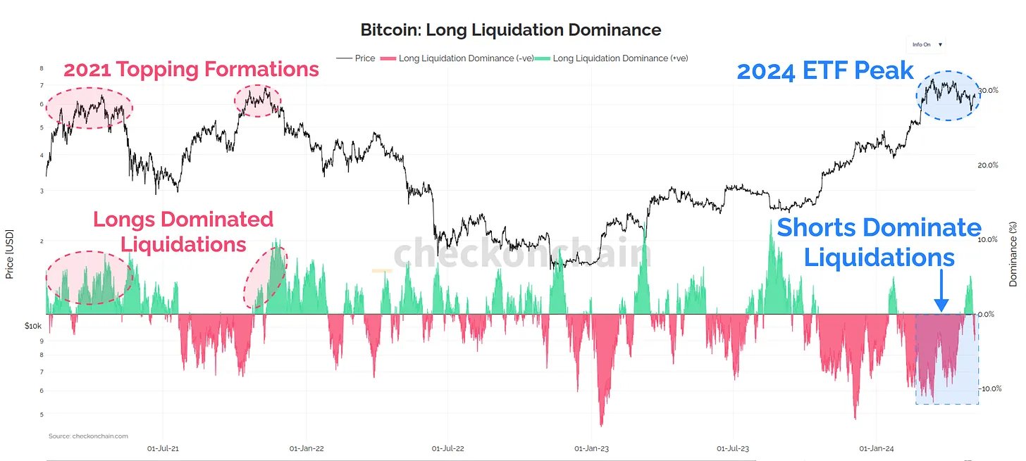
Bitcoin Long Liquidations

Liquidation” here naturally refers to the act of forceful closure that any derivatives market contract undergoes on an exchange when it accumulates losses of a certain degree.

The risk of a contract getting liquidated becomes higher, and the more volatile the asset price gets. During sharp rallies and crashes, huge amounts of liquidation can pile up in the market.

From the chart, it’s visible that as the rally in the cryptocurrency had occurred this year, the short holders had been taking a beating. This was only natural as surges pile up losses for these investors betting on a decline, so price growth as rapid as the one witnessed would have pushed many of these contracts toward liquidation.

Interestingly, the scale of the short dominance maintained throughout the run, implying that the investors didn’t quite believe the run would continue any further at every point of the rally, so they bet against it.

This has also remained true in the recent stagnation following the top, as short liquidations have outweighed the long ones even though the price has decreased.

As is apparent in the graph, the 2021 peaks saw a different trend. Longs were getting liquidated as Bitcoin topped out during both the first half of the 2021 peak and the second half.

In those periods, the investors had become too greedy and were only betting on the rise to continue even when the asset had slowed down. This greed appears to haven’t overtaken the market in the bull run.

While the current Bitcoin rally differs from the last one in this metric, analyst Maartunn has pointed out in an X post another indicator where the trend appears to be similar to that observed in previous peaks.

Image

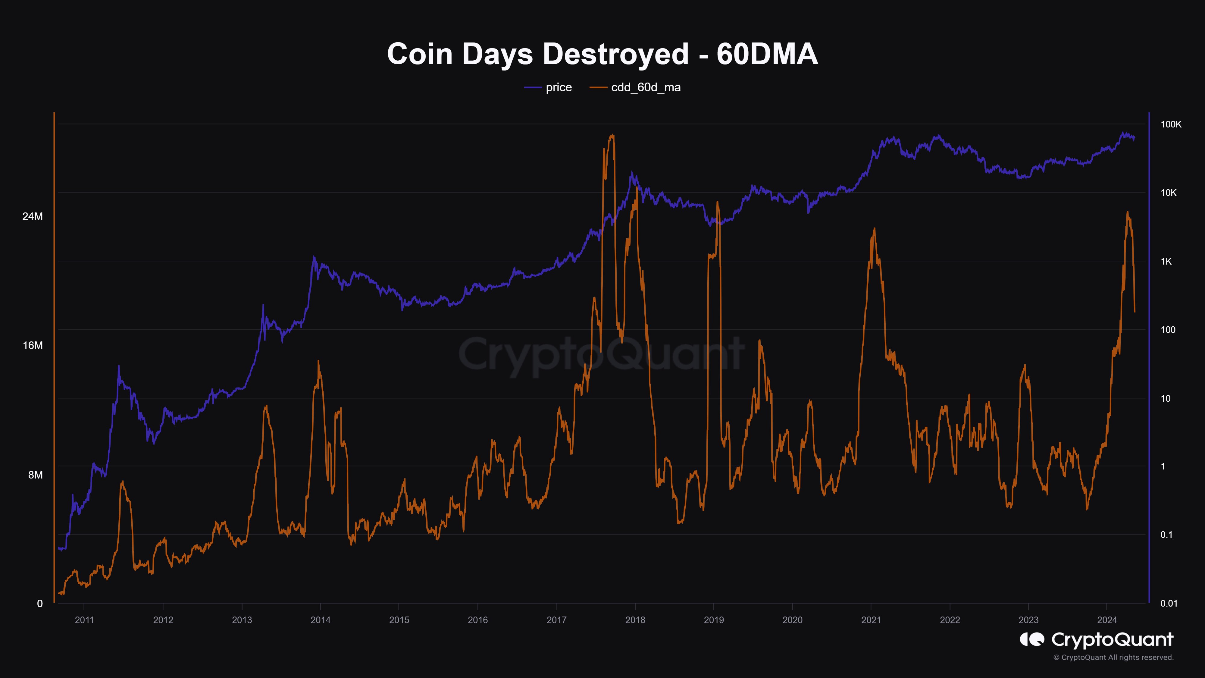
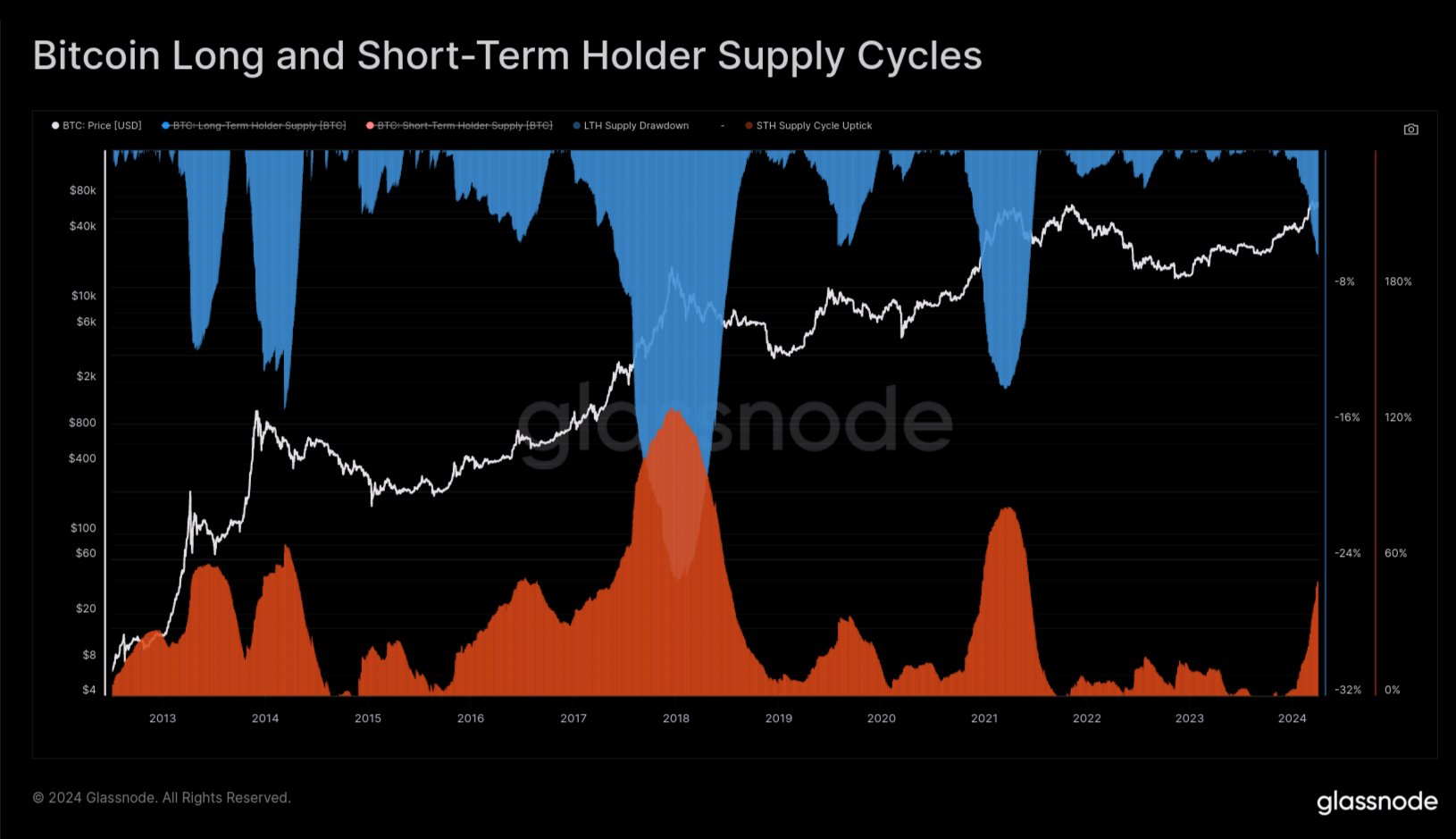
This indicator is the Coin Days Destroyed (CDD), which basically tells us about the scale of dormant coin movement that’s happening in the market right now. It would appear that this metric had attained very high levels recently.

“Coin Days Destroyed has probably peaked,” says Maartunn. “Bitcoin’s price typically reaches its peak around the same time.” It should be noted that although this has been true for some of the tops, the 2021 peak took months to form after the metric peaked.
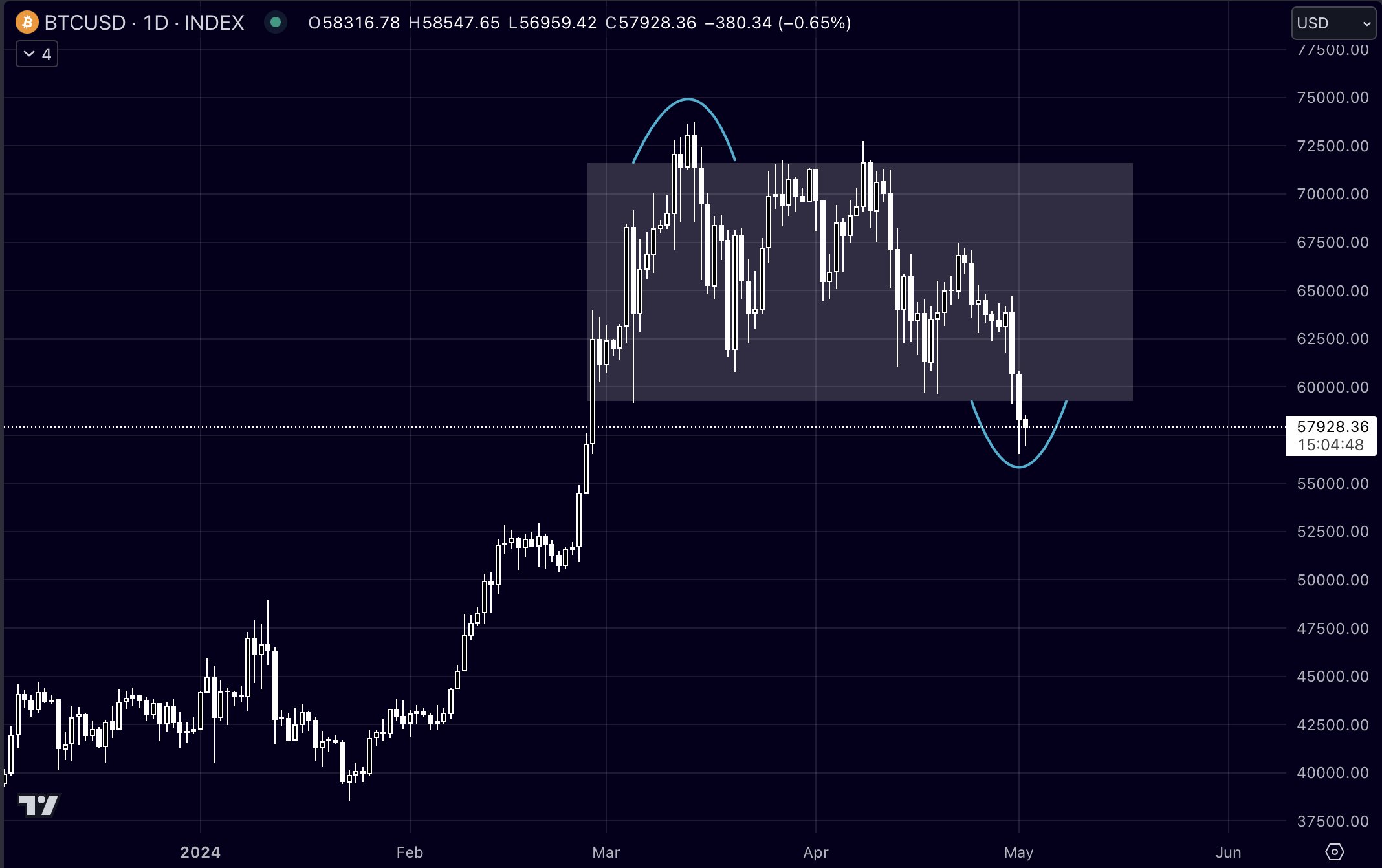
BTC Price

At the time of writing, Bitcoin is floating around $62,200, up more than 5% over the past week.

Bitcoin Price Chart

Here’s When Bitcoin Could Peak In This Accelerated Bull Run: Analyst

The current Bitcoin price behavior and its deviations from expected cyclical patterns remain a central theme of analysis. Crypto analyst Rekt Capital (@rektcapital) recently shared new insights on X concerning Bitcoin’s potential peak during the ongoing bull run, which is progressing at an atypical pace compared to historical data.

When Will Bitcoin Peak This Cycle?

In a detailed post, Rekt Capital pointed out that as of mid-March 2024, Bitcoin had not only reached new all-time highs but had done so approximately 260 days ahead of its traditional halving-induced cycles. This marked a significant acceleration. “When Bitcoin rallied to new All Time Highs in mid-March 2024, Bitcoin was accelerating in its cycle by 260 days compared to traditional Halving Cycles,” stated Rekt Capital.

However, this rapid pace has not been sustained. Over the past two months, Bitcoin has been in a phase of consolidation, which has altered its trajectory. The acceleration advantage has decreased to about 210 days compared to previous cycles. This deceleration is a critical factor, as it could lead to a re-synchronization with the typical halving cycle. Typically, BTC peaks 518-546 days after a halving event.

The analyst suggests shifting the predictive focus from just halving events to the periods after Bitcoin surpasses its previous all-time highs. Historically, BTC price tends to reach a bull market top within 266 to 315 days after breaking these thresholds. Given that this milestone was achieved again in mid-March 2024, the projected window for the next bull market peak could be set between late November 2024 and late January 2025.

Nevertheless, a notable trend is the increasing duration for which Bitcoin maintains levels beyond its old highs. In 2013, this period lasted 268 days, in 2017 it extended to 280 days, and by 2021, it had increased to 315 days.
This pattern suggests an incremental extension of approximately 14 to 35 days per cycle. “Historically, the amount of days that Bitcoin has spent beyond old All Time Highs has increased by approximately 14 days to 35 days,” explained Rekt Capital.

Adding these increments to the initial range of 266 to 315 days post-old highs, the peak could potentially extend to between 280 and 350 days post-breakout. This adjustment shifts the expected peak time frame to between mid-December 2024 and early March 2025.

Bitcoin cycle analysis
Potential Synchronization With Halving Cycles

Despite the current accelerated cycle, there remains a possibility that further deceleration could align Bitcoin more closely with its halving cycle. In past cycles, such as those between 2015-2017 and 2019-2021, Bitcoin peaked at 518 and 546 days post-halving, respectively. If Bitcoin’s rate of acceleration continues to decrease, the cycle may eventually resynchronize, potentially delaying the peak to between mid-September and mid-October 2025.

Rekt Capital elaborates, “But if Bitcoin continues to reduce its current acceleration in the cycle, it would resynchronize with traditional Halving cycles.” This could result in a peak more aligned with historical patterns, diverging from the current accelerated timeline.

At press time, BTC traded at $64,262.

Bitcoin price

Bitcoin Bull Run Over? Analyst Predicts What To Expect Now

The recent plummet in Bitcoin’s value below the $60,000 mark has sparked widespread speculation within the crypto community, raising questions among investors and market watchers about the future direction of its price. Marco Johanning, a well-known crypto analyst and founder of The Summit Club, took to X (formerly Twitter) to provide his insights on the current market conditions and what might be expected next.

According to Johanning, the recent price action does not signify a market downturn but rather a correction within an ongoing bull market. He emphasizes, “Bitcoin lost the range. What now? First and foremost, a reminder: we are in a bull market, and this is a correction. This is not a rally in a bear market. Or in other words, the high time frame trend is up no matter what.”

He supported this assertion with several indicators of a continued bullish trend. First, Bitcoin reached its bear market bottom in November 2022 and subsequently broke above the 200-day moving average, a critical indicator of long-term market trends. Following a drop below the 200-day moving average, there was a significant breakout above this level and THE major high time frame resistance in October 2023.

Moreover, Bitcoin achieved a new all-time high in March 2024. Over the last 18 months, Bitcoin has consistently recorded higher highs and higher lows, which are typical characteristics of a bullish market.

“This can’t be a bear market,” Johanning explained. “These elements underscore a fundamental bias crucial for assuming that the current drop is part of a broader bull market trend. Therefore, Bitcoin will eventually find a local bottom and ascend higher.”

Bitcoin Price Analysis: What To Expect Next?

Johanning provided a detailed breakdown of possible future scenarios based on technical analysis. His first scenario is based on the monthly chart where the most crucial level is at $48,000-$49,000. This level is key because it was a major hurdle overcome in February 2024. Now, it might serve as the perfect point for a bullish retest.

Furthermore, there’s a significant market imbalance down to the $48,000-$49,000 range, coinciding with the 0.5 Fibonacci retracement level from the last monthly swing low. This setup suggests a strong potential for price stabilization and reversal at this level, according to Johanning.

Bitcoin price analysis

The second scenario grounds on the weekly chart where the important level is at $52,000. This level acts as a major high time frame support/resistance, marked by a weekly imbalance that extends up to $52,000, and it matches the 0.382 Fibonacci retracement from the bottom to the top of the last major rally, and the 0.618 level from the last swing low to the top.

Bitcoin price analysis

The third scenario is based on the lower timeframes. Here, the most significant level is at $57,000. This mark is critical as it represents the 0.5 Fibonacci level from the last swing low and was a key area during the February climb. This level might serve as the stage for a potential deviation or price trap.

Bitcoin price analysis

“The recent bearish engulfing pattern breaking the monthly levels, followed by a bearish retest, signals significant market shifts,” noted Johanning. “If Bitcoin swiftly reclaims these key levels, particularly the $57,000 mark, we could see a deviation scenario unfold. Otherwise, the $52,000 or $48,000-$49,000 levels will likely be tested, each representing a higher low in the ongoing uptrend.”

Impact on Altcoins And Market Strategy

Altcoins have displayed remarkable resilience in the face of Bitcoin’s volatility, which Johanning finds particularly promising. “Usually, a significant drop in Bitcoin accompanied by a loss of a higher time frame range would lead to severe declines in altcoins. However, their strength yesterday is a good indicator that the worst may be over for altcoins,” he commented.

Johanning concluded his analysis with an optimistic outlook for both Bitcoin and altcoins, expressing confidence in the continuation of the bull market. He is actively accumulating more at current prices, anticipating substantial returns: “No matter which scenario plays out, I am committed to this trend until proven otherwise. I’m investing heavily, and if we truly remain in a bull market, the potential for profit is tremendous.”

At press time, BTC traded at $58,328.

Bitcoin price

Is The Bitcoin Top Already Here? This Historical Pattern Says So

A historical pattern currently forming in a Bitcoin on-chain indicator could suggest that a top may be near for the asset, if not already in.

Bitcoin SOPR Ratio Is Forming A Historical Top Pattern Right Now

In a CryptoQuant Quicktake post, an analyst has discussed about a pattern regarding the SOPR Ratio. The “Spent Output Profit Ratio” (SOPR) is an indicator that tells us whether the Bitcoin investors are selling their coins at a profit or loss right now.

When the value of this metric is greater than 1, it means that profit-selling is dominant in the market currently. On the other hand, the metric being under the threshold suggests the average holder is moving coins at some net loss.

In the context of the current topic, the SOPR itself isn’t of interest; rather, it is a different version called the SOPR Ratio. The name may be a bit confusing as SOPR already contains a “ratio,” but the latter ratio here corresponds to the fact that this indicator compares the SOPR of two Bitcoin cohorts: the long-term holders (LTHs) and short-term holders (STHs).

These investor groups make up for the two main divisions of the BTC market done based on holding time, with 155 days being the cutoff between the two. The STHs are those who bought within the past 155 days, while the LTHs include the HODLers carrying coins for longer than this timespan.

Now, here is a chart that shows the trend in the 7-day moving average (MA) of the Bitcoin SOPR Ratio over the history of the cryptocurrency:

Bitcoin SOPR Ratio

As displayed in the above graph, the 7-day MA Bitcoin SOPR Ratio had been heading up throughout 2023 and early parts of 2024, but recently, the metric has hit a top and reversed its direction. Whenever the SOPR Ratio is higher than 1, it means the LTHs, who are generally known to be resolute hands, are participating in a higher degree of profit-taking than the STHs.

It would appear that as BTC had observed its rally and approached a new all-time high (ATH), these diamond hands had started harvesting some of the gains they had earned over their long holding time. And once the price set a new ATH, these investors participated in peak profit-taking. Since then, their profit-selling has been dropping off, although they are still harvesting notably higher gains than the STHs.

In the chart, the analyst highlights how this pattern has been repeated at different points in the asset’s history. While the scale of the peak LTH profit-taking has been heading down over the cycles, it’s still true that the metric’s top has coincided with tops in the price during each of them.

As the line drawn by the quant suggests, it’s possible that the latest peak in the metric may have in fact been the top for this cycle. This is only, however, assuming that the pattern of diminishing returns in the indicator holds to the exact degree judged by the line.

It’s possible that the peak will still be higher than the current levels, while at the same time being lower than the previous cycle’s peak, thus still being in-line with the historical Bitcoin pattern.

Whatever the case be, though, the fact that the SOPR ratio has apparently hit a top could still be a bearish signal, if only in the short term.

BTC Price

Bitcoin has been making some steady recovery over the last few days as its price has now surged back above $66,100.

Bitcoin Price Chart

Bitcoin 2 Months Through “Euphoria Wave,” How Long Was The Last One?

On-chain data shows Bitcoin has been going through a “euphoria wave” for two months. Here’s how long it was in this phase during the last bull run.

Bitcoin Has Been In Euphoria Wave Phase According To Supply In Profit

According to the latest weekly report from the on-chain analytics firm Glassnode, the current BTC cycle is similar to the last one regarding the “Supply Profitability State.”

This indicator is based on the “Percent Supply in Profit,” which keeps track of the percentage of the total circulating Bitcoin supply that’s currently carrying a profit.

This metric works by going through the on-chain history of each coin in circulation to see the price at which it was last transferred. Assuming that this last transaction was the last point at which it changed hands, the price at its time would reflect the coin’s current cost basis.

Naturally, if this cost basis is lower in value than the current spot price of the cryptocurrency, then the coin in question carries some net unrealized gain. The Percent Supply in Profit adds up all such coins and calculates what percentage of the supply they make up for.

The supply Profitability State signals BTC’s current phase based on the market’s profitability status. The chart below shows the trend in this indicator over the past few years.

Bitcoin Supply In Profit

In the chart, the analytics firm has highlighted three important lines for the Bitcoin Percent Supply in Profit. The middle line (colored in blue) represents the cumulative mean of the metric, while the other two signify +1 (green) and -1 (red) standard deviation (SD) from this mean.

When the Bitcoin Percent Supply in Profit is above the +1SD (approximately 95% of the supply being in the green), the market may be considered to be in the euphoria or pre-euphoria phase.

Similarly, the Supply Profitability State would indicate a bottom discovery phase for values less than -1SD. The zone between these two corresponds to the “bear/bull transition” phase.

From the chart, it’s visible that during the last bull run, Bitcoin first saw a 1.5-month-long pre-euphoria wave, during which the metric tested the +1SD line. The asset followed up with a period of decline and consolidation, which put the Supply In Profit back under the +1 SD mark.

Finally, the coin observed a sharp rally, broke past the +1SD barrier, and went on to achieve new all-time highs, which naturally set the Supply In Profit to 100%.

Bitcoin seems to have witnessed a similar pattern this time around. A two-month-long pre-euphoria phase was followed by a drawdown, which has now been succeeded by a two-month-long euphoria wave during which the cryptocurrency has achieved new records.

If the euphoria wave lasts for a period similar to the last bull run, then four or more months might still be left for this Bitcoin bull rally.

BTC Price

Bitcoin had recovered above $72,000 earlier, but it appears that the asset has retraced back towards the $69,400 level.

Bitcoin Price Chart

Bitcoin 40% Of Way Through Bull Run If This Metric Is To Go By

A pattern in the holdings of the Bitcoin long-term holders may suggest that the current bull run is 40% of the way to completion.

Bitcoin Long-Term Holders Have Been Distributing Recently

In a new post on X, Glassnode lead analyst Checkmate discussed the recent behavior of the long-term Bitcoin holders. The “long-term holders” (LTHs) here refer to the BTC investors who have been holding onto their coins for over six months.

Statistically, the longer an investor holds onto their coins, the less likely they become to sell them at any point. Since the LTHs hold for significant periods, they are considered quite resolute.

And indeed, they display this resilience in their behavior, rarely selling despite whatever is happening in the broader market. As such, the times they sell are all the more noteworthy.

Historically, the LTHs have taken to distribution during bull runs when the asset has broken its previous all-time high (ATH) price. Due to their long holding times, these investors amass large profits, which they start to spend when a high amount of demand comes in during bull rallies that happily take coins off their hands at high prices.

Checkmate explained that the recent ATH break of the cryptocurrency has looked similar to any other past one, with the LTHs already having started spending for this round.

The chart below shows the trend in the supply of Bitcoin LTHs over the past few years.

Bitcoin Long-Term Holders

As displayed in the above graph, the Bitcoin LTHs have recently observed their supply heading down. Remember that when it comes to increases in this metric, there is a delay associated with when buying is happening and when this supply is going up.

This is natural because the newly bought coins must age for six months before they can be considered a part of the cohort’s holdings. When it comes to drawdowns, though, the same delay doesn’t emerge, as the age of the coins instantly resets back to zero, and they exit the group.

Thus, the latest distribution from the LTHs is indeed happening. “In the prior two cycles, new demand for Bitcoin was able to absorb this LTH sell-side for around 6-8 months while pushing prices multiples higher,” explains the Glassnode lead.

The chart below shows that the LTH supply has typically gone through a drawdown of around 14% during these bull run selloffs.

Bitcoin LTH Selloff

Checkmate notes that, based on this historical average drawdown in the LTH supply, the current Bitcoin cycle would be around 40% completion for this process.

BTC Price

Bitcoin has surged during the past 24 hours as its price has now returned to $71,800.

Bitcoin Price Chart

Bitcoin Top In Yet? What The Legendary MVRV Ratio Says

Here’s what the latest trend in the Bitcoin Market Value to Realized Value (MVRV) ratio suggests about where the market is currently in terms of a top.

Bitcoin MVRV Ratio Has Seen A Decline To The 2.34 Level

According to data from the market intelligence platform IntoTheBlock, the BTC MVRV ratio surged high earlier this year as the cryptocurrency rally took place.

The “MVRV ratio” is a popular indicator that tracks the ratio between the Bitcoin market cap and the realized cap. The former is simply the total valuation of the asset’s supply at the current spot price, while the latter is an on-chain capitalization model.

The realized cap measures the total sum of the value of the cryptocurrency’s supply, assuming that each coin in circulation has its true value at the price at which it was last transferred on the blockchain rather than the current spot value.

One way to interpret the realized cap is that since it takes into account the buying price of every token in circulation (assuming that the last transaction of every token was indeed the point at which it last changed hands), it essentially sums up the total capital the investors have invested in the asset.

As such, the MVRV ratio tells us how the total value that Bitcoin investors are carrying right now (that is, the market cap) compares against the value they put in (the realized cap).

Now, here is a chart that shows the trend in the Bitcoin MVRV ratio over the past few years:

Bitcoin MVRV ratio

As is visible in the graph, the Bitcoin MVRV ratio has had a value greater than 1 for a while now. When the indicator has such values, the market cap is greater than the realized cap, and hence, the investors carry net profits.

With the latest rally in the asset, this indicator has surged to relatively high levels, a natural consequence of the holders’ profits ballooning up with the price surge.

After the recent drawdown in the price, though, the MVRV ratio has also turned itself around, as it’s now heading down. At present, the ratio has a value of around 2.34.

“Traditionally, an MVRV ratio above 3 has been a reliable marker for predicting price peaks,” notes IntoTheBlock. So far, in the current rally, the metric hasn’t crossed this mark. It did come close recently, but the latest decline has meant it has gained a bit more distance to the level.

Why have tops historically occurred at high values of the Bitcoin MVRV ratio? The answer is that investors in profits are more likely to participate in selling, and this temptation to take profits only increases as their gains grow larger.

Because of this, selloffs are most probable when the market is holding extreme levels of profits, which is exactly what high MVRV ratio values reflect.

BTC Price

At the time of writing, Bitcoin is trading at around $67,200, up 3% over the past 24 hours.

Bitcoin Price Chart

Bitcoin Extreme Greed At Levels Higher Than Nov. 2021 Peak, Top Signal?

Data shows the Bitcoin sentiment has now reached extreme greed levels higher than even those at the price all-time high (ATH) in November 2021.

Bitcoin Fear & Greed Index Is Deep Inside Extreme Greed Territory Now

The “Fear & Greed Index” is an indicator created by Alternative that keeps track of the general sentiment present among the investors in the Bitcoin and wider cryptocurrency market right now.

The metric represents this average sentiment in the form of a score lying in the zero to hundred range. To calculate this score, the index takes into account the following five factors: volatility, trading volume, social media sentiment, market cap dominance, and Google Trends.

When the indicator shows a value less than 47, it means that the sentiment around the sector is that of fear. On the other hand, the index being above the 53 mark implies the presence of greed among the investors. Naturally, the region between these two territories belongs to the neutral mentality.

Besides these three main sentiments, there are two “extreme” sentiments called extreme fear and extreme greed. The former of these occurs at and below 25, while the latter is 75 and above.

Now, here is what the Bitcoin Fear & Greed Index currently looks like:

Bitcoin Fear & Greed Index

As is visible above, the Bitcoin Fear & Greed Index’s current value is 90, which means that the investors are holding a strong sentiment of extreme greed. This latest value is quite the jump from the sentiment from yesterday, when the index was around 82.

The reason behind this sharp increase in the indicator is obviously because of the fact that the cryptocurrency’s price has been pushing towards a new all-time high during its latest rally.

The current level of the Fear & Greed Index isn’t only high compared to the recent trend, but also when considering the historical data. The below chart shows how the metric’s value has fluctuated since its inception back in 2018:

Bitcoin Extreme Greed

As displayed in the graph, the Bitcoin Fear & Greed Index has now surpassed the level that it assumed during the November 2021 price all-time high, as it stands at values just below those observed between late 2020 and early 2021.

Besides this period, there has only been one other instance in the history of the metric where it has achieved levels higher than now: the rally peak during mid-2019.

Historically, Bitcoin has tended to move against the expectations of the majority, and as this expectation has leaned more towards one side, the probability of such a contrary move taking place has only gone up.

The top in the 2019 rally and November 2021 are just two such examples of this pattern in action. As such, it’s possible that the current extreme levels of the indicator mean that the price is at risk of forming a top right now.

It should be noted, however, that a top doesn’t necessarily have to immediately follow, as during the first half 2021 bull run, the metric was able to maintain at even higher levels for a while, without the rally being compromised.

BTC Price

Bitcoin was on the brink of setting a new all-time high just earlier, but its price has since cooled off towards the $66,700 level.

Bitcoin Price Chart

Bitcoin MVRV Hits Levels That Lead To Parabolic Bull Run In 2020

On-chain data shows the Bitcoin MVRV ratio is currently at the same high levels as those that led to the parabolic bull run back in 2020.

Bitcoin MVRV Ratio Has Shot Up As Latest Rally Has Occurred

As pointed out by CryptoQuant founder and CEO Ki Young Ju in a post on X, the MVRV ratio has just hit a value of 2.5. The “Market Value to Realized Value (MVRV) ratio” is a popular on-chain indicator that keeps track of the ratio between the Bitcoin market cap and the realized cap.

The “realized cap” here refers to a capitalization model for BTC that assumes that the real value of any token in circulation is not its current spot price (as the market cap takes it to be), but rather the value at which the coin was last transferred on the network.

The previous transaction for any coin may be considered the last time it changed hands, which implies that the price at the time would be its current cost basis. As such, the realized cap adds up the cost basis of every token in circulation.

This means that the realized cap essentially keeps track of the total amount of capital that the investors have used to purchase their Bitcoin. Since the MVRV ratio compares the market cap (that is, the value the investors are holding right now) against this initial investment, its value can tell us about the amount of profit or loss the investors as a whole are currently carrying.

Now, here is a chart that shows the trend in the Bitcoin MVRV ratio over the history of the cryptocurrency:

Bitcoin MVRV ratio

As is visible in the graph, the Bitcoin MVRV ratio has rapidly climbed up as the asset’s price has gone through its latest rally. In this surge, the metric has managed to exceed the 2.5 level.

When the ratio is greater than 1, it means that the market cap is higher than the realized cap right now, and thus, the overall market is holding its coins at some profit. A value of 2.5 implies the average wallet is currently carrying gains of 150%.

“In Nov 2020, MVRV was 2.5 at $18K, preceding the all-time high and parabolic bull run,” explains Ju. Back in that bull run, the peak of the first half of 2021 wasn’t hit until the MVRV ratio crossed the 3.7 mark, just like the two bull runs preceding it.

The top in November 2021, however, didn’t follow this pattern, as it formed close to the 3.0 level. It now remains to be seen which path Bitcoin would take in its current rally, if it is at all similar to either of these.

BTC Price

Following Bitcoin’s impressive 22% rally over the past week, the asset’s price is now trading around the $62,800 level, not very far from setting a new all-time high now.

Bitcoin Price Chart

Here’s Why A Bitcoin Bull Run In 2024 Is Inevitable

The expectations of a Bitcoin bull run in the year 2024 continue to drive investment decisions across the space. A number of reasons have been given for the expected bull run, including the approval of Spot Bitcoin ETFs for trading as well as the upcoming BTC halving event. One analyst has echoed the latter, elaborating on why the halving will bring about a bull market.

The Bitcoin Halving Event Will Send Market Higher

Crypto analyst James van Straten took to X (formerly Twitter) to explain why the Bitcoin halving event is bullish for price. Now, the halving is an event that is programmed to take place approximately every four years, cutting the block rewards in half each time it happens.

This means that the number of BTC that miners are awarded for mining a block is immediately slashed by 50%, thereby drastically reducing the number of new coins coming into circulation. Currently, the block reward is at 6.25 BTC and the next halving will slash it to 3.125.

Straten points to this reduction, using the monthly issuance as the case study. He explains that over the past month, there have been a total of 61,000 BTC accumulated by miners and exchanges. However, after the halving, the monthly issuance is expected to drop to 13,500 BTC and it is this drop that is most significant.

As Straten points out, if the demand were to stay elevated at the same levels when the halving takes place, it would see demand exceed supply by a factor of four. This will cause a shift in the market, which will have to “find an equilibrium most likely higher.” In other words, prices would have to go up to keep up with the demand.

Bitcoin price chart from Tradingview.com

Targets For BTC Price In 2024

Another bullish factor for the Bitcoin price is that the halving year coincides with the United States presidential elections. As Markus Thielen, Head of Research at Matrixport, pointed out in an analysis, this coincidence has always been bullish for the price.

The report points back to the previous halving and election years, which show the price of Bitcoin ending on a high note. The last three halving years have seen BTC rise 152% in 2012, 121% in 2016, and 302% in 2020, showing a consistent trend.

With the year 2024 being another halving and election year, the research analyst expects that the price of Bitcoin will finish out the year at $70,000. This would mean another 65% rally from the current price levels, and if the trends hold, the start of another bull market.

“Supported by the macro environment, monetary tailwinds, the US election cycle, and gradually increasing demand from TradeFi investors allocating to Bitcoin ETFs, a Bitcoin rally to 70,000 appears plausible,” Thielen said.

Bitcoin Top: This Is When Bull Run Will Peak According To Past Pattern

An analyst has explained when the next Bitcoin bull run peak might appear, if the same pattern as in previous cycles repeats this time as well.

This Is What Previous Bitcoin Cycles Suggest Regarding Bull Run Top

In a new post on X, analyst Ali has discussed about how the last two Bitcoin bull runs line up against each other and what it could mean for the current cycle of the cryptocurrency.

To make the comparison, the analyst has cited a chart that shows the price trend in each of the cycles with the cyclical bottoms being the common start-point for all of them.

Bitcoin Bull Run

From the graph, it’s visible that the peaks of the last two Bitcoin bull runs took shape at roughly the same amount of time since the bottoms of the respective cycles.

For the current cycle, the low that followed the FTX collapse in 2022 has been chosen as the bottom. If the current cycle is lined up against these other two starting from this bottom, then it would still have roughly 600 days before it reaches the same point as when the last couple of bull runs hit their tops.

“If Bitcoin mirrors past bull runs (2015-2018 & 2018-2022) from their respective market bottoms, projections suggest the next market peak could land around October 2025,” says Ali. “This implies BTC still has 600 days of bullish momentum ahead!”

BTC Has Been At Risk Of Slipping Below A Historical Line Recently

While BTC may have a bullish outlook for the long term, its short-term price trend has been painful for investors, as the cryptocurrency has seen a notable drawdown since the spot ETFs found approval from the US SEC.

The cryptocurrency had earlier even slipped down towards the $38,500 mark before making some recovery back around the $40,000 level that it’s still trading around.

Bitcoin Price Chart

In this latest plunge, Bitcoin came dangerously close to retesting the “short-term holder realized price,” a level that has been significant for the asset throughout history.

The “realized price” is a metric that keeps track of the price at which the average investor in the Bitcoin market acquired their coins. The spot price being above this value naturally implies the average holder in the sector is carrying profits, while it being under the line implies the dominance of losses.

As Ali has pointed out in another X post, the “short-term holder” group will find themselves underwater if the cryptocurrency’s price slips under the $38,130 level.

Bitcoin Short-Term Holder Realized Price

Short-term holders (STHs) refer to the Bitcoin investors who purchased their coins within the last 155 days. At the moment, their realized price stands at the $38,125 level. Historically, a sustained break below this line has often meant an extended stay for the coin below it.

So far, BTC has avoided a retest of this line, but if the current correction continues, it might even slip under it. “This potential BTC dip might trigger a new wave of panic selling as these holders will seek to minimize losses,” explains the analyst.

When Will Bitcoin Bull Run Begin? This Could Be The Metric To Watch

A pattern in the supply of the Bitcoin long-term holders could provide some hints about when the next bull run might begin in earnest.

Bitcoin HODLer Balance Has Followed A Specific Pattern In Previous Cycles

According to the market intelligence platform IntoTheBlock, the supply of the BTC HODLers is “an excellent indicator for measuring market cycles.” The “HODLers” or long-term holders (LTHs) refer to the Bitcoin investors who have held onto their coins since at least a year ago without having sold or transferred them on the blockchain.

The LTHs are the resolute hands in the market, which rarely sell their coins even when a profitable opportunity has presented itself or a deep price crash has occurred.

One way to track the behavior of these diamond hands is through the combined amount of balance they carry in their wallets. The chart below shows this Bitcoin metric trend over the past few years.

Bitcoin Long-Term Holder Supply

As displayed in the above graph, the Bitcoin supply held by the HODLers has been showing some growth over the past couple of years, suggesting that the LTHs have been accumulating.

This rise in the indicator has also continued through the latest rally, implying that the LTHs aren’t yet ready to start taking their profits. Something to note is that when the metric goes up, it doesn’t mean buying is happening in the present.

The indicator naturally has a 1-year lag associated with it, as coins must mature for that long before they can be included in the cohort. However, this only applies to buying as the holders moving their coins to sell instantly reset the age back to zero and, hence, remove them from the group.

In the chart, the analytics firm has highlighted a pattern that the Bitcoin LTH supply has observed during the leadup to past bull runs. It would appear that the HODLers have shown accumulation in such periods.

On the other hand, the start of selling from this cohort coincided with the beginning of the bull rally in proper. So far, the HODLers have only been accumulating recently, implying that the market may be in the pre-bull run phase.

If the historical pattern indeed holds for the current cycle as well, then the HODLer supply could be one to watch, as a significant downtrend in it could turn out to be a signal that the bull run has begun once more.

BTC Price

Bitcoin had plunged towards the $41,700 mark yesterday, but the asset has already seen some sharp recovery as its price is now trading around the $43,000 level.

Bitcoin Price Chart

Bitcoin Deja Vu: Capital Inflows Mirror Pre-2021 Bull Run Momentum

On-chain data shows the cryptocurrency capital inflows currently look similar to December 2020, right before Bitcoin rallied from $18,000 to $65,000.

Bitcoin & Ethereum Are Getting $19.7 Billion In Capital Injections Currently

As explained by analyst Ali in a new post on X, Bitcoin and Ethereum are receiving a large amount of capital inflows currently. To showcase these positive flows, the analyst has referred to the “BTC + ETH Net Position Change” indicator from the on-chain analytics firm Glassnode.

What this metric does is that it keeps track of the 30-day change taking place in the combined realized cap of these top two cryptocurrencies. The “realized cap” here basically refers to the total amount of capital (in USD) that investors have used to purchase a given asset.

As such, the metric’s net position change could provide hints about whether the total money invested into the coin in question has gone up or down during the past month.

Now, here is a chart that shows the trend in this indicator for Bitcoin and Ethereum over the past few years:

Bitcoin Capital Inflows

As displayed in the above graph, the Bitcoin + Ethereum Net Position Change has been inside the positive territory recently and has only been climbing up. The trend naturally makes sense, as both of the assets have registered some sharp rises during the past month.

Currently, the indicator has a value of $19.7 billion. As Ali has pointed out, “This is around the same capital inflow we saw back in December 2020 before BTC surged from $18,000 to $65,000!”

In the same chart, data for two other metrics is also shown. The first is the “Stablecoin Net Position Change,” which, as its name suggests, keeps track of the monthly inflows and outflows for the major USD stablecoins in the sector.

Unlike Bitcoin and Ethereum, though, this metric doesn’t make use of the realized cap, but simply the supply of the stables. This is obviously due to the fact that these coins have mostly the same value at all points, so the realized cap wouldn’t be any different from the market cap (which itself is equivalent to the supply as the price is $1).

From the chart, it’s visible that the stablecoins have also enjoyed positive inflows recently. This means that all three major asset classes in the sector, Bitcoin, Ethereum, and the stables, are receiving capital injections currently.

Most of the capital inflows and outflows towards the cryptocurrency sector happen through these three. The altcoins only receive their capital through a rotation from these core assets.

Thus, the stablecoins and top two cryptocurrencies simultaneously enjoying positive inflows have historically been a very bullish combination for the sector as a whole. This constructive combination didn’t form for most of this year but finally has during this latest leg in the rally.

The last indicator on the chart keeps track of the net incomings and outgoings from the sector as a whole by simply summing up the netflows for BTC + ETH and the stables. As is apparent, this metric also has a value similar to December 2020 at the moment.

Looking at Bitcoin’s historical performance following December 2020, it could mean that the BTC price is set for another price surge going forward.

BTC Price

Bitcoin had recovered above the $43,000 level just earlier, but it appears the coin has seen a setback as it’s now once again trading below the mark.

Bitcoin Price Chart

Bitcoin Poised For December Surge As Historical Patterns Suggest Strong Upside Ahead

As the eagerly awaited Bitcoin (BTC) exchange-traded fund (ETF) verdict approaches, excitement and anticipation continue to grow in the cryptocurrency market. 

According to a report by K33 Research, the upcoming decision, expected between January 8 and January 10, has been a significant factor behind Bitcoin’s positive momentum since October. Institutional demand remains robust, with traditional investors strongly interested in adding long BTC exposure. 

Bitcoin Set For Bullish December? 

Bitcoin has displayed a notable tendency to surge higher in the lead-up to major events, creating a sense of enthusiasm and driving prices upward. This phenomenon has been observed across various significant milestones in the cryptocurrency’s history. 

According to the report, examples include Bitcoin’s peak coinciding with the launch of the Chicago Mercantile Exchange’s (CME) BTC futures in 2017, its spike coinciding with Coinbase’s public listing in April 2021, and its peak on the day El Salvador declared Bitcoin legal tender in September 2021.

Similarly, Bitcoin reached its peak on the date of VanEck’s spot ETF deadline in November 2021. These instances highlight the potential for Bitcoin to experience significant price movements as the ETF verdict draws near.

The report emphasizes the substantial demand from institutional investors seeking exposure to Bitcoin. BTC exchange-traded products (ETPs) witnessed inflows of nearly 40,000 BTC in November, while CME open interest reached and maintained all-time highs. Futures premiums have also surged to 20%, indicating the strong interest from institutional players. 

In contrast, retail participation has shown signs of stagnation. Offshore flows have remained shallow, and Bitcoin-denominated open interest in BTC perpetual contracts is currently at yearly lows. These factors suggest that institutional flows continue to be the driving force behind Bitcoin’s solid market strength.

Based on the historical pattern of event-driven price movements and the sustained institutional demand, the report maintains a positive outlook for Bitcoin in December. 

As the ETF verdict approaches, K33 Research’s report suggests that the narrowing time window is expected to fuel enthusiasm and drive prices higher. However, it is worth noting that once the event occurs, prices may experience a temporary surge before potentially stabilizing, according to the report. 

 BTC’s Bull Run Indicator

Renowned crypto analyst Ali Martinez has identified a significant development in the Bitcoin market that suggests a bullish outlook for the cryptocurrency. 

According to Martinez, the Realized Price of Bitcoin has surpassed the Long-Term Holder Realized Price, signaling an increase in market momentum and attracting new investors willing to purchase Bitcoin at higher prices. 

Martinez’s analysis highlights that similar occurrences in the past have preceded substantial price surges, further fueling optimism regarding Bitcoin’s future performance. 

Bitcoin

The Realized Price of Bitcoin refers to the average price at which all previously transacted coins were acquired. It considers the price at which each Bitcoin unit was last moved on the blockchain. 

On the other hand, the Long-Term Holder Realized Price focuses specifically on coins held by long-term investors, providing insights into their average acquisition price. When the Realized Price surpasses the Long-Term Holder’s Realized Price, it suggests that newer investors are entering the market and are willing to buy Bitcoin at higher valuations.

As seen in the above chart, Bitcoin experienced significant gains following this bullish signal on three separate occasions in the past. Specifically, the cryptocurrency surged 12,736%, 4,474%, and 819%, respectively, following similar events. 

Bitcoin

In addition to Martinez’s bullish outlook for BTC, the largest cryptocurrency on the market has demonstrated relatively stable price action above $44,000 in the past hour. 

This stability increases the potential for continued upside and consolidation above key levels, positioning Bitcoin for further gains and surges in the future. It remains to be seen if the cryptocurrency will see any corrections following its impressive 16% surge over the past few days. 

Featured image from Shutterstock, chart from TradingView.com 

Sleeping Bitcoin Giants Wake Up: Pattern Mirrors 2021 Bull Run

On-chain data shows the dormant Bitcoin whales have been becoming active again recently in a fashion that’s reminiscent of the 2021 bull run.

Bitcoin Whales Dormant Since 10+ Years Ago Are Waking Up

In a new CryptoQuant Quicktake post, analyst Maartunn has talked about a pattern forming in Bitcoin that looks similar to what happened back in 2021, during the last bull run

The indicator of interest here is the amount of Bitcoin being moved on the blockchain that was dormant since at least ten years ago before the transaction took place.

Ten years is naturally a very long stretch of time, so whenever wallets holding BTC this old activate again, it’s always something that ignites discussion in the community.

In many cases, coins reach such an old age only because they became lost at some point. A lot of this supply would never be involved in transactions again, because of the wallets carrying them being lost to the point that they can’t be rediscovered by any means possible.

Some of the supply may simply be forgotten about, rather than lost, and might get found once more. When this happens, the finder (who may or may not be the original owner of the coins) could decide to shift the coins immediately, cashing in on them by selling, or perhaps, they may just decide to hold off a bit more, finding the appropriate price timing to offload the Bitcoin.

The below chart notes the instances where coins dormant since 10 years ago showed some movement during the past few years.

Bitcoin Dormant Whales

From the graph, it’s visible that the Bitcoin bull run back during the first half of 2021 saw many instances where large amounts of such dormant BTC stacks broke their silence.

Some of these whales who woke up could have been those who remembered their old BTC wallets after seeing the cryptocurrency making waves on the news, while others might have been those who had already rediscovered their old coins a while back, but had since been waiting for this profitable selling opportunity.

The 10 years old coins had mostly remained dormant in the second half of the bull run and the 2022 bear market, making only a few large moves. Among these, two in particular were quite interesting, as they coincided with bottoms in the asset’s price.

Maartunn has highlighted these instances in the chart. According to the analyst, it’s possible that these were whales who were panic selling after seeing the cryptocurrency decline to the lows.

As is apparent from the chart, dormant whale activity has heated up once again recently. “Looking at the past few months, there have been more than 13 similar transactions. It’s striking that this is happening during the uptrend, as Bitcoin is rising due to news about the emerging ETF,” notes Maartunn.

The latest of these transactions was just yesterday, when a 1,000 BTC stack more than 10 years old became involved in a move. In a post on X, the same analyst has explained that this whale is a retired miner, as many of the inputs that their wallet received came directly from the network’s block reward.

It would appear that the latest rally in the cryptocurrency is creating a similar effect as the 2021 bull run, attracting these dormant whales to finally move their coins.

BTC Price

At the time of writing, Bitcoin is trading around $42,400, up 13% in the past week.

Bitcoin Price Chart

Bitcoin Bull Run Is Only Just Starting, According To This Metric

On-chain data shows the Bitcoin SOPR hasn’t yet reached high levels that have been associated with heated bull market phases in the past.

Bitcoin SOPR Has Only Seen Mildly Positive Values Recently

In a CryptoQuant Quicktake post, an analyst has explained how market psychology has driven the BTC price during the past few years. The on-chain indicator that best represents the Bitcoin trader psychology according to the quant is the “Spent Output Profit Ratio” (SOPR).

The SOPR basically tells us about whether the BTC investors are selling their coins (or more precisely, transferring them on the blockchain) at a net amount of profit or loss.

When the indicator has a value greater than 1, it means that the average holder in the sector is selling their coins at some profit right now. On the other hand, a value under this threshold implies that loss-selling is dominant among the participants.

Naturally, when the SOPR has a value exactly equal to 1, the overall market can be assumed to be just breaking even on their selling, as the number of profits being realized is exactly canceling out the losses.

Now, here is a chart that shows the trend in the Bitcoin SOPR over the past few years:

Bitcoin SOPR

In the above graph, the analyst has marked the pattern that the Bitcoin SOPR has followed in recent years. During the 2018 bear market, the BTC SOPR dropped to pretty low values below 1 following the November 2018 crash. Coinciding with these lows in the metric, the price also found its bottom.

In the 2022 bear market, the BTC investors were keeping still in the red as they participated in only a relatively low amount of loss selling until the FTX crash occurred and the holders finally capitulated to a significant degree.

So far, it would appear that the low after the FTX collapse was indeed the bottom for the current cycle, as BTC has only gone and doubled in value since then. The pattern of this bottom has also been consistent with the one of the 2018 bear market.

In between these two major bottoms, there was also a large-scale capitulation event back in 2020, but this crash was mostly an anomaly caused by the unexpected emergence of the COVID-19 pandemic.

From the chart, it’s visible that the trend during rallies has generally been just the opposite: investors start selling at large profits and once the profit-taking attains extreme levels, the top is hit.

Earlier this year, the BTC SOPR spiked to high levels around when BTC hit its local top in April. Since then, though, the indicator has remained relatively calm, with some mild profit-taking coming after the latest leg in the rally.

“There will be many corrections and declines in the current market until it reaches the peak of the bull market, but from a psychological perspective, there still seems to be enough time left until the latter half of the bull market,” thinks the quant.

BTC Price

Bitcoin had registered a decline below the $37,000 level during the past day, but the asset has pulled itself back up since then as it’s just floating above the mark now.

Bitcoin Price Chart

Will Recent Binance Events Trigger This Historical Bitcoin Bull Run Signal?

The recent events at cryptocurrency exchange Binance could trigger the next Bitcoin bull run if this pattern continues to form.

Will Bitcoin Exchange Reserve Ratio Turn Around After Binance News?

As explained by an analyst in a CryptoQuant Quicktake post, the BTC exchange reserve ratio for US versus off-shore platforms has followed a specific pattern during past bull markets of the asset.

The “exchange reserve ratio” here refers to an indicator that compares the exchange reserves of any two platforms or group of platforms. The exchange reserve is the total amount of Bitcoin sitting in the wallets of the exchange/group in question.

In the context of the current discussion, the exchange reserve ratio between the US-based exchanges and foreign platforms is of interest. The trend in this metric can tell us about which type of exchanges users prefer to use.

When the ratio’s value declines, the off-shore exchanges gain steam as investors deposit their coins to them faster than to the US platforms (alternatively, they are withdrawing at a slower pace).

On the other hand, an increase implies the dominance of the American exchanges is going up as their exchange reserve is growing relative to that of the global platforms.

Now, here is a chart that shows the trend in the Bitcoin exchange reserve ratio for these two sets of exchanges over the last few years:

Bitcoin Exchange Reserve Ratio

In the graph, the quant has highlighted the two phases that the Bitcoin exchange reserve ratio for these platforms appeared to have followed during the last two bull runs.

In the first phase (marked in green), the indicator rises while the cryptocurrency goes through a buildup period for the bull rally. This suggests that large entities start participating in the American exchanges ahead of the bull run.

Once the bull run starts properly, the indicator’s value starts sliding down as investors withdraw their coins from these platforms again (the red box in the graph).

From the chart, it’s visible that the Bitcoin exchange reserve ratio for US vs. foreign exchanges was in a continued decline since the start of the bear market but has recently shown signs of turning around.

The indicator has only registered a small increase so far, so it’s hard to say if it’s a sign of a trend taking shape or just a temporary deviation. Whatever the case, though, a development has happened in the Bitcoin market that can tip the favor towards the American platforms regardless.

Binance, the largest cryptocurrency exchange based on trading volume, has seen a leadership change following Changpeng Zhao’s resignation. The instability has kickstarted outflows from the exchange, while US-based Coinbase has enjoyed inflows.

Thus, this may be the event that leads to a proper reversal in the BTC exchange reserve ratio. “If the recent regulations on CZ and Binance lead to an increase in the percentage of Bitcoin held on US exchanges, we will be ready for the next bull market,” notes the analyst.

BTC Price

Bitcoin has once again been trying to breach the $38,000 level today, as the chart below shows.

Bitcoin Price Chart

Bitcoin Macro Index Enters ‘Expansion’, Echoing 400% Bull Run Surge

In a detailed market update, Charles Edwards, founder of Capriole Investment, has provided an in-depth analysis of Bitcoin’s current market position, highlighting a pivotal shift to an ‘expansion’ phase in the Bitcoin Macro Index. This transition is particularly noteworthy as it parallels conditions observed prior to historical price surges in Bitcoin’s valuation.

Bitcoin has recently experienced a sharp uptick, ascending from $34,000 to an interim high of $38,000. After a brief period of resistance, the price corrected to approximately $36,500. Edwards highlights this movement as a critical technical victory, with Bitcoin overcoming and holding above the major resistance benchmarks of $35,000 on both the weekly and monthly timeframes.

This consolidation above key resistance levels sets a bullish context in the high timeframe technical analysis, positioning Bitcoin in a strong technical stance according to traditional market indicators. “The recent breakout into the 2021 range offers the best high timeframe technical setup we have seen in years. Provided $35K holds on a weekly and monthly basis in November, the next significant resistance is range high ($58-65K).”

Bitcoin price analysis

Bitcoin Macro Index Enters Expansion

The crux of Edwards’ update is the shift in the Bitcoin Macro Index, a complex model synthesizing over 40 metrics encompassing Bitcoin’s on-chain data, macro market indicators, and equity market influences. The index does not take price as an input, thus providing a ‘pure fundamentals’ perspective.

The current expansion is the first since November 2020, and only the third instance since the index’s inception, with the two previous occasions leading to substantial price rallies in the following periods. Edwards elucidates this with a direct quote: “The transition from recovery to expansion is simply the optimal time to allocate to Bitcoin from a risk-reward opportunity for this model.”

A look at the Bitcoin chart reveals that the Bitcoin price rose by a whopping 400% during the last bull run from early November 2020 to November 2021, after the Macro Index entered the expansion phase. The first historical signal was provided by the Macro Index on November 9, 2016, which was followed by a massive bull run of almost 2,600% until Bitcoin reached its then all-time high of $20,000 in February 2018.

Bitcoin Macro Index

Short-Term Technicals And Derivatives Market Analysis

In the short term, the technical outlook presents a mixed picture, according to Edwards. The derivative markets are indicating an overheated state, with low timeframe analysis suggesting a retracement could be imminent. Edwards introduces the ‘Bitcoin Heater’ metric, recently launched on Capriole Charts, which aggregate various derivatives market data and quantify the level of market risk based on the open interest and heating level of perpetuals, futures, and options markets.

The below chart shows that most of the time when the Bitcoin Heater is above 0.8, the market corrects or consolidates. “But there are large exceptions to the rule: such as the primary bull market rally from November 2020 through to Q1 2021. […] We should expect this metric to be high more frequently in 2024 (much like Q4 2020 – 2021),” Edwards stated.

Bitcoin Heater

The analyst concluded that the overall trend for Bitcoin remains positive, with major data points indicating a strong bullish scenario. However, he also cautioned about potential short-term risks in the low timeframe technicals and derivatives market. These, according to him, are common in the development of a bull run and could offer valuable opportunities if dips occur.

At press time, BTC traded at $35,626.

Bitcoin price

Bitcoin Bulls Gear Up: 200-Day SMA Rise And Historical Trend Signal $50,000 Price Target

In a surprising turn of events, Bitcoin (BTC) has once again defied expectations by reaching a new yearly high, igniting speculation about whether it can break the $40,000 milestone. 

After a brief consolidation phase, the leading cryptocurrency has regained its bullish momentum, soaring to a peak of $38,000 before retracing to its current trading level of $36,400. As the market eagerly awaits the next move, experts and analysts weigh in on Bitcoin’s potential to sustain its upward trajectory.

BTC’s Golden Cross Signals Potential Surge To $50,000

The Birb Nest team provides valuable insights into the short-term scenarios for Bitcoin. From a fundamental perspective, the anticipation of ETFs (Exchange-Traded Funds) and the upcoming halving event contribute to the current drive and support the bullish sentiment in the market. 

Moreover, from a technical standpoint, Bitcoin’s recent breakthrough of $32,000 has its sights set on the key psychological level of $40,000, bolstered by the presence of the Golden Cross and a rising 200-day simple moving average (SMA).

The Golden Cross, a bullish technical pattern formed when a short-term moving average crosses above a long-term moving average, has played a significant role in Bitcoin’s recent surge. 

Combined with the rising 200-day SMA, which indicates a strengthening long-term trend, these indicators reinforce the ongoing uptrend and provide a strong foundation for Bitcoin’s potential upward movement.

According to the Birb Nest team’s analysis, Bitcoin’s price action suggests an imminent increase in volatility, as indicated by the bullish Fear & Greed Index registering at 68.

After experiencing a 27% jump in October, surpassing the historical average, November historically exhibits robust gains of over 40%, potentially propelling Bitcoin toward $50,000. 

Notably, the second half of the month tends to be more bullish, heightening the anticipation for further price appreciation.

Expert Identifies Pivotal Resistance For Bitcoin

According to a recent post on X (formerly Twitter) by the crypto expert Michael Van De Poppe, $38,000 to $40,000 represents a critical resistance zone for Bitcoin. 

This means that price levels within this range will likely face significant selling pressure and challenge Bitcoin’s upward momentum. Van De Poppe warns against expecting an immediate breakout above this resistance level, suggesting that consolidation beneath it is a more probable scenario.

Bitcoin

Van De Poppe emphasizes the importance of consolidation beneath the resistance zone. Van De Poppe suggests that such consolidation provides a healthy base for Bitcoin’s price to gather strength before attempting a breakthrough. 

By stabilizing within this range, Bitcoin builds a stronger foundation to support a potential bullish move in the future.

Regardless of the forecast, the cryptocurrency’s upcoming price action remains to be seen if it will be accompanied by consolidation and a subsequent breakout or if Bitcoin is inclined to test lower support levels before embarking on another bullish move.

Featured image from Shutterstock, chart from TradingView.com