Bitcoin To Reach Escape Velocity? Analyst Makes The Case

An analyst has explained how Bitcoin seems to be showing a good setup to reach escape velocity based on the trend in this indicator.

Bitcoin VWAP Oscillator Has Been Showing A Bullish Divergence

As explained by analyst Willy Woo in a new post on X, a bullish divergence has appeared to be forming in the Volume-Weighted Average Price (VWAP) oscillator of the cryptocurrency.

The VWAP is an indicator that calculates an average price for any given asset, taking into account not only the price but also the volume. More formally, it’s calculated as the cumulative price sum multiplied by the volume divided by the cumulative volume.

This metric puts a higher weight on the price at which more volume is traded. Usually, the exchange-reported volume is used to find the metric, but for a cryptocurrency like Bitcoin, the entire transaction history is visible to the public thanks to blockchain data. Woo has used on-chain volume instead to calculate the VWAP for BTC.

The VWAP oscillator, the actual indicator of interest here, is a ratio between the asset’s spot price and VWAP. Here is the chart shared by the analyst that shows the trend in this metric over the past couple of years:

Bitcoin VWAP Oscillator

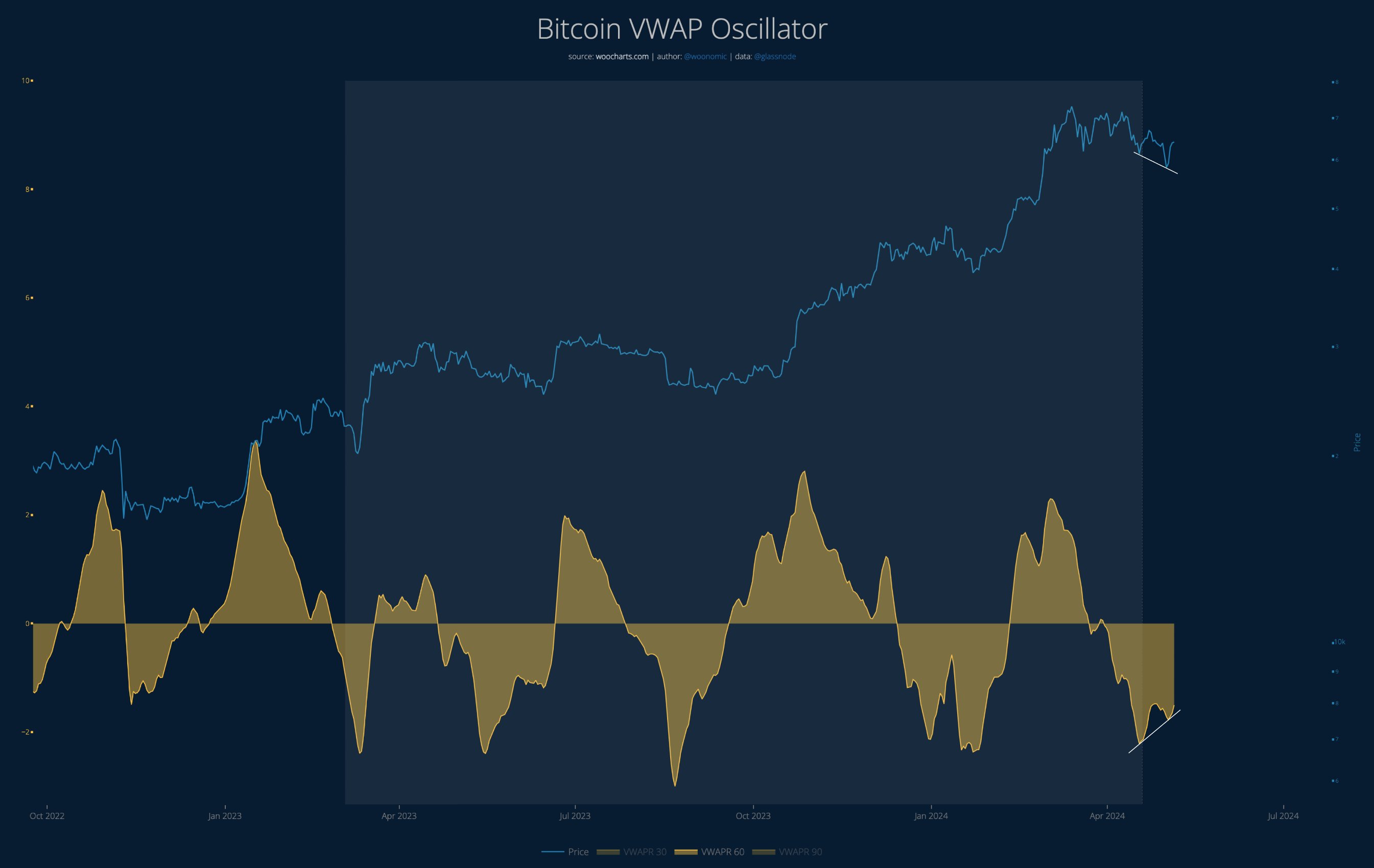
As displayed in the above graph, the Bitcoin VWAP oscillator has been in the negative territory for the past month but has recently shown a turnaround.

Although the metric is heading up, it’s still very much contained inside the red zone. At the same time as this rise, the cryptocurrency’s price has been heading down instead.

According to Woo, this is a bullish divergence forming for the asset and it’s also one that has a “lot of room to run,” since tops in the coin have generally occurred when the oscillator has reached a point of reversal at relatively high levels inside the positive zone, which should still be quite far away.

“Seems like a good setup for BTC to reach escape velocity,” notes the analyst. It remains to be seen whether the bullish divergence will end up bearing fruits for the asset.

In some other news, the Bitcoin whales (investors carrying 1,000 BTC or more) participated in buying around the recent lows of the asset. Still, market intelligence platform IntoTheBlock has revealed that the accumulation sprees from these large investors have been displaying an overall downtrend.

Bitcoin Whale Accumulation

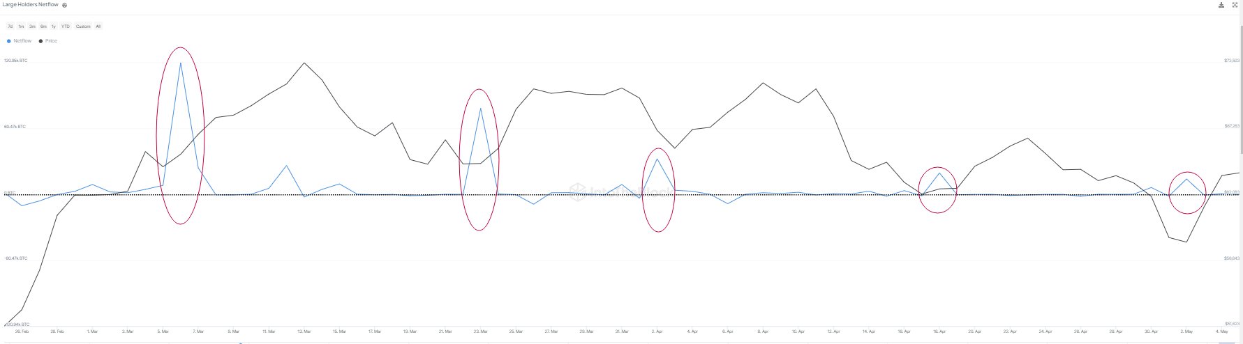
From the chart, it’s visible that the Bitcoin whales have been buying at each of the dips in the last few months, but it’s also visible that the scale of this buying has been diminishing with each one.

This could be a sign that the appetite for buying among these investors, although still present, is getting smaller with each dip.

BTC Price

When writing, Bitcoin is trading at around $63,500, up over 1% in the last seven days.

Bitcoin Price Chart

Bitcoin Relative Open Interest Lowest Since Feb, Analyst Says “Hard To Be Bearish”

Data shows the Bitcoin Open Interest as a percentage of its market cap has been at lows recently, a sign the derivatives side has been healthy.

Bitcoin Open Interest Is Now Less Than 2% Of The Market Cap

As explained by analyst James Van Straten in a new post on X, the derivatives side of the market has looked “extremely healthy” while BTC’s latest recovery has occurred.

The metric of interest here is the “Open Interest,” which keeps track of the total amount of derivatives-based Bitcoin positions that are currently open on all centralized exchanges.

When the value of this indicator goes up, it means that the investors are opening up more positions on the market right now. Generally, the total leverage in the market rises when such a trend takes place, so the price of the asset could end up turning more volatile following it.

On the other hand, a decline in the metric suggests users are either closing up their positions of their own volition or getting forcibly liquidated by their platform. The cryptocurrency may behave in a more stable manner following such a decrease.

Now, here here is a chart that shows the trend in the Bitcoin Open Interest over the past few years:

Image

In the graph, the Open Interest is displayed as a percentage of the asset’s market cap (that is, the total valuation of the entire BTC circulating supply at the current spot price).

It would appear that the indicator has registered a drawdown recently and has slipped under the 2% mark. This would suggest that the positions on the derivatives market now make up for less than 2% of the market cap.

From the chart, it’s visible that the metric had earlier spiked to a high as the coin’s rally towards a new all-time high had taken place. Interestingly, the market cap was rapidly going up in this rally, but this ratio was still trending up, implying that speculation had been growing at a rate faster than the price.

This may have been a sign that the derivatives side was starting to become overheated. In the drawdown that had followed the price top, the investors had started getting liquidated, leading to the ratio registering a decline.

The most recent price drop had helped reset the market further, bringing the ratio down to levels not seen since February. Bitcoin has been mounting a recovery effort in the past few days, but so far, the derivatives market has remained cool. “Hard to be bearish here,” says the analyst.

It now remains to be seen if the health of the market would continue to look optimistic in the coming days, thus potentially allowing for the recovery to go a step further.

BTC Price

Bitcoin had returned back above $65,500 earlier, but the asset has since seen a small pullback as it’s now down to $64,100.

Bitcoin Price Chart

Bitcoin Whales Continue Buying, Now Hold 25.16% Of All Supply

On-chain data shows that the Bitcoin whales’ holdings have grown to 25.16% of the entire supply, and their net accumulation has continued recently.

Bitcoin Investors With 1,000 To 10,000 BTC Have Continued To Buy Recently

According to data from the on-chain analytics firm Santiment, the BTC whales have accumulated more than 266,000 BTC since the start of the year. The indicator of interest here is the “Supply Distribution,” which keeps track of the percentage of the total circulating Bitcoin supply that the various wallet groups are holding right now.

The addresses are divided into these cohorts based on the number of coins they currently have in their balance. The 10 to 100 coins group, for example, includes all wallets that own at least 10 and, at most, 100 BTC.

The Supply Distribution sums up the amount that investors belonging to a particular group as a whole are carrying and calculates what percentage of the supply they contribute.

The 1,000 to 10,000 BTC cohort is of interest in the current discussion. At the current exchange rate, the lower limit for this cohort is $65 million, while the upper one is $650 million.

Clearly, the investors belonging to the group are quite massive, and as such, they are popularly known as “whales.” As the whales can quickly move large amounts, they have the potential to influence the market. Due to this, their behavior can be worth watching.

There are whales beyond this cohort’s 10,000 BTC upper limit as well, but at such massive scales, entities like exchanges also start coming into play, who aren’t exactly normal investors.

Now, here is a chart that shows the trend in the Bitcoin Supply Distribution for the 1,000 to 10,000 coins group over the last few months:

Bitcoin Whale & Sentiment

As displayed in the above graph, the Bitcoin Supply Distribution for this key investor group has observed a net rise over the year 2024 so far. The whales have bought 266,000 BTC ($17.2 billion) over this period.

However, this accumulation hasn’t been consistent. As is visible in the chart, the whales sold into the rally that would eventually lead to the asset’s new all-time high, and they bought back in once the drawdown was over.

As BTC has consolidated, so has its supply. Still, the latest change in the metric has been towards the upside, implying that these humongous holders are perhaps backing the current recovery push.

Following the latest accumulation, the 1,000 to 10,000 coins group holds 25.16% of the supply, which means that more than a quarter of all Bitcoin in circulation is sitting in the wallets of these large investors.

While whale buying is bullish, the current investor sentiment may not be so. As the data for the “Weighted Sentiment” metric attached by Santiment in the chart suggests, investors are currently showing FOMO towards the asset.

Historically, Bitcoin has tended to move against the majority’s expectations, so FUD/fear has been ideal for uptrends to start. FOMO/greed, on the other hand, has been where tops have become probable.

BTC Price

At the time of writing, Bitcoin is trading at around $64,700, up more than 7% over the past week.

Bitcoin Price Chart

Bitcoin “Liquid Inventory Ratio” Hits All-Time Low, What It Means

On-chain data shows the Bitcoin “Liquid Inventory Ratio” has dropped to an all-time low. Here’s what this could mean for the asset.

Bitcoin Sell Side Liquidity Is Low Relative To Demand Right Now

In a post on X, CryptoQuant founder and CEO Ki Young Ju discussed the recent trend in the Liquid Inventory Ratio for Bitcoin. The Liquid Inventory Ratio is an on-chain indicator that tells us about how the total sell-side liquidity inventory of the asset compares against its demand.

The sell-side liquidity inventory of the asset is gauged using four factors: the total exchange reserve, miner holdings, OTC desk holdings, and US government-seized BTC.

Out of these, the exchange reserve (that is, the total amount sitting in the wallets of centralized exchanges) is the largest potential source of sell-side liquidity.

The chart on the right below shows how the sell-side liquidity inventory of the coin has changed over the last few years:

Bitcoin Sell-Side Liquidity

From the graph, it’s visible that the sell-side liquidity of the cryptocurrency has been heading down for a while now. This decline is mostly driven by the depletion of exchange reserves, as investors have been continuously pushing towards self-custody, possibly preferring to hold onto their Bitcoin for extended periods.

The chart on the left displays the trend in the total demand for the asset. Here, the demand is measured using the 30-day balance changes of “accumulation addresses.”

The accumulation addresses are those that have a history of only buying BTC and no history of selling. Exchanges and miner entities are excluded from this cohort, of course, as they count under the sell-side liquidity instead, regardless of whether they satisfy the condition for accumulation addresses or not.

Clearly, the demand for Bitcoin has exploded recently as new players like exchange-traded funds (ETFs) have entered into the arena. All this BTC is potentially going out of circulation and being locked into the wallets known for hosting a one-way traffic.

Given these two developments in the sell-side liquidity inventory and demand, it’s not surprising to see that the Liquid Inventory Ratio, which measures the ratio between the two, has plunged recently.

Bitcoin Liquid Inventory Ratio

Following the latest decline in the indicator, its value has, in fact, dropped to a new all-time low. This means that the sell-side liquidity has never been this low when compared to the demand for Bitcoin.

Given this trend, it will be interesting to see how the BTC rally plays out from here, as the supply available to buy is only continuing to tighten.

BTC Price

Bitcoin had seen some drawdown earlier, but bullish winds have seemingly returned for the coin as its price has now recovered back above $70,200.

Bitcoin Price Chart

Bitcoin Traders Capitulate: Here’s What Happened Last 2 Times

On-chain data shows the Bitcoin investors have been capitulating recently, a sign that FUD has been gripping the market.

Bitcoin Total Amount Of Holders Has Seen A Drop Recently

According to data from the on-chain analytics firm Santiment, the Bitcoin Total Amount of Holders has registered a notable decline recently. The “Total Amount of Holders” here is an indicator that measures the total number of addresses on the BTC blockchain that are carrying some non-zero balance right now.

When the value of this metric trends up, it can mean that fresh hands are potentially investing into the cryptocurrency, opening new addresses and adding coins to them.

The indicator would naturally also increase if any investors who had left the asset before are returning back to it and filling up their wallets again. Another possible reason for the trend can also be due to holders breaking up their holdings into multiple wallets, for purposes like privacy.

In general, though, an increase in the Total Amount of Holders is usually a sign that net adoption of the coin is taking place, which can be a bullish sign in the long term.

On the other hand, a decline in the indicator can signal that some investors have decided to leave the cryptocurrency behind, as they have completely liquidated their holdings.

Now, here is a chart that shows the trend in the Bitcoin Total Amount of Holders over the past few months:

Bitcoin Total Amount of Holders

As displayed in the above graph, the Bitcoin Total Amount of Holders has suffered a decrease during the past 10 days or so. In all, 311,000 addresses have completely emptied themselves inside this window.

“To a novice trader, this may appear to be a concern with less overall active participants. However, historically this stat has reflected FUD moments in the market, indicating small BTC wallets are typically capitulating as large wallets scoop up their coins,” explains Santiment.

From the chart, it’s visible that there have also been two other instances of mass capitulation within the past few months. More specifically, 1.1 million addresses exited between the 23rd of September and 23rd of October, while 757,000 capitulated between the 21st of January and 13th of February.

Interestingly, during these capitulation events, the price went up 28% and 24%, respectively. So far since the latest selloff from the small hands has started, the cryptocurrency is down about 3%.

“If history is any indication, Bitcoin has a strong chance of putting up positive returns before this exodus of non-0 wallets this round (due to traders thinking the top is in) finally stops,” notes the analytics firm.

BTC Price

Since Bitcoin’s low at $60,600, the asset has enjoyed some sharp recovery as its price has now surged to the $66,800 level.

Bitcoin Price Chart

Bitcoin MVRV Hits Levels That Lead To Parabolic Bull Run In 2020

On-chain data shows the Bitcoin MVRV ratio is currently at the same high levels as those that led to the parabolic bull run back in 2020.

Bitcoin MVRV Ratio Has Shot Up As Latest Rally Has Occurred

As pointed out by CryptoQuant founder and CEO Ki Young Ju in a post on X, the MVRV ratio has just hit a value of 2.5. The “Market Value to Realized Value (MVRV) ratio” is a popular on-chain indicator that keeps track of the ratio between the Bitcoin market cap and the realized cap.

The “realized cap” here refers to a capitalization model for BTC that assumes that the real value of any token in circulation is not its current spot price (as the market cap takes it to be), but rather the value at which the coin was last transferred on the network.

The previous transaction for any coin may be considered the last time it changed hands, which implies that the price at the time would be its current cost basis. As such, the realized cap adds up the cost basis of every token in circulation.

This means that the realized cap essentially keeps track of the total amount of capital that the investors have used to purchase their Bitcoin. Since the MVRV ratio compares the market cap (that is, the value the investors are holding right now) against this initial investment, its value can tell us about the amount of profit or loss the investors as a whole are currently carrying.

Now, here is a chart that shows the trend in the Bitcoin MVRV ratio over the history of the cryptocurrency:

Bitcoin MVRV ratio

As is visible in the graph, the Bitcoin MVRV ratio has rapidly climbed up as the asset’s price has gone through its latest rally. In this surge, the metric has managed to exceed the 2.5 level.

When the ratio is greater than 1, it means that the market cap is higher than the realized cap right now, and thus, the overall market is holding its coins at some profit. A value of 2.5 implies the average wallet is currently carrying gains of 150%.

“In Nov 2020, MVRV was 2.5 at $18K, preceding the all-time high and parabolic bull run,” explains Ju. Back in that bull run, the peak of the first half of 2021 wasn’t hit until the MVRV ratio crossed the 3.7 mark, just like the two bull runs preceding it.

The top in November 2021, however, didn’t follow this pattern, as it formed close to the 3.0 level. It now remains to be seen which path Bitcoin would take in its current rally, if it is at all similar to either of these.

BTC Price

Following Bitcoin’s impressive 22% rally over the past week, the asset’s price is now trading around the $62,800 level, not very far from setting a new all-time high now.

Bitcoin Price Chart

Bitcoin FOMO Hasn’t Spiked Yet: Green Signal For Rally To Continue?

Data shows social media users aren’t yet showing FOMO around Bitcoin, a sign that the current rally could still have the potential to continue.

Bitcoin Social Volume Hasn’t Been Too High Recently

According to data from the analytics firm Santiment, the crowd FOMO that may be associated with a rally like BTC has seen recently hasn’t yet cropped up on social media.

The indicator of interest here is the “Social Volume,” which keeps track of the total amount of discussion any given topic or term is receiving on the major social media platforms right now.

The metric measures this by counting up the posts/threads/messages that are making at least one mention of the given term. The reason it tracks the number of posts themselves rather than the mentions is so that a few threads with a significant number of mentions can’t skew the indicator by themselves.

When a topic truly receives widespread attention on social media, a large number of posts crop up as users across the platforms participate in talks. Mentions, on the other hand, can sometimes spike just because some niche circles decide to discuss the term.

As such, measuring Social Volume through posts is what provides a better representation of the general trend being followed. Now, here is a chart that shows the trend in the indicator for terms related to Bitcoin and cryptocurrency:

Bitcoin Social Volume

As displayed in the above graph, the Bitcoin Social Volume hasn’t been too out of the ordinary recently, despite the sharp rally that the asset’s price has witnessed.

Generally, the indicator tends to rise as rapid moves in the cryptocurrency take place since users get spurred to talk more about the coin. When discussions rise too high, though, it’s often a sign that FOMO is increasing in the sector.

Historically, Bitcoin has tended to move against the expectations of the majority, so such a rise in FOMO has often resulted in top formations for the asset. When discussions rise alongside a drawdown instead (that is, a signal that FUD is going up), a bottom rather takes place for the coin.

From the chart, it’s visible that last month, the indicator registered a spike around the time of the spot ETF approvals, which coincided with the top, but such FOMO hasn’t reappeared for the coin yet.

“Despite Bitcoin’s +74% price rise in 4 months, the crowd FOMO that would normally be associated with this kind of surge has not been present,” notes the analytics firm.

“There was certainly an interest in BTC in the weeks directly before and after the SEC’s approval of 11 ETF’s, but the lack of new greed in the space can actually be considered a promising sign that this rally can continue,” explains Santiment.

BTC Price

Bitcoin has seen some pullback in the past day as its price has slipped under the $51,000 level.

Bitcoin Price Chart

Bitcoin CDD Shows Bullish Breakout, Rally Returning In Full Flow?

On-chain data shows a bullish breakout brewing in the Binary CDD indicator for Bitcoin, a sign that a strong price rise could be ahead for the asset.

Bitcoin Binary CDD Is Breaking Out Of Accumulation Zone

As pointed out by an analyst in a CryptoQuant Quicktake post, the Binary Coin Days Destroyed (CDD) appears to be forming a pattern for the cryptocurrency that has usually been the starting point of a bullish trend.

A “coin day” refers to a quantity that 1 BTC accumulates after staying dormant on the blockchain for “1” day. When a token that had been dormant for some number of days finally moves on the network, its coin days counter naturally resets back to zero.

The coin days that this token was carrying are thus said to be “destroyed.” The CDD keeps track of the total number of such coin days being reset through transactions across the network.

The Binary CDD, the actual metric of interest here, compares the current CDD against its historical average to tell us whether the CDD is higher or lower than the norm right now. As its name suggests, it can only assume one of two values: 0 or 1.

Now, here is a chart that shows the trend in the Bitcoin Binary CDD over the last few years:

Bitcoin Binary CDD

From the graph, it’s visible that the Bitcoin Binary CDD didn’t register a value of 1 too frequently between the end of the 2021 bull run and the final parts of 2023. Since around November of last year, though, the density of instances where Binary CDD observed 1 has grown stronger.

When the Binary CDD is 1, it means that the CDD is greater than its historical average currently. This implies that old coins are observing more movement than usual right now.

The “long-term holders” (LTHs) are investors who carry large amounts of coin days at any given point, as they tend to keep their BTC dormant for long periods (the cutoff for a holder to be included in the cohort is 155 days).

As such, spikes in the CDD tend to signal that these HODLers are on the move. “In an upward cycle, the movement of long-term holders increases as the price rises (orange boxes), and in a downward cycle, it decreases (blue boxes),” notes the quant. “This pattern has been repeating since the previous cycles.”

Since the LTHs have started to move now, it’s possible the market is now in the same phase as during the previous bullish periods, highlighted with the orange boxes by the analyst.

A similar pattern is also visible in the 182-day moving average (MA) of the Binary CDD, as the chart below shows.

Bitcoin Pattern

As is apparent from the graph, the 182-day MA of the Bitcoin binary CDD is beginning to break out of the accumulation zone, which is something that has historically led to sustained price surges for the cryptocurrency.

“It’s still worth monitoring, but finally, it has broken out of this range,” says the quant. “If it strongly surpasses this range, there is a high possibility that a full-fledged upward price cycle is beginning.”

BTC Price

After its dip towards the $42,200 mark over the weekend, Bitcoin appears to have kicked off the week with a return back above $43,000.

Bitcoin Price Chart

Bitcoin NVT Golden Cross Shoots Bullish Signal, Rally To Restart?

Data shows the Bitcoin NVT Golden Cross indicator has recently dipped inside the undervalued zone, a sign that could be bullish for the price.

Bitcoin NVT Golden Cross Has Entered The Bullish Territory

An analyst in a CryptoQuant Quicktake post explained that the NVT Golden Cross has recently indicated upside potential. The “Network Value to Transactions” (NVT) is an indicator that keeps track of the ratio between the Bitcoin market cap and transaction volume.

This metric is often used to determine whether the current price is fair. When the NVT has a high value, it means that the value of the cryptocurrency (the market cap) is high compared to its ability to transact coins (the transaction volume). Thus, the coin’s spot price may be considered overvalued in such conditions.

On the other hand, the ratio having a low value implies the asset may be underpriced right now as the market cap isn’t too high when compared to the transfer volume.

In the context of the current discussion, the NVT itself isn’t of interest, but rather a modified form called the “NVT Golden Cross” is. This metric compares the NVT’s short-term trend (10-day moving average) with its long-term trend (30-day MA).

Now, here is a chart that shows the trend in the NVT Golden Cross over the last few years:

NVT Golden Cross

Historically, the Bitcoin NVT Golden Cross has had two major zones relevant to the cryptocurrency’s price, as the quant has highlighted in the graph. A higher indicator value than 2.2 suggests the asset is overvalued and may be prone to forming at least a local top.

Similarly, its being under the -1.6 level can indicate that the coin may be undervalued and thus more likely to show some turnaround. The major lows in 2023 occurred near when the metric dipped inside this territory.

The chart shows that the indicator’s value has plummeted recently and has dived inside this latter zone. At the peak of this negative spike, the NVT Golden Cross had touched -2.5, which meant that it had notably fallen below the -1.6 threshold.

As is visible in the graph, this latest negative peak of the NVT Golden Cross exceeds what was observed during August, but it’s still below the levels seen around the bottom of June.

If the historical pattern is anything to go by, the latest low NVT Golden Cross values could indicate that a bottom is near for the cryptocurrency, if not already behind it.

BTC Price

Bitcoin has been stuck in sideways movement during the last few days as the coin has been unable to pick any direction. At present, the asset is floating around the $42,600 level.

Bitcoin Price Chart

Bitcoin “Outlook Remains Bullish,” As Long As This Stays True: Analyst

An analyst has explained that the outlook for Bitcoin should remain bullish as long as the cryptocurrency’s price remains above this level.

Bitcoin Has Strong On-Chain Support Above $41,800

In a new post on X, analyst Ali talked about the various BTC support and resistance levels from an on-chain perspective. In on-chain analysis, the strength of any support or resistance level depends on the amount of Bitcoin that the investors bought at said level.

The chart below shows what the distribution of the different BTC price ranges currently looks like based on the concentration of holder cost basis that they carry.

Bitcoin Support & Resistance

As displayed in the above graph, the $41,800 to $43,100 range hosts the acquisition price of most Bitcoin out of all the price ranges listed. To be more specific, about 2.4 million addresses acquired 1 million BTC within this range.

The cost basis is naturally of immense significance for any investor, as the spot price retesting can flip their profit-loss situation. As such, holders become more likely to show some move when a retest like this happens.

A holder in profit before the retest might tend to buy more when the retest happens, as they might believe this same level that proved profitable earlier would do so again.

On the other hand, loss holders might want to sell at their break-even level since they may fear the cryptocurrency going down again, putting them underwater again.

These buying and selling moves aren’t enough to move the market when just a few investors are making them, but if a large number of investors have their cost basis inside a narrow range, the reaction could become significant.

Since those above $41,800 to $43,100 range is dense with investors, it should be an essential on-chain range. The spot price is floating above the range so that these prices could act as a support barrier for the asset. Based on this, Ali explains, “as long as Bitcoin maintains its position above $41,800, the outlook remains bullish.”

The chart shows that the Bitcoin ranges above the price aren’t carrying the cost basis of that many investors. This could imply that there isn’t much resistance ahead for the coin.

The analyst notes that this lack of major resistance also strengthens the potential for the cryptocurrency to stay at the current levels or push towards the higher ones.

BTC Price

Bitcoin has been gradually making its way back up after the recent crash, with its price climbing towards the $43,800 mark. The below chart shows how the asset has performed during the last few days.

Bitcoin Price Chart

Bitcoin NVT Remains Bullish, All-Clear Signal For Rally?

On-chain data shows the Bitcoin Network Value to Transactions (NVT) ratio is above the bear zone, implying the recent price growth might have been healthy.

Bitcoin NVT Ratio Has Remained Outside Red Since October

According to data from the on-chain analytics firm Santiment, the NVT ratio has seen a significant improvement recently. The relevant indicator here is the “NVT ratio,” which keeps track of the ratio between the Bitcoin market cap and daily circulation.

The market cap here is naturally the total value of the asset, while circulation refers to the number of unique tokens observing some movement on the network inside a 24-hour rolling period.

Some other analytics websites use transaction volume in place of circulation, but Santiment’s version uses the latter because the volume often contains noise that’s not relevant to the market (like relay transactions of the same coins, which are counted multiple times in the volume, but only once in circulation).

When the value of the NVT ratio is high, it means that the price of the asset is high compared to the blockchain’s ability to transact coins right now. Such a trend can suggest the coin may be overvalued at the moment.

On the other hand, the metric being low implies the cryptocurrency might be underpriced currently as its transaction volume is at healthy levels compared to the market cap.

Now, here is a chart that shows the trend in the Bitcoin NVT ratio over the last few years:

Bitcoin NVT Ratio

As displayed in the above graph, the Bitcoin NVT ratio exited the historical bearish territory back in October and has continued to be outside it in the weeks since then.

The metric hasn’t exactly returned to the bullish zone proper yet; it has been more leaning towards neutral. However, the fact that the indicator has improved inside this period despite the cryptocurrency’s market cap also seeing a significant boost at the same time is certainly a positive development, as it suggests that the network activity growth has been outweighing the rise in the price.

At the current values of the ratio, the transaction activity of Bitcoin is justifying its market cap, so at the very least the asset may not be in immediate danger of a correction.

This naturally means that the rally should be able to continue for a while until the ratio returns back into the bearish territory (which may not even happen if the circulation continues to improve, as it has been during the price surge so far).

BTC Price

After seeing a pullback to as low as $35,000 earlier, Bitcoin has successfully recovered back above $37,000 during the past day.

Bitcoin Price Chart

Tether Continues To Flow Into Exchanges: Why This Is Bullish For Bitcoin

Tether (USDT) has continued to move into exchanges recently. Here’s why this can be a positive development for Bitcoin.

Tether Supply On Exchanges Is Now Highest In 7 Months

According to data from the on-chain analytics firm Santiment, $9.99 billion worth of USDT is now on exchanges. The indicator of relevance here is the “supply on exchanges,” which keeps track of the total amount of a cryptocurrency being stored in all centralized exchanges’ wallets.

The interpretation of this metric can differ depending on the type of asset that’s being discussed. In the case of Bitcoin, for example, the exchange reserve may be considered a measure of the potential selling pressure, as one of the reasons investors may deposit the coin is for selling-related purposes.

Thus, the cryptocurrency’s supply on exchanges going up could be a sign that selling is increasing in the sector, and hence, the asset’s price may be heading towards a bearish outcome.

In the context of the current discussion, BTC’s supply on exchanges isn’t the one of interest, but rather the metric for Tether is. USDT is a popular stablecoin (the largest one based on market cap) that always has its value pegged to the US Dollar.

Here is a chart that shows the trend in the supply of exchanges for Tether over the past few years:

Tether Supply on Exchanges Vs Bitcoin

Usually, an investor may want to hold their capital as a stablecoin like USDT to keep it away from the volatility associated with other assets in the cryptocurrency sector.

However, many such stablecoin holders use these assets as a temporary safe haven, as they eventually wish to return to the volatile market.

When these investors finally find the time to jump back into cryptocurrencies like Bitcoin, they swap their USDT for them. These traders may use exchanges to make this shift, so a rise in the supply on exchanges of the stablecoin can be a sign that investors are looking to swap into volatile coins.

Such buying using Tether can naturally cause a bullish effect on the prices of BTC and others. So, in this way, the exchange supply of the stablecoin can be considered the opposite of the metric for BTC.

The above graph shows that the indicator’s value has increased in the last few weeks. “The $9.99B worth of Tether sitting on exchanges is the highest level of buying power for crypto’s top stablecoin in approximately seven months,” notes Santiment.

It should be kept in mind that the rise in the Tether supply on exchanges only implies an increase in the available dry powder. Whether Bitcoin would benefit from a boost depends on whether this dry powder is used to buy the asset or not.

BTC Price

Bitcoin has declined in the past couple of days as the asset now trades around the $27,600 level.

Bitcoin Price Chart

This Bullish Combination Has Finally Formed For Bitcoin, Rally Ahead?

On-chain data shows that a bullish combination has just formed for Bitcoin, which may signal that a rally could be ahead for the asset.

Sharks & Whales Are Accumulating Both Bitcoin, Tether Right Now

According to data from the on-chain analytics firm Santiment, both the sharks and whales of BTC and USDT have been accumulating recently. The metric of interest here is the “Supply Distribution,” which keeps track of the total amount of a given asset that the different holder groups carry.

In the current topic, sharks and whales are the entities of interest. For Bitcoin, the combined supply of these assets may be defined as the 10 to 10,000 BTC range, while for Tether, it’s generally 100,000 to 10 million USDT.

The sharks and whales are influential entities in the sector due to their holdings, but their role differs between whether they are holding the volatile BTC or the stablecoin USDT.

The chart below shows how the supplies of the sharks and whales of the two cryptocurrencies have changed over the last few months:

Bitcoin & Tether Sharks & Whales

The graph shows that the Bitcoin sharks and whales have participated in some accumulation recently, which has taken their supply to 13.03 million BTC, a new high for the year.

Interestingly, while this accumulation has occurred, the sharks and whales of Tether have also expanded their holdings. The metric’s value, in this case, has reached a six-week high of 15.03 billion USDT.

The significance of the trend in the supply of the BTC sharks and whales may seem straightforward: these humongous entities are buying right now, so that should be bullish for the price. But what about the pattern being shown by the USDT cohort?

Generally, an investor may buy into a stablecoin like USDT to avoid the volatility of assets like Bitcoin. Once these holders feel that the prices are right to jump back into the volatile side of the sector, they exchange their fiat-tied tokens for their desired coin.

This shift can naturally provide buying pressure on whatever cryptocurrency they are swapping into. Because of this reason, one way to look at the supply of a stablecoin is as a measure of the available potential buying power for Bitcoin and other assets in the market.

Thus, the latest Tether accumulation would suggest that the sharks and whales have increased their buying capacity. Sometimes, spikes in this indicator come at the expense of the corresponding BTC metric, as these holders convert their reserves. While the buying power goes up for the future in such a scenario, it has only come at the expense of a BTC selloff.

In the current case, though, both of these indicators have trended up at the same time, which means that not only have the sharks and whales participated in some Bitcoin shopping, but the capital reserves that these large holders may deploy into the asset in the form of Tether have also gone up. “This is generally a bullish combination,” explains Santiment.

BTC Price

Bitcoin had earlier risen above the $27,000 level, but the asset has retreated in the past few hours as it is now trading around the $26,700 mark.

Bitcoin Price Chart

Bitcoin Net Taker Volume Turns Highly Positive, Bullish Sign?

Data shows the Bitcoin Net Taker Volume has turned significantly positive recently, a sign that may be bullish for the asset.

Bitcoin Net Taker Volume Has Risen To Positive Values Recently

In a new post on X, the CryptoQuant Netherlands Community Manager, Maartunn, pointed out that buying activity appears to be occurring in the market. The relevant indicator here is the “Net Taker Volume,” which measures the difference between the Bitcoin taker buy and taker sell volumes.

When this metric has a positive value, the taker’s buy volume is greater than the taker’s current sales volume. This suggests that the investors are willing to pay more than the spot price to buy the asset; thus, the majority of the market is bullish.

On the other hand, negative values imply a bearish mentality is the dominant force in the BTC sector, as the holders are willing to sell coins at a lower price.

Now, here is a chart that shows the trend in the Bitcoin Net Taker Volume over the last few weeks:

Bitcoin Net Taker Volume

As displayed in the above graph, the Bitcoin Net Taker Volume had a negative value when the dip toward the $25,000 level occurred a few days back. Still, before long, the indicator had registered a rise and entered positive territory.

With this switch towards a bullish mentality, the BTC spot price had observed a sharp recovery below the $26,000 mark. The chart shows that the metric’s value has only grown more positive since the surge, suggesting that significant buying could be occurring right now.

The price, however, has only consolidated sideways while this has happened. As for what this may mean, the analyst notes, “either limit sellers are taking control, or this thing will explode soon.”

Signs of dropping values of the Net Taker Volume may be worth watching out for, as the Grayscale rally last month had initially seen a sharp surge in the indicator. Still, soon enough, the metric had started to slide back down, potentially resulting in the asset’s retrace.

A few days back, another analyst shared a chart showing that the miners had made significant deposits to the spot exchanges.

Bitcoin Miner To Exchanges

Generally, miners transfer their coins to these platforms for selling purposes, so this spike could have been a sign that these chain validators had been gearing up for a dump.

The spike had occurred after BTC’s drop to $25,000, implying that the miners had perhaps panicked at the drop, and, hence, had made the deposits as a reaction.

It would appear that the market outweighed the selling pressure caused by this cohort in the end, as the net taker volume had turned positive, and the market had registered a successful rebound.

BTC Price

While Bitcoin has registered some uptrend in the past two days, the overall picture hasn’t changed for the cryptocurrency; its price remains in tight consolidation.

Bitcoin Price Chart

Bitcoin & Top Assets See High Loss Taking, Is This Bullish?

On-chain data shows Bitcoin and the other top assets are observing a high amount of loss-taking currently. Here’s what this could mean.

Investors Of Bitcoin & Other Top Coins Are Capitulating Currently

According to data from the on-chain analytics firm Santiment, the current trader capitulation that the largest assets in the market are seeing may be a bottom signal.

The indicator of interest here is the “ratio of daily on-chain transaction volume in profit to loss,” which, as its name already implies, tells us how the profit-taking volume for any given coin compares with its loss-taking volume right now.

When this metric has a positive value, it means that the profit-taking volume is higher than the loss-taking volume currently. Thus, such a trend implies that the market as a whole is harvesting profits at the moment.

On the other hand, the indicator having negative values suggests loss taking is the dominant behavior among the traders of the cryptocurrency in question right now.

In the context of the current discussion, the assets of relevance are Bitcoin (BTC), Ethereum (ETH), XRP (XRP), Litecoin (LTC), and Cardano (ADA).

Here is a chart that shows the trend in the ratio of transaction volume in profit to loss for these assets over the last few months:

Bitcoin Loss Taking

As displayed in the above graph, the indicator’s value for all these top assets has dipped inside the negative territory recently. This high loss realization from the investors has come as the market as a whole has been unable to amass together any significant rally.

From the chart, it’s visible that these assets have seen the investors capitulate at different points throughout the year, but the current capitulation event has an interesting feature that was missing from these previous instances: the loss-taking is currently happening for all these large cryptocurrencies.

It would appear that traders as a whole have finally started to give up on the market after experiencing endless consolidation, as they are ready to take losses in order to make their exit.

The scale of the loss-taking itself is also extraordinary, as the only other time this year that the loss volume overtook the profit volume to this degree was way back in March.

Historically, capitulation from investors has made bottoms more probable to form. And from the above chart, it’s visible that the March capitulation also leads to Bitcoin hitting a bottom.

The likely reason behind this pattern is that the investors who exit in losses are generally the weak hands, who had a low conviction in the asset, to begin with. In capitulation events, the coins that they sell at losses are picked up by the more resolute investors, and hence, the market gains a stronger foundation for building up rallies.

It’s possible that the high loss taking that Bitcoin and the others are experiencing currently may also lead to a bottom, if the historical precedence is anything to consider.

BTC Price

At the time of writing, Bitcoin is trading around $29,100, down 2% in the last week.

Bitcoin Price Chart

Bitcoin Miners Show Accumulation Again, Bullish Sign?

On-chain data shows that Bitcoin miners have been expanding their reserves recently, a sign that could be bullish for the asset’s price.

Bitcoin Miner Reserve Has Been Trending Up Recently

As pointed out by an analyst in a CryptoQuant post, BTC miners have been accumulating during the past 48 days. The indicator of interest here is the “miner reserve,” which measures the total amount of Bitcoin that all miners are holding in their wallets right now.

Related Reading: These Bitcoin Metrics Are At Important Retests, Will Bullish Trend Prevail?

When the value of this metric goes down, it means that the miners are withdrawing coins from their wallets currently. Generally, these chain validators only transfer coins out of their reserve whenever they want to sell them, so this kind of trend can have bearish implications for the price.

On the other hand, the indicator increasing in value implies the miners are adding a net amount of BTC to their wallets. Such a trend can be a sign that these investors are accumulating at the moment, and hence, can be bullish for the cryptocurrency.

Now, here is a chart that shows the trend in the Bitcoin miner reserve over the last couple of months:

Bitcoin Miner Reserve

As shown in the above graph, the Bitcoin miner reserve had observed a large rise back in May, but soon after this increase, this cohort started selling as the asset’s price continued to show struggle.

After the rally had taken place in June, however, the indicator’s value had stabilized, meaning that these investors were selling the same amount as they were adding to their holdings.

In the last few weeks, this sideways trend has slowly turned into an uptrend, as the miners have been gradually expanding their reserves. In the past 48 days, these chain validators have added a total of around 4,060 BTC to their holdings.

This amount is worth around $118 million at the current exchange rate, which isn’t a ton given the scale of the total miner reserve, but it’s still nonetheless a positive sign that the miners have been accumulating despite the cryptocurrency’s price observing some decline recently.

A notable portion of this latest accumulation by the miners has come from one mining pool, AntPool, as the below chart displays.

Bitcoin Antpool Reserve

In the past 52 days, the AntPool Bitcoin mining pool has added a total of about 1,020 BTC to their reserves, which is more than 25% of the total accumulation that all the miners have participated in during this period.

The quant has also attached the data for the exchange flows (as well the normal outflows/inflow) for this mining pool. Earlier, there was some concern around the market that these miners may have been selling as they were depositing to exchanges, but as it turned out, this cohort was merely transferring their coins back and forth from these platforms.

BTC Price

At the time of writing, Bitcoin is trading around $29,100, up 1% in the last week.

Bitcoin Price Chart

Sharks & Whales Accumulate Stablecoins, Why This Could Be Bullish For Bitcoin

Data shows the sharks and whales of the largest stablecoins have been accumulating, something that may turn out to be bullish for Bitcoin.

Sharks & Whales Have Been Loading Up On Stablecoins Recently

According to data from the on-chain analytics firm Santiment, the sharks and whales have recently improved their share of the total supply of stablecoins like USD Coin (USDC), Dai (DAI), and Binance USD (BUSD).

The relevant indicator here is the “Supply Distribution,” which tells us what percentage of a cryptocurrency’s total circulating supply is being held by which wallet group in the market.

Addresses are divided into these “wallet groups” based on the total number of tokens that they are holding at the moment. In the context of the current discussion, the 100,000 to 10 million coins cohort is of interest.

This group naturally includes the wallets of all the investors who are carrying a balance of at least 100,000 and at most 10 million tokens. As the assets in question here are USD-pegged stablecoins (meaning that their value is fixed at $1), the bounds of this range convert to $100,000 and $10 million, respectively.

As these amounts are massive, only the largest of the investors in the market would be sitting on these addresses. The sharks and whales are two such cohorts that are large enough to cover these wallets.

These groups can be quite influential in the market, as they have the power to move a notable amount of coins at once. Obviously, the whales would be the more important group of the two, as they are the larger cohort.

Now, here is a chart that shows the trend in the Supply Distribution of these sharks and whales for three of the most popular stablecoins in the sector:

Stablecoins Sharks & Whales

As displayed in the above graph, the supplies of these three stablecoins hit a low back in March, but have since then observed an increase. This means that sharks and whales of the respective tokens have been accumulating during this period.

Generally, investors use stables whenever they want to avoid the volatility associated with other assets like Bitcoin. So, sharks and whales picking up these coins can be a sign that they have been exiting the other assets recently.

Eventually, however, such investors who have taken safe haven in stablecoins may exchange these tokens back for the volatile coins, once they feel that prices are right to jump in.

Whenever these holders swap their stables, the prices of the assets that they are shifting into can naturally observe a buying pressure. This implies that the currently piled-up stablecoin supplies of the sharks and whales can be looked at as the potential dry powder that may be deployed into assets like Bitcoin.

In the last couple of weeks, the USDC, DAI, and BUSD supplies of these humongous holders have flatlined, meaning that they may have slowed down their exit from the volatile coins. If the trend now reverses and they start scooping up the other cryptocurrencies with their stables, BTC could possibly feel a bullish effect.

BTC Price

At the time of writing, Bitcoin is trading around $26,700, down 1% in the last week.

Bitcoin Price Chart

Bitcoin Funding Rates On BitMEX Turn Deep Red, Here’s Why This Is Bullish

Data shows the Bitcoin funding rates on the cryptocurrency exchange BitMEX have turned quite negative recently. Here’s why this may be bullish.

Bitcoin Funding Rates On BitMEX Have Plunged To Deep Red Values

As pointed out by an analyst in a CryptoQuant post, BTC felt a bullish boost the last time this pattern was observed. The “funding rate” is an indicator that measures the number of periodic fees that futures traders on a derivative exchange are currently exchanging between each other.

When the value of this metric is positive, it means the holders of long contracts are currently paying a premium to the short holders in order to keep their positions. Such a trend implies that the majority of the investors on the exchange hold a bullish sentiment right now.

On the other hand, negative values of the indicator suggest the shorts are overwhelming the longs at the moment. Naturally, this kind of trend is a sign of a bearish mentality being more dominant among the futures traders on the platform.

In the context of the current discussion, the relevant derivative exchange is BitMEX. Here is a chart that shows the trend in the Bitcoin funding rates for this platform over the last year and a half:

Bitcoin Funding Rates

As shown in the above graph, the Bitcoin funding rates on the BitMEX exchange have taken a plummet toward deep negative values recently. This means that a large number of short contracts are piling up on the platform in comparison to long contracts.

Generally, when the futures market becomes too unbalanced towards any one side, a sharp price move in the opposite direction to what the investors are heavily betting on becomes more probable.

This is because a mass liquidation event, called a “squeeze,” is generally more likely to take place towards the side that has more contracts open. In a squeeze, a swing in the price triggers a large amount of simultaneous liquidations and these liquidations only end up fueling said move further in return. A cascade of liquidations can then occur thanks to this amplified price move.

Since the funding rates on BitMEX are heavily lopsided towards the negative side right now, a short squeeze is a possibility in the near term. From the chart, it’s visible that the indicator displayed a similar trend just earlier in the year.

This negative spike in March occurred as Bitcoin’s price plunged below the $20,000 level, but these red values were only temporary, as a short squeeze took place not too long after and lead to BTC recovering in spectacular fashion.

The metric observed some even more negative values following the November 2022 FTX crash, but the price didn’t see any appreciable surge following them. Though, nonetheless, Bitcoin still saw the bottom coincide with the red BitMEX funding rates.

It now remains to be seen whether the pattern that was seen in March 2022 repeats this time as well, with BTC observing a short squeeze that reverses the current decline.

BTC Price

At the time of writing, Bitcoin is trading around $27,500, down 4% in the last week.

Bitcoin Price Chart

This Highly Profitable Bitcoin Cross Has Just Formed Again

On-chain data shows that a Bitcoin cross that has proved quite profitable has once again formed for the cryptocurrency.

Bitcoin Realized Price Of Short-Term Holders Overtakes Long-Term Holders

As an analyst in a CryptoQuant post explained, the realized price of the 1 to 3 months holders has just exceeded that of the 6 to 12 months investors.

The “realized price” here refers to a metric derived from the “realized cap,” which is a capitalization model for Bitcoin that assumes a coin’s true value is the price at which it was last transacted on the blockchain rather than the current BTC price as the usual market cap says.

The realized price is obtained when the realized cap is divided by the total number of coins in circulation. Since the realized cap accounted for the prices at which the investors acquired their coins (their “cost basis”), the realized price represents the average acquisition price in the market.

This means that whenever the Bitcoin price dips below this metric, the average cryptocurrency investor holds assets at a loss. Similarly, a break above implies a transition towards profits for the average investor.

In the context of the current discussion, the realized price of three specific segments of the market is relevant; the holders who bought between 1 month and 3 months ago, 3 months and 6 months ago, and 6 months and 12 months ago.

The first two of these are parts of the “short-term holder” (STH) cohort, while the third one is part of the “long-term holder” (LTH) group. Here is a chart that shows the trend in the Bitcoin realized price specifically for these segments of the market:

Bitcoin Realized Price

As shown in the above graph, an interesting pattern formed during the leadup to the 2021 bull run. First, the realized price of the 1-month to 3 months cohort exceeded that of the 6- 12 months group. Following this crossover, BTC saw some sharp uptrend, but it didn’t last long.

Then, as this price increase winded down, the 3- 6 months segment also crossed above this LTH cohort. These crossovers implied that fresh purchases were happening in the market as the rally built up. Since the prices were rising during this leadup, the STHs had to buy at higher and higher prices, which is why their realized price went up and eventually became higher than the LTHs’.

After these crossovers were completed, the BTC bull run ramped up. Recently, the first of these crossovers seem to be forming again, as the realized price of the 1-month 3 months group is now equal to that of the 6 months to 12 months band.

While it’s uncertain if the second crossover will also go and take shape now, Bitcoin could observe at least some bullish momentum from this initial cross alone (assuming that it’s not just a fake-out), just like it did back in 2020.

BTC Price

At the time of writing, Bitcoin is trading around $29,800, up 1% in the last week.

Bitcoin Price Chart

Bitcoin Exchange Outflows Spike, Bullish Sign?

On-chain data shows the Bitcoin exchange outflows have seen a significant spike during the past day, a sign that may be bullish for the price.

Bitcoin Exchange Outflows Have Observed A Large Spike Today

As pointed out by an analyst in a CryptoQuant post, a total of 2,138 BTC has been taken out of exchanges during the last day. The “exchange outflow” is an indicator that measures the total amount of Bitcoin that’s being withdrawn from the wallets of all centralized exchanges.

When the value of this metric has an elevated value, it means the investors are transferring out a large number of coins from these platforms. Generally, holders withdraw their BTC from exchanges for holding onto them for extended periods in offsite wallets. Because of this reason, elevated values of this metric can be a sign of accumulation, and hence, can be bullish for the cryptocurrency’s price.

On the other hand, the low values of the indicator imply there aren’t many withdrawals happening in the market right now. Such a trend can be either bearish or neutral for the asset, depending on how the “exchange inflow,” the counterpart indicator, is behaving at the moment.

Holders usually deposit to exchanges for selling-related purposes, so when the exchange inflow has high values, it suggests the investors may be participating in a selloff of the asset. Naturally, this can have bearish consequences for the price.

Now, here is a chart that shows the trend in the Bitcoin exchange outflow, as well as in the inflow, over the last day:

Bitcoin Exchange Outflow And Inflow

As displayed in the above graph, the Bitcoin exchange outflow has registered a very sharp spike in the last few hours. In total, the investors have withdrawn 2,138 BTC (about $60.6 million at the current exchange rate) from exchanges with this spike.

Since these large withdrawals have come while the price of the cryptocurrency has been in the lower $28,000 values (which are relatively low levels considering the price had been above $30,000 just a few days ago), it’s possible that these transfers out of exchanges are a sign of fresh buying taking place in the market.

From the chart, it’s also visible that the exchange inflows have remained at low values at the same time, meaning that there aren’t any deposits happening to counteract these withdrawals. This may imply that there isn’t any additional appetite for selling at the current levels for now.

This fresh unimpeded Bitcoin accumulation can be a positive sign for the market, as it means that there are at least some large investors in the sector who view the current prices as a discounted buying opportunity, and not as a sign of more decline to come.

BTC Price

At the time of writing, Bitcoin is trading around $28,000, down 9% in the last week.

Bitcoin Price Chart