Bitcoin Whales Continue Buying, Now Hold 25.16% Of All Supply

On-chain data shows that the Bitcoin whales’ holdings have grown to 25.16% of the entire supply, and their net accumulation has continued recently.

Bitcoin Investors With 1,000 To 10,000 BTC Have Continued To Buy Recently

According to data from the on-chain analytics firm Santiment, the BTC whales have accumulated more than 266,000 BTC since the start of the year. The indicator of interest here is the “Supply Distribution,” which keeps track of the percentage of the total circulating Bitcoin supply that the various wallet groups are holding right now.

The addresses are divided into these cohorts based on the number of coins they currently have in their balance. The 10 to 100 coins group, for example, includes all wallets that own at least 10 and, at most, 100 BTC.

The Supply Distribution sums up the amount that investors belonging to a particular group as a whole are carrying and calculates what percentage of the supply they contribute.

The 1,000 to 10,000 BTC cohort is of interest in the current discussion. At the current exchange rate, the lower limit for this cohort is $65 million, while the upper one is $650 million.

Clearly, the investors belonging to the group are quite massive, and as such, they are popularly known as “whales.” As the whales can quickly move large amounts, they have the potential to influence the market. Due to this, their behavior can be worth watching.

There are whales beyond this cohort’s 10,000 BTC upper limit as well, but at such massive scales, entities like exchanges also start coming into play, who aren’t exactly normal investors.

Now, here is a chart that shows the trend in the Bitcoin Supply Distribution for the 1,000 to 10,000 coins group over the last few months:

Bitcoin Whale & Sentiment

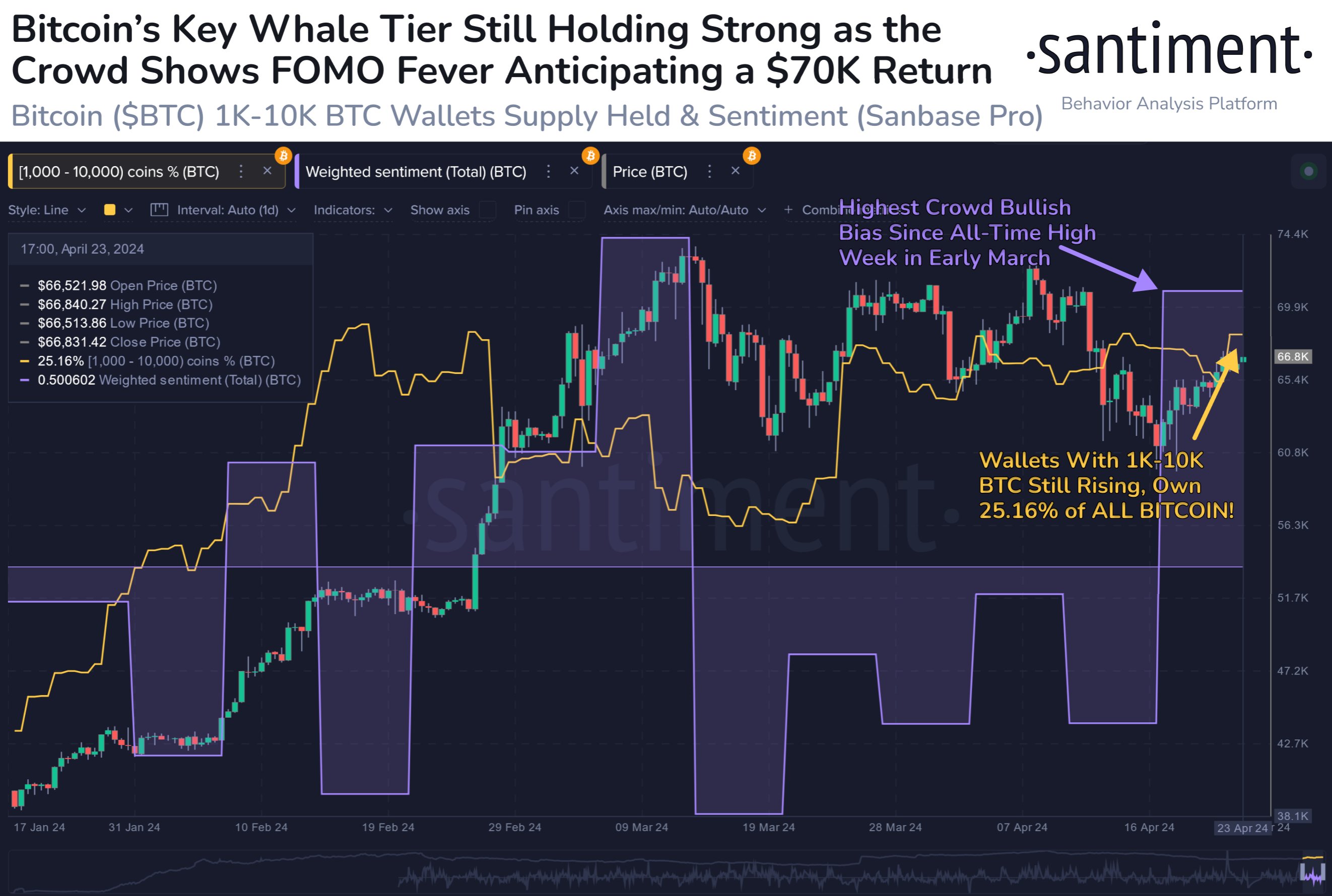
As displayed in the above graph, the Bitcoin Supply Distribution for this key investor group has observed a net rise over the year 2024 so far. The whales have bought 266,000 BTC ($17.2 billion) over this period.

However, this accumulation hasn’t been consistent. As is visible in the chart, the whales sold into the rally that would eventually lead to the asset’s new all-time high, and they bought back in once the drawdown was over.

As BTC has consolidated, so has its supply. Still, the latest change in the metric has been towards the upside, implying that these humongous holders are perhaps backing the current recovery push.

Following the latest accumulation, the 1,000 to 10,000 coins group holds 25.16% of the supply, which means that more than a quarter of all Bitcoin in circulation is sitting in the wallets of these large investors.

While whale buying is bullish, the current investor sentiment may not be so. As the data for the “Weighted Sentiment” metric attached by Santiment in the chart suggests, investors are currently showing FOMO towards the asset.

Historically, Bitcoin has tended to move against the majority’s expectations, so FUD/fear has been ideal for uptrends to start. FOMO/greed, on the other hand, has been where tops have become probable.

BTC Price

At the time of writing, Bitcoin is trading at around $64,700, up more than 7% over the past week.

Bitcoin Price Chart

Newbie Bitcoin Whales Hold 2x As Much As Veterans: What’s Behind This Trend?

On-chain data shows the new whale entrants in the Bitcoin market now hold almost twice as much as the veterans. Here’s what could be behind this shift.

Bitcoin Newbie Whale Holdings Have Been Rapidly Growing Recently

In a new post on X, CryptoQuant founder and CEO Ki Young Ju has discussed about how the holdings of the new whales compares against the old ones in the market right now.

The on-chain indicator of interest here is the “Realized Cap,” which, in short, keeps track of the total amount of capital that the investors have used to purchase their Bitcoin.

This capitalization model is in contrast to the usual market cap, which simply measures the total value that the holders as a whole are carrying based on the current spot price.

In the context of the current topic, the Realized Cap of the entire market isn’t of interest, but rather specifically that of two segments: the short-term holder whales and long-term holder whales.

Whales are defined as entities on the network who are holding at least 1,000 BTC in their balance. At the current exchange rate, this amount is worth $66.6 million, so the whales are clearly quite massive holders. Because of these large holdings, these investors can hold some influence in the market.

Based on holding time, the whales can be subdivided into two categories. The short-term holder (STH) whales are those who acquired their coins within the past 155 days, while the long-term holder (LTH) whales have been holding since longer than this timespan.

Now, here is the chart shared by Ju that reveals the Realized Cap breakdown between these two Bitcoin whale cohorts:

Bitcoin Realized Cap

As is visible in the above graph, the Realized Cap of the STH whales has historically not been too different from that of the LTH whales, but that appears to have changed recently.

The metric has pulled away for these new whales this year with some very sharp growth, as its value has now reached the $110.6 billion mark. This means that the STH whales have collectively bought their coins at an initial investment of a whopping $110.6 billion.

The Realized Cap of the LTH whales, on the other hand, has continued its usual trajectory, floating around $66.9 billion currently. This means that there is now a massive gap between the indicator for these two cohorts.

But what’s the reason behind the sudden emergence of this brand-new trend? As mentioned before, the STH cutoff stands at 155 days, which means that the Realized Cap of the STH whales would signify the total value of the purchases made by the whales over the last five months.

In the past five months, there has been one event in particular that has stood out, which has also never been present in any of the prior cycles: the approval of the spot exchange-traded funds (ETFs).

The spot ETFs provide an alternative mode of investment into the asset through a means that’s familiar to traditional investors. These funds have been bringing in some unprecedented demand into BTC and as their holdings also fall under the 155 days mark, they would count as STH whales.

Bitcoin has also been rallying this year, so all this new investment would have had to purchase at relatively high prices, thus causing the Realized Cap, which correlates to direct capital flows, to inflate even further.

BTC Price

Bitcoin is now trading at $66,400 after witnessing a surge of more than 6% over the past week.

Bitcoin Price Chart

Bitcoin Mega Whales Are Buying, Time For Rally To Return?

On-chain data shows that the largest number of investors in the Bitcoin market are finally buying, which could be bullish for the asset’s value.

Bitcoin Mega Whales Have Shown Net Inflows In The Past Day

In the past few weeks, the Bitcoin price has struggled to mount any significant bullish momentum as it has been stuck consolidating inside a range.

Earlier, while this was happening, the largest holders in the space had been sitting quietly, not buying or selling anything notable. According to data from the market intelligence platform IntoTheBlock, however, this appears to have changed in the past day.

Relevant holders here are the “Large Holders,” who, as defined by the analytics firm, are investors carrying at least 0.1% of the entire circulating Bitcoin supply in their wallets.

A little under 19.7 million tokens are circulating for the cryptocurrency, 0.1% of which would be 19,700 BTC. This amount is worth more than $1.26 billion at the current exchange rate of BTC.

Clearly, these large holders are quite large indeed, and in fact, they are much larger than the usual whale investors, who typically carry between 1,000 and 10,000 BTC. As such, it would perhaps be apt to call these humongous entities “mega whales.”

Since an investor’s influence in the market increases the larger their holdings, these mega whales would be the most powerful entities on the Bitcoin network. Therefore, their moves can have some consequences for the wider market.

IntoTheBlock has used the netflow on-chain indicator to track the movements of the Large Holders here, which measures the net amount of BTC entering or exiting the wallets of these investors.

The below chart shows the trend in this metric over the last few months:

Bitcoin Large Holder Netflow

As displayed in the above graph, the Bitcoin Large Holders netflow registered a notable positive spike yesterday, meaning these investors have received a net amount of coins into their wallets. The mega whales bought 19,760 BTC during this spike, worth more than $1.27 billion.

“Historically, accumulations by these addresses have often preceded rises in Bitcoin’s price,” notes the analytics firm. The chart shows that some extraordinary buys came from this cohort on the way to the new all-time high for the asset.

As such, it’s possible that these latest buys will also help the asset gain some bullish momentum in the near future. However, something to note is that the scale of the latest spike, although large on its own, isn’t quite as prominent as that of some of the large buys seen earlier.

BTC Price

At the time of writing, Bitcoin is trading at around $64,500, down more than 5% over the past week.

Bitcoin Price Chart

What’s A Simple Strategy For Buying & Selling Bitcoin? This Analyst Answers

An analyst has revealed a simple strategy for buying and selling Bitcoin using the historical pattern followed by two BTC on-chain indicators.

These Bitcoin On-Chain Indicators Have Followed A Specific Pattern Historically

In a post on X, CryptoQuant author Axel Adler Jr. discussed a simple strategy for timing buying and selling moves for Bitcoin. The strategy is based on the trend witnessed historically in two BTC on-chain metrics: the Net Unrealized Loss (NUL) and Net Unrealized Profit (NUP).

As their names suggest, these indicators keep track of the total amount of unrealized loss and unrealized profit that the investors are currently carrying.

These metrics work by going through the transaction history of each coin in circulation to see what price it was last transacted at. Assuming that the last transfer of each coin was the last time it changed hands, the price at its instant would act as its current cost basis.

If the previous price for any coin was less than the current spot price of the cryptocurrency, then that coin is currently carrying a profit. The NUP subtracts the two to calculate the exact unrealized gain for the coin.

Similarly, the NUL does the same for coins that have their cost basis above the latest value of the asset. These indicators then sum up this value for the entire supply and divide the sum by the current market cap.

Now, first, here is a chart shared by the analyst for the NUL that reveals a pattern that the metric has been following throughout the history of Bitcoin:

Bitcoin NUL

The Bitcoin NUL appears to have historically broken above the 0.5 level when the asset’s price has traded around bear market lows. According to Axel, the indicator in this territory would be the moment to buy more.

Recently, the metric has been floating around the zero mark, meaning that there has been any unrealized loss being held by the investors. This makes sense, as the cryptocurrency has set new all-time highs (ATHs). Naturally, 100% of the supply goes into profit when an ATH is set.

Similar to the pattern in the NUL, the NUP has been above the 0.7 level during major tops in the past, suggesting that it may be a good opportunity to sell when the indicator is in this zone.

Bitcoin NUP

As is visible in the chart, the NUP has been marching up with the recent rally in Bitcoin. Still, so far, the indicator hasn’t broken above the seemingly important 0.7 level, implying that the market may not yet be in an overheated place where selling would be ideal, at least according to this strategy.

The graphs of the two indicators, though, show that neither of them flagged the exact tops or bottoms in the asset. It’s especially prominent in the data of the NUP, where the metric signaled “sell” during tops that were merely halfway through the bull run.

That said, buying during the points flagged by the NUL and then selling at the overheated NUP values would have historically been profitable. In that sense, this would indeed be a “simple” strategy for the asset.

It remains to be seen, though, whether these patterns will continue to hold in the current Bitcoin cycle as well.

BTC Price

At the time of writing, Bitcoin is trading at around $69,400, down 2% over the past 24 hours.

Bitcoin Price Chart

Coinbase Sees Largest USDC Inflow Ever, What This Could Mean For Bitcoin

On-chain data shows Coinbase has just witnessed its largest USD Coin (USDC) inflow. Here’s why this may be relevant for Bitcoin.

Coinbase Has Just Seen A $1.4 Billion USDC Inflow

As pointed out by analyst Maartunn in a post on X, a large amount of USDC has flowed into Coinbase during the past day. The on-chain indicator of interest here is the “exchange inflow,” which keeps track of the total amount of a given asset entering into the wallets associated with a centralized exchange or group of platforms.

A spike in the exchange inflow can indicate that investors are interested in trading away the cryptocurrency. In the case of an asset like Bitcoin, such a trend can naturally be a bearish signal for the price.

In the context of the current discussion, though, a stablecoin is of focus. While USDC exchange inflows would also imply that the holder wants to sell the asset, the transaction wouldn’t affect the price since, by nature, the coin always remains stable at around $1.

This doesn’t mean that the sale of USD Coin isn’t of interest to the cryptocurrency sector as a whole, however. If investors are swapping stable coins in favor of volatile coins like BTC, then the prices of these latter assets would observe a buying effect.

Now, here is a chart that shows the trend in the USDC exchange inflow over the past month:

USDC Exchange Inflow

The above graph shows that the USDC exchange inflow has just registered a huge spike. According to Maartunn, this inflow was headed towards the cryptocurrency exchange Coinbase.

In total, $1.4 billion worth of the stablecoin has entered the platform’s wallets with this inflow, the largest the exchange has ever observed. Given the extraordinary scale, this could prove to be quite bullish for Bitcoin and others if the entity behind the inflow is planning to go on a buying run with this dry powder.

There also exists the scenario, however, where the whale actually intends to trade away the USD Coin stack in favor of fiat rather than using it to buy other cryptocurrencies. In such a case, a net amount of capital would be exiting the sector, which would be a bearish sign.

It now remains to be seen whether the massive USDC deposit indeed ends up causing any noticeable fluctuations in the volatile side of the market, particularly in the price of Bitcoin.

Bitcoin Price

Bitcoin had observed sharp bullish momentum earlier to cross above the $70,000 level, but since then, the asset has fallen back to sideways movement, with its price remaining unchanged.

Bitcoin Price Chart

Bitcoin Coinbase Premium Returns To Neutral: Buying Push Already Over?

The positive Bitcoin Coinbase Premium that drove the latest rally above $70,000 has dissipated, suggesting buying has already slowed down.

Bitcoin Coinbase Premium Gap Has Returned To Neutral Levels

CryptoQuant Netherlands community manager Maartunn explained in a post on X that the Bitcoin Coinbase Premium Gap has declined back toward the neutral line.

The “Coinbase Premium Gap” here refers to a metric that keeps track of the difference between the BTC prices listed on cryptocurrency exchanges Coinbase (USD pair) and Binance (USDT pair).

When the value of this metric is positive, it means that the price listed on Coinbase is greater than that on Binance right now. Such a trend implies that the buying pressure on the former is higher than that on the latter platform (or alternatively, the selling pressure on there is just lower).

On the other hand, a negative value can imply the selling pressure on Coinbase is higher than on Binance as the price of the cryptocurrency listed there is lower.

Now, here is a chart that shows the trend in the Bitcoin Coinbase Premium Gap over the past few days:

Bitcoin Coinbase Premium Gap

The chart shows that the Bitcoin Coinbase Premium Gap had taken to notably positive values as the latest upward push in the asset’s price had occurred. Since then, though, the metric has fallen, with its value approaching zero.

It would seem that the buying pressure on the platform contributed to the surge. The fact that the rally has slowed since the metric returned to neutral levels may add further evidence.

This isn’t unnatural for this year, however, as the Bitcoin price and Coinbase Premium Gap have shown a pretty tight relationship since the start of 2024.

Coinbase is popularly known as the preferred platform of American institutional investors, while Binance hosts more global traffic. As such, the premium’s value provides insight into how the behavior of the US-based large holders differs from that of world users.

Since the Coinbase Premium Gap has been the driver of the recent price surges, buying from these institutional entities could potentially have provided the fuel.

As the indicator’s value has now neared the neutral mark, it would imply that these whales have lifted their foot off the gas. Given the close relationship the metric and BTC price have held recently, it may be worth keeping an eye on how things develop in the coming days.

BTC may register some decline if the premium flips into the red from here. Naturally, a continuation of positive values would be a bullish sign instead.

BTC Price

At the time of writing, Bitcoin is trading around the $70,100 level, up more than 11% over the past week.

Bitcoin Price Chart

Bitcoin FOMO: Over 533,330 Addresses Bought Above $70,180

On-chain data suggests more than 533,330 addresses FOMO’d into Bitcoin above $70,180. Following the latest plunge, these investors would all be in losses.

Over 500K Bitcoin Addresses Have A Cost Basis Between $70,180 & $71,340

As pointed out by analyst Ali in a post on X, many investors have bought at the recently high price levels. Below is the chart shared by the analyst that shows how the distribution of the BTC supply looks right now across the various price ranges.

Bitcoin Cost Basis

The data is from the market intelligence platform IntoTheBlock, which has used on-chain data to determine the average acquisition price for any given address based on when its coins moved into its balance.

In the chart, the size of the dots represents the amount of coins that have their cost basis inside the corresponding range. It would appear that the $64,743 and $66,700 range is below the current price that hosts the cost basis of a significant amount of addresses.

More particularly, 382,000 addresses acquired 275,450 BTC at these levels. As the Bitcoin spot price is currently trading above this range, all these investors would naturally be carrying some profits.

Generally, investors are sensitive to retests of their cost basis, as such retests can potentially flip their profit-loss status. For holders who were in profit before the retest, the dip may appear as an opportunity to buy more.

The emerging reaction can be significant when many hands share their cost basis inside the same narrow range. If this retest occurs from above, the asset could feel some support as these investors rush to accumulate more.

Since the $64,743 to $66,700 range is dense with investors and is situated below the current spot price of the cryptocurrency, it could act as a major support center.

“Monitoring this level closely is crucial, as losing it could shift the focus to the next significant demand zone between $60,760 and $62,790, safeguarded by 797,500 addresses with over 298,000 BTC,” notes Ali.

In terms of the levels above, the $70,180 to $71,340 range particularly stands out, as 533,330 addresses bought a total of almost 433,000 BTC. A lot of these new buyers would be those FOMO’ing into the asset after seeing it explore new all-time highs.

This large block, however, may serve as a point of resistance for the cryptocurrency. These fresh hands might sell just as quickly as they bought in when a retest of their cost basis happens since they may be willing to just exit at their break-even, fearing more drops in the near future.

BTC Price

Bitcoin has seen a sharp correction during the past day, following which its spot price is now trading around the $67,900 level.

Bitcoin Price Chart

Bitcoin Sets New All-Time High Above $69,000 As Institutionals Show FOMO

Bitcoin has set a new all-time high (ATH) above the $69,000 level as institutional investors have aggressively bought on Coinbase.

Bitcoin Has Set A New ATH Above $69,000

The moment that every Bitcoin investor had been looking forward to has finally arrived today. The cryptocurrency just smashed past the record set in November 2021 to create a brand new ATH beyond the $69,000 level.

Bitcoin All-Time High

This historical moment has come for the asset as institutional investors have been showing some strong buying pressure recently.

Bitcoin Coinbase Premium Index Spikes To Highest Levels For 2024

As an analyst in a CryptoQuant Quicktake post explained, US institutional investors appear to be scrambling to buy Bitcoin as they are starting to feel FOMO with the sharp bullish momentum the cryptocurrency has enjoyed.

The metric of interest here is the “Coinbase Premium Index,” which keeps track of the percentage difference between the Bitcoin prices listed on cryptocurrency exchanges Coinbase (USD pair) and Binance (USDT pair).

The former exchange is the preferred platform for institutional traders based in the US, while the latter serves more global traffic. As such, the Coinbase Premium Index can provide hints about the differences in the buying and selling behaviors of the two groups.

When the indicator has a positive value, the price listed on Coinbase is higher than on Binance. Such a trend implies that the buying pressure is higher (or selling pressure is lower) from the US-based investors compared to Binance users.

On the other hand, the negative metric suggests that American institutional traders may be applying relatively high selling pressure on the market.

Now, here is a chart that shows the trend in the Bitcoin Coinbase Premium Index over the past few months:

Bitcoin Coinbase Premium Index

As displayed in the graph, the Bitcoin Coinbase Premium Index has registered a large positive spike recently, implying the difference between the prices on Coinbase and Binance has widened.

The indicator had been floating inside the green territory for a while before this spike, and in this period of high buying pressure on Coinbase, the coin observed a sharp rally.

This recent buying pressure would probably include sources like the spot exchange-traded funds (ETFs) approved this year. From the chart, it’s visible that the buying pressure has been even higher in the last couple of weeks, culminating in the latest spike.

Interest around the asset among these institutional entities had only been growing recently, but the latest spike suggests FOMO has gone up a level for these investors.

Given that institutional buying has been one of the main forces behind the latest rally in the cryptocurrency, it’s no wonder that its price has hit a fresh high off the back of the latest spike.

BitMEX Whales Buy Bitcoin: What History Says Will Happen Next

On-chain data shows the Bitcoin price has followed a particular pattern when the BitMEX whales have made large withdrawals.

Bitcoin Exchange Netflow For BitMEX Has Seen A Red Spike Recently

As an analyst in a CryptoQuant Quicktake post pointed out, the cryptocurrency exchange BitMEX has recently observed significant withdrawals from the whales.

The indicator of interest here is the “exchange netflow,” which tracks the amount of Bitcoin entering or leaving any exchange’s wallets. The metric’s value is calculated by subtracting the outflows from the inflows.

When the value of this metric is positive, it means that the inflows outweigh the outflows right now, implying that the investors are depositing a net number of coins to the platform.

Generally, one of the main reasons holders want to transfer their BTC to exchanges is for selling-related purposes, as this trend can have a bearish impact on the asset’s price.

On the other hand, the negative indicator implies net withdrawals are taking place on the exchange. Such a trend can suggest either some fresh buying is occurring or some existing investors are simply transferring the BTC they already own towards self-custody.

In either case, the holders withdrawing from the exchange’s custody can be a bullish sign for the cryptocurrency, implying that these investors potentially plan to hold onto their coins for extended periods.

Now, here is a chart that shows the trend in the Bitcoin exchange netflow for the BitMEX platform over the last few months:

Bitcoin Exchange Netflow

As displayed in the above graph, the Bitcoin exchange netflow for BitMEX has registered large negative values just recently. The investors have withdrawn about 4,000 BTC (equivalent to $168.3 million at the current exchange rate) from the platform during this net outflow spree.

The quant has explained that the price of the cryptocurrency and this metric have followed a specific pattern whenever this trend has occurred. Below is a zoomed-out indicator chart showing the previous instances where negative spikes took form.

quicktake-image

“When a significant volume of Bitcoins is observed leaving BitMEX, one of the leading cryptocurrency trading platforms, it often signals the formation of local bottoms in the price of Bitcoin (BTC),” notes the analyst.

The graph shows that large net withdrawals also occurred on the exchange right before the current rally in the cryptocurrency’s price began in October of last year.

It’s possible that these historical negative spikes in the indicator corresponded to buying from these BitMEX whales, which helped the price bottom out and turned around.

Given this historical pattern, the latest net withdrawals may have a similar effect to some degree on the coin. The quant cautions, however, that “it is essential to closely monitor these trends, as large inflows into the exchange can have the opposite effect, potentially leading to a decrease in BTC price.”

BTC Price

Bitcoin has erased its recent recovery as the asset’s price has returned to the $42,000 mark now.

Bitcoin Price Chart

Bitcoin Whales Bought The Recent Dip While Market Panicked

On-chain data suggests the Bitcoin whales may have participated in a significant amount of buying while the market was panicking about the recent lows.

Bitcoin Exchange Netflow Has Been Quite Negative Recently

An analyst in a CryptoQuant Quicktake post pointed out that the exchanges have recently seen outflows. The indicator of interest here is the “exchange netflow,” which keeps track of the net amount of Bitcoin entering or exiting out of the wallets of all centralized exchanges. The metric’s value is calculated by subtracting the outflows from the inflows.

When the indicator has a positive value, the inflows overwhelm the outflows, and a net number of coins moves into these platforms.

As one of the main reasons investors may want to deposit their BTC to the exchanges is for selling purposes, this trend can have bearish implications for the cryptocurrency.

On the other hand, the negative metric implies withdrawals are taking place, which can be a sign that the holders are accumulating right now. Such a trend could naturally turn out to be bullish for the asset’s price.

Now, here is a chart that shows the trend in the Bitcoin exchange netflow over the past year:

Bitcoin exchange netflow

The above graph shows that the Bitcoin exchange netflow has observed some deep negative spikes recently. This suggests that some large outflows have been occurring from these platforms.

Interestingly, these withdrawals came as BTC slipped towards the $41,600 level, implying that some investors were potentially buying while the rest of the market was panicking about the drawdown.

Given the large scale of the deposits, it’s likely that whale entities were behind them. The fact that these humongous holders were willing to risk accumulating at these recent prices could be a positive sign for the continuation of the rally.

Microstrategy has also just announced its massive $615 million BTC acquisition, which can naturally be another optimistic sign for the coin. The exchange netflows occurring ahead of the announcement are interesting, though.

It’s hard to be sure if there is any connection between the two, but one possibility is that the whales who bought at these recent lows knew about the acquisitions ahead of time.

Another, and perhaps the more likely explanation, is that these large investors were looking for an entry point into the asset ahead of the potential ETF approvals, and the dip presented as good an opportunity as any to achieve so.

Whatever the case, it would seem like the moves made by the whales might have paid off so far, as the Bitcoin price has rebounded since its lows (although its recovery hasn’t been too strong yet).

BTC Price

Bitcoin had recovered to as high as $43,800 during the past day, but the asset has since slumped back down as it’s now floating around the $42,800 mark.

Bitcoin Price Chart

These Bitcoin Holders Have Bought Almost $2 Billion In Last 6 Weeks: Data

On-chain data shows that mid to large Bitcoin holders have purchased almost $2 billion in the asset during the past six weeks.

Bitcoin Holders With 1 To 10,000 BTC Have Neared All-Time High Holdings

According to data from the on-chain analytics firm Santiment, the mid to large-sized BTC addresses have added 71,555 BTC to their holdings recently. The relevant indicator here is the “BTC Supply Distribution,” which keeps track of the total amount of Bitcoin that each holder group in the market is holding right now.

The investors or addresses are divided into these cohorts based on the total number of tokens that they are currently carrying. The 1-10 coins group, for instance, includes all holders who own at least 1 and at most 10 BTC.

If the Supply Distribution is applied to this specific cohort, it would tell us about the total amount of the asset that the addresses on the network fulfilling this condition are currently holding as a whole.

In the context of the current discussion, the mid and large-sized investors in the market are of interest. Typically, these are the addresses ranging between 1 and 10,000 BTC.

Here is a chart that shows the trend in the combined Bitcoin Supply Distribution for all the cohorts falling inside this particular coin range over the past few months:

Bitcoin Large Holdings

This wallet range covers a variety of groups, with the two most notable being the sharks and whales. The sharks are generally the entities with 100-1,000 BTC, while the whales are those with 1,000-10,000 BTC.

Both of these cohorts carry some power in the sector, because of the sheer size of their holdings. The whales, however, carry significantly more influence than the sharks, a natural consequence of their balances being much larger.

The rest of the investors inside this range (those with 1-100 BTC) are considered mid-sized holders, who may not be relevant individually, but as a whole, they can have a notable presence in the market.

From the graph, it’s visible that the combined holdings of all these groups have been heading up recently, implying that buying has been taking place. During the past six weeks alone, these investors have purchased a total of 71,155 BTC, which is equivalent to about $1.97 billion at the current exchange rate.

With this latest accumulation spree, the total holdings of these Bitcoin investors have hit about 15.2 million BTC, which is the largest amount that they have held since January 2022.

Not just that, their current holdings are also just 90,000 BTC shy from their all-time high back in November 2021, where they owned about 15.29 million tokens of the asset.

As is visible from the chart, the indicator has observed some particularly sharp growth during the past week or so, suggesting that these holders believe the current prices are worth buying at.

BTC Price

Bitcoin hasn’t moved much since its pullback a few days ago as its price is still trading around the $27,700 mark.

Bitcoin Price Chart

Bitcoin Whales Buy Dip, Addresses Now At Pre-Crash Levels

On-chain data shows the Bitcoin whales have been buying the dip, as their addresses have surged back towards pre-crash levels again.

Bitcoin Whales Have Fully Recovered To Their Pre-Crash Number

As pointed out by an analyst in a post on X, the whales appear to have been accumulating recently. The relevant indicator here is the “whale address count,” which measures the total number of Bitcoin addresses that hold at least 1,000 BTC and at most 10,000 BTC.

At the current exchange rate, this range converts to approximately $26 million at the lower bound and $260 million at the upper bound. These are clearly very significant amounts and the only investors large enough to be owners of these addresses would be the whale entities.

The whales naturally carry some influence in the market, due to the fact that they hold a notable part of the total circulating supply of the asset. Thus, their movements can be worth keeping an eye on, as they can influence the price of the asset.

Another version of the indicator tracks the addresses with balances upwards of 10,000 BTC (that is, this range’s upper bound), but at those levels, the wallets become more likely to belong to central entities like exchanges, so the trend in their addresses may not hold the same significance as what that of the normal whales would.

Now, here is a chart that shows the trend in the Bitcoin whale address count over the past month or so:

Bitcoin Whale Address Count

As displayed in the above graph, the whale address count observed a large drop around the time of the asset’s crash a few days back, where the price plummeted from the $29,000 level to below the $26,000 mark.

This decline in the number of addresses of these humongous investors would imply that some members of this cohort participated in distribution during the crash.

These whales who participated in the selloff didn’t necessarily clear out their entire holdings and exit the market, though, as distribution just enough to bring their address balances below the 1,000 BTC mark would still lead to a drawdown in the indicator.

Initially, following the crash, the number of these large Bitcoin holders remained flat, implying that there wasn’t any significant accumulation or distribution taking place.

In the past few days, however, the BTC whale address count has registered a sharp spike, suggesting that more whale-sized addresses have popped up on the network. With this uplift, the indicator has returned back to about the same values as it was before the price crash had occurred.

The whales participating in buying at the current price lows is naturally a positive sign for the cryptocurrency, as it could provide a more solid foundation for a rebound in the asset’s value.

BTC Price

At the time of writing, Bitcoin is trading near $26,021, down 1% in the last seven days.

Bitcoin Price Chart