The Hidden Forces Behind Bitcoin Price: Latest Insights From On-Chain Data

Leading on-chain analyst James Check, popularly known as Checkmatey, has recently delved into the intricacies of Bitcoin’s market dynamics, offering a detailed on-chain data analysis that sheds light on the forces driving Bitcoin prices. His latest insights highlight a period he describes as “Quiet and Trending,” suggesting a robust underpinning despite significant sell-side pressures and shifts in volatility.

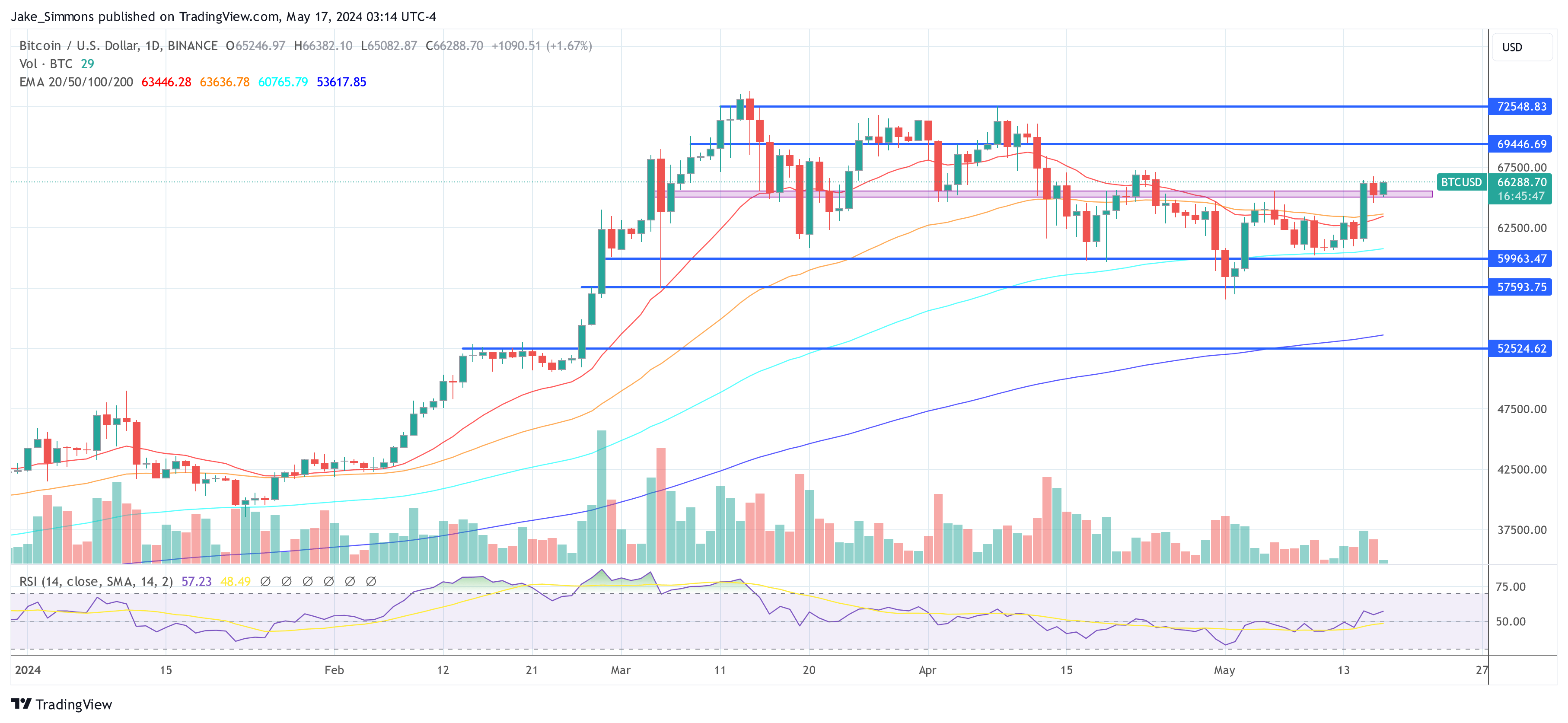
Bitcoin Follows The Stair-Stepping Rally-Consolidation-Rally Pattern

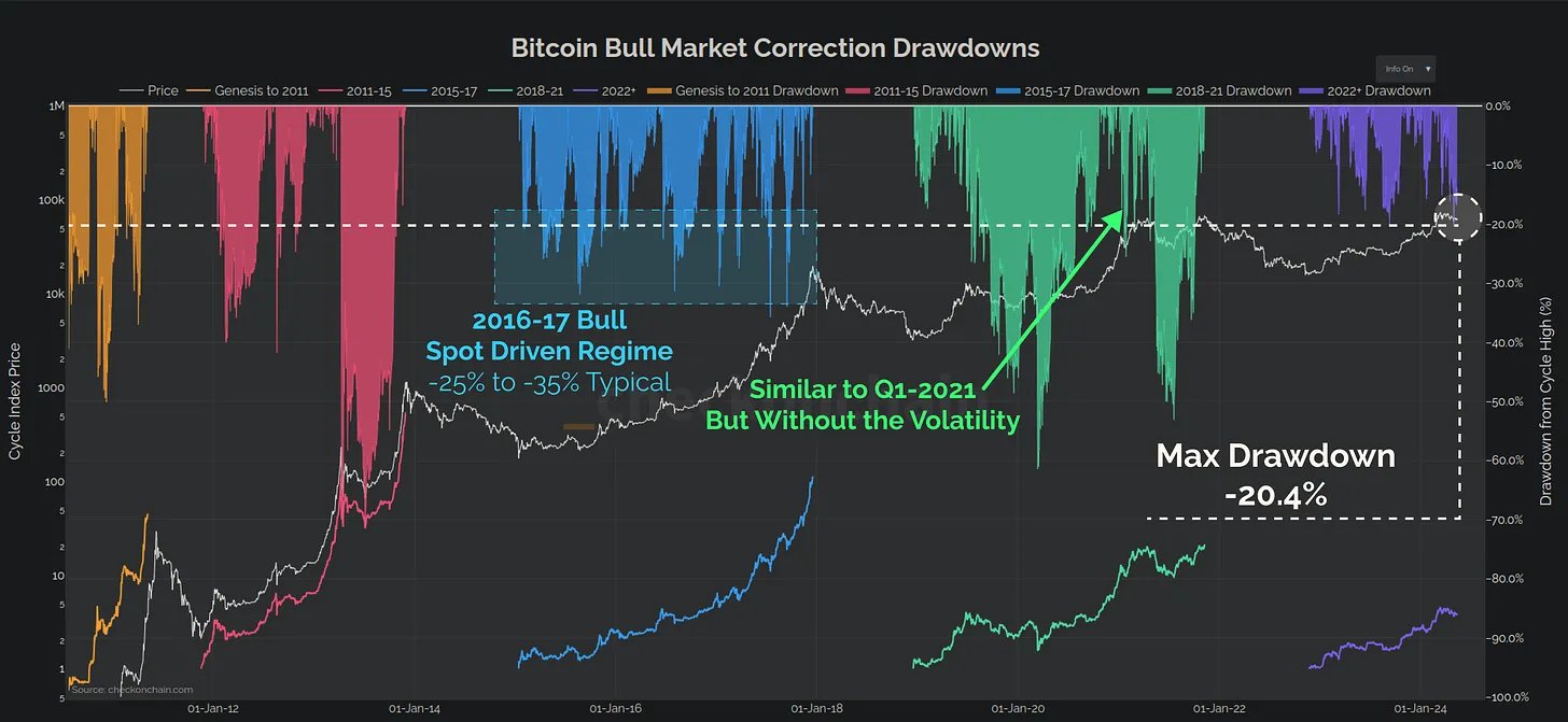
Since December, Bitcoin has experienced substantial sell-side pressure, with over 1.5 million BTC being sold. “Around 30% of this came out of GBTC, but the rest of it was good old fashioned profit taking,” Check explains.
Despite such substantial market sales, Bitcoin has demonstrated resilience with a relatively modest price correction of just -20%. This suggests that the foundational support levels for Bitcoin are stronger than what surface-level market movements might imply.

Bitcoin bull market drawdowns

A striking aspect of Check’s analysis is the transformation in Bitcoin’s volatility profile. “The overall realized volatility profile for Bitcoin is half what it was in 2021, and 3x smaller than 2017,” states Check. This trend indicates a growing maturity within the Bitcoin market, reflecting its evolution into a more stable asset over time compared to its early years.

Bitcoin Realized Volatility

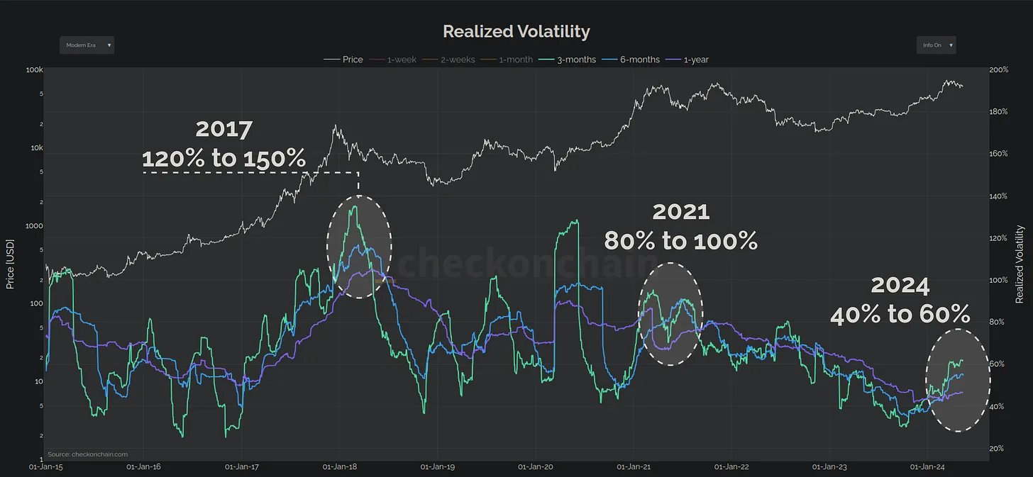
Check counters the typical narrative surrounding Bitcoin’s volatility: “What a lot of people forget however is that Bitcoin is volatile to the upside. Volatility to the upside is good!” He posits that the current increment in volatility is moderate and suggests that the market is still in the early phases of a bull run, rather than nearing its end.

A critical tool in Check’s analysis is the Short-Term Holder MVRV (STH-MVRV) Ratio, which he uses to gauge market sentiment and phases. According to Check, this ratio consistently finds support at 1.0 and resistance at 1.4 during stable uptrends. Stability is maintained as long as the ratio remains within these bounds. “Only when it breaks above this ceiling do things become unstable,” Check notes, which could signal a transition to bearish conditions.

Short-Term Holder MVRV

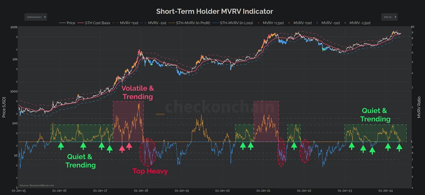
Despite the sell-off that brought Bitcoin down to $57k, Check observes that this has not significantly dented the profitability of short-term holders. “The magnitude of Unrealised Loss was very much in line with bull market corrections, calming fears of a top-heavy market.”

He further highlights that several of the local top buyers panic sold their Bitcoin at the lows, an action he interprets as beneficial for the correction phase, serving to stabilize the market by shaking out weak hands.

Expanding his analysis, Check refutes the criticism that Bitcoin’s volatility makes it a less viable asset. He points to a chart comparison of Bitcoin’s 30-day volatility against top-performing US stocks, showing that Bitcoin’s volatility is well within a manageable range.

Furthermore, he discusses the lower realized volatility of the SPY index, attributing it to the “out sized performance of the Magnificent-7,” which is counterbalanced by the poorer performance of the other components.

By highlighting the structural aspects of the current “Quiet and Trending” market phase, Check offers a refined perspective on how Bitcoin is navigating its maturation pathway, balancing between its speculative origins and its potential as a mainstream financial asset.

He concludes, “Overall, the Bitcoin uptrend in 2023-24 looks fairly structured, following stair-stepping rally-consolidation-rally pattern. However, as the charts above show, volatility tends to pick up during a consolidation, and that can lead to instability.”

At press time, BTC traded at $66,288.

Bitcoin price

Top 5 Watershed Moments In BTC On-Chain Analysis’ History. Is Your Favorite In?

These five moments shaped Bitcoin On-Chain analysis. Down below you’ll find a basic 101 article that reviews the basic concepts of the trade. If you have any problem with the list, David Puell is to blame. He’s a full-time on-chain analyst and the creator of MVRV and Puell Multiple. He didn’t include the metrics he created on the list, which says a lot.

Related Reading | Lessons From Reason’s “The Fake Environmentalist Attack on Bitcoin” Mini-Doc

In the following article, there’s also something for on-chain analysis experts. A side game called: Did your favorite moment make it? 

1. ByteCoin invents cointime destroyed in 2011, the very first on-chain metric ever, still used today, and first metric to detect holding behavior in any financial asset.

— David Puell (@kenoshaking) February 17, 2022

Anyway, let’s get into it.

On-Chain Analysis Moment #1- ByteCoin Invents Coin Days Destroyed (CDD) AKA Coin Time Destroyed

Invented In 2011, according to Puell, CDD is “the very first on-chain metric ever, still used today, and first metric to detect holding behavior in any financial asset.” How does the metric detect holders, though? According to Glassnode Academy, “Coin Days Destroyed is a measure of economic activity which gives more weight to coins which haven’t been spent for a long time.”

So, the first eureka moment was to get the coin’s age into the equation. That way, the all-important holders also entered. Glassnode again:

“It is considered an important alternative to looking at total transaction volumes, which may not accurately represent economic activity if value was not stored for a meaningful time. Conversely, coins held in cold storage as a long term store of value are considered economically important when they are spent as it signals a notable change in long-term holder behaviour.”

BTC price chart for 02/17/2022 on Gemini | Source: BTC/USD on TradingView.com
2. Moment #2 – Willy Woo and Chris Burniske Invent NVT Ratio 

This one emerged in 2017, and, according to Puell, it’s “where on-chain begins its Golden Age and became clearly an ecosystem of specialists”. It’s also “the first application of traditional economic/financial concepts to Bitcoin”. But, what’s the NVT Ratio specifically? Glassnode Academy responds:

“Network Value to Transactions (NVT) Ratio describes the relationship between market cap and transfer volume. Per Willy Woo, its creator, NVT can be considered analogous to the PE (price to earnings) Ratio used in equity markets.”

Another way to look at it is, “NVT is that it is the inverse of monetary velocity, comparing two of Bitcoin’s primary value propositions”. Those are store of value Vs. settlement/payments network.

3. @nic__carter and @khannib invent realized cap in 2018, the single most important and robust metric in the field, and first verifiable discovery of the cost basis of any asset.

— David Puell (@kenoshaking) February 17, 2022

On-Chain Analysis Moment #3 – Nic Carter And Antoine Le Calvez Invent Realized Capitalization

Created In 2018, Puell thinks Realized Capitalization is “ the single most important and robust metric in the field, and first verifiable discovery of the cost basis of any asset”. But, what is it exactly? According to Glassnode Academy, Realized Capitalization also makes on-chain analysis look into the age of the coins.

“Realized capitalization (realized cap) is a variation of market capitalization that values each UTXO based on the price when it was last moved, as opposed to its current value. As such, it represents the realized value of all the coins in the network, as opposed to their market value.”

Ok, “realized cap reduces the impact of lost and long dormant coins, and weights coins according to their actual presence in the economy of a given chain”. How does it do it, though? Glassnode again:

“When a coin that was last moved at significantly cheaper prices is spent, it will re-value the coins to the current price, and thus increase realized cap by a corresponding amount. Similarly, if a coin is spent at a price lower than when it was last moved, it will re-value to a cheaper price and have a corresponding decrease on realized cap.”

Moment #4 – Dhruv Bansal Invents HODL Waves 

Created in 2018, HODL Waves is the “last major primer in on-chain analysis, first metric to segregate supply into different conceptual frameworks”. According to Purell, it’s also the “most comprehensive economic time analysis on Bitcoin to date”. Surprising no one, HODL Waves also looks at the age of the coins. According to Glassnode Academy:

“HODL Waves provide a macro view of the age of coins as a proportion of total coin supply. This provides a gauge on the balance between short term and long term holdings. It can also indicate where changes in this age distribution occur as the thickness of HODL wave bands change in response to dormant coins maturing, or when old coins are spent, resetting their age into the youngest category.”

5. @ErgoBTC releases the forensics of PlusToken in 2019, the grey swan that defined the market structure of Bitcoin for that year and first relevant nation-state attack on the asset.

— David Puell (@kenoshaking) February 17, 2022

On-Chain Analysis Moment #5 – Ergo Releases The Forensics Of PlusToken

This famous case happened in 2019. According to Purell, it’s “the grey swan that defined the market structure of Bitcoin for that year and first relevant nation-state attack on the asset.” For a report on the situation, we had to consult Crypto Briefing, who spoke to:

“Ergo, the lead researcher of the report, told Crypto Briefing in an email that the most striking feature of this scam was its size. “Billion-dollar scams are very rare,” they said. “We did not expect the previously reported 200K BTC volumes to be accurate, but they were.”

Related Reading | Bitcoin On-Chain Demands Suggests That The Market Has Reached Its Bottom

The Ergo team also explained why the laundry of the funds didn’t work that well. It was because they practiced “self-shuffling.” What’s that, you ask? Crypto Briefing again: 

“It refers to the “repeated UTXO splitting and merging in hundreds of transactions,” according to the report. This method was both easy to track and the most common way in which PlusToken funds were handled.”

This case wouldn’t be complete without a big institution’s involvement. This time, the suspect is Huobi:

“Huobi played a major role in off-loading these funds too, with nearly 250,000 addresses associated with the PlusToken funds. These addresses were reduced to two clusters which were identified following the incompetent privacy standards.”

Of course, those are just suppositions. When it comes to the giant Huobi, nothing’s been proven.

Feature Image by analogicus on Pixabay | Charts by TradingView

Bitcoin On-Chain Data Reveals Why This Selloff Is Different From May’s Crash

Bitcoin on-chain data shows the exchange reserve indicator looks different for the current selloff when compared to the May crash.

Bitcoin Spot Exchange Reserve Continues To Decline Despite The Huge Dip

As pointed out by a CryptoQuant post, the BTC reserve on spot exchanges has actually declined amidst the current price dip.

The Bitcoin all exchanges reserve is an indicator that shows the amount of coins present in wallets of all the centralized spot exchanges.

When the reserve’s value moves up, it means more investors are sending their BTC to exchanges for withdrawing to fiat or altcoin purchasing.

Similarly, a downtrend in the metric implies investors are withdrawing a net amount of Bitcoin from exchange wallets to personal ones for hodling them, or selling through OTC deals.

Here is a chart showing how the value of the indicator has changed in the past year:

The Bitcoin exchange reserve seems to be going down | Source: CryptoQuant

Now, on examining the above graph, some interesting features can be seen. In the lead-up to the 2021 bull run, the exchange reserve was coming down from a very high value. This makes sense as a downtrend like that one means investors were accumulating more coins, which can help drive the price up.

Then, around when Bitcoin hit its all-time-high (ATH), the metric started climbing back up quick, indicating a selloff, and thus the price crashed in response.

Related Reading | Panama To Recognize Bitcoin As Payment Alternative, Issues New Regulations

The current sharp dip, however, looks different. The BTC reserve has actually been on a decline, implying investors haven’t been quick to selloff on these spot exchanges.

This would mean that this selloff may have been entirely driven by derivatives, unlike the May crash where spot exchanges also played a big role.

BTC Price

At the time of writing, Bitcoin’s price is around $47k, down 5% in the last 7 days. Over the past month, the cryptocurrency has accumulated 3% in gains.

The below chart shows the trend in the value of the coin over the past five days.

BTC’s price shows a lot of volatility | Source: BTCUSD on TradingView

Two days ago, Bitcoin saw absolute chaos in price action as the coin’s value went from $50k all the way down to $43k within the matter of fifteen minutes. And then just minutes later, BTC had already recovered above $47k.

Related Reading | How Futures Traders Could See The Bitcoin Selloff Coming

The coin dipped back down to $44.4k yesterday, but it is already back to $47k now. It’s hard to say at the moment where the price might head next, but one thing can be expected for sure: more volatility ahead.

Featured image from Unsplash.com, charts from TradingView.com, CryptoQuant.com

Bitcoin Nears $43k, Indicators Suggest Bull Market Ahead

The Bitcoin fund flow ratio for all exchanges is on a decline, while BTC transactions are rising. This could suggest a bull market is ahead.

Bitcoin Fund Flow Ratio For All Exchanges Goes Down

As pointed out by a CryptoQuant post, the BTC fund flow ratio for all exchanges seems to be on a downwards trend. Also, BTC transactions are going up.

The Bitcoin fund flow ratio is an indicator that’s defined as the total amount of BTC going into or out of exchanges divided by the total amount of BTC transferred on the whole network.

Fund Flow Ratio = Total Exchange Inflows + Outflows in BTC ÷ Total Transferred BTC (whole network)

Basically, the indicator shows the percentage of BTC that’s involved in exchange-related transactions as compared to the total transactions on the entire network.

Related Reading | New Bitcoin Users Activity Spikes To New All-Time Highs, What Does It Mean?

With the help of the fund flow ratio, it becomes possible to know what percentage of BTC transactions happen outside exchanges. That is, through methods like over-the-counter (OTC) deals or P2P transfers.

The other relevant metric here is the total tokens transferred. As the name suggests, this indicator shows the total number of BTC that has been transferred on the network in some form.

Related Reading | The Bullish Bitcoin Crossover No One Is Paying Attention To

Now, here is a chart that shows the trend in both the BTC fund flow ratio and total tokens transferred:

The two Bitcoin indicators show bullish signals | Source: CryptoQuant

As the chart shows, the BTC fund flow seems to be going down, while the tokens transferred metric is going up.

What this means is that while exchanges getting fewer transactions usually signals low volatility, the total transactions are also going up across the board. This would suggest that OTC deals are shooting through the roof (and thus occupying a relatively higher percentage), rather than a drop in the volatility itself.

The combination of these indicators behaving like this is usually a bullish sign. During the August of last year, before the bull run started, similar signals were present.

Bitcoin Price

At the time of writing, BTC’s price is around $42.7k, up 9.5% in the last 7 days. Over the past month, the crypto has gained 23.5% in value.

Below is a chart that shows the trend in the price of the crypto over the last 3 months:

BTC’s price shoots up | Source: BTCUSD on TradingView

Bitcoin seems to have caught a sharp uptrend as the crypto nears $43k. It’s unclear if BTC can continue the rally and go beyond this point, or whether it will crash again like at the start of the month. If the indicators discussed above are anything to go by, a bull run looks more likely at the moment.

Bitcoin Price Drops 5% As 12k BTC Flow Into Binance

On-chain data shows that shortly after crypto exchange Binance observed Bitcoin inflow of around 12k BTC, price fell by almost 5%.

Huge Bitcoin Inflow To Binance

As pointed out by a CryptoQuant post, inflow of around 12k BTC was seen on Binance, the largest crypto exchange by market volume.

The Bitcoin inflow is an indicator that shows the total amount of BTC transferred to a crypto exchange from a personal wallet.

As investors usually send their crypto to exchange wallets for cashing out, altcoin purchasing, etc., the indicator’s value going up would imply there is some selling pressure in the market.

A strong increase in the inflow metric can have direct effects on the price, which usually shows as a drop just a few hours later.

Related Reading | Fear And Greed: Sentiment Turns Neutral As Bitcoin Stagnates, What To Do?

Now, here is a chart that shows the trend in the value of the BTC inflow for Binance:

The BTC inflow for Binance shot up earlier today | Source: CryptoQuant

As the above graph shows, there was a sharp spike in the Bitcoin inflow for the crypto exchange Binance. This inflow’s value was around 12k BTC, worth around $470.6 million at the current rate.

The chart also displays the curve for  BTC’s price. It looks like just a few hours after this spike occurred, the crypto dropped in value by about 5%.

Related Reading | How A Hammer & The Golden Ratio Could Mean 6 More Months Of Bullish Bitcoin

And it makes sense as movement of 12k BTC is quite significant, and a spike like this might mean there is some short-term selling pressure in the market.

While this inflow was quite significant, another indicator, the Bitcoin all exchanges netflow, shows that there was outflow of about 19k BTC from all exchanges. This more than makes up for the inflow to Binance, hence the exchange reserve overall still looks to be down.

After plummeting, the Bitcoin exchange reserve continues to be down | Source: CryptoQuant
BTC Price

At the time of writing, Bitcoin’s price floats around $k, down % in the last 7 days. Over the past month, the cryptocurrency has amassed % in gains.

Below is a chart that shows the trend in the price of the coin over the last 6 months.

BTC’s price zig-zags below the $40k resistance level | Source: BTCUSD on TradingView

After enjoying a refreshing period of prolonged uptrend, Bitcoin’s price fell down after peaking at $42k. Now, it seems to be range bound below the $40k mark as the coin can’t seem to break it again.

It’s unclear where the price will head from here. It could either continue to be stuck in this range bound environment below the $40k level, or perhaps it will have a breakthrough soon, and a bull run will ensue as hinted by the Bitcoin bullish crossover.

On-Chain Data Shows Bitcoin Daily Transaction Volumes Are Up 94%, Rally Might Not Be Over Just Yet

Bitcoin has recently lost momentum following the rally that occurred over the past week. The digital asset had seen gains of over 20% while the entire market followed suit and showed massive gains all across the board. Bitcoin had spent 9 consecutive days closing in the green for the first time in a decade.

As the cryptocurrency sees slowing momentum, the price has experienced various dips that have driven the price down. After the asset had jumped over $42,000 for the first time in over a month. With this slowdown, it seems that the rally has come to its end. But on-chain data shows that bitcoin is picking up steam in other areas.

Related Reading | Bitcoin Is More Oversold Than It Was At ATH In April, Says Analyst

On-chain data analysis shows that daily transaction volumes of bitcoin have picked up in the past week. Jumping up 94% to $9.1 billion per day from $4.7 billion per day. Showing that while the price may have slowed down, the volumes have not.

Small Holders Accumulate Bitcoin Aggressively

This report from Glassnode shows that small-time bitcoin holders are accumulating the digital asset even more aggressively than the whales. These wallets which are referred to as the “Shrimp and Crab” wallets are the wallets holding less than 10 BTC on their balance. For the first time, small-time holders now collectively own 13.8% of the entire bitcoin supply.

Related Reading | On-Chain Expert Predicts $162K Bitcoin Peak This Cycle

The trends show that the wallets have been accumulating coins since May, after the market crash that saw assets losing up to 50% of their value in a short period of time. Wallets holding less than 10 BTC have continuously increased their holdings as the market has dipped and dived through the months.

Accumulation patterns continue to point towards bullish, and so does coin maturation, but these bullish indicators can often take time to develop in the market. Small investors accumulating more coins show more faith in the market. As more and more investors are now choosing to hold their coins instead of selling them off.

Price Movements So Far

Bitcoin price continues to struggle in the $38,000 range following the price dip at the beginning of the week. Momentum continues to remain low in the digital asset while it seems the rest of the market is trying to dissociate from the pioneer cryptocurrency.

BTC price continues to trend low | Source: BTCUSD on TradingView.com

The coin has so far lost over $1,000 in a 24-hour period. Showing a 3.64% decline in the coin price in the past day. Trading volumes have also declined 11% according to CoinMarketCap.

As of the time of this writing, bitcoin is currently trading at $38,358, as the market cap continues to remain above $720 billion.

Featured image from Cointelegraph, chart from TradingView.com