Bitcoin Price Linked To Binance Vs Coinbase Battle, Quant Reveals

A quant has explained how there appears to be a relationship between Coinbase’s spot volume dominance vs. Binance’s and the Bitcoin price.

Bitcoin Has Been Reacting To Binance/Coinbase Volume Changes

In a CryptoQuant Quicktake post, an analyst discussed the dynamics in the cryptocurrency market that arise out of the battle happening between Binance and Coinbase for spot volume dominance.

The quant shared a chart below that shows how this war for dominance has played out over the past decade.

Bitcoin Binance Vs Coinbase

As the graph shows, Binance has been the much more dominant of the two platforms when considering the spot volume. The exchange is hosting five times as much volume as Coinbase.

The analyst notes that the difference between the two would be even higher when considering the BTC-FDUSD pair, which isn’t included in the data depicted in the above chart.

Despite the much lower spot volume, Coinbase still hasn’t been irrelevant in the market. For example, the platform is the custodian for Bitcoin spot exchange-traded funds (ETFs) like BlackRock’s IBIT and Grayscale’s GBTC.

There also appears to be an interesting pattern between the dominance of the American exchange and the Bitcoin spot price. The quant has highlighted this trend in the graph.

There have been a few instances where a rise in the spot trading volume of Coinbase against Binance has preceded surges in the value of cryptocurrency. Similarly, declines in the platform’s dominance have seemingly led to drawdowns in the Bitcoin price.

The analyst has also discussed the trend in the volumes of the two exchanges more closely, using the spot volume ratio for them, as shown below.

Bitcoin Volume

The chart shows that the spot volume ratio between Binance and Coinbase had spiked to very high levels in 2023, with the former’s volume being 53 times the latter’s. The reason behind this was the zero-fee scheme that Binance had introduced for the Bitcoin trading pairs.

However, Coinbase’s volume has recently risen, although the ratio remains notably in favor of Binance. This shift in the market emerged as the Bitcoin spot ETF-related news started to intensify.

The quant concludes:

The dynamics between these exchanges are complex, but the graphs show that each exchange’s dominance at specific times has a direct impact on the price of Bitcoin. It’s a true battle between the market’s biggest players, where competition is constant, and the outcome is reflected in cryptocurrency movements.

BTC Price

At the time of writing, Bitcoin is trading at around $61,800, down 3% over the past week.

Bitcoin Price Chart

Is The Bitcoin Top Already Here? This Historical Pattern Says So

A historical pattern currently forming in a Bitcoin on-chain indicator could suggest that a top may be near for the asset, if not already in.

Bitcoin SOPR Ratio Is Forming A Historical Top Pattern Right Now

In a CryptoQuant Quicktake post, an analyst has discussed about a pattern regarding the SOPR Ratio. The “Spent Output Profit Ratio” (SOPR) is an indicator that tells us whether the Bitcoin investors are selling their coins at a profit or loss right now.

When the value of this metric is greater than 1, it means that profit-selling is dominant in the market currently. On the other hand, the metric being under the threshold suggests the average holder is moving coins at some net loss.

In the context of the current topic, the SOPR itself isn’t of interest; rather, it is a different version called the SOPR Ratio. The name may be a bit confusing as SOPR already contains a “ratio,” but the latter ratio here corresponds to the fact that this indicator compares the SOPR of two Bitcoin cohorts: the long-term holders (LTHs) and short-term holders (STHs).

These investor groups make up for the two main divisions of the BTC market done based on holding time, with 155 days being the cutoff between the two. The STHs are those who bought within the past 155 days, while the LTHs include the HODLers carrying coins for longer than this timespan.

Now, here is a chart that shows the trend in the 7-day moving average (MA) of the Bitcoin SOPR Ratio over the history of the cryptocurrency:

Bitcoin SOPR Ratio

As displayed in the above graph, the 7-day MA Bitcoin SOPR Ratio had been heading up throughout 2023 and early parts of 2024, but recently, the metric has hit a top and reversed its direction. Whenever the SOPR Ratio is higher than 1, it means the LTHs, who are generally known to be resolute hands, are participating in a higher degree of profit-taking than the STHs.

It would appear that as BTC had observed its rally and approached a new all-time high (ATH), these diamond hands had started harvesting some of the gains they had earned over their long holding time. And once the price set a new ATH, these investors participated in peak profit-taking. Since then, their profit-selling has been dropping off, although they are still harvesting notably higher gains than the STHs.

In the chart, the analyst highlights how this pattern has been repeated at different points in the asset’s history. While the scale of the peak LTH profit-taking has been heading down over the cycles, it’s still true that the metric’s top has coincided with tops in the price during each of them.

As the line drawn by the quant suggests, it’s possible that the latest peak in the metric may have in fact been the top for this cycle. This is only, however, assuming that the pattern of diminishing returns in the indicator holds to the exact degree judged by the line.

It’s possible that the peak will still be higher than the current levels, while at the same time being lower than the previous cycle’s peak, thus still being in-line with the historical Bitcoin pattern.

Whatever the case be, though, the fact that the SOPR ratio has apparently hit a top could still be a bearish signal, if only in the short term.

BTC Price

Bitcoin has been making some steady recovery over the last few days as its price has now surged back above $66,100.

Bitcoin Price Chart

Bitcoin Nears Two Important On-Chain Levels: What Happened Last Time

Data shows Bitcoin is currently nearing two notable on-chain price levels. Here’s what happened the last time BTC broke above them.

Bitcoin Is Approaching Vaulted Price & MVRV +1SD Currently

In a new post on X, Glassnode leads on-chain analyst Checkmate points out that BTC has been near two on-chain price levels recently. The first of these levels is the “MVRV +1SD.”

The Market Value to Realized Value (MVRV) ratio is a famous indicator for Bitcoin. In short, it compares the value that BTC holders are currently carrying (that is, the market cap) against the value they put into the cryptocurrency (the realized cap).

This metric is generally used to determine the scale of profit or loss that the market as a whole is carrying right now. Based on this, the fairness of the coin’s price may be judged.

In the context of the current discussion, the +1 standard deviation (SD) of the MVRV ratio from its mean is of relevance. More specifically, the price level at which the market would satisfy this MVRV ratio condition is of focus.

The other on-chain level of interest here is the “Vaulted Price.” This indicator is a product of the “Cointime Economics” framework that Checkmate came up with alongside David Puell from Ark Invest. In reference to this metric, the paper reads:

Vaulted Realized Price may be considered to be a pricing level that reflects the ‘potential energy’ stored in the system. Somewhat counter-intuitively, the more long-term coin accumulation that takes place, the larger the uncertainty becomes between the proportion of truly lost vs. HODLed supply. Vaulted Realized Price will trade lower in this instance, as more cointime accumulation takes place, and uncertainty regarding future distributive pressure builds (and vice-versa).

Now, here is a chart that shows the trend in these two indicators, as well as some other “original” on-chain levels, over the past few years:

Bitcoin Vaulted Price & MVRV +1SD

As displayed in the above graph, the Bitcoin spot price earlier broke through the Vaulted Price and went to the MVRV +1SD (note that the labeling is flipped in the chart by mistake, as Checkmate has noted in reply to the post).

Since then, the price has come down a bit and is trading under both of these levels. Nonetheless, it currently stands quite near to them and far above the other on-chain price levels like the realized price.

As the chart highlights, the last time cryptocurrency was in this situation was December 2020. Obviously, what followed then was the bull run of 2021.

It remains to be seen how Bitcoin’s interactions with these levels will be this time around and whether a similar euphoric run will follow with a potential break above them.

BTC Price

Bitcoin had shot up above the $72,000 mark earlier, but it has since slumped back again, and it’s now floating around $69,000.

Bitcoin Price Chart

Bitcoin 40% Of Way Through Bull Run If This Metric Is To Go By

A pattern in the holdings of the Bitcoin long-term holders may suggest that the current bull run is 40% of the way to completion.

Bitcoin Long-Term Holders Have Been Distributing Recently

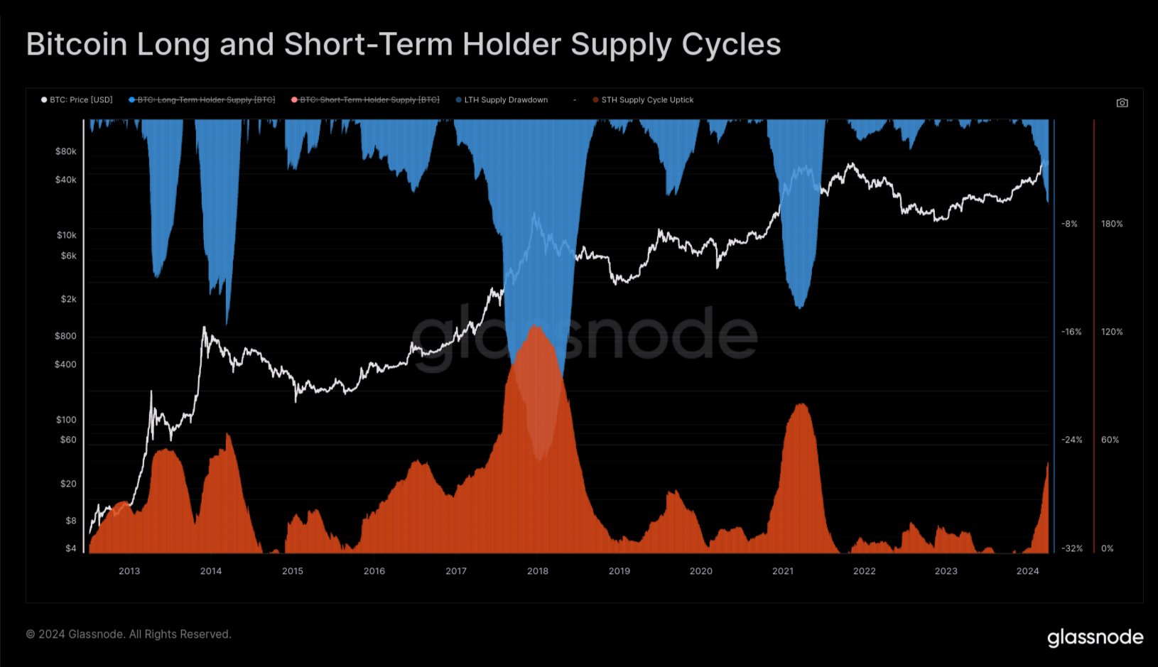
In a new post on X, Glassnode lead analyst Checkmate discussed the recent behavior of the long-term Bitcoin holders. The “long-term holders” (LTHs) here refer to the BTC investors who have been holding onto their coins for over six months.

Statistically, the longer an investor holds onto their coins, the less likely they become to sell them at any point. Since the LTHs hold for significant periods, they are considered quite resolute.

And indeed, they display this resilience in their behavior, rarely selling despite whatever is happening in the broader market. As such, the times they sell are all the more noteworthy.

Historically, the LTHs have taken to distribution during bull runs when the asset has broken its previous all-time high (ATH) price. Due to their long holding times, these investors amass large profits, which they start to spend when a high amount of demand comes in during bull rallies that happily take coins off their hands at high prices.

Checkmate explained that the recent ATH break of the cryptocurrency has looked similar to any other past one, with the LTHs already having started spending for this round.

The chart below shows the trend in the supply of Bitcoin LTHs over the past few years.

Bitcoin Long-Term Holders

As displayed in the above graph, the Bitcoin LTHs have recently observed their supply heading down. Remember that when it comes to increases in this metric, there is a delay associated with when buying is happening and when this supply is going up.

This is natural because the newly bought coins must age for six months before they can be considered a part of the cohort’s holdings. When it comes to drawdowns, though, the same delay doesn’t emerge, as the age of the coins instantly resets back to zero, and they exit the group.

Thus, the latest distribution from the LTHs is indeed happening. “In the prior two cycles, new demand for Bitcoin was able to absorb this LTH sell-side for around 6-8 months while pushing prices multiples higher,” explains the Glassnode lead.

The chart below shows that the LTH supply has typically gone through a drawdown of around 14% during these bull run selloffs.

Bitcoin LTH Selloff

Checkmate notes that, based on this historical average drawdown in the LTH supply, the current Bitcoin cycle would be around 40% completion for this process.

BTC Price

Bitcoin has surged during the past 24 hours as its price has now returned to $71,800.

Bitcoin Price Chart

Bitcoin Bull Flag Could Predict 10% Surge To $77,000, Analyst Explains

An analyst has explained that a breakout from a bull flag pattern could lead Bitcoin to surging towards a new all-time high of $77,000.

Bitcoin Has Been Forming A Bull Flag Pattern Recently

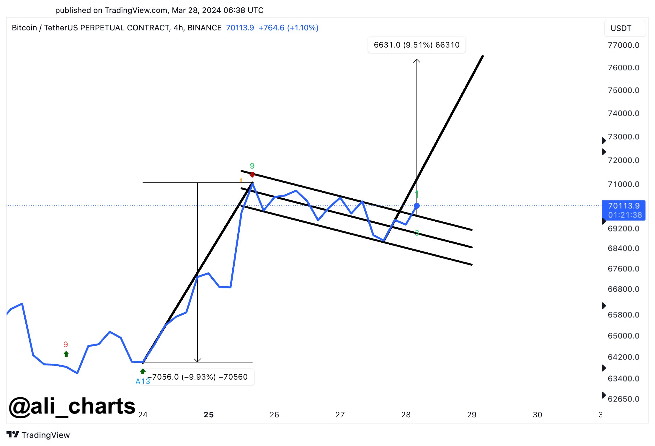
In a new post on X, analyst Ali has discussed about a bull flag recently forming in the 4-hour price of the cryptocurrency. The “bull flag” here refers to a pattern in technical analysis that, as its name implies, looks like a flag on a pole.

In this pattern, a sharp uptrend is succeeded by a period of consolidation towards the downside. The uptrend makes up for the pole, while the consolidation period acts as the flag.

When the price is trapped inside the flag, it tends to find resistance at its upper line, so tops may be probable to form there. Similarly, the lower line may act as support, thus facilitating for bottoms to take shape.

The bull flag is usually considered to be a continuation pattern, meaning that the prevailing trend (that is, the trend of the flag) would continue once the consolidation period is over.

This happens when a break above the resistance line takes place. The uptrend emerging out of such a break may be of the same height as the pole. If the asset falls under the support line, though, the pattern could be considered invalidated.

Like the bull flag, there is also the bear flag pattern, which works similarly except for the fact that the pole in this case corresponds to a downtrend while the flag is generally a consolidation channel angled upwards. Just like the bull flag, a continuation of the prevailing bearish trend may follow this formation.

Now, here is the chart shared by Ali that shows the bull flag that BTC’s 4-hour price has recently been consolidating inside:

Bitcoin Bull Flag

From the graph, it’s visible that the 4-hour Bitcoin price has appeared to have been consolidating inside this bull flag over the last few days. It’s also apparent that, in the past day, BTC has been climbing above the resistance line of the pattern.

This could mean that the cryptocurrency is preparing a break out of this formation. Naturally, the asset would have to show more momentum before the breakout can be confirmed.

“If BTC holds above $70,000, we could see a surge of nearly 10% to a new all-time high of $77,000!” says Ali. The analyst has chosen this target as such a swing would be of the same length as the pole that had preceded this flag.

BTC Price

Bitcoin has so far been heading in a direction that would add more credence to the breakout, as its price has now broken past the $71,300 level. With this surge, BTC investors would be enjoying profits of more than 7% over the past week.

Bitcoin Price Chart

Bitcoin’s Big Breakout: This Bullish Pattern Signals An Imminent Price Surge

Market analysts have recently observed a notable pattern in Bitcoin price chart, potentially signaling a shift in the market trend. Jake Wujastyk, a prominent market analyst, has particularly pointed out the emergence of an inverse head and shoulders pattern on Bitcoin’s daily candle chart.

This pattern, coupled with Bitcoin’s closing price above a significant “volume shelf” signals an imminent upward trajectory for Bitcoin.

Bitcoin Surge On The Horizon

In technical analysis, an inverse head and shoulders pattern is traditionally interpreted as a bullish signal. It is characterized by two lower peaks (shoulders) on either side of a far-down valley (head). The completion of this pattern occurs when the price breaks above the resistance level, known as the “neckline.”

In Bitcoin’s case, this neckline also aligns with a ‘volume shelf,’ as Wujastyk indicates, a price level where many contracts have previously been traded, indicating strong support or resistance.

As Bitcoin’s price currently sits above the critical level of $43,000 up by 4.7% in the past week, it suggests a growing momentum among buyers, hinting at a potential uptrend. At the time of writing, Bitcoin has seen a 2.1% increase in its price over the past 24 hours, reaching $43,144.

Bitcoin (BTC) price chart on TradingView.com

This price movement occurs against a backdrop of fluctuating daily trading volumes, which have decreased from over $25 billion to below $20 billion in a day.

Notably, this pattern’s emergence is particularly noteworthy as Bitcoin options are set to expire, with 22,000 BTC options nearing their expiry date. These options have a Put Call Ratio of 0.66, a Maxpain point of $42,000, and a notional value of $960 million, as per data from Greekslive.

For context, the Put Call Ratio is a key indicator in options trading, representing the number of put options relative to call options. A lower ratio suggests a bullish sentiment, as it indicates more call options (bets on the price rising) are being traded compared to put options (bets on the price falling).

Market Trends And BTC Halving Anticipation

The broader crypto market, including Ethereum (ETH) options, is also approaching expiration. 230,000 ETH options are set to expire, with a Put Call Ratio of 0.33, a Maxpain point of $2,300, and a notional value of $530 million. These figures suggest a more bullish outlook for Ethereum compared to Bitcoin.

Furthermore, according to GreekLive, the market has seen subdued activity recently, with both realized volatility (RV) and implied volatility (IV) trending lower for major cryptocurrencies.

However, introducing Bitcoin spot exchange-traded funds (ETFs) is beginning to attract incremental capital to the crypto market, compensating for the slowdown in grayscale sell-off. Meanwhile, the anticipation around Bitcoin’s halving event, scheduled for April 2024, is creating a buzz in the market.

A recent survey by Bitget indicates a bullish sentiment among investors regarding the upcoming Bitcoin halving. 84% of respondents globally believe that Bitcoin will exceed its all-time high of $69,000 in the next bull run.

Predictions for Bitcoin’s price during the halving are varied, with over half expecting it to be between $30,000 and $60,000, while about 30% foresee it is surpassing $60,000.

Featured image from Unsplash, Chart from TradingView

Bitcoin Top: This Is When Bull Run Will Peak According To Past Pattern

An analyst has explained when the next Bitcoin bull run peak might appear, if the same pattern as in previous cycles repeats this time as well.

This Is What Previous Bitcoin Cycles Suggest Regarding Bull Run Top

In a new post on X, analyst Ali has discussed about how the last two Bitcoin bull runs line up against each other and what it could mean for the current cycle of the cryptocurrency.

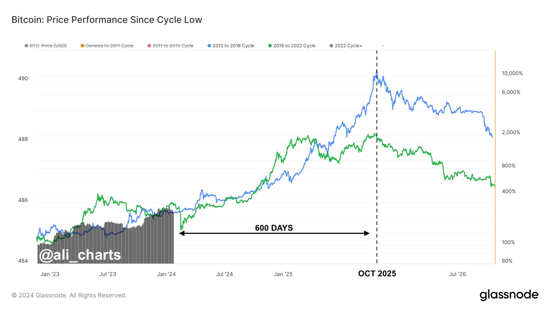
To make the comparison, the analyst has cited a chart that shows the price trend in each of the cycles with the cyclical bottoms being the common start-point for all of them.

Bitcoin Bull Run

From the graph, it’s visible that the peaks of the last two Bitcoin bull runs took shape at roughly the same amount of time since the bottoms of the respective cycles.

For the current cycle, the low that followed the FTX collapse in 2022 has been chosen as the bottom. If the current cycle is lined up against these other two starting from this bottom, then it would still have roughly 600 days before it reaches the same point as when the last couple of bull runs hit their tops.

“If Bitcoin mirrors past bull runs (2015-2018 & 2018-2022) from their respective market bottoms, projections suggest the next market peak could land around October 2025,” says Ali. “This implies BTC still has 600 days of bullish momentum ahead!”

BTC Has Been At Risk Of Slipping Below A Historical Line Recently

While BTC may have a bullish outlook for the long term, its short-term price trend has been painful for investors, as the cryptocurrency has seen a notable drawdown since the spot ETFs found approval from the US SEC.

The cryptocurrency had earlier even slipped down towards the $38,500 mark before making some recovery back around the $40,000 level that it’s still trading around.

Bitcoin Price Chart

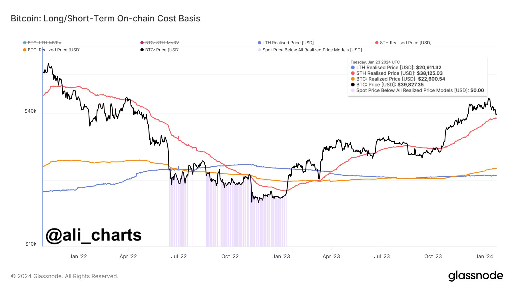
In this latest plunge, Bitcoin came dangerously close to retesting the “short-term holder realized price,” a level that has been significant for the asset throughout history.

The “realized price” is a metric that keeps track of the price at which the average investor in the Bitcoin market acquired their coins. The spot price being above this value naturally implies the average holder in the sector is carrying profits, while it being under the line implies the dominance of losses.

As Ali has pointed out in another X post, the “short-term holder” group will find themselves underwater if the cryptocurrency’s price slips under the $38,130 level.

Bitcoin Short-Term Holder Realized Price

Short-term holders (STHs) refer to the Bitcoin investors who purchased their coins within the last 155 days. At the moment, their realized price stands at the $38,125 level. Historically, a sustained break below this line has often meant an extended stay for the coin below it.

So far, BTC has avoided a retest of this line, but if the current correction continues, it might even slip under it. “This potential BTC dip might trigger a new wave of panic selling as these holders will seek to minimize losses,” explains the analyst.

Sleeping Bitcoin Giants Wake Up: Pattern Mirrors 2021 Bull Run

On-chain data shows the dormant Bitcoin whales have been becoming active again recently in a fashion that’s reminiscent of the 2021 bull run.

Bitcoin Whales Dormant Since 10+ Years Ago Are Waking Up

In a new CryptoQuant Quicktake post, analyst Maartunn has talked about a pattern forming in Bitcoin that looks similar to what happened back in 2021, during the last bull run

The indicator of interest here is the amount of Bitcoin being moved on the blockchain that was dormant since at least ten years ago before the transaction took place.

Ten years is naturally a very long stretch of time, so whenever wallets holding BTC this old activate again, it’s always something that ignites discussion in the community.

In many cases, coins reach such an old age only because they became lost at some point. A lot of this supply would never be involved in transactions again, because of the wallets carrying them being lost to the point that they can’t be rediscovered by any means possible.

Some of the supply may simply be forgotten about, rather than lost, and might get found once more. When this happens, the finder (who may or may not be the original owner of the coins) could decide to shift the coins immediately, cashing in on them by selling, or perhaps, they may just decide to hold off a bit more, finding the appropriate price timing to offload the Bitcoin.

The below chart notes the instances where coins dormant since 10 years ago showed some movement during the past few years.

Bitcoin Dormant Whales

From the graph, it’s visible that the Bitcoin bull run back during the first half of 2021 saw many instances where large amounts of such dormant BTC stacks broke their silence.

Some of these whales who woke up could have been those who remembered their old BTC wallets after seeing the cryptocurrency making waves on the news, while others might have been those who had already rediscovered their old coins a while back, but had since been waiting for this profitable selling opportunity.

The 10 years old coins had mostly remained dormant in the second half of the bull run and the 2022 bear market, making only a few large moves. Among these, two in particular were quite interesting, as they coincided with bottoms in the asset’s price.

Maartunn has highlighted these instances in the chart. According to the analyst, it’s possible that these were whales who were panic selling after seeing the cryptocurrency decline to the lows.

As is apparent from the chart, dormant whale activity has heated up once again recently. “Looking at the past few months, there have been more than 13 similar transactions. It’s striking that this is happening during the uptrend, as Bitcoin is rising due to news about the emerging ETF,” notes Maartunn.

The latest of these transactions was just yesterday, when a 1,000 BTC stack more than 10 years old became involved in a move. In a post on X, the same analyst has explained that this whale is a retired miner, as many of the inputs that their wallet received came directly from the network’s block reward.

It would appear that the latest rally in the cryptocurrency is creating a similar effect as the 2021 bull run, attracting these dormant whales to finally move their coins.

BTC Price

At the time of writing, Bitcoin is trading around $42,400, up 13% in the past week.

Bitcoin Price Chart

Bitcoin May Be Headed Towards 20%+ Decline Based On This Pattern

Bitcoin could see a decline of at least 20% in the near future, if the historical pattern of this indicator is anything to go by.

Aggregated Open Interest Of Assets Except Bitcoin Is Forming A Bearish Pattern

In a new post on X, CryptoQuant Netherlands community manager Maartunn has talked about a bearish pattern forming in the aggregated open interest of all cryptocurrencies except Bitcoin.

The “open interest” here refers to an indicator that measures the total amount of derivative positions (in USD) that are open on all exchanges around the world right now.

When the value of this metric is high for any cryptocurrency, it means that the asset has a high number of positions on the derivative market currently. Generally, this kind of trend makes it more probable for the price to show volatile moves.

On the other hand, low values imply the derivative side of the coin in question is cool at the moment, which may suggest a relative period of calmness for the price.

In the context of the current discussion, the aggregated open interest of all cryptocurrencies excluding Bitcoin is of interest. The below chart shows the trend in this indicator over the past couple of years:

Bitcoin Open Interest

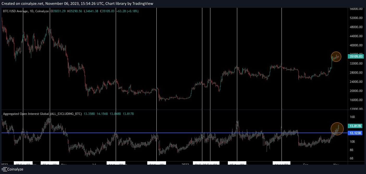
In the graph, Maartunn has highlighted an interesting pattern that the aggregated open interest of the altcoins and the Bitcoin price has followed in the last two years.

It would appear that whenever the indicator’s value has crossed the $12.2 billion mark, the BTC price has observed a top formation and has subsequently registered a decline. According to the analyst, this drawdown that has followed the pattern has always been at least 20%.

Just this year, the tops of the cryptocurrency’s price observed in February, April, and July all occurred during periods where the metric was above the $12.2 billion level.

From the chart, it’s visible that the aggregated open interest of the sector excluding BTC once again crossed above this line of historical significance back when the asset’s rally toward the current levels first happened.

Since then, the metric has only continued to climb higher and has now hit the $13.8 billion mark, meaning that the derivative market has become quite overheated now.

If the pattern that Bitcoin has displayed in the past is anything to refer to, then the asset may be fast approaching the top right now, given the overheated altcoin open interest.

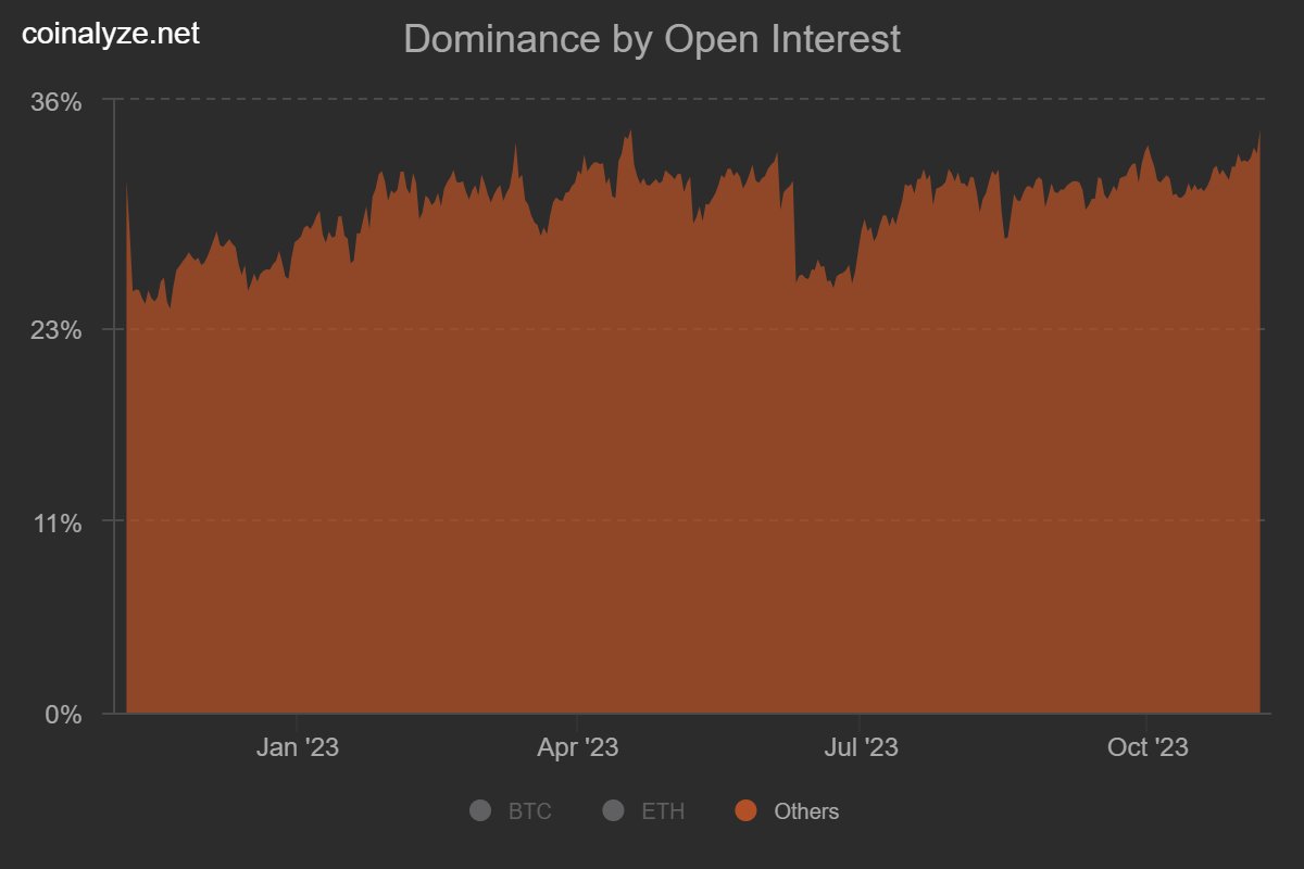
As another analyst has pointed out on X, the dominance of the futures open interest made up for by assets other than Bitcoin and Ethereum has also hit 2023 highs.

Altcoin Open Interest Dominance Vs Bitcoin

This once again puts into perspective the overheated status of the market, which could end dangerously for Bitcoin as well as the rest of the cryptocurrency sector.

BTC Price

Bitcoin had made another go at $35,000 in the last two days, but the asset has now once again slipped below the level as it’s now trading around $34,700.

Bitcoin Price Chart

Bitcoin Bottom: BTC Not Fulfilling This Historical Pattern Yet

On-chain data shows Bitcoin is currently not satisfying a condition that has historically occurred alongside major bottoms in the price.

Bitcoin Supply In Profit Is Still Greater Than Supply In Loss

In a new post on X, James V. Straten, a research and data analyst, has pointed out how BTC isn’t fulfilling the bottom condition for the supply in profit and loss metrics.

The “supply in profit” here naturally refers to the total amount of Bitcoin supply currently carrying an unrealized profit. Similarly, the “supply in loss” keeps track of the number of underwater coins.

These indicators work by going through the on-chain history of each coin in circulation to see what price it was last transferred at. If this previous price for any coin was less than the current BTC spot price, then that particular coin is being held at a profit, and the supply in profit adds to its value. On the other hand, the coins with a higher cost basis are counted by the supply in loss.

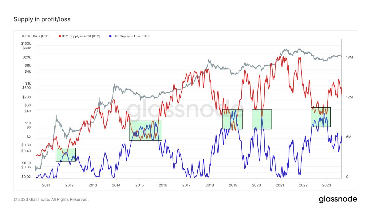
Now, here is a chart that shows the trend in both these Bitcoin metrics over the entire history of the cryptocurrency:

Bitcoin Supply In Profit & Loss

In the graph, the analyst has highlighted a specific pattern that these two indicators have shown during historical bottoms in the cryptocurrency’s price. It would appear that the supply in profit dips below the supply in loss during these periods of lows, implying that most of the market enters into a state of loss.

Generally, investors in profit are more likely to sell, so whenever the supply in profit is at very high values, tops become more probable for Bitcoin. Similarly, a large number of investors instead of being in loss should mean there wouldn’t be too many sellers left.

This is potentially why bottoms have historically formed when the supply in loss exceeds the supply in profit. The chart shows that the Bitcoin Supply in Profit is currently quite a distance over the supply in loss, suggesting that a decent number of coins still carry gains.

To be more precise, there is a difference of six million coins between the two supplies at the moment. The current market is nowhere near fulfilling the historical bottom criteria.

However, the bottoms that the pattern has generally coincided with have been the cyclical lows, observed during the worst phase of the bear markets. In the current cycle, this bottom was marked after the FTX crash in November 2022.

The only exception to this rule was in March 2020, when Bitcoin crashed due to the onset of the COVID-19 virus. This crash was an unexpected event, which may explain why it doesn’t fit in with the other bottoms.

As the market at its current stage is likely already past the bear-market bottom, this supply in profit and loss pattern shouldn’t hold too much bearing on whether BTC has hit a local bottom after the recent crash.

If the November 2022 low wasn’t the true bear-market bottom, BTC might have more pain in store, as a significant swing in market profitability will be required before the real bottom is found.

BTC Price

When writing, Bitcoin is trading around $26,300, down 7% in the last seven days.

Bitcoin Price Chart

Will Bitcoin Retest $20,500 Again? This Pattern May Suggest So

Bitcoin is forming a pattern that has historically led to the asset retesting a specific line. At present, this level would be found at $20,500.

Bitcoin Has Dropped Below The 200-Day SMA With The Recent Crash

A few days back, Bitcoin observed a sharp crash that took the cryptocurrency’s price toward the $26,000 mark. As this plummet was already significant, many have wondered whether this was it or if the drawdown will continue.

An analyst on X, Ali, shared a chart that may provide hints about where the asset could be heading next.

Bitcoin Realized Price

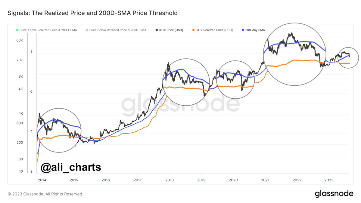
The analyst has attached the data for two Bitcoin-related metrics in the graph: the 200-day simple moving average (SMA) and the realized price. The chart shows that the BTC price has dropped below the 200-day SMA (colored in purple) with the latest crash.

According to the analyst, when the cryptocurrency’s price has crossed below this level during the past ten years, it has often retested the realized price (colored in orange).

The “realized price” here refers to the cost basis or the buying price of the average investor in the BTC market. This means that whenever the cryptocurrency dips below this level, the average holder enters a state of loss. On the other hand, breaks above the line imply a return to profits for most of the market.

Historically, this metric has had some interesting interactions with the spot price of the coin. During bullish periods, the line has generally supported the asset, while during bearish periods, it has acted as resistance.

The explanation behind these curious interactions may lie in how the investors’ minds work in each period. In bull markets, the average investor may think that the price will only go up, so whenever the asset drops to its buying price, they accumulate more of the asset.

Similarly, in bearish trends, the holders may believe the cryptocurrency will only go down, so the price they bought in (their break-even mark) would be the ideal exit opportunity.

This buying and selling may cause the level to act as support and resistance in the respective regimes. The latest example of this behavior was seen earlier in the year when Bitcoin rebounded off the line back in March.

As the asset now appears to have broken below the 200-day SMA, it may be heading towards a retest, as has often happened many times in the past.

Right now, the cost basis of the average investor is $20,500, which means that if BTC is going to touch this line again, a significant drawdown would need to occur.

If this scenario indeed plays out, then it’s possible that Bitcoin could find a rebound at the realized price once again. A retest failure, however, would be a very concerning sign, as it might signal the return of the bear market.

BTC Price

At the time of writing, Bitcoin is trading around $26,000, down 11% in the last week.

Bitcoin Price Chart