Bitcoin Greed No More: Sentiment Back At Neutral After $57,000 Plunge

Data shows that Bitcoin sentiment has cooled off to neutral from greed following the asset’s latest plunge to the $57,000 level.

Bitcoin Fear & Greed Index Has Returned To Neutral Levels

The “Fear & Greed Index” is an indicator created by Alternative that shows the average sentiment among investors in the Bitcoin and wider cryptocurrency market.

This index estimates sentiment by considering five factors: volatility, trading volume, social media data, market cap dominance, and Google Trends.

The metric uses a scale that runs from zero to 100 to represent this average sentiment. All values under 46 suggest that investors are fearful, while those above 54 imply a greedy market. The zone between these two cutoffs naturally corresponds to the territory of neutral mentality.

Now, here is what the Bitcoin sentiment looks like right now, according to the Fear & Greed Index:

Bitcoin Fear & Greed Index

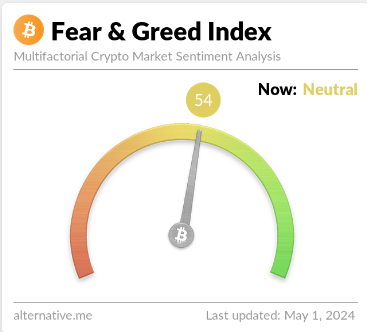
As displayed above, the Bitcoin Fear & Greed Index is at a value of 54, implying that investors share a neutral sentiment currently. However, the neutrality is only just, as the metric is right at the boundary of the greed region.

This is a significant departure from yesterday’s sentiment: 67. The chart below shows how the indicator’s value has changed recently.

Bitcoin Neutral

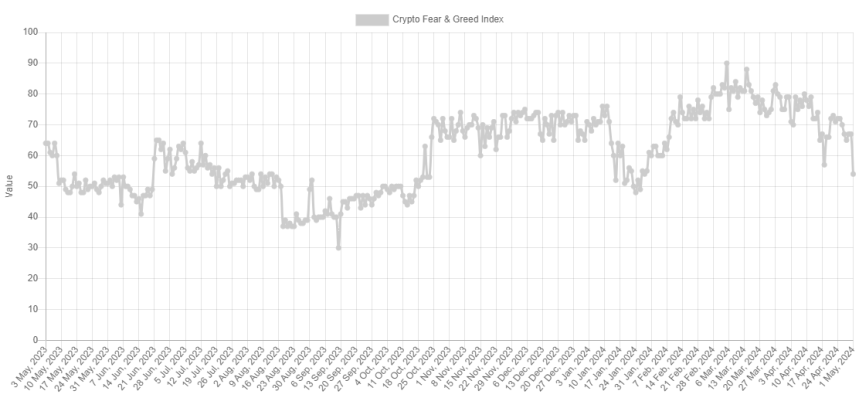
As the graph shows, the Bitcoin Fear & Greed Index has been declining recently. For most of February and March, as well as the first half of April, the indicator was in or near a special zone called extreme greed.

The market assumes this sentiment at values above 75. As the asset price struggled recently, the mentality cooled off from this extreme zone and entered the normal greed region. With the latest crash in BTC, the index has seen a sharp plunge, now exiting out of greed altogether.

Historically, cryptocurrency has tended to move against the majority’s expectations. The stronger this expectation, the higher the probability of such a contrary move.

This expectation is considered the strongest in extreme sentiment zones, as well as extreme fear and greed. As such, major bottoms and tops have often occurred in these territories.

The all-time high (ATH) price last month, which continues to be the top of the rally so far, also occurred alongside extreme values of the Bitcoin Fear & Greed Index.

With the sentiment now cooled to neutral, some investors may be watching for a fall into fear. This is natural because a rebound would become more probable the worse the sentiment gets now.

BTC Price

During Bitcoin’s latest plunge, its price briefly slipped below $57,000 before surging back to $57,300.

Bitcoin Price Chart

Bitcoin Traders Spread “Buy The Dip” As Bitcoin Plunges Below $66,000

Data shows “buy the dip” calls for Bitcoin have spiked around social media following the plummet the asset has seen below the $66,000 level.

Bitcoin Social Volume For Terms Related To Buy The Dip Has Shot Up

According to data from the analytics firm Santiment, Bitcoin investors have more heavily reacted with bullish calls than bearish ones despite the sharp decline the asset has observed.

The indicator of relevance here is the “Social Volume,” which tells us about the amount of discussion a given topic or term is receiving on the major social media platforms right now.

This metric works by going through the various posts/threads/messages on these websites to check for mentions of the topic. The indicator, however, doesn’t outright count up these mentions but rather the number of posts that contain at least one mention.

This is naturally due to the fact that a high mention count alone can’t be a reliable indication of whether social media users as a whole are talking about the topic, since talk being limited to just a few threads can also lead to a spike in this count.

In the context of the current discussion, Santiment has filtered the Social Volume for bullish and bearish keywords to find how the two sentiments compare currently.

The below chart shows the trend in the metric for these terms since the start of the year 2024:

Bitcoin Social Volume

For pinpointing bullish sentiment, the analytics firm has made use of terms such as “buy” or “bullish.” Similarly, “sell” or “bearish” are among the keywords for the opposite sentiment.

From the graph, it’s visible that the Social Volume for the former type of terms has exploded following the latest plunge in the Bitcoin price, suggesting that social media users are looking at the drawdown as an opportunity to buy more.

The bearish Social Volume has also seen an uplift, but its peak has only been half as high as one of the bullish terms. While the investors being bullish may sound optimistic at first, the fact is that this has actually not been ideal for rebounds to take place in the past.

As Santiment notes:

Historically, the best dip buy opportunities occur when the crowd consensus is showing a bit of fear toward a further drop. This usually results in small wallets dropping their bags for whales and sharks to scoop them up.

As such, the current market enthusiasm may actually be counterproductive for the chances of a bottom to form. According to the analytics firm, the real “buy the dip” for Bitcoin opportunity may present itself once the red sentiment has caught up to the blue one.

BTC Price

At the time of writing, Bitcoin is floating around $65,700, down more than 7% in the past week.

Bitcoin Price Chart

Bitcoin Plunges Under $63,000, Here’s Where Next On-Chain Support Is

Bitcoin has deepened its decline in the past day with its price now slipping below $63,000. Here’s where the next potential support is, according to on-chain data.

Bitcoin Could Find Support At These Price Levels

In a new post on X, analyst Ali has discussed how the Bitcoin support and resistance levels are looking like right now based on on-chain data from Glassnode.

The indicator of relevance here is the “UTXO Realized Price Distribution” (URPD), which, in short, tells us about the amount of coins (or more precisely, UTXOs) that were last purchased at any given price level that the asset has visited in its history so far.

Below is the chart shared by the analyst that shows the data for this distribution for the price levels around the recent spot value of the cryptocurrency:

Bitcoin URPD

From the graph, it’s visible that there are a few price levels not far from the current one that particularly stands out in terms of the amount of buying that took place at them.

In on-chain analysis, the potential for any level to act as support or resistance is based on the total number of coins that have their cost basis at the level in question.

Levels thick with coins that are situated under the current price would be probable to act as points of support, while those above the spot value could prove to be resistance walls.

As is apparent from the graph, the $61,100, $56,685, and $51,530 levels are the ones below the current price that hold the cost basis of a notable amount of the supply right now. Naturally, this means that should the decline continue further, these would be the levels to watch for a possible rebound.

Two levels above, however, are even larger than all three of these support levels: the cost basis centers around $66,990 and $72,880. Interestingly, the latter of these is the single largest acquisition level out of all the price levels listed in the chart, implying that a large amount of FOMO buying has occurred at the asset’s all-time high levels.

In the scenario that Bitcoin regains its upward momentum, these levels of high cost basis population would be where the asset could be most probable to find some trouble.

Now, as for why acquisition centers are considered relevant for support and resistance in on-chain analysis is the fact that investors are likely to show some kind of reaction when a retest of their cost basis takes place.

When such a retest is from above, the holders may decide to accumulate more, believing that the price will go up again in the future. On the other hand, they may sell instead if the retest is from below, as they may think exiting at break-even is better than risking another drop.

A large number of coins having their cost basis at the same level means a potentially large degree of one of these reactions happening and, hence, a strong support or resistance effect on the price.

BTC Price

Bitcoin is inching closer to the first major on-chain support level as it has now dropped to $62,700.

Bitcoin Price Chart

Bitcoin To $53,200? Why History Says It’s Possible

As Bitcoin drops below $68,000, history suggests this correction is rather tame for bull markets, as plunges to this deep on-chain level have been the norm.

Bitcoin Short-Term Holder Realized Price Is Currently Around $53,200

As pointed out by CryptoQuant Netherlands community manager Maartunn in a post on X, BTC still has a decent margin over the realized price of the short-term holders.

The “realized price” is an on-chain metric that keeps track of the average price at which the Bitcoin investors acquired their coins. The indicator calculates this value by going through the transaction history of each coin and assuming that the last transfer of it was the last time it was purchased (that is, the price at the time is its current cost basis).

When the spot value of the cryptocurrency dips below the realized price, it means that the average investor is now in a state of loss. On the other hand, a break above implies the market as a whole has entered into net profits.

In the context of the current discussion, the realized price for only a particular segment of the investors is of interest: the “short-term holders” (STHs). The STHs include all the investors who bought their coins within the past 155 days.

Now, here is a chart that shows the trend in the Bitcoin realized price specifically for this cohort:

Bitcoin Short-Term Holder Realized Price

As displayed in the above graph, the Bitcoin STH realized price has shot up recently as the price of the asset has gone up. This makes sense, as this group includes the most recent buyers, who would continuously be buying at higher prices in an uptrend, thus raising their average cost basis.

At present, this cohort’s realized price is about $53,200. During the past day, BTC has seen a sharp drop that has taken its price below the $68,000 mark, but clearly, the STHs would still be in high profits even after this drawdown.

“In previous bull markets, the average cost basis of short-term holders was fully reset multiple times,” explains Maartunn. This trend is most prominent in the data for the 2017 bull run when the price retested this level several times.

An interesting pattern that has been held is that these retests of the level during bull trends have generally resulted in the cryptocurrency finding support and turning itself back around.

The explanation for this trend may lie in the fickle nature of the STHs. The cost basis is an important level for these investors, and when a retest of it happens, they panic and show some reaction.

During uptrends, these holders are more likely to buy more when a retest of their cost basis occurs since they may think that the same price levels that were profitable earlier will be so again in the near future.

Naturally, it’s not a certainty that Bitcoin would also end up retesting this level in this bull market. Still, a correction might reach close to it if the historical precedent is anything to go by.

BTC Price

Following its 7% drop in the past day, Bitcoin is trading at around $67,700.

Bitcoin Price Chart

Crypto Market Crashes: Traders React With “Buy The Dip” Calls

The crypto market has seen a plunge today, and it would appear that social media users have reacted by calling to buy this “dip.”

Coins Across The Crypto Sector Are In The Red Today

According to data from the on-chain analytics firm Santiment, social media mentions of “buy the dip” have gone up following the latest tumble that the crypto market has experienced.

The relevant indicator here is the “social volume,” which keeps track of the number of unique posts/threads/messages on the various social media platforms that mention a specific topic.

The metric counts the posts themselves instead of the mentions because this method provides a more accurate representation of the behavior among social media users as a whole.

Consider two scenarios: one where a large number of mentions are happening over a few posts and another where mentions are also taking place but are spread out over a large number of posts.

In the first, discussion is limited to a specific group of users, but going by the mentions, this case would have as much interest in the topic as the latter when it’s not the case.

Now, to find whether “buy the dip” is gaining traction among crypto investors, what Santiment has done is filter out the social volume of crypto first and then search these posts for the mention of terms related to this idea.

Here is a chart that shows the trend in the social volume for this topic over the last month:

Crypto Buy The Dip

The graph shows that the crypto social volume for terms related to “buy the dip” has shot up after this plummet in the market. In the same chart, the analytics firm has also attached the “social dominance” data, which keeps track of what percentage of these discussions are adding up.

Social dominance has also registered a spike recently, and at the peak of this spike, it seems the metric assumed a value of about 0.7, which means 0.7% of all discussions related to the crypto sector involved this topic.

“Crypto has experienced its fastest drop in 4 months as markets have corrected and caused mild trader concerns,” notes Santiment. “There is a high level of buythedip calls, which typically means that there is a bit of overeagerness and FOMO on these low prices.”

While the market is optimistic about this plunge, too much optimism about things like “bottoms” has historically actually backfired for the assets’ prices. Thus, these mentions aren’t a sign that Bitcoin and others have finished with their decline, and more could potentially be on the way.

BTC Price

Bitcoin had gone under the $41,000 mark during its initial plunge, but it wasn’t long before it made some recovery towards the current price.

Bitcoin Price Chart

Bitcoin Could Plunge To $30,200 If This Level Is Lost: Analyst

On-chain data suggests the next major Bitcoin support level could be at $30,200 if the level pointed out by this analyst is lost.

Bitcoin Currently Has Support Levels At $36,400 And $34,300

In a new post on X, analyst Ali has discussed how the various support levels of BTC are looking like right now from an on-chain perspective. A level may be defined as support based on the amount of Bitcoin that was bought by the investors at said level.

Generally, whenever the price declines to the cost basis of an investor, they might become more likely to show some kind of move. Since the holder had last been in a state of profit, they might tend to believe that the asset would rise again in the future, if the prevailing trend is bullish in the market.

Thus, the investor could decide to buy more near their cost basis, thinking that it would turn out to be a profitable “dip” buy. Naturally, just a few traders showing this behavior won’t have any real effects on the price of the cryptocurrency. But if a large number of investors had bought around the same price level, the asset retesting at this level could produce a notable reaction in the market.

Such buying that would emerge could provide support to the cryptocurrency. Now, to view these support levels, the analyst has cited the “UTXO Realized Price Distribution” (URPD) metric from Glassnode, which tells us about the amount of supply that was last acquired at each of the price levels that the asset has visited in its history.

Bitcoin URPD

As displayed in the above graph, the prices around $36,400 hold the cost basis of a notable amount of the supply. The asset has dipped under this mark during the past day, though, implying that the cryptocurrency may be beginning to lose this major support area.

If the asset can’t reclaim this level, the next major support level would be present at $34,300. A decline towards this mark would suggest losses of more than 5% for the asset.

This support level is thinner than the one the asset is retesting right now, however, meaning it’s possible that the level may not be able to stop the asset from declining even further.

Should this scenario play out, Bitcoin would next have support about 16% down from the current spot price of $30,200. From the chart, it’s visible that all of the price levels below this support area till $25,000 host the cost basis of a significant amount of investors, meaning that these levels should pose a potentially impenetrable wall for the asset.

Thus, a decline to $30,200 is possible in the near term if the $34,300 level becomes lost, but it’s unlikely that Bitcoin would drop further than that.

BTC Price

Bitcoin had been hanging on at $37,000 recently, but it appears that the asset has finally slipped, as it’s now trading under $36,300.

Bitcoin Price Chart

$113 Million In Longs Get Rekt As Bitcoin Plunges Back To $34,000

Data shows the cryptocurrency longs have taken a beating today because of the plunge towards $34,000 that Bitcoin has observed.

Cryptocurrency Futures Market Has Seen Liquidations Totaling $137 Million Today

According to data from CoinGlass, a large amount of liquidations have taken place in the cryptocurrency futures market during the past day. “Liquidation” here refers to a forced closure of a futures contract being done by the derivative contract with which said position is open.

A contract is liquidated when it amasses losses equal to a certain percentage of the margin (that is, the initial collateral that the holder had put forth when opening the contract).

As it’s easy for traders’ bets to fail during volatile periods, it’s not surprising that the volatility from the past day has induced liquidations throughout the market. The below table shows the data for the liquidations that have occurred in the sector during the last day.

Crypto and Bitcoin Liquidations

As you can see, the cryptocurrency futures market has seen liquidations amounting to about $137 million in the past day. Out of these, around $113 million of the contracts were long positions.

This means that more than 82% of the liquidation flush in this period has involved the long holders. This is consistent with the price action, as most of the liquidations have been triggered by a plunge in the Bitcoin price from above $35,400 to the $34,000 mark.

Such large liquidation events are popularly called “squeezes.” Since the squeeze from the last 24 hours has seen the longs on the losing side, the event was a “long squeeze.”

As the below table displays, Bitcoin-related contracts have unsurprisingly contributed the most towards this latest squeeze.

Bitcoin Flush

Bitcoin saw $40 million in futures liquidations, while Ethereum registered almost half of those at $21 million. Out of the altcoins, Solana (SOL) observed the highest liquidations.

SOL has seen a bit of an explosion recently, so it’s not unexpected that it has attracted a large amount of speculators towards it. As a natural consequence of this higher interest in the cryptocurrency, its liquidations have been more than the other altcoins.

Mass liquidation events like today’s aren’t exactly a rare occurrence in the cryptocurrency sector, due to extreme amounts of leverage being easily accessible and the volatility that most of the coins witness on the regular.

It would appear that today’s liquidation squeeze has been unable to put off speculators, as the Bitcoin open interest (a measure of the total amount of contracts open on the futures market) is still at high values.

Bitcoin Open Interest

As such, it’s possible that Bitcoin will see more volatility in the near future and with it, another liquidation squeeze.

Bitcoin Price

Following its drop of more than 3%, Bitcoin is now trading around the $34,200 level.

Bitcoin Price Chart

Bitcoin Plunges To $26,000 As Miners Sell Big

Bitcoin has plunged towards the $26,000 level as on-chain data shows the Bitcoin mines have been participating in a selloff.

Bitcoin Miner To Exchange Flow Has Spiked During The Past Day

As pointed out by an analyst in a CryptoQuant post, the miners have been showing signs of selling recently. The relevant indicator here is the “miner to exchange flow,” which keeps track of the total amount of Bitcoin that miners are depositing to exchanges.

Generally, these chain validators only make such transactions when they intend to sell, so the indicator’s value observing a spike can be a sign of a selloff.

The below chart shows the trend in the 7-day moving average (MA) BTC miner to exchange flow over the past couple of weeks:

Bitcoin Miner To Exchange Flow

As displayed in the graph, the 7-day MA Bitcoin miner to exchange flow has seen a huge spike during the past day. The quant has also highlighted the previous instances of high values of the indicator that occurred in the past two weeks.

It would appear that the BTC price has generally registered a drawdown whenever the miners make large deposits to these platforms. With the latest spike in the metric, too, the cryptocurrency has taken a plunge, as its price has now returned back to the $26,000 level, completely erasing the recovery that the Grayscale rally had brought.

It’s never a certainty that the deposits that these holders are making are indeed for selling, but given the timing of the price drawdown, it would appear likely that the miners were looking to sell after all.

In the chart, the analyst has also attached the data for a few more metrics. First, there are the “miner inflow” and “miner outflow” indicators, which, as their name suggests, measure the amount of Bitcoin that the miners are transferring into and out of their wallets, respectively.

From the graph, it’s visible that the BTC miner outflow spiked during the crash, which makes sense as the miners had made some transfers from their wallets toward exchanges.

The miner inflow, however, had also registered high values at the same time, meaning that fresh coins had entered back into the wallets of these chain validators.

This would suggest that some of the miners may have used the opportunity of the crash to expand their holdings. The “miner reserve,” the other metric of interest here, measures the total amount of Bitcoin that this cohort is carrying in its wallets right now and this indicator’s data would confirm that the holdings of the miners have actually gone up during the price drop.

So, while some Bitcoin miners may have contributed to the selling pressure, others have more than made up for it by accumulating more of the cryptocurrency.

BTC Price

As mentioned before, Bitcoin has now seen a complete retrace of the returns from the latest rally, bringing the asset back to the $26,000 level it had previously been consolidating at.Bitcoin Price Chart

Bitcoin Hangs At $26,200: Why This Is A Crucial Support Level

Bitcoin has plunged during the last 24 hours and now finds itself at the $26,200 level. Here’s why this level is important for the asset.

Bitcoin 200 WMA & 111 DMA Are Both At $26,200 Right Now

In a new tweet, the analytics firm Glassnode has talked about how the different technical pricing models for Bitcoin may be interacting with the asset’s price currently.

There are four relevant technical pricing models here, and each of them is based on different moving averages (MAs) for the cryptocurrency.

An MA is a tool that finds the average of any given quantity over a specified region, and as its name implies, it moves with time and changes its value according to changes in said quantity.

MAs, when taken over long ranges, can smooth out the curve of the quantity and remove short-term fluctuations from the data. This has made them useful analytical tools since they can make studying long-term trends easier.

In the context of the current topic, the relevant MAs for Bitcoin are 111-day MA, 200-week MA, 365-day MA, and 200-day MA. The first of these, the 111-day MA, is called the Pi Cycle indicator, and it generally finds useful in identifying short to mid-term momentum in the asset’s value.

The 200-week MA is used for finding the baseline momentum of a BTC cycle as 200 weeks are equal to almost 4 years, which is about what the length of BTC cycles in the popular sense is.

Here is a chart that shows the trend in these different Bitcoin technical pricing models over the past year:

Bitcoin Technical Pricing Models

As shown in the above graph, these different Bitcoin pricing models have taken turns in providing support and resistance to the price during different periods of the cycle.

For example, the 111-day MA turned into support recently, as the price rebounded off this level back during the plunge in March of this year, as can be seen in the chart.

The 111-day and 200-week MAs have recently come into phase, as both their values stand at $26,200 right now. This is the level that Bitcoin has been finding support at in recent days, so it would appear that the base formed by these lines may be helping the price currently.

Glassnode notes that if a break below this region of support takes place, the next levels of interest can be the 365-day and 200-day MAs. The former of these simply represent the yearly average price, while the latter metric is called the Mayer Multiple (MM).

The MM has historically been associated with the transition point between bullish and bearish trends for the cryptocurrency. When the 111-day MA provided support to the price back in March, the metric had been in phase with the MM.

From the graph, it’s visible that the 365-day and 200-day MAs have also interestingly found confluence recently, as their current values are $22,300 and $22,600, respectively. This would imply that between $22,300 and $22,600 may be the next major support area for the asset.

BTC Price

At the time of writing, Bitcoin is trading around $26,200, down 4% in the last week.

Bitcoin Price Chart

Bitcoin Plunges Below $27,000 As Miners Show Signs Of Selling

Bitcoin has now dipped below the $27,000 level as on-chain data shows the miners have possibly been selling the asset recently.

Bitcoin Miner Reserve Has Taken A Sharp Plummet Recently

As pointed out by an analyst in a CryptoQuant post, miners have taken out about 1,750 BTC from their wallets during the past day. The relevant indicator here is the “miner outflow,” which measures the total amount of Bitcoin that miners are transferring out of their wallets currently.

The counterpart metric of the outflow is called the “inflow,” and it naturally tracks the total number of coins going into the addresses of these blockchain validators.

Here is a chart that shows the trend in the Bitcoin miner outflow, as well as the inflow, over the last few weeks:

Bitcoin Miner Outflow

Whenever the miner inflow has a high value, it means that this cohort is depositing a large amount of Bitcoin into their wallets. Such a trend, when prolonged, can be a sign that the miners are accumulating right now. Naturally, this can have bullish implications for the price.

When the outflow is high, on the other hand, it suggests that a large amount of the asset is exiting from the supply of the miners. Generally, the main reason why these holders transfer their coins out of their wallets is for selling-related purposes, so this kind of trend can be bearish for the cryptocurrency’s value.

In the above graph, it’s visible that the miner inflow has been at relatively low values during the past day, implying that these investors aren’t depositing any significant amounts to their wallets.

The miner outflow, however, has registered a pretty high spike in the same period. In total, around 1,750 BTC ($47 million) has exited the supply of the miners with this surge in the indicator.

Since there haven’t been any inflows to counteract these outflows, a net amount of the asset has now left the miners’ wallets. This would mean that if the outflows were made for selling purposes, a net bearish effect should appear on the price.

An indicator that helps better identify whether these transfers were for selling or not is the “miner to exchange flow,” which tracks only the miner outflows heading towards centralized exchanges.

Usually, this cohort uses the exchanges when they want to take part in distribution. As shown in the above chart, however, the metric has remained low recently, meaning that these outflows haven’t directly entered into the wallets of these platforms.

Though, the quant has discovered that the destination wallet of the 1,750 miner outflow made another transfer, which was indeed towards an exchange. “There is a high probability that 1,750 BTC ultimately went to Binance,” explains the analyst.

When these outflows took place yesterday, Bitcoin was above the $27,000 level. Following them, however, the asset has observed a plunge and is now below this mark, suggesting that this latest selling pressure from the miners may have been behind the decline.

BTC Price

At the time of writing, Bitcoin is trading around $26,800, up 2% in the last week.

Bitcoin Price Chart

Bitcoin Plunges Below $27,000, Which Holder Groups Are Selling?

Bitcoin has plunged below the $27,000 mark during the past day. Here are the market segments that are possibly participating in this selloff.

These Bitcoin Investors Have Been Spending Their Coins Recently

In a new tweet, the on-chain analytics firm Glassnode has broken down the prices at which the average coins sold today were bought. Generally, the BTC market is divided into two main segments: the long-term holders (LTHs) and the short-term holders (STHs).

The STHs comprise a cohort including all investors who acquired their Bitcoin within the last 155 days. The LTHs, on the other hand, are investors who have been holding for more than this threshold amount.

In the context of the current discussion, the relevant indicator is the “dormancy average spending ranges,” which finds out the periods in which the average coins being spent/transferred by these two groups were first acquired.

For example, if the metric shows the 7-day spending range for the LTHs as $20,000 to $30,000, it means that the coins these investors sold in the past week were initially bought at prices in this range.

Here is a chart showing the data for the current 7-day dormancy average spending ranges for the STHs and LTHs, as well for the combined market.

Bitcoin Sellers

The graph shows that the 7-day average spending range for the STHs is quite close to the current prices at $30,400 to $27,300. Some of these sellers bought at higher prices than those observed in the past week, so they must have been selling at a loss (although not a particularly deep one).

The indicator puts the LTHs’ acquisition range at $67,600 to $35,000. As highlighted in the chart, the timeframe of these purchases included the lead-up to the November 2021 price all-time high, the top itself, and the period when the decline towards the bear market first started.

It would appear that these holders who bought at the high bull market prices have budged because of the pressure the cryptocurrency has been under lately and have finally decided to take their losses and move on.

Generally, the longer an investor holds onto their coins, the less likely they become to sell at any point. This would perhaps explain why the acquisition timeframe of the current STHs is so recent; the fickle ones are those who have only been holding a short while.

For the BTC LTHs, however, the probable reason why the acquisition period of the average seller from this group is so far back, rather than nearer to 155 days ago (the cutoff of the youngest LTHs), is that a lot of the younger LTHs would be in profits currently as they bought during the lower, bear-market prices.

As such, the Bitcoin investors more likely to waver in their conviction right now would be those holding the most severe losses, the 2021 bull run top buyers.

The chart also includes the 7-day average spending range for the combined BTC sector, and as one may expect, this range lies in the middle of the two cohorts ($15,800 to $28,500), but the timeframe is closer to the STHs, as a lot of the sellers are bound to be recent buyers.

BTC Price

At the time of writing, Bitcoin is trading around $26,300, down 10% in the last week.

Bitcoin Price Chart

Bitcoin Long-Term Holders Dump As BTC Plunges Under $17K

On-chain data shows Bitcoin long-term holders are dumping their coins as BTC plummets below the $17,000 level.

Bitcoin Long-Term Holder SOPR Spikes Today

As pointed out by an analyst in a CryptoQuant post, some BTC long-term holders seem to have taken profits in the past day. The relevant indicator here is the “Spent Output Profit Ratio,” which tells us whether Bitcoin investors as a whole are selling their coins at a profit or at a loss right now.

When this metric has a value greater than 1, it means the average holder has been moving their coins at some profit recently. On the other hand, values below the threshold suggest the overall market has been realizing some loss. Naturally, SOPR exactly equal to 1 implies that the investors are just breaking-even with their selling.

The “long-term holder” (LTH) group is a Bitcoin cohort that includes all investors who have been holding onto their coins since at least 155 days ago, without having moved or sold them from a single address. Here is a chart that shows the trend in the Bitcoin SOPR specifically for these LTHs during the last 15 days:

Bitcoin Long-Term Holder SOPR

As the above graph shows, the Bitcoin LTH SOPR (EMA16) has observed a sharp spike above 1 during the past day. This means that these holders have harvested some profits today. Statistically, LTHs are the investors least likely to sell at any point, so any dumping from them can have noticeable consequences on the BTC market.

From the chart, it’s apparent that when the indicator last saw such a large spike in its value, the price of the crypto had plunged down shortly after. Interestingly, the latest spike has only come after BTC has plunged down under $17k. Usually, such holders sell for profits during rallies, but here the dumping has come after the bullish momentum has already passed over.

This could be a sign that with all the FUD going around in the market right now, these supposed diamond hands have also broken down and feel bearish about the prospects of Bitcoin at the moment. Such a trend is likely to be negative for the price, and might take the crypto even further lower.

BTC Price

Bitcoin Price Chart

At the time of writing, Bitcoin’s price floats around $16.7k, down 2% in the last week. The above chart displays the trend in the value of the crypto over the last five days.

Bitcoin To Plunge Further? Long-Term Holders Ramp Up Selling

On-chain data shows Bitcoin long-term holders have ramped up their selling recently, something that could lead to further plunge in the crypto’s price.

Bitcoin Exchange Inflow CDD Has Spiked Up Over The Last Day

As pointed out by an analyst in a CryptoQuant post, the current rise in the CDD is the largest since 6th October.

A “Coin Day” is the quantity that 1 BTC accumulates after staying still for 1 day in a single address. If a coin that has amassed some number of Coin Days finally moves to another wallet, its Coin Days counter resets, and the Coin Days are said to be “destroyed.”

The “Coin Days Destroyed” (CDD) metric keeps note of the total number of such Coin Days being destroyed throughout the network on any given day.

Another version of this indicator is the “exchange inflow CDD,” which measures only those Coin Days that were reset because of transactions to centralized exchanges.

Now, here is a chart that shows the trend in the Bitcoin exchange inflow CDD over the past month:

Bitcoin Exchange Inflow CDD

The value of the metric seems to have spiked up during the last day or so | Source: CryptoQuant

As you can see in the above graph, the Bitcoin exchange inflow CDD has shown a sharp rise in its value recently.

There is a cohort in the BTC market called the “long-term holder” (LTH) group, which includes all investors who hold onto their coins for long periods without moving them.

Related Reading: Bitcoin Capitulation Deepens As aSOPR Metric Plunges To Dec 2018 Lows

Because of the dormancy of their coins, thes LTHs accumulate a large numbers of Coin Days. As such, whenever these holders do move their coins, the CDD usually spikes up due to the scale of Coin Days involved.

The current spike in the Bitcoin exchange inflow CDD thus suggests that some LTHs have deposited their coins to exchange wallets.

As the exchanges in question are spot platforms, it’s possible that this movement of coins was made for selling purposes.

From the graph, it’s apparent that both the previous big spikes in the indicator were followed by declines in the price of Bitcoin.

If the latest surge was also because of LTHs preparing to dump their coins, then the crypto is likely to observe bearish trend this time as well.

BTC Price

At the time of writing, Bitcoin’s price floats around $16.4k, down 2% in the last week. Over the past month, the crypto has lost 15% in value.

Bitcoin Price Chart

Looks like the price of the coin has been back to moving sideways in the last few days | Source: BTCUSD on TradingView
Featured image from Zdeněk Macháček on Unsplash.com, charts from TradingView.com, CryptoQuant.com