Bitcoin To $92,190: Crypto Analyst Reveals Path To ATH Target

An analyst has explained what path Bitcoin might need to follow to surge to a new all-time high (ATH) target of $92,190.

Bitcoin Needs To Breach This Resistance Barrier To Rise To New ATH

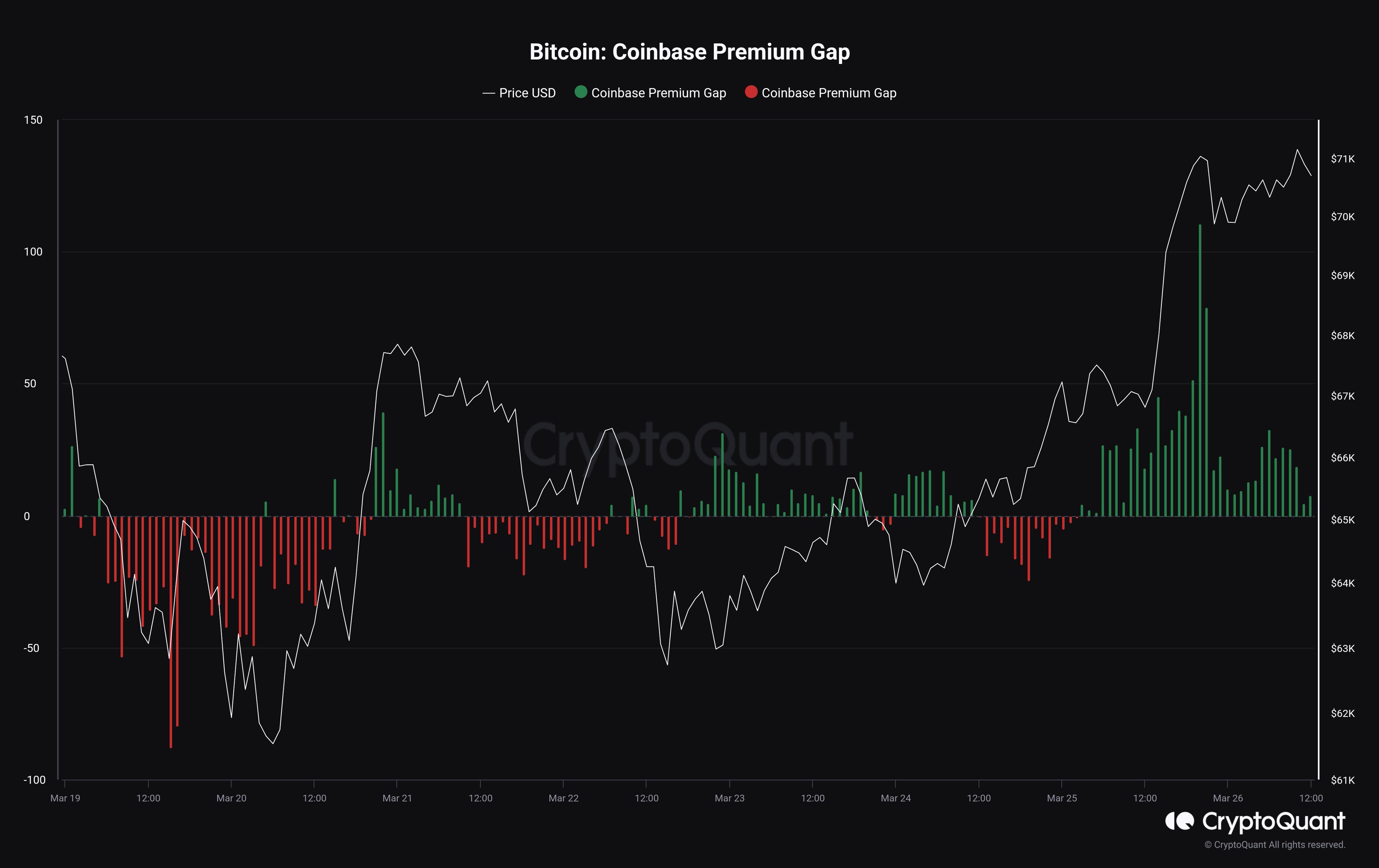
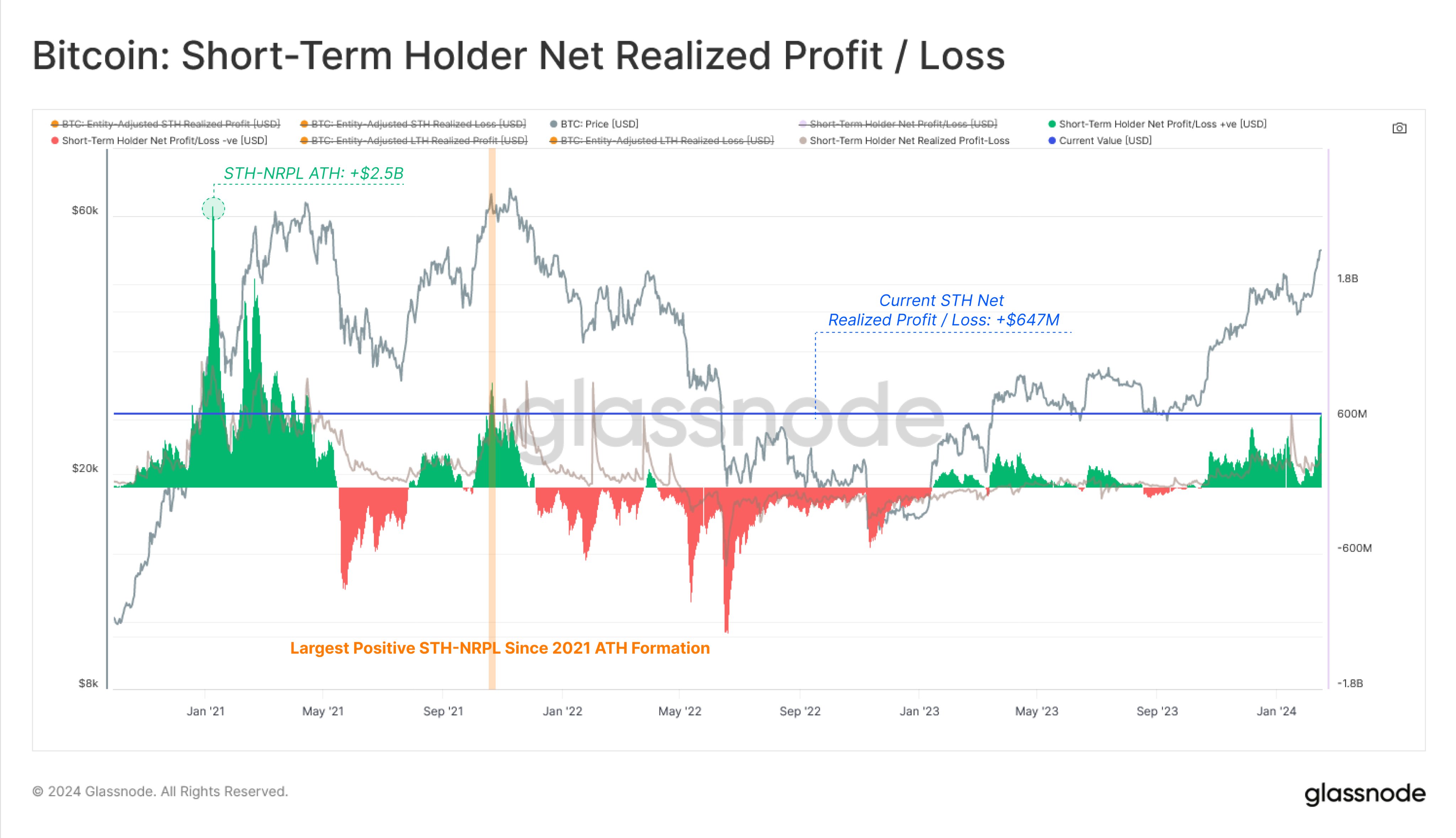
In a new thread on X, analyst Ali discussed whether the BTC price has hit the top. The one signal the analyst has pointed out that may point towards the top has been the massive scale of profit-taking that the market has seen recently.

Ali is waiting for another confirmation before the top can be confirmed. In the scenario that the top gets validated, these are the targets the analyst has marked based on on-chain data.

Bitcoin URPD

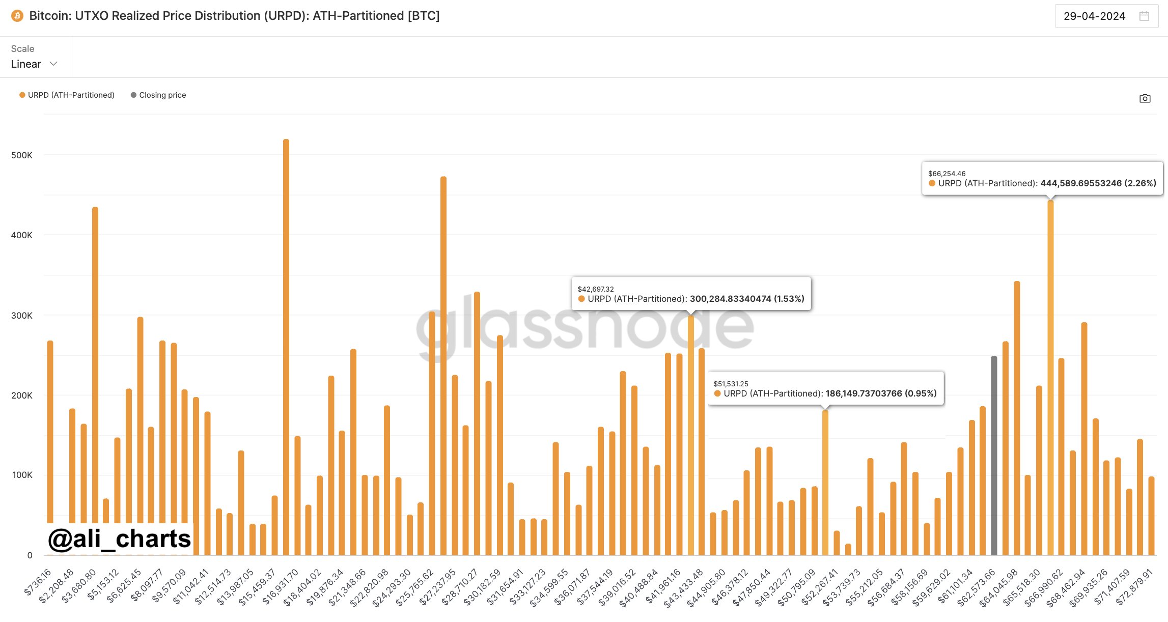
The above chart shows the Bitcoin UTXO Realized Price Distribution (URPD) data from Glassnode, which tells us how many coins were last bought at what price levels.

Generally, the cost basis is an important level for any investor, so they are likely to show some reaction when a retest of it happens. This reaction is the largest when many investors share their cost basis around the same level.

When this retest happens from above, the holders may respond by buying more, as they could see the drop as a dip opportunity. As such, large cost basis zones below the current price can prove to be centers of support.

“If the market top is confirmed, BTC could drop toward $51,530 or even $42,700!” notes Ali, given that these two levels are the next major support lines for the coin.

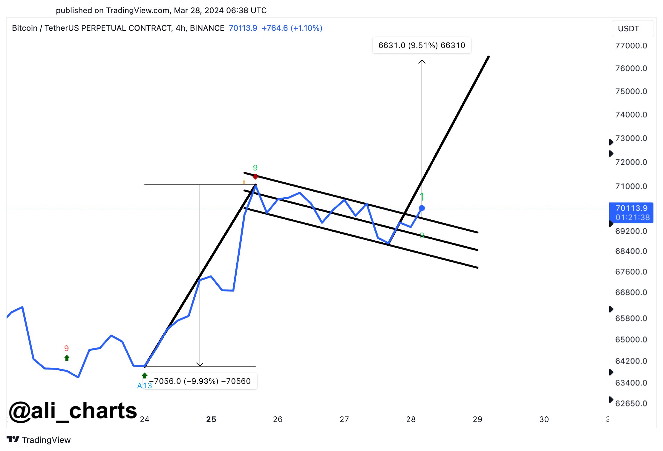
The analyst says, however, that if BTC can instead break the $66,250 level, which is a source of major resistance right now since these loss holders may be desperate to exit at their break-even, then this bearish outlook could become invalidated.

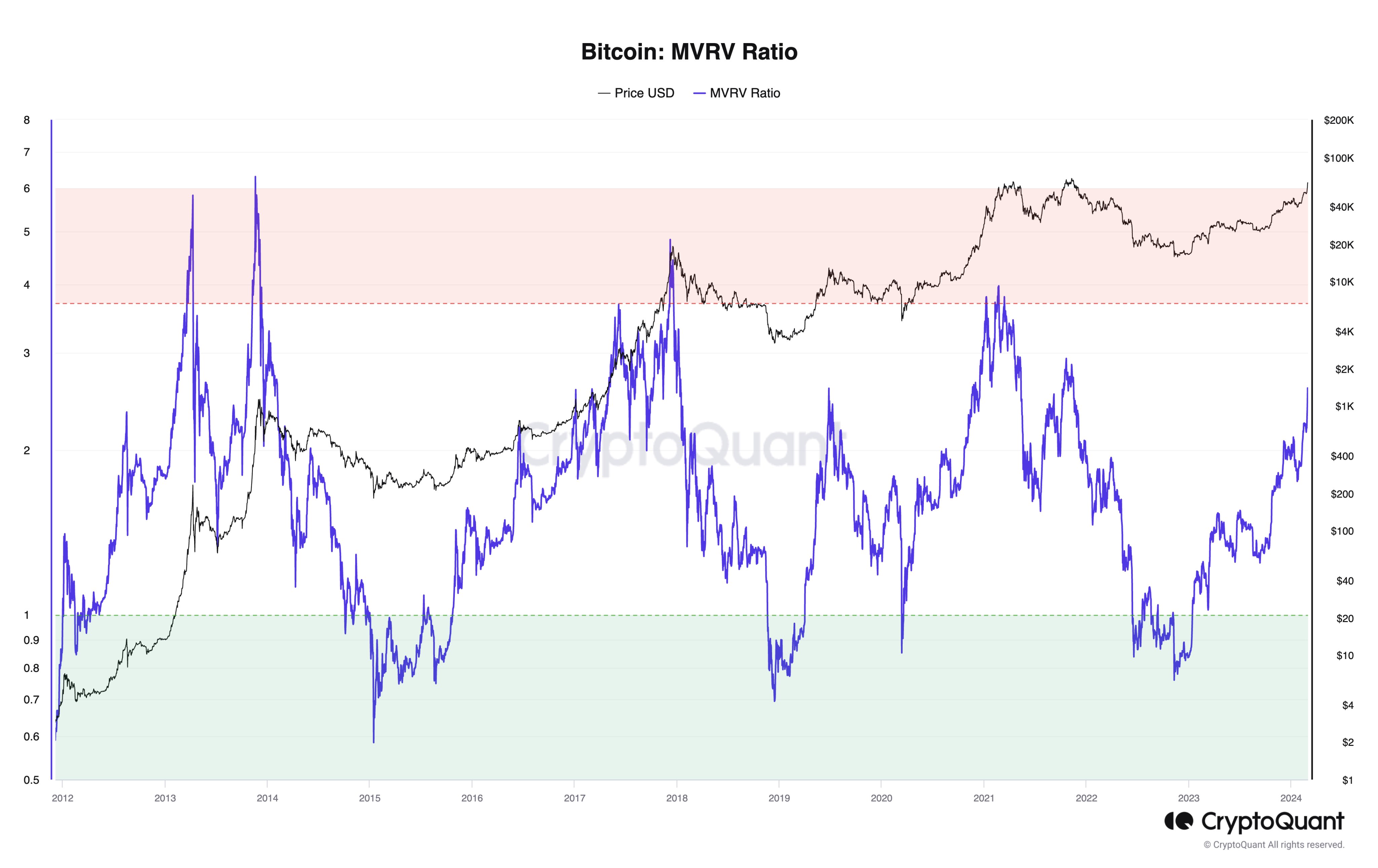
An on-chain pricing model could provide some hints about what might happen when such a break occurs.

Bitcoin MVRV Pricing Bands

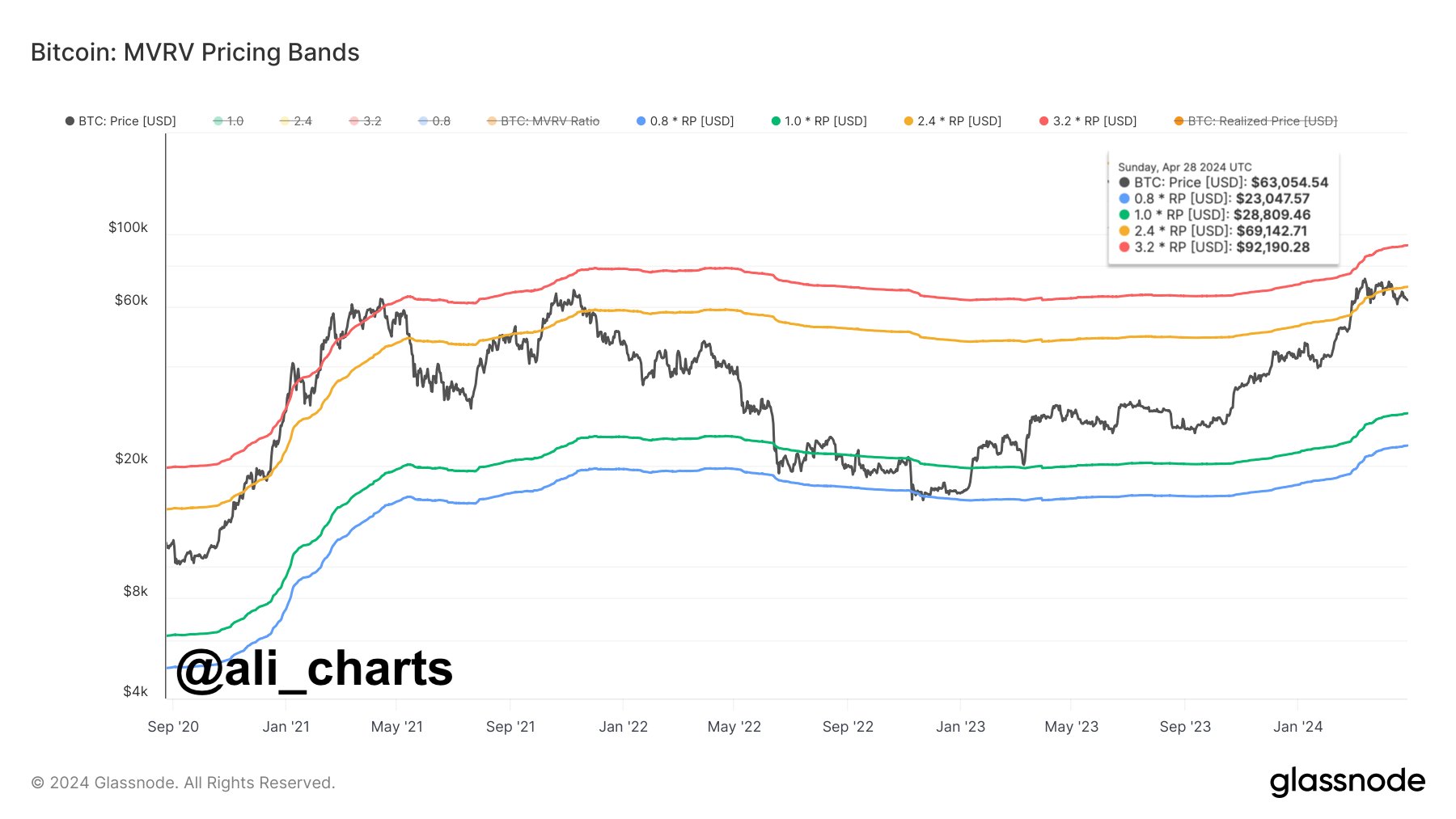
The Market Value to Realized Value (MVRV) Pricing Bands is a model that, in short, tells us about where the different multipliers of the average cost basis of the entire market currently lie.

The chart shows that the market cost basis is currently at $28,800. Historically, three multipliers of this metric have been relevant for the asset: 0.8x, 2.4x, and 3.2x.

The 0.8x level is where bottoms occur, while the 3.2x line is a probable spot for tops to form. Bull rallies in proper have occurred after a breach of the 2.4x level.

At present, the 2.4x level lies at $69,150. “By rising above $66,250, Bitcoin will gain the strength to push towards $69,150. And if this resistance barrier is breached, BTC can advance toward a new all-time high of $92,190,” explains Ali.

This ATH target is based on the fact that the 3.2x level is equivalent to $92,190 at the moment. It remains to be seen whether the top is already in and BTC would retest the lower levels or if more is left to this rally.

BTC Price

At the time of writing, Bitcoin is trading at around $61,100, down more than 7% over the past week.

Bitcoin Price Chart

Is The Bitcoin Top Already Here? This Historical Pattern Says So

A historical pattern currently forming in a Bitcoin on-chain indicator could suggest that a top may be near for the asset, if not already in.

Bitcoin SOPR Ratio Is Forming A Historical Top Pattern Right Now

In a CryptoQuant Quicktake post, an analyst has discussed about a pattern regarding the SOPR Ratio. The “Spent Output Profit Ratio” (SOPR) is an indicator that tells us whether the Bitcoin investors are selling their coins at a profit or loss right now.

When the value of this metric is greater than 1, it means that profit-selling is dominant in the market currently. On the other hand, the metric being under the threshold suggests the average holder is moving coins at some net loss.

In the context of the current topic, the SOPR itself isn’t of interest; rather, it is a different version called the SOPR Ratio. The name may be a bit confusing as SOPR already contains a “ratio,” but the latter ratio here corresponds to the fact that this indicator compares the SOPR of two Bitcoin cohorts: the long-term holders (LTHs) and short-term holders (STHs).

These investor groups make up for the two main divisions of the BTC market done based on holding time, with 155 days being the cutoff between the two. The STHs are those who bought within the past 155 days, while the LTHs include the HODLers carrying coins for longer than this timespan.

Now, here is a chart that shows the trend in the 7-day moving average (MA) of the Bitcoin SOPR Ratio over the history of the cryptocurrency:

Bitcoin SOPR Ratio

As displayed in the above graph, the 7-day MA Bitcoin SOPR Ratio had been heading up throughout 2023 and early parts of 2024, but recently, the metric has hit a top and reversed its direction. Whenever the SOPR Ratio is higher than 1, it means the LTHs, who are generally known to be resolute hands, are participating in a higher degree of profit-taking than the STHs.

It would appear that as BTC had observed its rally and approached a new all-time high (ATH), these diamond hands had started harvesting some of the gains they had earned over their long holding time. And once the price set a new ATH, these investors participated in peak profit-taking. Since then, their profit-selling has been dropping off, although they are still harvesting notably higher gains than the STHs.

In the chart, the analyst highlights how this pattern has been repeated at different points in the asset’s history. While the scale of the peak LTH profit-taking has been heading down over the cycles, it’s still true that the metric’s top has coincided with tops in the price during each of them.

As the line drawn by the quant suggests, it’s possible that the latest peak in the metric may have in fact been the top for this cycle. This is only, however, assuming that the pattern of diminishing returns in the indicator holds to the exact degree judged by the line.

It’s possible that the peak will still be higher than the current levels, while at the same time being lower than the previous cycle’s peak, thus still being in-line with the historical Bitcoin pattern.

Whatever the case be, though, the fact that the SOPR ratio has apparently hit a top could still be a bearish signal, if only in the short term.

BTC Price

Bitcoin has been making some steady recovery over the last few days as its price has now surged back above $66,100.

Bitcoin Price Chart

Bitcoin Mega Whales Are Buying, Time For Rally To Return?

On-chain data shows that the largest number of investors in the Bitcoin market are finally buying, which could be bullish for the asset’s value.

Bitcoin Mega Whales Have Shown Net Inflows In The Past Day

In the past few weeks, the Bitcoin price has struggled to mount any significant bullish momentum as it has been stuck consolidating inside a range.

Earlier, while this was happening, the largest holders in the space had been sitting quietly, not buying or selling anything notable. According to data from the market intelligence platform IntoTheBlock, however, this appears to have changed in the past day.

Relevant holders here are the “Large Holders,” who, as defined by the analytics firm, are investors carrying at least 0.1% of the entire circulating Bitcoin supply in their wallets.

A little under 19.7 million tokens are circulating for the cryptocurrency, 0.1% of which would be 19,700 BTC. This amount is worth more than $1.26 billion at the current exchange rate of BTC.

Clearly, these large holders are quite large indeed, and in fact, they are much larger than the usual whale investors, who typically carry between 1,000 and 10,000 BTC. As such, it would perhaps be apt to call these humongous entities “mega whales.”

Since an investor’s influence in the market increases the larger their holdings, these mega whales would be the most powerful entities on the Bitcoin network. Therefore, their moves can have some consequences for the wider market.

IntoTheBlock has used the netflow on-chain indicator to track the movements of the Large Holders here, which measures the net amount of BTC entering or exiting the wallets of these investors.

The below chart shows the trend in this metric over the last few months:

Bitcoin Large Holder Netflow

As displayed in the above graph, the Bitcoin Large Holders netflow registered a notable positive spike yesterday, meaning these investors have received a net amount of coins into their wallets. The mega whales bought 19,760 BTC during this spike, worth more than $1.27 billion.

“Historically, accumulations by these addresses have often preceded rises in Bitcoin’s price,” notes the analytics firm. The chart shows that some extraordinary buys came from this cohort on the way to the new all-time high for the asset.

As such, it’s possible that these latest buys will also help the asset gain some bullish momentum in the near future. However, something to note is that the scale of the latest spike, although large on its own, isn’t quite as prominent as that of some of the large buys seen earlier.

BTC Price

At the time of writing, Bitcoin is trading at around $64,500, down more than 5% over the past week.

Bitcoin Price Chart

Bitcoin Back Above $70,000 Despite Negative Taker Volume

Bitcoin has surged back above the $70,000 level during the past day despite the negative Net Taker Volume for the asset.

Bitcoin Net Taker Volume Has Seen Some Large Negative Spikes Recently

As explained by CryptoQuant Netherlands community manager Maartunn in a post on X, selling spikes of a significantly heavier scale than before have recently appeared in the Bitcoin Net Taker Volume.

The “Net Taker Volume” is an indicator that keeps track of the difference between the Bitcoin taker buy and taker sell volumes in perpetual swaps. How can the sell and buy volumes be different? As CryptoQuant explains in its data guide:

This concept is often confusing because every trade requires both a buyer and a seller of the given underlying asset. However, depending on whether the order taker is a buyer or seller (whether a transaction occurs at the ask price or the bid price), you can distinguish between long volume from taker seller volume.

When the value of this metric is positive, it means that the taker buy volume is overwhelming the taker sell volume right now. Such a trend implies a bullish sentiment is shared by the majority.

On the other hand, the negative indicator suggests that more sellers are willing to sell the coin at a lower price, a sign that a bearish mentality is the dominant one.

Now, here is a chart that shows the trend in the Bitcoin Net Taker Volume over the past year:

Bitcoin Net Taker Volume

As the above graph shows, the Bitcoin Net Taker Volume has recently registered a sharp negative spike, implying that the taker sell volume has been higher than the taker buy volume.

The Net Taker Volume has been seeing some large red spikes for a while, as the analyst highlighted in the chart. “Bitcoin is being hammered down massively, with selling spikes on the Net Taker Volume significantly heavier than before,” says Maartunn.

Interestingly, despite this bearish sentiment in the market, the Bitcoin price has managed to hold up relatively well. Obviously, the coin’s bullish momentum has gone while these negative Net Taker Volume spikes have taken hold, but the fact that BTC has shown strength against any sustained drawdowns is still impressive.

A pattern that’s perhaps visible in the chart is that although the Net Taker Volume has continued to see red spikes recently, their scale has gradually decreased.

Thus, if this trend continues, it’s possible that the bearish mentality will eventually run out, and buying pressure will take over Bitcoin. It now remains to be seen how the indicator develops shortly.

BTC Price

Bitcoin declined below $68,000 just yesterday, but today, the asset has already bounced back and is now trading around $70,800.

Bitcoin Price Chart

Bitcoin 2 Months Through “Euphoria Wave,” How Long Was The Last One?

On-chain data shows Bitcoin has been going through a “euphoria wave” for two months. Here’s how long it was in this phase during the last bull run.

Bitcoin Has Been In Euphoria Wave Phase According To Supply In Profit

According to the latest weekly report from the on-chain analytics firm Glassnode, the current BTC cycle is similar to the last one regarding the “Supply Profitability State.”

This indicator is based on the “Percent Supply in Profit,” which keeps track of the percentage of the total circulating Bitcoin supply that’s currently carrying a profit.

This metric works by going through the on-chain history of each coin in circulation to see the price at which it was last transferred. Assuming that this last transaction was the last point at which it changed hands, the price at its time would reflect the coin’s current cost basis.

Naturally, if this cost basis is lower in value than the current spot price of the cryptocurrency, then the coin in question carries some net unrealized gain. The Percent Supply in Profit adds up all such coins and calculates what percentage of the supply they make up for.

The supply Profitability State signals BTC’s current phase based on the market’s profitability status. The chart below shows the trend in this indicator over the past few years.

Bitcoin Supply In Profit

In the chart, the analytics firm has highlighted three important lines for the Bitcoin Percent Supply in Profit. The middle line (colored in blue) represents the cumulative mean of the metric, while the other two signify +1 (green) and -1 (red) standard deviation (SD) from this mean.

When the Bitcoin Percent Supply in Profit is above the +1SD (approximately 95% of the supply being in the green), the market may be considered to be in the euphoria or pre-euphoria phase.

Similarly, the Supply Profitability State would indicate a bottom discovery phase for values less than -1SD. The zone between these two corresponds to the “bear/bull transition” phase.

From the chart, it’s visible that during the last bull run, Bitcoin first saw a 1.5-month-long pre-euphoria wave, during which the metric tested the +1SD line. The asset followed up with a period of decline and consolidation, which put the Supply In Profit back under the +1 SD mark.

Finally, the coin observed a sharp rally, broke past the +1SD barrier, and went on to achieve new all-time highs, which naturally set the Supply In Profit to 100%.

Bitcoin seems to have witnessed a similar pattern this time around. A two-month-long pre-euphoria phase was followed by a drawdown, which has now been succeeded by a two-month-long euphoria wave during which the cryptocurrency has achieved new records.

If the euphoria wave lasts for a period similar to the last bull run, then four or more months might still be left for this Bitcoin bull rally.

BTC Price

Bitcoin had recovered above $72,000 earlier, but it appears that the asset has retraced back towards the $69,400 level.

Bitcoin Price Chart

Bitcoin 40% Of Way Through Bull Run If This Metric Is To Go By

A pattern in the holdings of the Bitcoin long-term holders may suggest that the current bull run is 40% of the way to completion.

Bitcoin Long-Term Holders Have Been Distributing Recently

In a new post on X, Glassnode lead analyst Checkmate discussed the recent behavior of the long-term Bitcoin holders. The “long-term holders” (LTHs) here refer to the BTC investors who have been holding onto their coins for over six months.

Statistically, the longer an investor holds onto their coins, the less likely they become to sell them at any point. Since the LTHs hold for significant periods, they are considered quite resolute.

And indeed, they display this resilience in their behavior, rarely selling despite whatever is happening in the broader market. As such, the times they sell are all the more noteworthy.

Historically, the LTHs have taken to distribution during bull runs when the asset has broken its previous all-time high (ATH) price. Due to their long holding times, these investors amass large profits, which they start to spend when a high amount of demand comes in during bull rallies that happily take coins off their hands at high prices.

Checkmate explained that the recent ATH break of the cryptocurrency has looked similar to any other past one, with the LTHs already having started spending for this round.

The chart below shows the trend in the supply of Bitcoin LTHs over the past few years.

Bitcoin Long-Term Holders

As displayed in the above graph, the Bitcoin LTHs have recently observed their supply heading down. Remember that when it comes to increases in this metric, there is a delay associated with when buying is happening and when this supply is going up.

This is natural because the newly bought coins must age for six months before they can be considered a part of the cohort’s holdings. When it comes to drawdowns, though, the same delay doesn’t emerge, as the age of the coins instantly resets back to zero, and they exit the group.

Thus, the latest distribution from the LTHs is indeed happening. “In the prior two cycles, new demand for Bitcoin was able to absorb this LTH sell-side for around 6-8 months while pushing prices multiples higher,” explains the Glassnode lead.

The chart below shows that the LTH supply has typically gone through a drawdown of around 14% during these bull run selloffs.

Bitcoin LTH Selloff

Checkmate notes that, based on this historical average drawdown in the LTH supply, the current Bitcoin cycle would be around 40% completion for this process.

BTC Price

Bitcoin has surged during the past 24 hours as its price has now returned to $71,800.

Bitcoin Price Chart

Bitcoin Bull Flag Could Predict 10% Surge To $77,000, Analyst Explains

An analyst has explained that a breakout from a bull flag pattern could lead Bitcoin to surging towards a new all-time high of $77,000.

Bitcoin Has Been Forming A Bull Flag Pattern Recently

In a new post on X, analyst Ali has discussed about a bull flag recently forming in the 4-hour price of the cryptocurrency. The “bull flag” here refers to a pattern in technical analysis that, as its name implies, looks like a flag on a pole.

In this pattern, a sharp uptrend is succeeded by a period of consolidation towards the downside. The uptrend makes up for the pole, while the consolidation period acts as the flag.

When the price is trapped inside the flag, it tends to find resistance at its upper line, so tops may be probable to form there. Similarly, the lower line may act as support, thus facilitating for bottoms to take shape.

The bull flag is usually considered to be a continuation pattern, meaning that the prevailing trend (that is, the trend of the flag) would continue once the consolidation period is over.

This happens when a break above the resistance line takes place. The uptrend emerging out of such a break may be of the same height as the pole. If the asset falls under the support line, though, the pattern could be considered invalidated.

Like the bull flag, there is also the bear flag pattern, which works similarly except for the fact that the pole in this case corresponds to a downtrend while the flag is generally a consolidation channel angled upwards. Just like the bull flag, a continuation of the prevailing bearish trend may follow this formation.

Now, here is the chart shared by Ali that shows the bull flag that BTC’s 4-hour price has recently been consolidating inside:

Bitcoin Bull Flag

From the graph, it’s visible that the 4-hour Bitcoin price has appeared to have been consolidating inside this bull flag over the last few days. It’s also apparent that, in the past day, BTC has been climbing above the resistance line of the pattern.

This could mean that the cryptocurrency is preparing a break out of this formation. Naturally, the asset would have to show more momentum before the breakout can be confirmed.

“If BTC holds above $70,000, we could see a surge of nearly 10% to a new all-time high of $77,000!” says Ali. The analyst has chosen this target as such a swing would be of the same length as the pole that had preceded this flag.

BTC Price

Bitcoin has so far been heading in a direction that would add more credence to the breakout, as its price has now broken past the $71,300 level. With this surge, BTC investors would be enjoying profits of more than 7% over the past week.

Bitcoin Price Chart

Bitcoin Coinbase Premium Returns To Neutral: Buying Push Already Over?

The positive Bitcoin Coinbase Premium that drove the latest rally above $70,000 has dissipated, suggesting buying has already slowed down.

Bitcoin Coinbase Premium Gap Has Returned To Neutral Levels

CryptoQuant Netherlands community manager Maartunn explained in a post on X that the Bitcoin Coinbase Premium Gap has declined back toward the neutral line.

The “Coinbase Premium Gap” here refers to a metric that keeps track of the difference between the BTC prices listed on cryptocurrency exchanges Coinbase (USD pair) and Binance (USDT pair).

When the value of this metric is positive, it means that the price listed on Coinbase is greater than that on Binance right now. Such a trend implies that the buying pressure on the former is higher than that on the latter platform (or alternatively, the selling pressure on there is just lower).

On the other hand, a negative value can imply the selling pressure on Coinbase is higher than on Binance as the price of the cryptocurrency listed there is lower.

Now, here is a chart that shows the trend in the Bitcoin Coinbase Premium Gap over the past few days:

Bitcoin Coinbase Premium Gap

The chart shows that the Bitcoin Coinbase Premium Gap had taken to notably positive values as the latest upward push in the asset’s price had occurred. Since then, though, the metric has fallen, with its value approaching zero.

It would seem that the buying pressure on the platform contributed to the surge. The fact that the rally has slowed since the metric returned to neutral levels may add further evidence.

This isn’t unnatural for this year, however, as the Bitcoin price and Coinbase Premium Gap have shown a pretty tight relationship since the start of 2024.

Coinbase is popularly known as the preferred platform of American institutional investors, while Binance hosts more global traffic. As such, the premium’s value provides insight into how the behavior of the US-based large holders differs from that of world users.

Since the Coinbase Premium Gap has been the driver of the recent price surges, buying from these institutional entities could potentially have provided the fuel.

As the indicator’s value has now neared the neutral mark, it would imply that these whales have lifted their foot off the gas. Given the close relationship the metric and BTC price have held recently, it may be worth keeping an eye on how things develop in the coming days.

BTC may register some decline if the premium flips into the red from here. Naturally, a continuation of positive values would be a bullish sign instead.

BTC Price

At the time of writing, Bitcoin is trading around the $70,100 level, up more than 11% over the past week.

Bitcoin Price Chart

Bitcoin Sentiment Returns To Extreme Greed As BTC Breaks $71,000

Data shows the Bitcoin market sentiment has returned to the extreme greed territory as BTC has registered its rally beyond the $71,000 level.

Bitcoin Fear & Greed Index Now Points To “Extreme Greed”

The “Fear & Greed Index” is an indicator made by Alternative that tells us about the general sentiment among the investors in the Bitcoin and wider cryptocurrency market.

This index represents the sentiment as a score between zero and hundred. To calculate this value, the indicator takes into account the data of these factors: volatility, trading volume, social media sentiment, market cap dominance, and Google Trends.

When the indicator has a value of 46 or less, it means that the average investor holds a sentiment of fear right now. On the other hand, a value of 54 or more implies the market shares a majority mentality of greed. Naturally, the region in-between these two (47 to 53) corresponds to the neutral sentiment.

Now, here is what the latest value of the Bitcoin Fear & Greed Index looks like:

Bitcoin Fear & Greed Index

As is visible above, the Bitcoin Fear & Greed Index is at 81 right now, meaning that it’s deep into the greed region. In fact, this value is so deep that it’s inside a territory known as “extreme greed.”

Extreme greed occurs when the index hits values higher than 75. Fear also has its own extreme region; this one occupying values under 25. Historically, these two sentiments have proven to be particularly significant for the market.

BTC and other assets in the sector have often tended to move in the opposite direction from what the majority expect. In the territory of the extreme sentiments, this expectation is naturally the strongest, and hence, the probability of a contrary move taking place is also the highest.

Because of this reason, major tops and bottoms in Bitcoin’s price have typically taken shape when the cryptocurrency has been inside the respective extreme zones.

Earlier in the month, the Fear & Greed Index had assumed especially high extreme greed levels, as the asset’s rally towards new all-time highs (ATHs) had occurred.

Two of the major tops in this period, including the current ATH, coincided with peaks in the indicator, implying that the overheated sentiment may have once again played a role.

Bitcoin Fear & Greed Index

With the recent drawdown in the asset, though, the sentiment also cooled off and exited out of the extreme greed territory, as is visible in the above chart. In bullish periods, the sentiment retreading back to the normal greed region can be a positive sign for fresh upward moves to start.

And indeed, this has followed for the cryptocurrency this time as well, as its price has made notable recovery over the past couple of days. With the coin making a return back towards $71,000, the sentiment has also heated up again, hence why the index’s latest value is pointing at extreme greed.

The aforementioned tops from earlier in the month occurred at Fear & Greed Index values of 90 and 88, respectively, suggesting that the current extreme greed value of 81 may not be too high for another peak to be probable.

BTC Price

Bitcoin had broken above the $71,000 level earlier in the day, but the digital asset has since registered a bit of a pullback towards $70,700.

Bitcoin Price Chart

Bitcoin Top In Yet? What The Legendary MVRV Ratio Says

Here’s what the latest trend in the Bitcoin Market Value to Realized Value (MVRV) ratio suggests about where the market is currently in terms of a top.

Bitcoin MVRV Ratio Has Seen A Decline To The 2.34 Level

According to data from the market intelligence platform IntoTheBlock, the BTC MVRV ratio surged high earlier this year as the cryptocurrency rally took place.

The “MVRV ratio” is a popular indicator that tracks the ratio between the Bitcoin market cap and the realized cap. The former is simply the total valuation of the asset’s supply at the current spot price, while the latter is an on-chain capitalization model.

The realized cap measures the total sum of the value of the cryptocurrency’s supply, assuming that each coin in circulation has its true value at the price at which it was last transferred on the blockchain rather than the current spot value.

One way to interpret the realized cap is that since it takes into account the buying price of every token in circulation (assuming that the last transaction of every token was indeed the point at which it last changed hands), it essentially sums up the total capital the investors have invested in the asset.

As such, the MVRV ratio tells us how the total value that Bitcoin investors are carrying right now (that is, the market cap) compares against the value they put in (the realized cap).

Now, here is a chart that shows the trend in the Bitcoin MVRV ratio over the past few years:

Bitcoin MVRV ratio

As is visible in the graph, the Bitcoin MVRV ratio has had a value greater than 1 for a while now. When the indicator has such values, the market cap is greater than the realized cap, and hence, the investors carry net profits.

With the latest rally in the asset, this indicator has surged to relatively high levels, a natural consequence of the holders’ profits ballooning up with the price surge.

After the recent drawdown in the price, though, the MVRV ratio has also turned itself around, as it’s now heading down. At present, the ratio has a value of around 2.34.

“Traditionally, an MVRV ratio above 3 has been a reliable marker for predicting price peaks,” notes IntoTheBlock. So far, in the current rally, the metric hasn’t crossed this mark. It did come close recently, but the latest decline has meant it has gained a bit more distance to the level.

Why have tops historically occurred at high values of the Bitcoin MVRV ratio? The answer is that investors in profits are more likely to participate in selling, and this temptation to take profits only increases as their gains grow larger.

Because of this, selloffs are most probable when the market is holding extreme levels of profits, which is exactly what high MVRV ratio values reflect.

BTC Price

At the time of writing, Bitcoin is trading at around $67,200, up 3% over the past 24 hours.

Bitcoin Price Chart

Bitcoin Retests Resistance: Here’s The Level A Break Could Lead To

Data shows Bitcoin is currently retesting a major on-chain resistance level, and a break above which can potentially lead to a surge in its price.

Bitcoin Has Major On-Chain Resistance Around $67,000

As pointed out by analyst Ali in a post on X, BTC may be able to see a rise towards the $72,900 level if the asset can break the current on-chain resistance barrier.

In on-chain analysis, any level’s potential to act as support or resistance is measured using the amount of Bitcoin that was acquired/bought by the investors around said level.

The analyst has shared the chart for the “UTXO Realized Price Distribution” (URPD) indicator from Glassnode, that reveals how the various levels around the current spot value of BTC are looking like right now based on the density of supply that was last bought at them.

Bitcoin URPD

The URPD here is “ATH partitioned,” which means that the price ranges here are defined by dividing the levels between zero and the current all-time high (ATH) into 100 equal partitions.

From the chart, it’s visible that the partition around the $66,990 level carries the cost basis of a notable amount of the supply right now (1.3%). This also happens to be the range BTC is retesting at the moment.

Generally, the cost basis is a special level for investors, and thus, they tend to be more likely to show some reaction when a retest takes place. If a large number of holders share their cost basis inside the same narrow range, then this reaction may result in a scale that could be relevant for the market.

As for what direction this reaction from the holders would be probable to happen depends on the side the retest is happening from. A retest from under (meaning that these holders had been in loss prior to the retest) could lead to a selling reaction in the market.

This is because these investors may not want to risk the cryptocurrency declining again in the future, so exiting while they have the opportunity to at their break-even might be tempting.

As such, retests like these can lead to the asset feeling some degree of resistance. In the current case, the range is notably filled up with coins, so it’s possible that the strength of this resistance would be just as powerful.

From the chart, it’s visible that after this range, the asset potentially faces no strong on-chain resistance barriers until the $72,879 level, which hosts the cost basis of about 1.61% of the supply. “If Bitcoin can break past $66,990, it will likely rise toward $72,880!” says Ali.

BTC Price

Bitcoin has been climbing up in the past day, with its price now reaching the $67,200 level. Should this surge be sustained, the asset would be through the current resistance block.

Bitcoin Price Chart

Bitcoin Long-Term Holders & Price Top: Glassnode Reveals Pattern

The on-chain analytics firm Glassnode has explained that Bitcoin tends to reach a potential top when the long-term holders show this pattern.

Bitcoin Long-Term Holders Have Been Ramping Up Distribution

In a new report, Glassnode discussed the influence that the BTC long-term holders have on the cryptocurrency’s supply dynamics. The “long-term holders” (LTHs) here refer to the Bitcoin investors who have been holding onto their coins for more than 155 days.

The LTHs comprise one of the two main divisions of the BTC user base based on holding time, with the other cohort known as the “short-term holders” (STHs).

Historically, the LTHs have proven themselves to be the persistent hands of the market. They don’t quickly sell their coins regardless of what is happening in the broader sector. The STHs, on the other hand, often react to FUD and FOMO events.

As such, it’s not unusual to see the STHs participating in selling. However, the LTHs showing sustained distribution can be something to note, as selling from these HODLers, who usually sit tight, may have implications for the market.

There are many different ways of tracking the behavior of the LTHs, but in the context of the current discussion, Glassnode has used the “LTH Market Inflation Rate” metric.

As the report explains:

It shows the annualized rate of Bitcoin accumulation or distribution by LTHs relative to daily miner issuance. This rate helps identify periods of net accumulation, where LTHs are effectively removing Bitcoin from the market, and periods of net distribution, where LTHs add to the market’s sell-side pressure.

Now, here is a chart that shows the trend in the BTC LTH Market Inflation Rate over the past several years:

Bitcoin LTH Market Inflation Rate

In the chart, the analytics firm has also attached the data for the asset’s Inflation Rate, which is basically the amount that the miners are introducing into the circulating supply by solving blocks and receiving rewards for them.

When the LTH Market Inflation Rate equals 0%, these HODLers are accumulating amounts exactly equal to what the miners are issuing.

This implies that the indicator below the 0% mark suggests the LTHs are pulling coins out of the supply, while it being above is a sign that they are either distributing or just not buying enough to absorb what the miners are producing.

The graph shows that historically, the cryptocurrency’s price has tended to reach a state of equilibrium and potentially even a top when the LTH distribution has peaked.

The LTH Market Inflation Rate has been increasing recently, but it’s yet to reach any significant levels. As for what this could mean for the market, Glassnode says:

Currently, the trend in the LTH market inflation rate indicates we are in an early phase of a distribution cycle, with about 30% completed. This suggests significant activity ahead within the current cycle until we achieve a market equilibrium point from the supply and demand perspective and potential price tops.

BTC Price

Bitcoin has retraced most of its recovery from the past few days, as its price has now declined to $63,800.

Bitcoin Price Chart

Bitcoin Extreme Greed At Levels Higher Than Nov. 2021 Peak, Top Signal?

Data shows the Bitcoin sentiment has now reached extreme greed levels higher than even those at the price all-time high (ATH) in November 2021.

Bitcoin Fear & Greed Index Is Deep Inside Extreme Greed Territory Now

The “Fear & Greed Index” is an indicator created by Alternative that keeps track of the general sentiment present among the investors in the Bitcoin and wider cryptocurrency market right now.

The metric represents this average sentiment in the form of a score lying in the zero to hundred range. To calculate this score, the index takes into account the following five factors: volatility, trading volume, social media sentiment, market cap dominance, and Google Trends.

When the indicator shows a value less than 47, it means that the sentiment around the sector is that of fear. On the other hand, the index being above the 53 mark implies the presence of greed among the investors. Naturally, the region between these two territories belongs to the neutral mentality.

Besides these three main sentiments, there are two “extreme” sentiments called extreme fear and extreme greed. The former of these occurs at and below 25, while the latter is 75 and above.

Now, here is what the Bitcoin Fear & Greed Index currently looks like:

Bitcoin Fear & Greed Index

As is visible above, the Bitcoin Fear & Greed Index’s current value is 90, which means that the investors are holding a strong sentiment of extreme greed. This latest value is quite the jump from the sentiment from yesterday, when the index was around 82.

The reason behind this sharp increase in the indicator is obviously because of the fact that the cryptocurrency’s price has been pushing towards a new all-time high during its latest rally.

The current level of the Fear & Greed Index isn’t only high compared to the recent trend, but also when considering the historical data. The below chart shows how the metric’s value has fluctuated since its inception back in 2018:

Bitcoin Extreme Greed

As displayed in the graph, the Bitcoin Fear & Greed Index has now surpassed the level that it assumed during the November 2021 price all-time high, as it stands at values just below those observed between late 2020 and early 2021.

Besides this period, there has only been one other instance in the history of the metric where it has achieved levels higher than now: the rally peak during mid-2019.

Historically, Bitcoin has tended to move against the expectations of the majority, and as this expectation has leaned more towards one side, the probability of such a contrary move taking place has only gone up.

The top in the 2019 rally and November 2021 are just two such examples of this pattern in action. As such, it’s possible that the current extreme levels of the indicator mean that the price is at risk of forming a top right now.

It should be noted, however, that a top doesn’t necessarily have to immediately follow, as during the first half 2021 bull run, the metric was able to maintain at even higher levels for a while, without the rally being compromised.

BTC Price

Bitcoin was on the brink of setting a new all-time high just earlier, but its price has since cooled off towards the $66,700 level.

Bitcoin Price Chart

Bitcoin Volatility Induces $700 Million Carnage In Crypto Futures

Data shows the cryptocurrency futures market has seen liquidations amounting to $700 million in the past day as Bitcoin has gone through its volatility.

Bitcoin Has Seen Intense Price Action In Past 24 Hours

The past day has been a bit of a rollercoaster for Bitcoin, with the asset registering sharp price action in both directions but ultimately going up as the bulls win out.

The chart below shows what the price action for the cryptocurrency has looked like recently.

Bitcoin Price Chart

From the graph, it’s visible that Bitcoin initially witnessed some sharp bullish momentum, in which the coin not only broke above the $60,000 level, but went up to touch the $64,000 mark.

This high, which is the peak for the year so far, only lasted briefly, however, as BTC crashed down spectacularly to under the $59,000 mark. The asset has since recovered to higher levels, now floating around $62,700.

The rest of the cryptocurrency sector has also gone through its volatility, with prices fluctuating across the coins. As is usually the case with such sharp price action, the futures market has suffered many liquidations.

Crypto Futures Market Has Gone Through A Squeeze In The Past Day

According to data from CoinGlass, the cryptocurrency futures market has witnessed the liquidation of contracts worth more than $700 million in the last 24 hours.

The table below displays the relevant information about the liquidations.

Bitcoin & Crypto Liquidations

It would appear that only $131 million of the liquidations came within twelve hours, suggesting that most of the flush was situated inside the preceding half-day period. This makes sense, as Bitcoin was most volatile inside this window.

It also seems that the long-to-short ratio in this liquidation event has been quite balanced, even though the price has increased in the past day. This would suggest that some aggressive longing occurred as Bitcoin approached $64,000, and the subsequent pullback wiped these top buyers.

The table below shows how the distribution has looked for the various symbols.

Bitcoin & Other Cryptos

As is generally the case, Bitcoin futures contracts have again been responsible for the largest portion of the total market liquidations, contributing around $270 million.

What’s different this time, however, is that this share, although the largest, isn’t even half the total liquidations. This could come down to the fact that speculators may now be playing around with altcoin positions after gaining confidence from the BTC price surge.

Dogecoin, the best performer among the top coins with its 34% jump, has occupied the largest share among the alts, with almost $51 million in liquidations.

Bitcoin MVRV Hits Levels That Lead To Parabolic Bull Run In 2020

On-chain data shows the Bitcoin MVRV ratio is currently at the same high levels as those that led to the parabolic bull run back in 2020.

Bitcoin MVRV Ratio Has Shot Up As Latest Rally Has Occurred

As pointed out by CryptoQuant founder and CEO Ki Young Ju in a post on X, the MVRV ratio has just hit a value of 2.5. The “Market Value to Realized Value (MVRV) ratio” is a popular on-chain indicator that keeps track of the ratio between the Bitcoin market cap and the realized cap.

The “realized cap” here refers to a capitalization model for BTC that assumes that the real value of any token in circulation is not its current spot price (as the market cap takes it to be), but rather the value at which the coin was last transferred on the network.

The previous transaction for any coin may be considered the last time it changed hands, which implies that the price at the time would be its current cost basis. As such, the realized cap adds up the cost basis of every token in circulation.

This means that the realized cap essentially keeps track of the total amount of capital that the investors have used to purchase their Bitcoin. Since the MVRV ratio compares the market cap (that is, the value the investors are holding right now) against this initial investment, its value can tell us about the amount of profit or loss the investors as a whole are currently carrying.

Now, here is a chart that shows the trend in the Bitcoin MVRV ratio over the history of the cryptocurrency:

Bitcoin MVRV ratio

As is visible in the graph, the Bitcoin MVRV ratio has rapidly climbed up as the asset’s price has gone through its latest rally. In this surge, the metric has managed to exceed the 2.5 level.

When the ratio is greater than 1, it means that the market cap is higher than the realized cap right now, and thus, the overall market is holding its coins at some profit. A value of 2.5 implies the average wallet is currently carrying gains of 150%.

“In Nov 2020, MVRV was 2.5 at $18K, preceding the all-time high and parabolic bull run,” explains Ju. Back in that bull run, the peak of the first half of 2021 wasn’t hit until the MVRV ratio crossed the 3.7 mark, just like the two bull runs preceding it.

The top in November 2021, however, didn’t follow this pattern, as it formed close to the 3.0 level. It now remains to be seen which path Bitcoin would take in its current rally, if it is at all similar to either of these.

BTC Price

Following Bitcoin’s impressive 22% rally over the past week, the asset’s price is now trading around the $62,800 level, not very far from setting a new all-time high now.

Bitcoin Price Chart

95% Of Bitcoin Now In Profit: Why This Could Be A Signal To Sell

On-chain data shows the Bitcoin supply in profit has reached levels that led to some tops in the past, like the peak of the April 2019 rally.

Bitcoin Supply In Profit Has Shot Up Following BTC’s Latest Run

As pointed out by an analyst in a CryptoQuant Quicktake post, Bitcoin supply in profit has hit very high levels after the asset’s latest rally. The “supply in profit” here refers to a metric that measures the percentage of the total circulating BTC supply that’s currently carrying some amount of unrealized gain.

This indicator works by going through the transaction history of each coin (more precisely, each UTXO) on the blockchain to see what price it was last moved at. Assuming that the previous transfer of the coin was the last time it changed hands, the price at that instance would act as its current cost basis.

As such, if the previous transfer price for any coin was less than the spot value of the cryptocurrency right now, then that particular coin would be holding a profit currently. The supply in profit sums up all such coins and calculates what percentage of the total supply they make up for.

A counterpart indicator called the “supply in loss” does the same for coins of the opposite type (that is, those with a cost basis lower than the current price). This metric’s value can also simply be found by subtracting the supply in profit from 100 (since the total supply must add up to 100%).

Now, here is a chart that shows the trend in the Bitcoin supply in profit over the past few years:

Bitcoin Supply In Profit

As displayed in the above graph, the Bitcoin supply in profit has naturally shot up recently as the asset’s price has gone through its rally. After the latest continuation of the run towards the $57,000 level, the metric has hit the 95% mark.

This means that 95% of all UTXOs in existence is carrying a profit at the moment. This may not entirely be a positive thing, however, if history is anything to go by.

As the quant has highlighted in the chart, the BTC rally that started in April 2019 topped out just as the supply in profit hit the same high levels as right now. Similarly, the local top in 2020 at the beginning of the last bull market also coincided with these levels.

The reason behind this pattern is likely to be the fact that investors in profit are more likely to sell their coins at any point. Thus, when a large percentage of holders are carrying gains, the probability of a mass selloff can spike up.

That said, in the 2017 and 2021 bull runs, as well as during the November 2021 peak, the indicator did manage to surpass these levels for a while before the top was encountered.

As such, it remains to be seen if the current rally is similar to the likes of the April 2019 run, in which case a top might be hit here, or if it’s a proper bull run, meaning that there might still be a while to go before the peak.

BTC Price

At the time of writing, Bitcoin is trading around the $56,500 level, up 8% over the past week.

Bitcoin Price Chart

Bitcoin FOMO Hasn’t Spiked Yet: Green Signal For Rally To Continue?

Data shows social media users aren’t yet showing FOMO around Bitcoin, a sign that the current rally could still have the potential to continue.

Bitcoin Social Volume Hasn’t Been Too High Recently

According to data from the analytics firm Santiment, the crowd FOMO that may be associated with a rally like BTC has seen recently hasn’t yet cropped up on social media.

The indicator of interest here is the “Social Volume,” which keeps track of the total amount of discussion any given topic or term is receiving on the major social media platforms right now.

The metric measures this by counting up the posts/threads/messages that are making at least one mention of the given term. The reason it tracks the number of posts themselves rather than the mentions is so that a few threads with a significant number of mentions can’t skew the indicator by themselves.

When a topic truly receives widespread attention on social media, a large number of posts crop up as users across the platforms participate in talks. Mentions, on the other hand, can sometimes spike just because some niche circles decide to discuss the term.

As such, measuring Social Volume through posts is what provides a better representation of the general trend being followed. Now, here is a chart that shows the trend in the indicator for terms related to Bitcoin and cryptocurrency:

Bitcoin Social Volume

As displayed in the above graph, the Bitcoin Social Volume hasn’t been too out of the ordinary recently, despite the sharp rally that the asset’s price has witnessed.

Generally, the indicator tends to rise as rapid moves in the cryptocurrency take place since users get spurred to talk more about the coin. When discussions rise too high, though, it’s often a sign that FOMO is increasing in the sector.

Historically, Bitcoin has tended to move against the expectations of the majority, so such a rise in FOMO has often resulted in top formations for the asset. When discussions rise alongside a drawdown instead (that is, a signal that FUD is going up), a bottom rather takes place for the coin.

From the chart, it’s visible that last month, the indicator registered a spike around the time of the spot ETF approvals, which coincided with the top, but such FOMO hasn’t reappeared for the coin yet.

“Despite Bitcoin’s +74% price rise in 4 months, the crowd FOMO that would normally be associated with this kind of surge has not been present,” notes the analytics firm.

“There was certainly an interest in BTC in the weeks directly before and after the SEC’s approval of 11 ETF’s, but the lack of new greed in the space can actually be considered a promising sign that this rally can continue,” explains Santiment.

BTC Price

Bitcoin has seen some pullback in the past day as its price has slipped under the $51,000 level.

Bitcoin Price Chart

Bitcoin Short-Term Holders Just Locked In $647 Million In Profits

On-chain data from Glassnode shows that the Bitcoin short-term holders have recently participated in a massive $647 million profit-taking event.

Bitcoin Short-Term Holders Have Realized Large Net Profits Recently

According to data from the on-chain analytics firm Glassnode, the short-term holders have given a strong reaction to the $52,000 break. The “short-term holders” (STHs) here refer to the Bitcoin investors who bought their coins within the past 155 days.

Statistically, the longer an investor holds onto their coins, the less likely they become to sell at any point. The STHs have a relatively low holding time, so they easily sell during price rallies or crashes.

On the other hand, the “long-term holders” (LTHs), which make up the rest of the userbase (that is, those withholding time greater than 155 days), tend to carry a strong resolve.

Since the STHs are fickle-minded, it’s not surprising that they have made some selling moves after the latest rally in the asset. One way to gauge the reaction of this cohort is through the “Net Realized Profit/Loss” metric.

This indicator keeps track of the net profit or loss the investors realize across the network. The metric finds this value by going through the on-chain history of each coin being transferred right now to check the price it was moved at before.

Assuming that a change of hands occurred in the previous transfer and that another such change is happening with the current one, then the coin’s sale would realize a profit or loss equal to the difference between the two prices.

The Net Realized Profit/Loss sums up all such profits and losses and outputs the net value. Now, here is a chart that shows the trend in this indicator specifically for the Bitcoin STHs over the past few years:

Bitcoin STH Net Realized Profit/Loss

As displayed in the above graph, the Bitcoin STH Net Realized Profit/Loss has spiked to highly positive levels recently, implying that these investors’ profits have significantly outweighed the losses.

This cohort has realized $647 million in net profits during this latest selling spree. The chart shows that the last time the indicator was at higher positive values was back around the formation of the 2021 all-time high.

The current values aren’t off this mark, but the STH Net Realized Profit/Loss levels that hit back during the first half of the 2021 bull run are still far away. For perspective, the peak in the metric achieved back then was $2.5 billion, which remains the all-time high for the indicator.

BTC Price

Since the rapid surge above $52,000, Bitcoin has calmed down slightly, as it has moved sideways in the past few days. At present, BTC is trading at around $52,500.

Bitcoin Price Chart

Bitcoin Signal That Has Held Since December Says It’s Time To Sell

An analyst has explained that an indicator that has been holding for Bitcoin since December is now giving a sell signal for the cryptocurrency.

TD Sequential Is Providing A Sell Signal On Daily Bitcoin Chart Currently

In a new post on X, analyst Ali discussed a TD Sequential sell signal forming in the Bitcoin daily price chart. The “Tom Demark (TD) Sequential” is an indicator in technical analysis used for pinpointing locations of probable tops and bottoms in any asset’s price.

The TD Sequential has two phases. The first is called the “setup” and lasts nine candles. Once nine candles (of the same polarity) are in, the setup completes, and the indicator signals a likely reversal for the price.

The direction of such a reversal naturally depends on the type of candles that formed the setup. If these candles were green, the indicator would imply a top for the asset, while red candles would suggest a bottom.

When the setup finishes, the “countdown” phase begins. In this phase, candles of the same type are counted again, except for thirteen. Once the countdown also completes, another potential reversal could be assumed to have occurred for the price.

Recently, Bitcoin has finished a TD Sequential phase of the former type. Here is the chart shared by the analyst that shows this pattern forming in the daily price of the cryptocurrency:

Bitcoin Sell Signal

As is visible in the graph, the TD Sequential setup has recently finished with green candles for Bitcoin. These green candles have come for the coin as it has enjoyed some sharp bullish momentum, which has taken its price beyond the $52,000 mark.

The fact that the TD Sequential setup has formed with green candles suggests the indicator may now be providing a sell signal for the cryptocurrency’s price.

In the same chart, Ali highlighted the previous instances since December of last year where a setup was completed for the asset. It would appear that both TD Sequential buy and sell signals have held for the coin in this window.

Going by this pattern, the latest TD Sequential reversal signal might also hold for the asset. And as it’s a bearish one this time, the analyst expects a correction lasting for one to four daily candlesticks.

BTC Price

Bitcoin’s recent momentum has meant that the asset has been among the best performers in the sector, registering growth of around 16% during the past week.

Currently, the coin is hovering around the $52,500 level. The chart below shows the asset’s trajectory over the last month.

Bitcoin Price Chart

Bitcoin Flies Above $47,300, But Watch Out For Extreme Greed

Bitcoin is finally showing a sustained bullish push as it has now broken above $47,300, but overly positive sentiment can be an obstacle to this rally.

Bitcoin Fear & Greed Index Suggests Market Is Nearing Extreme Greed

The “Fear & Greed Index” is an indicator that tells us about the general sentiment among the investors in the Bitcoin and wider cryptocurrency sector. According to Alternative, its creator, the index takes into account five factors to calculate this sentiment.

These are volatility, market volume, social media sentiment, market cap dominance, and Google Trends. The index outputs the sentiment as a number lying between zero to hundred.

All values of 46 and under imply the investors are fearful, while those of 54 or over suggest the presence of greed in the market. The region between 47 and 53 corresponds to the region of neutral sentiment.

Now, here is what the Fear & Greed Index looks like for Bitcoin right now to see which of these regions the market stands in at present:

Bitcoin Fear & Greed Index

As is visible above, the Bitcoin Fear & Greed Index has a value of 72 at the moment, implying that the majority of the investors in the space share a greedy mentality.

Besides the three core sentiments mentioned earlier, there are also two extreme ones: the extreme fear and extreme greed. The former of these occurs at values of 25 and under, while the latter takes place at 75 and above.

Historically, these two sentiments, in particular, have held great significance for the cryptocurrency’s trajectory. Generally, at any point, the asset is more likely to move against the expectations of the majority, and in these extreme regions, this expectation becomes the strongest.

As such, these sentiments have been where major reversals in the asset have been the most likely to occur. Followers of a trading philosophy called “contrarian investing” exploit this fact to time their buying and selling moves. Warren Buffet‘s famous quote sums up the idea, “Be fearful when others are greedy, and greedy when others are fearful.”

At a value of 72, the Bitcoin market is quite close to entering into the extreme greed region right now. Just yesterday, the metric had a value of 66, which means there has been some jump in just the past 24 hours.

Bitcoin Extreme Greed

This increase in the index has naturally come because of the bullish momentum that the asset has enjoyed in the past day. Any further improvements in sentiment, however, may be alarming, as the metric would then enter into the extreme greed territory.

The last time that the Bitcoin Fear & Greed Index surged into extreme greed values was around the time of the approval of the spot exchange-traded funds (ETFs). As it happened, the coin hit its top, coinciding with this overly bullish mentality.

Thus, if this precedence is anything to go by, any visit into the territory in the coming days may serve as a warning that a top is near for the cryptocurrency.

BTC Price

Bitcoin has enjoyed an uplift of over 6% during the past 24 hours as its price has cleared the $47,300 level.

Bitcoin Price Chart