Bitcoin Rebounds After Nearing Cost Basis Of Short-Term Whales

Bitcoin has found a rebound back above the $66,000 mark following a drop towards the on-chain cost basis of the short-term holder whales.

Bitcoin Drawdown Had Nearly Put Short-Term Whales Under Pressure

As pointed out by an analyst in a CryptoQuant Quicktake post, BTC’s price had neared the Realized Price of the short-term holder whales during the recent drop, but had still managed to remain above the level.

The “Realized Price” here refers to an on-chain indicator that, in short, keeps track of the cost basis (that is, the acquisition price) of the average investor in the Bitcoin market.

When the spot price of the cryptocurrency is trading above this level, it means that the investors as a whole are in a state of unrealized profits right now. On the other hand, it being under implies the overall market is carrying losses.

In the context of the current discussion, the Realized Price of the entire Bitcoin market isn’t of interest, but that of only a part of it: the short-term holder (STH) whales.

The STHs refer to the BTC investors who bought their coins within the past 155 days, while the whales are categorized as entities holding greater than 1,000 BTC. As such, the STH whales would refer to the large investors who bought during the last five months.

Naturally, the Realized Price of this group would indicate the average whale buying price over the past five months (and this price would obviously have to be one the cryptocurrency had traded at on some occasion inside this timeframe).

Now, here is a chart that shows the trend in the Bitcoin Realized Price for the STH whales over the last decade:

Bitcoin Short-Term Holder Whales

From the graph, it’s visible that the Realized Price of the STH whales has rapidly climbed alongside the sharp rally Bitcoin has gone through this year. This makes sense, as the STHs represent the new hands coming into the market, who would have to buy at higher prices as the asset’s surge would continue.

Not only that, but the STHs who age past the 155 days mark (that is, those who bought at the relatively low prices) exit out of the cohort, thus raising the average even further.

The group that these matured investors advance to is known as the long-term holder (LTH) cohort. In the same chart, the quant has also attached the data for the Realized Price of the LTH whales as well.

It would appear that these veteran whales have their cost basis at just $21,500, meaning that these investors would be getting some big rewards for their patience. In contrast, the STH whales have their Realized Price at $60,700.

During Bitcoin’s recent drawdown, the asset had come close to retesting this mark. Such retests have historically lead to reactions in the market and during bull runs, this reaction has often appeared in the form of buying. This may be why the cryptocurrency found its rebound near the $60,700 level.

BTC Price

With its latest rebound, Bitcoin has so far managed to recover back towards the $66,500 level.
Bitcoin Price Chart

Bitcoin Traders No Longer Extremely Greedy: Rebound Signal?

Data shows that Bitcoin investor sentiment has cooled to the lowest level since February, something that could facilitate a rebound in the price.

Bitcoin Fear & Greed Index Now Points At Just ‘Greed’

The “Fear & Greed Index” is an indicator created by Alternative that tells us about the general sentiment among investors in the Bitcoin and broader cryptocurrency sector.

This metric uses a numeric scale from zero to hundred to represent the sentiment. To calculate the score, the index considers the data of five factors: volatility, trading volume, social media sentiment, market cap dominance, and Google Trends.

All values of the indicator above the 53 mark suggest the presence of greed among the investors, while below the 47 level implies a fearful market. The region between these two corresponds to the neutral sentiment.

Here is how the latest value of the Bitcoin Fear & Greed Index looks:

Bitcoin Fear & Greed Index

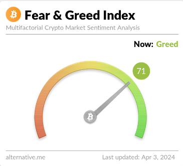
As is visible above, the Bitcoin Fear & Greed Index currently has a value of 71, implying that the investors share a majority sentiment of greed. Just yesterday, the index’s value had been notably higher than this, implying that there has been a bit of a cooldown of sentiment in the past 24 hours.

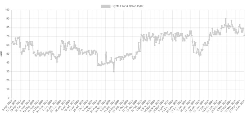
Below is a chart that shows the trend in the index over the past year.

Bitcoin Fear & Greed Index

Besides the three core sentiments, there are also two “extreme” sentiments: extreme greed and extreme fear. The former occurs at values above 75, while the latter occurs under 25.

The Bitcoin Fear & Greed Index was 79 yesterday, implying that the market had been extremely greedy. The indicator has been regularly inside this zone for the past month, so the current normal greed values go against the trend.

The sentiment among investors has naturally been so high recently because the BTC price has gone through a sharp rally in this period and has explored fresh all-time highs (ATHs).

The Bitcoin price has historically tended to go against the majority’s expectations. And the stronger this expectation has been, the more likely such a contrary move will occur.

Due to this reason, the extreme sentiments have been where reversals in the asset have been the most probable to take place in the past. For instance, the current ATH of the asset formed when the index was at a value of 88.

With the recent price drawdown, sentiment has also taken a hit. The fact that it has fallen out of the extreme greed zone, though, may be conducive to a bottom forming. The earlier bottom, around 20 March, also formed when the index exited the zone.

The current level of the Bitcoin Fear & Greed Index is not only lower than it was then but also the lowest since 11 February, when the asset was still trading around $48,000.

BTC Price

Bitcoin is now down to the $65,800 level after facing a drawdown of more than 7% over the last few days.

Bitcoin Price Chart

Bitcoin Sentiment Cools Off, Price Rebound Soon?

The Bitcoin Fear & Greed Index shows that the sentiment around the asset has cooled off a bit recently, something that could pave the way for a rebound.

Bitcoin Fear & Greed Index Has Gone Through Some Decline Recently

The “Fear & Greed Index” is an indicator created by Alternative that tells us about the average sentiment present among the investors in the Bitcoin and wider cryptocurrency market

To determine the trader mentality, the index takes into consideration for these five factors: volatility, trading volume, social media sentiment, market cap dominance, and Google Trends.

The metric uses a numeric scale that runs from zero to hundred for representing this sentiment. A score of 46 or less implies the presence of fear among the investors, while that of 54 and above suggests greed in the market.

The territory between these two (47 to 53) naturally corresponds to the neutral mentality. Besides these three sentiments, there are also two extreme sentiments called “extreme greed” and “extreme fear.”

The extreme greed occurs at values above 75, while the extreme fear takes place below 25. Historically, these two sentiments have been quite relevant for BTC’s trajectory.

Tops have generally tended to form when the investors have held the former sentiment, while bottoms have been probable to happen when the market has been in the latter region.

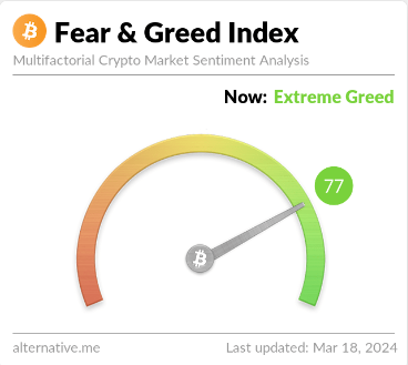
At present, the traders are holding a mentality of extreme greed, as the latest data of the Bitcoin Fear & Greed Index shows.

Bitcoin Fear & Greed Index

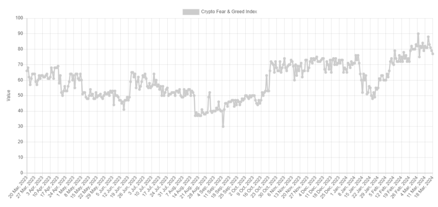
As is visible, the indicator’s value is 77 right now, meaning that while it’s indeed inside extreme greed, it’s only so just. This is a fresh change from how it has been recently, as the chart below displays.

Bitcoin Extreme Greed

From the graph, it’s visible that the Bitcoin Fear & Greed Index has mostly stayed deep inside the extreme greed region recently. On the 14th of this month, the indicator hit the 88 mark, and alongside this high, the BTC price registered its current all-time high of about $73,800.

Since this peak, though, the asset has plunged, and it appears that alongside it, so has the sentiment among the traders. As mentioned earlier, tops have been more likely to occur when the market has shared a mentality of extreme greed and this probability has generally only gone up the more extreme levels the metric has hit.

This could perhaps explain why the recent top occurred when it did. Another top this month, the one that took place on the 5th, also coincided with high values in the Fear & Greed Index (a peak of 90 this time).

Shortly after this earlier peak and the plummet in the cryptocurrency that had followed, the asset found its bottom as the metric briefly exited the extreme greed region.

As the Bitcoin Fear & Greed Index is once again looking to dip outside this territory, it’s possible that a bottom may be near for the price this time as well. It now remains to be seen if the sentiment would cool down enough in the coming days so as to leave the extreme region behind, at least temporarily.

BTC Price

Bitcoin had plunged towards $64,500 during the weekend, but it seems the coin has made some recovery in the past day as it’s now back at $68,000.

Bitcoin Price Chart

Bitcoin Plunge Below $27,000 Drives Investors Into Fear, Will Rebound Occur?

Data shows the Bitcoin drop below the $27,000 level has made most investors fearful for the first time this month.

Bitcoin Fear & Greed Index Is Pointing At “Fear” Right Now

The “fear and greed index” is an indicator that tells us about the general sentiment among investors in the Bitcoin and broader cryptocurrency market. Alternative created the metric, and according to the website, it’s based on these factors: volatility, trading volume, social media sentiment, market cap dominance, and Google Trends data.

The indicator uses a numeric scale from zero to hundred to represent the sentiment. When the index has a value greater than 54, it means that the average investor is greedy right now, while it being under 46 implies a fearful mentality is dominant.

The region between these two thresholds naturally signifies a neutral sentiment among the holders. Until today, the sector had been stuck inside this region since the last couple of days of September, as the investors had been split about the trajectory of Bitcoin.

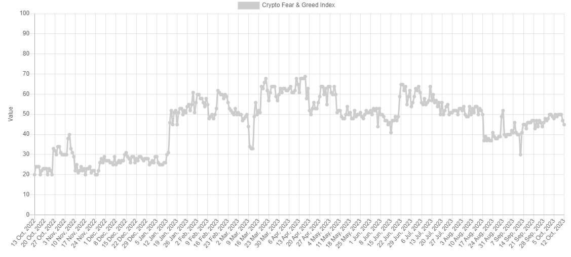
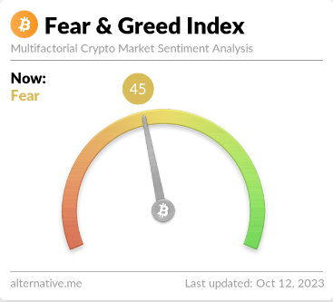
The chart below shows that the market sentiment has worsened with the latest drop in the cryptocurrency’s price below the $27,000 level.

Bitcoin Fear & Greed Index

After this latest drop in sentiment, the fear and greed index has hit a value of 45, meaning that investor sentiment has just entered the fear region.

Bitcoin Fear

Historically, the market has tended to move in a way that’s opposite to what the majority of the investors believe. The likelihood of such a contrary move happening increases as this imbalance in the sentiment rises.

While the holders are leaning towards one side (fear), the imbalance is small, as the fear and greed index is barely inside the territory. As such, the probability of a rebound would be pretty high right now (at least based on the sentiment).

Besides the core sentiments discussed before, there are also two special zones, called “extreme fear” (at or below values of 25) and “extreme greed” (at or above values of 75).

These regions are where the cryptocurrency has often turned around in the past. Naturally, bottoms have occurred in the former zone, while tops have formed in the latter area.

If the Bitcoin fear and greed index continues declining in the coming days and reaches values near the extreme fear region, a bounce could become a real possibility.

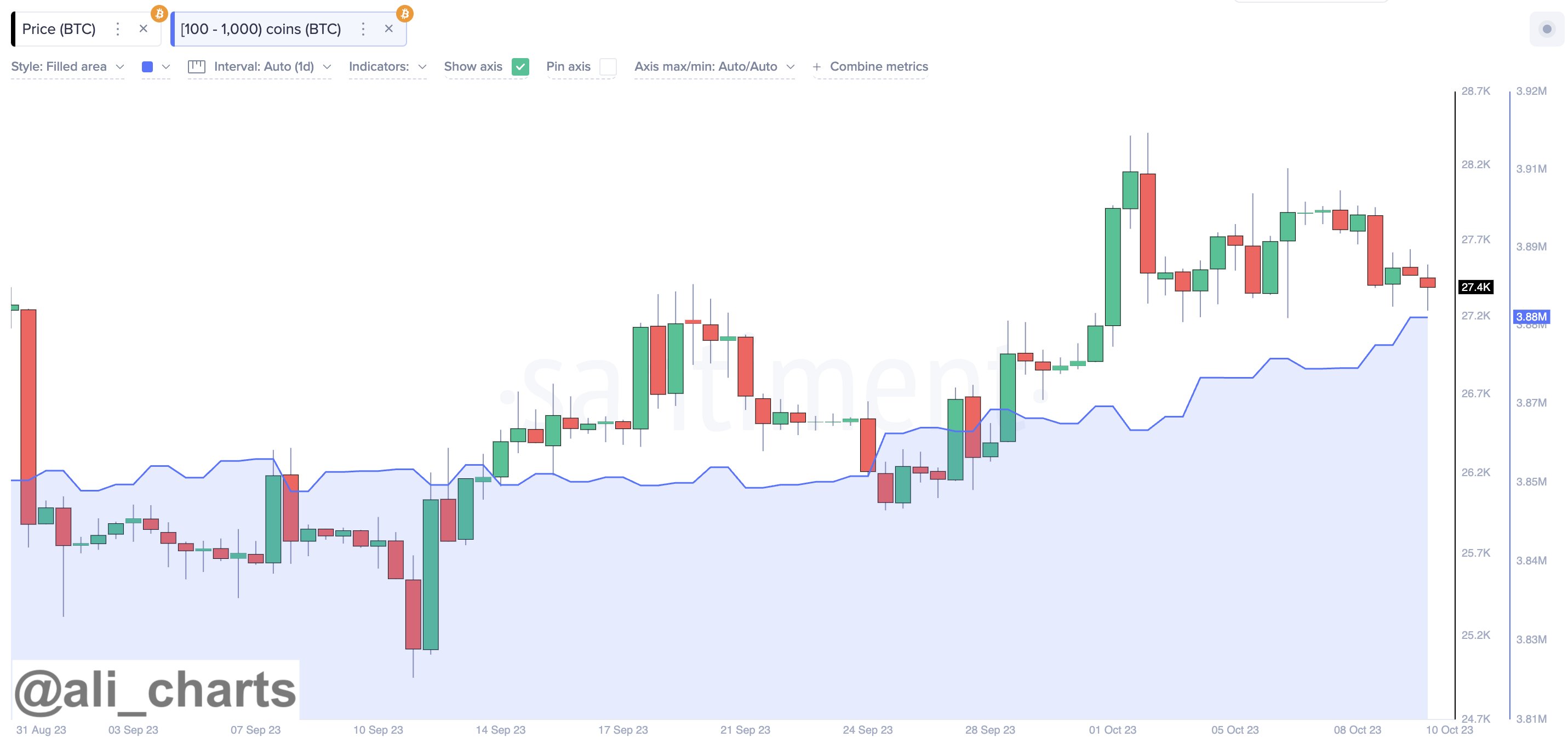
For now, one sign pointing to the chances of a rebound may be that the large investors have been buying recently, as an analyst on X pointed out.

Bitcoin Whales

Since the start of October, Bitcoin investors holding between 100 and 1,000 coins have purchased a combined 20,000 BTC worth around $533.6 million at the current exchange rate.

BTC Price

At the time of writing, Bitcoin is trading at around $26,700, down almost 5% in the past week.

Bitcoin Price Chart

Bitcoin Could Decline Further Before A Rebound, Here’s Why

The pattern of an on-chain metric may suggest that Bitcoin could see more downside ahead before a rebound is found.

Bitcoin STH SOPR Hasn’t Hit The Bottom Zone Yet

An analyst in a CryptoQuant Quicktake post explained that the BTC short-term holders are selling at a loss. The relevant indicator here is the “Spent Output Profit Ratio (SOPR),” which tells us whether the Bitcoin holders are selling their coins at a profit or a loss.

When the value of this indicator is greater than 1, it means that the average holder in the market is moving their coins at a profit. On the other hand, values below this threshold imply that loss-taking is the dominant force in the sector.

The SOPR being exactly equal to one naturally suggests that the market is just breaking even on its selling right now as the total amount of realized profits cancel out the losses.

The SOPR can also be defined for just a part of the market. In the context of the current discussion, the short-term holder (STH) group is of interest. These investors have been holding onto their coins since less than 155 days ago.

Now, here is a chart that shows the trend in the 30-day moving average (MA) Bitcoin SOPR over the past several years:

Bitcoin STH SOPR

As displayed in the above graph, the 30-day MA Bitcoin STH SOPR had been above one for most of the year 2023, but following the recent struggle in the asset’s price, the indicator has dipped below this mark.

Historically, the one indicator level has been a line of support for the cryptocurrency, as it has often found rebounds. For example, Bitcoin found bottoms at this mark during the slumps in both March and June.

With the recent drawdown, though, this support level has been breached, as the STHs are now selling their coins at a loss. Usually, whenever the metric dips below this level, it doesn’t come back above it quickly, as the line begins to act as resistance instead.

The Bitcoin STH SOPR has historically been able to find rebounds in the green box that the quant has highlighted in the chart. The indicator is still a notable distance above this bottoming zone.

If the BTC price will only find its rebound when the indicator dips inside this zone, then more decline could be ahead for the asset so that the STHs are pushed into capitulating at a deeper degree.

BTC Price In The Short Term

Bitcoin has continued its sideways struggle recently as the cryptocurrency has been unable to find a break in either direction. The asset’s price is floating around the $25,700 mark.

Bitcoin Price Chart

This Could Be The Metric To Watch For A Bitcoin Bounce: Santiment

On-chain data from Santiment suggests that the stablecoin whale supply could be the metric to watch for the likelihood of a Bitcoin bounce.

Whale Supply Of Stablecoins Could Hold Key To Bitcoin Rebound

In a recent post on X, the on-chain analytics firm Santiment discussed the percentage of the total stablecoin supply that the whales in the sector are holding right now.

The “whales” here refer to entities that are carrying at least $5 million worth of stablecoins in their addresses. Naturally, all stablecoins that are in circulation are included in this metric, regardless of their market caps.

“A tried and true method for predicting where crypto heads next is analyzing big wallets to see the ratio of stablecoins they hold,” explains the analytics firm.

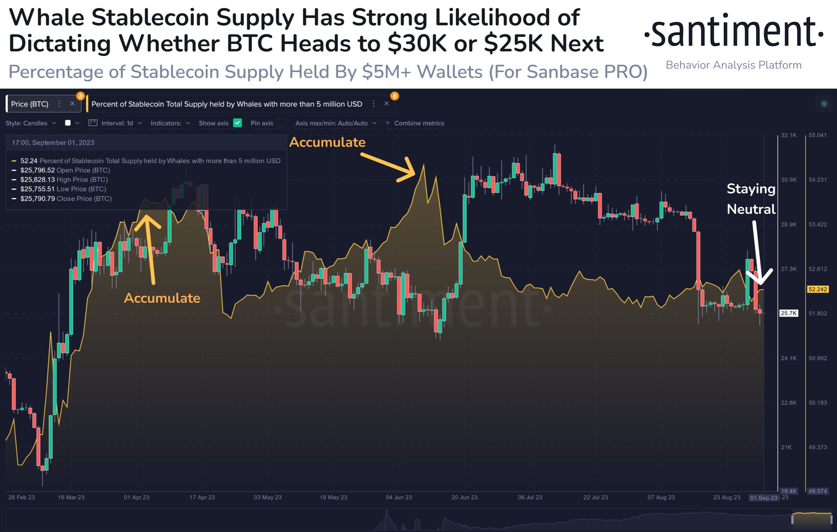
Here is a chart that displays the data for the holdings of these humongous investors:

Stablecoin Whale Supply

The reason that the stablecoin supply of this cohort may be relevant for the rest of the cryptocurrency sector is that it provides a look into the buying power available to these whales.

Generally, these holders use stables to store their capital away from the volatility of coins like Bitcoin, but once they feel that the time is right to jump back in, they deploy these fiat-tied tokens back into the other coins, providing a bullish boost to their prices.

This can be seen working in action in the chart as well. Back in May-June, these investors had been accumulating, and once their supply had hit a peak and they had started distributing instead, the Bitcoin price had observed a rally.

Given the close timing, it would seem likely that the whales had been shedding their stablecoin holdings in order to buy assets like BTC, thus acting as fuel for the uplift.

As displayed in the graph, the stablecoin holdings of the whales haven’t changed much recently, suggesting that these investors haven’t been taking part in either accumulation or distribution.

This could indicate that the whales don’t have any extraordinary buying capacity currently. An uplift in this indicator, however, would imply that the purchasing power of this cohort is going up, which could then lead towards a rebound for the rest of the market.

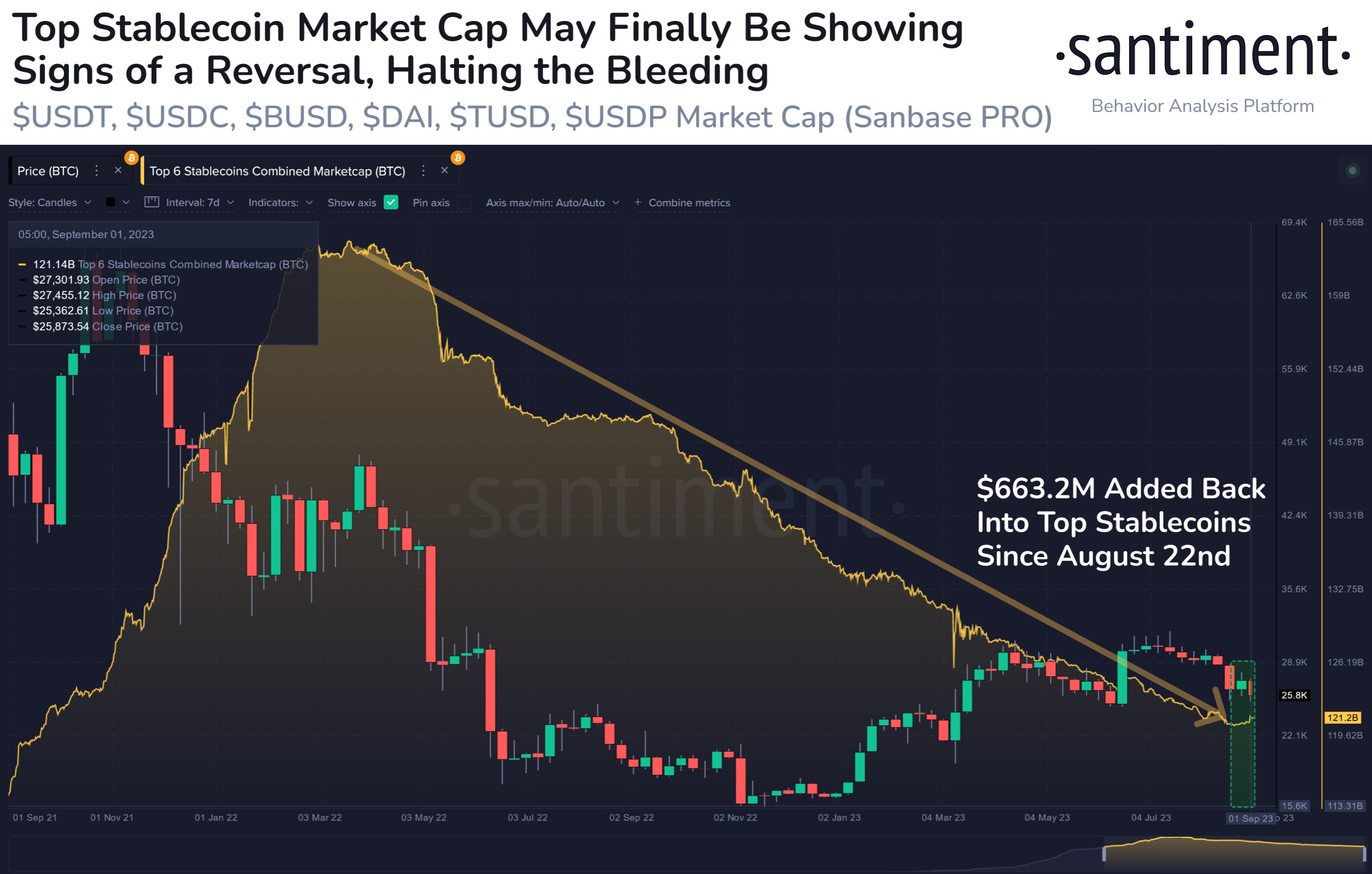
One positive sign forming in the market may be the fact that the market cap of the six largest stablecoins is slowly starting to turn around.

Stablecoins Market Cap

The combined market cap of these large stablecoins has been in a perpetual downtrend since early 2022, suggesting a constant drainage of capital from the sector. In the past couple of weeks, though, these fiat-tied assets have seen a combined growth of $663.2 million, which may be one of the early signs that a rebound could finally be taking place.

Such small rises in the metric have already been seen a few times during this downtrend, though, so this latest one might as well turn out to be a temporary deviation like those previous ones. If, however, this recent increase is indeed a sign that things are finally changing, then it would mean that the cryptocurrency sector is seeing some constructive growth at last.

BTC Price

Bitcoin hasn’t moved an inch in the last few days as the asset continues to move around the $25,900 level.

Bitcoin Price Chart

Bitcoin Bullish Signal: Exchange Netflow Remains Negative

On-chain data shows the Bitcoin exchange netflow has remained at negative values recently, which could play in the favor of the asset.

Exchanges Have Been Seeing Net Bitcoin Outflows Recently

An analyst in a CryptoQuant Quicktake post explained that investors have been withdrawing their coins from exchanges recently. The relevant indicator here is the “exchange netflow,” which measures the net amount of Bitcoin currently moving into or out of the wallets of all centralized exchanges. The metric’s value is calculated as the outflows subtracted from the inflows.

When this indicator’s value is positive, the inflows are more significant than the outflows right now; hence, a net number of coins is moving into these platforms.

As one of the main reasons holders may want to deposit their coins to exchanges is for selling-related purposes, such a trend can have bearish consequences for the cryptocurrency.

On the other hand, negative values suggest the holders are making net withdrawals currently. This kind of trend, when sustained, may be a sign that accumulation is going on in the market, which can naturally have bullish effects on the price in the long term.

Now, here is a chart that shows the trend in the Bitcoin exchange netflow over the last few months:

Bitcoin Exchange Netflow

As displayed in the above graph, the Bitcoin exchange’s netflow had been positive during the crash earlier in the month, implying that net deposits had occurred.

These inflows would have been from the investors taking part in the selloff and from those panic selling just after the selloff had occurred. This indicator tracks the combined data for both spot and derivative platforms, so a chunk of these inflows is bound to be coming from those looking to speculate on the futures market.

It wasn’t long, however, before the netflow turned negative, and the metric has since maintained in this region. This would suggest that the holders have continuously taken their coins off these central entities during the last few days.

As analyst James V. Straten has pointed out on X, many of these outflows have come from the Bybit platform alone.

Bitcoin Bybit Reserve

The total balance on the exchange has plunged as a massive $300 million outflow has occurred. These latest withdrawals are the largest the exchange has ever witnessed.

Bitcoin Surges After News Of Grayscale’s Success

Grayscale has found success in its lawsuit against the US Securities and Exchange Commission (SEC). The Bitcoin market has quickly reacted, as the cryptocurrency has shot up towards the $27,500 mark.

Bitcoin Price Chart

If the market-wide negative netflows that had been occurring were true because of buying taking place in the market, then this sharp rebound could have holding power, as it would mean that it has built up off a strong accumulation foundation.

Will Bitcoin Show A Repeat Of The March Rebound?

Will Bitcoin observe a repeat of the rebound that took place after the crash back in March? Here’s what this on-chain metric suggests.

Bitcoin Short-Term Holder SOPR Is Showing A Pattern Similar To March

As an analyst in a CryptoQuant post explained, if the BTC short-term holder SOPR crosses above 1 in the coming days, a rebound might occur. The “Spent Output Profit Ratio” (SOPR) here refers to an indicator that tells us whether the investors are selling their Bitcoin at a profit or a loss right now.

When the value of this metric is greater than 1, it means that the average holder is currently moving their coins at a profit. On the other hand, values under this threshold imply that loss-taking is the dominant behavior in the market.

The SOPR being precisely equal to one naturally suggests that the investors are just breaking-even on their selling currently, as the total amount of profits realized in the market is precisely canceling out the losses.

In the context of the current discussion, the SOPR for only a specific market segment is of interest. Namely, the short-term holder (STH) SOPR is the relevant metric.

Here is a chart that shows the trend in the 7-day simple moving average (SMA) Bitcoin STH SOPR over the past few months:

Bitcoin STH SOPR

The STH group includes investors who purchased their BTC less than 155 days ago. This cohort makes up one of the two main segments of the market, the other side being the “long-term holders” (LTHs).

As displayed in the graph, the 7-day Bitcoin STH SOPR had been floating around the neutral mark before the recent crash, but following it, the metric has plunged into the loss territory. This would suggest that the STHs have been panic-selling at a loss after they witnessed the cryptocurrency register a deep drawdown.

The chart shows that the crash back in March of this year also pushed the STHs into selling at a loss. The lowest value that the 7-day STH SOPR has seen in the current crash so far has been similar to what the March crash observed.

Historically, capitulation has allowed the asset to form bottoms, as in such events, the weak hands exit the market, and the more persistent investors may pick up their coins.

This effect seems to have worked in March, as the coin hit its bottom during the STHs’ capitulation. As the loss selling slowed down, Bitcoin rebounded in speculator fashion, as its price jumped below $20,000 to near the $30,000 mark.

Currently, the STHs’ loss selling is slowing down, as the metric’s value is gradually rising. The latest capitulation may have also allowed BTC to form a bottom this time. It remains to be seen whether that was the case, and if Bitcoin can show a rebound similar to back in March.

BTC Price

At the time of writing, Bitcoin is trading around $26,000, down 11% in the last week.

Bitcoin Price Chart

Will Bitcoin Rebound Anytime Soon? Here’s What On-Chain Data Says

Bitcoin has continued to struggle recently as its price is still in the low $29,000 level. Here’s what on-chain data says about if a rebound is likely or not.

What Does Bitcoin On-Chain Data Say About The Asset’s Near-Term Outlook?

Bitcoin has stagnated recently as the cryptocurrency’s price has failed to keep any significant moves going. Even the latest decline in the asset has been indecisive, as the price didn’t take long to fall back to a sideways movement. Under these conditions, it’s natural that investors may be wondering when the asset might break out of this consolidation.

Related Reading: Quant Explains How These Indicators Affect Ethereum Price

Recent on-chain data from Santiment sheds light on the underlying metrics related to the asset, which may contain hints about where the cryptocurrency’s price could be heading next.

First, here is a chart that shows the data for two of the Bitcoin indicators that are of interest here:

Bitcoin Active Addresses & Profit To Loss

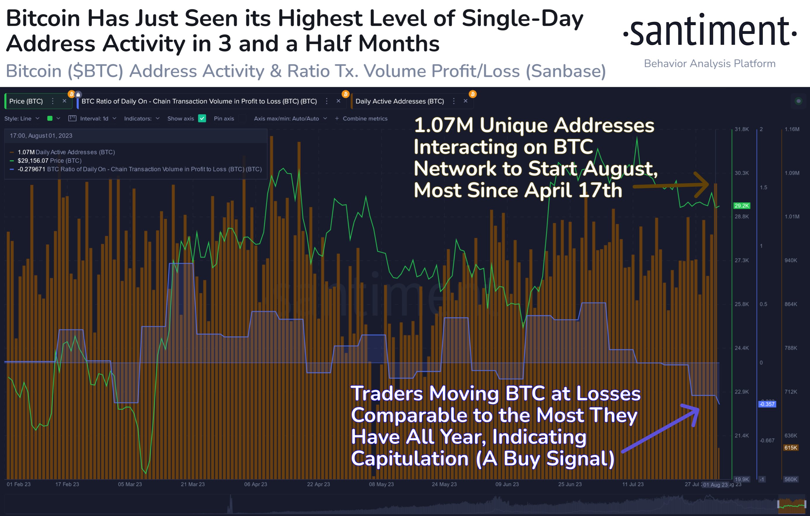
As you can see in the above graph, there are two indicators of relevance here: the “daily active addresses” and the “ratio of on-chain transaction volume in profit to loss.”

The former of these naturally keeps track of the total number of unique addresses on the Bitcoin blockchain that are taking part in some kind of transaction activity on the network.

From the chart, it’s visible that this metric has observed a large spike recently, suggesting that a high number of addresses have become active. Generally, a large number of addresses making transfers on the chain implies that a high amount of users are making use of the chain right now.

The current value of the metric suggests that more than a million addresses have been active recently, which is the highest that the indicator has been since the middle of April. Such an increase in utility suggests that there is a large amount of interest in the coin at the moment.

Now, the other metric here measures the difference between the profit-taking and loss-taking volumes on the Bitcoin network. As is visible in the graph, this indicator has a negative value currently, which means that the majority of the selling in the market is happening at some loss.

These negative levels of the metric are similar in scale to those observed back during the March plunge. Historically, bottoms in the price have become more probable to form when investors are capitulating like this, as the coins of the weak hands are picked up by the strong hands in such periods.

If a rebound move does arise from this capitulation, then its timing may be ideal, as a high amount of active addresses can mean the presence of a large number of traders who can help fuel the move.

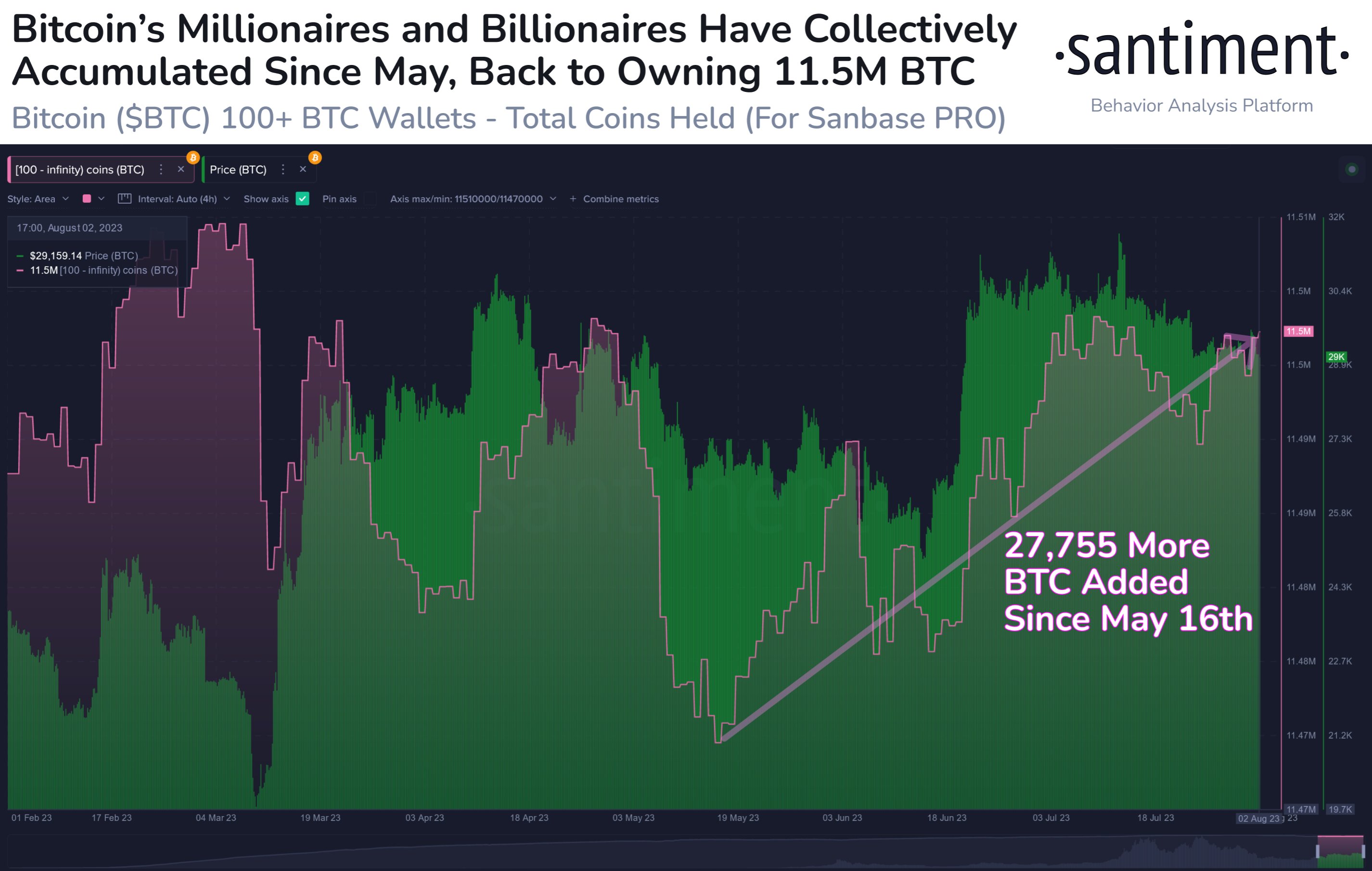
Additionally, the Bitcoin millionaire and billionaire addresses have also been behind the asset recently, as they have added 27,755 BTC to their holdings since May.

Bitcoin sharks & whales

Based on these factors, it’s not hard to believe that a rebound in the cryptocurrency’s price might take place in the near future, although it may only be a short-term move.

BTC Price

At the time of writing, Bitcoin is trading around $29,100, down 1% in the last week.

Bitcoin Price Chart

Bitcoin Rebounds From $27,100 After Spike In Bearish Sentiment

Data shows the Bitcoin sentiment had turned quite bearish just before the asset’s price had rebounded up from the $27,100 level.

Bitcoin Recovers Shortly After FUD Takes Over Market

According to data from the on-chain analytics firm Santiment, investors showed high levels of fear around the time of the local bottom during the past day. The relevant indicator here is the “social volume,” which measures the total number of social media text documents that mention a given topic like cryptocurrency or Bitcoin.

These social media text documents include a variety of sources, like Reddit, Twitter, Telegram, and other forums. The social volume only tracks how many such documents mention the term at least once. So this means that even if a post contains the keyword several times, its contribution to the social volume will still be only one unit.

The significance of the social volume is that it tells us about the amount of discussion that certain topics are getting from social media participants at the moment.

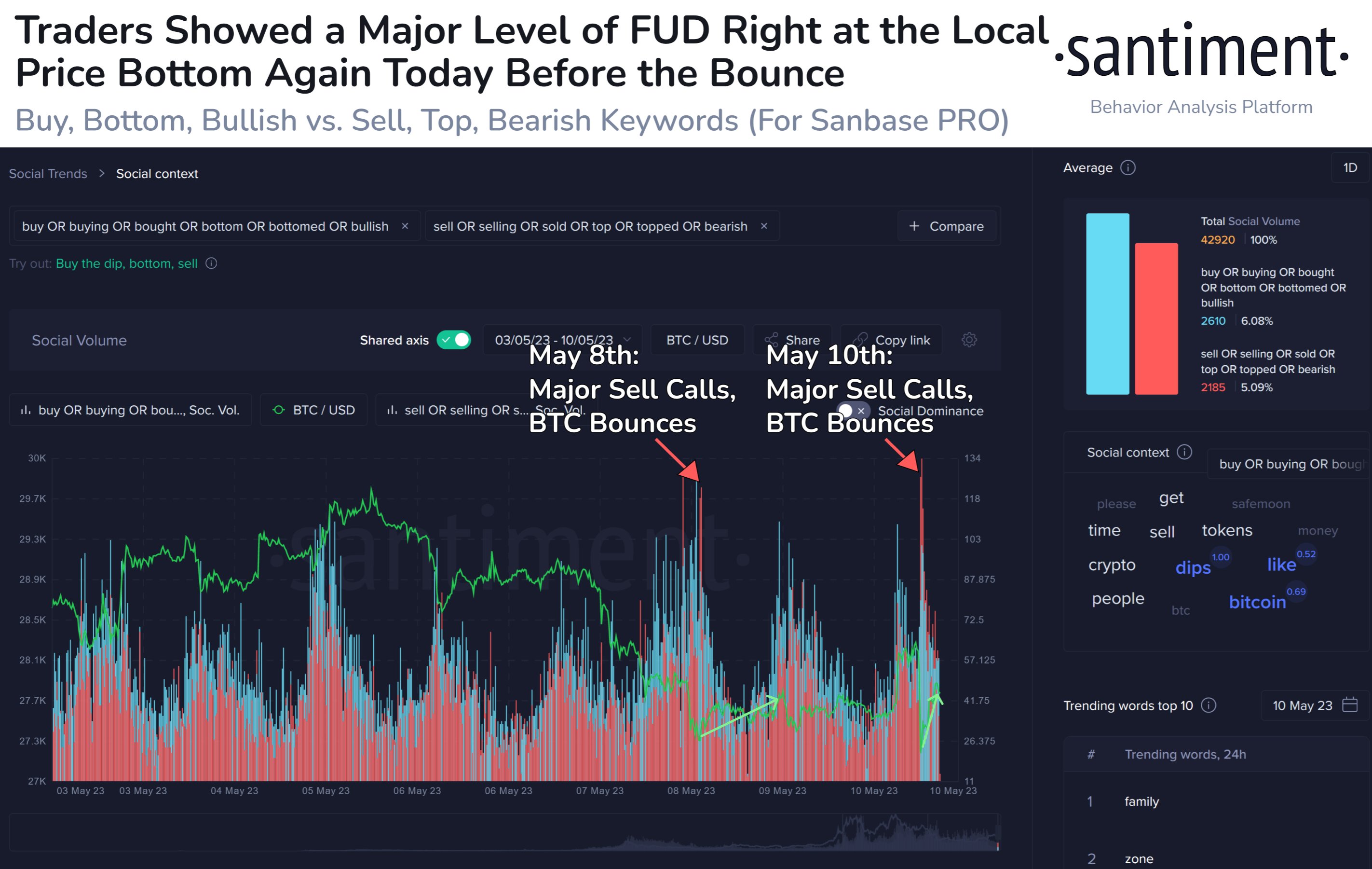
In the context of the current topic, social media is used to know the degree of the bearish and bullish sentiments in the market. Here is a chart that shows the trend in these social volumes for Bitcoin over the last week:

Bitcoin Social Volume

To separate the social volume for discussions that imply a bullish mentality, terms such as “buy, bottom, bullish” have been chosen, while keywords like “sell, top, bearish” are the ones selected for pinpointing a bearish sentiment.

As displayed in the above graph, the Bitcoin social volume for the bearish sentiment seems to have observed a large spike during the past day. This surge in the indicator had come after BTC had plunged from above $28,000 to around $27,100.

This suggests that the BTC investors had turned very fearful during this panic selloff. A similar level of bearish sentiment was also observed only a couple of days back, as the chart highlights.

The turn in market mentality back then had also come following a decline (this time from the $29,000 mark to the low $27,000 levels), and interestingly, it had coincided with the local bottom in the price.

The spike this time has also occurred simultaneously with the possible local bottom formation at $27,100, as the price of the cryptocurrency has recovered a little bit since then.

Historically, whenever the market has held an opinion too unbalanced in any particular direction, the price has tended to move opposite to this opinion of the masses. Because of this, in times when the market has seen large amounts of greed, a local top has generally become more probable.

Naturally, the same goes for local bottoms as well, since they have usually formed when FUD has taken over the minds of the investors. The recent spike appears to have been an example of this pattern, and so far, it looks like the latest bearish sentiment spike may also be the same.

BTC Price

At the time of writing, Bitcoin is trading around $27,500, down 5% in the last week.

Bitcoin Price Chart

Bitcoin Plunge Under $28,000 Only Temporary? This Metric Suggests So

Bitcoin has now plunged under the $28,000 level, but the data of an on-chain indicator may suggest that this drop could only be temporary.

Bitcoin Short-Term Holder SOPR Has Dropped Just Under The 1 Level

As pointed out by an analyst in a CryptoQuant post, the current values of the metric have generally served as ideal buying opportunities during rallies in the past.

The relevant indicator here is the “Spent Output Profit Ratio,” which tells us whether the average Bitcoin investor is selling their coins at a profit or at a loss right now.

When this indicator has a value greater than 1, it means the profits being realized in the market are currently greater than the losses. On the other hand, values below this threshold suggest a dominance of loss-taking from the holders.

The SOPR being exactly equal to 1 naturally corresponds to a neutral state, where the average holder is just breaking even on their investment, as profits are equal to losses here.

While the SOPR is generally defined for the entire Bitcoin market, it can also be applied to specific segments of the market. In the context of the current discussion, the “short-term holder” (STH) segment is of interest.

The STHs make up a cohort that includes all investors who have been holding onto their coins since less than 155 days ago. The STHs who manage to hold beyond this threshold enter into the “long-term holder” (LTH) group.

Now, here is a chart that shows the trend in the Bitcoin STH SOPR over the last few years:

Bitcoin STH SOPR

As displayed in the above graph, the Bitcoin STH SOPR was below the 1 mark during last year’s bear market, suggesting that the average STH had been selling at a loss in this period.

This is the typical behavior observed in bearish periods, as the constant price decline makes investors panic and sell at losses. An interesting pattern that is seen during such periods is that the line where SOPR attains a value of 1 starts providing resistance to the asset.

The reason this happens is that at this level, the STHs are selling at the price they bought in. During bear markets, they usually go into losses, so whenever they find the opportunity to sell to recoup their original investment, they jump right on it. This is why the level provides resistance and forces the indicator to stay under it.

The opposite behavior is seen in price rallies, however, as holders start looking at the break-even level as a profitable entry point, which leads to a large amount of buying taking place at the level. This assures that the indicator quickly returns above the 1 level if it falls below it.

From the chart, it’s visible that the rally this year has also seen a similar trend so far, as the Bitcoin STH SOPR has maintained above 1 (besides a temporary drop in March, which ended up resulting in a sharp surge in the price).

In the last few days, the indicator has again plunged to this level of much historical significance as the price has slipped under $28,000. If the past pattern is anything to go by, a rebound could become more probable for the BTC price here.

BTC Price

At the time of writing, Bitcoin is trading around $27,600, down 1% in the last week.

Bitcoin Price Chart