This Bitcoin Metric Foreshadowed Recent Price Drops, Quant Reveals

A quant has pointed out how a Bitcoin metric may have detected selling pressure in the market, and therefore, the subsequent price drops, in advance.

Bitcoin CDD Registered Spikes Before Recent Price Plunges

In a new post on X, an analyst has discussed about how the Coin Days Destroyed (CDD) on-chain indicator may be used to identify selling pressure in the market early.

A “coin day” refers to the quantity that 1 BTC accumulates after staying still on the blockchain for 1 day. When a token stays dormant for a while, it naturally accumulates some number of coin days, and once it’s finally transferred on the network, its coin days counter resets back to zero.

The coin days that this token had been carrying prior to this movement are said to be “destroyed” by the transaction. The CDD keeps track of the total number of such days being reset across the network on any given day.

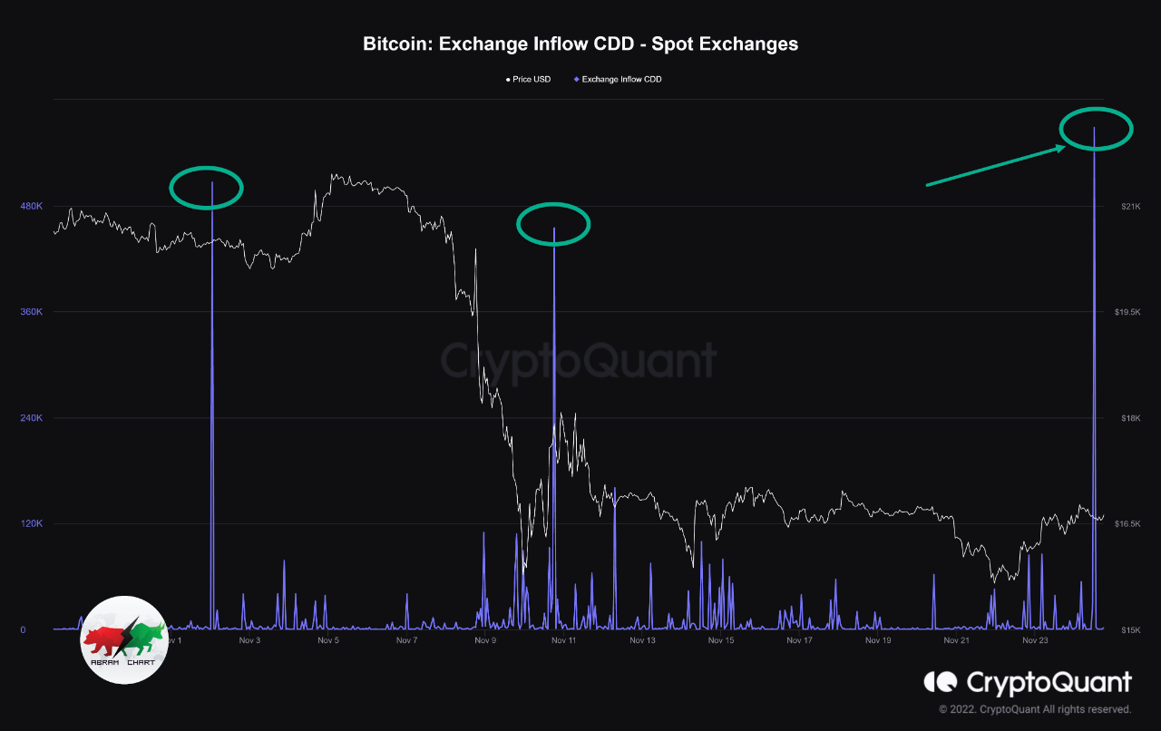
Now, here is a chart that shows the trend in the CDD for Bitcoin over the last couple of months:

Bitcoin CDD

As displayed in the above graph, the Bitcoin CDD observed a large spike just a few days ago. Whenever this metric’s value shoots up, it means that a large amount of coins previously dormant are now on the move.

Such transfers are generally correlated with the long-term holder whales, who are large entities who carry their coins for significant periods, and thus, accumulate a large number of coin days.

Often, when these dormant entities finally break their silence, it’s for selling-related purposes. As such, spikes in the CDD can be an indication that the HODLer whales have decided to do some selling.

In the chart, the quant has highlighted the major spikes that the indicator observed during the last two months. It would appear that following the onset of such spikes, the asset’s price has generally gone on to witness some bearish action.

The aforementioned spike from a few days ago, too, has proven to be bearish for the asset so far as it occurred when Bitcoin had recovered towards $67,000, and the price has since erased this recovery. It would appear that some of these diamond hands had looked at this surge as an exit opportunity.

Last month, the CDD had seen two spikes even larger than this recent one. These spikes had occurred near what continues to be the top for the rally so far. Thus, the selling pressure from HODLers may have played a role in this top and the subsequent drawdown that followed.

Given the relationship that this metric has appeared to have held with the Bitcoin price, it may be worth keeping an eye on it, as it may continue to indicate the onset of selling pressure in the near future as well.

BTC Price

Bitcoin has continued its bearish trajectory during the past day as it has now slipped towards the $62,300 level.

Bitcoin Price Chart

Bitcoin Miners Always Sell Into Halvings, Is This Time Any Different?

On-chain data shows Bitcoin miners have always sold as Halvings have occurred. With the next one just around the corner, how are miners behaving this time?

Next Bitcoin Halving Is Less Than Two Days Away Now

In a CryptoQuant Quicktake post, an analyst discussed Bitcoin miners’ behavior in the build-up to the next Halving.

The “Halving” is a periodic event on the Bitcoin network where the cryptocurrency’s block rewards (the compensation miners receive for solving blocks) are permanently slashed in half.

This event occurs approximately every four years, and according to NiceHash’s countdown, the next one will occur in just over 32 hours.

Bitcoin Halving

Bitcoin miners earn revenue from two sources: transaction fees and block rewards. Historically, the former has been quite low on the BTC network, so the miners primarily depend on the latter to pay off their running costs.

Since the block rewards are cut in half during Halvings, these events naturally deal a significant blow to the miner’s revenues. As such, it’s not surprising that the miners have generally shown a reaction to the event in the past cycles.

“One of the common dynamics that occur in every cycle of cutting the issuance of new BTC is the significant selling pressure exerted by miners,” says the quant. One way to gauge the degree of selling pressure coming from these chain validators is via the Miner to Exchange Flow metric.

This indicator tracks the total amount of Bitcoin moving from miner-associated addresses to wallets connected to centralized exchanges. As miners usually deposit Bitcoin to these platforms for selling, this flow can provide hints about their selling behavior.

Now, here is a chart that shows the trend in the 30-day moving average (MA) BTC Miner to Exchange Flow over the last few years:

Bitcoin Miner to Exchange Flow

As displayed in the above graph, the 30-day MA Bitcoin Miner to Exchange Flow had surged to high levels in the 2020 Halving event, implying that this group had potentially been participating in a selloff.

This selling push may have come from the miners planning to exit, given the sharp revenue reduction that was set to occur. The graph, though, clearly shows that no such selling pressure has emerged this time around despite the event being just around the corner.

So, what’s going on here? The analyst suggests that the Bitcoin miners may have already completed the latest round of selling in advance (as the exchange inflows from the cohort did spike in February). If this is true, the quant thinks this could benefit the market in the short term.

BTC Price

Bitcoin has continued to move sideways inside a range recently, as its price is still trading around $63,500.

Bitcoin Price Chart

Bitcoin Whales Showing Different Behavior From Past Cycles, But Why?

On-chain data suggests the Bitcoin whales have been showing different behavior regarding exchange inflows from the last cycle. Here’s why this may be so.

Bitcoin Whales Are Showing Different Behavior In Exchange Inflows This Time

As an analyst explained in a CryptoQuant Quicktake post, the BTC whales’ movements have been different this time compared to the previous cycle.

The indicator of interest here is the “exchange inflow,” which tracks the total amount of Bitcoin being transferred to wallets attached to all centralized exchanges. In the context of the current discussion, derivative platforms are specifically of interest.

When this metric’s value is high, it means that investors are depositing large amounts on these exchanges. Such a trend usually suggests a high demand for the services these derivative exchanges provide.

Generally, extraordinary spikes in the indicator are associated with whale movements, given that only these humongous holders can cause such large shifts.

On the other hand, when the metric has a low value, it suggests that the whales aren’t depositing anything significant to these platforms, a possible sign that they don’t want to take risks on the derivative side.

Now, here is the chart shared by the quant, which shows the data for the Bitcoin exchange inflow for derivative exchanges:

Bitcoin Exchange Inflow

The indicator in the above graph also has another condition attached: it only tracks the inflows coming from the whales that had been holding for at least 1 month and at most 3 months.

These would be the newbie whales in the market, but not quite so new that they have only bought (those with a holding time of less than 1 month). Restricting this time range also excludes the data of the traders who make a high amount of moves in short timeframes on average.

As the analyst has highlighted in the chart, the whales in this group have usually made large inflows to derivative platforms around notable cryptocurrency tops and bottoms, when speculation is at its height.

Interestingly, though, the cryptocurrency has witnessed no such large inflow spikes this year even though the asset has broken past the previous all-time high (ATH).

One explanation may be that the whales are not interested in making any real moves right now. However, a more likely reason may be that spot exchange-traded funds (ETFs) exist now.

The spot ETFs hold Bitcoin on behalf of their customers and let them gain indirect exposure to the cryptocurrency in a way familiar to conventional investors.

The ETFs have brought significant demand into the asset and have quickly become an important part of the market. It’s possible that, with this new investment vehicle, the usual cryptocurrency exchanges no longer have the same relevance for the asset.

This could be why the pattern that held during the previous BTC cycle has seemingly disappeared from the current one.

BTC Price

At the time of writing, Bitcoin is trading at around $66,100, down more than 8% over the past week.

Bitcoin Price Chart

Bitcoin Short-Term Holders Capitulate: $5.2 Billion Sold At Loss

On-chain data shows the recent Bitcoin drawdown has shaken up the short-term holders, leading them to make large exchange deposits at a loss.

Bitcoin Short-Term Holders Have Transferred Huge Volume In Loss To Exchanges

As analyst James Van Straten pointed out in a post on X, the BTC short-term holders have recently participated in a large amount of loss-taking. The “short-term holders” (STHs) are the Bitcoin investors who bought their coins within the past 155 days.

The STHs make up one of the two main divisions of the BTC market, which is done on the basis of holding time, with the other cohort being known as the long-term holders (LTHs).

Statistically, the longer an investor holds onto their coins, the less likely they become to sell them at any point. As such, the STHs would reflect the weak-minded side of the market, while the LTHs would be the persistent diamond hands.

Given their fickle nature, the STHs usually easily react whenever a notable sector change occurs, like a price rally or crash. Recently, BTC has registered a significant drawdown, so these investors would likely have made some moves.

Indeed, on-chain data would confirm this. Below is a Glassnode chart shared by Straten, which reveals the trend in the transfer volume in loss (in USD) going from the wallets of the STHs to centralized exchanges.

Bitcoin STH Capitulation

As displayed in the above graph, Bitcoin short-term holders have recently deposited a large number of tokens holding a loss into exchange-affiliated wallets.

Exchange inflows usually suggest demand for using the services these platforms provide, which can include selling. As these latest deposits from the STHs have come following a sharp drop in the price, it would appear possible that the panic-sellers indeed made these inflows.

As the Bitcoin price is currently near the all-time high (ATH), most of the STH group would be holding a profit. So, all this loss volume can only come from those who bought at the recent highs.

This isn’t the first time the market has observed such quick capitulation from FOMO buyers this year. The chart shows that the exchange transfer volume in loss from the STHs also spiked very high during the plunge that followed the latest price ATH.

The spike back then was even greater in scale than the one witnessed recently and suggested the shakeout of the holders who the news of the ATH had driven in.

In the latest capitulation event, the Bitcoin STHs have deposited $5.2 billion worth of underwater coins to the exchanges within a two-day window.

BTC Price

Since the plunge a few days ago, Bitcoin has been unable to find any significant upward momentum, as its price has only been able to recover to $66,500.

Bitcoin Price Chart

What’s A Simple Strategy For Buying & Selling Bitcoin? This Analyst Answers

An analyst has revealed a simple strategy for buying and selling Bitcoin using the historical pattern followed by two BTC on-chain indicators.

These Bitcoin On-Chain Indicators Have Followed A Specific Pattern Historically

In a post on X, CryptoQuant author Axel Adler Jr. discussed a simple strategy for timing buying and selling moves for Bitcoin. The strategy is based on the trend witnessed historically in two BTC on-chain metrics: the Net Unrealized Loss (NUL) and Net Unrealized Profit (NUP).

As their names suggest, these indicators keep track of the total amount of unrealized loss and unrealized profit that the investors are currently carrying.

These metrics work by going through the transaction history of each coin in circulation to see what price it was last transacted at. Assuming that the last transfer of each coin was the last time it changed hands, the price at its instant would act as its current cost basis.

If the previous price for any coin was less than the current spot price of the cryptocurrency, then that coin is currently carrying a profit. The NUP subtracts the two to calculate the exact unrealized gain for the coin.

Similarly, the NUL does the same for coins that have their cost basis above the latest value of the asset. These indicators then sum up this value for the entire supply and divide the sum by the current market cap.

Now, first, here is a chart shared by the analyst for the NUL that reveals a pattern that the metric has been following throughout the history of Bitcoin:

Bitcoin NUL

The Bitcoin NUL appears to have historically broken above the 0.5 level when the asset’s price has traded around bear market lows. According to Axel, the indicator in this territory would be the moment to buy more.

Recently, the metric has been floating around the zero mark, meaning that there has been any unrealized loss being held by the investors. This makes sense, as the cryptocurrency has set new all-time highs (ATHs). Naturally, 100% of the supply goes into profit when an ATH is set.

Similar to the pattern in the NUL, the NUP has been above the 0.7 level during major tops in the past, suggesting that it may be a good opportunity to sell when the indicator is in this zone.

Bitcoin NUP

As is visible in the chart, the NUP has been marching up with the recent rally in Bitcoin. Still, so far, the indicator hasn’t broken above the seemingly important 0.7 level, implying that the market may not yet be in an overheated place where selling would be ideal, at least according to this strategy.

The graphs of the two indicators, though, show that neither of them flagged the exact tops or bottoms in the asset. It’s especially prominent in the data of the NUP, where the metric signaled “sell” during tops that were merely halfway through the bull run.

That said, buying during the points flagged by the NUL and then selling at the overheated NUP values would have historically been profitable. In that sense, this would indeed be a “simple” strategy for the asset.

It remains to be seen, though, whether these patterns will continue to hold in the current Bitcoin cycle as well.

BTC Price

At the time of writing, Bitcoin is trading at around $69,400, down 2% over the past 24 hours.

Bitcoin Price Chart

Bitcoin Traders Capitulate: Here’s What Happened Last 2 Times

On-chain data shows the Bitcoin investors have been capitulating recently, a sign that FUD has been gripping the market.

Bitcoin Total Amount Of Holders Has Seen A Drop Recently

According to data from the on-chain analytics firm Santiment, the Bitcoin Total Amount of Holders has registered a notable decline recently. The “Total Amount of Holders” here is an indicator that measures the total number of addresses on the BTC blockchain that are carrying some non-zero balance right now.

When the value of this metric trends up, it can mean that fresh hands are potentially investing into the cryptocurrency, opening new addresses and adding coins to them.

The indicator would naturally also increase if any investors who had left the asset before are returning back to it and filling up their wallets again. Another possible reason for the trend can also be due to holders breaking up their holdings into multiple wallets, for purposes like privacy.

In general, though, an increase in the Total Amount of Holders is usually a sign that net adoption of the coin is taking place, which can be a bullish sign in the long term.

On the other hand, a decline in the indicator can signal that some investors have decided to leave the cryptocurrency behind, as they have completely liquidated their holdings.

Now, here is a chart that shows the trend in the Bitcoin Total Amount of Holders over the past few months:

Bitcoin Total Amount of Holders

As displayed in the above graph, the Bitcoin Total Amount of Holders has suffered a decrease during the past 10 days or so. In all, 311,000 addresses have completely emptied themselves inside this window.

“To a novice trader, this may appear to be a concern with less overall active participants. However, historically this stat has reflected FUD moments in the market, indicating small BTC wallets are typically capitulating as large wallets scoop up their coins,” explains Santiment.

From the chart, it’s visible that there have also been two other instances of mass capitulation within the past few months. More specifically, 1.1 million addresses exited between the 23rd of September and 23rd of October, while 757,000 capitulated between the 21st of January and 13th of February.

Interestingly, during these capitulation events, the price went up 28% and 24%, respectively. So far since the latest selloff from the small hands has started, the cryptocurrency is down about 3%.

“If history is any indication, Bitcoin has a strong chance of putting up positive returns before this exodus of non-0 wallets this round (due to traders thinking the top is in) finally stops,” notes the analytics firm.

BTC Price

Since Bitcoin’s low at $60,600, the asset has enjoyed some sharp recovery as its price has now surged to the $66,800 level.

Bitcoin Price Chart

Prepare For Impact: US Government Will Dump $130 Million Worth Of Bitcoin

The US government has revealed its plans to offload a significant portion of its Bitcoin (BTC) holdings. This move has raised concerns in the crypto community, considering how much selling pressure this could add to what the crypto market is already facing.  

US Government To Sell $130 Million Worth Of Bitcoin

The Department of Justice (DOJ) gave notice of its intent to dispose of over $130 million worth of Bitcoin. These crypto assets form part of what had been forfeited to the government in its case against Joseph Farace. The DOJ specifically noted that it had seized almost 2875 BTC from Farace and Sean Bridges and an additional 58.7 BTC from Farace alone. 

Farace, also known as the Xanaxman, had ties to the Silk Road as he pled guilty to manufacturing and distributing alprazolam on the dark web marketplace. The Bitcoin confiscated from him forms a portion of the over 69,369 BTC, which the US government is believed to have recovered as proceeds from Silk Road. 

Related Reading: Bitcoin Whales Go On Buying Spree As Price Dips, Here’s How Much They Bought

A sale of such magnitude is concerning as it could have a notable impact on Bitcoin’s price and the broader crypto market. Moreover, it comes at a time when the market is already under significant selling pressure from whales like Grayscale, Celsius, and FTX. However, it is worth noting that this proposed sale by the government might not happen anytime soon. 

In the notice, the DOJ also announced that any other person aside from the defendant claiming an interest in the forfeited property had 60 days to come forward with its claims. As such, it is more than likely that the sale will not occur until the expiration of the 60-day period, which doesn’t lapse until sometime in March. 

Bitcoin price chart from Tradingview.com

Selling Pressure Might Soon Cool Off

The daily outflows that Grayscale’s GBTC has faced recently suggest that the Bitcoin selling pressure might soon cool off. The Spot Bitcoin ETF has seen lower outflows since Bloomberg analyst James Seyffart reported that the fund saw $640 million flow out on January 22, its largest yet. 

Since then, GBTC is said to have seen outflows of $515 million, $429 million, and $394 million on January 23, 24, and 25, respectively. If this turns out to be a trend, then the investment fund is expected to stop bleeding soon enough. That also spells good news for the crypto market as Grayscale will cool off on offloading large sums of Bitcoin daily. 

At the time of writing, Bitcoin is trading just a little above $40,000, up in the last 24 hours, according to data from CoinMarketCap. 

$130M Silk Road Bitcoin Stash To Be Sold By US Government

Since mid-January Bitcoin (BTC) has been facing mounting selling pressure from various market players. This includes asset manager Grayscale, bankrupt crypto exchange FTX, and now, the US government, which is set to auction off a substantial amount of Bitcoin seized from the infamous dark web marketplace Silk Road.

Sale Of Confiscated Silk Road Bitcoin

The US government has filed a notice to sell approximately $130 million worth of Bitcoin confiscated from Silk Road. The filing states that the United States intends to dispose of the forfeited property as directed by the United States Attorney General.

Individuals or entities, except for the defendants in the case, claiming an interest in the forfeited property must file an ancillary petition within 60 days of the initial publication of the notice. 

Once all ancillary petitions have been addressed or the filing period has expired, the United States will obtain clear title to the property, enabling them to warrant good title to subsequent purchasers or transferees.

The ongoing selling pressure on BTC has resulted in a sharp 20% correction over the past 10 days. This trend is expected to continue and further amplify the selling pressure. Adding to the situation, asset manager Grayscale, while slowing down its selling activities, continues to transfer a significant amount of Bitcoin to Coinbase. 

Bitcoin

According to data from Arkham Intelligence, Grayscale recently sent an additional 10,000 BTC worth $400 million to Coinbase. 

Since the approval of the Bitcoin spot exchange-traded fund (ETF), Grayscale has deposited a total of 103,134 BTC ($4.23 billion) to Coinbase Prime. Currently, Grayscale holds 510,682 BTC ($20.43 billion).

Ideal Buying Opportunities? 

Adam Cochran, a prominent market expert, has provided insights into the recent price action and the expectations of Bitcoin buyers. Cochran highlights that aggregate open interest (OI) for BTC has decreased by 17% from recent highs but remains around 20% higher than the averages observed during more stable market ranges. 

Cochran notes that the market has seen attempts to catch falling prices, suggesting a mix of “sophisticated” and leveraged buyers.

Cochran further observes that retail investors are driven by narratives surrounding the ETF and halving events, leading them to buy dips on leverage. However, many investors remain unconvinced about the market’s direction and are waiting for a clear entry point, according to Cochran’s analysis. 

Notably, Cochran highlights that the current funding rates do not indicate a bearish sentiment, even in options trading, suggesting an expectation of a bottom formation shortly.

The market’s dynamics are influenced by emotions and probabilities, and Cochran believes that too many participants are overexposing themselves emotionally by trying to catch the bottom of the market on each dip. 

This behavior has increased the likelihood that the recent price action may not mark the bottom yet. Cochran suggests that a sentiment reset, a decline in the 3-month annualized basis by around 25%, and a further decrease in open interest would provide a healthier environment for major plays in the market.

Ultimately, Cochran emphasizes the need for a reset in expectations, highlighting that a period of doom and despair is necessary for market participants to reassess their positions. 

Cochran points out that a range between $35,000 and $37,000 BTC could be a suitable level for larger spot buys in the longer term. However, Cochran also notes that a potential drop to the $28,000 to $32,000 range could provide ideal conditions for confident, leveraged deployment.

Bitcoin

Currently, BTC is trading at $39,800, up a slight 0.6% in the past 24 hours, but down over 14% in the past fourteen days.

Featured image from Shutterstock, chart from TradingView.com

Sell The News: Bitcoin Short-Term Holders Participate In $2 Billion Selloff

On-chain data shows that Bitcoin short-term holders have deposited $2 billion in BTC to exchanges, the fourth largest amount in the last two years.

Bitcoin Short-Term Holder Exchange Inflows Have Spiked Up

As analyst James V. Straten explained in a new post on X, the BTC short-term holders have potentially participated in a very sizeable selloff recently. The “short-term holders” (STHs) are the Bitcoin investors who bought their coins within the last 155 days.

The STHs comprise one of the two main divisions of the BTC market based on holding time; the other segment is called the “long-term holder” (LTH) cohort and includes the holders who mature past the 155-day cutoff.

Statistically, the probability that a holder would sell or move their coins on the blockchain drops the longer they keep them dormant. As such, the STHs are more likely to participate in selling at any point than the LTHs.

This behavior of the STHs is usually especially apparent whenever the cryptocurrency observes a sharp rally or crash, as these fickle-minded investors can’t help but fall prey to the FOMO or FUD of the situation.

One way to track whether the STHs are selling or not is through their exchange inflows. Investors may deposit to these central entities when they want to sell, so the volume going to these platforms can naturally provide some measure of the degree of selling pressure the holders are currently exerting.

Now, here is a chart that shows the trend in the Bitcoin STH transfer volume going towards exchanges (in USD) over the past couple of years:

Bitcoin STH Exchange Inflows

As displayed in the above graph, the Bitcoin volume going from the wallets held by the STHs toward the exchanges has registered a spike recently. “Yesterday, over $2B worth of Bitcoin got sent to exchanges from STHs,” notes Straten.

From the chart, it’s apparent that during the last couple of years, there have only been three instances where the market saw these weak hands transfer more significant amounts to these platforms.

According to the analyst, $1.3 billion of the total $2 billion inflow volume from the STHs involved coins carrying some profits. While the rest, $750 million, moved at a loss.

If these inflows were indeed for selling, it would appear that both types of sellers were in the market during the spike: those capitulating at a loss and those harvesting their profits. Straten remarks that the profitability ratio of this inflow volume is a bit suspicious, as the asset mostly moved flat or negative during this period.

This potential selloff from the STHs has come as the Bitcoin spot ETF is not far from being decided by the US SEC. The commission’s X account was also compromised earlier, and someone posted a fake approval announcement using it, to which the market reacted strongly.

Given the timing of the inflows, it would appear that the BTC STHs expect the event to be a sell-the-news type of deal, so once the decision is made, more inflows could follow.

BTC Price

At the time of writing, Bitcoin is trading at around $45,200, up more than 4% in the past week.

Bitcoin Price Chart

Bitcoin Rushes To Exchanges, But This Sign Remains Positive For The Bulls

On-chain data shows an increasing trend of Bitcoin moving to exchanges, a typical bearish sign, but another signal still remains optimistic for the bulls.

Bitcoin Exchange Inflows Are Up, But So Are USDT Deposits

According to data from the on-chain analytics firm Santiment, BTC has been flowing into exchanges recently. The relevant indicator here is the “supply on exchanges,” which keeps track of the percentage of a cryptocurrency’s total circulating supply that’s currently sitting in the wallets of all centralized exchanges.

When the value of this metric goes up, it means that the investors are making net deposits of the asset into these platforms, while a decline implies outflows are taking place.

What effect either of these trends might have on the market depends on the type of cryptocurrency in question. Santiment has shared the below chart, which shows how the supply on exchanges has recently changed for four assets: Bitcoin, Ethereum (ETH), Tether (USDT), and USD Coin (USDC).

Bitcoin Supply On Exchanges

As displayed in the above graph, the Bitcoin and Ethereum exchange supplies had both been on the decline earlier, but recently, BTC has diverged from this downtrend and registered some net deposits.

These deposits first started after BTC finished its rally to $44,000 and took to sideways movement. Generally, one of the main reasons why holders might deposit their coins to exchanges is for selling purposes, so these recent inflows can be a sign that selling has been taking place.

The uptrend in the supply on exchanges also became a bit sharper in the leadup to the asset’s latest plunge, suggesting that the inflows have indeed been adding to the selling pressure.

From the chart, it’s also visible that the Bitcoin supply on exchanges hasn’t yet reversed its trend, a potential indication that selling hasn’t completely exhausted yet.

Meanwhile, Ethereum has continued to see supply exit these central entities, implying that investors of the cryptocurrency are possibly still participating in net accumulation.

Something that could prove to be positive for BTC, though, is the fact that the Tether supply on exchanges has risen since the plunge. Investors usually make use of stablecoins like USDT and USDC whenever they want to escape the volatility associated with coins like BTC and ETH, but such investors generally only do this as a temporary measure.

When the holders plan to leave the cryptocurrency sector as a whole, they do so through fiat instead. Opting for stablecoins instead, thus, means that they intend to stay in the market and possibly eventually return back towards the volatile side.

Sizeable swaps from stables into Bitcoin and others can naturally provide a buying boost to their prices, so exchange inflows of them can be a bullish sign for these volatile assets.

The most bullish combination is when BTC rallies while the USDT exchange supply does the same, as such a trend suggests that fresh capital is entering into the sector.

In the current case, the Tether exchange supply has gone up at the expense of BTC’s price, so only a rotation of capital has occurred. Nonetheless, the fact that not all capital has exited the sector as a whole can still be an optimistic sign for the rally’s return.

BTC Price

Bitcoin had plunged towards $40,000 yesterday, but the coin has already made some swift recovery as it’s now trading around the $41,700 level.

Bitcoin Price Chart

Bitcoin Whales Ramp Up Selling, BTC To Decline Below $32,000?

On-chain data shows the Bitcoin whales have potentially ramped up their selling recently, something that could lead to a drawdown for the asset.

Bitcoin Exchange Whale Ratio Has Spiked Recently

As explained by an analyst in a CryptoQuant Quicktake post, the price of Bitcoin could correct towards the $31,000 to $32,000 range from the current whale selling pressure.

The relevant indicator here is the “exchange whale ratio,” which measures the ratio between the sum of the top 10 transfers to exchanges and the total exchange inflow.

The 10 largest transactions going towards these platforms generally come from the whales, so this ratio can tell us about how the inflow activity of the whales currently compares against the rest of the market.

These humongous investors may transfer their coins to these central entities for a variety of purposes, one of which could be for selling. Thus, whenever the whales occupy a large part of the total exchange inflows, it’s a potential sign that the selling pressure being mounted by this cohort is rising.

Historically, the indicator crossing the 0.90 mark has particularly been bearish for the cryptocurrency. At this level, 90% of the total inflows are coming from the wallets of the whales.

Now, here is a chart that shows the trend in the 72-hour moving average (MA) Bitcoin exchange whale ratio over the past few months:

Bitcoin Exchange Whale Ratio

In the above graph, the quant has marked the 0.90 level in red and has highlighted the points in the Bitcoin price corresponding to the instances where the 72-hour MA exchange whale ratio crossed this line.

The analyst notes that in all of these occurrences, the cryptocurrency first registered some volatility and then observed a decline in the short term, leading toward a local bottom formation.

Given the close timings, it would appear possible that the higher inflows from the whales during these instances were at least partially made for selling purposes.

From the chart, it’s visible that the indicator has once again risen above the 0.90 level recently, suggesting that the whales have considerably ramped up their inflows.

Naturally, these high values of the metrics don’t necessarily have to be bearish for the asset, as it’s possible that this cohort is simply opening up positions on the derivatives market this time (and to some extent, it has to be true in either case, as the futures open interest has seen an increase in the last few days).

Given the pattern that has followed in the last few instances, though, the quant says, “I expect increased volatility in Bitcoin and anticipate a new local bottom with a drop to the 31,000 to 32,000 dollar range, which previously acted as resistance.”

BTC Price

Bitcoin hasn’t been able to find any direction in the last few days as the coin has been consolidating above $34,000. If the exchange whale ratio is anything to go by, though, things might change soon for the asset.

Bitcoin Price Chart

Bitcoin Mega Whales Return To Selling Mode, More Downside Soon?

On-chain data shows the largest of the Bitcoin whales have returned to distribution, a sign that could be bearish for the asset’s price.

Bitcoin Investors With More Than 10,000 BTC Are Selling Again

As explained by analyst James V. Straten in a new post on X, the BTC whales, who had earlier been in a phase of accumulation, have switched their behavior to that of distribution now.

The relevant indicator here is the “Trend Accumulation Score” from Glassnode, which keeps track of whether Bitcoin investors have been buying or selling during the past month. This metric finds this value by looking at the balance changes in the addresses of the holders.

The score also puts a higher weightage on the larger entities, meaning that the accumulation of a few large holders would be more significant for the indicator than the behavior of the smaller hands.

When the Trend Accumulation Score has a value close to 1, it means that there is a trend of net accumulation in the market right now. On the other hand, values close to zero imply distribution is the dominant behavior currently.

Now, here is how this score has changed for the various Bitcoin investor cohorts since the start of the year:

Bitcoin Trend Accumulation Score

As you can see above, the entire Bitcoin market had been displaying a net distribution behavior during August as the accumulation trend score had been a shade of red for all the cohorts (with the deeper shades naturally being closer to the zero mark). During this selloff period, BTC had registered a significant drawdown.

At the start of September, most of the investor groups had still continued to sell, but interestingly, the largest cohort in the sector, the holders carrying more than 10,000 BTC ($262.7 million at the current exchange rate) had started accumulating instead.

This group may be called the “mega whales,” since these investors stand out even among the whales. From the data, it’s visible that while these mega whales had been buying earlier in the month, they have recently again shown a shift in their behavior.

The Trend Accumulation Score has declined for these humongous entities and now it’s leaning toward distribution. This may suggest that while these investors had thought the earlier lows presented ideal entry opportunities, the fact that the coin has only continued to stagnate recently may have changed their minds.

At present, though, the mega whales aren’t dumping Bitcoin at too large a scale. The same is not true for the rest of the cohorts, however, who have taken to some pretty heavy selling recently, as the Trend Accumulation Score has turned deep red for them.

This market-wide selling could be a troubling sign for the cryptocurrency and may be a foreshadowing of a drawdown in the near future.

BTC Price

Bitcoin has been showing a trend of overall consolidation since the crash back in August, as the cryptocurrency continues to float around the $26,200 mark.

Bitcoin Price Chart

Are Bitcoin Whales Selling? This Metric May Suggest So

On-chain data shows the Bitcoin exchange whale ratio has spiked, a sign that the whales may be selling now.

Bitcoin Exchange Whale Ratio Has Gone Up In Recent Days

An analyst in a CryptoQuant post explained that the whale inflows have been higher than usual recently. The “exchange whale ratio” is an indicator that measures the ratio between the sum of the top 10 inflows to exchanges and the total exchange inflows.

Generally, the ten most significant transactions going to exchanges are coming from the whales, so this ratio’s value can provide hints about how the inflow activity of these humongous investors currently compares with the entire market.

When the value of this metric is high, it means that this cohort is making up a significant part of the total market inflows. As one of the main reasons investors deposit their coins to these platforms is for selling-related purposes, this trend can be a sign that the whales are currently applying a large amount of selling pressure.

On the other hand, low values imply the whales are making up for a relatively healthy portion of the total inflows. Depending on other market factors, such a trend may be neutral or bullish for the cryptocurrency’s price.

Now, here is a chart that shows the trend in the Bitcoin exchange whale ratio over the last couple of years:

Bitcoin Exchange Whale Ratio

The above graph shows that the Bitcoin exchange whale ratio has recently registered a spike. In this latest surge, the metric had neared the 0.70 mark, implying that almost 70% of the total exchange inflows had come from these humongous investors alone.

If these whales have made these deposits to sell their coins, then BTC could naturally feel a bearish effect from this inflow activity. So far, however, the price hasn’t seen any significant decline, as it continues to be within the range it has been endlessly consolidating for the past few weeks.

In the chart, the quant has also highlighted the instances during the last couple of years where the Bitcoin exchange whale ratio spiked to similarly high values.

It would appear that the BTC price declined shortly after most of these occurrences. In some instances, the bearish effect only occurred with a delay, meaning that even though the recent spike hasn’t led to a significant price drawdown, it could still do so soon.

It remains to be seen how the Bitcoin market copes with this potential high selling pressure from the whales this time.

BTC Price

At the time of writing, Bitcoin is trading around $29,000, down 2% in the last week.

Bitcoin Price Chart

Bitcoin Exchange Inflows Mostly Coming From Loss Holders, Weak Hands Exiting?

On-chain data suggests a majority of the Bitcoin exchange inflows are currently coming from investors holding their coins at a loss.

Bitcoin Exchange Inflow Volume Is Tending Towards Losses Right Now

According to data from the on-chain analytics firm Glassnode, the short-term holders are mostly contributing to these loss inflows. The “exchange inflow” is an indicator that measures the total amount of Bitcoin that’s currently flowing into the wallets of centralized exchanges.

Generally, investors deposit to these platforms whenever want to sell, so a large amount of inflows can be a sign that a selloff is going on in the BTC market right now. Low values of the metric, on the other hand, imply holders may not be participating in much selling at the moment, which can be bullish for the price.

In the context of the current discussion, the exchange inflow itself isn’t of relevance; a related metric called the “exchange inflow volume profit/loss bias” is. As this indicator’s name already suggests, it tells us whether the inflows going to exchanges are coming from profit or loss holders currently.

When this metric has a value greater than 1, it means the majority of the inflow volume contains coins that their holders had been carrying at a profit. Similarly, values under the threshold imply a dominance of the loss volume.

Now, here is a chart that shows the trend in the Bitcoin exchange inflow profit/loss bias over the last few years:

Bitcoin Exchange Inflows

As shown in the above graph, the Bitcoin exchange inflow volume profit/loss bias has had a value above 1 for most of the ongoing rallies that started back in January of this year.

This suggests that most of the exchange inflows in this period have come from the profit holders. This naturally makes sense, as any rally generally entices a large number of holders to sell and harvest their gains.

There have been a couple of exceptional instances, however. The first was back in March when the asset’s price plunged below the $20,000 level. The bias in the market shifted towards loss selling then, implying that some investors who bought around the local top had started capitulating.

A similar pattern has also occurred recently, as the cryptocurrency’s price has stumbled below the $27,000 level. Following this plunge, the indicator’s value has come down to just 0.70.

Further data from Glassnode reveals that the bias of the long-term holders (LTHs), the investors holding their coins since at least 155 days ago, have actually leaned towards profits recently.

Bitcoin Long-Term Holder Inflows

From the chart, it’s visible that the indicator has a value of 1.73 for the LTHs, implying a strong bias toward profits. Naturally, if the LTHs haven’t been selling at a loss, the opposite cohort must be the short-term holders (STHs).

Bitcoin Short-Term Holder Inflows

Interestingly, the indicator’s value for the STHs is 0.69, which is almost exactly the same as the average for the entire market. This would mean that the LTHs have contributed relatively little to selling pressure recently.

The STHs selling right now would be the ones that bought at and near the top of the rally so far and their capitulation may be a sign that these weak hands are currently being cleansed from the market.

Although the indicator hasn’t dipped as low as in March yet, this capitulation could be a sign that a local bottom may be near for Bitcoin.

BTC Price

At the time of writing, Bitcoin is trading around $26,400, down 1% in the last week.

Bitcoin Price Chart

Bitcoin Plunges Below $27,000, Which Holder Groups Are Selling?

Bitcoin has plunged below the $27,000 mark during the past day. Here are the market segments that are possibly participating in this selloff.

These Bitcoin Investors Have Been Spending Their Coins Recently

In a new tweet, the on-chain analytics firm Glassnode has broken down the prices at which the average coins sold today were bought. Generally, the BTC market is divided into two main segments: the long-term holders (LTHs) and the short-term holders (STHs).

The STHs comprise a cohort including all investors who acquired their Bitcoin within the last 155 days. The LTHs, on the other hand, are investors who have been holding for more than this threshold amount.

In the context of the current discussion, the relevant indicator is the “dormancy average spending ranges,” which finds out the periods in which the average coins being spent/transferred by these two groups were first acquired.

For example, if the metric shows the 7-day spending range for the LTHs as $20,000 to $30,000, it means that the coins these investors sold in the past week were initially bought at prices in this range.

Here is a chart showing the data for the current 7-day dormancy average spending ranges for the STHs and LTHs, as well for the combined market.

Bitcoin Sellers

The graph shows that the 7-day average spending range for the STHs is quite close to the current prices at $30,400 to $27,300. Some of these sellers bought at higher prices than those observed in the past week, so they must have been selling at a loss (although not a particularly deep one).

The indicator puts the LTHs’ acquisition range at $67,600 to $35,000. As highlighted in the chart, the timeframe of these purchases included the lead-up to the November 2021 price all-time high, the top itself, and the period when the decline towards the bear market first started.

It would appear that these holders who bought at the high bull market prices have budged because of the pressure the cryptocurrency has been under lately and have finally decided to take their losses and move on.

Generally, the longer an investor holds onto their coins, the less likely they become to sell at any point. This would perhaps explain why the acquisition timeframe of the current STHs is so recent; the fickle ones are those who have only been holding a short while.

For the BTC LTHs, however, the probable reason why the acquisition period of the average seller from this group is so far back, rather than nearer to 155 days ago (the cutoff of the youngest LTHs), is that a lot of the younger LTHs would be in profits currently as they bought during the lower, bear-market prices.

As such, the Bitcoin investors more likely to waver in their conviction right now would be those holding the most severe losses, the 2021 bull run top buyers.

The chart also includes the 7-day average spending range for the combined BTC sector, and as one may expect, this range lies in the middle of the two cohorts ($15,800 to $28,500), but the timeframe is closer to the STHs, as a lot of the sellers are bound to be recent buyers.

BTC Price

At the time of writing, Bitcoin is trading around $26,300, down 10% in the last week.

Bitcoin Price Chart

Bitcoin To Plunge Further? Long-Term Holders Ramp Up Selling

On-chain data shows Bitcoin long-term holders have ramped up their selling recently, something that could lead to further plunge in the crypto’s price.

Bitcoin Exchange Inflow CDD Has Spiked Up Over The Last Day

As pointed out by an analyst in a CryptoQuant post, the current rise in the CDD is the largest since 6th October.

A “Coin Day” is the quantity that 1 BTC accumulates after staying still for 1 day in a single address. If a coin that has amassed some number of Coin Days finally moves to another wallet, its Coin Days counter resets, and the Coin Days are said to be “destroyed.”

The “Coin Days Destroyed” (CDD) metric keeps note of the total number of such Coin Days being destroyed throughout the network on any given day.

Another version of this indicator is the “exchange inflow CDD,” which measures only those Coin Days that were reset because of transactions to centralized exchanges.

Now, here is a chart that shows the trend in the Bitcoin exchange inflow CDD over the past month:

Bitcoin Exchange Inflow CDD

The value of the metric seems to have spiked up during the last day or so | Source: CryptoQuant

As you can see in the above graph, the Bitcoin exchange inflow CDD has shown a sharp rise in its value recently.

There is a cohort in the BTC market called the “long-term holder” (LTH) group, which includes all investors who hold onto their coins for long periods without moving them.

Related Reading: Bitcoin Capitulation Deepens As aSOPR Metric Plunges To Dec 2018 Lows

Because of the dormancy of their coins, thes LTHs accumulate a large numbers of Coin Days. As such, whenever these holders do move their coins, the CDD usually spikes up due to the scale of Coin Days involved.

The current spike in the Bitcoin exchange inflow CDD thus suggests that some LTHs have deposited their coins to exchange wallets.

As the exchanges in question are spot platforms, it’s possible that this movement of coins was made for selling purposes.

From the graph, it’s apparent that both the previous big spikes in the indicator were followed by declines in the price of Bitcoin.

If the latest surge was also because of LTHs preparing to dump their coins, then the crypto is likely to observe bearish trend this time as well.

BTC Price

At the time of writing, Bitcoin’s price floats around $16.4k, down 2% in the last week. Over the past month, the crypto has lost 15% in value.

Bitcoin Price Chart

Looks like the price of the coin has been back to moving sideways in the last few days | Source: BTCUSD on TradingView
Featured image from Zdeněk Macháček on Unsplash.com, charts from TradingView.com, CryptoQuant.com

Bitcoin Holders Selling At Large Losses, Is Final Capitulation Here?

On-chain data shows Bitcoin holders have been selling at large losses on the level of previous bottoms, suggesting that the final capitulation for the cycle may be here.

Bitcoin 7-Day MA aSOPR Has Sharply Gone Down Recently

As pointed out by an analyst in a CryptoQuant post, the BTC market participants may be coming close to surrendering.

The relevant indicator here is the “Spent Output Profit Ratio” (SOPR), which tells us whether Bitcoin investors are selling their coins at a profit or at a loss right now.

When the value of this metric is greater than 1, it means the average holder is moving their coins at a profit currently.

On the other hand, the indicator having values less than the threshold suggests the market as a whole is realizing some amount of loss at the moment.

Naturally, the SOPR having values exactly equal to 1 implies the investors are just breaking-even on their selling.

The “Adjusted SOPR” (aSOPR) is a modified version of this metric that doesn’t take into account movement of all those coins that were sold within an hour of being bought. This helps remove noise from the data that won’t have any significant impacts on the market.

Now, here is a chart that shows the trend in the 7-day moving average Bitcoin aSOPR over the last several years:

Bitcoin aSOPR

Looks like the 7-day MA value of the metric has declined in recent days | Source: CryptoQuant

As you can see in the above graph, the 7-day MA Bitcoin aSOPR has taken a deep dive below the 1 mark recently. This means that investors are now selling at some big losses.

The current levels of the indicator are the same as those observed back during the 2018-19 bear market bottom, as well as during the COVID crash.

The reason such deep capitulations have usually coincided with major bottoms in the price of the crypto is that they signify an exhaustion of selling pressure as the weak holders give up and dump their holdings at a loss.

Stronger hands then buy these coins up and accumulate at cheap prices, leading to a more positive outcome in the long term.

If the current capitulation really is the final one, then a bottom may be in sight for Bitcoin. However, bullish trend wouldn’t immediately follow the coin; the short term outcome is likely to still be bearish.

BTC Price

At the time of writing, Bitcoin’s price floats around $16.1k, down 5% in the last week.

Bitcoin Price Chart

The value of the crypto seems to have gone down during the past day | Source: BTCUSD on TradingView
Featured image from 愚木混株 cdd20 on Unsplash.com, charts from TradingView.com, CryptoQuant.com

This Indicator Hints US Investors Sold Bitcoin Harder Than Others During Crash

The Bitcoin Coinbase Premium Index suggests US investors have been selling more heavily than others during the latest crash in the crypto.

Bitcoin Coinbase Premium Index Has Turned Deep Red Recently

As pointed out by an analyst in a CryptoQuant post, whales on Coinbase Pro seem to have been behind the latest dump.

The “Coinbase Premium Index” is an indicator that measures the percentage difference between the Bitcoin price listed on Coinbase Pro (USD Pair) and the one listed on Binance (USDT pair).

Coinbase Pro is popularly known to be used by investors based in the US (especially large institutionals), while Binance gets a more global traffic.

Therefore, the price gaps listed on these two crypto exchanges can hint at which investors are selling or buying more.

When the metric has a positive value, it means the value of BTC on Coinbase is higher than on Binance right now, suggesting that US investors have provided more buying pressure recently.

On the other hand, negative values of the premium suggest American holders are dumping more than global investors at the moment.

Now, here is a chart that shows the trend in the Bitcoin Coinbase Premium Index over the past year:

Bitcoin Coinbase Premium Index

The value of the metric seems to have been red in recent days | Source: CryptoQuant

As you can see in the above graph, the Bitcoin Coinbase Premium Index has plunged into negative values recently along with the crash.

This means that US investors have been dumping more aggressively than investors from the rest of the world in the past week.

Also, as is clearly visible in the chart, a similar trend was also seen back in early May, when BTC’s price crashed from $40k to $30k.

The quant notes that while Coinbase observed this selling, the Bitcoin Korea Premium Index showed an interesting behavior. The below chart highlights this trend.

Bitcoin Korea Premium Index

Looks like this metric had a green value recently | Source: CryptoQuant

The Korea Premium Index measures the gap between the prices listed on South Korean crypto exchanges, and that on other exchanges.

From the graph, it’s apparent that during both the current crash as well as the one in May, the indicator showed positive spikes.

This implies that while the US investors were dumping, the Korean investors were focusing on “buying the dip.”

BTC Price

At the time of writing, Bitcoin’s price floats around $16.8k, down 15% in the last week. Over the past month, the crypto has shed 11% in value.

Bitcoin Price Chart

BTC has been stuck in consolidation under $17k in the last few days | Source: BTCUSD on TradingView
Featured image from Unsplash.com, charts from TradingView.com, CryptoQuant.com