$29,700 Could Be The Next Big Level To Claim For Bitcoin, Here’s Why

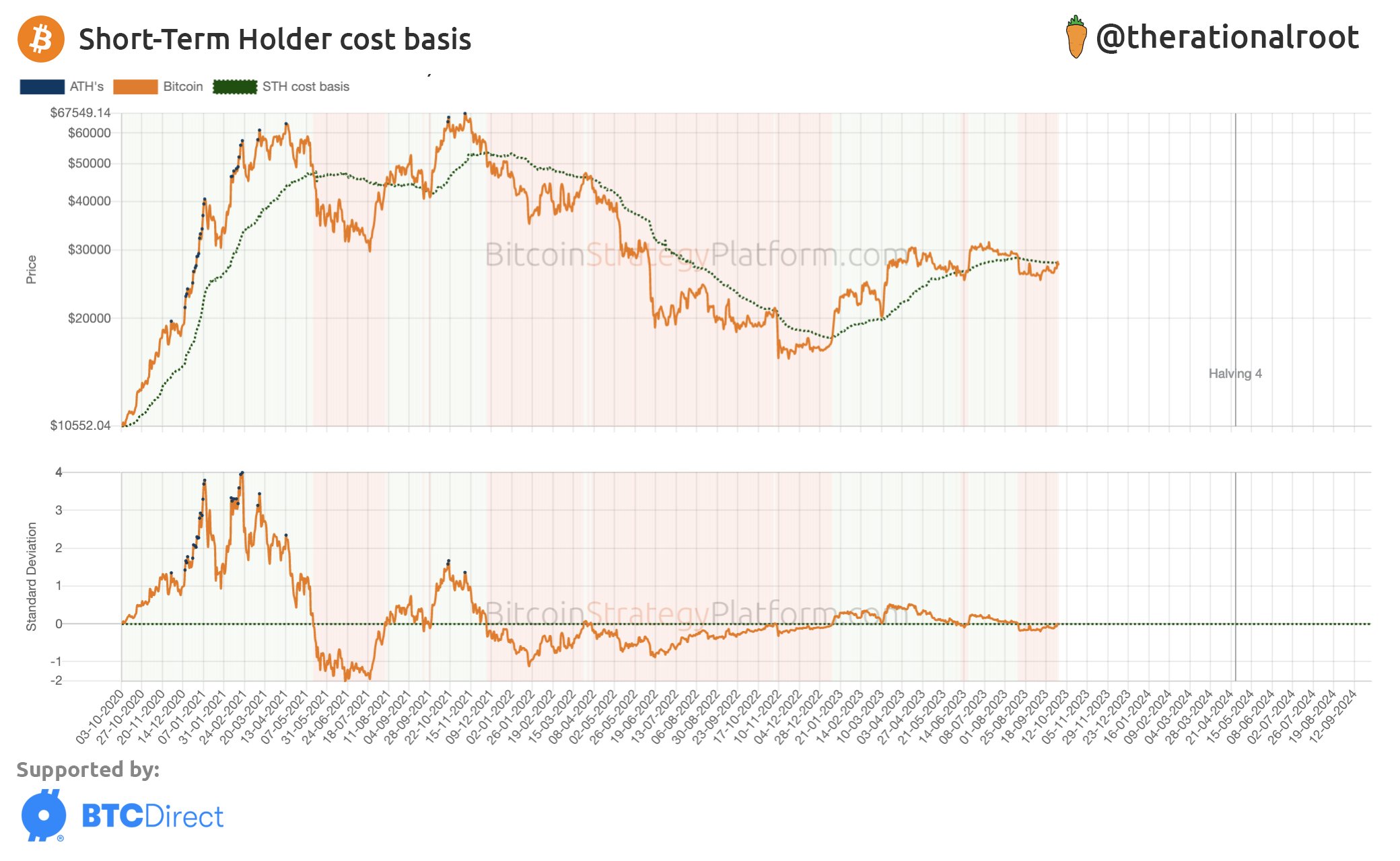
On-chain data shows the true market mean price of Bitcoin is valued at $29,700 right now, making the level of particular significance for the coin.

Bitcoin True Market Mean Price Is At $29,700 Currently

In a new post on X, the lead on-chain analyst at the on-chain analytics firm Glassnode, “Checkmate,” pointed out how the BTC price currently trades below the true market cost basis.

The “market cost basis” refers to the average price at which the investors in the sector bought their coins. One popular way of calculating this cost basis is through the “realized cap,” which measures the total value of the cryptocurrency by assuming that the price at which each coin on the blockchain was last transferred is its true value.

When this capitalization model is divided by the total number of coins in circulation, the “realized price” is obtained, which is the average cost basis of the supply.

However, this method has some issues, such as a chunk of the circulating Bitcoin supply being permanently inaccessible (due to wallet keys becoming lost). A lot of this inactive supply would have traded long ago, meaning its cost basis would be shallow compared to today’s prices. Thus, if included in the metric, it would skew its value away from reality.

Checkmate and Ark Invest’s David Puell came up with “Cointime Economics” a while back, a new methodology that tackles the problems with the realized price.

“Cointime Economics introduces a simplified framework to efficiently discount the impact of lost supply and amplify economic impacts on the truly active supply,” explains Glassnode.

The chart below shows the trend in the “true market mean price” for Bitcoin, as calculated by this advanced model.

Bitcoin True Market Mean Price

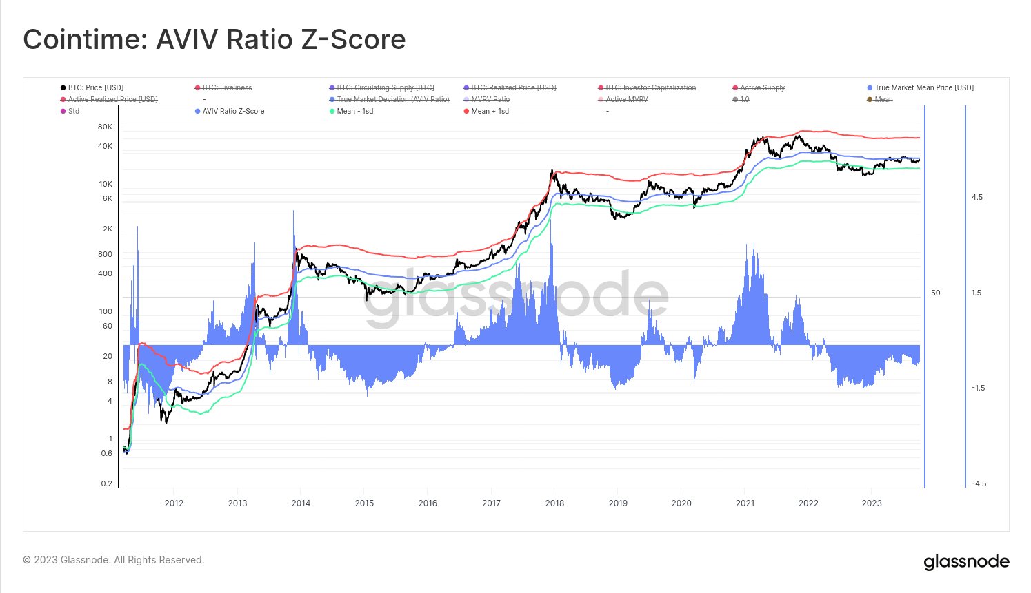
Based on this more accurate model, Bitcoin currently has a true mean price of $29,700. Therefore, the asset’s spot price is trading well below this level.

The graph shows that significant breaks above this indicator have historically resulted in the cryptocurrency enjoying some sustained bullish momentum.

Checkmate has also attached the “AVIV Ratio Z-Score” data in the same chart. The “AVIV Ratio” tracks the deviation from the true market mean that BTC is currently observing.

The Glassnode lead notes that this indicator is the most accurate measure of the market centroid for Bitcoin. At the current value, the metric is “still -0.6 standard deviations below its long-term mean,” according to the analyst.

The near-term outcome of the price based on this is uncertain, but in the long term, Bitcoin could see a reversion back to its mean, thus making the current price levels potentially profitable buying points.

BTC Price

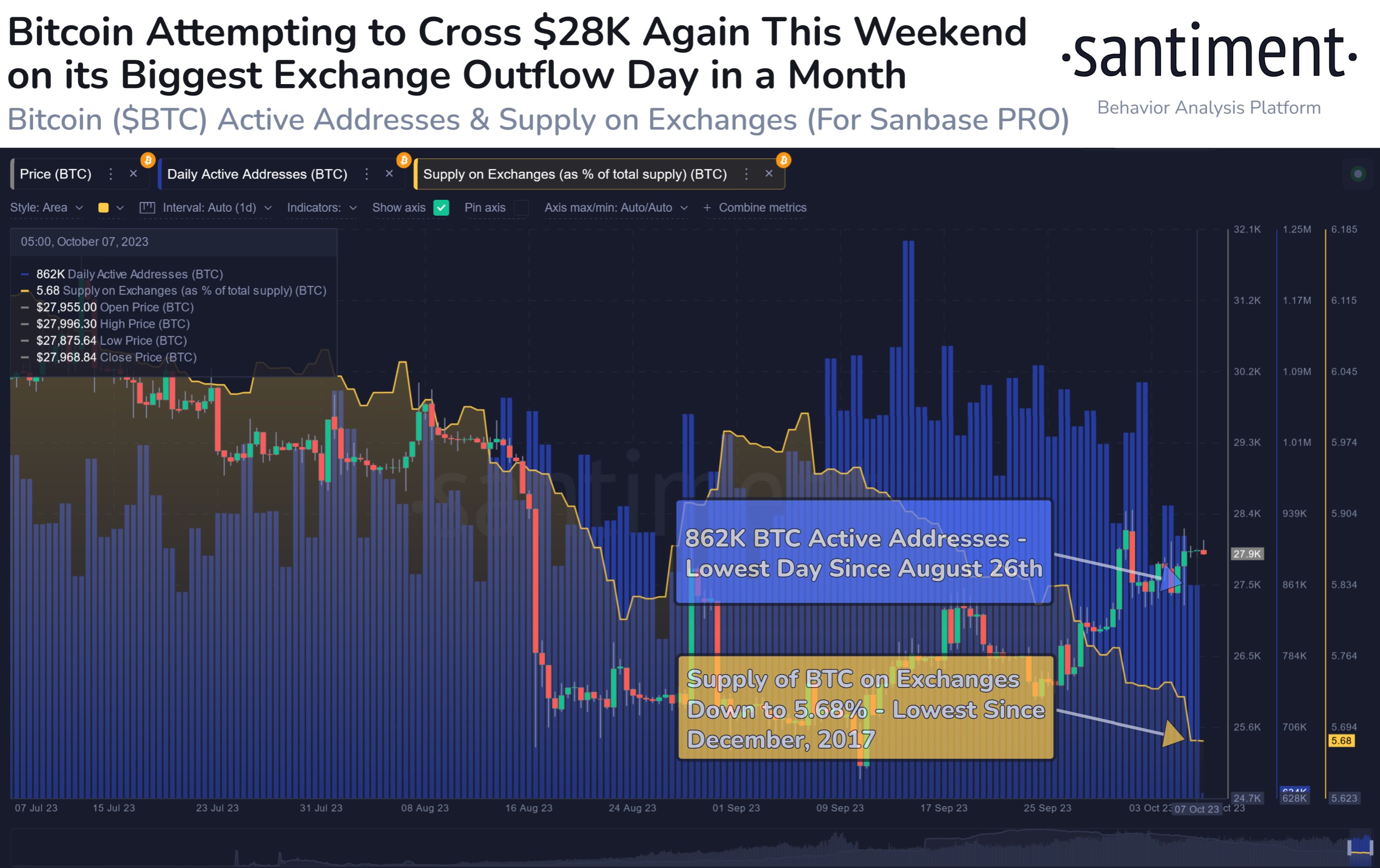
At the time of writing, Bitcoin is trading at around $27,500, down 3% in the last week.

Bitcoin Price Chart

Bitcoin Makes Another Attempt At $28,000, Can Break Happen?

Bitcoin is currently trying to have another go at the $28,000 level. Here’s what on-chain data says regarding whether a retest can be successful.

Bitcoin On-Chain Signals Are Not All Positive Right Now

In a new post on X, the on-chain analytics firm Santiment has looked into a couple of on-chain indicators that may provide some hints about whether BTC can sustain any bullish momentum currently or not.

The first metric of relevance is the “supply on exchanges,” which keeps track of the percentage of the total Bitcoin supply that’s currently sitting in the wallets of all centralized exchanges.

When the value of this metric decreases, it means that withdrawals are taking place on these platforms right now. Generally, investors take out their coins to self-custodial wallets whenever they intend to hold onto them for extended periods, so this kind of trend can have a bullish effect in the long term.

On the other hand, the reverse trend implies selling may be going in the market as holders are depositing a net amount of the cryptocurrency to the exchanges at the moment.

Now, here is a chart that shows the trend in the Bitcoin supply on exchanges over the past few months:

Bitcoin Supply on Exchanges & Active Addresses

From the graph, it’s visible that the Bitcoin supply on exchanges has observed a constant decline during the past month. This naturally suggests that the investors are transferring a net number of coins out of these platforms.

As mentioned before, if the investors are accumulating with these withdrawals, the price could feel a bullish impact, although it may only appear in the long term. Therefore, these outflows may not directly be relevant to the current price surge.

Another way to look at the net withdrawals, however, is that at the very least net deposits aren’t taking place currently. As is visible from the chart, the recovery rally at the end of August very quickly died out as investors transferred a large amount of BTC toward exchanges.

For now, it would appear that such a selloff isn’t taking place, which could potentially allow for the asset’s run to continue. There is another indicator highlighted in the graph, but unlike the supply on exchanges, this one doesn’t seem to be showing a positive trend.

This metric is the “daily active addresses,” which keeps track of the unique number of addresses that are participating in transaction activity on the blockchain. This indicator has now plunged toward the lowest levels since late August, implying that user interest in the asset is low currently.

Historically, rallies have only been sustainable when they have been able to amass a large amount of trader attention, as such moves typically require a high amount of fuel. At present, the current recovery move lacks such investor activity.

On top of this, the $27,900 level is currently a point of major resistance, as that’s where the average cost basis of the short-term holders lies, as CryptoQuant analyst Maartunn has pointed out.

Bitcoin Realized Price

All in all, it looks like a significant break above the $28,000 level could prove to be quite tricky for the cryptocurrency in the near future unless things can turn around fast in terms of user interest.

BTC Price

Bitcoin’s latest attempt may be ending in failure once again as its price has now retraced towards $27,600.

Bitcoin Price Chart

These Bitcoin Holders Have Bought Almost $2 Billion In Last 6 Weeks: Data

On-chain data shows that mid to large Bitcoin holders have purchased almost $2 billion in the asset during the past six weeks.

Bitcoin Holders With 1 To 10,000 BTC Have Neared All-Time High Holdings

According to data from the on-chain analytics firm Santiment, the mid to large-sized BTC addresses have added 71,555 BTC to their holdings recently. The relevant indicator here is the “BTC Supply Distribution,” which keeps track of the total amount of Bitcoin that each holder group in the market is holding right now.

The investors or addresses are divided into these cohorts based on the total number of tokens that they are currently carrying. The 1-10 coins group, for instance, includes all holders who own at least 1 and at most 10 BTC.

If the Supply Distribution is applied to this specific cohort, it would tell us about the total amount of the asset that the addresses on the network fulfilling this condition are currently holding as a whole.

In the context of the current discussion, the mid and large-sized investors in the market are of interest. Typically, these are the addresses ranging between 1 and 10,000 BTC.

Here is a chart that shows the trend in the combined Bitcoin Supply Distribution for all the cohorts falling inside this particular coin range over the past few months:

Bitcoin Large Holdings

This wallet range covers a variety of groups, with the two most notable being the sharks and whales. The sharks are generally the entities with 100-1,000 BTC, while the whales are those with 1,000-10,000 BTC.

Both of these cohorts carry some power in the sector, because of the sheer size of their holdings. The whales, however, carry significantly more influence than the sharks, a natural consequence of their balances being much larger.

The rest of the investors inside this range (those with 1-100 BTC) are considered mid-sized holders, who may not be relevant individually, but as a whole, they can have a notable presence in the market.

From the graph, it’s visible that the combined holdings of all these groups have been heading up recently, implying that buying has been taking place. During the past six weeks alone, these investors have purchased a total of 71,155 BTC, which is equivalent to about $1.97 billion at the current exchange rate.

With this latest accumulation spree, the total holdings of these Bitcoin investors have hit about 15.2 million BTC, which is the largest amount that they have held since January 2022.

Not just that, their current holdings are also just 90,000 BTC shy from their all-time high back in November 2021, where they owned about 15.29 million tokens of the asset.

As is visible from the chart, the indicator has observed some particularly sharp growth during the past week or so, suggesting that these holders believe the current prices are worth buying at.

BTC Price

Bitcoin hasn’t moved much since its pullback a few days ago as its price is still trading around the $27,700 mark.

Bitcoin Price Chart

This Ethereum Metric Is Retesting The Bear-Bull Junction, Will Break Happen?

On-chain data shows the Ethereum MVRV ratio is currently testing a level that has historically served as the boundary between bear and bull markets.

Ethereum MVRV Ratio Is Retesting Its 180-Day SMA Right Now

The “Market Value to Realized Value (MVRV) ratio” is an indicator that measures the ratio between the Ethereum market cap and realized cap. The former is naturally just the total supply valuation at its spot price. At the same time, the latter is an on-chain capitalization model that calculates the value differently.

The realized cap assumes that the real value of any coin in circulation isn’t the spot price (which the market cap refers to) but the price at which it was last bought/transferred on the blockchain.

One way to look at the realized cap is that it represents the total amount of capital that the investors have put into the cryptocurrency, as it considers each holder’s cost basis or buying price.

Since the MVRV ratio compares these two capitalization models, it can tell us whether the investors hold more or less value than they initially invested in Ethereum.

The indicator’s usefulness is that it may serve as a way to determine whether the asset’s price is fair or not right now. When the investors hold a value significantly more than they put in (that is, they are in high profits), they would be more tempted to sell, and hence, the spot price could face a correction.

Similarly, the holders as a whole being in deep losses can instead be a signal that the bottom might be near for the cryptocurrency, as it’s becoming quite underpriced.

Now, here is a chart shared by analyst Ali on X, which shows the trend in the Ethereum MVRV ratio, as well as its 180-day simple moving average (SMA), over the past few years:

Ethereum MVRV Momentum

The 180-day SMA of the ETH MVRV ratio has interestingly held significance for the cryptocurrency. According to Ali, “Ethereum market cycles transition from bearish to bullish when the MVRV (blue line) breaks strongly above the MVRV 180-day SMA (red line).”

During the bear market last year, the ratio had been below the 180-day SMA line, but with the rally that began this year in January, the metric had managed to break above the level, and bullish winds supported the asset once more. During the recent struggle for the asset, however, the MVRV has again slipped under the level.

Nonetheless, in the past few days, the ETH MVRV has been trending up a bit and approaching another retest of this historical junction between bearish and bullish trends.

It remains to be seen whether a retest will happen in the coming days for Ethereum and if a break towards the bullish territory can be found.

ETH Price

Ethereum Price Chart

XRP, Polygon See Month-High Volumes As Investors Show FOMO

On-chain data shows the trading volumes of XRP and Polygon have hit monthly highs as investors are displaying FOMO towards the assets.

XRP, Polygon See Volume Spike Similar To Bitcoin’s Surge A Few Days Back

According to data from the on-chain analytics firm Santiment, XRP & MATIC have seen high volumes recently. The “trading volume” here refers to the total amount of any cryptocurrency that’s being transacted on the different exchanges in the sector every day.

When the value of this metric is high, it means that the asset in question is being moved around a lot on the exchanges. Such a trend implies that traders are actively participating in the market right now.

On the other hand, low values suggest the interest in the cryptocurrency may be low at the moment as not much trading activity related to it is happening on the platforms.

Now, here is a chart that shows the trend in this indicator for XRP, Polygon, and Bitcoin over the past month or so:

XRP & Polygon Trading Volume

As displayed in the above graph, the Bitcoin trading volume had become pretty high a few days back when the asset’s price had surged toward the $28,500 mark.

This spike in the volume had come with a delay, however, as its peak had occurred after the cryptocurrency had already started on its pullback. This could be a sign that once investors saw the rally, they felt like they had to FOMO in, so they quickly made some trades, but many of these investors had arrived late to the scene, hence why the spike had come later.

The volume would have also been fueled by the panic sellers who bought at the top but sold as soon as they saw that the rally was already starting to cool down.

During the past couple of days, XRP and Polygon have also seen some recovery surges (although the rises haven’t been anything too impressive) and the trading volume has also shown similar spikes for these cryptocurrencies as well.

At the peak of this latest surge, the volume of these cryptocurrencies had managed to hit its highest level in about a month. “FOMO is high right now,” notes Santiment.

It would appear that just like with BTC, investors had started jumping on these cryptocurrencies once they saw the rally. Those falling for FOMO, however, would have once again faced disappointment, as both XRP and MATIC have already retraced their latest recovery attempts.

If the trading volume continues to stay high even after the pullback, though, then it would be a positive sign for the prices of these altcoins, as it would mean that there is still significant demand for them at these lower price levels.

XRP Price

In its latest recovery rally, XRP had managed to rise near the $0.55 mark, but with the pullback since then, the cryptocurrency has dropped toward the $0.52 level.

XRP Price Chart

Here’s The Level Bitcoin Must Conquer If Rally Has To Return

Here’s the level, according to on-chain data, that Bitcoin might have to conquer if the rally has to make a real comeback.

Bitcoin Is Currently Near Short-Term Holder Cost Basis

In a new post on X, analyst Root shared a chart revealing that the BTC price has recently been retesting the short-term holders’ cost basis or the realized price (STHs).

The “realized price” here measures the average price at which Bitcoin investors acquired their coins. When the spot price is trading above this indicator, the holders are in a state of profit right now, while below the metric implies the market is in loss.

This realized price is for the entire investor base but can be defined only for specific segments. In the context of the current discussion, the holder group of interest is the “short-term holders” (STHs).

The STHs include all investors who purchased their coins less than 155 days ago. Their average cost basis should, thus, lie inside the price range of the past five months.

Here is a chart that shows how the realized price of the Bitcoin STHs has changed over the past few years:

Bitcoin Short-Term Holder Realized Price

As displayed in the above graph, Bitcoin briefly broke above the STH realized price during the latest rally above the $28,000 level. Still, with the pullback, the cryptocurrency has plunged under the metric again.

The STH cost basis has been historically important for the asset, as breaks above the level generally mean bullish winds. At the same time, plunges under have often brought with them bearish momentum.

But the significance doesn’t end there: the level has acted as support during rallies and has provided resistance in bearish periods. The explanation behind this curious pattern could lie in investor psychology.

While rallies are going on if the BTC spot price drops to the cost basis of the STHs, these investors may tend to believe that the price would once again go up in the future, and so, they might buy more at their cost basis, thinking it to be a profitable buy. This extraordinary buying pressure could be behind the support BTC finds here.

Conversely, bear markets put fear in the minds of the STHs, so as soon as they can break even, they quickly sell and exit, thus providing resistance to the cryptocurrency.

It now remains to be seen whether Bitcoin will make a break above the STH realized price in the coming days, and if it does, whether the price will be able to stay above it for an extended period, unlike the latest attempt.

Bitcoin had been enjoying support at this level during the rally in the first half of the year, so if it can reclaim the line again, it would be an optimistic sign for things to come.

BTC Price

At the time of writing, Bitcoin is trading at around $27,400, up 4% in the last week.

Bitcoin Price Chart

These Are The Altcoins To Keep An Eye On: Santiment

Data from Santiment shows that several altcoins have registered an increase in address activity, which may make them worth keeping an eye on.

Bitcoin Cash & Other Altcoins Have Observed A Rise In Active Addresses

As explained by the on-chain analytics firm Santiment in a new post on X, some alts are seeing rising activity despite the cooldown that the overall cryptocurrency sector has observed in the past couple of days.

The indicator of interest here is the “daily active addresses,” which keeps track of the total number of unique addresses of any given coin that are interacting on the blockchain in some way every day. The metric accounts for both senders and receivers.

By “unique,” what’s meant here is that any address participating in transaction activity on the blockchain is only counted once, regardless of how many transfers it may be involved in.

This restriction helps provide a more accurate representation of the actual activity on the network, as just a few addresses making hundreds of transactions can’t skew the metric by themselves.

When the value of the indicator is high, it means that there are a large number of unique addresses taking part in transaction activity right now. Such a trend implies the blockchain is receiving a high amount of traffic currently.

On the other hand, low values imply not many users are interacting with the network, a possible sign that interest in trading the cryptocurrency is low at the moment.

Now, here is a chart that shows the trend in the daily active addresses for several different altcoins over the past month:

Altcoin Active Addresses

As displayed in the above graph, the daily active addresses indicator has observed a sharp surge in the past couple of days for the altcoins listed here: Bitcoin Cash (BCH), Small Love Potion (SLP), Mask (MASK), LeverFi (LEVER), and Civic (CVC).

According to Santiment, these latest highs in the metric correspond to the highest levels that these cryptocurrencies have witnessed in around three months. Such high activity naturally suggests that there is a lot of interest in these coins among investors right now.

Most of these are small-cap coins, though, but there is one among them that has a very notable standing in the rest of the market: BCH. The 16th-ranked asset in the sector has registered a decline in the last two days, much like the wider sector, but the asset’s active addresses have remained high in number.

Usually, high address activity is a good sign for rallies, as a large amount of active trader pool means that the move has a higher probability of finding the fuel it needs to keep itself going.

Interestingly, besides these altcoins, the largest stablecoin in the sector, Tether (USDT), has also seen the indicator shoot up during this period. Investors use stablecoins for storing their value in a more secure form and for buying into other assets, so the high address activity can potentially be a sign that some moves are taking place in the background.

BCH Price

Bitcoin Cash had earlier surged past the $250 mark, but with the latest drawdown, the altcoin has plunged to $230.

Bitcoin Cash Altcoin Price Chart

Can Bitcoin Continue Its Run? These Factors Could Suggest So

Bitcoin has observed a pullback in the past day, but these factors may imply that the cryptocurrency’s rally can continue.

These Factors Could Suggest A Bullish Outcome For Bitcoin

A couple of days back, Bitcoin had started observing some sharp upward momentum, and by yesterday, the cryptocurrency had managed to breach the $28,500 level. In the past day, however, the asset has registered a decline, falling below the $27,500 mark.

While it’s uncertain whether the rally is over or not, some signs can be optimistic for the investors. As explained by the on-chain analytics firm Santiment, two positive developments have occurred related to Tether (USDT), the largest stablecoin in the cryptocurrency sector.

The first indicator of relevance here is the “USDT supply on exchanges,” which measures the percentage of the total circulating supply of the stablecoin in the wallets of all centralized exchanges.

Here is a chart that shows the trend in this Tether metric over the past year:

Bitcoin & Tether

Usually, investors store their capital in the form of a stablecoin like USDT whenever they want to avoid the volatility associated with the other assets in the sector. Such investors generally plan to go back into the volatile side of the market eventually, though, as they would have instead gone for fiat if they didn’t.

Once these holders feel the time is right to dive into Bitcoin and other coins, they trade their stables for their desired cryptocurrencies. Naturally, such a shift provides a bullish boost to whatever assets they buy using their stablecoins.

Investors generally use exchanges for conversions like these, so the current supply on these platforms can be considered potential dry powder ready to be deployed into BTC and others.

The graph shows that the Tether supply on exchanges had plunged to a low of 17.6% a few months back, implying that the available buying pressure from the stablecoin had run out.

Interestingly, this low in June had occurred in the leadup to a sharp Bitcoin rally, implying that the plunge in the exchange reserve of the stablecoin was, in fact, because of it being converted into the asset, thus providing the fuel for the surge. However, the rally back then couldn’t be sustained, as BTC eventually faced a struggle.

In the months since this low, USDT reserves have slowly built back up on exchanges, as 24.7% of the stablecoin’s supply is now sitting on these platforms. Unlike that previous rally, it would appear that this latest surge has a store of potential buying power available that may be deployed at any time.

In the chart, Santiment has also attached the data for another metric: the combined supply of the ten largest Tether whales. It would appear that these humongous investors have also increased their holdings during this period, implying that they also carry significant dry powder now.

It now remains to be seen whether this stored-up USDT will be converted into the cryptocurrency to provide support to the surge in the coming days or not.

BTC Price

At the time of writing, Bitcoin is trading at around $27,400, up 5% in the last week.

Bitcoin Price Chart

Cardano To Shed Its Gains? Profit-Taking Spikes To High Levels

On-chain data shows the profit-taking among Cardano investors has spiked to high levels, a sign that the asset may register a decline in the coming days.

Cardano Has Observed High Profit-Taking After The Rally

According to data from the on-chain analytics firm Santiment, AAVE, ADA, and CRV are among the altcoins that have recently observed the most extreme profit-taking.

The relevant indicator here is the “ratio of daily on-chain transaction volume in profit to loss,” which, as its name suggests, tells us about how the profit-taking volume of any cryptocurrency compares with its loss-taking volume.

This indicator works by going through the on-chain history of each sold coin to see what price it was last moved at. If the previous selling price for any coin was more than the current value it’s being moved at, then its sale contributes to the loss volume. Similarly, the sale would count under the profit volume if it were otherwise.

When the value of this metric is positive, it means that the profit-taking volume is more than the loss-taking volume right now. On the other hand, negative values suggest the dominance of the loss-taking volume.

Now, here is a chart that shows the trend in this indicator for Cardano, Aave, and Curve over the past month or so:

Cardano Profit-Taking Volume

As displayed in the above graph, the indicator appears to have observed a large spike recently for all three of these altcoins. During the peak of this surge, the metric’s value had been among the highest levels observed in the year so far.

This interest in profit-taking occurred after these cryptocurrencies had observed their respective rallies, following Bitcoin’s surge beyond the $28,000 mark.

This extreme profit-taking spree has hit Curve the hardest, as the cryptocurrency has plunged almost 7% during the past day. Cardano has held onto some of its recoveries, as the decline has only been about 2%.

Aave has not felt any negative effects from this profit-taking, as the cryptocurrency price has mostly continued to move sideways in the past day.

While ADA has shown some strength against the profit-taking, it’s still a concerning sign for the asset that its modest recovery rally has instigated such an extreme reaction from the market.

It would seem possible that some of the investors had been waiting for an exit opportunity, however small, and once they got it in the form of this surge, they swiftly sold their coins. If the profit-taking continues in the coming days, Cardano may retrace more of its recovery.

ADA Price

Cardano had approached the $0.27 level at the peak of this rally, but since then, the asset has slumped back toward the $0.26 mark.

Cardano Price Chart

Bitcoin MPI Forms Death Cross, End of The Rally?

On-chain data shows the Bitcoin Miners’ Position Index (MPI) has formed a death cross recently, a sign that the asset’s rally may end.

Bitcoin MPI Has Formed A Bearish Crossover Recently

As pointed out by an analyst in a CryptoQuant Quicktake post, the 365-day moving average (MA) of the BTC MPI has crossed above the 90-day recently. The “MPI” here refers to an indicator that measures the ratio between the miner outflows and the yearly MA.

The “miner outflows” are the amounts these chain validators transfer out of their combined wallets. Generally, the miners take out their coins for selling purposes, so the miners outflows can measure how much dumping they are currently partaking in.

Miner outflows are usually not that unusual, though, as this cohort has to constantly sell what they mine to pay off their running costs like electricity bills. What can be notable, however, is whether their selling deviates from the norm.

The MPI provides us with information about precisely this since it compares the outflows against their 365-day MA. When the metric is greater than 0, the miners are selling more than the average for the past year, while negative values imply the opposite.

Now, here is a chart that shows the trend in the 90-day and 365-day MAs of the Bitcoin MPI over the last few years:

Bitcoin MPI

The above graph shows that the 90-day MA Bitcoin MPI (colored in orange) has declined during the last few weeks. Recently, the metric crossed below the 365-day MA, consolidating sideways.

Historically, the crosses of the two MAs of the BTC MPI have appeared to be significant for the cryptocurrency’s price. In the chart, the quant has highlighted the major crossovers that occurred during the last few years.

Whenever the indicator’s 90-day MA has observed a cross above the 365-day MA, BTC has gone off to witness some bullish momentum. Such a cross preceded the April 2019 rally, the 2021 bull run, and the rally that started this January.

On the other hand, the opposite type of cross has proven to be bearish for the asset’s value, as steep declines have followed it. Since this death cross has once again formed for Bitcoin recently, it may signal that this year’s rally has reached its conclusion.

However, the crossover is still in the process of forming, meaning that the coming weeks may be important. If the 90-day MA can turn itself around quickly, then the death cross may not form, but if the metrics continue in their current trajectory, the bearish signal would be solidified.

BTC Price

Regardless of the death cross, Bitcoin has observed some sharp bullish momentum during the past 24 hours, as the asset has surged to the $28,300 level.

Bitcoin Price Chart

Chainlink Signal That Preceded Crashes Of 34% Is Back

An on-chain signal that preceded crashes of at least 34% for Chainlink in the past has once again formed for the cryptocurrency.

Chainlink 30-Day MVRV Ratio Recently Hit The 20% Mark

As explained by an analyst in a post on X, the last two times the 30-day MVRV ratio broke above the 19% level, the price of LINK registered a sharp decline. The “Market Value to Realized Value (MVRV) ratio” is an indicator that measures the ratio between the Chainlink market cap and the realized cap.

The “realized cap” here refers to the total amount of capital that holders of the cryptocurrency have invested into it. As the MVRV ratio compares the spot valuation (the market cap) with the amount that the investors bought the asset with, its value can provide hints about whether the holders as a whole are in profits or not.

When the metric has a value greater than 1, it means that the market cap is more than the realized cap, and hence, the average investor is in profit right now. The more the holders get into profit, however, the more likely they become to sell, so high values of the MVRV ratio can suggest the asset is becoming overpriced and a correction may be due.

On the other hand, values under the threshold suggest the cryptocurrency may be undervalued currently as the overall market is holding some net unrealized losses.

Now, here is a chart that shows the trend in the 30-day version of the Chainlink MVRV ratio, which looks at the profitability of only the investors who bought within the past month:

Chainlink MVRV Ratio

In the above graph, the value of the 30-day MVRV ratio is represented as a percentage relative to the break-even level. As is visible, this indicator has observed some sharp uptrend recently as Chainlink has enjoyed its rally.

During this latest rapid growth, the metric had managed to hit a peak of 20%, which means that the market cap had become 20% more than the realized cap of the 30-day investors.

The analyst has pointed out an interesting trend that LINK has followed during the past couple of years. It would appear that whenever the 30-day MVRV ratio has broken above the 19% mark, the cryptocurrency has followed up with a steep drawdown.

This has happened two times in the period of the chart and coincidentally, Chainlink’s decline was about 34.5% in both of these instances (although the time the drawdown was spread out over was different in the two cases).

Since the 30-day MVRV has once again surged above this apparently significant level, it’s possible that LINK may also register a similar drop in the coming days or weeks.

LINK Price

Chainlink has observed some sharp uptrend over the past month, as its price is currently trading just under the $8 level, having gone up almost 34% in the period. If the MVRV ratio is anything to go by, though, this impressive run may finally be coming to an end.

Chainlink Price Chart

This Bullish Combination Has Finally Formed For Bitcoin, Rally Ahead?

On-chain data shows that a bullish combination has just formed for Bitcoin, which may signal that a rally could be ahead for the asset.

Sharks & Whales Are Accumulating Both Bitcoin, Tether Right Now

According to data from the on-chain analytics firm Santiment, both the sharks and whales of BTC and USDT have been accumulating recently. The metric of interest here is the “Supply Distribution,” which keeps track of the total amount of a given asset that the different holder groups carry.

In the current topic, sharks and whales are the entities of interest. For Bitcoin, the combined supply of these assets may be defined as the 10 to 10,000 BTC range, while for Tether, it’s generally 100,000 to 10 million USDT.

The sharks and whales are influential entities in the sector due to their holdings, but their role differs between whether they are holding the volatile BTC or the stablecoin USDT.

The chart below shows how the supplies of the sharks and whales of the two cryptocurrencies have changed over the last few months:

Bitcoin & Tether Sharks & Whales

The graph shows that the Bitcoin sharks and whales have participated in some accumulation recently, which has taken their supply to 13.03 million BTC, a new high for the year.

Interestingly, while this accumulation has occurred, the sharks and whales of Tether have also expanded their holdings. The metric’s value, in this case, has reached a six-week high of 15.03 billion USDT.

The significance of the trend in the supply of the BTC sharks and whales may seem straightforward: these humongous entities are buying right now, so that should be bullish for the price. But what about the pattern being shown by the USDT cohort?

Generally, an investor may buy into a stablecoin like USDT to avoid the volatility of assets like Bitcoin. Once these holders feel that the prices are right to jump back into the volatile side of the sector, they exchange their fiat-tied tokens for their desired coin.

This shift can naturally provide buying pressure on whatever cryptocurrency they are swapping into. Because of this reason, one way to look at the supply of a stablecoin is as a measure of the available potential buying power for Bitcoin and other assets in the market.

Thus, the latest Tether accumulation would suggest that the sharks and whales have increased their buying capacity. Sometimes, spikes in this indicator come at the expense of the corresponding BTC metric, as these holders convert their reserves. While the buying power goes up for the future in such a scenario, it has only come at the expense of a BTC selloff.

In the current case, though, both of these indicators have trended up at the same time, which means that not only have the sharks and whales participated in some Bitcoin shopping, but the capital reserves that these large holders may deploy into the asset in the form of Tether have also gone up. “This is generally a bullish combination,” explains Santiment.

BTC Price

Bitcoin had earlier risen above the $27,000 level, but the asset has retreated in the past few hours as it is now trading around the $26,700 mark.

Bitcoin Price Chart

Bitcoin Surge Above $27,000 May Not Last, Here’s Why

Bitcoin has broken back above the $27,000 level during the past day, but if on-chain data is to go by, this surge may not last for long.

Bitcoin Investors Are Taking Profits At Highest Rate In 3 Months

According to data from the on-chain analytics firm Santiment, there is a chance that a short-term correction could happen for the cryptocurrency. The relevant metric here is the “ratio of daily on-chain transaction volume in profit to loss,” which, as its name suggests, tells us about how the profit-taking volume compares against the loss-taking volume on the Bitcoin network right now.

This indicator works by going through the transaction history of each coin being sold/transferred on the blockchain to see what price it was moved at before. If this previous selling price for any coin was less than the current spot price, then that coin is being sold at a profit right now.

The sale of all such tokens would contribute toward the Bitcoin profit-taking volume, while coins of the opposite type would add towards the loss-taking volume.

Now, here is a chart that shows the trend in this BTC metric over the past few months:

Bitcoin Profit-Taking Volume

As displayed in the above graph, this Bitcoin indicator has observed a large spike as the cryptocurrency’s price itself has seen a surge beyond the $27,000 mark and has reached a value of 2.51.

When the metric has a value greater than zero, it means that the profit-taking volume is more than the loss-taking volume. On the other hand, values under this threshold suggest the dominance of loss-taking.

At the current value of 2.51, the profit-taking volume outweighs the loss-taking one by 3.51 to 1. This disparity between these two volumes is the highest it has been since around three months ago.

Historically, intense profit-taking has usually resulted in at least a short-term top for Bitcoin, so it’s possible that the current values of the metric would also result in a correction for the price.

In the chart, Santiment has also attached the data for the “Market Value to Realized Value (MVRV) ratio,” which keeps track of the difference between the Bitcoin market cap and realized cap.

The latter of these is basically a measure of the total amount of capital that the investors as a whole have put into the cryptocurrency, so this metric tells us how the value that the holders are carrying currently compares with their total investment.

From the graph, it’s visible that the 7-day Bitcoin MVRV ratio has turned notably positive with this rise, which implies that the investors are carrying profits at the moment.

The analytics firm notes that this metric going back below zero would be ideal for the next leg up, as the holders being in loss would lead to an exhaustion of the profit-sellers.

BTC Price

So far, despite the aggressive profit-taking happening in the market, Bitcoin has managed to hold above the $27,000 mark.

Bitcoin Price Chart

Research Firm Reveals Its “Altcoin Trading Playbook”

A research firm has revealed an altcoin trading playbook that could serve as a guide for navigating the next cryptocurrency bull run.

K33 Research Shares Its Altcoin Trading Playbook

In a new post on X, K33 Research (formerly Arcane Research) explained that new altcoins make better trades than old ones. The firm has given a few reasons for why this is so.

“In lack of price-driving fundamentals, the narratives and liquidity matter,” explains the research organization. “And new coins generally outperform old coins.”

K33 Research has used the example of some “Ethereum killers” during the last bull market to show how the newer coins outperform the older ones. The below chart shows how the performance of these coins has been compared (note that the Y-axis, the price, is normalized concerning September 22, 2020, here).

Altcoin Ethereum Killers

From the chart, it’s apparent that Tron (TRX) and EOS (EOS), which were vouched as the Ethereum killers during the 2017/18 bull market, failed to set new all-time highs (ATHs) during the 2021 bull run.

However, the new kids on the block, like Solana (SOL) and Avalanche (AVAX), observed much better returns than the old, established altcoins during the latest bull market.

Why do old altcoins have difficulty returning to their former glory? According to K33 Research, there are a few factors behind this. First, the coins that have gone through a cycle have many holders at a loss, waiting to come into the green to exit.

These underwater investors provide additional selling pressure during rallies that new coins, where everyone is in the green during the initial rally, don’t have to face.

The old coins also have to deal with the rising circulating supply because of the token unlocks, which, due to supply-demand dynamics, can hurt the price if the demand side doesn’t catch up.

Altcoin Example

Finally, the research firm notes that old coins are also tied to narratives that have gone out of fashion. On the other hand, new coins are the narratives when they launch and, thus, appear interesting to investors.

While new altcoins certainly have a leg up to old coins regarding these factors, K33 Research notes that not all such coins make for a good investment. The firm advises investors to look for a few things to know whether a project may be worth investing in.

The first thing could be whether or not the total number of holders is rising rapidly for the altcoin. A high amount of adoption means the asset has more steam behind it for building sustainable moves. The firm also says that a low float and high fully dilated value (FDV) should be avoided.

ETH Price

At the time of writing, Ethereum is trading at around $1,600, up 3% during the past week.

Ethereum Price Chart

Maker (MKR) Rockets To $1,500 With 15% Surge, Will This Run Continue?

The Maker token, MKR, has managed to break the $1,500 level with a sharp 15% rally as on-chain data shows MKR has seen high address activity recently.

Maker Has Outperformed Top Coins With 15% Rally In Past Week

While giants like Bitcoin have struggled recently, MKR has proven to be different as the coin has observed an impressive run of bullish momentum. Following the latest leg up in the asset’s rally, it has surged past the $1,500 level, a feat it hasn’t replicated since May 2022, almost a year and a half ago now.

Related Reading: Bitcoin Bearish Signal: Long-Term Holders Deposit To Exchanges

The below chart shows what the asset’s recent rally has looked like:

Maker Price Chart

Out of the top 100 cryptocurrencies by market cap, only Chainlink (LINK) and Curve (CRV) have seen better returns than Maker’s 15% gains during the past week.

Even these two assets haven’t seen bullish momentum as consistent as MKR in the past month, though, as MKR’s superb 42% profits in the period notably outshine theirs.

Maker Active Addresses Have Hit A 10-Week High

According to data from the on-chain analytics firm Santiment, this sharp run in MKR has come alongside a surge in the cryptocurrency’s “active addresses” metric.

This indicator keeps track of the daily total number of unique Maker addresses that are taking part in some kind of transaction activity on the blockchain. This metric’s value can simply be looked at as the amount of traffic that the network is receiving every day.

When the indicator has high values, it means that a large number of users are participating in the trading activity of the asset. Such a trend implies that interest in the coin is high currently.

Now, here is a chart that shows how the active addresses metric has changed for MKR during the past month:

Maker Active Addresses

From the graph, it’s visible that the Maker active addresses have climbed up alongside the rally in the asset’s price. After the latest increase in the indicator, its value has hit 651, which is the highest observed in around 10 weeks.

Generally, for any surge to be sustainable, it requires continued participation from a large amount of traders. Rallies that aren’t accompanied by a sufficient rise in user activity usually run out of steam before long.

Since the latest Maker surge has seen an increasing number of addresses becoming active, signs could be looking good for its sustainability. As the price continues its run, though, some investors might be tempted to harvest the high profits that they have amassed.

In the same chart, Santiment has also attached the data for the exchange netflow, which shows that some inflows of $7.6 million just have occurred towards centralized exchange platforms, implying that profit-taking may already be beginning.

This is a relatively modest amount, but the analytics firm warns that inflows can be something to be cautious about, as they could lead towards at least a temporary top in the price.

Curve (CRV) Is Up 20%, But This Whale May End The Run

Curve has observed gains of more than 20% in the past week, but this rally may not continue for long, as a whale has made a large move to exchanges.

Curve Has Enjoyed A Sharp Rally Over The Past Week

CRV has gone against the grain recently as it has registered some sharp bullish momentum during a period where the largest coins in the sector, like Bitcoin and Ethereum, have struggled.

Following this latest uptrend, the Curve DAO token’s price has risen above the $0.52 mark. Here is a chart that shows how the cryptocurrency has performed over the past month:

Curve DAO Token Price Chart

In the past week, CRV is up more than 20%, which makes it the best-performing coin among the top 100 cryptocurrencies by market cap. The outperformance is by quite a distance, too, as many of the assets are in the red for the period. Now, the main question on the minds of the Curve DAO token holders is: can the asset keep up its rally?

In the sharp surge a few days back, the asset had briefly managed to breach the $0.56 level, but the asset had quickly returned to the current level.

Since then, CRV has been moving sideways, suggesting a slowdown in the buying pressure. While the asset has continued to hold at the current levels positive, some investors may be becoming restless, like a certain whale.

CRV Whale Has Made A Sizeable Deposit To Binance Today

According to data from the cryptocurrency transaction tracker service Whale Alert, a large CRV transfer has been spotted on the Ethereum blockchain during the past day.

The transaction in question involved the movement of about 33.3 million CRVs, worth approximately $17.3 million at the time the transfer took place on the network.

Given the large size of the move, it’s likely that a whale entity is behind it. As for what this humongous holder may have wanted to accomplish with the transfer, the full details may reveal some context.

Curve Whale Deposit

It would seem like the sending address in the case of this transaction was an unknown wallet, meaning that it was unattached to any known centralized platform and was likely the whale’s personal, self-custodial wallet.

The destination of the move was the Binance exchange. As one of the main reasons investors use these platforms is for selling-related purposes, there is a chance that the deposit has been made for dumping.

If this is truly the whale losing patience and taking profits at the current price level, then the Curve DAO token may observe at least a temporary pullback in the coming days.

Bitcoin Bearish Signal: Long-Term Holders Deposit To Exchanges

On-chain data shows that Bitcoin long-term holders are making deposits to exchanges currently, something that could be bearish for the price.

Bitcoin Exchange Inflow CDD Has Spiked Recently

As explained by an analyst in a CryptoQuant Quicktake post, investors have been making deposits to spot exchanges recently. There are two relevant indicators here: the “exchange inflow” and the “exchange reserve.”

The former of these keeps track of the total amount of Bitcoin that the holders are transferring to centralized exchanges, while the latter one measures the total amount sitting in the wallets of these platforms.

When the value of the inflow metric spikes, it means that the investors are moving a large number of coins to the exchanges. As one of the main reasons why holders may make such transfers is for selling-related purposes, this kind of trend can be a sign that selling is occurring.

Since selling activity occurs on the spot exchanges, the quant has restricted the exchange inflow and reserve indicators to track only the data related to the spot platforms.

The analyst has also chosen another modifier on the exchange inflow: the “Coin Days Destroyed” (CDD). In simple terms, what the CDD checks for is the activity of dormant coins in the market.

Tokens that have been sitting in wallets for a long time accumulate a large number of “coin days” (where 1 coin day corresponds to 1 BTC staying still for 1 day) and when these coins finally move, the coin days are reset or “destroyed,” which is the number that the CDD measures. The exchange inflow CDD naturally only keeps track of the coin days being destroyed through transfers to exchanges.

Now, here are the charts that show the trends in the 7-day simple moving average (SMA) value of this Bitcoin indicator and the 14-day SMA exchange reserve:

Bitcoin Exchange Inflow CDD & Exchange Reserve

From the first graph, it’s visible that the Bitcoin exchange inflow CDD has registered a sharp spike recently. This would suggest that a potentially large number of dormant coins have been moved into these platforms.

Usually, the CDD having large values like these can be a sign that the “long-term holders” (LTHs) are on the move. The LTHs (defined as holders carrying their coins since at least six months ago) are the most resolute bunch in the market, so their depositing to exchanges can be something to watch for, as it implies that the market has made even these diamond hands waver.

As is visible from the second chart, the exchange reserve has also gone up alongside this spike in the exchange inflow CDD, suggesting that there haven’t been enough withdrawals to make up for these inflows.

It now remains to be seen what effect these possible selling moves from the LTHs may have on the Bitcoin price in the coming days.

BTC Price

Bitcoin has continued its stagnant price action recently as its price is still trading around the $26,400 mark.

Bitcoin Price Chart

Bitcoin Mining Now Most Sustainably-Powered Global Industry: Data

Data shows that the Bitcoin mining sector has become the most sustainably-powered global industry, as more than 50% of it uses clean energy.

Majority Of Bitcoin Mining Industry Uses Clean Energy Sources

One of the main criticisms against BTC is that the sector uses a considerable amount of energy and, thus, releases a notable amount of emissions.

Things appear to be developing for the better and quite fast. In a new post on X, the co-founder of CH4Capital, Daniel Batten, has shared a few charts that look into the sustainability of the BTC network and how it compares with other sectors.

The first chart displays the trend in the percentage of sustainable energy used by Bitcoin mining and other industries over the last four years.

Bitcoin Mining Sustainability

As shown in the above chart, most industries have seen minimal growth in using sustainable energy during this period. The Banking Sector, the second largest in terms of clean energy usage, saw a rise of 2.6%.

On the other hand, the Bitcoin mining sector has observed an increase of a whopping 38%, which has taken the share of sustainable energy powering the blockchain to 52.6%. This growth has naturally made BTC mining the most sustainable among these global industries.

An even more interesting chart is this one that compares the emissions of the network (in terms of megatons of CO2 emitted) with the various indicators related to the blockchain’s growth.

Bitcoin Emissions

Three Bitcoin metrics are being considered here: the mining hashrate, the price, and the total number of users. The first has grown by 475% during the past four years, the second by 164%, and the third by 289%.

Despite these growths, however, the emissions of the mining sector have gone down almost 10% in the same period. Batten notes that even if you double these metrics during any four-year cycle, the emissions will be the same as at the start, which no other industry has achieved.

The fact that the hashrate, which is a measure of the total amount of computing power that miners have connected to the blockchain, has been able to rise while total emissions go down would imply that the emission intensity (that is, the emissions per kWh of power used) has declined.

Indeed, as the data would confirm, the BTC network’s emission intensity has dropped by more than 50% in the last four years, making the mining sector the most emission-efficient among the global industries.

Bitcoin Emission Intensity

Finally, Batten has also shared the energy composition of the network, noting that the largest power source is hydro.

Bitcoin Energy Mix

This means that the Bitcoin mining sector is also the only one that doesn’t have its largest source of power coal.

BTC Price

Bitcoin has been stagnant for a while now, and the asset is only continuing this sideways trend as its price trades around the $26,100 level.

Bitcoin Price Chart

Bitcoin Mega Whales Return To Selling Mode, More Downside Soon?

On-chain data shows the largest of the Bitcoin whales have returned to distribution, a sign that could be bearish for the asset’s price.

Bitcoin Investors With More Than 10,000 BTC Are Selling Again

As explained by analyst James V. Straten in a new post on X, the BTC whales, who had earlier been in a phase of accumulation, have switched their behavior to that of distribution now.

The relevant indicator here is the “Trend Accumulation Score” from Glassnode, which keeps track of whether Bitcoin investors have been buying or selling during the past month. This metric finds this value by looking at the balance changes in the addresses of the holders.

The score also puts a higher weightage on the larger entities, meaning that the accumulation of a few large holders would be more significant for the indicator than the behavior of the smaller hands.

When the Trend Accumulation Score has a value close to 1, it means that there is a trend of net accumulation in the market right now. On the other hand, values close to zero imply distribution is the dominant behavior currently.

Now, here is how this score has changed for the various Bitcoin investor cohorts since the start of the year:

Bitcoin Trend Accumulation Score

As you can see above, the entire Bitcoin market had been displaying a net distribution behavior during August as the accumulation trend score had been a shade of red for all the cohorts (with the deeper shades naturally being closer to the zero mark). During this selloff period, BTC had registered a significant drawdown.

At the start of September, most of the investor groups had still continued to sell, but interestingly, the largest cohort in the sector, the holders carrying more than 10,000 BTC ($262.7 million at the current exchange rate) had started accumulating instead.

This group may be called the “mega whales,” since these investors stand out even among the whales. From the data, it’s visible that while these mega whales had been buying earlier in the month, they have recently again shown a shift in their behavior.

The Trend Accumulation Score has declined for these humongous entities and now it’s leaning toward distribution. This may suggest that while these investors had thought the earlier lows presented ideal entry opportunities, the fact that the coin has only continued to stagnate recently may have changed their minds.

At present, though, the mega whales aren’t dumping Bitcoin at too large a scale. The same is not true for the rest of the cohorts, however, who have taken to some pretty heavy selling recently, as the Trend Accumulation Score has turned deep red for them.

This market-wide selling could be a troubling sign for the cryptocurrency and may be a foreshadowing of a drawdown in the near future.

BTC Price

Bitcoin has been showing a trend of overall consolidation since the crash back in August, as the cryptocurrency continues to float around the $26,200 mark.

Bitcoin Price Chart

Bitcoin Social Media Talk Drops To 3-Month Low, All Eyes On Altcoins?

Data shows the social media talk around Bitcoin has dropped to low levels recently, indicating that investors are paying attention to altcoins instead.

Bitcoin Social Dominance Has Declined To Just 17% Recently

According to data from the on-chain analytics firm Santiment, BTC-related discussions on social media have dropped recently. The relevant indicator here is “social dominance,” based on the concept of “social volume.”

The social volume of any asset is a measure of the degree of talk it receives on the major social media platforms. The metric makes this measurement through a text-based data collection that Santiment has procured from different websites.

A feature of the indicator is that it only counts the unique number of posts or messages that mention the coin. This means that if a thread receives many mentions of the cryptocurrency, its contribution to the social volume will remain just one unit.

This restriction helps the social volume provide a more accurate representation of the trend being observed throughout social media. The aforementioned social dominance is a metric that tells us what percentage of the combined social volume related to the top 100 assets by market cap is being contributed by any cryptocurrency.

Here is a chart that shows how the social dominance of Bitcoin has changed during the last few months:

Bitcoin Social Dominance

As shown in the above graph, Bitcoin’s social dominance has registered a downtrend during the last few days, implying that the share of the social media discussions occupied by the number one cryptocurrency has shrunken.

This is perhaps a result of the asset’s price stagnating recently. Generally, investors don’t find such price action interesting, so they may stop paying attention to the coin during phases like this.

With the latest drop in the indicator, its value has dropped to 17%, meaning that 17% of the discussions related to the top 100 coins currently involve the topic of Bitcoin. This level of social dominance is the lowest it has been since June.

Naturally, this drop suggests that the altcoins have recently attracted some attention. Santiment notes that traders are looking elsewhere to FOMO right now, as some of the smaller projects in the market are observing a surge in talks.

Historically, the holders dropping BTC in favor of alts has been a sign of greed in the market. Such greed, however, is generally not favorable for the sector as a whole, as only weak rallies emerge in periods like these.

BTC Price

Bitcoin is trading around the $26,100 level after having decreased by more than 2% during the past 24 hours.

Bitcoin Price Chart