Ethereum Funding Rates Turn Deep Red, What Does It Mean?

Data shows the Ethereum funding rates have been quite negative in recent days. Here’s what this could mean for the cryptocurrency’s price.

Ethereum Funding Rates Have Been Under The Zero Mark Recently

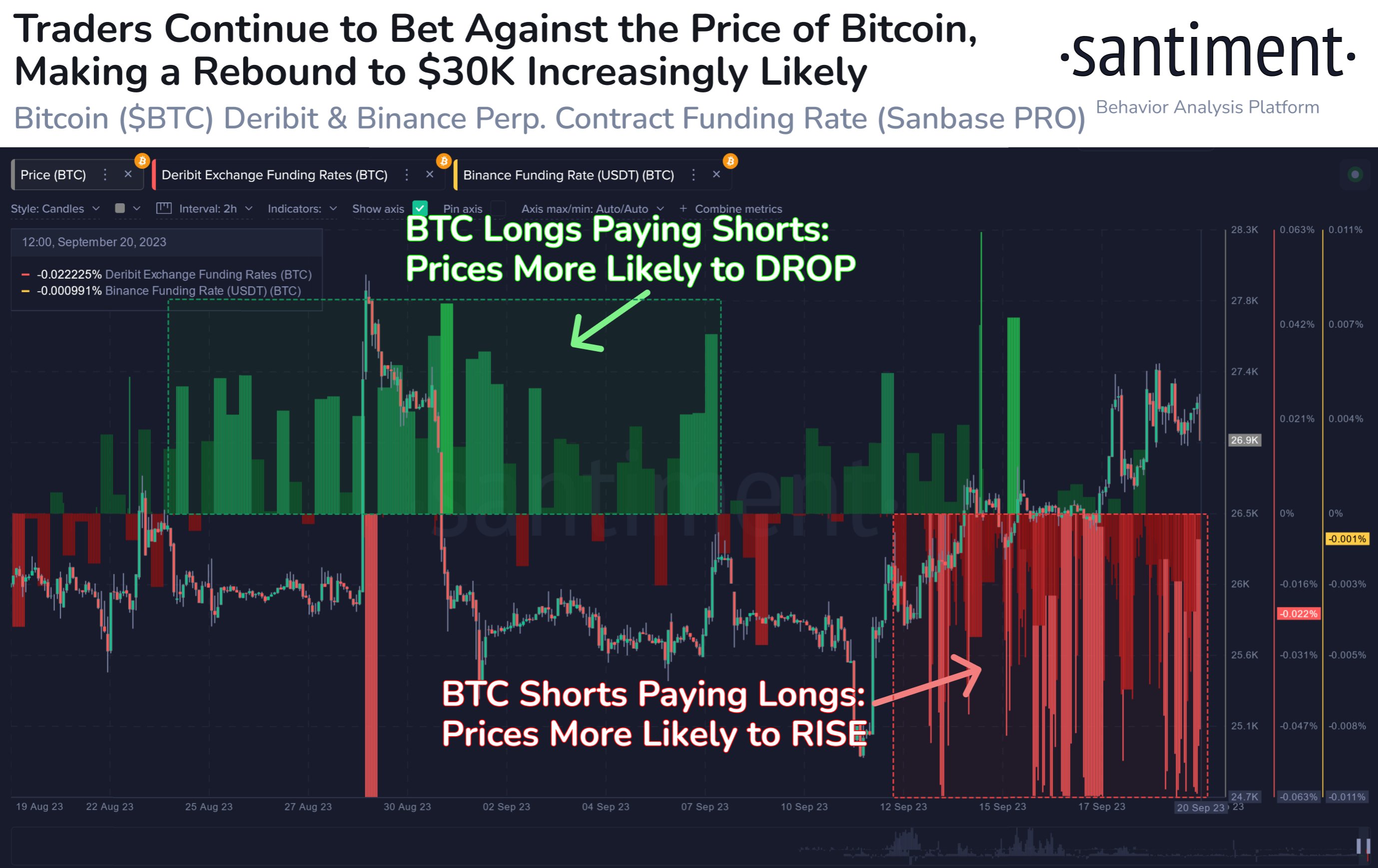
As explained by an analyst in a CryptoQuant post, a short squeeze may be a possibility for the asset currently. The “funding rate” is an indicator that keeps track of the periodic fees that traders on the futures market are exchanging with each other.

When the value of this metric is positive, it means that the long contract holders are paying a premium to the short holders right now. Such a trend implies the longs outweigh the shorts currently, and hence, a bullish mentality is the dominant force in the sector.

On the other hand, negative values suggest the majority of the futures market users share a bearish sentiment at the moment as the shorts are the ones paying a fee.

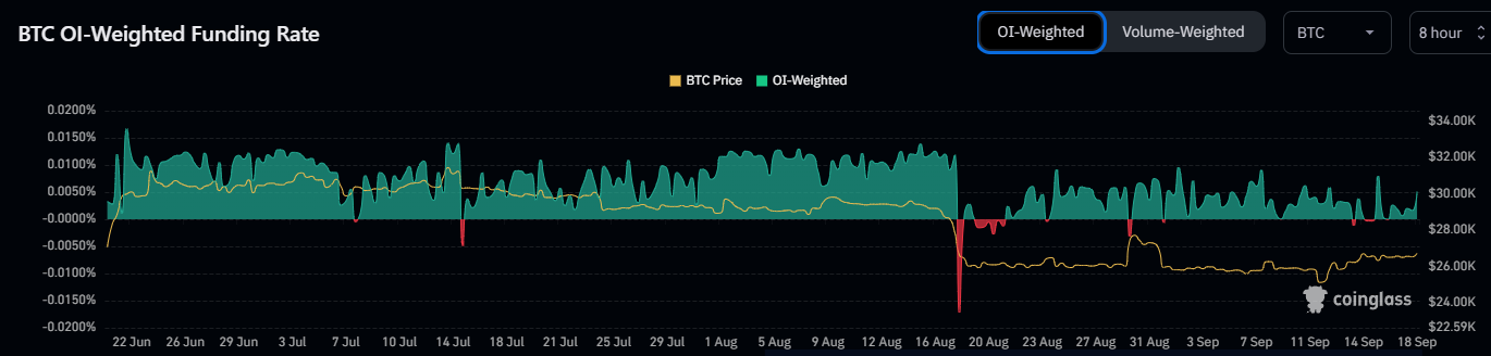
Now, here is a chart that shows the trend in the Ethereum funding rates over the past week:

Ethereum Funding Rates

As displayed in the above graph, the Ethereum funding rates had been positive until just a couple of days back, implying that the majority of the futures traders had been betting on the asset’s price to go up.

The metric’s value has plunged to the negative zone during the past day or so, however, suggesting that a complete flip in mentality has occurred among the investors.

This bearish sentiment, though, may not necessarily be bad for the price. This is because the more the mentality has become skewed in one direction historically, the more probable the price of the cryptocurrency has become to show a sharp move in the opposite direction.

One major reason why this happens is that mass liquidation events, which are popularly called “squeezes,” are more likely to involve the dominant side of the futures market.

During a squeeze, a sudden swing in the price ends up liquidating a large amount of contracts at once. Such liquidations only provide fuel for the price move that caused them, thus amplifying it further. This can lead to a cascade of more liquidations.

As shorts have piled up in the Ethereum futures market recently, the probability of a short squeeze occurring would be elevated. Naturally, if such an event does take place, the asset’s value could see a sharp rebound.

This doesn’t necessarily have to happen, of course, and if it does, it may not be soon. From the chart, it’s visible that the funding rate had remained at notable positive values for a while before the ETH price finally registered its plunge.

ETH Price

Ethereum has taken a hit of more than 3% during the past week as the asset’s price is now trading under the $1,600 level.

Ethereum Price Chart

Bitcoin Bull Run May Not Begin Until This Ratio Reverses Trend

The Bitcoin bull run may not start properly until this on-chain ratio reverses the trajectory it is currently going in.

Bitcoin RHODL Ratio Is Currently Showing A “Dead Cat Bounce”

As analyst James V. Straten explained in a post on X, the BTC RHODL ratio may contain hints about when the cryptocurrency’s next bull run could be coming.

The “Realized HODL ratio” (RHODL) here refers to an indicator that keeps track of the ratio between the value held by the investors holding since 6 months and 3 years ago and that held by the 1 day to 3 months old holders.

These former investors make up a segment of the larger “long-term holder” (LTH) group. More specifically, this part of the group may be termed the “single cycle LTHs” since their holding range is inside the span of a BTC cycle (typically four years).

The other investors, those holding since 1 day and 3 months ago, represent the youngest members of the “short-term holder” (STH) cohort. The entire STH group has its cutoff at the six-month mark, where the LTH group naturally begins.

As the RHODL ratio compares the value held by these two cohorts, its trend can provide hints about how the rotation of capital occurs in the market.

Now, here is a chart that shows the trend in the Bitcoin RHODL ratio over the history of the cryptocurrency:

Bitcoin RHODL Ratio

The above graph shows that the Bitcoin RHODL ratio has followed a similar pattern in each Bitcoin cycle. The metric always hits a bottom during bull run tops and starts heading up.

This increase represents a rotation of capital towards the LTHs, as the bear market setting in leads to the STHs giving up on the asset and exiting, while the persistent holders left behind accumulate more at the lower prices.

This accumulation from the LTHs continues until the bear market bottom. The graph shows that the RHODL ratio has always seen its top coincide with the cyclical bottoms in the price.

Due to the relief rally following the worst bear market stage, STHs return to the market and grow their holdings, while some LTHs sell their coins to take their profits.

In the graph, Straten has highlighted that the indicator has been sharply going down during the past few months, just like it did in the buildup to past bull markets.

As noted by the circles, though, the indicator generally experiences a sort of dead cat bounce on the way down. The indicator has recently turned towards the upside, potentially implying that this same dead cat bounce pattern is again forming.

Historically, true bull markets have followed when the Bitcoin RHODL ratio has again reversed its direction following this pattern and has resumed its downtrend. A similar reversal may also be the one to watch for this time, as it could lead towards the next bull run.

BTC Price

Bitcoin has continued to move sideways since the drop yesterday as its price continues to trade around the $26,600 mark.

Bitcoin Price Chart

“Paper BTC” Is Counteracting A Bullish Bitcoin Supply Shock, Analyst Explains

An analyst has explained how the growth in “paper BTC” could be counteracting a bullish Bitcoin supply shock from taking effect.

Liquid Bitcoin Supply Has Dropped, But Paper BTC Is Still At Significant Levels

In a new post on X, analyst Willy Woo shared insight into how the paper BTC compares against the real BTC being traded. According to the analyst, “paper BTC” refers to the combined futures open interest value.

Here is a chart that shows the trend in the ratio between the two types of Bitcoin over the past couple of years:

Bitcoin Paper Vs Real

The graph shows that the ratio’s value has fluctuated between 0.2 and 0.3 in recent months, suggesting that the paper Bitcoin has been 20 to 30% more than the real coins during this period.

The real supply of the cryptocurrency may be divided into three categories: illiquid, liquid, and highly liquid. The on-chain analytics firm Glassnode puts coins into these divisions based on the behavior of the investors holding them.

To be more precise, the ratio between the cumulative outflows and inflows of the investor since they entered the market is used to define their liquidity. This ratio’s value approaches zero for the illiquid supply, as holders of this cohort rarely move coins out of their addresses.

Similarly, the value becomes close to 1 for the highly liquid supply, as investors of this class tend to shift their coins quickly. In the above ratio, Woo has only used this highly liquid supply as a measure of the “real BTC.”

As the chart below shows, this highly liquid Bitcoin supply has been going down recently.

Bitcoin Highly Liquid Supply

The analyst notes that the less the number of coins in this supply, the more bullish is the outlook for Bitcoin since there are a lesser amount of coins available to be bought.

Another analyst, James V. Straten, replied to Woo’s post with a chart that combines the liquid supply into the ratio, which, while less fluid than the highly liquid supply, still constitutes a notable part of the BTC traded supply.

Image

According to Straten, the liquid and highly liquid supplies have observed a combined drawdown of 500,000 BTC (around $13.3 billion at the current exchange rate) since May 2023.

However, as the paper BTC is still significantly more than the real BTC, any “supply shock” effects being created out of the real supply becoming less liquid are being more than made up for by the increase in the paper supply.

BTC Price

Bitcoin has registered a sharp decline in the past day, as the coin has lost the $27,000 level and is currently floating around the $26,500 mark.

Bitcoin Price Chart

Binance & Deribit Traders Aggressively Short Bitcoin, Squeeze Incoming?

Data shows Bitcoin shorts have been piling up on cryptocurrency exchanges Binance and Deribit during the past few days.

Bitcoin Funding Rates On Binance & Deribit Are Deep Red Right Now

According to data from the analytics firm Santiment, traders on the derivative market have continued to bet against the cryptocurrency recently. The relevant indicator here is the “funding rate,” which keeps track of the periodic fee that derivative contract holders on an exchange are paying each other right now.

When this metric has a positive value, it means that the long traders are paying a premium to the short traders in order to hold onto their positions. Such a trend suggests that the majority sentiment on the given exchange is bullish currently.

On the other hand, the metric being under the zero mark implies the traders on the platform hold a bearish mentality at the moment, as the shorts are the dominant force.

Now, here is a chart that shows the trend in the Bitcoin funding rates for Binance and Deribit over the past month:

Bitcoin Funding Rates

As displayed in the above graph, the Bitcoin funding rate for both of these exchanges had been mostly positive during the last third of August and the starting third of this month, implying that the majority of the traders had been longs.

The bets of these holders had failed, however, as the price had seen an overall downtrend in this period. Since the rebound earlier this month, though, the sentiment has flipped in the market as shorts have piled up on both of these platforms.

These short traders haven’t been successful so far, either, as the value of the cryptocurrency has seen net growth since they have appeared. Historically, the market has actually been more likely to go against the expectation of the majority, so this pattern may be in line with that.

The reason why the asset would move against the bets of these contract holders is that mass liquidation events, called squeezes, become more likely to happen the more lopsided the sector is.

A large amount of long liquidations can amplify crashes, while short liquidations can provide the fuel for upward surges. Since Bitcoin is still seeing aggressive shorting, it may be a positive sign for the cryptocurrency’s current price rise, as a potential short squeeze could help it extend further.

Interestingly, while Bitcoin is being bet against right now, Ethereum’s funding rates are positive, as pointed out by analyst James V. Straten in a post on X.

Bitcoin Vs Ethereum Funding Rates

From the graph, it’s visible that the funding rates of the top two assets in the sector have gone opposite ways recently. This means that while BTC may be able to build an uptrend off the shorts, ETH could face the opposite effect if the longs end up being liquidated.

BTC Price

Bitcoin has seen a drawdown of about 1.5% today as the asset’s price has now dropped towards the $26,700 level.

Bitcoin Price Chart

Is Bitcoin Bull Run Coming Soon? What Network Fundamentals Say

Here’s what the Bitcoin network fundamentals have to say regarding whether the cryptocurrency could see a bull run soon or not.

Monthly Average Bitcoin New Addresses Have Shot Up Recently

In a new post on X, analyst Ali discussed the possibility of a bull run starting soon for the cryptocurrency. According to the analyst, “a bull run is often characterized by increased on-chain activity.”

To measure the activity, Ali has used the “new addresses” metric, which keeps track of the total number of new addresses coming online on the Bitcoin blockchain every day.

When the value of this metric is high, it means that many users have joined the network during the past day. This could suggest that the cryptocurrency is observing high adoption right now.

On the other hand, low values imply not many newcomers are currently attracted to the blockchain, potentially a sign of a lack of interest in the market around the coin.

Now, here is a chart that shows the trend in the Bitcoin new addresses, as well as the 30-day and 365-day simple moving averages (SMAs) of the indicator over the past few years:

Bitcoin New Addresses

The increased activity, which may be associated with a bull run, can be “spotted when the monthly average of new wallets (red) surpasses the yearly average (blue), which indicates strengthened network fundamentals and increased use,” as explained by the analyst.

The graph shows that the 30-day SMA of the Bitcoin new addresses had been under the 365-day SMA during the bear market, but with the rally this year, the former had managed to break above the latter.

The reverse cross had happened during the slowdown in May-June, but as the subsequent rebound in the price had occurred, the monthly average new addresses had broken back above the yearly average, and it has since stayed there.

Recently, despite the struggle in the price, the 30-day SMA of the metric has only continued to rise sharply. This could naturally be a constructive sign for the asset, and going by historical precedence, it may even mean a return toward bullish momentum.

The lead on-chain analyst at Glassnode, @_Checkmatey_, however, has replied to Ali’s post, saying, “with the advent of ordinals, it is always a great idea to pair ‘addresses,’ and ‘transactions’ metrics with ‘volume’ metrics.”

Ordinals” here refer to inscribing data directly into the Bitcoin blockchain. They are utilized in various applications, including making non-fungible tokens (NFTs) on the network.

Such chain applications can skew the address-related metrics, as new ones may be created solely for using the blockchain in this way and not for actually trading the coin itself.

The Glassnode lead explains that they assign a slightly higher weight towards the volume metrics because the Ordinals-related transactions don’t involve much volume.

Bitcoin Exchange Volume

Unlike the new addresses metric, the bullish pattern isn’t yet forming for the exchange volume (which includes both inflows and outflows). This would suggest that the activity on the network may not be at a bull run stage right now.

BTC Price

At the time of writing, Bitcoin is trading at around $27,000, up 3% over the past week.

Bitcoin Price Chart

Bitcoin May Not See Lasting Bullish Momentum Until This Happens

Bitcoin might not be able to observe any extended runs of bullish momentum until this on-chain indicator reverses its trend.

Stablecoin Whale Supply Has Dropped To Lowest In Six Months

During the past few days, Bitcoin has registered some rise and has managed to breach the $27,000 level. The asset has, however, been unable to build up any sustained moves above this mark so far.

The below chart shows how the cryptocurrency’s price has changed in recent days:

Bitcoin Price Chart

While moves above the level have all failed, the asset is still more than 3% up during the past week, which is more than some of the other top coins like Ethereum (ETH), Cardano (ADA), and Dogecoin (DOGE).

Now, as for whether Bitcoin can find a proper break toward higher levels, data from the on-chain analytics firm Santiment may provide some hints. The indicator of interest here is the combined percentage of the stablecoin circulating supply that’s being held by the whales.

Here is a chart that shows the trend in this indicator over the past year:

Stablecoin Whale Supply

The “whales” here refer to entities that are carrying at least $5 million in their addresses. These investors are among the largest in the market, so they can hold some notable influence.

Related Reading: Here’s Where Next Bitcoin Resistance Lies, From An On-Chain Perspective

From the graph, it’s visible that the total stablecoin supply held by these humongous holders has been on a net decline during the past few months. Following the latest drawdown in the metric, its value has hit 51.14%, which is the lowest observed since March 18th, about six months ago.

What Does This Mean For The Bitcoin Price?

Now, the main question is: what’s the relevance of this metric to Bitcoin? The answer to this question lies in the reason why these holders generally choose to hold stablecoins.

Investors may want to hold their capital in the form of these fiat-tied tokens whenever they intend to avoid the volatility associated with other assets in the sector like BTC.

Such holders are probable to return back into the market as if they were looking to completely exit the sector, they may have done so through outflows into fiat. Once these stablecoin investors find that the prices are right to jump back into the volatile side of the market, they swap their tokens for them.

This act of shifting naturally provides a buying pressure on the prices of the coins that they are moving into. Because of this reason, the stablecoin supply could serve as a measure of the potential dry powder available for Bitcoin and other cryptocurrencies.

As the whales are clearly the most significant entities in the sector, the stablecoin supply held by them is of particular importance. Generally, uptrends in BTC follow periods where the whales significantly shed their stable supplies, as it means that they are buying into the asset with them.

Examples of such a trend are visible in the chart, as this pattern formed both prior to the January rally and the rebound in June. These investors have been decreasing their supply recently as well, but as BTC has gone down in this period instead, it’s likely that this decline is coming from withdrawals into fiat.

A turnaround in this indicator may be the one to watch for, as it can be a sign of fresh capital injections into the sector. Perhaps only once the whales’ buying power would return to the same levels as it was earlier in the year when Bitcoin breached $30,000, the asset would be able to find a sustained upward move.

Here’s Where Next Bitcoin Resistance Lies, From An On-Chain Perspective

Here’s where the next major resistance to clear Bitcoin could lie from the perspective of on-chain analysis.

Bitcoin Resistances According To On-Chain Data

Bitcoin has recently observed a surge beyond the $27,000 mark, and many have been wondering how long this fresh rally could continue for the cryptocurrency. One way to determine this could perhaps be by looking at where the major resistance levels are.

In terms of on-chain analysis, “resistance” generally lies in regions where many investors have their cost basis present because of how holder psychology tends to work.

The “cost basis” here refers to the average price at which an investor buys coins. When the spot price is below a holder’s cost basis, they are in a net amount of loss.

Once BTC returns to the investor’s acquisition price, they may want to sell, as at least that way, they would have avoided exiting at any losses. Due to this reason, whenever a large number of investors have their cost basis present inside a particular price range, the range could provide resistance to the asset because of the volume of selling pressure that may arise in it.

Now, here is what the different Bitcoin price ranges look like in terms of investor cost basis concentration, according to data from the market intelligence platform IntoTheBlock:

Bitcoin Cost Basis

As displayed above, the following particularly thick cost basis range is $25,853 to $29,662. “Key resistance is anticipated around $29.2K — a point of acquisition for over 1.77M addresses,” explains IntoTheBlock.

The $27,200 to $28,000 range (the range just after the current spot price of the cryptocurrency) isn’t exactly thin, either, but it has notably fewer investors than the other one. The following range, $28,000 to $28,853, doesn’t have many investors, so if BTC can clear the upcoming range, the run-up to nearly $29,000 may be clear.

While investor cost basis can act as resistance on retests from below, they can also support when being touched from up. The reason behind this could be that an investor that had earlier been in profits might have reason to believe the asset would go up again, so they might buy more at their cost basis, thinking it to be a profitable entry point.

From the image, it’s apparent that both the ranges just below the current price are very thick with addresses because Bitcoin had earlier consolidated at these price levels for a significant time.

It might be due to these strong support levels that when the asset had retraced back to $26,600 yesterday, it quickly found a rebound to the current price level.

BTC Price

At the time of writing, Bitcoin is floating around the $27,200 level, up 4% during the past seven days.

Bitcoin Price Chart

Bitcoin Rally Driven By Coinbase Users? Premium Would Say So

The Bitcoin Coinbase Premium Gap has been positive during the past few days, implying the surge above $27,000 may be driven by the platform’s users.

Coinbase Users Have Been Participating In Aggressive Bitcoin Buying Recently

In a new post on X, the CryptoQuant Netherlands community manager, Maartunn, has pointed out how there appears to have been buying going on at Coinbase recently.

The relevant indicator here is the “Coinbase Premium Gap,” which keeps track of the difference between the Bitcoin prices listed on the cryptocurrency exchanges Coinbase and Binance.

The former platform is more popular among US-based investors (including large institutional holders), while the latter receives more global traffic. As such, the Premium Gap’s value may provide insight into how the behaviors of these two audiences differ.

When the value of this metric is positive, it means that the price on Coinbase is greater than that on Binance right now. This would imply that the American investors have either been applying a higher buying pressure or a lower selling pressure as compared to the global users.

Now, here is a chart that shows the trend in the Bitcoin Coinbase Premium Gap over the last few days:

Bitcoin Coinbase Premium Gap

As displayed in the above graph, the Bitcoin Coinbase Premium Gap had been negative earlier in the month, implying that Coinbase users had been selling more than Binance users.

The metric had turned especially deep in the leadup to and during the plunge towards the $25,000 level, suggesting the selloff was driven by the American holders.

During the recovery that had followed, the Premium Gap had turned positive, but only after a delay, implying that the US-based investors didn’t initially contribute towards the surge.

Since then, however, the indicator has remained at notable positive values, meaning that the platform’s user base has been constantly accumulating the cryptocurrency.

From the graph, it’s visible that the buying on Coinbase appears to have only ramped up during the past couple of days, as the Premium Gap has observed a sharp spike.

The timing of this surge could indicate that the US-based investors are the ones helping the asset’s recent growth beyond the $27,000 level. This is a good sign, naturally, as strong buying pressure from the US institutional holders could provide the appropriate fuel for the cryptocurrency to retest higher levels.

It now remains to be seen whether the Bitcoin Coinbase Premium Gap would continue to remain at positive values in the coming days, or if buying would cool down on the platform.

BTC Price

Bitcoin had observed a sharp drop from the $27,200 level to $26,600 yesterday but has since made a swift recovery back to the mark, as the below chart displays.

Bitcoin Price Chart

Bitcoin Open Interest Rises By $1.8 Billion As BTC Breaks $27,000

Data shows the Bitcoin Open Interest has shot up by $1.8 billion as the cryptocurrency’s price has broken the $27,000 level.

Bitcoin Open Interest Has Exploded During The Past Day

The “Open Interest” indicator keeps track of the total amount of Bitcoin futures contracts currently open on all derivative exchange platforms.

When the value of this metric rises, it means that the investors are opening up new positions on the market right now. Generally, the cryptocurrency becomes more likely to display volatility when this happens, as new contracts usually imply an increase in the total leverage in the sector (“leverage” naturally being the loan amount holders can opt to take against their positions).

On the other hand, the indicator going down implies that a net amount of contracts are either closing up or getting liquidated. The asset may become more calmer following such a trend.

Now, here is a chart from CoinGlass that shows the trend in the Bitcoin Open Interest over the year 2023 so far:

Bitcoin Open Interest

The above graph shows that the Bitcoin Open Interest has registered a rather sharp surge today. The main instigator behind this futures rush appears to be the surge in the cryptocurrency’s mark beyond the $27,000 level.

Before this rise, the indicator had a value of $11.04 billion, but now it has hit the $12.81 billion mark, suggesting an increase of a whopping $1.77 billion (about 16%).

This rapid growth in the Open Interest can naturally lead to the asset becoming more volatile, although it’s hard to say in what direction this volatility might appear.

If this rise has come from shorts jumping in to bet against the asset, a further rise would result in their liquidation, thus fueling the price increase even further. If, however, the contracts being opened are long, then it may not end very well for the rally.

The chart shows that the Open Interest had a similar spike back during the Grayscale rally last month, but the longs that had opened then had ended up finding liquidation, as the price had returned to lower levels.

The funding rate, which measures the periodic fee that futures traders pay each other, may provide hints about whether the new positions are shorts or longs.

Bitcoin Funding Rate

As is visible in the graph, the Bitcoin funding rate is positive currently, but it hasn’t changed much with the Open Interest rise, implying that long and short positions are spread more evenly in this increase.

It remains to be seen where the cryptocurrency goes in the coming few days and if the Open Interest surge will play any role.

BTC Price

Bitcoin had surged to $27,400 earlier in the day but has since retraced back to $27,200.

Bitcoin Price Chart

This Bitcoin Metric Continues To Retest Bear-Bull Junction, Will A Break Happen?

On-chain data shows a Bitcoin indicator has continued to retest the bear-bull transition point recently, but is yet to obtain a break.

Bitcoin Short-Term Holder SOPR Is Retesting The Break-Even Level

As pointed out by an analyst in a CryptoQuant post, the short-term holders have continued to sell at a loss recently. The relevant indicator here is the “Spent Output Profit Ratio” (SOPR), which tells us whether the average investor in the Bitcoin market is selling at a profit or at a loss right now.

When the value of this metric is greater than 1, it means that the overall market is realizing more profits than losses with their selling currently. On the other hand, values under the threshold suggest the dominance of loss-taking in the sector.

The SOPR being exactly equal to 1 implies that the total amount of profits being realized by the investors are exactly canceling out the losses, and thus, the average holder can be thought to be just breaking even on their sales.

Now, here is a chart that shows the trend in the Bitcoin SOPR over the last couple of years:

Bitcoin STH SOPR

As displayed in the bottom graph in the image, the Bitcoin ASOPR has been consolidating around the 1 mark recently. The ‘A’ in front of SOPR here refers to “Adjusted,” since the indicator has been adjusted to filter out the sales of coins that were sold within one hour of their previous sales.

From the graph, it’s visible that the Bitcoin ASOPR has constantly remained slightly inside the loss region recently as it has been retesting the break-even mark from below. This means that the average holder can be assumed to be selling at a slight loss right now.

The indicator has made many attempts to break into the profit territory, but it hasn’t found any success so far. Historically, the ASOPR has been inside the red zone during bearish periods, while it has been in the green region during bullish periods.

An indicator that displays this relationship even more closely is the short-term holder SOPR. The “short-term holders” (STHs) here refer to investors who have been holding their coins for less than 155 days.

As is visible in the graph, whenever the Bitcoin SOPR for these investors has entered inside the profit zone, the price has experienced some uptrend. Much like the metric’s value for the overall market, though, the STH SOPR has also been inside the red zone recently, with these holders in fact registering more losses than the rest of the sector.

Currently, the indicator is once again sitting at the break-even mark. This retest could be one to watch for, as if a break is found, a bullish trend could follow, much like it did during the instances during the past few months.

BTC Price

Bitcoin has observed a sharp surge in the past day as its price has now crossed the $27,000 level.

Bitcoin Price Chart

Bitcoin Profit-Taking At 2-Month High, Pullback Incoming?

On-chain data shows the Bitcoin profit-taking has risen to a two-month high, which could provide resistance to the BTC surge.

Bitcoin Profit-Taking Volume Has Shot Up With The Price Rise

According to data from the on-chain analytics firm Santiment, investors have started to take profits following the latest cryptocurrency price increase. The relevant indicator here is the “ratio of daily on-chain transaction volume in profit to loss,” as its name already implies, it tells us how the profit-taking volume in the market currently compares against the loss-taking one.

The indicator separates these two volumes by going through the on-chain history of each coin being sold/transferred on the network to see what price it was previously moved at.

If this last selling price for any coin was less than the current spot price, the sale of that particular coin contributes to the profit-taking volume. Similarly, their transactions would count under the loss-taking volume for the opposite type of coins.

When the indicator has a value greater than zero, the profit-taking volume is currently overwhelming the loss-taking volume. On the other hand, values under this mark suggest that loss-taking is currently the dominant behavior among investors.

Now, here is a chart that shows how the value of this Bitcoin indicator has changed over the past month:

Bitcoin Profit-Taking

As displayed in the above graph, the indicator’s value has risen as Bitcoin’s rebound from the $25,000 level occurred during the past few days. This suggests that the investors have started increasing their profit-taking volume.

During the past day or so, the metric has seen exceptionally high values, as the difference between the profit-taking and loss-taking volumes is at a two-month high now.

Usually, profit-taking is a normal sign during price rallies. Still, considering that this latest increase in BTC’s value isn’t too extraordinary, the level of the profit selling may be a cause for concern.

Perhaps some of the holders selling here have lost hope for the asset after it has been stuck in consolidation for some time now. These investors might be jumping on this relatively minor exit opportunity because they don’t think a better one will emerge shortly.

In the chart, Santiment has also attached the data for another metric: the active addresses. This indicator keeps track of the total number of addresses taking part in some transfer activity on the blockchain daily.

It’s visible that this metric has been at notably high values in the past few days, suggesting that many traders have been paying attention to the cryptocurrency.

While sellers may be present in the market, the high activity could also suggest the presence of buyers. It remains to be seen whether the profit-takers would pull the asset back down, or if the buyers are strong enough to hold them off.

BTC Price

Bitcoin had climbed to the $26,700 mark yesterday but dropped back under $26,500 today.

Bitcoin Price Chart

Bitcoin Surges To $26,700, But Will This Rise Last?

Bitcoin has observed a surge towards the $26,700 level in the past day. Here’s what on-chain data says regarding whether this rise would stay.

Bitcoin Has Broken The $26,700 Level During The Past Day

After a long run of stagnation around and below the $26,000 level, Bitcoin finally seems to be making a steady run above it, as the cryptocurrency has now breached the $26,700 mark.

Bitcoin Price Chart

With this latest rise, BTC is up about 4% during the past week, making the coin the best performer among the top 10 assets by market cap in the sector. After seeing so many fragile attempts at recovery in recent weeks, though, Bitcoin investors might be doubtful whether this rise is here to stay.

On-chain data might provide some hints about this. First, here are how the support and resistance levels look like from an on-chain perspective, according to data from the market intelligence platform IntoTheBlock:

Bitcoin Support Levels

Generally, investors tend to buy more at their cost basis (the price at which they bought their coins) whenever the price dips back to their cost basis from above.

As they had been in profits before this dip, they may believe that the price would rise shortly and that their cost basis could be a profitable entry point for further accumulation.

On the other hand, investors in loss might look forward to the price reaching their cost basis to sell and exit. This can provide resistance to the asset if many investors have the same cost basis as the price it’s trying to test from below.

In the above infographic, the various price levels and the investor concentrations at them are displayed. When IntoTheBlock posted it, the price had been trading at $26,100.

The cryptocurrency is currently mowing through the $26,100 to $26,900 range, which holds the cost basis of a decent amount of investors. Should the asset’s attempts fail, though, the $25,300 to $26,100 range should provide plenty of support, as it currently has a thick concentration of holders.

Bitcoin Exchange Inflows Have Occurred Throughout The Last Month

However, one sign that may be concerning for the asset is that the whales have been making significant deposits to exchanges during the past month, as analyst James V. Straten has pointed out.

Bitcoin Whale Inflows

The above chart shows the data for the Bitcoin exchange netflows only for transfers worth at least $10 million. This graph shows that the metric has mostly had a positive value throughout the past month, meaning that large entities like the whales have been constantly moving coins into these platforms.

As one of the main reasons these investors may transfer to exchanges is for selling purposes, this could indicate that these holders have been preparing for a selloff.

It remains to be seen whether these Bitcoin whale exchange inflows would lead to this short-lived rise or if the market would bash through the selling pressure.

Ethereum Leverage Ratio Is Rising, What Does It Mean?

Data shows the Ethereum leverage ratio has been going up recently, something that may lead to higher volatility for the asset’s price.

Ethereum Estimated Leverage Ratio Has Risen To 23% Now

As explained by an analyst in a CryptoQuant Quicktake post, the Ethereum leverage ratio is pointing at increased risk in the market. The “estimated leverage ratio” (ELR) refers to the ratio between the Ethereum open interest and derivative exchange reserve.

The former of these, the “open interest,” keeps track of the total amount of positions that are currently open in the ETH futures market, while the latter metric, the derivative exchange reserve, simply measures the number of tokens sitting in the wallets of all centralized derivative exchanges.

The ELR basically tells us about how much leverage the average user on the futures market is currently opting for. When this indicator has a high value, it means that the open interest has a significant value compared to the exchange reserve, and so, the average contract is going for a high amount of leverage.

On the other hand, low values imply that the futures market users aren’t willing to take risks at the moment as they haven’t taken any significant amount of leverage.

Now, here is a chart that shows the trend in the Ethereum ELR over the last few years:

Ethereum ELR

Historically, whenever the ELR has gone up, the price of the cryptocurrency has become more likely to show volatility. This is due to the fact that a higher amount of leverage means that the average contract becomes more likely to get liquidated.

A large amount of liquidations happening at once can lead to chaos in the market, and since this is more likely to happen when the ELR is high, the price can naturally have a greater chance of turning volatile.

As displayed in the above graph, the Ethereum ELR had risen to some high values in August. As it usually plays out, this overleveraged market condition resulted in sharp price action for the asset, which, in this case, occurred in the form of a steep crash from the $1,800 level to the $1,600 level.

The ELR quickly cooled down to relatively low values with the crash, as the positions with the most leverage were weeded out. For a while, the metric moved sideways at these lows, but recently, the indicator has once again started to rise.

At present, the metric has a value of 23%, which isn’t as high as the pre-August crash value, but is still notable nonetheless. Huobi, Derbit, and OKX appear to have a disproportionate amount of leverage as compared to the wider sector, as the ELR for the platforms is currently 88%, 73%, and 43%, respectively.

“When ELR increases, volatility tends to follow the same path,” notes the quant. “In this sense, Ethereum may be heading towards a period of increased turbulence.”

ETH Price

Ethereum had declined towards $1,500 at the start of the week but has since made recovery back above the $1,600 mark.

Ethereum Price Chart

Bitcoin Net Taker Volume Turns Highly Positive, Bullish Sign?

Data shows the Bitcoin Net Taker Volume has turned significantly positive recently, a sign that may be bullish for the asset.

Bitcoin Net Taker Volume Has Risen To Positive Values Recently

In a new post on X, the CryptoQuant Netherlands Community Manager, Maartunn, pointed out that buying activity appears to be occurring in the market. The relevant indicator here is the “Net Taker Volume,” which measures the difference between the Bitcoin taker buy and taker sell volumes.

When this metric has a positive value, the taker’s buy volume is greater than the taker’s current sales volume. This suggests that the investors are willing to pay more than the spot price to buy the asset; thus, the majority of the market is bullish.

On the other hand, negative values imply a bearish mentality is the dominant force in the BTC sector, as the holders are willing to sell coins at a lower price.

Now, here is a chart that shows the trend in the Bitcoin Net Taker Volume over the last few weeks:

Bitcoin Net Taker Volume

As displayed in the above graph, the Bitcoin Net Taker Volume had a negative value when the dip toward the $25,000 level occurred a few days back. Still, before long, the indicator had registered a rise and entered positive territory.

With this switch towards a bullish mentality, the BTC spot price had observed a sharp recovery below the $26,000 mark. The chart shows that the metric’s value has only grown more positive since the surge, suggesting that significant buying could be occurring right now.

The price, however, has only consolidated sideways while this has happened. As for what this may mean, the analyst notes, “either limit sellers are taking control, or this thing will explode soon.”

Signs of dropping values of the Net Taker Volume may be worth watching out for, as the Grayscale rally last month had initially seen a sharp surge in the indicator. Still, soon enough, the metric had started to slide back down, potentially resulting in the asset’s retrace.

A few days back, another analyst shared a chart showing that the miners had made significant deposits to the spot exchanges.

Bitcoin Miner To Exchanges

Generally, miners transfer their coins to these platforms for selling purposes, so this spike could have been a sign that these chain validators had been gearing up for a dump.

The spike had occurred after BTC’s drop to $25,000, implying that the miners had perhaps panicked at the drop, and, hence, had made the deposits as a reaction.

It would appear that the market outweighed the selling pressure caused by this cohort in the end, as the net taker volume had turned positive, and the market had registered a successful rebound.

BTC Price

While Bitcoin has registered some uptrend in the past two days, the overall picture hasn’t changed for the cryptocurrency; its price remains in tight consolidation.

Bitcoin Price Chart

Bitcoin Sentiment Now Close To Extreme Fear: Why This Matters

Data shows the Bitcoin market sentiment has worsened recently and is approaching extreme fear territory.

Bitcoin Fear & Greed Index Has Plunged Inside The Fear Region Recently

The “fear and greed index” is a Bitcoin indicator that tells us about the general sentiment among the investors in the Bitcoin and broader cryptocurrency market. This metric uses a numeric scale from zero to a hundred to represent this sentiment.

When the index has a value greater than 54, the investors share greed. On the other hand, values under 46 imply the presence of fear in the market. The in-between region naturally suggests that the majority mentality is neutral currently.

Here is what the Bitcoin fear and greed index looks like right now:

Bitcoin Fear & Greed Index

As displayed above, the Bitcoin fear and greed index currently has a value of 30, meaning that most investors in the sector share a mentality of fear.

Just yesterday, the indicator had a value of 40, implying that the sentiment has worsened quite a bit during the past day.

Bitcoin Fear

Besides the three core sentiments already discussed, there are also “extreme fear” and “extreme greed.” These two regions of the indicator have been pretty significant historically for the cryptocurrency.

The reason is that extreme fear occurs at and under 25 when the major bottoms have formed for the asset’s price. Similarly, the tops have occurred in extreme greed (at and above 75).

Bitcoin has generally tended to go against what most investors expect. The extreme regions are when this expectation is the strongest, hence why a reversal occurred.

A trading technique called “contrarian investing” exploits this apparent pattern. Warren Buffet’s famous quote says, “be fearful when others are greedy, and greedy when others are fearful.”

The current value of the index (30) is quite close to the extreme fear region, which means that if sentiment worsens further in the coming days, it might drop into this territory. Naturally, if such a drop happens, a contrarian investor might take it as a signal to buy the cryptocurrency.

Interestingly, if Bitcoin bottoms out in the coming weeks and sets itself up for a reversal, it would align with the historical Halloween Effect. According to this effect, BTC and other assets usually perform the best between 31 October and 1 May.

Those who practice the “sell in May and go away” strategy come back this season to buy back into the asset. It remains to be seen how the Bitcoin sentiment will develop in the coming month and if the Halloween Effect will play any role.

BTC Price

At the time of writing, Bitcoin is trading at around $26,200, up 1% during the past week.

Bitcoin Price Chart

Bitcoin Forming Death Cross: Here’s What Happened Last Time

Bitcoin appears to be in the process of forming a death cross currently. Here’s what happened to the asset the last time this pattern emerged.

Bitcoin 50-Day MA Is Moving Below The 200-Day MA Right Now

As pointed out by an analyst in a post on X, the 50-day moving average (MA) has been attempting a cross below the 200-day MA recently. A “Moving Average” is an analytical tool that calculates the average of any given quantity over a specific period of time. As its name suggests, it moves and changes alongside the quantity in question.

The main benefit of an MA is that it removes short-term fluctuations from the data, smoothing out the curve. This makes the study of long-term trends easier to perform.

MAs can be taken over any length of time, whether that be a minute or a decade. There are some periods that are particularly useful, however, like the 50-day and 200-day MAs, which are of relevance in the current discussion.

The interactions between these two Bitcoin MAs have apparently had consequences for the asset’s trend in the past, and the chart below shows how these two MAs have looked recently:

Bitcoin Death Cross

Historically, whenever the 50-day MA has dipped below the 200-day MA, the cross has proved to be a bearish one for the cryptocurrency’s price. In the above graph, it’s visible that the last time this type of crossover occurred was in January 2022.

Back then, the asset had been on its way down from its November 2021 all-time high and the death cross may have cemented the asset’s fate, as a long bear-market drawdown had followed afterward.

The opposite type of crossover, where the short-term MA moves above the long-term one, has generally been a bullish cross instead, as the asset has usually enjoyed uptrends following it. This crossover had been seen earlier in this year as well, after which BTC had gone on to see some significant rise.

Recently, however, as the cryptocurrency’s price has been struggling, the 50-day MA has started to go down and has now neared the 200-day MA. If the former continues in this trajectory and completes the cross below the latter, then another death cross would form for Bitcoin.

Such a cross would be an ominous sign for the asset, as it could imply that a significant drawdown may be ahead for the coin. So far, though, the bearish cross hasn’t been fully confirmed yet.

It now remains to be seen if the death cross will be completed in the coming days, or if BTC would turn itself around before it happens, leading to the 50-day MA pulling away from the 200-day MA for now.

BTC Price

Bitcoin has gone through a bit of a rollercoaster in the past two days, as its price had first dropped towards the $25,100 level, but has since already recovered above $26,100.

Bitcoin Price Chart

Bitcoin Adoption: Addresses Saw 2nd-Highest Rise In History This Weekend

On-chain data shows the Bitcoin network saw new addresses crop up at the second-highest rate in history during the past weekend.

Bitcoin New Addresses Metric Shot Up During This Past Weekend

According to data from the market intelligence platform IntoTheBlock, BTC has just observed its highest number of new addresses since 2017. The relevant metric here is the “new addresses,” which simply keeps track of the total number of new addresses appearing on the Bitcoin network every day.

Generally, new users coming into the network aren’t the only ones generating new addresses as existing holders of the asset may also create new addresses for better privacy of their transactions and other purposes like dividing funds into multiple wallets.

Regardless of this, a good chunk of the new addresses being created on any given day are indeed signs that new investors are coming into the market, so the indicator can provide us with hints about how the adoption of the cryptocurrency is coming along.

When this metric has a high value, it naturally means that a large number of addresses are coming online for the first time on the blockchain, which could suggest that new traffic is being attracted to the blockchain currently.

Now, here is a chart that shows the trend in the Bitcoin new addresses over the past year:

Bitcoin New Addresses

As displayed in the above graph, the metric’s value shot up during the weekend that has just passed by, suggesting a significant amount of address creation has occurred.

At the peak of this spike, the daily value of the metric had been about 719,000 addresses, which is the highest that the indicator has been since 2017. The spike in 2017 is an all-time high for the daily new addresses, which means that this latest value is the second-highest spike that the asset has ever seen.

This extraordinary influx of new addresses on the network would imply a large amount of investors have decided to enter into the market. Historically, adoption has been a constructive sign for the cryptocurrency, as a large user base provides for a more solid foundation for sustainable growth in the future.

Any positives arising from adoption, however, typically don’t appear in the short-term periods, as the effect only plays a role for the asset in the longer timespans.

BTC Price

Bitcoin has continued to struggle recently as the asset has been devoid of any sort of real volatility. At present, the asset’s price is floating around the $25,600 mark.

These recent prices may be what has pushed new users toward the network, as they may have found the current lows to be a viable entry point into the market.

However, as mentioned before, this adoption is unlikely to be of any help to the cryptocurrency right now, unless the users coming in are the likes of the whales.

Bitcoin Price Chart

Litecoin Breaks Another Record: HODLers On Network Now Exceed 5 Million

On-chain data shows Litecoin has reached another milestone as the total number of HODLers on the network now exceeds five million.

Litecoin Long-Term Holders Have Continued To Rise In Number Recently

According to data from the market intelligence platform IntoTheBlock, LTC has seen its long-term holder count hit a new record this week. The firm defines “long-term holders” (LTHs) or HODLers as investors holding onto their coins since at least one year ago. Note that this cutoff for the LTHs differs from what some other analytics platforms use, usually around five to six months.

The chart below shows how the number of addresses owned by these LTH HODLers has changed over the past few years.

Litecoin HODLers

As displayed in the above graph, the Litecoin HODLer count has significantly increased during this period. Since the start of last year, in particular, the indicator has seen exponential growth.

Following this sharp rise, the number of addresses carrying coins since at least one year ago has now broken the five million mark, a new record for the cryptocurrency.

Interestingly, while the LTHs have grown in number during this period, the cryptocurrency price has mostly struggled. This shows that despite the poor price action, there has been growing confidence among a subset of holders who believe that the asset would be a profitable investment in the long term.

This is naturally a positive development for the cryptocurrency, as more LTHs mean more supply that’s locked inside the wallets of these resolute hands, which in turn implies a lesser possibility of selling occurring in the market.

LTC Price Has Continued To Struggle Recently

Since Litecoin finished its plunge in mid-August, its price has only moved sideways. When writing, the cryptocurrency is trading at around $63.

Litecoin Price Chart

While the Litecoin HODLers only going up in number through this slide since July is a constructive sign for the asset, it may not mean much in the short term.

Where the LTC price could go next from here depends on several factors, one of which could be on-chain resistance and support levels. IntoTheBlock has shared the concentration of the investors at the different LTC cost basis price ranges.

Litecoin Profit/Loss

The “cost basis” here refers to the price at which the investors bought their coins. In the above data, the dot for the $64.9 to $69.29 range, for instance, represents the percentage of Litecoin investors who bought at prices lying inside this range.

Generally, when the price surges to cost basis levels with a high amount of investor concentration, there is a chance that the asset could feel some resistance. This is because these investors, previously in losses, come into the green with the surge, which may entice them to sell and exit the market.

The range ahead of the current one looks to be not that concentrated with holders, which may mean that Litecoin wouldn’t find too much resistance if a surge toward the $69 mark has to happen. However, there are notable percentages of holders in the following few price ranges, making a further surge difficult.

Cardano Whales Sell 1.02 Billion ADA, More Pain Ahead?

On-chain data shows the Cardano whales have sold more than a billion ADA during the past week, a sign that pain may not be over for the asset yet.

Cardano Whales Have Participated In Some Distribution Recently

Cardano didn’t have the best time in August, as the cryptocurrency registered a more than 18% drop. This new month of September hasn’t been any better for ADA, as the asset has only continued to struggle sideways around its lows so far.

At present, the asset is trading just under the $0.26 level. The chart below displays the recent price action in the cryptocurrency.

Cardano Price Chart

Cardano’s flat returns over the past week aren’t anything different from what has been happening in the wider sector, as Bitcoin (BTC) and Ethereum (ETH) have also been similarly stale recently.

That said, a bearish signal exclusive to the asset appears to have emerged, as Ali, an analyst on X, has pointed out in a new post. According to on-chain data, the ADA whales have participated in a selloff over the past week.

Cardano Whale Selloff

The above chart shows the trend in the combined supply of the Cardano investors holding at least 10 million and at most 100 million ADA in their wallets. At the current exchange rate, this range converts to about $2.6 million at the lower end and $26 million at the upper bound.

The holders of this vast amount of the token are called “whales.” Due to their massive holdings, they are among the most influential entities on the network. The graph shows that these large investors have seen their holdings go down sharply recently.

This ADA holder group has distributed a net amount of 1.02 billion ADA (worth around $260 million) in this latest selloff, which is a pretty significant figure.

The whales shaving off their supply is naturally not a positive sign for the cryptocurrency, as it suggests that some of these humongous holders don’t think the asset will recover shortly, so they are cutting their losses and exiting the coin.

ADA Continues To Be 7th Largest Coin In Sector

Despite its decline, Cardano is still the seventh-largest asset in the cryptocurrency sector in terms of market cap, as the table below shows.

Cardano Market Cap

However, the gap between ADA and the 8th place Dogecoin (DOGE) is down to less than $100 million now, meaning that the asset is at risk of dropping down from its spot.

Unless things change fast for Cardano, it may be inevitable that the cryptocurrency would slip below the memecoin shortly, given the bearish movement from the whales.

Bitcoin Could Decline Further Before A Rebound, Here’s Why

The pattern of an on-chain metric may suggest that Bitcoin could see more downside ahead before a rebound is found.

Bitcoin STH SOPR Hasn’t Hit The Bottom Zone Yet

An analyst in a CryptoQuant Quicktake post explained that the BTC short-term holders are selling at a loss. The relevant indicator here is the “Spent Output Profit Ratio (SOPR),” which tells us whether the Bitcoin holders are selling their coins at a profit or a loss.

When the value of this indicator is greater than 1, it means that the average holder in the market is moving their coins at a profit. On the other hand, values below this threshold imply that loss-taking is the dominant force in the sector.

The SOPR being exactly equal to one naturally suggests that the market is just breaking even on its selling right now as the total amount of realized profits cancel out the losses.

The SOPR can also be defined for just a part of the market. In the context of the current discussion, the short-term holder (STH) group is of interest. These investors have been holding onto their coins since less than 155 days ago.

Now, here is a chart that shows the trend in the 30-day moving average (MA) Bitcoin SOPR over the past several years:

Bitcoin STH SOPR

As displayed in the above graph, the 30-day MA Bitcoin STH SOPR had been above one for most of the year 2023, but following the recent struggle in the asset’s price, the indicator has dipped below this mark.

Historically, the one indicator level has been a line of support for the cryptocurrency, as it has often found rebounds. For example, Bitcoin found bottoms at this mark during the slumps in both March and June.

With the recent drawdown, though, this support level has been breached, as the STHs are now selling their coins at a loss. Usually, whenever the metric dips below this level, it doesn’t come back above it quickly, as the line begins to act as resistance instead.

The Bitcoin STH SOPR has historically been able to find rebounds in the green box that the quant has highlighted in the chart. The indicator is still a notable distance above this bottoming zone.

If the BTC price will only find its rebound when the indicator dips inside this zone, then more decline could be ahead for the asset so that the STHs are pushed into capitulating at a deeper degree.

BTC Price In The Short Term

Bitcoin has continued its sideways struggle recently as the cryptocurrency has been unable to find a break in either direction. The asset’s price is floating around the $25,700 mark.

Bitcoin Price Chart