Analyst Reveals Why Ethereum Is Underperforming Against Bitcoin

Ethereum has been notably underperforming Bitcoin through this latest rally. Here’s why this is so, according to a CryptoQuant analyst.

Ethereum Net Taker Volume Has Been Mostly Negative Recently

In a new post on X, CryptoQuant Netherlands community manager Maartunn has pointed out what the “net taker volume” for Ethereum is looking like.

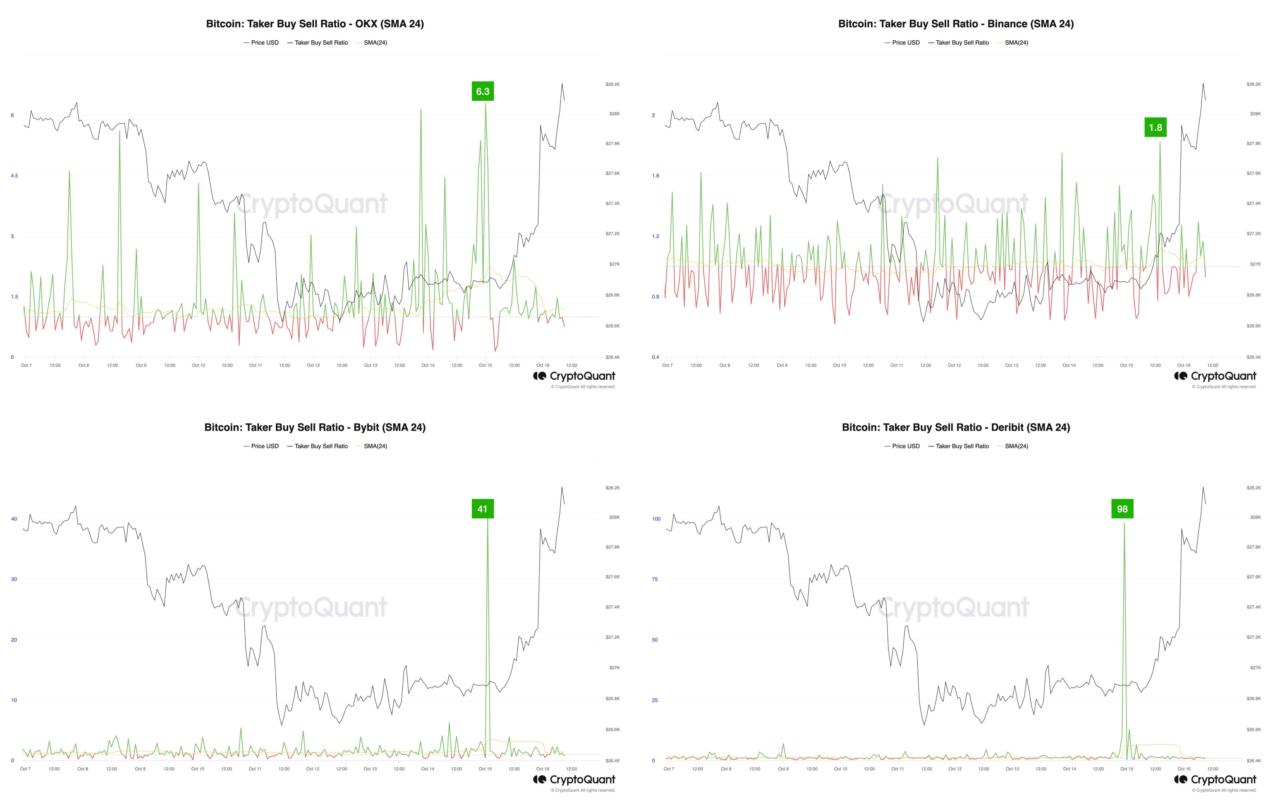
The net taker volume here is an indicator that keeps track of the difference between the taker buy volume and taker sell volume on the Bitcoin futures market.

When the value of this metric is positive, it means that the taker buy volume is dominating the taker sell volume right now. Such a trend implies buying pressure may be strong in the market currently.

On the other hand, negative values could suggest the presence of a bearish sentiment among the investors, as selling pressure is higher than the buying pressure.

Now, here is a chart that shows the trend in the 30-day moving average (MA) Ethereum net taker volume over the past few years:

Ethereum Net Taker Volume

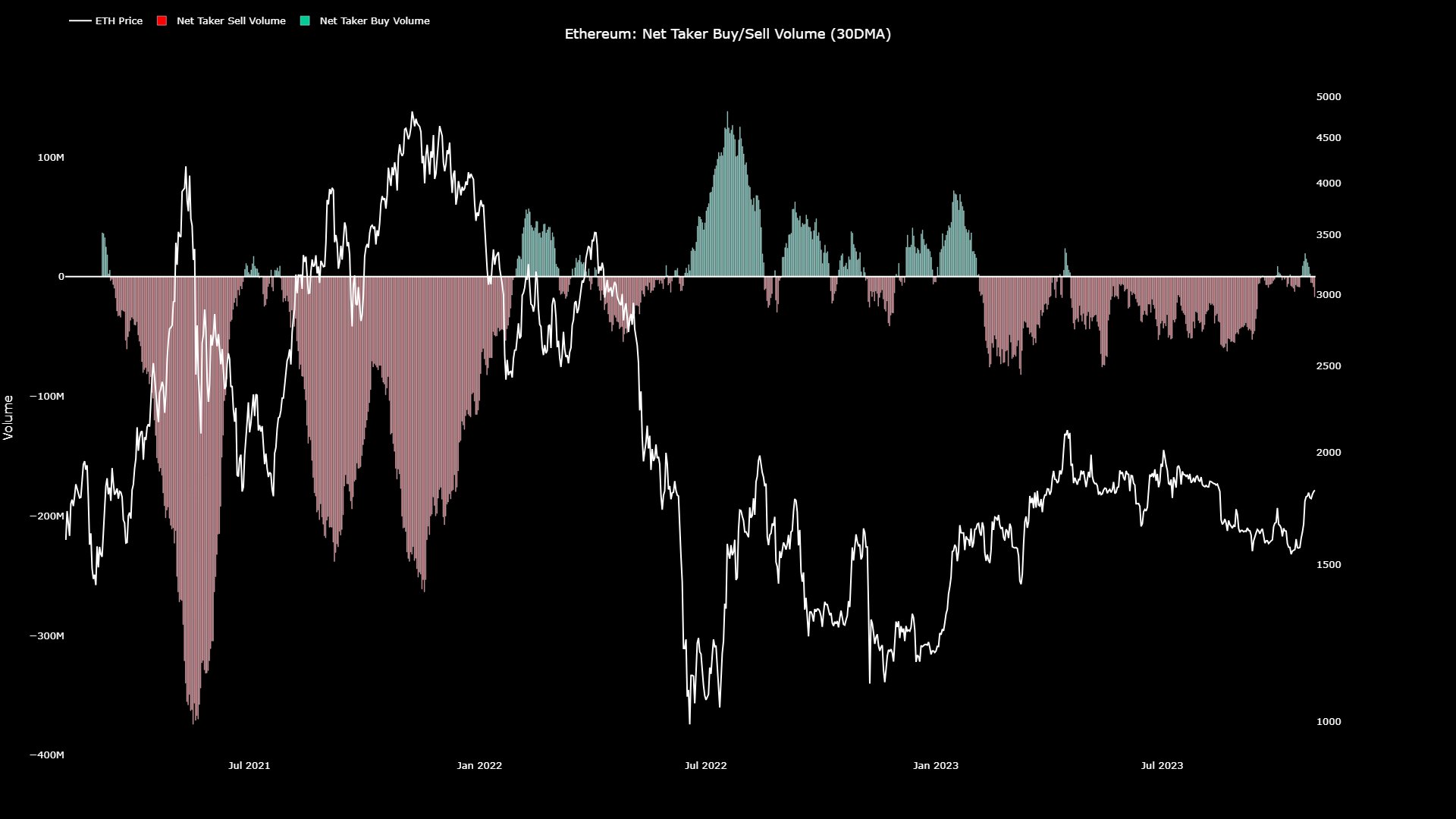
As displayed in the above graph, the Ethereum net taker volume has been mostly negative during the past few months, implying that sentiment around the asset has remained bearish.

Bitcoin, on the other hand, has enjoyed periods where the taker buy volume has surpassed the taker sell volume, as the chart shared by the analyst a few days back showed.

Bitcoin Net Taker Volume

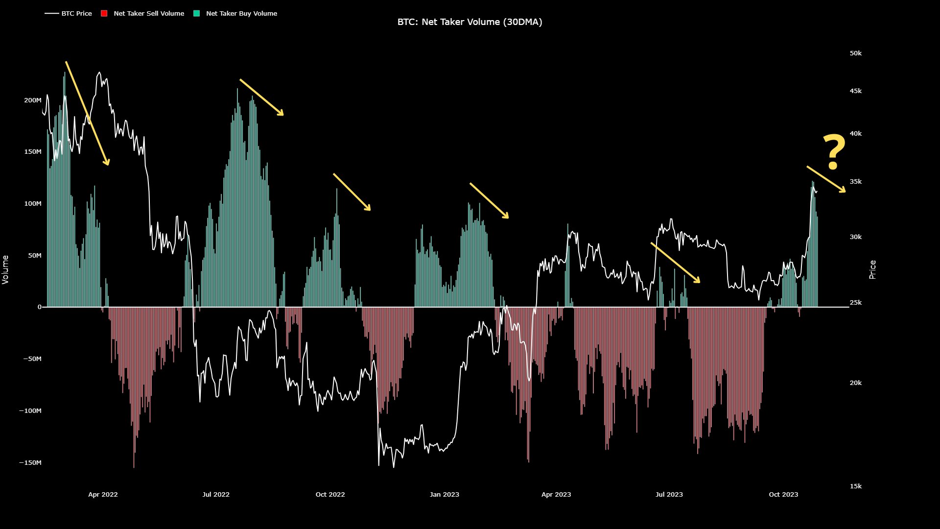
Most notably, the net taker volume of Bitcoin is significantly positive right now, suggesting the strong buying pressure present in the market. Unsurprisingly, BTC’s sharp rally has come alongside these positive values of the metric.

Ethereum has no such buying pressure present at the moment. Maartunn believes this is why the ETH price has been performing considerably poorly against BTC recently.

Ethereum Has Still Not Touched The Highs Set Earlier In The Year

Ethereum’s underperformance against Bitcoin is easily visible in the asset’s year-to-date chart.

Ethereum Price Chart

At the same time as Bitcoin observed its rally off the back of the highly positive net taker volume, Ethereum also saw a surge of its own. This rise, though, has been nowhere near as sharp as that of the original cryptocurrency, as ETH is still just trading around $1,800, which is notably less than the top of around $2,100 that the asset set back in April.

Not only has Bitcoin surpassed the $31,000 top it set back in July, it has also done so in spectacular fashion, as it’s now trading above the $34,000 level, which is significantly higher.

If the net taker volume is anything to go by, the second largest cryptocurrency may continue to underperform versus the largest, so long as investor sentiment around it remains negative.

Bitcoin Whales Ramp Up Selling, BTC To Decline Below $32,000?

On-chain data shows the Bitcoin whales have potentially ramped up their selling recently, something that could lead to a drawdown for the asset.

Bitcoin Exchange Whale Ratio Has Spiked Recently

As explained by an analyst in a CryptoQuant Quicktake post, the price of Bitcoin could correct towards the $31,000 to $32,000 range from the current whale selling pressure.

The relevant indicator here is the “exchange whale ratio,” which measures the ratio between the sum of the top 10 transfers to exchanges and the total exchange inflow.

The 10 largest transactions going towards these platforms generally come from the whales, so this ratio can tell us about how the inflow activity of the whales currently compares against the rest of the market.

These humongous investors may transfer their coins to these central entities for a variety of purposes, one of which could be for selling. Thus, whenever the whales occupy a large part of the total exchange inflows, it’s a potential sign that the selling pressure being mounted by this cohort is rising.

Historically, the indicator crossing the 0.90 mark has particularly been bearish for the cryptocurrency. At this level, 90% of the total inflows are coming from the wallets of the whales.

Now, here is a chart that shows the trend in the 72-hour moving average (MA) Bitcoin exchange whale ratio over the past few months:

Bitcoin Exchange Whale Ratio

In the above graph, the quant has marked the 0.90 level in red and has highlighted the points in the Bitcoin price corresponding to the instances where the 72-hour MA exchange whale ratio crossed this line.

The analyst notes that in all of these occurrences, the cryptocurrency first registered some volatility and then observed a decline in the short term, leading toward a local bottom formation.

Given the close timings, it would appear possible that the higher inflows from the whales during these instances were at least partially made for selling purposes.

From the chart, it’s visible that the indicator has once again risen above the 0.90 level recently, suggesting that the whales have considerably ramped up their inflows.

Naturally, these high values of the metrics don’t necessarily have to be bearish for the asset, as it’s possible that this cohort is simply opening up positions on the derivatives market this time (and to some extent, it has to be true in either case, as the futures open interest has seen an increase in the last few days).

Given the pattern that has followed in the last few instances, though, the quant says, “I expect increased volatility in Bitcoin and anticipate a new local bottom with a drop to the 31,000 to 32,000 dollar range, which previously acted as resistance.”

BTC Price

Bitcoin hasn’t been able to find any direction in the last few days as the coin has been consolidating above $34,000. If the exchange whale ratio is anything to go by, though, things might change soon for the asset.

Bitcoin Price Chart

Ethereum Bearish Signal: MVRV Has Entered The “Danger” Zone

On-chain data shows the Ethereum Market Value to Realized Value (MVRV) ratio has entered inside a danger zone that has historically led to tops.

Ethereum MVRV Ratio Has Surged Into The Danger Zone Recently

In its latest insight post, the on-chain analytics firm Santiment has talked about some underlying metrics related to ETH. First, the firm has pointed out how the trading volume of the cryptocurrency has gone down since Ethereum’s surge from a few days back.

Ethereum Volume

The trading volume observing a significant decline while the price is trying to continue its rally could indicate that momentum is weakening for the cryptocurrency.

One positive for the asset, though, could be the fact that the supply on exchanges has gone down since the rally started, implying that the investors have made net withdrawals.

Ethereum Exchange Supply

Generally, investors transfer their Ethereum out of these central entities to hold onto it in self-custodial wallets for extended periods, so this decline in the supply on exchanges could be a sign of fresh accumulation.

Following the latest rise in the asset, its social dominance has also seen a jump. The “social dominance” here refers to the mindshare that Ethereum occupies on social media platforms among the top 100 cryptocurrencies by market cap.

Ethereum Social Dominance

It would appear that more eyes have been turning at Ethereum recently, which can be a sign that hype is building up among the traders. Historically, too much hype has been negative for the asset, as it has often led to top formations.

So far, though, the social dominance is still notably below the levels it was at when ETH hit its local top at the start of this month, as is apparent in the above chart. According to Santiment, this “may suggest there can be some room for it to go before things cool down.”

A signal that is more concretely bearish for Ethereum, however, is the 30-day MVRV ratio. In simple terms, what this ratio tells us is how the value that investors are holding (the market cap) compares against the capital that they invested into the asset (the realized cap).

Ethereum MVRV Ratio

Here, Santiment has used the 30-day MVRV ratio, which means this indicator only keeps track of the investors/addresses who bought their coins within the last 30 days.

As shown in the chart, this Ethereum indicator has recently risen into a territory that the analytics firm labels as a “danger zone.” Historically, the price has seen a correction not too long after the metric has reached this zone so another local top may be due for Ethereum right now.

ETH Price

At the time of writing, Ethereum is trading at around $1,800, up 1% in the past week.

Ethereum Price Chart

Can PEPE Build On Its 60% Rise? Here’s What On-Chain Data Says

PEPE has observed an impressive 60% rally recently. Here’s what on-chain data says regarding whether this rise can continue.

PEPE Has Seen Some On-Chain Metrics Light Up Recently

In a new post on X, the market intelligence platform IntoTheBlock has discussed how PEPE is looking in terms of its on-chain indicators currently. The first metric of interest here is the profit/loss breakdown of the memecoin’s user base.

PEPE Profit/Loss

As displayed above, about 35% of the holders/addresses of the cryptocurrency are carrying their coins with some net unrealized profit right now. On the other hand, the loss investors amount to 51% of the network’s user base, meaning that the majority of the holders are in the red currently.

The remaining 14% of the addresses are breaking even at the current price levels of the asset. Generally, the investors carrying profits are more likely to sell their coins to harvest their gains, which means that if there are many holders in profit, significant selling pressure could arise in the market.

In the current scenario, however, more than 50% of the investors are still carrying their coins at a loss despite the recent 60% surge that PEPE has enjoyed. Thus, the potential selling pressure in the sector may not be too much yet. This could certainly be a positive sign for the rally’s sustainability.

Next, IntoTheBlock has pointed out how the address activity related to PEPE has observed a significant boost recently.

PEPE Addresses

According to the analytics firm, the active addresses jumped 372% between October 19th and 25th, while the new addresses increased by 440% in the same period.

The “active addresses” metric keeps track of the daily number of addresses participating in some transaction activity on the blockchain. In contrast, the new addresses indicator measures the daily number of wallets coming online on the network for the first time.

The sharp growth in these indicators would imply that network activity has been high recently, both in terms of usage and adoption. Historically, rallies have thrived in such conditions, as a large number of active traders is what such moves require to be sustainable.

Lastly, IntoTheBlock has pointed out that while the PEPE whales haven’t shown concrete signs of accumulation yet, they have been potentially becoming active recently.

PEPE Whales

From the chart, it’s visible that the “large transactions volume” has observed some rise recently. The large transactions refer to transactions worth at least $100,000 in value, usually made by the whales and institutional entities.

While the uptick in the activity of these humongous investors hasn’t been that much, it’s still an optimistic sign that these investors have been showing at least some interest in PEPE during this rally.

PEPE Price

Since its sharp rise, PEPE has gone stale in the last few days as its price continues to trade around $0.0000011672.

Memecoin Price Chart

Bitcoin Solid Above $34,000 Despite High Short-Term Holder Profit-Taking

Bitcoin has shown some impressive strength above the $34,000 mark despite a high amount of profit-taking from short-term holders.

Bitcoin Short-Term Holders Are Selling, While Long-Term Holders Are Still Quiet

As explained by analyst James V. Straten in a new post on X, the short-term holders are currently participating in one of the strongest profit-taking events of the past couple of years.

The “short-term holders” (STHs) here refer to all those Bitcoin investors who have been holding onto their coins since less than 155 days ago. This group comprises one of the two main divisions of the BTC market, with the other being called the “long-term holders” (LTHs).

Statistically, the longer an investor keeps their coins dormant, the less likely they become to sell them at any point. Because of this reason, the STHs are generally the weak-minded hands of the sector, while the LTHs are the strong, persistent holders.

Whenever the sector goes through any significant FUD or FOMO, the STHs budge and participate in at least some amount of selling. The LTHs, on the other hand, usually show little reaction.

Since the Bitcoin price has enjoyed a sharp rally recently that has taken its price above the $34,000 level, the STHs would naturally be selling now. One way to track whether this Bitcoin group is selling their coins can be by tracking the volume that they are transferring to exchanges.

In the context of the current discussion, Straten has decided to choose the version of this indicator that specifically tracks the transactions from investors who are in profit, as profit-taking is generally the behavior of focus during rallies. In contrast, loss transactions play a greater role in price slumps.

Now, here is a chart that shows the trend in the metric for the Bitcoin STHs over the past two years:

Bitcoin Short-Term Holder Profit-Taking

As shown in the above graph, the Bitcoin STHs in profit have sent large amounts to these centralized platforms since the latest rally in the asset.

This confirms that these weak hands have been selling recently. As mentioned before, it’s not unusual for such a thing to happen, but the scale of the profit-taking this time around is particularly significant.

From the chart, it’s visible that there have only been a few times in the past couple of years where the STHs in profit have transferred comparable or higher volumes to exchanges. Given this selloff, it’s impressive that Bitcoin has been able to hold on above the $34,000 level during the last few days.

As expected from the LTHs, they haven’t sold much despite the rally.

Bitcoin Long-Term Holders

The metric is currently at its sixth-largest value for this year, but as is clear from the above graph, the scale of this selloff is still not that much in pure terms.

BTC Price

At the time of writing, Bitcoin is trading at around $34,700, up 13% in the past week.

Bitcoin Price Chart

Is Bitcoin Top Here? This Metric Would Say Otherwise

The Bitcoin MVRV ratio, an on-chain indicator, could suggest the asset may not have hit its top for the current rally just yet.

Bitcoin MVRV Ratio Says Market Isn’t Overheated Right Now

According to data from the market intelligence platform IntoTheBlock, past bull markets hit their peaks when the MVRV ratio crossed the 300% mark. The “Market Value to Realized Value (MVRV) ratio” refers to an indicator that keeps track of the ratio between the Bitcoin market cap and realized cap.

The “realized cap” here is a capitalization model for BTC that calculates the total value of the cryptocurrency by assuming that each coin in circulation is worth the same as the price at which it was last moved, rather than the current spot price.

As the price at which a coin was last moved on the blockchain was likely the price at which it changed hands, the realized cap can be interpreted as the total amount of capital that the investors as a whole have put into the asset.

The MVRV ratio compares the price of the coin (the market cap) with the realized cap, so it can tell us whether the investors are holding more or less than they put in.

Now, here is a chart that shows the trend in the Bitcoin MVRV ratio over the last few years:

Bitcoin MVRV Ratio

In the above graph, the Bitcoin MVRV ratio is shown as a percentage. At the 100% mark, the two capitalization models approach a equal value, suggesting that the market as a whole is just breaking-even.

Above this threshold, the investors are holding a net amount of profit, while below they are carrying loss. From the chart, it’s visible that the BTC MVRV ratio has remained above the break-even in recent months as the asset’s price has observed a rally.

At present, the metric is floating about the 150% level, suggesting that the market cap is 50% more than the realized cap. Historically, the larger the investors’ profits have gotten, the more likely they have become to take part in a selloff.

Because of this reason, tops have generally formed when the MVRV ratio has hit high levels. IntoTheBlock notes, however, that the bull markets in the past have usually only hit their peaks when the indicator has crossed the 300% mark.

Clearly, the indicator is still a significant distance away from this mark at the moment. This could be a potential sign that the Bitcoin rally hasn’t reached a state of overheat yet and thus, there might be more to come for the cryptocurrency’s price in terms of bullish momentum.

BTC Price

The Bitcoin rally has hit the pause button in the past week as the asset’s price has taken to sideways movement. Currently, the coin is trading around the $34,500 mark.

Bitcoin Price Chart

Are Bitcoin Derivatives Behind The Latest Rally? Glassnode Answers

Since the latest Bitcoin rally started, there has been speculation going on as to whether derivatives fuel the surge. Here’s what Glassnode says.

Bitcoin Funding Rates Have Remained Cool Recently

In its latest weekly report, the on-chain analytics firm Glassnode has talked about what the derivatives side of the market has looked like while the latest rally in the asset has occurred.

First, the report has looked into the open interest of the perpetual swap markets, where “open interest” refers to the total amount of Bitcoin contracts currently open. The metric has been measured in terms of BTC here so that the USD price fluctuations don’t affect the trend.

Bitcoin Open Interest

From the chart, it’s visible that the Bitcoin open interest saw two large liquidation squeezes back in January and August, with the former one being a short squeeze and the latter one being a long squeeze.

Since the latest rally started, BTC has observed two liquidation events: one of 25,000 BTC and the other of 33,000 BTC. This combined short squeeze is now of the same scale as the aforementioned mass liquidation events.

In terms of the USD values of the liquidation events, the latest squeeze is again comparable with the other ones this year:

Bitcoin Futures Liquidations

On the topic of liquidations, Glassnode reveals that, interestingly, the market has been dominated by long liquidations throughout the history of Bitcoin. There have only been a few phases where shorts have dominated the longs over 30 days.

The latest large short liquidations have resulted in the shorts just overtaking the longs, as the chart below shows.

Bitcoin Net Liquidation Volume

Curiously, it would appear that during the few periods that the short liquidations have dominated the market (highlighted in yellow), Bitcoin has observed a point of extreme in its price.

While the liquidation data would suggest that the derivatives have indeed played a role in driving the market through this latest rally, the funding rates could tell a different story.

Bitcoin Funding Rates

“Of note is that funding rates and cash-and-carry basis in futures markets have remained relatively calm all things considered,” explains Glassnode. “2023 has generally seen futures markets yield annualized rates over 6%, which are greater than US treasury rates.”

Back in August, however, the selloff cooled off these funding rates, and they have since remained relatively low. Even with the latest chaos in the market, the metric still hasn’t seen any significant uptick. The analytics firm notes that this could imply the Bitcoin rally is only partially driven by leveraged speculation.

BTC Price

At the time of writing, Bitcoin is trading at around $34,300, up 23% in the past week.

Bitcoin Price Chart

Will Ethereum Rally Continue? These Could Be The Factors To Watch

The data of two on-chain indicators may be referred to for finding out whether the latest Ethereum rally can go on or not.

Ethereum Has Enjoyed A Sharp Rally Of More Than 12% In The Past Week

Like the rest of the cryptocurrency market, Ethereum has observed a rally during the past few days. Although the coin’s bullish momentum hasn’t been quite as strong as Bitcoin’s, its weekly gains of 12% are still nonetheless significant.

Yesterday, the asset had been carrying even higher profits, as its price had touched above $1,850. In the past day, though, ETH has noted some drawdown, as it’s now trading under the $1,800 level.

Ethereum Price Chart

After the pullback, some investors have been wondering whether the Ethereum rally is done for now or if it has hopes for continuing further. On-chain data from Santiment may hold some hints about that.

ETH Exchange Supply Has Plunged, While Whale Transfers Have Spiked

In a new post on X, the on-chain analytics firm Santiment has discussed two important ETH metrics. The first of these is the “whale transaction count,” which keeps track of the total number of Ethereum transactions that carry a value of at least $100,000.

Generally, only the whale entities are capable of moving such a large amount of the asset with a single transfer, so transactions of this scale are assumed to reflect the behavior of these humongous investors.

The below chart shows the trend in this ETH indicator over the past few months.

Ethereum Whale Transaction Count

As displayed in the above graph, the Ethereum whale transaction count has observed some pretty high values recently. This suggests that these large holders have been quite active in the market.

At the peak of this spike, the indicator had a value of 6,049, which is the highest number of daily transactions that the whales have made on the network since April of this year.

The whale transaction count metric by itself can’t point towards a bullish or bearish outcome for the cryptocurrency, as both selling and buying transfers are included in the count.

It’s true, however, that whales would need to stay active if the rally has to continue, as their contribution will provide the necessary fuel for it. So far, the whales have been active indeed, but it remains to be seen whether they are still buying or if they are pivoting towards selling. The pullback in the Ethereum price may hint towards the latter.

The other indicator that Santiment has attached to the chart is the “supply on exchanges,” which measures the percentage of the total circulating ETH supply that’s sitting in the wallets of all centralized exchanges.

From the graph, it’s visible that this indicator has only continued to slide down since the rally started, implying that investors have continued to make net withdrawals from these platforms.

At present, 8.41% of the ETH supply is on exchanges, which is the lowest level since July 2015. Holders continuing to withdraw their coins can be a constructive sign for the cryptocurrency, as it can be a sign that accumulation is going on.

Bitcoin Long-Term Holders Stay Resolute Despite Rally, Supply Hits New ATH

On-chain data shows the Bitcoin long-term holder supply has set a new all-time high (ATH) despite the rally offering a profitable exit point.

Bitcoin Long-Term Holders Haven’t Given In To The Allure Of Profit-Taking Yet

In its latest weekly report, the on-chain analytics firm Glassnode has discussed how the BTC long-term holders have reacted to the latest rally in the asset towards the $35,000 level.

The “long-term holders” (LTHs) refer to those investors who have held onto their coins since at least 155 days ago. Statistically, the longer a holder keeps their coins still, the less likely they become to move them at any point.

Thus, since the LTHs have been holding their coins for a significant amount, they generally tend to remain quiet in the future. Throughout history, this cohort has shown this conviction regardless of whatever is going on in the market, whether FUD from crashes or FOMO from rallies.

Because of this, the times that the LTHs participate in selling can be ones to watch for, as they show that the market has pushed even these diamond hands towards selling.

Now, here is a chart that shows the trend in the supply held by the Bitcoin LTHs throughout the history of the cryptocurrency:

Bitcoin Long-Term Holder Supply

As displayed in the above graph, the Bitcoin LTH supply has increased recently and has set a new ATH of about 14.9 million BTC. This suggests that a net amount of the supply has continued to mature past the 155-day threshold despite the sharp rally that the asset has enjoyed.

From the chart, it’s visible that at some point during major historical rallies, these LTHs have usually participated in at least a bit of net selling as some members of the cohort look to harvest their gains. Interestingly, that hasn’t happened with this rally so far.

In the chart, Glassnode has also attached the data for another metric: the amount of the LTH supply being held at some loss. It would appear that 29.6% of the supply owned by these HODLers (about 4.28 million BTC) is currently carrying a net unrealized loss.

The on-chain analytics firm notes that this is quite a high value considering the significant uptrend that Bitcoin has seen since the lows in 2022. Such indicator values have rather been seen during the deep bear market phases historically (except the March 2020 spike, which occurred because of the sudden COVID crash).

“This suggests that the LTH cohort may be a more hardened and firm-handed cohort compared to prior cycles,” explains the report.

BTC Price

Bitcoin has seen a sharp 13% jump in the past 24 hours as the cryptocurrency is now trading at $34,500.

Bitcoin Price Chart

All Clear For $40,000? Bitcoin Shows Little On-Chain Resistance Ahead

Bitcoin might have an easy path toward the $40,000 mark as on-chain data suggests there isn’t much resistance ahead.

Bitcoin Levels Ahead Are Thin With Addresses Right Now

According to data from the market intelligence platform IntoTheBlock, there isn’t any exceptionally large resistance ahead for BTC. In on-chain analysis, resistance and support levels are defined on the basis of whether a large number of investors have bought their coins at the price levels or not.

The reason behind this is that the holders often show some reaction to the spot price retesting their cost basis (that is, their acquisition price). Whether they react by selling or buying could depend on which side the price is retesting their cost basis from.

When the spot value retests an investor’s cost basis from below, that is, when said investor had been in loss previously, the holder may react by selling their coins. This is because they might fear that Bitcoin would go down again, so exiting at break-even would sound like the ideal option.

On the other hand, the opposite type of retest may lead to the investor accumulating more, as they may think that since these same price levels turned out to be profitable earlier, they would do so again in the future.

Such buying and selling are insignificant on smaller scales, but if a large number of investors have their cost basis inside a particular price range, then the range could act as support or resistance for the asset.

Now, here is a chart that shows how the different Bitcoin price ranges look like on the basis of the concentration of investors who bought at them:

Bitcoin Support & Resistance

As displayed above, the price ranges after the current one doesn’t host the cost basis of that many investors. This implies that these prices shouldn’t offer too much resistance to the cryptocurrency, should a retest of them happen.

The range that’s thickest with investors currently is the one above $38,200, meaning that it would potentially be the trickiest to clear on the way to $40,000. This range, too, however, isn’t that much in terms of investor concentration when compared to the price levels Bitcoin has already cleared.

From the graph, it’s visible that the levels under $31,000 are especially rich with addresses. Thus, if the cryptocurrency observes a retrace towards them, it should potentially find some strong support.

IntoTheBlock also notes that with the latest rally, about 80% of the investors have now come into a state of profit, which is the highest level that the metric has seen since the bull market peak back in 2021.

It now remains to be seen if Bitcoin can keep up this rally and build up towards the $40,000 level, as at least on-chain data suggests such a move shouldn’t be too hard.

BTC Price

Bitcoin is up more than 12% within the past day alone as the asset is currently floating around the $34,400 level.

Bitcoin Price Chart

$35,000 The Next Key Level To Break For Bitcoin, Here’s Why

Bitcoin has now broken the $31,000 mark with its latest rally. According to on-chain data, the level could be the next major milestone for BTC.

Bitcoin Realized Price Of 2021 Holders Is $35,000 At The Moment

In a new post on X,  analyst James V. Straten has discussed the profit/loss situation of the different yearly Bitcoin buyer cohorts. The indicator of interest here is the “realized price,” which keeps track of the average price at which investors in the BTC market bought their coins.

When the asset’s spot price is below this metric, the average holder in the sector is at a loss right now. On the other hand, it being above the indicator suggests the dominance of profits among the investors.

Here, Straten hasn’t shared the chart for the ordinary realized price for the entire circulating supply but rather a few versions of the metric that only consider buyers since the start of a particular year. The chart below shows the trend in the Bitcoin realized price for each year since 2017.

Bitcoin Realized Price

As is visible in the graph, the Bitcoin realized price for all years except 2021 is below the current spot price of the cryptocurrency. This implies that the different yearly cohorts of the asset are holding their coins at some net unrealized profit.

The latest groups to enter into a state of profit have been the 2022+ and 2023+ ones. The 2021+ group has a realized price of about $35,000 at the moment, which is still a significant distance away, but as Straten has noted, the gap between the spot price and the metric is now the narrowest since the two diverged back at the start of the bear market.

Interestingly, during the peak in 2021, this group’s cost basis was around $48,000. The analyst suggests their realized price, since decreasing significantly, indicates some impressive Dollar-Cost Averaging (DCA) in the market.

In on-chain analysis, major cost basis levels have always played an important role, as the BTC spot price has often observed support or resistance on retests of them.

The chart shows that the Bitcoin price had found support at the 2023+ realized price back in June. The recent seemingly endless consolidation that BTC saw before the latest rally happened around the 2022+ and 2023+ metrics after they had overlapped.

Given the historical examples, the 2021+ may realize price will cause the price to react somehow when it eventually reaches there. Thus, the $35,000 level would be a significant milestone for the asset, as successfully claiming it could imply clear waters ahead for the cryptocurrency.

At the same time, however, the chances of participants buckling and harvesting their gains are increasing with all these groups coming into profits. Such profit-taking can lead to a pullback in the price, at least in the short term.

BTC Price

At the time of writing, Bitcoin is trading at around $31,200, up 11% in the past week.

Bitcoin Price Chart

Chainlink MVRV Enters Bearish Zone As LINK Breaks $10, Correction Soon?

On-chain data shows the Chainlink MVRV ratio has shot up as LINK has rallied above $10, a sign that a steep correction may be due for the asset.

Chainlink 30-Day MVRV Ratio Has Crossed The Bearish 20% Mark

As explained by an analyst in a post on X, the last three times the LINK MVRV ratio hit similar levels as now, the cryptocurrency registered a sharp drawdown. The “MVRV ratio” (where MVRV stands for Market Value to Realized Value) is an indicator that measures the ratio between the Chainlink market cap and the realized cap.

The realized cap here refers to a LINK capitalization model that assumes the true value of each coin in circulation isn’t the same as the asset’s spot price, but rather the price at which the coin last moved on the blockchain.

This price at which the coin was last transferred could be imagined to be the value at which its holder bought it, so the realized cap takes into account the prices at which each investor in the market acquired their LINK.

Thus, the realized cap is essentially a measure of the total amount of capital the holders as a whole have invested into Chainlink. Since the MVRV ratio compares the market cap with this metric, it can provide us with info about the profit/loss situation of the investors.

Now, here is a chart that shows the trend in the 7-day moving average (MA) of the ChainlinK MVRV ratio over the past year and a half:

Chainlink MVRV ratio

Note that in the above graph, the MVRV ratio shown isn’t just the ordinary version, but rather the 30-day one. What this means is that this indicator only takes into account the data of coins that were moved within the past month.

From the chart, it’s visible that the Chainlink 30-day MVRV ratio has observed a strong rise recently as the price of the cryptocurrency has enjoyed sharp upward momentum.

The metric has crossed the 21% mark with this increase, suggesting that the investors who bought within the last 30 days are holding 21% more in value than what they put in.

Usually, the more the profits held by the investors, the greater their probability of giving in to the allure of profit-taking. As such, whenever the investors are carrying a high amount of profits, the risk of a correction taking place can become significant.

In the current case, the Chainlink investors are those who only bought within the past 30 days, which means that this cohort is bound to have fickle-minded hands who would easily be tempted to harvest their gains.

As the analyst has marked in the chart, it would appear that the last three times the MVRV ratio crossed above 20% for this group, the LINK price observed a sharp decline.

In the first two cases, this drawdown was 34% each, while in the third and latest one, it was about 14%, which is still quite a notable drop. If this pattern is anything to go by, Chainlink may see another such correction soon.

LINK Price

Chainlink has seen another 9% rise during the last 24 hours as its price has now broken above the $10.1 mark.

Chainlink Price Chart

Bitcoin Knocks At The Door Of $30,000, But Can Break Happen?

Bitcoin has approached the $30,000 mark with a sharp rally today, but on-chain data suggests the level could provide some major resistance.

1.49 Million Addresses Bought Around The $30,000 Level

According to data from the market intelligence platform IntoTheBlock, the most significant potential resistance for BTC is at the current levels. The “resistance” here refers to not the technical resistance, but rather the on-chain one.

From the on-chain perspective, levels are defined as resistance/support on the basis of the concentration of investors/addresses who bought at said levels.

The below chart shows what the distribution of the holders looks like right now across the various levels of the asset:

Bitcoin Resistance

Generally, whenever the price of the asset retests the cost basis of an investor, they may become more likely to show some kind of move. If this retest happens from below, that is, the holder had been in losses prior to this, they might be tempted to sell at break-even.

On the other hand, a decline in the price towards their acquisition price may lead to them buying more of the asset, as they might think that if these same levels proved to be profitable earlier, they could do so again in the near future.

The thicker the band of investors who have their cost basis inside a specific price range, the more pronounced effects like these would be. Thus, such ranges above the price could be looked at as sources of resistance, while those below may serve as support.

As is visible in the above graph, the $29,800 to $30,700 range is particularly rich with addresses right now. To be more particular, about 1.49 million addresses bought their coins here.

Naturally, this means that Bitcoin could find it troubling to cross above this range, as it has already happened throughout the past year. “At the same time, 73% of Bitcoin addresses are currently in profit,” notes IntoTheBlock, as the ranges below all have thick green bands currently.

While the range will be hard to clear, at least strong support below means the cryptocurrency could keep up the retests until eventually it can find a break. If BTC can indeed clear the range, it shouldn’t have much resistance at higher levels, as not many investors have their cost basis there.

One positive sign for the current rally could be the fact that it’s not driven by the derivatives side, as an analyst has pointed out on X.

Bitcoin Open Interest

In the above chart, the data for the ratio between the Bitcoin open interest and market cap is displayed. The “open interest” here is a measure of the total amount of BTC contracts open on the futures market.

The indicator’s value has declined recently, implying that the open interest has gone down relative to the market cap. This could suggest that the current rally is driven by spot buying.

BTC Price

Bitcoin is currently inside the range of major resistance discussed before as its price is trading around $29,900.

Bitcoin Price Chart

Wait For Bitcoin At $20,000? This Analyst Says No

An analyst has explained using on-chain data that Bitcoin has a major demand bucket at the current price levels, so it won’t hit $20,000 anytime soon.

Huge Bitcoin Buying Occurred Inside The $25,000 To $30,000 Range

In a new post on X, analyst Ali has explained that some large entities accumulated at the $25,000 to $30,000 range. The indicator of interest here is the “UTXO Realized Price Distribution” (URPD), which, in short, tells us about the amount of Bitcoin that was acquired at the different price levels of the cryptocurrency.

Here is a chart that shows how the URPD of the current Bitcoin market looks like:

Bitcoin URPD

Notice that the URPD here is “ATH-partitioned.” What this means is that the price ranges here have been defined by creating 100 equally spaced partitions between zero and the all-time high (ATH) of the cryptocurrency.

From the graph of the Bitcoin URPD, it’s visible that the price levels between $25,000 and $30,000 are host to the cost basis of a particularly large amount of the supply.

Ali notes that most people, including major institutional investors like Michael Saylor’s Microstrategy and Elon Musk’s Tesla, purchased a significant number of coins between these levels.

The levels being so dense with supply isn’t only significant because of the fact that these large entities believe those prices were worthy buys, but also due to how investor psychology tends to work out.

Generally, whenever the price retests the cost basis of a holder, they may become more probable to show some reaction. How they would react depends on their sentiment and profit/loss status prior to the retest.

If they had been i9n profits before the price declined towards their cost basis, they may believe the price would go up again in the future so they would accumulate more at the dip.

On the other hand, them being at loss before may make them sell at their cost basis, as they would find the idea of breaking-even more enticing than potentially going back into losses.

There are some dense price buckets above the current level, meaning that BTC could feel resistance when it would retest them due to such investors exiting at their break-even.

If Bitcoin declines instead, however, it could feel strong support, as the buckets below are zones of some pretty major demand, so at least some of these investors might be inclined to buy more at these same levels. Thus, a decline below this range could be unlikely for the cryptocurrency.

“So when they tell you “It’s too late to buy BTC” or “Wait for $20k,” please ignore them!”, advises the analyst.

BTC Price

Bitcoin is up almost 7% during the past week, but the coin’s surge has slowed down recently as its price has mostly been consolidating around $28,500.

Bitcoin Price Chart

This Bullish Divergence Is Once Again Forming For Bitcoin, Rally Soon?

Data shows a divergence is forming between Bitcoin and Ethereum’s open interest, something that has been bullish for BTC in the past.

Bitcoin Open Interest Has Declined, While Ethereum Has Seen Rise

According to data from the on-chain analytics firm Santiment, the BTC open interest has been going down since Monday. The “open interest” here refers to the total amount of Bitcoin contracts (in USD) that are currently open on the futures and options market.

When the value of this metric increases, it means that there are more positions being opened up on derivative exchanges right now. Such a trend can lead to increased volatility for the asset, as more positions generally come with higher overall leverage for the sector.

On the other hand, decreasing values suggest the traders are either closing off their positions or are getting liquidated. The cryptocurrency may become calmer following this kind of trend.

Now, here is a chart that shows the trend in the open interest for Bitcoin and Ethereum over the past month:

Bitcoin Open Interest

As displayed in the above graph, The Bitcoin open interest has observed a downtrend in the last few days. This decline in the indicator had first started when the fake iShares ETF announcement led to more than $100 million shorts being flushed in a flash.

The metric saw a bit of a rebound not too long after this sudden sharp liquidation squeeze took place, but it was quick to return back toward a downward trajectory.

At the same time that this latest decline in the Bitcoin open interest has occurred, the Ethereum open interest has registered a rise instead. This suggests that while contracts are closing up on BTC futures and options, the ETH side of the market is seeing renewed interest.

Interestingly, as Santiment has highlighted in the chart, the last time this trend occurred, the Bitcoin price benefited from an uplift. This previous occurrence of the pattern was between September 28 and 30, and shortly after this, the BTC price saw an increase of about 4.5%.

The divergence between the metrics of the two assets was much more pronounced back then as compared to now; however, the scales of both the decline in the BTC open interest and the rise in the ETH open interest were far greater.

Nonetheless, the same general pattern has still repeated this time, so it now remains to be seen whether Bitcoin would see a bullish effect this time as well, and if so, to what degree, given the lesser scale of the divergence.

BTC Price

Bitcoin has gone stale during the last few days as its price is still trading around the $28,400 mark right now.

Bitcoin Price Chart

This Rare Bullish Bitcoin Crossover Could Soon Form, Quant Predicts When

A rare bullish crossover between two on-chain metrics could soon be forming for Bitcoin. Here’s when this analyst believes the cross would happen.

Bitcoin Realized Prices Of Two UTXO Age Bands Are Moving Towards A Cross

As explained by an analyst in a CryptoQuant Quicktake post, a bullish crossover is expected to happen soon for BTC. The indicator of interest here is the “realized price,” which basically keeps track of the price at which the average investor in the Bitcoin market acquired their coins.

The indicator calculates this value by going through the on-chain history of each coin in circulation to see what price it was last transacted at. The metric assumes this price to be its buying price and so, after taking the mean of this value for all tokens on the network, the average cost basis of all coins is obtained.

When the cryptocurrency’s price is under this metric, it means that the average holder in the sector is in a state of loss. On the other hand, the price being above the indicator implies the overall market is enjoying net profits.

The realized price of the entire user base isn’t of relevance in the context of the current discussion, but two specific UTXO age bands which are 6 months to 12 months and 12 months to 18 months. What these age bands signify is that the coins (or more accurately, UTXOs) belonging to them were last moved inside their range.

Now, here is a chart that shows the trend in the Bitcoin realized price for these two UTXO age bands over the past few years:

Bitcoin Realized Price

As displayed in the above graph, the realized price of the UTXOs sitting dormant between 12 and 18 months ago has been heading down for a while now. The 6-month to 12 months age band had been showing a similar trajectory earlier in the year, but a while back, the metric plateaued and has since then turned itself around.

The reason the average cost basis of investors belonging to this age band has reversed its trajectory is that the 6 months cutoff for the group now lies in April, which means that those who bought during the rally in the starting months of the year would now be counted under this cohort.

Earlier in the year, the bear market buyers were a part of the group, so the average naturally headed down. The 12-month to 18-month-old group, on the other hand, still constitutes these bear market buyers, hence why its realized price is still decreasing.

If these two metrics continue in their current trajectories, they will go through a crossover. As the quant has highlighted in the chart, such a crossover where the 6 months to 12 months band has broken above the 12 months to 18 months cohort, has historically proven to be bullish for the asset.

In total, there have only been four such crossovers in the cryptocurrency’s entire history, so if this crossover goes on to form, it would only be the fifth ever. The analyst believes that November 28, 2023, is when this bullish crossover could be expected to form for Bitcoin.

BTC Price

Bitcoin had made a push toward the $29,000 level yesterday, but it appears the surge has already calmed down as the coin has retraced towards $28,400.

Bitcoin Price Chart

Bitcoin Market Cap Could Rise By $1 Trillion After Spot ETFs Launch: CryptoQuant

CryptoQuant has revealed in its latest report that the Bitcoin market cap could rise by as much as $1 trillion after launching the spot ETFs.

Bitcoin Could See A 165% Rise When The Spot ETFs Launch

Yesterday, fake news of the approved iShares Bitcoin spot ETF took the sector by storm, as all cryptocurrencies observed sharp rallies. At the peak of this surge, BTC had approached the $30,000 level.

However, when the market realized the truth about the announcement, the asset quickly retraced to the levels it was at before the rally. While the gains were only brief, the rally nonetheless provided a glimpse into the strong reaction that the market could see to the launch of a real ETF.

This was just one spot ETF; however, several others are waiting in line to be approved. How would the market look like when all these ETFs have launched? In its new report, the on-chain analytics firm CryptoQuant has discussed precisely that.

Bitcoin Spot ETFs

The above table shows information about the various companies waiting to be approved for the Bitcoin spot ETF, including the total size of their assets under management (AUM).

“Although these ETFs are not expected to be approved this year, the probability that they will be approved by the final deadline (March 2024) has been growing as a result of favorable court rulings for Grayscale (GBTC Fund) and XRP in their respective legal fight against the SEC,” says the firm.

In total, these companies’ AUM are around $15.6 trillion. If they put just 1% of this amount towards BTC, it would mean inflows of a whopping $155 billion for the asset. “To put it in context, these amounts represent almost a third of the current market capitalization of Bitcoin,” notes CryptoQuant.

Now, how this capital inflow could affect the market cap of BTC isn’t exactly simple to say. Generally, the market cap increases by more than just the raw capital entering the cryptocurrency.

The firm has used the “realized cap” metric to assess this relationship. The realized cap is a capitalization method for BTC that calculates its total value by assuming that the value of each coin is the same as the price at which it was last transacted on the blockchain.

The realized cap can be imagined as the total investment made by the investors, accounting for the prices at which each bought their coins. The chart below shows how this realized cap has compared with the market over the years.

Bitcoin Realized Cap

The graph shows that the market cap and realized cap usually have noticeably different growth rates, as they have always followed pretty different paths.

CryptoQuant has calculated the ratio between the annual growths of the two caps and has found that for most of the asset’s history, the market cap has grown by 3 to 6 times faster than the realized cap.

If the realized cap grows by $155 billion when the spot ETFs get approved and the asset managers allot 1% of their AUM to Bitcoin, the market cap could grow by between $450 and $900 billion.

The report notes this figure implies “the market cap would increase between 82% and 165% from the current level and that Bitcoin price could reach between $50K and $73K as a result of these inflows of fresh money.”

BTC Price

Bitcoin has enjoyed some uptrend over the past few days as the asset has now climbed above the $28,500 level.

Bitcoin Price Chart

Analyst Points Out Weird Bitcoin Activity On Bybit & Deribit Before Flash Surge

An analyst has pointed out how some suspicious Bitcoin buying activity took place on Bybit and Deribit in the leadup to yesterday’s flash surge.

Bitcoin Taker Buy Sell Ratio Saw Extraordinary Spikes On Bybit & Deribit Yesterday

In a new post on X, Julio Moreno, head of research at CryptoQuant, discussed how the BTC taker buy-sell ratio looked like for the different exchanges in the market leading up to the surprise rally yesterday.

The “taker buy sell ratio” here refers to an indicator that keeps track of the ratio between the taker buy and taker sell volumes for Bitcoin on any given exchange (or group of platforms).

When the value of this metric is greater than 1, it means that the taker buy volume is more than the sell volume currently. Such a trend suggests that the investors are willing to pay more to purchase the asset and thus, a bullish sentiment is shared by the majority.

On the other hand, a value under the threshold implies a bearish mentality is active on the exchange as the traders are willing to sell the asset at a lower price at the moment.

Now, here is a chart that shows the trend in the 24-day simple moving average (SMA) Bitcoin taker buy-sell ratio over the past few days for four exchanges: Binance, OKX, Bybit, and Deribit.

Bitcoin Taker Buy Sell Ratio

Yesterday, Bitcoin saw a very sharp sudden rally as false news broke out that the iShares BTC spot ETF had been approved by the US SEC. This surge, however, retraced in as spectacular a fashion as it had occurred as the market quickly realized that the rumor was without any substance.

From the chart, it’s visible that all four of these exchanges saw spikes in the taker buy-sell ratio in the hours leading up to this rally. The spikes on Binance and OKX, though, were of pretty normal levels, as spikes of similar scales had occurred in the preceding days as well.

In the case of Bybit and Deribit, however, the 24-day SMA of the ratio had hit peaks of 41 and 98, respectively, which are both extremely high levels. For comparison, the indicator only hit 1.8 on Binance and 6.3 on OKX.

This would suggest that some really high Bitcoin buying volume was observed on Bybit and Deribit, which was unlike what was seen on other exchanges in the sector.

It’s unclear what this pattern means, but it’s possible that some users on these platforms had already been tipped on the fake announcement in advance.

BTC Price

Regardless of the quick rally and crash, Bitcoin has enjoyed some upward momentum during the past couple of days as the cryptocurrency’s value has now climbed toward the $28,500 level.

Bitcoin Price Chart