XRP Down 3% After SEC Settlement Stalls, But Social Media Turns Bullish

A federal judge has rejected Ripple and the SEC’s proposed $50 million settlement, but social media sentiment around XRP has turned bullish anyway.

Ripple-SEC Settlement Stalled After Court Rejection

The Ripple-SEC case seemed to be moving forward after both parties agreed on a reduced $50 million settlement, but the joint motion for an indicative ruling has now been rejected in court.

According to the filing shared by defense lawyer James K. Filian in an X post, the two haven’t “come close” to showing exceptional circumstances outweighing public interest or the administration of justice that would justify modifying the judgment. This means that the original fine of $125 million still stands for Ripple.

Following the news, XRP has taken a bearish hit to its price, as the below chart displays.

XRP Price Chart

The asset was trading around $2.15 at the time the news broke out, but it has since fallen below $2.09, implying a decrease of around 3%. Naturally, this reaction is quite mild by the cryptocurrency sector’s standards, but could still suggest some panic selling.

Sentiment among the retail crowd, however, has seen a surprising jump, as per social media data.

XRP Sentiment On Social Media Has Seen A Bullish Jump

In a new post on X, the analytics firm Santiment has talked about how the social media users have responded to news of the Ripple-SEC case stalling. The indicator shared by Santiment is the “Positive/Negative Sentiment,” gauging the ratio between positive and negative comments involving a given coin on the major social media platforms.

The indicator separates between positive and negative posts/threads/messages on the platforms using a machine-learning model and determines how the counts of the two compare.

Here is a chart that shows the latest trend in the metric for Bitcoin, Ethereum, and XRP:

Bitcoin Vs Ethereum Vs XRP

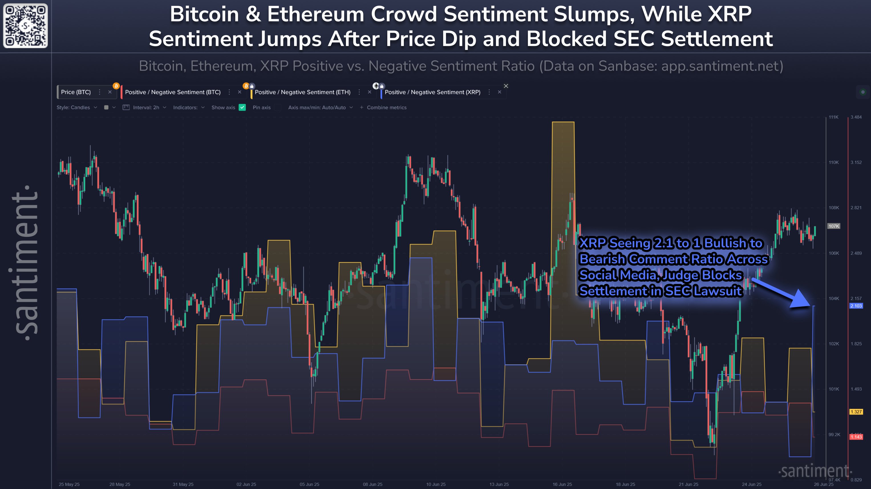
As displayed in the above graph, the Positive/Negative Sentiment is currently above the 1 mark for all three of these cryptocurrencies, indicating that posts pertaining to bullish sentiment outweigh the bearish ones.

For Bitcoin and Ethereum, however, the positive comments only have a slight advantage, meaning that while optimism does exist among the crowd, it’s quite mild.

From the chart, it’s visible that XRP has diverged from these assets with a sharp spike, which has taken its Positive/Negative Sentiment to a value of 2.1. This is the highest level for the cryptocurrency in 17 days and corresponds to there being more than double as many bullish calls as bearish ones.

Often, retail sentiment acts as a contrarian signal, with extreme values in either direction leading to some sort of reversal in the price. As such, while this development in crowd mentality could potentially imply investors aren’t worried about the news, the indicator could still be to keep an eye on.

Bitcoin Binance Open Interest Shoots Up: Warning For BTC?

Data shows the Bitcoin Open Interest on the cryptocurrency exchange Binance has recently shot up. What could this mean for the asset’s price?

Bitcoin Binance Open Interest Has Seen A Sharp Increase

As explained by an analyst in a CryptoQuant Quicktake post, the Bitcoin Open Interest on Binance has spiked. The “Open Interest” refers to an indicator that measures the total amount of BTC positions that are currently open on a given derivatives platform.

When the value of the metric goes up, it means the investors are opening up fresh positions on the market. As the total amount of leverage present in the sector rises when new positions appear, this kind of trend can lead to the asset’s price becoming more volatile.

On the other hand, the indicator observing a decline suggests the holders are either closing up positions of their own volition or getting liquidated by their platform. Since leverage goes down with such a trend, the cryptocurrency can become more stable following it.

Now, here is a chart that shows the trend in the 24-hour percentage change of the Bitcoin Open Interest for the Binance exchange over the past month:

Bitcoin Open Interest

As displayed in the above graph, the 24-hour change in the Binance Bitcoin Open Interest recently shot up to a notably positive value, implying the number of positions on the platform saw a significant jump.

At the peak of this spike, the indicator hit a value of more than 6%. From the chart, it’s visible that there have been a couple of other occasions that the metric has breached this mark during the past month.

Interestingly, each of these spikes coincided with points that preceded a period of consolidation/decline for Bitcoin. As the quant notes,

This recurring pattern suggests that large inflows into leveraged positions often precede periods where short-term gains are realized, leading to potential price pullbacks or sideways movement as market participants de-risk.

The analyst has also shared another chart, this one tracking the 7-day change in the Realized Cap of the short-term holders and long-term holders. The “Realized Cap” refers to an indicator that keeps track of the capital that the holders have invested into Bitcoin.

Below is a chart that shows the change in this metric for two investor cohorts, short-term holders (holding time of 155 days or lesser) and long-term holders (holding time greater than 155 days).

Bitcoin Realized Cap

As is apparent from the graph, the 7-day change in the Realized Cap has recently been positive for long-term holders, which suggests capital has been maturing from the short-term holders into this cohort.

That said, earlier in the month, the indicator hit a peak of $57 billion, but today it has come down to just $3.5 billion. So, while capital is still aging into long-term holders, it’s now happening at a much slower rate.

BTC Price

Bitcoin has been attempting to break past the $108,000 mark, but so far, it hasn’t found success as its price is still trading around $107,200.

Bitcoin Price Chart

Bitcoin Retests $108,000, But Holders Disagree On Direction

As Bitcoin pushes back toward the $108,000 level, on-chain data reveals the investor cohorts are still divided in their accumulation behavior.

Bitcoin Accumulation Trend Score Shows Mixed Behavior From Holders

In a new post on X, the on-chain analytics firm Glassnode has talked about how the BTC investor cohorts aren’t showing a unified behavior on the Accumulation Trend Score. The Accumulation Trend Score refers to an indicator that basically tells us whether Bitcoin holders are accumulating or not. The metric bases its value on two factors: the balance changes happening in the wallets of the investors and the size of those wallets.

When the value of the indicator is greater than 0.5, it means the large holders (or a large number of small hands) are leaning toward net accumulation. The closer the score is to 1.0, the stronger the buying. On the other hand, the metric being under the threshold suggests the investors are in a phase of distribution (or simply, that they aren’t accumulating). This behavior is the strongest at the zero mark.

Now, here is the chart for the Accumulation Trend Score shared by Glassnode, showing the trend in the metric separately for the various holder groups:

Bitcoin Accumulation Trend Score

As displayed in the above graph, the Accumulation Trend Score has recently varied in value across these cohorts. Investors who hold between 1 to 10 BTC appear to be distributing, while those with 10 to 100 BTC are accumulating.

Among the large holders, the trend leans more neutral, but the indicator still doesn’t show any clear uniformity. Members of the 1,000 to 10,000 coins group, popularly referred to as the whales, are currently tending toward accumulation, but those part of the 10,000+ cohort, the ‘mega whales,’ are showing slight distribution.

According to the analytics firm, the Accumulation Trend Score of the network as a whole stands at 0.57. As such, it seems there is no majority behavior being followed by the traders at the moment.

That said, while a unifying buying push hasn’t appeared alongside the latest price rally toward $108,000, there has still been an improvement that has occurred in the score. According to the analytics firm, the indicator dropped to a low of 0.25 earlier.

It only remains to be seen, however, whether the Bitcoin investors would continue to move in this direction, or if indecision is here to stay for a while.

BTC Price

Bitcoin attempted to find a break above the $108,000 level earlier, but the asset has so far not been able to maintain a sustainable move, and its price has even seen rejection toward $107,100.

Bitcoin Price Chart

Chainlink Holders Set Record As 1-Yr MVRV Signals ‘Opportunity’

On-chain data shows new investors have been coming into Chainlink (LINK) as the MVRV Ratio signals a potential long-term opportunity for the asset.

Chainlink Has Seen Its Total Holder Count Reach A New High

In a new post on X, the analytics firm Santiment has discussed about the latest trend in the Total Amount of Holders metric for Chainlink. This indicator measures, as its name suggests, the total number of addresses on the LINK network that are carrying some non-zero balance.

Below is the chart shared by Santiment that shows how the value of the metric has changed during the past year.

Chainlink Total Amount of Holders

As displayed in the graph, the Total Amount of Holders observed an inflection point earlier this year and has since been climbing up at a notable rate. This suggests that new non-empty wallets are popping up on the network.

This kind of trend can arise due to a number of reasons. Fresh investors coming into the space or old ones who sold before making a return naturally contribute to an increase in the indicator. Another factor could be existing users creating new wallets to distribute their holdings or for privacy purposes.

In general, all of these could be assumed to be occurring simultaneously to a degree whenever the Total Amount of Holders goes up. As such, the recent uptrend in the metric could indicate that some net adoption (that is, the influx of new investors) has steadily been taking place for Chainlink.

Over the past month, 7,903 new non-zero balance addresses have joined the chain, bringing the Total Amount of Holders to a fresh all-time high (ATH) of 769,380.

In the same chart, the analytics firm has also attached the data of another indicator: the Market Value to Realized Value (MVRV) Ratio. This metric basically compares how the value held by the BTC investors (the market cap) compares against the value put in by them (the realized cap).

In other words, the indicator tells us about the profit-loss balance of the holders. Here, the version of the MVRV Ratio that’s relevant is the 365-day version, capturing the situation of the investors who bought their coins within the past year.

From the graph, it’s visible that the 1-year MVRV Ratio of Chainlink is currently sitting at a negative 17.3%, an indication that these traders are, on average, holding a loss of 17.3%.

Generally, however, investors being underwater isn’t actually a bad thing for the cryptocurrency. This is because holders in profit are the ones more likely to participate in selling. As such, Santiment notes that the trend in the 365-day MVRV Ratio could suggest the asset’s “long-term investing timeframe is in an opportunity zone.”

LINK Price

At the time of writing, Chainlink is trading around $13.15, up more than 2% in the last seven days.

Chainlink Price Chart

Tron’s 374% Profit-Taking Spree Uncovered—Here’s Who Was Behind It

On-chain data shows Tron (TRX) observed a large profit-taking spike earlier in the month. Which type of holder was responsible for the move?

Tron SOPR Saw A Huge Spike Earlier In The Month

In a CryptoQuant Quicktake post, analyst Maartunn has talked about the recent trend in the Spent Output Profit Ratio (SOPR) of Tron. The SOPR refers to an on-chain indicator that tells us about whether the TRX investors are moving or selling their coins at a profit or loss.

The indicator works by going through the transfer history of each coin being moved to see what price it was last transacted at. Coins that have this cost basis above the current spot price are contributing to loss realization, while those with the opposite setup to profit realization.

The SOPR takes the ratio between the spent value and cost basis, and sums it up for all coins being sold on the blockchain to find a net situation for the market as a whole.

When the value of the indicator is greater than 1, it means the investors are, on average, realizing a profit through their transactions. On the other hand, the metric being under this threshold suggests the dominance of loss realization in the market.

Now, here is the chart shared by the quant that shows the trend in the Tron SOPR over the past year:

Bitcoin SOPR

As displayed in the above graph, the Tron SOPR saw a huge spike above the 1 mark earlier in the month, implying investors took part in a significant amount of profit-taking.

From the chart, it’s also visible that there were other profit realization spikes during the past year, but the current one stands out for its scale. The latest peak in the metric saw its value go to 4.74, corresponding to a profit margin of 374%.

“With TRX priced at $0.268 at the time, the average acquisition price for those coins would have been around $0.0566,” explains Maartunn. Interestingly, Tron hasn’t seen extended periods around this price mark since late 2022, meaning that the tokens would have been held for a good while before being finally transacted this month.

Usually, when dormant hands break their silence, it’s likely to be for selling-related purposes. That said, it’s not the only reason they may do so. “The activity could be tied to early investors realizing gains, internal transfers, or reallocation decisions,” notes the analyst.

In some other news, the USDT supply on the Tron network has reached a new milestone, as institutional DeFi solutions provider Sentora (formerly IntoTheBlock) has pointed out in an X post.

Tron USDT Supply

There is now over $80 billion in USDT supply circulating on Tron, the second-most out of any cryptocurrency network.

TRX Price

At the time of writing, Tron is trading around $0.273, up 0.5% over the last 24 hours.

Tron Price Chart

Crypto Bears Rekt: $359M Gone As Bitcoin, Ethereum Rebound

Data shows the rebound in Bitcoin and other cryptocurrencies has punished the bears, triggering a massive wave of short liquidations.

Crypto Sector Has Just Witnessed A Mass Liquidation Event

According to data from CoinGlass, a large amount of liquidations have piled up on the cryptocurrency derivatives market. “Liquidation” refers to the forceful shutdown that any open contract has to go through if its losses exceed the threshold defined by its platform.

Below is a table that shows the numbers related to the latest liquidations in the market.

Bitcoin & Crypto Liquidations

As displayed, the cryptocurrency sector has seen a derivatives flush of over half a billion dollars during the past day. Out of these, 73.7% of the liquidations, equivalent to $371 million, came from the short investors alone.

The short-heavy mass liquidations have come as Bitcoin and company have rebounded following the news of a ceasefire between Israel and Iran. Earlier, US strikes on Iranian nuclear facilities had induced a crash in the market that ended up unleashing a flurry of long liquidations. This time, it seems the bears have been the ones caught out instead.

As usual, Bitcoin and Ethereum have topped the list of liquidations, but interestingly, the latter ($168 million) has managed to outweigh the former ($153 million), which is generally not the case.

Bitcoin Vs Ethereum Vs Other Cryptos

Ethereum observing a higher amount of liquidations could come down to the fact that its price has seen a larger jump during the past day (7% vs 3.5%). It could also be an indication of an elevated level of speculative interest in the cryptocurrency.

Out of the altcoins, Solana and XRP have topped the charts with $29 million and $13 million in liquidations, respectively. Though clearly, these numbers are quite small compared to the figures of the top two titans, showcasing the sheer difference in capital involved.

In some other news, Bitcoin taker buy volume has shot up on the cryptocurrency exchange Bybit, as an analyst has pointed out in a CryptoQuant Quicktake post.

Bitcoin Taker Buy Sell Ratio

In the chart, the data of the Bitcoin Taker Buy Sell Ratio is shown. This metric measures the ratio between the taker buy and taker sell volumes for a given platform. Here, the exchange involved is Bybit.

It would appear that the indicator has recently seen a sharp spike above the 1 mark, a sign that long volume has started to sharply outpace the short one. According to the quant, spikes in the metric on Bybit have often preceded a surge in the BTC price.

BTC Price

Following the recovery run over the last 24 hours, Bitcoin has returned to the $105,100 mark.

Bitcoin Price Chart

This Bitcoin Zone Could Be Market’s Next True ‘Pivot,’ Says Glassnode

The on-chain analytics firm Glassnode has highlighted the $97,000 to $98,000 zone as an important one for Bitcoin. Here’s why.

Bitcoin CBD Suggests Build Up Of Supply In This Range

In a new post on X, Glassnode has discussed about a potentially significant zone for Bitcoin based on the Cost Basis Distribution. The Cost Basis Distribution (CBD) is an indicator that measures the amount of the BTC supply that investors last purchased or transferred at the various price levels.

Bitcoin CBD

As is visible in the above graph, there is a dense supply zone located between $97,000 to $98,000. Generally, investors are quite sensitive to retests of their cost basis, so a large amount of them (or alternatively, a few large holders) having their acquisition level inside a narrow range could make retests of it significant for Bitcoin.

When the mood in the market is bullish, holders can react to retests of their cost basis from above by buying more. They may do so believing that the same level would end up proving profitable again in the future and the retrace is just a ‘dip.’

The cryptocurrency suffered a plunge yesterday and nearly touched this region. Since then, however, things have turned around for the asset and it has gained some distance over it once more.

In the event that the decline does continue, which may not be too unexpected given the volatile geopolitical situation at the moment, the zone could end up acting as the next true pivot for Bitcoin, according to the analytics firm.

While the CBD tells us where the cryptocurrency’s supply is concentrated, it doesn’t contain any information about who bought or sold at those price levels. Glassnode’s behavioral cohorts, investor groups divided on the basis of their behavior, solve this problem.

Here is a chart that shows the trend in the Bitcoin supply held by these holder cohorts over the past few years:

Bitcoin Investor Cohorts

There are five of these behavior groups. First Buyers (green) include the investors who are buying Bitcoin for the very first time. As displayed in the chart, the supply of this group has been on the rise, indicating fresh demand has been coming in.

Momentum Buyers (blue) are those that capitalize on market momentum by buying during uptrends. On the opposite spectrum are the Conviction Buyers (purple), who buy despite falling prices.

Finally, there are the Loss Sellers (red) and Profit Takers (yellow), who correspond to investors exiting at a loss and profit, respectively. During the past couple of weeks, the former cohort has seen an increase of 29%, a sign that weak hands have been capitulating.

That said, the analytics firm has noted, “Conviction Buyers also increased, suggesting sentiment isn’t collapsing. Some are cutting losses – others are actively lowering their cost basis.”

BTC Price

At the time of writing, Bitcoin is floating around $103,900, down more than 4% in the last seven days.

Bitcoin Price Chart

Bitcoin STHs Capitulate: 14,700 BTC Moved To Exchanges At Loss

As volatility engulfs the cryptocurrency market amid war tensions, on-chain data shows that the Bitcoin short-term holders are selling at a loss.

Bitcoin Short-Term Holders Just Made Large Exchange Inflows At A Loss

In a new post on X, CryptoQuant author Axel Adler Jr has talked about how the Bitcoin short-term holders have reacted to the price volatility that has come alongside rising tensions in the Middle East following US strikes on three nuclear facilities in Iran.

The short-term holders (STHs) refer to the BTC investors who purchased their coins within the past 155 days. The other side of the network, the holders with a holding time greater than 155 days, are termed as the long-term holders (LTHs). The former group contains the new entrants and low conviction holders, who generally panic easily whenever some change occurs in the market. On the other hand, the latter cohort includes the veterans of the market, who tend to sit tight through crashes and rallies alike.

As such, given the recent sharp price action that has occurred in the sector, the STHs are likely to have made some moves. And indeed, on-chain data would confirm so.

Bitcoin STH P&L To Exchanges

The above chart, shared by the analyst, shows the data for the profit and loss exchange deposit transactions that the STHs as a whole are making. Investors usually transfer to these centralized platforms when they want to sell, so inflows going to them can provide hints about whether selling is elevated or not.

From the graph, it’s visible that the loss transactions going to the exchanges from this cohort have amounted to 14,700 BTC, which, although lower than the two major capitulation events from the past couple of months, is significant. Thus, it would appear that some of the STHs have reacted to the news by exiting the market, even if it means taking a loss.

It’s also apparent from the chart that the profitable transfers have remained relatively low at 3,100 BTC. This is likely down to the fact that the STHs are left with little profit following the price decline, as the on-chain analytics firm Glassnode has pointed out in an X post.

Bitcoin STH Realized Price

In the chart, the trend of the STH Realized Price is displayed. This indicator keeps track of the Bitcoin cost basis or acquisition level of the average STH. During the crash, the price almost retested the line, and even after the rebound, it remains close to it, meaning the profit margin for the cohort is still tight.

BTC Price

At the time of writing, Bitcoin is trading around $101,300, down over 5% in the last week.

Bitcoin Price Chart

Consolidation Takes Its Toll: Bitcoin Investors No Longer Greedy

Data shows the Bitcoin Fear & Greed Index has returned back to the neutral territory, a sign that investors are losing optimism.

Bitcoin Fear & Greed Index Has Reset Back To Neutral

The “Fear & Greed Index” refers to an indicator created by Alternative that tells us about the average sentiment present among the traders in the Bitcoin and wider cryptocurrency markets.

The index makes use of the data of these five factors in order to determine the trader mentality: trading volume, market cap dominance, volatility, social media sentiment, and Google Trends.

The indicator represents the calculated sentiment as a score lying between zero and hundred. Values above the 54 mark correspond to the dominance of greed in the market, while those below 46 to presence of fear among the investors. All values lying between these cutoffs correlate to a net neutral sentiment.

Now, here is how the mood in the Bitcoin market is like right now according to the Fear & Greed Index:

Bitcoin

As is visible above, the Bitcoin Fear & Greed Index has a value of 54 at the moment, which suggests the investors hold a neutral sentiment, although one that’s right on the edge of turning into greed.

The recent neutral mentality in the sector has come following a phase of greed among the traders, as the below chart shows.

Bitcoin Neutral

As displayed in the graph, the Bitcoin Fear & Greed Index spiked to a high of 72 earlier in the month as the asset’s price gave investors hope that its consolidation phase might be coming to an end.

As the recovery rally has fizzled out and the coin has returned to its range, however, optimism among the investors has predictably faded. If history is to go by, though, this development may not actually be so bad for the cryptocurrency.

Generally, digital asset markets tend to move in a way that goes contrary to the expectations of the majority. The probability of such an opposite move taking place goes up the more extreme the crowd opinion becomes.

Besides the three core sentiments, there are two special regions known as the extreme fear (under 25) and extreme greed (above 75). These zones are where the likelihood of a contrary move has been the strongest in the past, with tops and bottoms often taking form.

Although the market sentiment has recently only seen a reset to the neutral territory, the fact that the investors are no longer greedy could still be a positive for Bitcoin and other cryptocurrencies. There have been many instances in the past where a dip into the neutral zone was enough for the bull run to regain momentum.

It only remains to be seen, though, how the prices of BTC and others would develop in the coming days.

BTC Price

At the time of writing, Bitcoin is floating around the $102,800 mark, down more than 2% in the last seven days.

Bitcoin Price Chart

Dogecoin Gears Up For 60% Move—Will It Be Up Or Down?

An analyst has explained how Dogecoin could be primed for a 60% price move. Here’s the range that could end up deciding the direction of the break.

Dogecoin Is Nearing The End Of A Triangle Pattern

In a new post on X, analyst Ali Martinez has talked about how Dogecoin is currently looking from a technical analysis (TA) perspective. Below is the chart shared by the analyst that shows the trend in the 1-day price of DOGE.

Dogecoin Triangle

As displayed in the graph, the daily Dogecoin price has been trading inside what appears to be a triangular channel. A triangle is a TA pattern that forms whenever an asset’s price observes consolidation between two converging trendlines.

The upper line of the pattern is likely to provide resistance to the price, while the lower one support. A break out of either of the lines can signal a continuation of trend in that direction.

There are a few different types of triangles, with a few popular ones being the Symmetrical, Ascending, and Descending variations. The orientation of the trendlines decides the type of the triangle.

In a Symmetrical Triangle, the lines converge at a roughly equal and opposite slope. This means that as the price travels inside the pattern, both upward and downward volatility shrinks in an even manner.

For the Ascending and Descending versions, however, there is a bias to the upside or downside. In the former, the upper trendline is parallel to the time-axis and the price progressively makes higher lows. Similarly, the latter involves lower highs with a flat support level.

From the chart, it’s apparent that the Triangle that Dogecoin has been moving inside for the past few months is similar to a Symmetrical Triangle, but it has a slight tilt toward the downside.

It’s also visible that DOGE is nearing in on the end of the triangle. Generally, triangle breakouts become more likely to occur as the asset approaches the apex, as the consolidation range squeezes tight in this region.

Considering that Dogecoin may be in this zone now, it’s possible that its spring may be ready to uncoil. Based on the pattern forming in the daily price, the analyst has noted that DOGE looks primed for a 60% move.

As for which way a break would happen, that naturally comes down to which line the memecoin exits the triangle from. ” All you need to do is wait for a daily close outside of the $0.16 to $0.22 range to determine the direction of the trend,” notes Martinez.

DOGE Price

At the time of writing, Dogecoin is floating around $0.168, down more than 11% over the last seven days.

Dogecoin Price Chart

Solana Plunges 13%: Can Key On-Chain Support Stop The Fall?

Solana has declined by around 13% in the past week, which has brought the asset back to a major on-chain support cluster. Could this be where the bleed ends?

Solana Has Strong On-Chain Support Between $145 & $147

In a new post on X, the on-chain analytics firm Glassnode has talked about where support and resistance levels lie for Solana based on the Cost Basis Distribution (CBD) metric.

The Cost Basis Distribution tells us about how much of the cryptocurrency’s circulating supply was last purchased or transferred at what spot price. Below is the chart shared by Glassnode that shows the data of the indicator for Solana over the past few months.

Solana CBD

As is visible, there are a few price zones near the current Solana spot price that stand out in terms of the amount of supply that they hold. The $155 to $157 range carries the cost basis of around 31 million tokens and the $164 to $166 range that of 29 million tokens.

A third demand zone exists at $145 to $147, a region that the cryptocurrency’s price is currently making a retest of. Here, the investors last purchased a total of 13 million SOL.

To any investor, their cost basis is an important level, so they are more likely to show some kind of move when a retest of it occurs. Generally, this type of reaction isn’t anything relevant for the asset when just a few holders share their acquisition mark at the level, but when a large amount of them are involved, like in the case of the range that SOL is retesting right now, a sizeable reaction can sometimes appear.

Generally, these moves tend toward buying when the retest occurs from above. That is, when the investors were in the green prior to the retest. This happens because these holders might believe the price decline to be just a dip opportunity or they may simply want to protect their cost basis.

Similarly, holders might panic sell when the retest happens from below. This could happen because underwater sellers can be desperate to get back into the green and once they do, they might fear that the rise is only temporary so they could push for the exit.

As Solana is retesting the $145 to $147 range from above, it’s possible that buyers from this region could provide support to the asset and help cushion its fall. In the event that a turnaround does happen, the $155 to $157 resistance range could be of focus next.

The analytics firm has also shared the CBD of another altcoin, Tron (TRX).

Tron CBD

As Glassnode explains,

Cost Basis Distribution shows TRON found support in the $0.26–$0.27 range, where over 14B $TRX is held -marking the strongest cluster on the chart. Above that, the supply is relatively thin and most investor positioning remains below current price.

SOL Price

Solana is currently hanging right at the lower end of the support range as its price is floating around $145.

Solana Price Chart

These Altcoins Are Bucking The Trend—But Can They Keep It Up?

A few altcoins have diverged from the market with sharp rallies. Here’s whether they can sustain the momentum, according to social media data.

Social Media Has Started Paying Attention To These Altcoins

In a new insight post, the analytics firm Santiment has talked about some altcoins that have recently diverged from the rest of the market with notable price surges.

Here are the coins in question and how their monthly returns have looked:

Altcoin Profits

As is visible above, these altcoins have managed to deliver sizeable profits during a period where the major assets have printed losses. Bitcoin (BTC), for instance, is down around 2% on this timeframe. Among the listed alts, two are particularly prominent in terms of market cap size: Hyperliquid (HYPE) and WhiteBIT Token (WBT). The former has seen a rise of 51.6% and the latter 59.2%.

Now, can these coins sustain their runs? One hint can come from social media data. Santiment has shared two indicators related to social media: Social Dominance and Positive/Negative Sentiment. The first metric, the Social Dominance, tells us about what part of social media discussions related to the top 100 assets a particular cryptocurrency is responsible for.

The indicator determines this by comparing the asset’s Social Volume, a count of the posts/messages/threads on social media containing unique mentions of the coin, with the combined Social Volume of the top 100 cryptocurrencies.

The other metric of interest, the Positive/Negative Sentiment, basically measures the ratio between the positive and negative sentiments present among the social media users.

To determine this, the indicator runs the Social Volume of an asset through a machine-learning model to distinguish between bullish and bearish comments. It then takes the ratio of the two to find the net situation on these platforms.

First, here is a chart that shows the trend in both of these metrics for Hyperliquid:

Altcoins Hyperliquid Social Dominance

As displayed in the above graph, the Social Dominance of HYPE peaked at 1.5% in May, but has gone down since then, despite the price continuing its surge. Nonetheless, the indicator has remained at 1.25%, which is still a notable level. Alongside this high attention, the Positive/Negative Sentiment has stayed at around 3.75, which suggests social media users have been making almost 4 times as many bullish comments related to the altcoin as bearish ones.

Historically, altcoins have tended to move against the crowd’s expectations, so an excessive sentiment in either direction has often proven to be a reversal signal. This means that an overly bullish mood can actually lead to a top for an asset. Considering this, HYPE may not be in the best position for continuing its surge, at least from the perspective of sentiment.

While Hyperliquid has seen a bit of a cooldown in Social Dominance, WhiteBIT Token has just seen a huge surge.

Altcoins WBT Social Dominance

That said, WBT’s Positive/Negative Sentiment hasn’t budged alongside this Social Dominance explosion, although it remains at a notable level of 3.07. Based on the trend, the analytics firm thinks, “we likely will see its price make a second run after its local top that just occurred on June 15th unless FOMO begins to make an appearance.”

HYPE Price

Hyperliquid has seen a sharp decline since its peak on Monday as its price has come down to $39, a potential sign that the social media hype may already be biting back.

Hyperliquid Price Chart

Bitcoin NVT Enters Reversal Zone: BTC Dangerously Overvalued?

On-chain data shows the Bitcoin Network Value to Transactions (NVT) Golden Cross has surged into a zone that has historically signaled overpriced conditions for the asset.

Bitcoin NVT Golden Cross Has Crossed Above 2.2

In a new post on X, CryptoQuant author Darkfrost has talked about the latest trend in the NVT Golden Cross of Bitcoin. The NVT Golden Cross is an indicator based on another metric known as the NVT Ratio.

The NVT Ratio keeps track of the ratio between the BTC market cap and transaction volume. The idea behind the indicator is that the ability to transact coins (as gauged by the transaction volume) could be considered as a reflection of the asset’s ‘fair value.’

Thus, through the comparison of the cryptocurrency’s current value (that is, the market cap) with this fair value, the metric can tell us about whether the asset is overvalued or undervalued.

When the value of the metric is high, it means the market cap is high compared to the transaction volume. Such a trend could imply BTC may be becoming overheated. On the other hand, the indicator being low could suggest room for the coin to grow relative to its volume.

Now, the NVT Golden Cross, the actual metric of relevance here, is a signaling indicator like the Bollinger bands for the NVT Ratio that aims to locate tops and bottoms in its value. The NVT Golden Cross does so by comparing the short-term trend (represented by the 10-day MA) with the long-term one (30-day MA).

Below is the chart shared by the analyst that shows the trend in the metric over the last couple of years.

Bitcoin NVT Golden Cross

As displayed in the above graph, the Bitcoin NVT Golden Cross has recently registered a sharp uptick and entered into the region above the 2.2 mark (highlighted in red).

This zone is where the cryptocurrency’s market cap has historically outpaced the transaction volume to a degree that a reversion to the mean has tended to occur. In other words, it’s where price corrections to the downside have taken place for the asset.

Though, it’s visible from the chart that not every top in the NVT Golden Cross inside this territory coincides with a price top. And in many instances that it does, the decline in the asset isn’t to some major degree.

So far since the signal has appeared, however, the asset has indeed been going down, a potential sign that the same reversion effect may be in play once more. It now remains to be seen whether downside will be limited, or if this will be one of those instances where the signal was followed by an extended drawdown.

BTC Price

At the time of writing, Bitcoin is floating around $103,700, down almost 5% in the last seven days.

Bitcoin Price Chart

XRP Bullish Signal: Shark & Whale Wallets Set New All-Time High

On-chain data shows XRP shark and whale population has climbed to a new record alongside a spike in activity on the blockchain.

XRP Wallets With 1 Million+ Tokens Have Set A New Record

In a new post on X, the on-chain analytics firm Santiment has discussed the latest trend in a couple of indicators related to the XRP network. The first metric of relevance is the “Supply Distribution,” which tells us, among other things, the number of wallets that belong to a particular coin range.

In the context of the current topic, the range of interest is above 1 million coins (with the upper bound being infinity). This cutoff for the range converts to about $2.2 million at the current exchange rate, which is quite significant.

Naturally, the only investors who would qualify for this threshold would be the big-money ones. Such holders are popularly known as the sharks and whales. Generally, the influence of any entity on the network goes up the more coins that they hold, so this cohort, with its large holdings, can carry some degree of power.

As such, the behavior of the sharks and whales can be worth keeping an eye on. If nothing else, it can at least inform us about what the sentiment may be like among these humongous investors.

Now, here is the chart shared by Santiment that shows the trend in the Supply Distribution of these 1 million+ holders over the past year:

XRP Sharks & Whales

As displayed in the above graph, the XRP Supply Distribution has recently registered an uptick for sharks and whales, implying more wallets carrying above a million coins have popped up on the network. This could be an indication that some new big-money investors have potentially joined the chain. Following the increase, the network now has 2,708 wallets of this size, which is a new record.

In the same chart, the analytics firm has also attached the data of the second relevant metric: Daily Active Addresses. This indicator measures the unique total number of wallets that are becoming involved in some kind of transaction activity on the network every day, whether as a sender or receiver.

Since the smaller entities like retail massively outweigh the large investors in terms of number, this metric essentially represents the amount of activity that the entities on the smaller end of the network are participating in.

From the graph, it’s visible that the XRP Daily Active Addresses have recently observed a large spike. Over the past week, the metric has averaged a value of 295,000 addresses daily, which is a drastic jump over the 35,000 to 40,000 figure witnessed during the last three months.

“The XRP ledger is showing serious signs of growth, from both a usage and key stakeholder perspective,” notes Santiment. It now remains to be seen what effect, if any, these changes in network metrics would have on the cryptocurrency’s price.

XRP Price

XRP shot up beyond the $2.33 mark yesterday, but it seems bullish momentum has already faded as the coin has dropped back to $2.20.

XRP Price Chart

Stablecoin Exchange Inflows Plummet $61 Billion—Warning Sign for Bitcoin?

On-chain data shows the exchange inflows related to the stablecoins USDT and USDC have seen a sharp plunge. Here’s what this could mean for Bitcoin and other cryptocurrencies.

Stablecoin Exchange Inflows Have Dropped Below Yearly Average

In a new post on X, CryptoQuant author Axel Adler Jr has discussed about the latest trend in the Exchange Inflow of the top two stablecoins in the sector, USDT and USDC.

The “Exchange Inflow” refers to an on-chain indicator that keeps track of the total amount of a given asset that’s moving into the wallets associated with centralized exchanges.

Generally, investors may deposit their coins into these platforms when they want to trade them away, so a high value on the Exchange Inflow can indicate demand for swapping the cryptocurrency. For volatile assets like Bitcoin, this is something that can naturally be bearish for the price.

In the case of stablecoins, however, their price doesn’t see any impact from exchange deposits, since it always remains, by definition, stable around whatever fiat currency the asset is tracking.

That said, stablecoin inflows aren’t without consequence. Investors usually deposit these assets to swap into a volatile cryptocurrency of their choice. As such, coins like Bitcoin can see a bullish effect from an Exchange Inflow spike related to these fiat-tied tokens.

Now, here is a chart that shows the trend in the combined Exchange Inflow of the top two stablecoins, USDT and USDC, over the past few years:

Stablecoins Exchange Inflow Vs Bitcoin Price

As displayed in the above graph, the Exchange Inflow of USDT and USDC shot up to a very high value at the end of last year, a sign that the investors were making massive deposits of these stablecoins.

Alongside the spike in the indicator, the Bitcoin price observed a rally to a new all-time high (ATH), a potential sign that the stablecoin inflows may have helped provide the fuel for the run.

At the peak of the spike, the metric reached a value of $131 billion per day. From the chart, it’s apparent that since then, the indicator has been following a downward trajectory and today, its value has come down to $70 billion per day.

This represents a significant decline of $61 billion since the high. Though, while the indicator is indeed notably down compared to the peak, its current level is still high in the context of the wider cycle so far.

Naturally, if this drawdown in the stablecoin Exchange Inflow keeps up, it could potentially turn out to be a bearish sign for Bitcoin and other digital assets. That said, even though BTC went down earlier in the year, its price is still above the $100,000 mark right now, a possible sign that investors may simply be entering a phase of consolidation.

Bitcoin Price

Following a surge of about 2.5% over the last 24 hours, Bitcoin has managed to recover back to the $108,100 level.

Bitcoin Price Chart

Dogecoin Must Hold This Level—Or Risk A 30% Price Crash

An analyst has explained how Dogecoin might have to hold strong above this level, if the memecoin has to avoid a 30% price drop.

Dogecoin Is Currently Trading Inside A Symmetrical Triangle

In a new post on X, analyst Ali Martinez has shared a chart that shows where Dogecoin currently stands from a technical analysis (TA) perspective. Below is the graph in question, showing the trend in the 1-day price of the memecoin.

Dogecoin Symmetrical Triangle

From the chart, it’s visible that the Dogecoin price has possibly been trading inside a triangular channel during the last few months. The channel hasn’t appeared to be just any triangle-shaped one, either, but a special type called the Symmetrical Triangle.

A Symmetrical Triangle forms whenever an asset observes consolidation between two trendlines converging at a roughly equal and opposite slope. The upper line of the pattern tracks lower highs in the price, and the lower one higher lows.

As the asset moves inside this channel, its range becomes narrower with time, until it shrinks down to a point at the apex. Generally, volatile moves are more likely to occur when consolidation tightens, so a breakout of the pattern becomes increasingly probable as the price approaches the tip of the triangle

Symmetrical Triangle breakouts can signal a continuation of the trend in the direction of the break. This means that a rise above the pattern can be a bullish sign, while a drop below it may be a bearish one.

As displayed in the chart, the 1-day price of Dogecoin has recently been nearing the end of the triangle, a potential sign that a breakout could be imminent. Currently, the memecoin is retesting the lower line, so it will be interesting to see whether the level holds or if this is where a break would finally happen.

Unlike the Ascending and Descending Triangles, two other popular types of triangular channels in TA, breakouts are usually considered to be equally probable in either direction for a Symmetrical Triangle. The reason is simple: consolidation occurs in an exactly sideways manner in this pattern. In contrast, the Ascending and Descending types slope upward and downward, respectively, which can bias the breakout direction.

Thus, even if Dogecoin is retesting the lower level right now, a rebound and then breakout from the upper line may also still be quite possible. That said, in the event that a bearish breakout does take place, things can be especially troubling for DOGE, as there is another level of importance just nearby.

The level in question, situated around $0.168, corresponds to the 0.786 Fibonacci Retracement level. Fibonacci Retracement levels are lines defined using ratios found in the famous Fibonacci series. “Dogecoin $DOGE must hold above $0.168 to avoid a 30% price drop!” warns the analyst.

DOGE Price

At the time of writing, Dogecoin is trading around $0.177, down over 4% in the last week.

Dogecoin Price Chart

Ethereum ETF Frenzy: Inflows Jump 5x While Bitcoin Stalls

Data shows the Ethereum spot exchange-traded funds (ETFs) have seen weekly inflows five times the recent average, while Bitcoin has seen a slowdown in momentum.

Ethereum Spot ETFs Have Seen 154,000 ETH In Inflows This Week

In a new post on X, the analytics firm Glassnode has talked about the latest trend in the netflow related to the US-based Ethereum spot ETFs. The “spot ETFs” refer to investment vehicles that allow an alternate means of exposure to a given asset.

This means that with a spot ETF, a trader can ‘invest’ into an asset without having to directly own it. In the context of cryptocurrencies, this is especially relevant, as the ETFs trade on traditional platforms. Some investors may not want to fiddle with digital asset exchanges and wallets, so the ETFs offer them a familiar path into cryptocurrencies.

The option of the spot ETFs is a relatively recent one in the sector, with Bitcoin’s version gaining approval from the US Securities and Exchange Commission (SEC) at the start of 2024 and Ethereum’s in mid-2024.

Below is a chart that shows how the netflows related to the latter’s spot ETFs have looked during the past month.

Ethereum ETF Netflows

From the graph, it’s visible that the Ethereum US spot ETFs have been witnessing net inflows for the last few weeks, a sign that there has been demand for the coin from the traditional investors.

“This week alone, they’ve seen 154K ETH in inflows – 5x higher than their recent weekly average,” notes Glassnode. “For context: the biggest single-day ETH inflow this month was 77K ETH on June 11th.”

While the trend has been that of growth for Ethereum, it has looked a bit more mixed when it comes to the number one digital asset, Bitcoin.

Bitcoin spot ETFs

As displayed in the above graph, the Bitcoin US spot ETFs have also seen positive netflows this week. The scale of the inflows, however, hasn’t been anything impressive, as only around 7,800 BTC has entered into the ETFs.

This is above average, but far lower than the highs witnessed in May, when at one point the daily inflow had reached a peak of 7,900 BTC, more than the inflows for the entire current week.

Last week, the Bitcoin spot ETFs witnessed an outright negative netflow, so it seems the momentum has recently just been slower for the asset. In contrast, things have looked much more green for Ethereum indeed.

ETH Price

While Ethereum has been seeing consistent ETF inflows, its price has still underperformed against Bitcoin over the past day as it has dropped to $2,540, a decline of 7% compared to BTC’s 2% loss.

Ethereum Price Chart

$390M In Ethereum Leaves Exchanges—Biggest Daily Exit In Over A Month

On-chain data shows Ethereum has just witnessed its largest daily withdrawal in over a month, a sign that may turn out to be bullish for the asset’s price.

Ethereum Has Recently Seen Notable Exchange Outflows

As explained by the institutional DeFi solutions provider Sentora (formerly IntoTheBlock) in a new post on X, a large amount of Ethereum has left exchanges. The on-chain indicator of interest here is the “Exchange Netflow,” which measures the net amount of ETH entering into or exiting out of the wallets associated with centralized exchanges.

When the value of this metric is positive, it means the exchanges are receiving a net number of deposits. As one of the main reasons why investors deposit their tokens to these platforms is for selling-related purposes, this kind of trend can have a bearish implication for the ETH price.

On the other hand, the indicator being below zero suggests the exchange outflows outweigh the inflows. Such a trend can imply the holders are accumulating, which can naturally have a bullish effect on the asset.

Now, here is the chart shared by Sentora that shows the trend in the Ethereum Exchange Netflow over the past month:

Ethereum Exchange Netflow

As displayed in the above graph, the Ethereum Exchange Netflow has seen a sharp negative spike during the past day, which suggests the investors have withdrawn a significant amount of the cryptocurrency.

In total, the exchanges have handled net outflows of more than 140,000 ETH (worth about $390 million) with this withdrawal spree. This is the largest single-day exit that these platforms have faced in over a month.

These outflows have come as Ethereum has been attempting a breakout from its month-long range. As such, it’s possible that a portion of the large holders of the market have some level of confidence in this rally.

In some other news, the cash-margined Ethereum Futures Open Interest has set a new all-time high, as the on-chain analytics firm Glassnode has revealed in an X post.

Ethereum Open Interest

The Futures Open Interest is an indicator that measures the total amount of positions related to Ethereum that are currently open on all derivatives platforms. Here, the ‘cash-margined’ Open Interest is of relevance, which includes all the contracts that have fiat/stablecoins as collateral.

From the chart, it’s apparent that this metric has recently seen some rapid growth and has achieved a new record of about $20 billion. “Despite a slight pullback from the $2.8K levels, leverage continues to build as traders load up using stablecoins,” notes Glassnode.

ETH Price

Ethereum crossed beyond the $2,800 level earlier, but it appears it has seen a setback as its price is back at $2,750.

Ethereum Price Chart

Tron Has Plenty Of Room For A 2025 Bull Run, Risk Metric Signals

The Tron (TRX) Sharpe Ratio suggests the cryptocurrency’s price may be far from overheating, a sign that the coin could have more upside potential.

Tron Sharpe Ratio Is Still Significantly Below Overheating Zone

In a CryptoQuant Quicktake post, an analyst has talked about the latest trend in the Sharpe Ratio of Tron. The “Sharpe Ratio” refers to an indicator that compares the returns of an asset against the risk associated with it.

The numerator in the ratio, the ‘returns’ portion, is defined as the difference between the average return of the coin and the risk-free return (that is, the theoretical return involved with an asset carrying zero risk) over a given period. The denominator, the ‘risk’ part, is the asset’s standard deviation of returns over the same window (in other words, its volatility).

When the value of this metric is greater than 1, it means the cryptocurrency is printing returns that outweigh its risk. On the other hand, it being under the threshold suggests the asset’s performance has been lackluster compared to its volatility.

Now, here is a chart that shows the trend in the Tron Sharpe Ratio over the last few years:

Tron Sharpe Ratio

As displayed in the above graph, the Tron Sharpe Ratio fell below the 1 level earlier, but its value has since returned above the mark. According to the quant, the metric being above the level has historically accompanied bullish price action.

An extremely high value, however, has proven to be an overheating signal, with the asset tending to arrive at a top. “Whenever the Adjusted Sharpe Ratio climbs above 40, it often signals a market that’s overheating,” explains the analyst. “In the past, readings over 40 have lined up well with local tops.”

So far since its return above 1, the Tron Sharpe Ratio has only managed to reach a high of 8.3, which is clearly significantly below this cutoff. This trend could mean that TRX hasn’t been too overheated.

“With TRX’s Sharpe Ratio still far from historical peaks, the data suggests there’s plenty of upside room for a potential bull run in 2025,” says the quant. It now remains to be seen how the coin will develop in the near future, given this pattern.

In some other news, the Tron network set a new record in USDT transaction volume last month, as CryptoQuant community analyst Maartunn has pointed out in an X post.

Tron USDT Transfers

In total, the month of May saw over $694 billion in USDT transaction volume on the Tron network. Around $411 billion of these transfers were of a size that’s generally associated with the whales.

TRX Price

At the time of writing, Tron is trading around $0.272, down 1% in the last week.

Tron Price Chart

Bitcoin Options Traders Expect Quiet—But On-Chain Data Suggests Chaos

The Bitcoin Options traders have been pricing in low implied volatility, but on-chain data shows a setup ripe for amplified price swings.

Bitcoin Options ATM IV Has Been Trending Lower

In its latest weekly report, the analytics firm Glassnode has talked about how the volatility risk associated with Bitcoin looks from the perspective of on-chain analysis.

The indicator shared by Glassnode is the Realized Supply Density, which tells us about how concentrated the cryptocurrency’s supply is around the current spot price.

When the value of this metric is high, it means the investors have participated in a large amount of buying at or near the asset’s latest price. “In such environments, even modest price fluctuations can affect a broad swath of investors, often amplifying market sensitivity and, in turn, volatility potential,” explains the analytics firm.

Below is the chart for the indicator shared by in the report.

Bitcoin Realized Supply Density

As is visible in the graph, the Bitcoin Realized Supply Density has gone through an uplift during the past few weeks, which suggests accumulation has taken place around the current spot price. “This concentration raises the probability of outsized reactions to price movements, increasing volatility risk in the near term,” notes Glassnode.

While on-chain data may hint that volatility could go up in the future, it would appear the traders on the Options market don’t quite think the same, as the At-The-Money Implied Volatility (ATM IV) has been going down.

The IV is a metric that represents the traders’ expectations of how volatile Bitcoin will be over a given period, based on the pricing of Options contracts. The ATM version of the indicator specifically calculates this expectation based on Options closest to the latest spot price.

Here is a chart that shows the trend in the Bitcoin Options ATM IV across different expiration timeframes:

Bitcoin Options ATM IV

From the above graph, it’s apparent that the Bitcoin Options ATM IV has been going down for all major tenors, an indication that the traders don’t expect high volatility for the cryptocurrency in the near future.

“Historically, such complacency in volatility pricing has often served as a counter-trend signal, preceding periods of heightened volatility,” says the analytics firm. With on-chain data suggesting increased volatility risk and this signal forming at the same time, it now remains to be seen how Bitcoin would develop in the coming days.

BTC Price

At the time of writing, Bitcoin is trading around $108,800, up more than 3.5% in the last week.

Bitcoin Price Chart