Crypto Analyst Predicts 244% Shiba Inu Rally Based On Bull Flag

An analyst explained how Shiba Inu could be heading towards a massive rally based on a bull flag pattern that forms in its daily chart.

Shiba Inu Has Been Consolidating Inside A Bull Flag Recently

In a new post on X, analyst Ali has discussed about a bull flag that has recently appeared in the daily price of Shiba Inu. The bull flag is a pattern in technical analysis (TA) that, as its name suggests, is shaped like a flag on a pole.

The pattern forms when an uptrend is followed by a period of consolidation inside a parallel channel toward the downward direction. The starting uptrend makes up for the pole, while the channel acts as the flag.

Like other TA patterns, the consolidation channel or flag here comprises two parallel lines. The upper level connects the price tops, while the lower one joins the bottoms.

When the asset retests either of these levels, it’s probable to undergo a reversal, with the upper line of the channel acting as a point of resistance and the lower one as support.

A break above the resistance line is considered a bullish signal for the price. The uptrend resulting from such a break may be the same length as the flag’s pole.

On the other hand, a drop below the flag (that is, a breakdown of support) invalidates the formation and may even suggest the takeover of bearish momentum for the asset.

Similar to the bull flag, there is also the bear flag in TA, which works much in the same way, except that it occurs during a downtrend (with the flag signifying consolidation towards the upside following a downward pole).

Now, here is the chart shared by Ali that shows the bull flag pattern Shiba Inu has potentially been forming on its daily price recently:

Shiba Inu Bull Flag

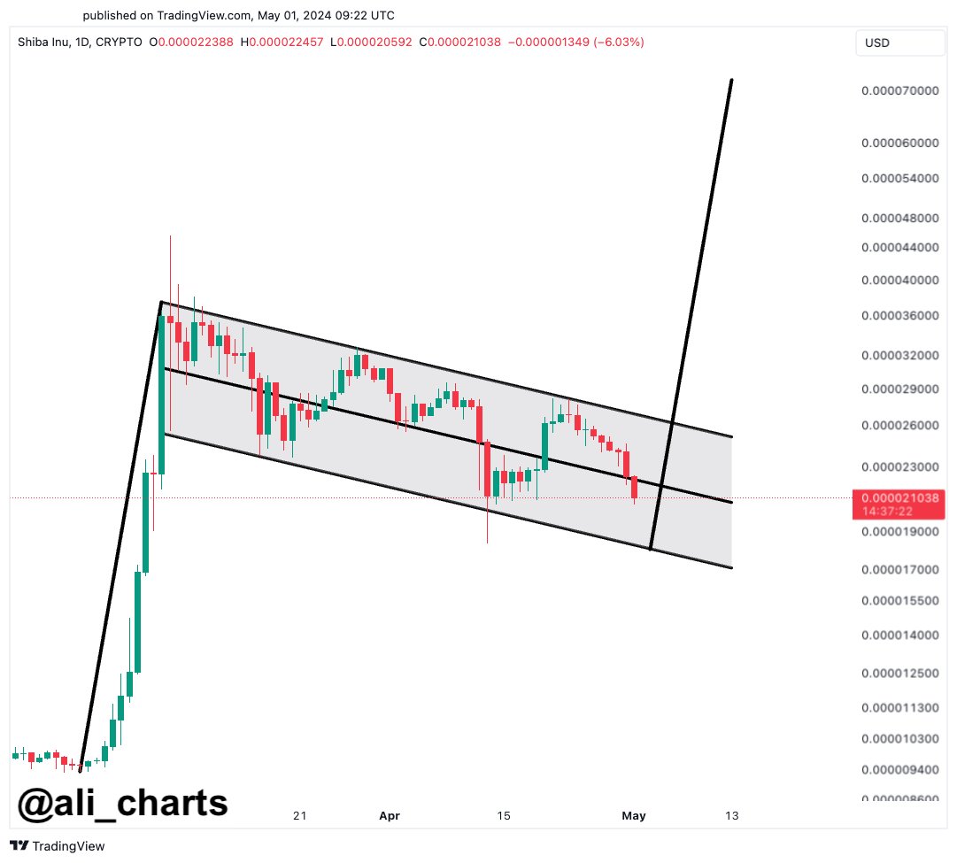
From the graph, it’s clear that the Shiba Inu 1-day price has been consolidating inside what appears to be a bull flag pattern channel in the past few weeks.

“I’m placing buy orders around $0.000018343, aiming for a bullish breakout that sends $SHIB to $0.000072323,” says the analyst. The former level is about where SHIB should meet the flag’s support next if it continues in its current trajectory, while the latter target is based on the height of the pole.

A run to the bullish target of $0.000072323 would imply a rally of more than 244% from the current spot price of the cryptocurrency, while from the lower support of $0.000018343, any such surge would correspond to a growth of over 294%.

It remains to be seen whether Shiba Inu will show a break above this bull flag pattern and, if it does, whether the price will benefit from bullish effects.

SHIB Price

At the time of writing, Shiba Inu is trading around $0.00002110, down more than 18% over the past week.

Shiba Inu Price Chart

Bitcoin Greed No More: Sentiment Back At Neutral After $57,000 Plunge

Data shows that Bitcoin sentiment has cooled off to neutral from greed following the asset’s latest plunge to the $57,000 level.

Bitcoin Fear & Greed Index Has Returned To Neutral Levels

The “Fear & Greed Index” is an indicator created by Alternative that shows the average sentiment among investors in the Bitcoin and wider cryptocurrency market.

This index estimates sentiment by considering five factors: volatility, trading volume, social media data, market cap dominance, and Google Trends.

The metric uses a scale that runs from zero to 100 to represent this average sentiment. All values under 46 suggest that investors are fearful, while those above 54 imply a greedy market. The zone between these two cutoffs naturally corresponds to the territory of neutral mentality.

Now, here is what the Bitcoin sentiment looks like right now, according to the Fear & Greed Index:

Bitcoin Fear & Greed Index

As displayed above, the Bitcoin Fear & Greed Index is at a value of 54, implying that investors share a neutral sentiment currently. However, the neutrality is only just, as the metric is right at the boundary of the greed region.

This is a significant departure from yesterday’s sentiment: 67. The chart below shows how the indicator’s value has changed recently.

Bitcoin Neutral

As the graph shows, the Bitcoin Fear & Greed Index has been declining recently. For most of February and March, as well as the first half of April, the indicator was in or near a special zone called extreme greed.

The market assumes this sentiment at values above 75. As the asset price struggled recently, the mentality cooled off from this extreme zone and entered the normal greed region. With the latest crash in BTC, the index has seen a sharp plunge, now exiting out of greed altogether.

Historically, cryptocurrency has tended to move against the majority’s expectations. The stronger this expectation, the higher the probability of such a contrary move.

This expectation is considered the strongest in extreme sentiment zones, as well as extreme fear and greed. As such, major bottoms and tops have often occurred in these territories.

The all-time high (ATH) price last month, which continues to be the top of the rally so far, also occurred alongside extreme values of the Bitcoin Fear & Greed Index.

With the sentiment now cooled to neutral, some investors may be watching for a fall into fear. This is natural because a rebound would become more probable the worse the sentiment gets now.

BTC Price

During Bitcoin’s latest plunge, its price briefly slipped below $57,000 before surging back to $57,300.

Bitcoin Price Chart

Bitcoin To $92,190: Crypto Analyst Reveals Path To ATH Target

An analyst has explained what path Bitcoin might need to follow to surge to a new all-time high (ATH) target of $92,190.

Bitcoin Needs To Breach This Resistance Barrier To Rise To New ATH

In a new thread on X, analyst Ali discussed whether the BTC price has hit the top. The one signal the analyst has pointed out that may point towards the top has been the massive scale of profit-taking that the market has seen recently.

Ali is waiting for another confirmation before the top can be confirmed. In the scenario that the top gets validated, these are the targets the analyst has marked based on on-chain data.

Bitcoin URPD

The above chart shows the Bitcoin UTXO Realized Price Distribution (URPD) data from Glassnode, which tells us how many coins were last bought at what price levels.

Generally, the cost basis is an important level for any investor, so they are likely to show some reaction when a retest of it happens. This reaction is the largest when many investors share their cost basis around the same level.

When this retest happens from above, the holders may respond by buying more, as they could see the drop as a dip opportunity. As such, large cost basis zones below the current price can prove to be centers of support.

“If the market top is confirmed, BTC could drop toward $51,530 or even $42,700!” notes Ali, given that these two levels are the next major support lines for the coin.

The analyst says, however, that if BTC can instead break the $66,250 level, which is a source of major resistance right now since these loss holders may be desperate to exit at their break-even, then this bearish outlook could become invalidated.

An on-chain pricing model could provide some hints about what might happen when such a break occurs.

Bitcoin MVRV Pricing Bands

The Market Value to Realized Value (MVRV) Pricing Bands is a model that, in short, tells us about where the different multipliers of the average cost basis of the entire market currently lie.

The chart shows that the market cost basis is currently at $28,800. Historically, three multipliers of this metric have been relevant for the asset: 0.8x, 2.4x, and 3.2x.

The 0.8x level is where bottoms occur, while the 3.2x line is a probable spot for tops to form. Bull rallies in proper have occurred after a breach of the 2.4x level.

At present, the 2.4x level lies at $69,150. “By rising above $66,250, Bitcoin will gain the strength to push towards $69,150. And if this resistance barrier is breached, BTC can advance toward a new all-time high of $92,190,” explains Ali.

This ATH target is based on the fact that the 3.2x level is equivalent to $92,190 at the moment. It remains to be seen whether the top is already in and BTC would retest the lower levels or if more is left to this rally.

BTC Price

At the time of writing, Bitcoin is trading at around $61,100, down more than 7% over the past week.

Bitcoin Price Chart

Bitcoin Dominance: Traders Preferring The OG To Dogecoin & Other Altcoins

On-chain data suggests Bitcoin has recently experienced an influx of investors while Dogecoin, Cardano, and other altcoins have seen a slowdown.

Bitcoin Total Amount Of Holders Rise While Altcoins See Flat Movement

According to data from the on-chain analytics firm Santiment, the number of Bitcoin investors has sharply increased recently. The on-chain metric of interest here is the “Total Amount of Holders,” which keeps track of the total number of addresses on a given network carrying some non-zero balance.

When the value of this indicator goes up for any asset, it can be due to several things. The first and most obvious contributor to this trend would be adoption, as a fresh influx of users would naturally create more addresses.

Another contributor could be old investors returning to reinvest in the coin after selling out their balance earlier. The indicator would also increase when investors spread out their holdings among multiple wallets for reasons like privacy.

In general, some net adoption occurs whenever the Total Amount of Holders goes up. Historically, adoption has been a constructive sign for any blockchain in the long term.

Naturally, when this metric’s value goes down, it implies that some investors have decided to exit from the cryptocurrency as they have completely cleaned out their wallets.

Now, here is a chart that shows the trend in the Total Amount of Holders for some of the top assets in the sector: Bitcoin (BTC), Ethereum (ETH), XRP (XRP), Cardano (ADA), Dogecoin (DOGE), and Chainlink (LINK).

Bitcoin Total Amount of Holders Vs Dogecoin

As displayed in the graph, Dogecoin started 2024 with some rapid adoption as its Total Amount of Holders had been observing a sharp uptrend. However, this growth only lasted for the first couple of months, as the metric has since flattened for the memecoin.

Other altcoins like Chainlink and Cardano have also witnessed flat action in the metric in this period. The trend had been just the opposite for Bitcoin, where more or less flat movement had occurred in its number of investors earlier in the year, but the asset has seen some uptrend in the metric this month.

It’s possible that investors were previously attracted to Dogecoin and other networks, but now that markets have been undergoing bearish price action, traders are back to preferring the original cryptocurrency.

Overall, DOGE’s holders are still up 13.8% in the past three months, while BTC’s growth stands at 2.6%. Naturally, the latter’s userbase is also larger, so a relatively small percentage could be due to that.

Cardano is among the few networks in the sector that have observed negative action in the Total Amount of Holders during this window, although the decrease is a mere 0.1%.

BTC Price

Bitcoin has been struggling to make any recovery run count recently, as its price is back at $63,000 after the latest failed attempt.

Bitcoin Price Chart

This Bitcoin Metric Foreshadowed Recent Price Drops, Quant Reveals

A quant has pointed out how a Bitcoin metric may have detected selling pressure in the market, and therefore, the subsequent price drops, in advance.

Bitcoin CDD Registered Spikes Before Recent Price Plunges

In a new post on X, an analyst has discussed about how the Coin Days Destroyed (CDD) on-chain indicator may be used to identify selling pressure in the market early.

A “coin day” refers to the quantity that 1 BTC accumulates after staying still on the blockchain for 1 day. When a token stays dormant for a while, it naturally accumulates some number of coin days, and once it’s finally transferred on the network, its coin days counter resets back to zero.

The coin days that this token had been carrying prior to this movement are said to be “destroyed” by the transaction. The CDD keeps track of the total number of such days being reset across the network on any given day.

Now, here is a chart that shows the trend in the CDD for Bitcoin over the last couple of months:

Bitcoin CDD

As displayed in the above graph, the Bitcoin CDD observed a large spike just a few days ago. Whenever this metric’s value shoots up, it means that a large amount of coins previously dormant are now on the move.

Such transfers are generally correlated with the long-term holder whales, who are large entities who carry their coins for significant periods, and thus, accumulate a large number of coin days.

Often, when these dormant entities finally break their silence, it’s for selling-related purposes. As such, spikes in the CDD can be an indication that the HODLer whales have decided to do some selling.

In the chart, the quant has highlighted the major spikes that the indicator observed during the last two months. It would appear that following the onset of such spikes, the asset’s price has generally gone on to witness some bearish action.

The aforementioned spike from a few days ago, too, has proven to be bearish for the asset so far as it occurred when Bitcoin had recovered towards $67,000, and the price has since erased this recovery. It would appear that some of these diamond hands had looked at this surge as an exit opportunity.

Last month, the CDD had seen two spikes even larger than this recent one. These spikes had occurred near what continues to be the top for the rally so far. Thus, the selling pressure from HODLers may have played a role in this top and the subsequent drawdown that followed.

Given the relationship that this metric has appeared to have held with the Bitcoin price, it may be worth keeping an eye on it, as it may continue to indicate the onset of selling pressure in the near future as well.

BTC Price

Bitcoin has continued its bearish trajectory during the past day as it has now slipped towards the $62,300 level.

Bitcoin Price Chart

XRP Whales Are Active: Here’s Where They Are Sending Coins

On-chain data shows the XRP whales have been active during the past day. Here are the destinations their moves have been heading to.

XRP Whales Have Moved Around Big Amounts In Last 24 Hours

According to data from the cryptocurrency transaction tracker service Whale Alert, several large XRP transactions have been witnessed on the blockchain in the past day.

More specifically, five transfers in total that are of scale often attributed to the whales have occurred on the network inside this window. Since whale transactions involve the transfer of a significant sum of capital, they can sometimes cause fluctuations in the market.

The implications any whale transfers might have for the market depend on their intent. However, the exact purpose behind any transfer can be hard to ascertain. Nonetheless, the address details of the transaction may provide at least some hints about the context surrounding it.

First, here are the details regarding the oldest XRP whale transfer from the past day:

XRP Whale Deposit

As is visible above, this transaction involved the movement of 29.74 million XRP, worth $15.7 million at the time of the transfer. The sender was an unknown wallet, likely a whale’s address.

On the other hand, the receiver was a wallet attached to a known centralized platform: the cryptocurrency exchange Bitso. Thus, the whale here made a deposit to the exchange from their personal address.

Investors usually make such transactions whenever they want to use one of the services platforms like these provide, including selling. As such, exchange inflows can prove to be bearish for the price.

The second-oldest whale transaction from the past 24 hours was also an exchange inflow, this one towards Bitstamp. Interestingly, the sending address for this one was the same as the Bitso deposit, so the same whale was probably behind both of these moves.

The large investor shifted 27,430,000 XRP ($14.5 million) to the exchange in this second move. Naturally, if the whale has made these large moves for selling, they could be a bad sign for the asset’s price.

Though, perhaps fortunately for the XRP investors, two exchange outflows have also occurred recently, which may cancel out these inflows. Below are the details of the two larger withdrawals.

XRP Withdrawal

In this move, a whale took out around 26.67 million XRP ($14 million) from Binance. Today’s exchange outflow also involved Binance, with another 20.85 million tokens ($10.6 million) leaving the platform.

The fifth and final transfer was the largest during the past day at a whopping 100 million XRP ($53 million), but this move involved unknown wallets on both sides so it’s impossible to say why the move would have been made.

The reason could have been anything, from a change of wallets to selling through over-the-counter (OTC) means.

XRP Price

XRP had recovered to $0.57 earlier in the week, but it appears that the coin has lost this progress; it’s back at $0.52 now.

XRP Price Chart

85% Of Altcoins In “Opportunity Zone,” Santiment Reveals

The on-chain analytics firm Santiment has revealed that over 85% of all altcoins in the sector are currently in the historical “opportunity zone.”

MVRV Would Suggest Most Altcoins Are Ready For A Bounce

In a new post on X, Santiment discussed how the altcoin market looks based on their MVRV ratio model. The “Market Value to Realized Value (MVRV) ratio” is a popular on-chain indicator that compares the market cap of Bitcoin against its realized cap.

The market cap here is the usual total valuation of the asset’s circulating supply based on the current spot price. At the same time, the latter is an on-chain capitalization model that calculates the asset’s value by assuming the “true” value of any coin in circulation is the last price at which it is transferred on the blockchain.

Given that the last transaction of any coin would have likely been the last time it changed hands, the price at its time would act as its current cost basis. As such, the realized cap essentially sums up the cost basis of every token in the circulating supply.

Therefore, one way to view the model is as a measure of the total amount of capital the investors have put into the asset. In contrast, the market cap measures the value holders are carrying.

Since the MVRV ratio compares these two models, its value can tell whether Bitcoin investors hold more or less than their total initial investment.

Historically, when investors have been in high profits, tops have become probable to form, as the risk of profit-taking can spike in such periods. On the other hand, a dominance of losses could lead to bottom formations as selling pressure runs out in the market.

Based on these facts, Santiment has defined an “opportunity” and “danger” zone model for altcoins. The chart below shows how the market currently looks from the perspective of this MVRV model.

Bitcoin MVRV Ratio

Under this model, when the MVRV divergence for any asset on some timeframe is higher than 1, the coin is considered to be inside the bullish opportunity zone. Similarly, if it is less than -1, it suggests it’s in the bearish danger zone.

The chart shows that MVRV divergence for a large part of the market is in the opportunity zone right now. As the analytics firm explains,

Over 85% of assets we track are in a historic opportunity zone when calculating the market value to realized value (MVRV) of wallets’ collective returns over 1-month, 3-month, and 6-month cycles.

Thus, if the model is to go by, now may be the time to go around altcoin shopping.

ETH Price

Ethereum, the largest among the altcoins, has observed a 3% surge over the past week, which has taken its price to $3,150.

BNB Price Chart

Bitcoin Forms Death Cross & TD-9 Sell Signal: Brace For Impact?

An analyst has explained how Bitcoin is forming both a death cross and TD sell signal, which may lead to potential dips in these targets.

Bitcoin Looking In Trouble As 12-Hour Chart Forms Two Bearish Signals

In a new post on X, analyst Ali discussed two signals that have recently formed in Bitcoin’s 12-hour chart. The first of these is a “death cross,” which occurs when an asset’s short-term simple moving average (SMA) dips below its long-term SMA.

Regarding the death cross, the 50-day and 100-day SMAs make up for the short-term and long-term trend lines. Historically, such formations have been considered bearish signals, with the price potentially suffering once the pattern is confirmed.

The other signal that has appeared for the cryptocurrency involves the Tom Demark (TD) Sequential. This indicator is popularly used for finding locations of probable tops and bottoms in any asset’s price.

The TD Sequential has two phases: the “setup” and “countdown.” The first phase, the setup, is said to be complete once the asset has gone through nine candles of the same polarity. After these nine candles, the price may have reached a likely reversal point.

Naturally, if the candles in the setup’s formation were red, then the signal would be a buy one, while if the prevailing trend were bullish, the reversal would be towards the downside.

Once the setup is complete, the countdown phase begins. This phase works much like the setup, except that candles are counted up to thirteen instead of nine. After the countdown’s completion, the commodity may be assumed to have reached another potential top/bottom.

Now, here is the chart shared by Ali that highlights how signals about both of these technical analysis patterns have been witnessed in the 12-hour price of Bitcoin recently:

Bitcoin Death Cross & TD-9 Sell

As is visible in the graph, the 12-hour price of Bitcoin first saw a death cross form with the 50-day SMA moving under the 100-day SMA. Then, it observed the completion of a TD Sequential setup, with the indicator suggesting a reversal to the downward direction.

Since this double bearish pattern has appeared, BTC has been heading down, suggesting that these signals may already be in effect. “If BTC falls below $63,300, brace for possible dives to $61,000 or even $59,000,” says the analyst.

From the current price of the cryptocurrency, a potential drawdown to the first of these targets would mean a decline of 4.6%, while one to the latter level would suggest a drop of nearly 8%.

BTC Price

So far, Bitcoin has managed to prevent falls under the $63,300 target listed by the analyst, as it currently floats around $64,000.

Bitcoin Price Chart

Bitcoin Whales Continue Buying, Now Hold 25.16% Of All Supply

On-chain data shows that the Bitcoin whales’ holdings have grown to 25.16% of the entire supply, and their net accumulation has continued recently.

Bitcoin Investors With 1,000 To 10,000 BTC Have Continued To Buy Recently

According to data from the on-chain analytics firm Santiment, the BTC whales have accumulated more than 266,000 BTC since the start of the year. The indicator of interest here is the “Supply Distribution,” which keeps track of the percentage of the total circulating Bitcoin supply that the various wallet groups are holding right now.

The addresses are divided into these cohorts based on the number of coins they currently have in their balance. The 10 to 100 coins group, for example, includes all wallets that own at least 10 and, at most, 100 BTC.

The Supply Distribution sums up the amount that investors belonging to a particular group as a whole are carrying and calculates what percentage of the supply they contribute.

The 1,000 to 10,000 BTC cohort is of interest in the current discussion. At the current exchange rate, the lower limit for this cohort is $65 million, while the upper one is $650 million.

Clearly, the investors belonging to the group are quite massive, and as such, they are popularly known as “whales.” As the whales can quickly move large amounts, they have the potential to influence the market. Due to this, their behavior can be worth watching.

There are whales beyond this cohort’s 10,000 BTC upper limit as well, but at such massive scales, entities like exchanges also start coming into play, who aren’t exactly normal investors.

Now, here is a chart that shows the trend in the Bitcoin Supply Distribution for the 1,000 to 10,000 coins group over the last few months:

Bitcoin Whale & Sentiment

As displayed in the above graph, the Bitcoin Supply Distribution for this key investor group has observed a net rise over the year 2024 so far. The whales have bought 266,000 BTC ($17.2 billion) over this period.

However, this accumulation hasn’t been consistent. As is visible in the chart, the whales sold into the rally that would eventually lead to the asset’s new all-time high, and they bought back in once the drawdown was over.

As BTC has consolidated, so has its supply. Still, the latest change in the metric has been towards the upside, implying that these humongous holders are perhaps backing the current recovery push.

Following the latest accumulation, the 1,000 to 10,000 coins group holds 25.16% of the supply, which means that more than a quarter of all Bitcoin in circulation is sitting in the wallets of these large investors.

While whale buying is bullish, the current investor sentiment may not be so. As the data for the “Weighted Sentiment” metric attached by Santiment in the chart suggests, investors are currently showing FOMO towards the asset.

Historically, Bitcoin has tended to move against the majority’s expectations, so FUD/fear has been ideal for uptrends to start. FOMO/greed, on the other hand, has been where tops have become probable.

BTC Price

At the time of writing, Bitcoin is trading at around $64,700, up more than 7% over the past week.

Bitcoin Price Chart

Newbie Bitcoin Whales Hold 2x As Much As Veterans: What’s Behind This Trend?

On-chain data shows the new whale entrants in the Bitcoin market now hold almost twice as much as the veterans. Here’s what could be behind this shift.

Bitcoin Newbie Whale Holdings Have Been Rapidly Growing Recently

In a new post on X, CryptoQuant founder and CEO Ki Young Ju has discussed about how the holdings of the new whales compares against the old ones in the market right now.

The on-chain indicator of interest here is the “Realized Cap,” which, in short, keeps track of the total amount of capital that the investors have used to purchase their Bitcoin.

This capitalization model is in contrast to the usual market cap, which simply measures the total value that the holders as a whole are carrying based on the current spot price.

In the context of the current topic, the Realized Cap of the entire market isn’t of interest, but rather specifically that of two segments: the short-term holder whales and long-term holder whales.

Whales are defined as entities on the network who are holding at least 1,000 BTC in their balance. At the current exchange rate, this amount is worth $66.6 million, so the whales are clearly quite massive holders. Because of these large holdings, these investors can hold some influence in the market.

Based on holding time, the whales can be subdivided into two categories. The short-term holder (STH) whales are those who acquired their coins within the past 155 days, while the long-term holder (LTH) whales have been holding since longer than this timespan.

Now, here is the chart shared by Ju that reveals the Realized Cap breakdown between these two Bitcoin whale cohorts:

Bitcoin Realized Cap

As is visible in the above graph, the Realized Cap of the STH whales has historically not been too different from that of the LTH whales, but that appears to have changed recently.

The metric has pulled away for these new whales this year with some very sharp growth, as its value has now reached the $110.6 billion mark. This means that the STH whales have collectively bought their coins at an initial investment of a whopping $110.6 billion.

The Realized Cap of the LTH whales, on the other hand, has continued its usual trajectory, floating around $66.9 billion currently. This means that there is now a massive gap between the indicator for these two cohorts.

But what’s the reason behind the sudden emergence of this brand-new trend? As mentioned before, the STH cutoff stands at 155 days, which means that the Realized Cap of the STH whales would signify the total value of the purchases made by the whales over the last five months.

In the past five months, there has been one event in particular that has stood out, which has also never been present in any of the prior cycles: the approval of the spot exchange-traded funds (ETFs).

The spot ETFs provide an alternative mode of investment into the asset through a means that’s familiar to traditional investors. These funds have been bringing in some unprecedented demand into BTC and as their holdings also fall under the 155 days mark, they would count as STH whales.

Bitcoin has also been rallying this year, so all this new investment would have had to purchase at relatively high prices, thus causing the Realized Cap, which correlates to direct capital flows, to inflate even further.

BTC Price

Bitcoin is now trading at $66,400 after witnessing a surge of more than 6% over the past week.

Bitcoin Price Chart

Is The Bitcoin Top Already Here? This Historical Pattern Says So

A historical pattern currently forming in a Bitcoin on-chain indicator could suggest that a top may be near for the asset, if not already in.

Bitcoin SOPR Ratio Is Forming A Historical Top Pattern Right Now

In a CryptoQuant Quicktake post, an analyst has discussed about a pattern regarding the SOPR Ratio. The “Spent Output Profit Ratio” (SOPR) is an indicator that tells us whether the Bitcoin investors are selling their coins at a profit or loss right now.

When the value of this metric is greater than 1, it means that profit-selling is dominant in the market currently. On the other hand, the metric being under the threshold suggests the average holder is moving coins at some net loss.

In the context of the current topic, the SOPR itself isn’t of interest; rather, it is a different version called the SOPR Ratio. The name may be a bit confusing as SOPR already contains a “ratio,” but the latter ratio here corresponds to the fact that this indicator compares the SOPR of two Bitcoin cohorts: the long-term holders (LTHs) and short-term holders (STHs).

These investor groups make up for the two main divisions of the BTC market done based on holding time, with 155 days being the cutoff between the two. The STHs are those who bought within the past 155 days, while the LTHs include the HODLers carrying coins for longer than this timespan.

Now, here is a chart that shows the trend in the 7-day moving average (MA) of the Bitcoin SOPR Ratio over the history of the cryptocurrency:

Bitcoin SOPR Ratio

As displayed in the above graph, the 7-day MA Bitcoin SOPR Ratio had been heading up throughout 2023 and early parts of 2024, but recently, the metric has hit a top and reversed its direction. Whenever the SOPR Ratio is higher than 1, it means the LTHs, who are generally known to be resolute hands, are participating in a higher degree of profit-taking than the STHs.

It would appear that as BTC had observed its rally and approached a new all-time high (ATH), these diamond hands had started harvesting some of the gains they had earned over their long holding time. And once the price set a new ATH, these investors participated in peak profit-taking. Since then, their profit-selling has been dropping off, although they are still harvesting notably higher gains than the STHs.

In the chart, the analyst highlights how this pattern has been repeated at different points in the asset’s history. While the scale of the peak LTH profit-taking has been heading down over the cycles, it’s still true that the metric’s top has coincided with tops in the price during each of them.

As the line drawn by the quant suggests, it’s possible that the latest peak in the metric may have in fact been the top for this cycle. This is only, however, assuming that the pattern of diminishing returns in the indicator holds to the exact degree judged by the line.

It’s possible that the peak will still be higher than the current levels, while at the same time being lower than the previous cycle’s peak, thus still being in-line with the historical Bitcoin pattern.

Whatever the case be, though, the fact that the SOPR ratio has apparently hit a top could still be a bearish signal, if only in the short term.

BTC Price

Bitcoin has been making some steady recovery over the last few days as its price has now surged back above $66,100.

Bitcoin Price Chart

Ethereum To See Fresh Move Soon? What Futures Data Says

Data shows the Ethereum Open Interest has been trading at relatively low levels recently. Here’s what this could mean for the asset’s price.

Ethereum Open Interest Has Been Moving Sideways Since Its Plunge

As explained by an analyst in a CryptoQuant Quicktake post, the ETH Open Interest has followed a similar trajectory as the price of the cryptocurrency recently. The “Open Interest” here refers to the total number of derivative-related contracts open for Ethereum on all exchanges.

When the value of this metric goes up, it means that investors are currently opening up new positions on these platforms. Generally, this kind of trend leads to an increase in the market’s total leverage, so the asset price could become more volatile.

On the other hand, a decline in the indicator implies the investors are either closing up their positions of their own volition or getting forcibly liquidated by their platform. Such a drawdown may accompany violent price action, but once the drop is over, the market could become more stable due to the reduced leverage.

Now, here is a chart that shows the trend in the Ethereum Open Interest over the last few months:

Bitcoin Open Interest

As displayed in the above graph, the Ethereum Open Interest registered a sharp drop earlier alongside the asset’s price. The plunge in the metric was naturally caused by the long contract holders being washed out in the price drawdown.

As the price has mostly consolidated sideways since the decline, so has the value of the Open Interest. The quant notes,

This alignment suggests a cooling down of activity within the futures market. Consequently, the market appears poised for the resurgence of either long or short positions, potentially initiating a fresh and decisive market movement in either direction.

Another indicator related to the derivative market that could be relevant for Ethereum’s future price action is the funding rate. This metric tracks the periodic fees that derivative contract holders are currently paying each other.

Positive funding rates imply that the long holders are paying the shorts a premium to hold onto their positions; hence, that bullish sentiment is dominant. Similarly, negative values suggest that a bearish sentiment is shared by the majority of the derivative traders.

The chart below shows that the Ethereum funding rate has recently turned red.

Ethereum Funding Rates

Historically, the market has been more likely to move against the opinion of the majority, so the fact that the funding rate has flipped negative may be a good sign for the chances of any potential uptrends to start.

ETH Price

Ethereum has gradually increased over the last few days, as its price has now reached $3,200.

Ethereum Price Chart

Dogecoin To $1: Analyst Thinks Dream Milestone Could Be Hit In Coming Weeks

An analyst has explained how a pattern forming in the Dogecoin price may suggest a rally to $1, if historical trend repeats this time as well.

Dogecoin 1-Week Price Appears To Be Forming A Classic Pattern

In a new post on X, analyst Ali has discussed how DOGE seems to have been showing a classic pattern in its weekly price once again. This trend involves a technical analysis (TA) pattern called the “Descending Triangle,” which, as its name suggests, is shaped like a triangle.

The pattern involves two trendlines between which the price of the asset consolidates; one of these is a line slopped downwards while the other is parallel to the time-axis. This property of the price converging downwards as it goes through the pattern is why it has descending in its name.

Like other TA consolidation patterns, the upper line of the Descending Triangle also provides resistance to the commodity, making tops more probable to form at it. Similarly, the lower line acts as a point of support and can help the price reverse back upwards.

A break out of either of these lines may result in a continuation of the trend in that direction. This means that a break above the triangle can be a bullish signal, while one below could suggest the dominance of bearish momentum.

Similar to the Descending Triangle, there is also an Ascending Triangle in TA, which works much like it, except for the fact that the parallel axis makes the upper line, connecting together tops, while the lower line ascends up as it joins higher lows.

Now, here is the chart shared by Ali that highlights a pattern that DOGE’s 7-day price has been forming recently:

Dogecoin Descending Triangle

From the graph, it’s visible that the Dogecoin 1-week price had been trading inside a long Descending Triangle between 2021 and this year, but the meme coin found a break earlier and has since registered some notable uplift.

Recently, though, the cryptocurrency has reached a stage of sideways movement. This, however, may not entirely be a bad thing, as DOGE has also seen a similar trend of a Descending Triangle break followed by consolidation in the past as well.

As is visible in the chart, the previous two such formations led to Dogecoin witnessing some very significant growth. As such, the latest one may also prove to be bullish, if this historical pattern continues to hold.

“Based on past trends, we might just see DOGE rocket towards $1 in the coming weeks!” explains Ali. From the current spot price, such a potential rally would mean a growth of a whopping 525% for the coin.

DOGE Price

Dogecoin’s price action has been quite stale since the price plunge earlier in the month, as the asset’s price is still trading around $0.16.

Dogecoin Price Chart

Bitcoin Mega Whales Are Buying, Time For Rally To Return?

On-chain data shows that the largest number of investors in the Bitcoin market are finally buying, which could be bullish for the asset’s value.

Bitcoin Mega Whales Have Shown Net Inflows In The Past Day

In the past few weeks, the Bitcoin price has struggled to mount any significant bullish momentum as it has been stuck consolidating inside a range.

Earlier, while this was happening, the largest holders in the space had been sitting quietly, not buying or selling anything notable. According to data from the market intelligence platform IntoTheBlock, however, this appears to have changed in the past day.

Relevant holders here are the “Large Holders,” who, as defined by the analytics firm, are investors carrying at least 0.1% of the entire circulating Bitcoin supply in their wallets.

A little under 19.7 million tokens are circulating for the cryptocurrency, 0.1% of which would be 19,700 BTC. This amount is worth more than $1.26 billion at the current exchange rate of BTC.

Clearly, these large holders are quite large indeed, and in fact, they are much larger than the usual whale investors, who typically carry between 1,000 and 10,000 BTC. As such, it would perhaps be apt to call these humongous entities “mega whales.”

Since an investor’s influence in the market increases the larger their holdings, these mega whales would be the most powerful entities on the Bitcoin network. Therefore, their moves can have some consequences for the wider market.

IntoTheBlock has used the netflow on-chain indicator to track the movements of the Large Holders here, which measures the net amount of BTC entering or exiting the wallets of these investors.

The below chart shows the trend in this metric over the last few months:

Bitcoin Large Holder Netflow

As displayed in the above graph, the Bitcoin Large Holders netflow registered a notable positive spike yesterday, meaning these investors have received a net amount of coins into their wallets. The mega whales bought 19,760 BTC during this spike, worth more than $1.27 billion.

“Historically, accumulations by these addresses have often preceded rises in Bitcoin’s price,” notes the analytics firm. The chart shows that some extraordinary buys came from this cohort on the way to the new all-time high for the asset.

As such, it’s possible that these latest buys will also help the asset gain some bullish momentum in the near future. However, something to note is that the scale of the latest spike, although large on its own, isn’t quite as prominent as that of some of the large buys seen earlier.

BTC Price

At the time of writing, Bitcoin is trading at around $64,500, down more than 5% over the past week.

Bitcoin Price Chart

Bitcoin Trader Selling Pressure Declining, CryptoQuant Head Explains Why

The head of research at the on-chain analytics firm CryptoQuant has explained why selling pressure from Bitcoin traders may be declining.

Bitcoin Short-Term Holder Realized Price Has Risen To $60,000

In a new post on X, CryptoQuant head of research Julio Moreno has discussed why the short-term holder selling pressure may be declining for BTC. The “short-term holders” (STHs) refer to the Bitcoin investors who have been holding onto their coins since less than 155 days ago.

The STHs include the “traders” of the market who make many moves within short periods and don’t tend to HODL their coins. This group can be quite reactive to market movements, easily panic selling whenever a crash or rally takes place.

Generally, investors in profits are more likely to sell their coins, so one way to gauge whether the STHs would be likely to take part in a selloff is through their profit/loss margin.

Here, Moreno has cited the profit/loss margin of this cohort based on its realized price.

Bitcoin STH Realized Price

The STH realized price (highlighted in pink) here refers to the average cost basis or acquisition price of the investors part of this cohort calculated using blockchain transaction history.

When the spot value of the cryptocurrency is above this level, it means that these holders as a whole are sitting on some net profits right now. On the other hand, the price being below the metric implies the dominance of losses.

From the above chart, it’s visible that Bitcoin has been above the STH realized price for the last few months, meaning that these traders have been enjoying profits.

This is typical during bull markets as the price keeps pushing up, letting these investors make profits. While STHs tend to stay in the green in these periods, tops do become probable to take place if these profits get extreme.

As is apparent in the graph, the profit/loss margin spiked to significant levels just as BTC set its latest all-time high, which continues to be the top thus far.

Recently, as Bitcoin has consolidated between the $60,000 to $70,000 range, the STH realized price has rapidly risen, now attaining a value of around $60,000. This occurs because as STHs have traded in this range, their acquisition prices have been repriced at these higher levels, thus pushing up the average.

BTC has been quite close to this level recently so that the STHs wouldn’t be holding that much profit now. “Bitcoin selling pressure from traders may be declining as unrealized profit margins are basically zero now,” notes the CryptoQuant head.

BTC Price

Bitcoin has continued to show action contained within its recent range as its price is still trading around $65,200.

Bitcoin Price Chart

Bitcoin Miners Always Sell Into Halvings, Is This Time Any Different?

On-chain data shows Bitcoin miners have always sold as Halvings have occurred. With the next one just around the corner, how are miners behaving this time?

Next Bitcoin Halving Is Less Than Two Days Away Now

In a CryptoQuant Quicktake post, an analyst discussed Bitcoin miners’ behavior in the build-up to the next Halving.

The “Halving” is a periodic event on the Bitcoin network where the cryptocurrency’s block rewards (the compensation miners receive for solving blocks) are permanently slashed in half.

This event occurs approximately every four years, and according to NiceHash’s countdown, the next one will occur in just over 32 hours.

Bitcoin Halving

Bitcoin miners earn revenue from two sources: transaction fees and block rewards. Historically, the former has been quite low on the BTC network, so the miners primarily depend on the latter to pay off their running costs.

Since the block rewards are cut in half during Halvings, these events naturally deal a significant blow to the miner’s revenues. As such, it’s not surprising that the miners have generally shown a reaction to the event in the past cycles.

“One of the common dynamics that occur in every cycle of cutting the issuance of new BTC is the significant selling pressure exerted by miners,” says the quant. One way to gauge the degree of selling pressure coming from these chain validators is via the Miner to Exchange Flow metric.

This indicator tracks the total amount of Bitcoin moving from miner-associated addresses to wallets connected to centralized exchanges. As miners usually deposit Bitcoin to these platforms for selling, this flow can provide hints about their selling behavior.

Now, here is a chart that shows the trend in the 30-day moving average (MA) BTC Miner to Exchange Flow over the last few years:

Bitcoin Miner to Exchange Flow

As displayed in the above graph, the 30-day MA Bitcoin Miner to Exchange Flow had surged to high levels in the 2020 Halving event, implying that this group had potentially been participating in a selloff.

This selling push may have come from the miners planning to exit, given the sharp revenue reduction that was set to occur. The graph, though, clearly shows that no such selling pressure has emerged this time around despite the event being just around the corner.

So, what’s going on here? The analyst suggests that the Bitcoin miners may have already completed the latest round of selling in advance (as the exchange inflows from the cohort did spike in February). If this is true, the quant thinks this could benefit the market in the short term.

BTC Price

Bitcoin has continued to move sideways inside a range recently, as its price is still trading around $63,500.

Bitcoin Price Chart

Chainlink (LINK) Forms Bullish Pattern That Led To 50% Rally On Average

On-chain data shows that a Chainlink indicator is currently forming a pattern that has led to an average 50% increase for LINK in the past.

Chainlink 30-Day MVRV Ratio Has Plunged

In a new post on X, analyst Ali discussed the latest trend in Chainlink’s 30-day MVRV ratio. The “Market Value to Realized Value (MVRV) ratio” is a popular on-chain indicator that tracks the ratio between LINK’s market cap and realized cap.

The market cap naturally refers to the total valuation of the asset’s circulating supply at the current spot price. In contrast, the realized cap is a different type of capitalization model that calculates the total value of the cryptocurrency by instead taking the price at which each coin in circulation last moved on the network as its “true” value.

Since the last transaction of any coin was probably the last time it changed hands, the price at its time would signify its current cost basis. As such, the realized cap sums up the cost basis of every coin in circulation.

In this view, the realized cap would be nothing but a measure of the total capital the investors have used to purchase the asset. In contrast, the market cap represents the value that they are holding right now.

The MVRV ratio compares these two models, and its value can provide hints about whether the overall market holds more or less than it puts into Chainlink.

In the context of the current topic, the 30-day version of this indicator is of focus, which restricts itself to only the investors who bought within the past month. Here is the chart shared by the analyst that shows the trend in this LINK indicator over the past couple of years:

Chainlink MVRV Ratio

As displayed in the above graph, the Chainlink 30-day MVRV ratio has recently taken a sharp plunge and dipped under the 0% mark. The 0% mark is where the market cap and realized cap are exactly equal, so below it, the latter would be greater than the former.

When this is the case, the investors are carrying losses. This recent plunge into the negative has naturally come for the metric as the cryptocurrency’s price has plummeted, putting the 30-day buyers underwater.

In the chart, Ali has highlighted a specific pattern that Chainlink appears to have followed regarding this indicator, plunging deep into the negative territory. “Each time Chainlink MVRV 30-Day Ratio has dropped below -12.24% since August 2022, it’s signaled a prime buying opportunity, averaging 50% returns!” notes the analyst.

Recently, the indicator has declined towards 17.54%, meaning it’s below this level, which has historically led to profitable buying windows for the coin. It remains to be seen whether the pattern followed in the last two years will hold this time as well.

LINK Price

The past week has been terrible for Chainlink investors. The asset’s price has plunged by more than 23%, coming down to just $13.3 now.

Chainlink Price Chart

69% Of PEPE Holders Left In Profits After 26% Plunge

On-chain data shows the percentage of the PEPE investors currently in the green has fallen to 69% after the 26% plunge the memecoin has seen in the past week.

69% Of All PEPE Addresses Are Carrying Some Gains Right Now

In a new post on X, the market intelligence platform IntoTheBlock has posted an update on how the investor profitability is looking for the memecoin PEPE currently.

The analytics firm’s metric gauges whether a holder is in profit or not by reviewing their address’s on-chain history. Based on when the wallet acquired the coins, the indicator calculates the investor’s average cost basis using the spot price of the asset at the time of those purchases.

If the current spot value of the cryptocurrency is higher than this average cost basis for any address, then that particular investor is carrying net gains currently. IntoTheBlock categorizes such addresses to be “in the money.”

Similarly, investors with a cost basis higher than the latest price are considered “out of the money.” Naturally, the two values being exactly equal would suggest the holder is just breaking even on their investment or is “at the money.”

Now, here is the data shared by the analytics firm that shows how this investor breakdown looks like for PEPE at the moment:

PEPE Profits

As is visible above, 69% of the total addresses holding PEPE have their cost basis higher than the current spot price of the coin, while 27% are in losses. 4% of the investors are sitting on their cost basis right now.

This profitability ratio isn’t that high, as, for example, 89% of Bitcoin investors are currently in profit, according to IntoTheBlock data. The reason behind the lower profits for the memecoin is that its price has seen a steep drawdown recently.

Historically, the addresses in the green have been more likely to sell to harvest their gains. As such, when the market profit-loss balance is overwhelmingly towards profits, a mass selloff can occur.

Naturally, this means the chances of a top being hit increase with increasing investor profits. However, a low percentage of investors being in profits can be conducive to bottoms forming, as profit-selling exhausts at these levels.

At present, PEPE is neither dominated by green investors nor red ones. In bull runs, however, profitability levels generally remain higher, so any cooldown can help prices rebound.

Thus, the fact that investor profitability has returned to the 69% level for the memecoin could be a sign that a bottom is close if the bullish regime has to continue.

PEPE Price

PEPE has returned to the $0.0000050913 mark after having declined more than 26% over the last seven days. The chart below shows the memecoin’s performance over the past month.

PEPE Price Chart

Bitcoin Long-Term Holders Slow Down After 700,000 BTC Selloff, Reversal Sign?

On-chain data shows the Bitcoin long-term holder selling pressure has been running out recently after an extended selloff from the group.

Bitcoin Long-Term Holders Have Sold Huge In Past 4 Months

As analyst James Van Straten explained in a post on X, the long-term holders have massively reduced distribution during the last ten days. The “long-term holders” (LTHs) here refer to the Bitcoin investors carrying their coins since more than 155 days ago.

The LTHs comprise one of the two main divisions of the BTC sector, with the other cohort known as the “short-term holders” (STHs). The STHs are naturally the investors who bought within the past 155 days.

Statistically, the longer an investor holds onto their coins, the less likely they become to sell at any point. As such, the LTHs represent the more committed part of the BTC market.

The STHs, on the other hand, are fickle-minded hands who may sell at the first sight of any FUD or profit-taking opportunity. As such, selling from the STHs is usually not that noteworthy. However, Selloffs from the LTHs can be something to watch for, as they rarely occur.

One way to track the behavior of these Bitcoin cohorts is through the total amount of supply they carry in their respective combined wallets. The chart below shows the STH and LTH supply trend over the past year.

Bitcoin STH & LTH Supply

As displayed in the above graph, the supply of Bitcoin LTHs increased through most of 2023. At the same time, the supply of STHs naturally decreased.

Something to note here is that this increase in the LTH supply didn’t mean that these HODLers were buying then. Instead, some STHs bought 155 days ago and have finally held long enough to qualify for the cohort.

Thus, there is a 155-day delay between accumulation and the increase registered in the LTH supply. When it comes to selling, though, no such time lag exists, as the LTHs who transfer coins on the blockchain immediately eject from the group and become part of the STHs.

The chart shows that this trend of the supply of these diamond hands going up flipped this year, and the LTHs have been selling instead. In the past four months, these investors have distributed 700,000 BTC.

This excludes the selloff from Grayscale Bitcoin Trust (GBTC), which has constantly been bleeding coins since the US SEC approved the spot exchange-traded funds (ETFs) in January. These coins had also matured enough to become part of the LTHs.

Recently, as the price has gone through some bearish action, the LTH supply has flatlined, implying that the selling from these HODLers has finally stopped, at least for now. Given this new trend, it now remains to be seen how BTC’s value develops from here.

BTC Price

Following the latest drawdown in Bitcoin, its price has dropped towards the $63,200 level.

Bitcoin Price Chart

Bitcoin Has Next Major Demand Zone At $56,000: Brace For Impact?

On-chain data shows the next major Bitcoin demand zone is around $56,000, a level BTC might end up revisiting if the decline continues.

Bitcoin Has Next Major On-Chain Support Around $56,000

According to data from the market intelligence platform IntoTheBlock, BTC’s recent drawdown has meant that it may end up having to rely on the price range around $56,000 for support.

In on-chain analysis, a level’s potential as support or resistance is based on the total number of coins that the investors last acquired there. Below is a chart that shows what the various price ranges around the current spot price of the cryptocurrency look like in terms of this cost-basis distribution.

Bitcoin On-Chain Cost Basis

In the graph, the size of the dot represents the amount of Bitcoin that was purchased inside the corresponding price range. It would appear that the $63,000 to $64,890 level is currently thick with investors. To be more particular, 1 million investors acquired 530,000 BTC inside this range.

Generally, whenever the asset retests the cost basis of any investor, they may become more likely to make some kind of move, due to the importance the level holds for them.

Investors who were in profits just prior to the retest may be willing to make further bets, believing that if this level was profitable in the past it might be so again in the future.

Naturally, this buying effect would only be relevant for the market if a large amount of investors acquired coins inside a tight price range. The $63,000 to $64,890 range qualifies for this.

The range should have acted as a support point for the coin, but BTC has recently slipped under it, possibly suggesting that this support level may have broken down.

As IntoTheBlock has highlighted in the chart, the next major range of potential support is the $55,200 to $57,100 range. Thus, should the current drawdown continue, this may be the next relevant range.

“While this doesn’t mean that Bitcoin has to go this low, it is good to keep this range in mind while price is exploring recent lows,” notes the analytics firm. A decline to the average price of this range ($56,000) would mean a drawdown of almost 10% from the current spot value of the coin.

Before this level, though, there is another interesting on-chain level that BTC could end up revisiting. As analyst James Van Straten has pointed out in an X post, the Realized Price (the average cost basis) of the short-term holders is around $58,800 right now.

Bitcoin Short-Term Holder Realized Price

The short-term holders (STHs) here refer to the investors who bought within the past 155 days. This group’s Realized Price has been at an important level historically during bull runs, as the asset has often found support at it.

Breaks under it have, in fact, usually led to bearish transitions in the past. “If we drop below this, I will concede to a bear market similar to May 2021,” says Straten.

BTC Price

Bitcoin has registered a decline of almost 7% over the past 24 hours and in the process, has lost any recovery it had made earlier. Now, BTC is trading around $62,100.

Bitcoin Price Chart