Bitcoin Safe From Drops Under $60,300? On-Chain Data Says So

On-chain data shows Bitcoin currently has a thick supply wall between the $60,300 and $62,155 levels that may prevent the asset from falling lower.

A Large Amount Of Bitcoin Was Bought Near Current Prices

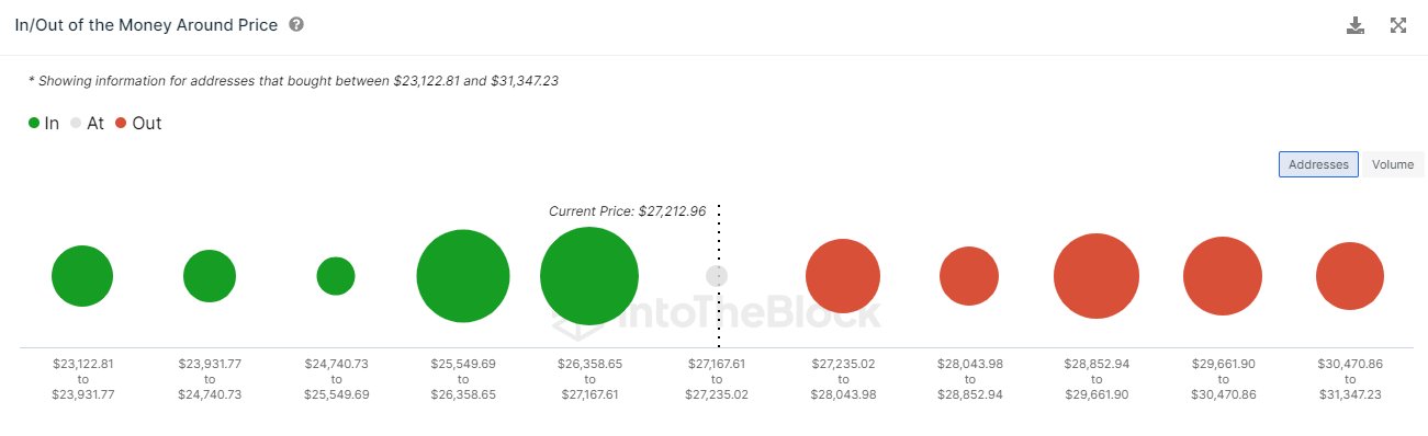
As explained by analyst Ali in a new post on X, BTC has a major support wall just below it right now. In on-chain analysis, the strength of support and resistance levels is gauged through the amount of Bitcoin that the investors bought at them.

The chart below shows how the distribution of the investor cost basis has looked like for BTC across the price ranges near the current spot value:

Bitcoin Support

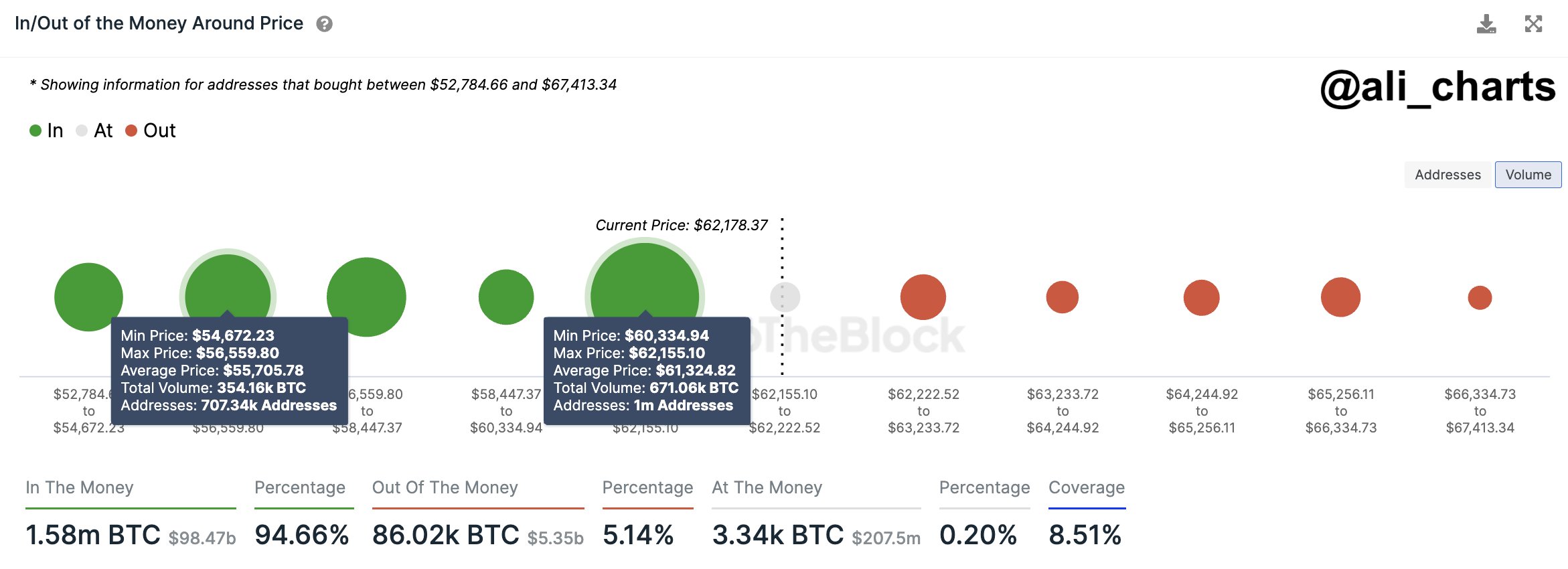
Here, the size of the dot represents the number of tokens that the addresses bought between the corresponding price levels. From the graph, it’s apparent that the $60,300 to $62,100 range has a particularly high density of coins right now.

Most of the price levels in this range lie just below the current spot price of the cryptocurrency, meaning that the investors who bought here would be making some profit, albeit only a slight one.

Generally, when the price retests the cost basis of such investors who were in profit prior to the retest (meaning that the price has approached their cost basis from above), a buying reaction may be produced by these addresses.

This is because holders like these may have reason to believe that if they were able to get into profits before, they might be able to do so again in the near future, so they may just accumulate on this “dip.”

Such a reaction can naturally provide support to the cryptocurrency. The scale of this support, however, is naturally not anything significant if only a few investors bought at the level to begin with. Narrow ranges that are thick with addresses, on the other hand, might just prove to be a source of noticeable support.

In the aforementioned price range near the current spot price, one million addresses acquired a total of about 671,000 BTC. “This accumulation zone highlights strong investor confidence and could serve as a crucial level of support for BTC, potentially cushioning against further drops,” notes the analyst.

While the price ranges under the current price are heavy with coins, it’s visible in the chart that this isn’t the case for the ranges above. Just like how supply wallets below can be a source of support, they can instead act as resistance when above.

The fact that the supply walls above are quite thin suggests that there wouldn’t be too many investors waiting to quickly exit at their break-even, and thus, selling pressure due to them should be low.

That said, it doesn’t mean there isn’t any impedance at all. Bitcoin is approaching all-time highs at this point, meaning that the vast majority of the supply is in profit. At these levels, mass selling for harvesting these gains can be the main challenge preventing the run from continuing.

BTC Price

At present, Bitcoin is trading around the $62,000 level, meaning that it’s right on the edge of the major support wall.

Bitcoin Price Chart

Here’s Where Next Bitcoin Resistance Lies, From An On-Chain Perspective

Here’s where the next major resistance to clear Bitcoin could lie from the perspective of on-chain analysis.

Bitcoin Resistances According To On-Chain Data

Bitcoin has recently observed a surge beyond the $27,000 mark, and many have been wondering how long this fresh rally could continue for the cryptocurrency. One way to determine this could perhaps be by looking at where the major resistance levels are.

In terms of on-chain analysis, “resistance” generally lies in regions where many investors have their cost basis present because of how holder psychology tends to work.

The “cost basis” here refers to the average price at which an investor buys coins. When the spot price is below a holder’s cost basis, they are in a net amount of loss.

Once BTC returns to the investor’s acquisition price, they may want to sell, as at least that way, they would have avoided exiting at any losses. Due to this reason, whenever a large number of investors have their cost basis present inside a particular price range, the range could provide resistance to the asset because of the volume of selling pressure that may arise in it.

Now, here is what the different Bitcoin price ranges look like in terms of investor cost basis concentration, according to data from the market intelligence platform IntoTheBlock:

Bitcoin Cost Basis

As displayed above, the following particularly thick cost basis range is $25,853 to $29,662. “Key resistance is anticipated around $29.2K — a point of acquisition for over 1.77M addresses,” explains IntoTheBlock.

The $27,200 to $28,000 range (the range just after the current spot price of the cryptocurrency) isn’t exactly thin, either, but it has notably fewer investors than the other one. The following range, $28,000 to $28,853, doesn’t have many investors, so if BTC can clear the upcoming range, the run-up to nearly $29,000 may be clear.

While investor cost basis can act as resistance on retests from below, they can also support when being touched from up. The reason behind this could be that an investor that had earlier been in profits might have reason to believe the asset would go up again, so they might buy more at their cost basis, thinking it to be a profitable entry point.

From the image, it’s apparent that both the ranges just below the current price are very thick with addresses because Bitcoin had earlier consolidated at these price levels for a significant time.

It might be due to these strong support levels that when the asset had retraced back to $26,600 yesterday, it quickly found a rebound to the current price level.

BTC Price

At the time of writing, Bitcoin is floating around the $27,200 level, up 4% during the past seven days.

Bitcoin Price Chart

Is The Bitcoin Price Rally Sustainable? On-Chain Data Provides Crucial Insights

Bitcoin has been trending up since hitting a local low below $25,000 on September 11th. Yesterday’s rally to $27,435 marked a 10% increase from the recent low. As NewsBTC reported, the rally was largely led by the futures market and a massive increase in open interest of over $1 billion, more than half of which was flushed out when BTC fell back below $27,000. Despite this, BTC is up around 7.5% from last week’s low. A reason to be bullish?

Glassnode Report Sheds Light On Market Sentiment

According to Glassnode, the Realized HODL Ratio (RHODL) serves as a crucial market sentiment indicator. It measures the balance between investments in recently moved coins (those held for less than a week) and those in the hands of longer-term HODLers (held for 1-2 years). The RHODL Ratio for the year 2023 is flirting with the 2-year median level. While this indicates a modest influx of new investors, the momentum behind this shift remains relatively weak.

Bitcoin RHODL ratio

Glassnode’s Accumulation Trend Score further elaborates on this trend. It shows that the current recovery rally of 2023 has been significantly influenced by investor FOMO (Fear of Missing Out), with noticeable accumulation patterns around local price tops exceeding $30,000. This behavior contrasts sharply with the latter half of 2022, where newer market entrants showed resilience by accumulating Bitcoin at lower price levels.

Bitcoin accumulation trend score

The Realized Profit and Loss indicators also reveal a complex picture. These metrics measure the value change of spent coins by comparing the acquisition price with the disposal price. In 2023, periods of intense coin accumulation were often accompanied by elevated levels of profit-taking. This pattern, which Glassnode describes as a “confluence,” is similar to market behavior seen in peak periods of 2021.

An assessment of Short-Term Holders (STH) uncovers a precarious situation. A staggering majority, more than 97.5% of the supply procured by these newcomers, is currently operating at a loss, levels unseen since the infamous FTX debacle. Using the STH-MVRV and STH-SOPR metrics, which quantify the magnitude of unrealized and realized profits or losses, Glassnode elucidates the extreme financial pressures recent investors have grappled with.

Market Confidence Remains Low

The report also delves into the realm of market confidence. A close examination of the divergence between the cost basis of two investor subgroups — spenders and holders — offers an indication of prevailing market sentiment. As the market reeled from the price plummet from $29k to $26k in mid-August, an overwhelmingly negative sentiment was evident. This was manifested as the cost basis of spenders fell sharply below that of holders, a clear signal of prevalent market panic.

To offer a clearer visualization, Glassnode has normalized this metric in relation to the spot price. A crucial observation is the cyclical nature of negative sentiment during bear market recovery phases, usually lasting between 1.5 to 3.5 months. The market recently plunged into its first negative sentiment phase since 2022’s conclusion.

Currently, the trend lasts 20 days, which could mean that the end has not yet been marked by the recent rally, if history repeats itself. However, if there is a sustained bounce back into positive territory, it could be indicative of renewed capital inflow, signifying a return to a more favorable stance for Bitcoin holders.

Investor confidence in trend

In conclusion, Glassnode’s on-chain data reveals a Bitcoin market that is currently in a state of flux. Although 2023 has seen new capital entering the market, the influx lacks strong momentum. Market sentiment, especially among short-term holders, is decidedly bearish. These findings indicate that caution remains the watchword, with underlying market sentiment offering mixed signals about the sustainability of the current Bitcoin rally.

At press time, BTC traded at $26,846 after being rejected at the 23.6% Fibonacci retracement level (at $27,369) in the 4-hour chart.

Bitcoin price

What’s Behind The Recent Bitcoin Drop? Here’s What On-Chain Data Says

Bitcoin on-chain data hints that selling from the miners may have been behind the latest plunge in the asset’s price below the $28,000 mark.

Bitcoin Miners Have Shown Signs Of Selling Recently

As pointed out by an analyst in a CryptoQuant post, miners had been putting on some selling pressure on Bitcoin while the decline had happened. A relevant indicator here is the “miner netflow,” which measures the net amount of Bitcoin entering into or exiting the wallets of all miners.

When this metric has a positive value, it means a net number of coins is being transferred into the wallets of miners right now. Such a trend implies that these chain validators are accumulating currently, which is naturally something that could be bullish for the price.

On the other hand, negative values suggest miners are transferring some BTC out of their holdings at the moment. Usually, miners transfer out their coins whenever they want to sell them. Hence, negative netflow values can have bearish consequences for the asset.

Now, here is a chart that shows the trend in the 30-day simple moving average (SMA) Bitcoin miner netflow over the past week or so:

Bitcoin Miner Netflow

As displayed in the above graph, the 30-day SMA Bitcoin miner netflow registered a very sharp red spike when the cryptocurrency’s price was in the middle of its decline a few days ago.

BTC was just above $28,000 when this spike came, but the asset rapidly plummeted to the low $27,000 level following it. The timing of these large net outflows taking place from the miners may be a sign that it was this cohort’s selling that at least partially contributed to the coin’s drawdown.

The chart for the 30-day exponential moving average (EMA) Bitcoin miner reserve, a metric that measures the total amount of BTC all miners are holding right now, also shows this spike:

Bitcoin Miner Reserve

This plummet in the Bitcoin miner reserve from a few days ago naturally makes sense, as the netflow is nothing but a measure of the changes taking place in this metric. From the chart, it’s visible that while the outflows may have been sizeable, they still haven’t significantly affected this cohort’s total holdings, meaning that many miners are still sitting still on their wallets.

Nonetheless, compared to the average during the last 365 days, the current outflows are very large, as the data for the 14-day EMA Miners’ Position Index (MPI) below displays.

Bitcoin MPI

It looks like the rate at which Bitcoin miners are selling right now (proportional to the past year) is greater than what even the FTX crash back in November 2022 saw.

All these indicators suggest that this extraordinary selling pressure from these holders could be why BTC plunged to low $27,000 levels a couple of days ago, something that the coin is yet to recover.

BTC Price

At the time of writing, Bitcoin is trading around $27,300, down 8% in the last week.

Bitcoin Price Chart

Is Bitcoin Rise Above $20k Sustainable? Here’s What On-Chain Data Says

Bitcoin is now back above the $20k mark after observing some sharp uptrend over the past day, but is this pump sustainable? Here’s what on-chain data has to say about it.

Bitcoin All Exchanges Netflows Remain Muted Following The Price Rise

As explained by an analyst in a CryptoQuant post, the BTC exchange netflows can help us know whether this short-term uptrend is sustainable or not.

The “all exchanges netflow” is an indicator that measures the net amount of Bitcoin entering or exiting wallets of all centralized exchanges. The metric’s value is simply calculated by taking the difference between the inflows and the outflows.

When the indicator has a positive value, it means investors are depositing a net number of coins to exchanges right now. Since these holders may be sending the BTC to exchanges for selling purposes, this kind of trend could have bearish implications on the price of the crypto.

On the other hand, negative values of the netflow imply the outflows are currently overwhelming the inflows. Such a trend, when prolonged, can be bullish for the coin as it may be a sign of accumulation from holders.

Now, here is a chart that shows the trend in the Bitcoin all exchanges netflow over the last couple of weeks:

Bitcoin Exchange Netflow

Looks like the value of the metric saw a spike about a week ago| Source: CryptoQuant

As you can see in the above graph, only the positive scale of the Bitcoin exchange netflow is displayed, as it’s a sufficient enough metric in the context of the current price discussion.

It seems like there have been no significant spikes in the value of the indicator since the crypto has observed the pump. This means that whales haven’t deposited any coins for dumping yet.

Just a week or so back, there was a pretty large positive netflow spike, shortly after which BTC returned back from its small rise.

For now, Bitcoin hasn’t seen any such inflows, which would suggest the rise could continue in the short term. However, it remains to be seen how long the whales will keep sitting still.

BTC Price

At the time of writing, Bitcoin’s price floats around $20.5k, up 7% in the last seven days. Over the past month, the crypto has gained 9% in value.

The below chart shows the trend in the price of the coin over the last five days.

Bitcoin Price Chart

The value of the crypto seems to have sharply risen up over the past 24 hours | Source: BTCUSD on TradingView
Featured image from Jievani Weerasinghe on Unsplash.com, charts from TradingView.com, CryptoQuant.com