When To Be Bearish On Bitcoin? On-Chain Analyst Answers

An on-chain analyst has explained signals in several metrics to see if Bitcoin is in a bearish phase.

These Bitcoin Indicators Could Be To Follow For Bear Market Signals

In a new post on X, on-chain analyst Checkmate replied to a user asking about an on-chain metric indicating when it’s time to turn bearish on cryptocurrency.

Checkmate has shared two indicators: the Short-Term Holder Realized Profit/Loss Momentum and the Short-Term Holder MVRV Ratio Momentum. “Short-Term Holders” (STHs) here refer to the Bitcoin investors who bought their coins within the past 155 days, meaning that both of these metrics are only for the recent buyers in the market.

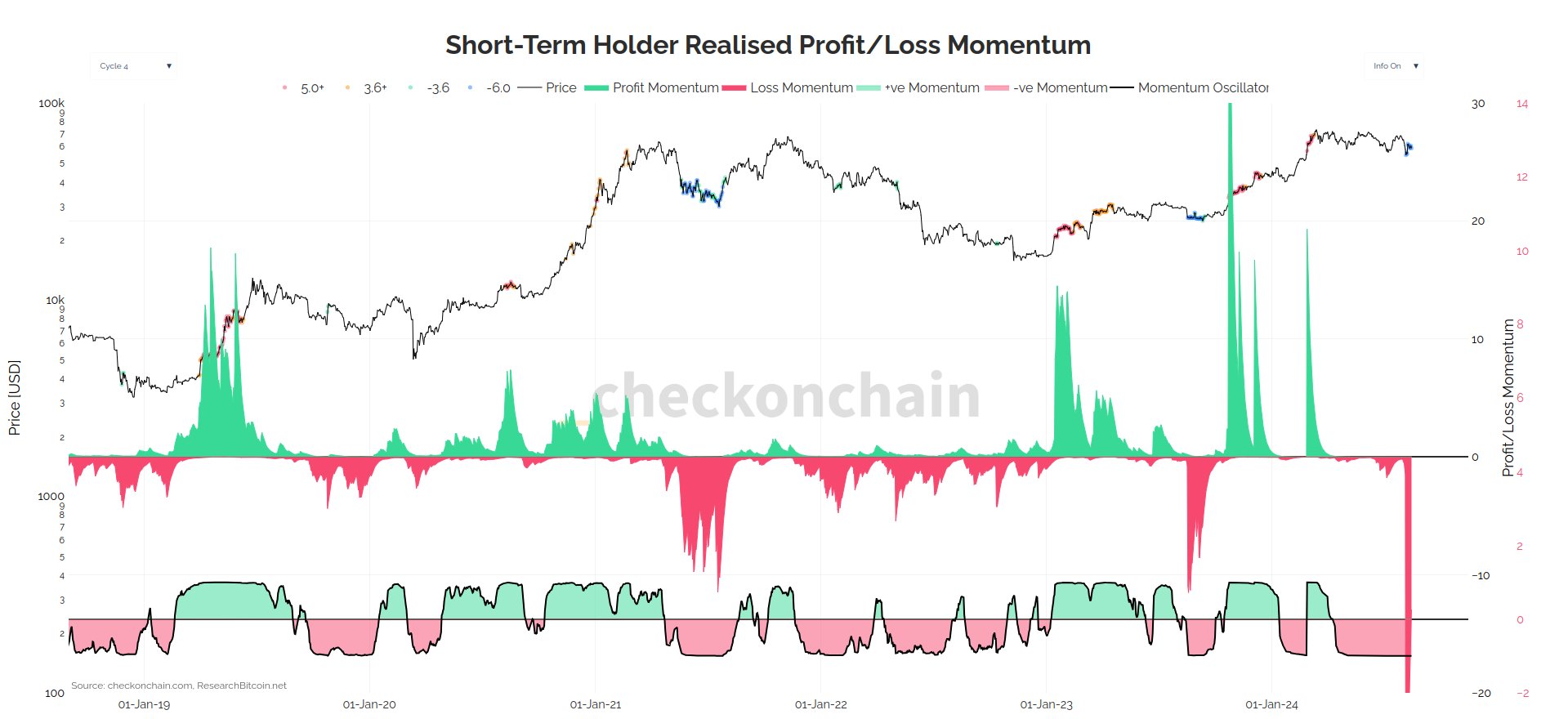
First, the “Realized Profit/Loss Momentum” measures, as its name suggests, the momentum in the ratio of the profit and loss that the STHs are realizing through their selling.

Below is the chart for the indicator posted by the analyst.

Bitcoin STH Realized Profit/Loss Momentum

According to the analyst, it is time to be bearish when the oscillator on the bottom of this chart turns red (corresponding to negative momentum in the STH Realized Profit/Loss).

The graph shows that this oscillator assumed negative values soon after the price set its new all-time high (ATH) and has since remained in the region. And indeed, while the indicator has seen these values, Bitcoin has been going through a rough phase.

The STH MVRV Ratio Momentum’s second indicator works similarly and keeps track of the distance between the Market Value to Realized Value (MVRV) Ratio for this cohort and its 155-day moving average (MA).

The MVRV Ratio is a popular indicator that tells us how the value held by the investors (the market cap) compares against what they used to purchase their coins (the Realized Cap). In other words, the metric provides information about the unrealized profit/loss of the holders.

Thus, whereas the Realized Profit/Loss keeps track of the net profit/loss the investors are harvesting through their selling, this metric tells us about the profit/loss they have yet to take.

Here is the data for the momentum indicator for the MVRV Ratio specifically for the STHs:

Bitcoin STH MVRV Ratio

According to the analyst, just like with the first indicator, this one also gives a bearish signal when the momentum turns red. As the chart shows, the STH MVRV Ratio has been under its 155-day MA for the same period as the bearish momentum in the Realized Profit/Loss, thus providing confluence to the signal.

BTC Price

Bitcoin had pushed towards $62,000 earlier in the week, but the asset has since slipped up as it’s now back at $57,800.
Bitcoin Price Chart

Bitcoin Bearish Signal: Exchange Inflows Hit $1.2 Billion In Past Month

On-chain data shows exchanges have registered Bitcoin deposits of about $1.2 billion in the past month.

Bitcoin Exchange Supply Has Seen A Significant Increase In The Past Month

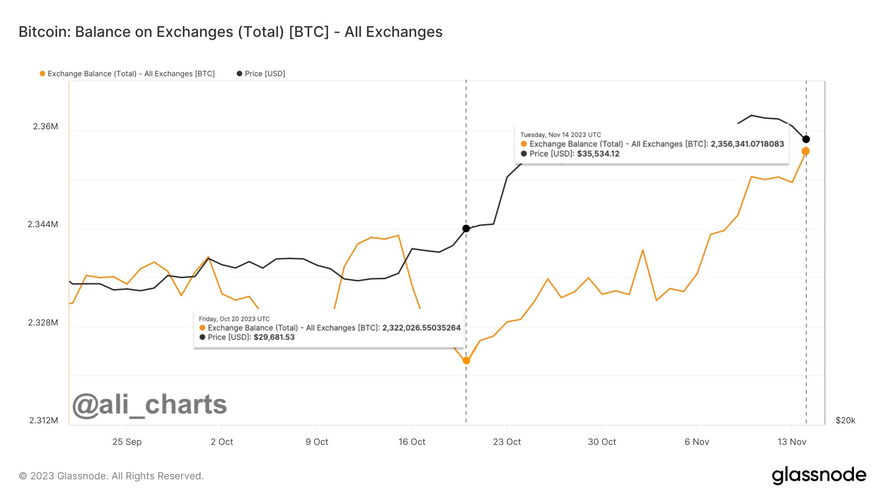
As explained by analyst Ali in a new post on X, exchanges have seen hefty inflows recently. The relevant indicator here is the “balance on exchanges,” which keeps track of the total amount of Bitcoin in the wallets of all centralized exchanges.

When this metric’s value rises, these platforms are receiving a net amount of deposits right now. Generally, one of the main reasons investors would choose to transfer their coins to exchanges from their self-custodial wallets is for selling purposes, so a high amount of inflows can be a sign that a selloff may be taking place in the market.

On the other hand, the indicator’s value going down suggests the holders are withdrawing their coins currently. The investors usually transfer their BTC to self-custodial wallets to hold onto them for extended periods. This kind of behavior, when sustained, could prove to be bullish for the price in the long term.

Now, here is a chart that shows the trend in the Bitcoin balance on exchanges over the past couple of months:

Bitcoin Exchange Balance

As displayed in the above graph, the Bitcoin balance on exchanges has been rising during the past month, suggesting that a net amount of supply has been constantly flowing into these platforms.

This latest uptrend in the indicator started around when BTC’s recent upward push began, a potential sign that the deposits were being made to take advantage of the profitable exit opportunity.

The metric’s rise had been slow at first, but after Bitcoin’s latest adventure above $37,000, the exchanges have seen a sharp growth in their supply. This elevated selling pressure could be why the asset has slowed down in the last few days.

The exchanges have received inflows of about 34,000 BTC in the past month, equivalent to about $1.2 billion at the current exchange rate. While this is significant selling pressure in the short-term, this amount is still not much in the grand scheme of things, as the total balance on exchanges is of the scale of more than 2.5 million BTC right now.

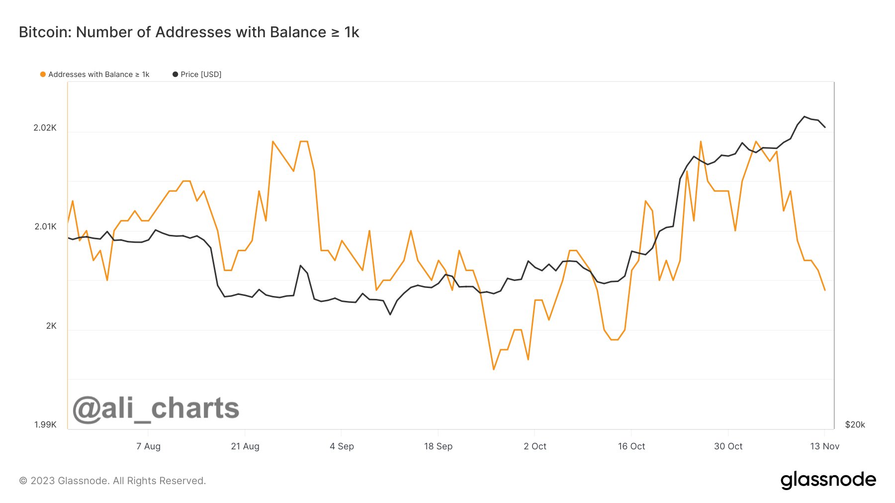
The recent increased selling pressure in the market is also visible in the form of the number of addresses owned by the whales (entities holding at least 1,000 BTC), as the chart shared by the same analyst shows.

Bitcoin Whales

The number of addresses under this cohort has seen a notable decline recently, implying that these humongous investors have been selling off their coins and exiting the sector.

BTC Price

Bitcoin has registered some decline during the past few days as its price is now floating around the $36,000 level.

Bitcoin Price Chart

Bitcoin Bearish Signal: Long-Term Holders Deposit To Exchanges

On-chain data shows that Bitcoin long-term holders are making deposits to exchanges currently, something that could be bearish for the price.

Bitcoin Exchange Inflow CDD Has Spiked Recently

As explained by an analyst in a CryptoQuant Quicktake post, investors have been making deposits to spot exchanges recently. There are two relevant indicators here: the “exchange inflow” and the “exchange reserve.”

The former of these keeps track of the total amount of Bitcoin that the holders are transferring to centralized exchanges, while the latter one measures the total amount sitting in the wallets of these platforms.

When the value of the inflow metric spikes, it means that the investors are moving a large number of coins to the exchanges. As one of the main reasons why holders may make such transfers is for selling-related purposes, this kind of trend can be a sign that selling is occurring.

Since selling activity occurs on the spot exchanges, the quant has restricted the exchange inflow and reserve indicators to track only the data related to the spot platforms.

The analyst has also chosen another modifier on the exchange inflow: the “Coin Days Destroyed” (CDD). In simple terms, what the CDD checks for is the activity of dormant coins in the market.

Tokens that have been sitting in wallets for a long time accumulate a large number of “coin days” (where 1 coin day corresponds to 1 BTC staying still for 1 day) and when these coins finally move, the coin days are reset or “destroyed,” which is the number that the CDD measures. The exchange inflow CDD naturally only keeps track of the coin days being destroyed through transfers to exchanges.

Now, here are the charts that show the trends in the 7-day simple moving average (SMA) value of this Bitcoin indicator and the 14-day SMA exchange reserve:

Bitcoin Exchange Inflow CDD & Exchange Reserve

From the first graph, it’s visible that the Bitcoin exchange inflow CDD has registered a sharp spike recently. This would suggest that a potentially large number of dormant coins have been moved into these platforms.

Usually, the CDD having large values like these can be a sign that the “long-term holders” (LTHs) are on the move. The LTHs (defined as holders carrying their coins since at least six months ago) are the most resolute bunch in the market, so their depositing to exchanges can be something to watch for, as it implies that the market has made even these diamond hands waver.

As is visible from the second chart, the exchange reserve has also gone up alongside this spike in the exchange inflow CDD, suggesting that there haven’t been enough withdrawals to make up for these inflows.

It now remains to be seen what effect these possible selling moves from the LTHs may have on the Bitcoin price in the coming days.

BTC Price

Bitcoin has continued its stagnant price action recently as its price is still trading around the $26,400 mark.

Bitcoin Price Chart

Bitcoin Bearish Signal: Miners Continue To Sell

On-chain data shows that Bitcoin miners have continued to sell recently, a sign that can be bearish for the price of the cryptocurrency.

Bitcoin Miner Reserve Has Been Going Down Since Rally Started

As an analyst in a CryptoQuant post pointed out, BTC miners have continued to shave coins off their reserve recently. The “miner reserve” is an indicator that measures the total amount of Bitcoin that all miners are holding in their wallets currently.

Related Reading: Bitcoin Emerges As the King Of Assets,10X Growth Over Gold During US Banking Crisis

When the value of this metric goes up, it means the miners are depositing a net number of coins into their wallets. This trend suggests these blockchain validators are accumulating the cryptocurrency. As miners are often a source of selling pressure in the market, their holding on and adding to their supply can be bullish for the price.

On the other hand, a decreasing value in this indicator implies that miners are transferring some BTC out of their reserve. Since one of the main reasons why these investors may withdraw from their wallets is for selling-related purposes, such a trend can have bearish consequences for the asset’s value.

Now, here is a chart that shows the trend in the Bitcoin miner reserve over the past year:

Bitcoin Miner Reserve

The above graph shows that the Bitcoin miner reserve saw a sharp plunge just as the rally began in January, suggesting that these investors sold to take advantage of the profit-taking opportunity. The drawdown in the metric was also quite sharp in this case and surpassed the levels seen during the FTX crash last November.

The miner reserve has only moved sideways or down since this selloff, suggesting that these holders haven’t participated in any accumulation in recent months; they have only been looking at chances to exit.

Recently, when Bitcoin plunged from the $30,000 mark, the indicator again saw a sharp leg down, meaning that this cohort was again selling their BTC.

The drawdown in the indicator has also continued through the volatile price action observed in the last few days, suggesting that the BTC miners are still disposing of their coins.

Though these investors may have been selling a net amount of coins recently, the actual scale of their selling isn’t that significant compared to their total reserve (they currently hold upwards of 1.82 million BTC in their wallets).

The quant notes, however, that the miners holding onto their coins for longer periods could be one of the crucial factors for the bullish trend’s health.

It now remains to be seen whether these holders can reverse the trend anytime soon or if they will continue to sell Bitcoin in the short term. Either possibility is likely to have a profound effect on the BTC price.

BTC Price

At the time of writing, Bitcoin is trading around $28,100, up 3% in the last week.

Bitcoin Price Chart

Bitcoin Bearish Signal: NVT Golden Cross Enters Overbought Zone

On-chain data shows the Bitcoin NVT Golden Cross has entered into the overbought region, something that could be bearish for the price.

Bitcoin NVT Golden Cross Has Been Going Up Recently

As pointed out by an analyst in a CryptoQuant post, the most recent touch of this zone led to a drop in the price of the cryptocurrency. The “Network Value to Transactions” (NVT) is an indicator that measures the ratio between the market cap of Bitcoin and its transaction volume (both in USD).

What this metric tells is whether the asset is overpriced or underpriced right now, based on how the value of the network (the market cap) compares with its ability to transact coins (the transaction volume).

High values of the indicator suggest the cryptocurrency’s cap is inflated compared to its volume, and hence, the coin’s price may be overvalued currently. Similarly, low values can imply the asset may be undervalued at the moment.

Now, a metric derived from the NVT is the “NVT Golden Cross,” which compares the 30-day moving average (MA) of the NVT with its 10-day MA. By taking the ratio of the long-term and short-term trends like this, the indicator can help point out the tops and bottoms in the NVT.

Here is a chart that displays how the value of the Bitcoin NVT Golden Cross has changed over the past year:

Bitcoin NVT Golden Cross

As shown in the above graph, the quant has marked the historical regions where the Bitcoin NVT Golden Cross has signaled underbought and overbought conditions for the asset.

It looks like the values of the metric above 2.2 have been a sign that the cryptocurrency is undersold, while those below the -1.6 level have implied an oversold condition.

From the chart, it’s visible that the indicator touched the underpriced region last month, and the price reacted by observing some bullish momentum. Since then, the metric has seen an overall uptrend.

A week or so ago, when Bitcoin was floating around the $30,000 level, the NVT Golden Cross entered inside the overpriced region. Following this formation, the price faced some severe drawdown as it plunged to the low $27,000 level.

The metric cooled down for a while following this selloff, but in the past couple of days, it has once again risen to touch the red zone. This would mean that the asset may be becoming overbought again.

Over the past day, however, Bitcoin has actually only observed some strong upwards momentum, as the coin’s value has now recovered to levels above $29,000 again.

In the past, tops haven’t always been immediately formed whenever the NVT Golden Cross has surged to this area, so this wouldn’t exactly be unprecedented. However, considering that the surge may have only made the coin more overpriced, a local top may be hit soon for the asset, if this metric’s pattern is anything to go by.

BTC Price

At the time of writing, Bitcoin is trading around $29,400, up 1% in the last week.

Bitcoin Price Chart

Bitcoin Bearish Signal: Spot And Derivative Reserves Shoot Up

On-chain data shows the Bitcoin spot and derivative exchange reserves have both shot up recently, a sign that could be bearish for the price.

Bitcoin Spot And Derivative Reserves Register Growth

As pointed out by an analyst in a CryptoQuant post, the open interest and the funding rates are also heating up in the BTC market. The “exchange reserve” is an indicator that measures the total amount of Bitcoin that investors are depositing into wallets of centralized exchanges right now.

This metric has two versions; one is for the spot exchanges, while the other is for the derivative platforms. Usually, investors deposit to spot exchanges for selling purposes, so an increase in the reserves of these platforms can suggest selling pressure is rising in the market.

And as holders use derivative exchanges for opening positions on the futures market, a rise in this reserve can lead to higher volatility (the effect on the price can be in either direction).

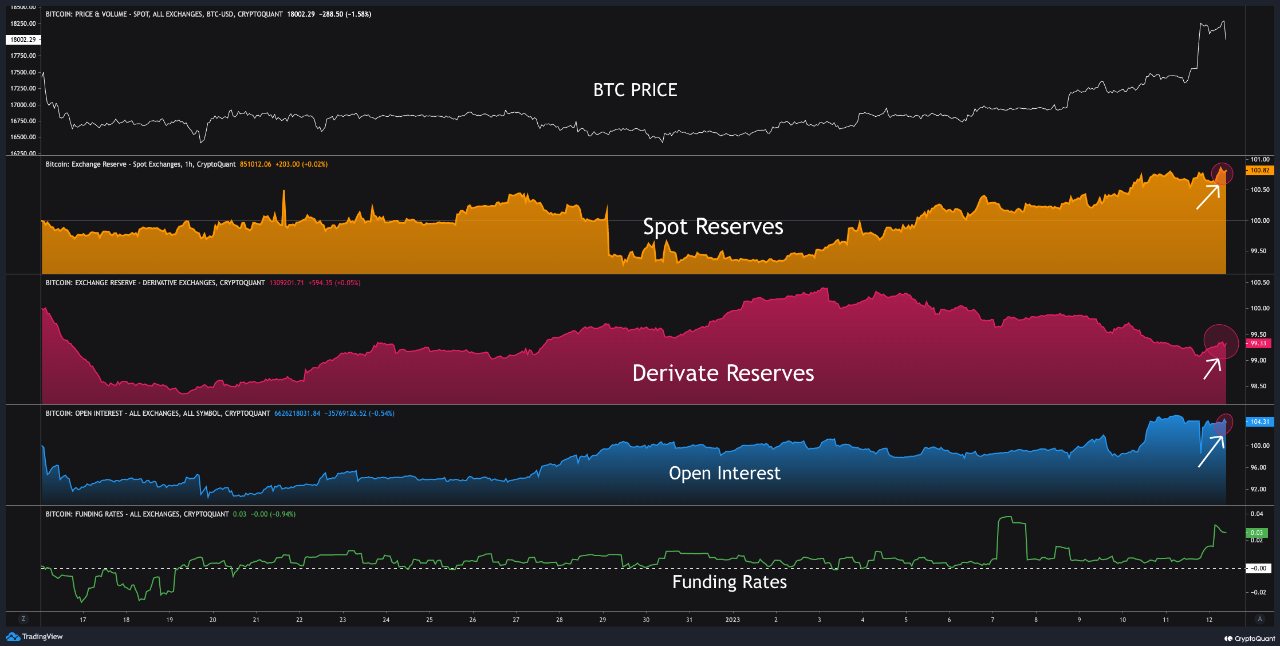
Now, here is a chart that shows the trend in these Bitcoin exchange reserves over the last month:

Bitcoin Exchange Reserves

As displayed in the above graph, both the spot and derivative exchange reserves have increased in value recently, suggesting that investors have been making deposits to these platforms. The increased spot reserves suggest an elevated selling pressure in the market, while the derivative reserves imply an overheated futures sector.

The chart also includes data for two other metrics, the open interest, and the funding rates. The “open interest” is an indicator that measures the total amount of futures positions currently open on derivative exchanges. This metric takes into account both short and long contracts.

The graph shows that this metric has also trended up recently, further suggesting that the futures market is currently overheated. The other indicator, the “funding rates,” tells us whether there are more shorts or longs in the market.

The Bitcoin funding rates are favorable now, implying that the longs are overwhelming the shorts. Generally, whichever way this metric swing tells us which of these contract holders is more at risk of a liquidation squeeze.

So far, there hasn’t been any long squeeze in the market, but rather a short squeeze as the price has been able to keep up the momentum. There have been some high liquidations during the past day that may have helped calm the overheated futures market for now, but since there is increased selling pressure on the spot exchanges, BTC is still at risk for a short-term pullback.

BTC Price

At the time of writing, BTC is trading around $19,100, up 14% in the last week.

Bitcoin Price Chart

Bitcoin Bearish Signal: Large Dormant Supply On The Move

On-chain data shows a large amount of old Bitcoin supply has moved in the last few days, something that could be bearish for the crypto’s price.

Bitcoin Supply Older Than 2 Years Showed Movement In The Past Week

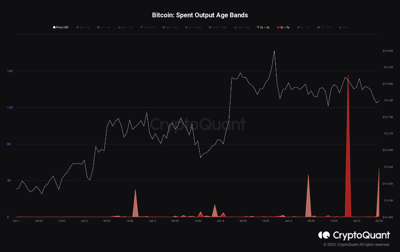
As pointed out by an analyst in a CryptoQuant post, a total of four large transfers with old supply have taken place in the last week. The relevant indicator here is the “Spent Output Age Bands” (SOAB), which tells us the total number of coins that each age band is moving on the chain right now.

The age bands refer to supply groups divided based on the criteria of the age of the coins (or more precisely, of the UTXOs). For example, the 1m-3m age band includes all coins that have been sitting dormant inside the same addresses since at least 1 month ago and at most 3 months ago. The SOAB metric for this group would then measure the total number of these coins that have been transferred to another wallet.

Now, the age bands of interest here are the 2y-3y and 3y-5y groups. Typically, investors that have been holding their coins since more than 155 days ago are said to be the “long-term holders” (LTHs), so both these bands include coins belonging to two different segments of the LTHs.

Also, it’s a statistical fact that the longer investors hold onto their BTC, the less probable they become to sell at any point. This implies that the holders with such aged supply as in these bands would be some of the most resolute HODLers in the market.

Here is a chart that shows the SOAB data for these two Bitcoin age bands over the past week:

Bitcoin Spent Output Age Bands

As the above graph displays, there have been four large movements of coins belonging to these cohorts in the last few days. Three of these transfers were from the 2y-3y age band, while one was from the 3y-5y group.

The spike from the latter cohort was significantly larger than the others, amounting to more than 15,000 BTC being moved. All the transfers from the 2y-3y age band combined came to almost 13,000 BTC, which is still less than the 3y-5y group’s transactions.

Generally, large movements of such old Bitcoin supply is a sign of dumping from the LTHs, and if it’s the case here as well, then it would mean that the current market broke these so-called diamond hands into selling.

The quant notes that these transfers were at least not headed towards exchanges, which does reduce the probability of these transactions being for selling purposes (but obviously doesn’t eliminate the chances, as these investors could just have been selling through OTC deals).

Regardless of that, however, the analyst cautions, “it is very surprising to see FOUR of these transactions in one week. It is definitely worth watching in the next period.”

BTC Price

At the time of writing, Bitcoin is trading around $16,700, up 1% in the last week.

Bitcoin Price Chart

Bitcoin Bearish Signal: ‘Mid-Term’ Holders Show Signs Of Dumping

On-chain data shows that Bitcoin “mid-term” holders have been on the move during the past day, suggesting that they may be dumping currently.

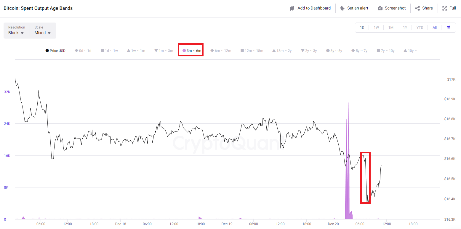
Bitcoin 3-6 Months Age Band Shows Large Spike In Spent Outputs

As pointed out by an analyst in a CryptoQuant post, an increase in the spent outputs for the 3-6 months group has resulted in big moves for BTC before. The relevant indicator here is the “Spent Output Age Bands,” which tells us which age bands in the Bitcoin market are moving how many coins right now.

These “age bands” are groups that define ranges between which the coins (or holders) falling into said band last showed any movement or selling. For instance, the “1m-3m” age band includes all tokens that have been sitting dormant since at least 1 month and at most 3 months ago. If holders belonging to this group shift their coins, then the move will show up as a spike on the spent outputs chart for the band.

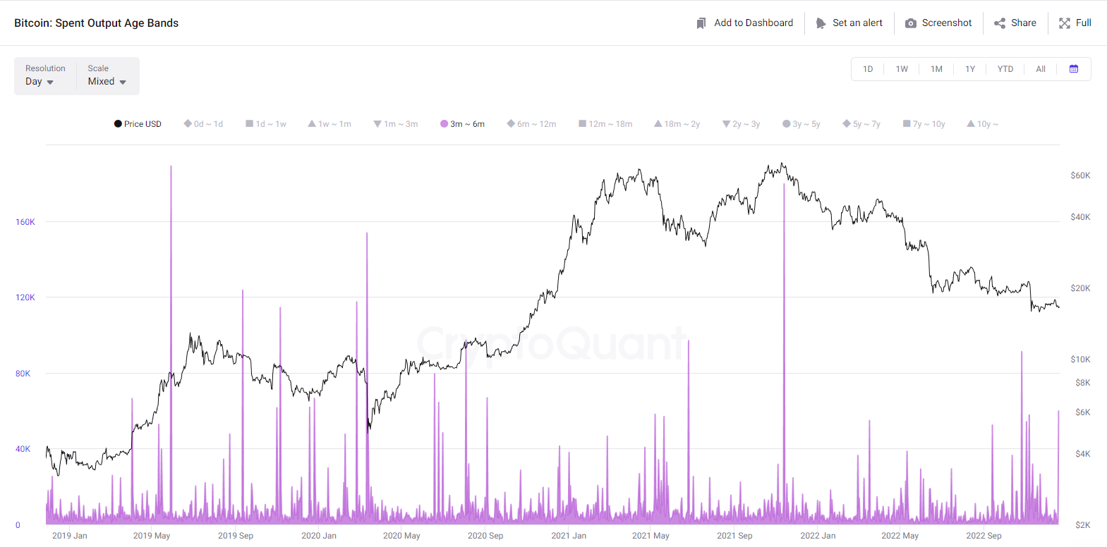
In the context of the current topic, the relevant age band is the “3m-6m” group. Here is a chart that shows the trend in the spent output metric for it during the last few years:

Bitcoin Spent Output Age Bands

As the above graph displays, the spent output metric has recorded a large value for the 3m-6m Bitcoin age band recently. The holders belonging to this group are sometimes referred to as the “mid-term holders,” because of the fact that their range covers the boundary between the short-term holder and the long-term holder cohorts.

From the chart, it’s apparent that generally whenever this holder group has shown signs of heavy dumping, the price of BTC has observed a steep decline shortly after. The latest crash following the collapse of FTX, too, was preceded by a large movement from these investors.

After the current spike, Bitcoin has actually already seen a short-term drop, as the below chart shows. However, it’s unclear at the moment whether this decline was all there is going to be. If past examples are anything to go by, Bitcoin usually observes a large move whenever this trend forms, which implies the real decline from the latest spike may be yet to come.

Bitcoin Mid-Term Holder Dumping

BTC Price

At the time of writing, Bitcoin’s price floats around $16.8k, down 3% in the last week.

Bitcoin Price Chart

Bitcoin Bearish Signal: MPI Records Highest Value Since April 2022

On-chain data shows the Bitcoin MPI has surged to its highest value since the April of this year, a sign that may prove to be bearish for the crypto’s price.

Bitcoin Miners’ Position Index Has Spiked Up During Past Day

As pointed out by an analyst in a CryptoQuant post, this instance is the fifth time that the metric has sent a warning signal.

The “Miners’ Position Index” (or the MPI in short) is an indicator that measures the ratio between the miner outflows in USD, and the 365-day moving average of the same.

Generally, miners transfer coins out of their wallets (that is, make outflow transactions) for selling purposes. Thus, the MPI can tell us whether miners are selling more or less right now compared to their past year average.

When the value of this metric is high, it means miners are dumping more than usual currently. On the other hand, low values suggest these chain validators aren’t doing any heavy selling at the moment.

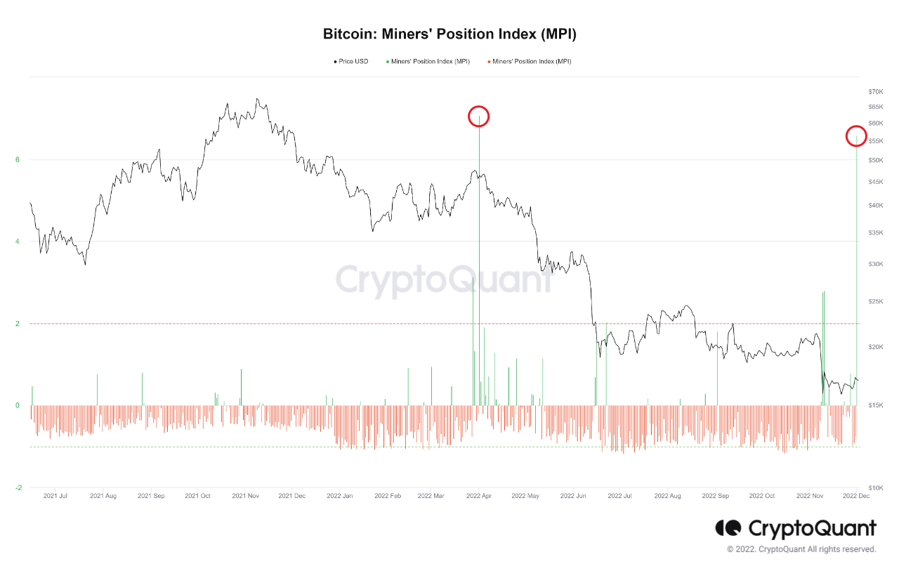
Now, here is a chart that shows the trend in the Bitcoin MPI over the past year and a half:

Bitcoin MPI

The value of the metric seems to have been pretty high recently | Source: CryptoQuant

As you can see in the above graph, whenever the Bitcoin Miners’ Position Index has crossed above a value of 2 during the past year, the price of the crypto has seen a decline shortly after.

There have been five such spikes in 2022 so far, the latest of which has only just been recorded in the last 24 hours.

This current surge has now taken the indicator’s value to the highest level since the spike back in April of this year.

When this previous spike was seen, Bitcoin was above $45k, but only a week later the crypto had crashed below $40k.

If the latest rise in miner selling also follows the same trend as back in April, then BTC may observe some downtrend in the coming days.

BTC Price

At the time of writing, Bitcoin’s price floats around $16.9k, up 3% in the last week. Over the past month, the crypto has lost 17% in value.

Below is a chart that shows the trend in the price of the coin over the last five days.

Bitcoin Price Chart

Looks like the price of the crypto has retreaded below the $17k level again | Source: BTCUSD on TradingView

Bitcoin has surged up in the last few days, but it’s unclear whether this rise will last, given the recent increased selling pressure from the miners.

Featured image from Hans-Jurgen Mager on Unsplash.com, charts from TradingView.com, CryptoQuant.com

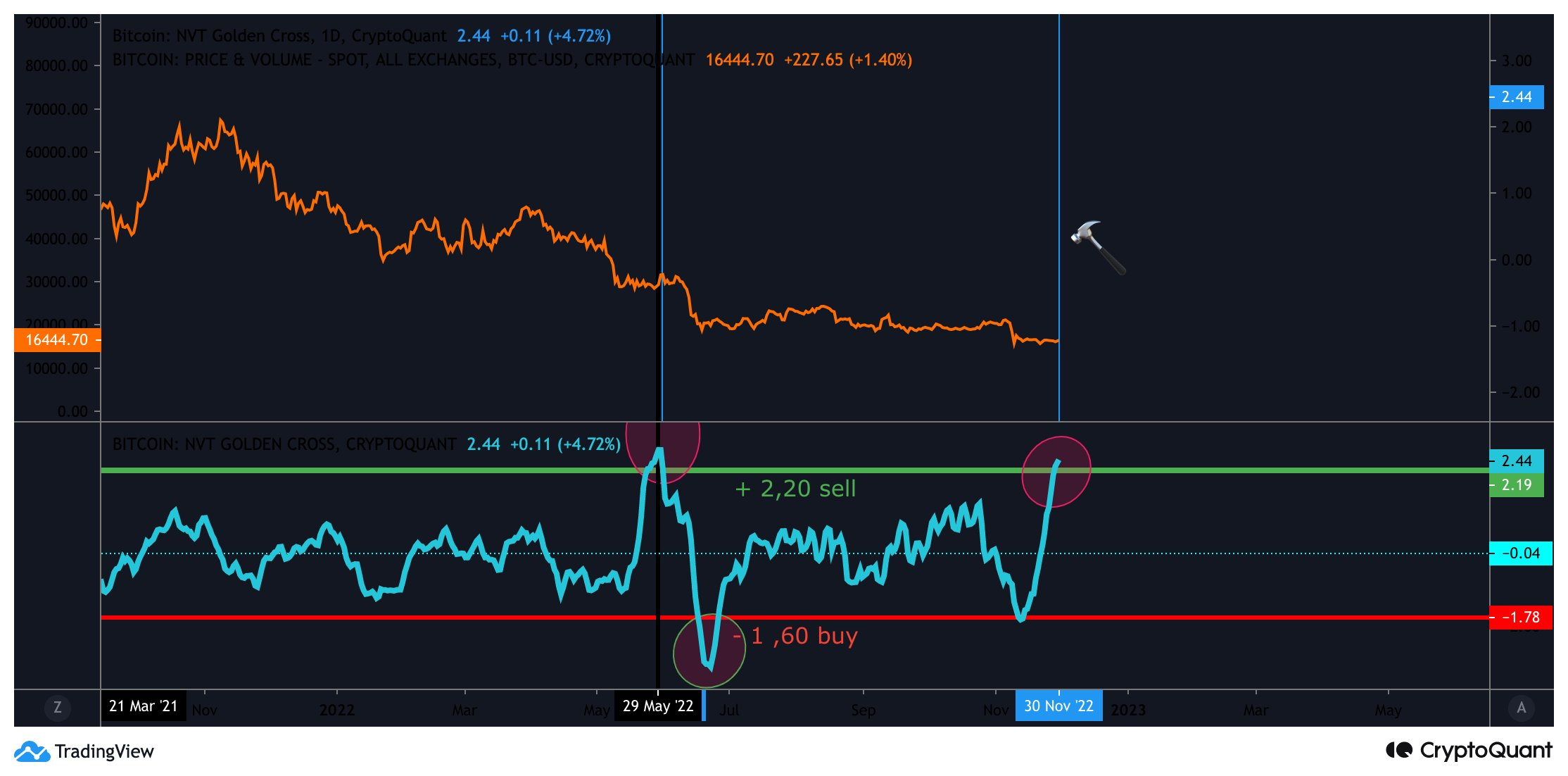
Bitcoin Bearish Signal: NVT Golden Cross Enters Sell Zone

On-chain data shows the Bitcoin NVT golden cross has now entered into the “sell” zone, something that could be bearish for the price of the crypto.

Bitcoin NVT Golden Cross Surges, Now Has A Value Of 2.44

As pointed out by an analyst in a CryptoQuant post, this sell signal might lead to BTC’s price dropping in the next ten days.

The “Network Value to Transactions ratio” (NVT ratio) is an indicator that’s defined as the market cap divided by the transacted volume in a specific period.

What this metric tells us is how the value of Bitcoin currently compares with the investors’ ability to transact coins, and thus if the crypto is undervalued or overvalued right now.

One application of this ratio is through the NVT golden cross, which compares the short-term (10-day moving average) and the long-term (30-day moving average) trends in NVT to indicate tops and bottoms in the crypto’s price.

Historically, the metric’s value being higher than 2.2 has usually been a signal to sell, while it being less than -1.6 has been a bullish sign.

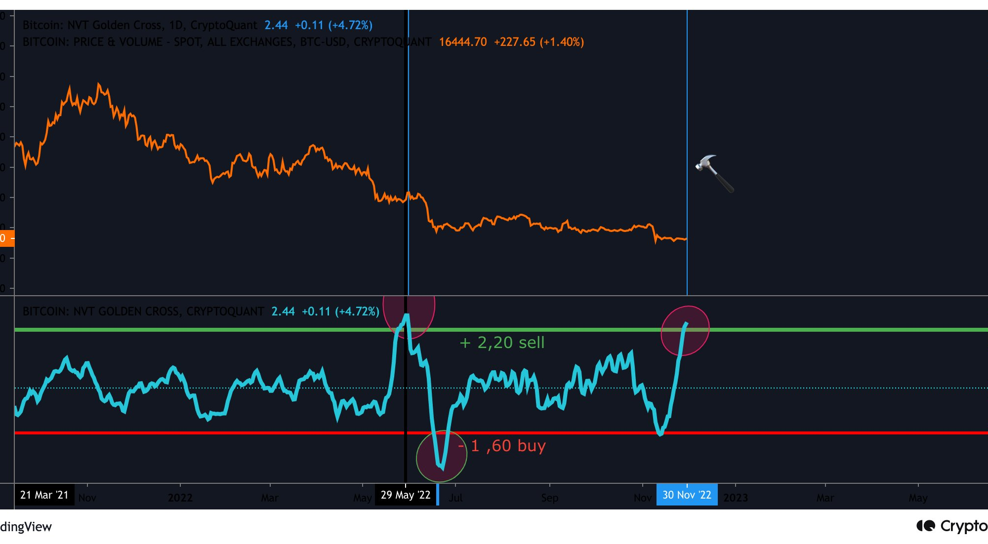
Now, here is a chart that shows the trend in the Bitcoin NVT golden cross over the last year:

quicktake-image

The value of the metric seems to have sharply gone up in recent days | Source: CryptoQuant

As you can see in the above graph, the Bitcoin NVT golden cross has observed some sharp uptrend recently.

The indicator now has a value of 2.44, meaning it has exceeded the 2.20 level that has historically implied sell signals.

During late May, the metric saw a similar surge and rose to a peak value of 2.77. When the following month rolled around, BTC went through a huge crash from $30k to $20k.

Since the crypto is once again overpriced according to the NVT golden cross, it’s possible the coin may go through more drawdown in the coming days.

However, as the metric’s value is still lower than what it was at the high preceding the June crash, there might be potential for it to rise further, before the actual sell signal is in.

BTC Price

At the time of writing, Bitcoin’s price floats around $16.8k, up 2% in the last seven days. Over the past month, the crypto has lost 19% in value.

Below is a chart that shows the trend in the price of the coin over the last five days.

Bitcoin Price Chart

Looks like the value of the crypto has shot up during the last couple of days | Source: BTCUSD on TradingView
Featured image from Mark Basarab on Unsplash.com, charts from TradingView.com, CryptoQuant.com

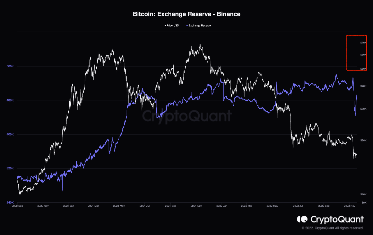
Bitcoin Bearish Signal: 130k BTC Just Flowed Into Binance

On-chain data shows the crypto exchange Binance has just received Bitcoin inflows of 130k BTC, a sign that may be bearish for the price of the crypto.

Binance’s Bitcoin Exchange Reserve Has Sharply Spiked Up Over Past Day

As pointed out by an analyst in a CryptoQuant post, Binance has received a massive Bitcoin deposit today.

The relevant indicator here is the “exchange reserve,” which tells us the total amount of BTC currently sitting in the wallets of a centralized exchange.

When the value of this metric goes down, it means investors are withdrawing their coins from the exchange right now. Such a trend, when sustained, could be bullish for the crypto’s price as it might be a sign of accumulation.

On the other hand, rises in the indicator suggest holders are transferring their BTC to the exchange’s wallets currently. As investors could be depositing for selling purposes, this kind of trend can be bearish for the coin’s value.

Now, here is a chart that shows the trend in the Bitcoin exchange reserve of the crypto exchange Binance over the last few years:

Bitcoin Exchange Reserve - Binance

The value of the metric seems to have suddenly jumped up in recent days | Source: CryptoQuant

As you can see in the above graph, the Bitcoin exchange reserve for Binance sharply fell off earlier in the month.

These outflows occurred as the crypto exchange FTX went belly up, reigniting fear among investors around central custody, and causing them to rush to withdraw their coins from such platforms.

In the last few days, however, Binance’s BTC reserve has once again started to trend up, implying that whales might be making moves to dump.

And today, the indicator has very rapidly increased to a new high, as investors have made a massive deposit of 130k BTC to the exchange.

At the moment, it’s unclear whether this is an organic increase in Binance’s Bitcoin reserve, or if it’s because of the exchange making some internal wallet shuffles that have been mistakenly picked up as fresh deposits by CryptoQuant’s metric.

However, if it’s indeed a true spike, then the outcome from this could be bearish for the price of BTC.

BTC Price

At the time of writing, Bitcoin’s price floats around $16.7k, down 3% in the last week. Over the past month, the crypto has lost 14% in value.

The below chart shows the trend in the price of the coin over the last five days.

Bitcoin Price Chart

Looks like BTC has continued to hold still in the last few days | Source: BTCUSD on TradingView
Featured image from Jonathan Borba on Unsplash.com, charts from TradingView.com, CryptoQuant.com

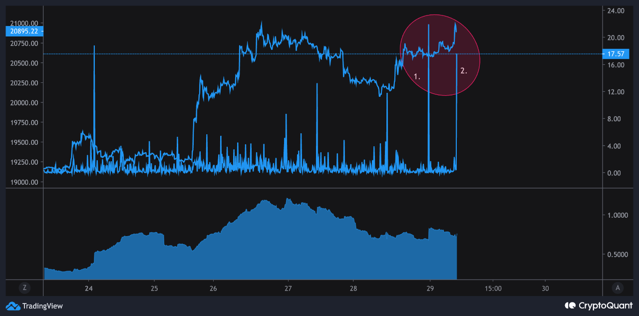
Bitcoin Bearish Signal: Exchanges Receiving Large Deposits

On-chain data shows the Bitcoin exchange inflows have spiked up over the last day, something that could prove to be bearish for the price of the crypto.

Bitcoin Exchange Inflow Mean Has Observed Two Spikes In The Past 24 Hours

As pointed out by an analyst in a CryptoQuant post, the two exchange inflow mean spikes amounted to around 21 BTC and 17 BTC respectively.

The “exchange inflow mean” is an indicator that measures the mean amount of Bitcoin being transferred to the wallets of centralized exchanges per transaction.

It’s different from the normal inflow metric in that instead of simply measuring the total number of coins flowing into exchanges, it tells us how large the average transaction to exchanges has been recently.

When the value of this indicator is high, it means investors are depositing a lot of BTC to exchanges right now. Such a trend can be a sign of dumping in the market.

On the other hand, low values of the metric suggest there isn’t much selling pressure in the Bitcoin market at the moment.

Now, here is a chart that shows the trend in BTC exchange inflow mean over the last few days:

Bitcoin Exchange Inflow Mean

Looks like the value of the metric seems to have been quite high recently | Source: CryptoQuant

As you can see in the above graph, the Bitcoin exchange inflow mean has seen a couple of spikes in the last 24 hours.

The first of these measured to around 21 BTC, which means that at the time it occurred the average transaction going into exchanges involved 21 coins. Similarly, the second spike had the mean inflow value touch more than 17 BTC.

Since these spikes have come as the price of the crypto has surged up, they could be coming from whales trying to profit from the pump.

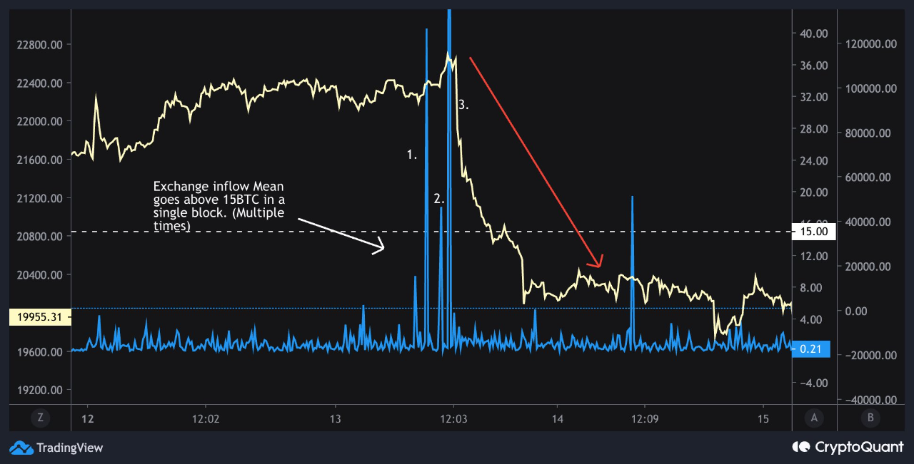
In the past, the occurrence of multiple Bitcoin exchange inflow mean spikes larger than 15 BTC in value has generally been followed by a dip in the crypto’s price.

Below is another chart that the same quant posted earlier in the month, which displays a recent instance of this kind of trend in the inflow mean.

Bitcoin Bearish

The exchange inflow mean spikes lead to the price going down | Source: CryptoQuant

BTC Price

At the time of writing, Bitcoin’s price floats around $20.6k, up 8% in the last week. Over the past month, the crypto has gained 6% in value.

The below chart shows the trend in the price of the coin over the last five days.

Bitcoin Price Chart

The value of the crypto seems to have surged up recently | Source: BTCUSD on TradingView
Featured image from Hans-Jurgen Mager on Unsplash.com, charts from TradingView.com, CryptoQuant.com

Bitcoin Bearish Signal: Dormant Supply On The Move Again

On-chain data shows some dormant Bitcoin supply is again moving into exchanges, something that could be bearish for the price of the crypto.

Bitcoin Exchange Inflow For Old Coins Has Observed Spikes In Recent Days

As pointed out by an analyst in a CryptoQuant post, some coins in the age ranges 2y-3y and 3y-5y have recently been deposited to exchanges.

The “exchange inflow” is an indicator that measures the total amount of Bitcoin being transferred into the wallets of all centralized exchanges.

When the value of this metric is high, it means investors are depositing large amounts to exchanges right now. Such a trend, when prolonged, can prove to be bearish for the value of the crypto as it can be a sign of dumping from holders.

A modified version of this indicator is the exchange inflow “Spent Output Age Bands” (SOAB), which tells us about the individual contribution to the total inflows from the different supply groups in the market.

These cohorts are categorized based on the amount of time their coins have been sitting still for. The relevant age bands here are “2y-3y” and “3y-5y&#8221$$ the below chart shows the trend in the exchange inflows coming from these supplies:

Looks like the value of the metric for these cohorts has been raised in recent days | Source: CryptoQuant

As you can see in the above graph, the Bitcoin exchange inflow SOAB has spiked up for these coin groups during the last couple of days or so.

This means that some investors have been depositing sizeable amounts of coins aged between 2 to 3 years and those between 3 to 5 years.

Such old supply is called the “long-term holder” supply. In general, the older the coins are, the less probable they are to move at any point.

So, any movement from these coins, especially those to exchanges, may have noticeable implications on the price of Bitcoin.

BTC Price

At the time of writing, Bitcoin’s price floats around $19.1k, up 1% in the last seven days. Over the past month, the crypto has lost 1% in value.

The below chart shows the trend in the price of the coin over the last five days.

The value of the crypto seems to have rebounded back from the dip a couple of days ago | Source: BTCUSD on TradingView

Bitcoin has continued to show stale price movement in the past week as the crypto has been mostly sticking around the $19k level. Two days or so ago BTC did make an attempt to break the monotony by plunging below to $18.7k, but it wasn’t long before the coin was back at $19k.

Featured image from Max Saeling on Unsplash.com, charts from TradingView.com, CryptoQuant.com

Bitcoin Bearish Signal: Miners Continue Transfers To Exchanges

On-chain data shows miners have sent a large amount of Bitcoin to spot exchanges recently, something that can be bearish for the value of the crypto.

Bitcoin Miners To Spot Exchanges Flow Has Surged Up Over The Past Day

As pointed out by an analyst in a CryptoQuant post, the latest spike in the miner exchange deposits is larger than any other recent peaks.

The relevant indicator here is the “miners to spot exchanges flow mean,” which measures the total amount of Bitcoin being transferred by miners to spot exchanges.

When the value of this metric shoots up, it means miners have just sent a large number of coins to exchanges. Since these chain validators usually deposit to spot markets for selling purposes, this kind of trend can prove to be bearish for the price of BTC.

On the other hand, the value of the indicator being low suggests there aren’t many transactions happening from miner wallets to centralized exchange wallets. Such a trend can be either neutral or bullish for the value of the coin as it implies there isn’t much selling pressure coming from this cohort right now.

Now, here is a chart that shows the trend in the Bitcoin miners to spot exchanges flow mean over the last couple of weeks:

The hourly value of the metric seems to have been quite high in recent days | Source: CryptoQuant

As you can see in the above graph, the Bitcoin miners to spot exchanges flow mean has observed a huge spike during the past day.

The last two weeks saw several exchange inflows coming from miners, after each of which the price generally suffered a short-term decline.

This latest increase in the miner spot deposits is significantly larger than any other seen in this period, and has come while the price has already plunged down. This is unlike the previous ones, which came as the price was around a peak.

If the same trend as the previous miner exchange inflows follows this time as well, then these fresh deposits are also likely to have a bearish impact on Bitcoin.

BTC Price

At the time of writing, Bitcoin’s price floats around $20.1k, up 4% in the last seven days. Over the past month, the crypto has lost 17% in value.

Below is a chart that shows the trend in the price of the coin over the last five days.

Looks like the value of the crypto plummeted down a few days back and has since moved sideways | Source: BTCUSD on TradingView
Featured image from Brent Jones on Unsplash.com, charts from TradingView.com, CryptoQuant.com

Bitcoin Bearish Signal: Whales With 1k-10k BTC Depositing To Exchanges

On-chain data shows Bitcoin exchange inflows from whales holding between 1k to 10k BTC have spiked up recently, a sign that can be bearish for the price of the crypto.

Bitcoin Exchange Inflows Spike Up Following Rally Above $24k

As pointed out by a CryptoQuant post, the BTC whales with between 1k to 10k BTC seem to have sent a large stack to exchanges recently.

The “exchange inflow” is an indicator that measures the total amount of Bitcoin being transferred to wallets of all centralized exchanges (both spot and derivatives).

When the value of this metric spikes up, it means a large number of coins are being deposited to exchanges right now. Depending on how many of these are being moved to spot exchanges, such a trend can be bearish for the price of BTC as investors usually send to these exchanges for selling purposes.

On the other hand, low values of the indicator suggest there is little selling going on in the market at the moment. Therefore, this kind of trend can be neutral or bullish for the value of the coin.

Now, here is a chart that shows the trend in the Bitcoin all exchanges inflows over the last few days:

The value of the metric seems to have spiked up recently | Source: CryptoQuant

As you can see in the above graph, the Bitcoin all exchanges inflows have registered large values during the last couple of days. The latest spike has come shortly after the BTC price surged above $24k.

The chart actually shows a modified version of the indicator, called the “exchange inflow – spent output value bands,” which tells us what contribution to the total inflows is coming from each of the different sized holders in the market.

It looks like the investors holding 1k to 10k BTC had an especially large movement to exchanges in the last two days. Holders belonging to this group are the whales, so the current trend can suggest whales may be planning to dump right now.

However, as mentioned earlier, the indicator takes into account inflows for both spot and derivatives exchanges. A large part of the latest inflows went to the derivatives exchanges, which implies whales may have been hedging against their spot positions.

Nonetheless, a sizeable part of the total inflows did go to spot exchanges, so some selling may still be going on in the market from these whales.

BTC Price

At the time of writing, Bitcoin’s price floats around $23.8k, up 2% in the past week.

Looks like the value of the crypto has come down during the past day | Source: BTCUSD on TradingView
Featured image from Thomas Bonometti on Unsplash.com, charts from TradingView.com, CryptoQuant.com

Bitcoin Funding Rate Remains Positive, More Decline Soon?

On-chain data shows the Bitcoin funding rate is still at a relatively high positive value, suggesting that the crypto might see more decline in the near term.

Bitcoin Funding Rate Has Been At A Positive Value During The Last Few Days

As pointed out by an analyst in a CryptoQuant post, the current funding rate suggests that the price is in a new decline right now.

The “funding rate” is an indicator that measures the periodic fee that traders in the Bitcoin futures market have to pay each other.

When the value of this metric is above zero, it means long traders are currently paying a premium to the short traders to keep their positions. Such values indicate that a bullish sentiment is more dominant in the market at the moment.

Related Reading | On-Chain Data: Bitcoin Whales With 10k+ BTC Have Been Growing

On the other hand, negative values of the indicator imply the majority sentiment is bearish right now as shorts are paying longs currently.

Now, here is a chart that shows the trend in the Bitcoin funding rates over the last six months:

The value of the metric seems to have been positive in the past week | Source: CryptoQuant

As you can see in the above graph, whenever the Bitcoin funding rate has reached a relatively high positive value during the last few months, the price of the crypto has generally observed a decline not too long after. Similarly, negative spikes have resulted in the value of BTC seeing some uptrend.

Here’s what’s going on here: high positive values mean longs are piling up in the market. So, a significant enough sudden decline can liquidate a lot of these, which can end up driving the price further down, and thus liquidating even more long positions. Such an event where liquidations cascade together is called a “squeeze” (or in this case, a long squeeze).

Related Reading | Bitcoin NUPL Shows Average Holder Back In Profit, But For How Long?

A few days back, when the price of the crypto was above $23k, the funding rate again made a positive peak and the price subsequently went down. However, the current value of the indicator still looks to be quite positive, which may mean the decline is still ongoing.

BTC Price

At the time of writing, Bitcoin’s price floats around $22.7k, up 6% in the last seven days. Over the past month, the crypto has gained 8% in value.

The below chart shows the trend in the price of the coin over the last five days.

Looks like the value of the crypto has been sliding down over the last few days | Source: BTCUSD on TradingView
Featured image from Brent Jones on Unsplash.com, charts from TradingView.com, CryptoQuant.com

Bitcoin Bearish Signal: Exchange Netflows Spike Up

On-chain data shows the Bitcoin exchange netflow has observed a sharp positive spike recently, a sign that could be bearish for the crypto’s price.

Bitcoin All Exchanges Netflow Spikes Up Following 9% Inflation Report

As pointed out by an analyst in a CryptoQuant post, exchanges have recently seen a large amount of BTC deposits.

The “all exchanges netflow” is an indicator that measures the net amount of Bitcoin entering or exiting wallets of all centralized exchanges as a whole. The metric’s value is calculated by simply taking the difference between the inflows and the outflows.

When the value of the netflow is positive, it means a net number of coins are moving into these wallets right now. As investors usually deposit their coins to exchanges for selling purposes, this kind of trend can prove to be bearish for the value of BTC.

Related Reading | Bitcoin Funding Rate Turns Highly Positive, Long Squeeze In The Making?

On the other hand, the value of the indicator being negative suggests investors are withdrawing their coins at the moment. Such a trend, when prolonged, can be a sign of accumulation from holders, and hence can be bullish for the price of the crypto.

Now, here is a chart that shows the trend in the Bitcoin all exchanges netflow over the past week:

Looks like the value of the metric has spiked up recently | Source: CryptoQuant

As you can see in the above graph, the Bitcoin exchange netflow has observed a positive spike over the past 24 hours.

There was another spike not too long before this latest one, but that other spike was neutralized by a similarly large negative value of the metric.

Related Reading | Market Update: MATIC, UNI And AAVE Outperforms While Bitcoin Strugles To Hold Above $20k

The quant in the post notes that inflows on the crypto exchange Gemini (which is popularly known to be used by whales) have contributed to this positive netflow value.

These deposits have come a couple of days after the CPI report for the month came out and revealed that inflation rose 9% in June.

If the inflows are indeed from whales looking to dump their coins, then the near term outlook can be bearish for the price of Bitcoin.

BTC Price

At the time of writing, Bitcoin’s price floats around $20.8k, down 4% in the last seven days. Over the past month, the crypto has lost 7% in value.

The below chart shows the trend in the price of the coin over the last five days.

After the upwards move, the value of the crypto seems to have been moving sideways over the last couple of days | Source: BTCUSD on TradingView
Featured image from anvesh baru on Unsplash.com, charts from TradingView.com, CryptoQuant.com

Bitcoin Bearish Signal: Exchange Whale Ratio Is Trending Up

On-chain data shows the Bitcoin exchange whale ratio has been going up recently, something that may be bearish for the price of the crypto.

Bitcoin Exchange Whale Ratio Has Been Going Up In Recent Weeks

As pointed out by an analyst in a CryptoQuant post, the current BTC whale ratio value suggests whales are still selling large amounts.

The “exchange whale ratio” is an indicator that measures the ratio between the sum of the top ten Bitcoin transactions to exchanges and the total exchange inflows.

In simpler terms, what this metric tells is how much of the total inflows to exchanges is contributed by the whales (the ten largest transactions are assumed to be from whales).

When the value of the ratio is high, it means the whales are making up for a large part of the inflows right now. Such a trend can be a sign of dumping from these humongous holders, and hence can be bearish for the crypto.

Related Reading | Glassnode: Bitcoin LTHs Who Bought During 2017-2020 Aren’t Selling Yet

On the other hand, low values of the metric can suggest whales are selling at a healthy rate right now. This could be either neutral or bullish for BTC’s price.

Now, here is a chart that shows the trend in the Bitcoin exchange whale ratio over the last couple of years:

Looks like the value of the indicator has been going up recently | Source: CryptoQuant

As you can see in the above graph, the Bitcoin exchange whale ratio has been rising up in recent weeks.

The increase seems to have started around when the coin dropped below the $20k support. A large part of the market went underwater following this crash and the subsequent ramping up of dumping from whales could suggest they are in a capitulation phase right now.

Related Reading | Inflation Hits New 40-Year High, Will Bitcoin And Ethereum Plummet Again?

The quant notes that while this heavy selling from the whales can be bearish for the crypto’s price in the short term, it could also be a sign that the bottom is coming near.

BTC Price

At the time of writing, Bitcoin’s price floats around $19.4k, down 3% in the last seven days. Over the past month, the crypto has lost 27% in value.

The below chart shows the trend in the price of the coin over the last five days.

The value of the crypto seems to have been going down over the last few days | Source: BTCUSD on TradingView

Bitcoin looked to be holding above $20k a week ago or so, but during the past few days the coin has once again started moving down below the level.

Featured image from Karl-Heinz Müller on Unsplash.com, charts from TradingView.com, CryptoQuant.com

Bitcoin Bearish Signal: Leverage Ratio Is Still Very High

On-chain data shows the Bitcoin leverage ratio still has a very high value, a sign that has usually proven to be bearish for the crypto in recent months.

Bitcoin Exchange Leverage Ratio Has Been Going Up In Recent Weeks

As pointed out by an analyst in a CryptoQuant post, the BTC all exchanges leverage ratio is still quite high, suggesting that the crypto could still see further downtrend.

The “leverage ratio” is an indicator that is defined as the ratio between the open interest and the all derivatives exchange reserve.

Here, the “open interest” is a measure of the total amount of Bitcoin futures positions currently open in the derivatives market.

And the “derivatives exchange reserve” is just the total number of coins currently stored in wallets of all derivatives exchanges.

What the leverage ratio tells us is how much leverage users are taking on average in the BTC futures market right now.

When the value of this indicator is high, it means users are taking a large amount of risk in the form of leverage at the moment. An excess of leverage usually leads to higher volatility in the market.

Related Reading | Bitcoin On-Chain Data: Miners Deposit Big To Derivatives Exchanges

On the other hand, lower values of the ratio can result in lesser relative volatility in the crypto’s price since users aren’t taking much risk.

Now, here is a chart that shows the trend in the Bitcoin all exchanges leverage ratio over the last year:

The value of the metric seems to have been quite high in recent days | Source: CryptoQuant

As you can see in the above graph, whenever the Bitcoin leverage ratio has hit a steep value during the last several months, both the indicator and the coin’s price has subsequently plunged down.

Mass leverage flushes like these are called “liquidation squeezes.” During such events, liquidations cascade together and amplify the price move that triggered the squeeze.

Related Reading | Why Bitcoin Is Undervalued According To This Expert’s “Conservative” Model

Since the price moved in the same direction as the squeeze in these instances, they were all examples of a “long squeeze.”

It looks like the ratio’s value is once again high right now. If a similar trend as in the last few months follows this time as well, then a long squeeze may be coming  soon and taking Bitcoin in for another plummet.

BTC Price

At the time of writing, Bitcoin’s price floats around $20.5k, up 4% in the last week. Over the past month, the crypto has lost 30% in value.

Looks like the value of the crypto has been going down over the last few days | Source: BTCUSD on TradingView
Featured image from mana5280 on Unsplash.com, charts from TradingView.com, CryptoQuant.com

Bitcoin “Diamond Hands” Start To Break As 1yr+ Supply Ramps Up Selling

Data shows the Bitcoin supply older than 1 year has shown accelerating movement recently, suggesting even the crypto’s stronger hands are feeling the fear in the market.

Bitcoin Diamond Hands Are Starting To Budge In Current Market

According to the latest weekly report from Glassnode, BTC’s older supply has been observing selling in recent days.

The relevant indicator here is the “revived supply last active 1+ years,” which measures how many coins that have been sitting still since at least one year ago are seeing movement per day.

When the value of this metric spikes up, it means a large amount of coins belonging to Bitcoin hodlers are being moved at the moment.

Such a trend, when prolonged over a period, may be bearish for the crypto’s price as this kind of movement can imply the diamond hands in the market have been selling.

On the other hand, low values of the metric imply there hasn’t been any significant movement in the supply older than one year recently.

Related Reading | Bitcoin Long-Term Holder Loss-Taking Now Highest Since 2019

This trend shows hodlers are holding strong on to their coins, a sign that could be either neutral or bullish for the coin’s value.

Now, here is a chart that shows the trend in the revived Bitcoin supply last active 1+ year ago over the past 12 months:

The value of the indicator seems to have been high recently | Source: Glassnode’s The Week Onchain – Week 25, 2022

As you can see in the above graph, a large amount of coins last active more than a year ago showed movement in recent days.

Also, not just that, this spending of old coins has been rather accelerating, now reaching a value of 20k to 36k BTC per day.

Related Reading | New York’s Latest Bill Clamping Down On Bitcoin Mining Draws Sharp Criticism From Industry

This implies that these long-term holders have been ramping up their selling in the last few days as the price of the crypto has struggled.

The trend suggests that the recent crash has put fear and panic among even the stronger of Bitcoin hands, who are usually the last to budge during selloffs.

If the selling of coins older than one year continues on, then BTC could observe further downtrend in the near future.

BTC Price

At the time of writing, Bitcoin’s price floats around $21k, down 5% in the last seven days. Over the past month, the crypto has lost 28% in value.

The below chart shows the trend in the price of the coin over the last five days.

Looks like the value of the crypto has been steadily rising over the last few days | Source: BTCUSD on TradingView
Featured image from Unsplash.com, charts from TradingView.com, Glassnode.com