Bitcoin Indicator That Timed January Top Now Gives Signal To Buy

An analyst has pointed out how the Bitcoin Tom Demark (TD) Sequential has just given a signal that could be bullish for the asset’s price.

Bitcoin TD Sequential Is Flashing A Buy Signal Right Now

In a new post on X, analyst Ali Martinez has discussed about the TD Sequential signal that has just formed for Bitcoin on its daily chart. The “TD Sequential” here refers to an indicator from technical analysis (TA) that’s used for locating probable tops and bottoms in any asset’s price.

The indicator consists of two phases: setup and countdown. The end of each of these phases is assumed to coincide with a signal for a turnaround in the cryptocurrency.

In the first phase, the setup, candles of the same color in the chart are counted up to nine. These candles don’t need to be consecutive, just that there should be nine of them. Once the ninth candle is in, the setup is said to be ‘complete,’ and the price can be considered to have reached a reversal.

The second phase, the countdown, picks up right where the setup left. It works almost exactly in the same manner, with the one exception being that candles here are counted up to 13 instead. Following these 13 candles, the asset arrives at another point of likely trend exhaustion.

Naturally, where the price would go after the end of either phase depends on the polarity of the candles involved in the phase’s completion. Green candles imply a reversal to the downside, while red ones suggest the formation of a bottom.

Bitcoin has recently formed a TD Sequential signal of the first type. Here’s the chart shared by Martinez that shows the pattern in the coin’s daily price:

Bitcoin TD Sequential

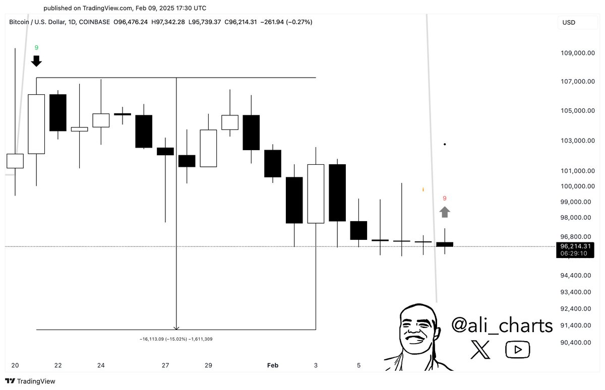
From the graph, it’s visible that the 24-hour price of Bitcoin has finished a TD Sequential setup with nine red candles recently, which suggests the asset may be due a bullish reversal. In the chart, the analyst has also highlighted the last signal that the indicator gave for the cryptocurrency. It would appear that this previous signal was a sell one and it was also right on the mark as it coincided with last month’s price top.

Given this pattern, it’s possible that the latest TD Sequential signal would also end up holding for Bitcoin. If so, it might finally help the asset shove off its recent bearish winds.

Speaking of the TD Sequential, another top coin, Cardano (ADA), has also formed a signal recently, as Martinez has pointed out in another X post. As displayed in the below chart, the pattern is a bullish one for ADA as well.

Cardano TD Sequential

BTC Price

Bitcoin slipped under the $95,000 level yesterday, but the asset has made some quick recovery in the past day as its price is now trading around $97,700.

Bitcoin Price Chart

Legendary Bitcoin Puell Multiple Finally Enters ‘Buy’ Territory

On-chain data shows the Bitcoin Puell Multiple has recently declined into the historical bottom zone as BTC’s continued consolidation.

Bitcoin Puell Multiple Is Now Under The 0.4 Level

As an analyst in a CryptoQuant Quicktake post explained, the BTC Puell Multiple has declined under 0.4 for the first time since the end of 2022. The “Puell Multiple” here refers to a popular on-chain indicator that keeps track of the ratio between the daily Bitcoin miner revenue and the 365-day moving average (MA) of the same.

The daily miner revenue here refers to the USD value of the BTC amount the chain validators receive as compensation for solving blocks on the network. Miners also earn revenue from another source, the transaction fees, but in the context of the Puell Multiple, only the first component, often called the Issuance, is relevant.

When the value of this ratio is greater than 1, miners are currently making more revenue from block subsidy than the average for the past year. Similarly, it being under the threshold suggests these chain validators are earning less than usual.

Now, here is a chart that shows the trend in the Bitcoin Puell Multiple over the past decade:

Bitcoin Puell Multiple

As displayed in the above graph, the Bitcoin Puell Multiple had shot up earlier in the year and peaked in April. The rally mainly caused this surge that BTC had witnessed in the first quarter of 2024.

It’s apparent from the chart, though, that the indicator had observed a sharp plunge under the 1 mark right after this peak. The reason behind this lies in an event that had occurred then: the fourth Halving.

Halvings are periodic events programmed into the Bitcoin blockchain that permanently slash the BTC block subsidy in half every four years. With the Issuance being halved during the latest such event, it makes sense that the Puell Multiple registered a crash.

As BTC’s price has been showing a slow descent in the months since then, the USD value of the miner revenue has also been declining, which has naturally been reflected in the Puell Multiple. With its latest downward move, the indicator is under the 0.4 level.

Historically, the zone below this 0.4 mark has proven significant for the Bitcoin price. As the quant has highlighted in the graph, the asset has tended to form bottoms when the metric has been in this region.

The last time Puell Multiple was in this bottoming zone was when the cryptocurrency had observed its bear market lows in 2022. Given these past examples, it’s possible that the Bitcoin price would follow and show something similar this time.

That said, the price has generally only reached a bottom after BTC has spent some time in this zone. As such, it may be a while before the coin can reach a rebound, assuming the pattern holds.

BTC Price

Bitcoin has been trying to move beyond the $58,000 mark during the past day, but the asset has been unable to gather enough momentum, with the latest attempt sending the coin to $57,600.

Bitcoin Price Chart

Bitcoin MVRV Lowest Since FTX Crash, Signal To Buy?

On-chain data shows the Bitcoin Market Value to Realized Value (MVRV) ratio has observed a plunge alongside the latest price crash.

Bitcoin 30-Day MVRV Ratio Is Now At Lowest Levels Since FTX Collapse

As explained by analyst Ali Martinez in a new post on X, the 30-day MVRV ratio has just gone through a sharp drop. The “MVRV ratio” refers to a popular on-chain indicator that, in short, tells us about how the value held by the Bitcoin investors (that is, the market cap) compares against the capital put in by them (the realized cap).

When the value of this ratio is greater than 1, it means the investors as a whole are carrying an unrealized profit right now. On the other hand, it being under the mark suggests the dominance of loss in the market.

In the context of the current topic, the MVRV ratio for the entire market isn’t of interest, but that of just a segment of it: the investors who bought their coins within the past 30 days.

Now, here is a chart that shows the trend in the 30-day Bitcoin MVRV ratio over the past couple of years:

Bitcoin MVRV Ratio

Note that the 30-day Bitcoin MVRV ratio here is displayed as a percentage, with the zero mark essentially taking the same role as the 1 value in the normal version.

From the graph, it’s visible that the indicator had shot up to high levels earlier in the year as the asset had witnessed a rapid surge to a new all-time high (ATH). In the consolidation period that had followed this ATH, though, the metric had fallen to oscillation about the zero mark.

This sideways trajectory, in the price and the indicator, both, has now finally been broken, as the cryptocurrency has observed a crash. The 30-day MVRV ratio has now slumped to sharp negative values of 17%, meaning that the average investor who bought in the past month is 17% in the red right now.

As is apparent in the chart, the last time that the indicator plummeted this low was in November 2022, when the Bitcoin price crashed following the collapse of the cryptocurrency exchange FTX. “That period marked a bottom and an excellent buying opportunity,” notes the analyst.

Generally, when investor profits balloon too much, a top can become likely, as the chances of widespread profit-taking become significant. The price ATH earlier in the year also formed when the indicator had a high value.

In times of high losses, though, selling could be assumed to have reached a state of exhaustion, meaning that a rebound could be probable. Bitcoin saw this in effect during the FTX crash, but it only remains to be seen whether a similar fate also lies in store for it this time.

BTC Price

The early signs of a potential rebound may already be here as the Bitcoin price has made recovery to $54,400 from its low under $50,000.

Bitcoin Price Chart

Social Media Screams “Sell” As Bitcoin Crashes To $54,000: Buy Signal?

Data shows users on social media platforms have been calling to sell Bitcoin after its latest crash, a signal that contrarian traders may be waiting for.

Bitcoin Sentiment On Social Media Has Turned Quite Bearish

According to data from the analytics firm Santiment, social media is showing historic levels of FUD amid the market drawdown. The indicator of interest here is the “Social Volume,” which basically tells us about the degree of discussion around a given topic or term that users on the major social media platforms are currently participating in.

This metric works by going through posts/threads/messages on these platforms to look for mentions of the keyword. The indicator then counts up the number of posts that contain at least one such mention.

The reason the Social Volume doesn’t simply count up the mentions themselves is that mentions alone don’t contain any information about if the trend is being followed across social media as a whole.

Sometimes, for example, mentions can be high for a topic, but most of them could be limited to niche circles (that is, inside a few posts). The Social Volume naturally wouldn’t spike in this case, but it would when users across the platforms are making posts about the term.

Now, what the analytics firm has done here is that it has applied terms related to sentiment to Social Volume, to differentiate between discussions related to positive and negative sentiments.

Here is the chart shared by Santiment that shows how the Social Volume for negative and positive sentiments has changed alongside the recent Bitcoin volatility:

Bitcoin Social Volume

To discern the sentiment, the analytics firm has chosen terms such as buy, bottom, and bullish in the case of positive sentiment, and sell, top, and bearish for negative sentiment.

From the graph, it’s visible that the Social Volume for the latter type of keywords has observed a huge spike alongside the plunge in the Bitcoin price. This would imply that a large amount of bearish posts have popped up on social media.

The indicator has also spiked for terms pertaining to positive sentiment, but clearly, the scale has been lesser than the one for bearish terms. In fact, the latest ratio between sell and buy calls has actually been the largest observed in the year so far.

Thus, it would appear that social media users as a whole are feeling FUD towards Bitcoin. This may actually be a positive development for the cryptocurrency, however, as its price has historically been more likely to move in the opposite direction to what the crowd expects.

As is apparent in the chart, buying calls had spiked on a few occasions following price plunges in the past month, but this optimism had only led to a continued decline for the asset.

With the latest crash, sentiment appears to have finally flipped, with Bitcoin traders starting to give up. “For bold traders, this is a window that some may wish to be a true contrarian and buy into the crowd’s anger and frustration,” notes Santiment.

BTC Price

Bitcoin had briefly slipped under the $54,000 level during the plunge, but the asset appears to have bounced back to $55,400 since then.

Bitcoin Price Chart

Bitcoin NVT Flashes Buy Signal, Bottom In?

On-chain data shows the Bitcoin NVT ratio is currently flashing a buy signal, a sign that the bottom for the asset’s price might now be in.

Bitcoin NVT Golden Cross Is Showing A Green Signal

As pointed out by an analyst in a CryptoQuant post, the Network Value to Transactions (NVT) Golden Cross has now dipped below the -2 mark. The “Network Value to Transactions (NVT) ratio” is an indicator that measures the ratio between the Bitcoin market cap and transaction volume (both denominated in USD).

When the value of this metric is high, it means that the price of the asset (that is, its market cap) is high when compared to its ability to transact coins (the transaction volume). Such a trend may imply that BTC is overvalued right now.

On the other hand, low values can suggest that the market cap isn’t that much relative to the volume, so the cryptocurrency’s price may be undervalued at the moment.

In the context of the current discussion, the NVT ratio itself isn’t of interest, but rather a modified form of it called the “NVT Golden Cross” is. This new indicator aims to pinpoint tops and bottoms in the NVT ratio by comparing its 30-day moving average (MA) with the 10-day one.

Now, here is a chart that shows the trend in the Bitcoin NVT Golden Cross over the past year:

Bitcoin NVT Golden Cross

As displayed in the above graph, the Bitcoin NVT Golden Cross has plunged recently as the cryptocurrency’s price has gone through a crash. Following the latest drawdown, the indicator is now deep inside the negative territory, at a value below -2.

In the chart, the quant has marked two lines for the metric that have held some significance for the asset during the past. The first of these (marked in red) takes place at around 2.2, while the other one (green) is at -1.6.

Historically, whenever the NVT Golden Cross has crossed above the former line, the cryptocurrency has generally observed the formation of a local top. Similarly, a break below the latter level has resulted in bottoms for the coin.

From the chart, it’s clear that the indicator has now dipped firmly below the bottom line, implying that Bitcoin might be undervalued currently. In the past year, there have been three other instances of the indicator plunging below the line, each coinciding with some sort of low for the price.

The first two of these had reached bottom values similar to now, while the third occurrence (which is the latest one) saw the NVT Golden Cross dip much deeper towards the -3.1 mark before the bottom was hit.

It’s unclear which scenario might play out for Bitcoin this time, but one thing may be clear from this pattern: the bottom could be near for the cryptocurrency, or may even already be in.

BTC Price

At the time of writing, Bitcoin is trading at around $26,500, down 7% in the last week.

Bitcoin Price Chart

Bitcoin Stablecoin Supply Ratio Now Forms A “Buy” Signal

On-chain data shows the Bitcoin stablecoin supply ratio is now showing a green signal that has proved to be profitable for the crypto several times in the last two years.

Bitcoin Stablecoin Supply Ratio Shock Momentum Forms “Buy” Signal

As pointed out by an analyst in a CryptoQuant post, out of the 11 previous such buy signals, 10 ended up profitable for the crypto.

The “stablecoin supply ratio” (or the SSR in brief) is an indicator that measures the ratio between the market cap of Bitcoin and that of all stablecoins.

Generally, whenever investors want to avoid volatility associated with cryptos like BTC, they shift their coins into stablecoins. Once they feel that prices are right to re-enter the markets again, they buy back into them. As such, the total stablecoin supply can be looked at as potential buying pressure for other cryptos.

When the value of the SSR is high, it means the BTC supply is higher compared to the stablecoin cap, and thus there is low buying pressure in the market currently.

On the other hand, low values of the indicator suggest there is high potential dry powder in the market right now. Because of this, such a trend can be bullish for the price of Bitcoin.

Now, there is a metric called the Bitcoin SSR “shock momentum,” which tracks the rate of change in its value. Here is a chart that shows the trend for it over the past couple of years:

Looks like the value of the metric has been low in recent days | Source: CryptoQuant

As you can see in the above graph, the quant from the post has marked the relevant points of trend for the Bitcoin SSR shock momentum.

It seems like whenever this metric has made a low below the green dotted level, the price of the crypto has observed a buy signal.

During the last two years, there have been eleven instances of this pattern taking place, out of which only one has turned out to be a false signal.

Most recently, the indicator has once again showed this formation. If the past trend is anything to go by, then this may turn out to be bullish for Bitcoin.

BTC Price

At the time of writing, Bitcoin’s price floats around $20.9k, up 4% in the past week. Over the last month, the crypto has lost 12% in value.

The below chart shows the trend in the BTC price over the last five days.

The value of the crypto seems to have spiked up over the past day | Source: BTCUSD on TradingView
Featured image from Quaritsch Photography on Unsplash.com, charts from TradingView.com, CryptoQuant.com

Bitcoin Taker Buy/Sell Volume Shows “Buy” Signal As BTC Gears Up For Rally

On-chain data shows the Bitcoin taker buy/sell volume is now showing a “buy” signal as the crypto looks to be gearing up for a new rally.

Bitcoin Taker Buy/Sell Volume Says Now May Be The Time To Buy

As pointed out by an analyst in a CryptoQuant post, the BTC taker buy volume recently reached a value that has historically been a green signal for the crypto.

The “taker buy volume” is an indicator that measures the long volume of Bitcoin on derivatives exchanges. The metric works by checking orders on the book to see how many takers are buyers. This volume divided by the total volume is called the taker buy ratio.

When the value of this indicator rises above 0.50, it means the majority of the order takers are currently buyers on exchanges.

On the other hand, the value of the ratio below this threshold implies that the Bitcoin short volume is higher at the moment.

Related Reading | Bitcoin Sets Record For Largest Single Day Pump After One Year

An alternate indicator is the “taker sell volume,” which measures the total number of sell orders or the short volume.

Now, here is a chart that shows the trend in these Bitcoin indicators over the past few months:

Looks like the taker buy ratio has risen in the past couple of days | Source: CryptoQuant

As you can see in the above graph, the Bitcoin taker buy ratio has exceeded the value of 0.52 this week. Naturally, the sell ratio has gone down on the other hand.

Related Reading | Data Shows Bitcoin Top Buyers Already Capitulated, New Bull Rally Here?

In the post, the quant explains that this value of the metric has historically flashed a buy signal for the cryptocurrency. Most recently, the indicator went above this threshold on 4th Feb, following which the price of the coin observed a surge.

If this pattern holds true this time as well, it would mean that now may be a good time to stack up on Bitcoin.

BTC Price

At the time of writing, Bitcoin’s price floats around $45k, up 15% in the last seven days. Over the past month, the crypto has gained 14% in value.

The below chart shows the trend in the price of the coin over the last five days.

BTC’s price looks to have surged up over the past couple of days | Source: BTCUSD on TradingView

After crashing all the way down to $34k last week, Bitcoin seems to have made some solid recovery back now as the coin approaches another retest of the $45k price level.

Currently, it’s unclear whether this recovery will last as the uncertainty due to the Russian invasion of Ukraine still looms over financial markets.

Featured image from Unsplash.com, charts from TradingView.com, CryptoQuant.com

Bitcoin Taker Buy/Sell Ratio Shows “Buy” Signal As BTC Lifts Off

On-chain data shows the Bitcoin taker buy/sell ratio is now lighting up a “buy” signal as the price of the crypto begins to take off.

Bitcoin Taker Buy Sell Ratio Suggests Now May Be A Good Time To Buy

As explained by an analyst in a CryptoQuant post, the taker buy sell ratio metrics can be used to find viable entry and exit spots in the market.

The “Bitcoin taker buy volume” is an indicator that measures the volume of buy orders filled by takers in perpetual swaps. Similarly, the “taker sell volume” measures the amount of sell orders.

The “taker buy ratio” (or its sell counterpart) is defined as the ratio between the buy volume and the total volume on perpetual swaps.

When the value of the taker buy ratio goes up, it means the buyers are currently willing to buy coins at a higher price. Such a trend shows that the buying pressure is currently stronger than the selling pressure.

On the other hand, taker sell ratio moving up would indicate a shift towards a more bearish sentiment in the market.

Related Reading | Is The Bitcoin Bottom In? Here’s What SOPR Data Says

Now, here is a chart that shows the trend in these indicators over the past couple of years:

The taker buy ratio seems to have crossed the 0.52 mark recently | Source: CryptoQuant

As you can see in the above graph, the quant has marked the important periods of trend. It looks like whenever the taker buy ratio has moved above the 0.52 level, a buying spot has been signaled for Bitcoin.

On the other hand, the taker sell ratio touching similar values has historically indicated a selling point for the crypto.

Related Reading | The Bear Signal That Suggests Another Bitcoin Crash Is Coming

It seems the value of the taker buy ratio just passed the 0.52 mark recently, suggesting around now may be an ideal buying opportunity for Bitcoin.

BTC Price

At the time of writing, Bitcoin’s price floats around $43.3k, up 12% in the last seven days. Over the past month, the crypto has accumulated 4% in gains.

The below chart shows the trend in the price of BTC over the last five days.

BTC’s price has shown some sharp uptrend over the past week | Source: BTCUSD on TradingView

After a long period of downwards movement, Bitcoin has finally enjoyed some constant uptrend over the past week. Earlier in the day, the coin’s price briefly broke above $45k before sliding down to the current levels.

It’s unclear at the moment if this trend will continue, or if it’s just a bull trap. However, if the taker buy ratio is anything to consider, the outcome of the coin may be bullish.

Featured image from Unsplash.com, charts from TradingView.com, CryptoQuant.com