Bitcoin Loses Historical Level, Analyst Says “Reclaim And Bounce, Or Die”

An analyst has pointed out how Bitcoin recently closed below a historically important on-chain level, a failure to reclaim which could spell trouble for BTC.

Bitcoin Fell Below Short-Term Holder Cost Basis In Latest Crash

In a new post on X, Maartunn discussed BTC’s recent close below the realized price of the short-term holders and stressed its importance in reclamation.

The “realized price” here refers to an on-chain indicator that tracks the price at which the average investor on the Bitcoin network acquired their coins. In other words, it measures the average cost basis in the BTC market.

When the spot value of a cryptocurrency is below this metric, it means that the average investor in the market is carrying their coins at a loss right now. On the other hand, being above the indicator suggests that the holders as a whole are in the green currently.

In the current topic, the realized price of the entire Bitcoin market isn’t of interest but rather of only a subsection: the short-term holders (STH).

The STHs are the BTC investors who bought their coins within the past 155 days. These holders represent the inconsistent side of the market, who easily show a reaction whenever a change like a crash or rally occurs in the sector.

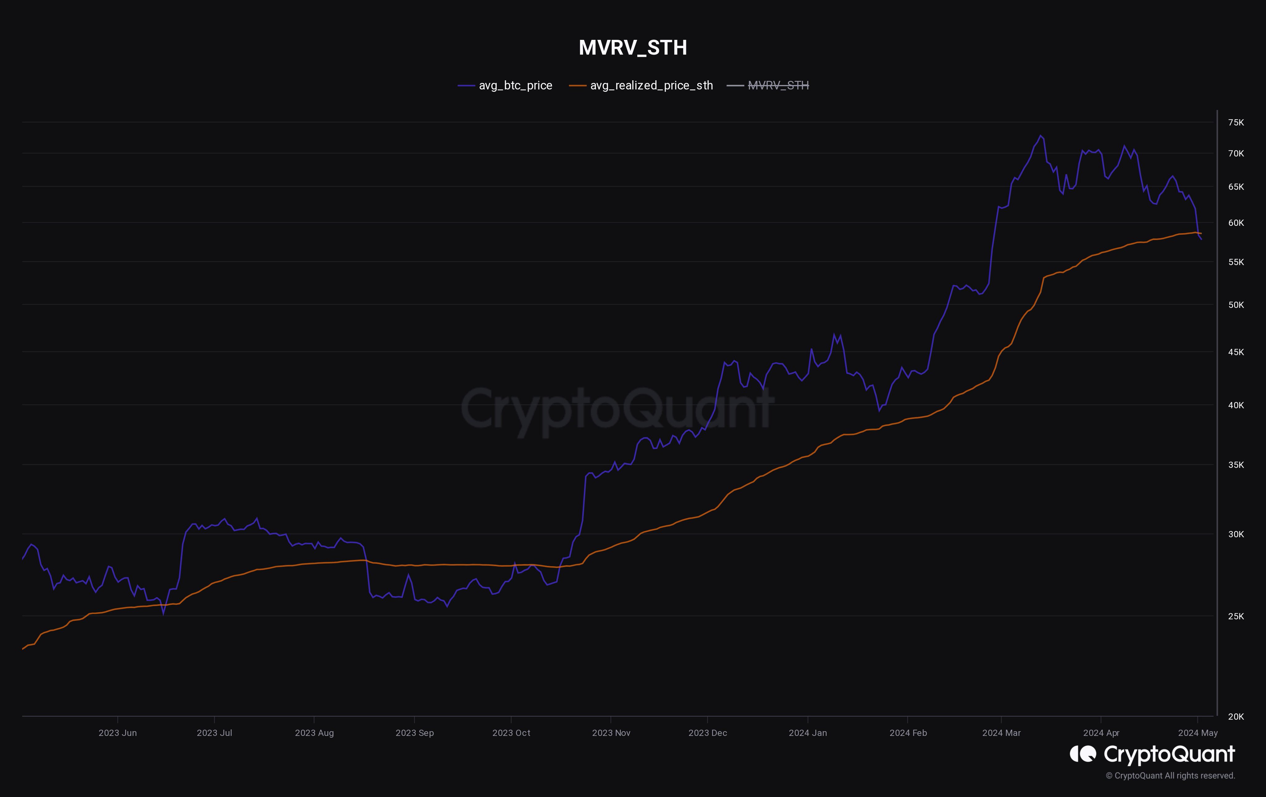
Now, here is a chart that shows the trend in the realized price specifically for these investors over the past year:

Bitcoin STH Realized Price

The realized price of the Bitcoin STHs is floating around $58,500. During the latest crash, Bitcoin went as low as below $57,000, meaning that the plunge has put these investors under pressure.

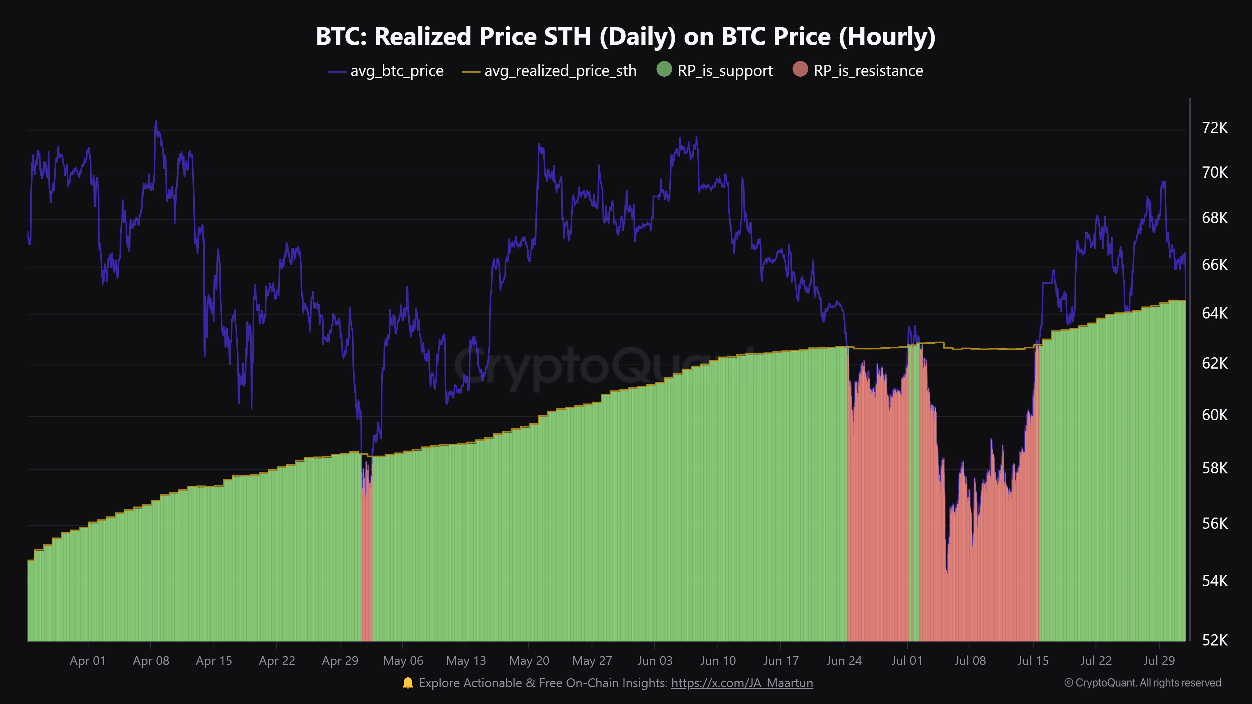
Historically, the average cost basis of the STHs has been significant for the cryptocurrency, as it has taken turns acting as support and resistance, depending on the market’s phase.

During bullish trends, this metric often acts as a point of support. The chart shows that when Bitcoin had declined near this level earlier in the year, it had found a rebound.

The metric acts as resistance during bear markets, keeping the price below it. These patterns may be related to how investor psychology works.

In bullish periods, the STHs might view their cost basis as a profitable buying opportunity, so they accumulate during dips in it, thus helping the price turn around. In bear markets, these investors could look at the level as a point of exit, as they may not believe the price will go up any further.

After closing below the STH realized price earlier, Bitcoin is now fighting to reclaim this historical level. It now remains to be seen if support will once again be found or if the level will truly become lost.

BTC Price

Bitcoin has climbed back above the STH realized price, trading above $59,300. This is certainly a sign in the positive direction, but it’s hard to say whether this recovery will last.

Bitcoin Price Chart

Bitcoin Retests Resistance: Here’s The Level A Break Could Lead To

Data shows Bitcoin is currently retesting a major on-chain resistance level, and a break above which can potentially lead to a surge in its price.

Bitcoin Has Major On-Chain Resistance Around $67,000

As pointed out by analyst Ali in a post on X, BTC may be able to see a rise towards the $72,900 level if the asset can break the current on-chain resistance barrier.

In on-chain analysis, any level’s potential to act as support or resistance is measured using the amount of Bitcoin that was acquired/bought by the investors around said level.

The analyst has shared the chart for the “UTXO Realized Price Distribution” (URPD) indicator from Glassnode, that reveals how the various levels around the current spot value of BTC are looking like right now based on the density of supply that was last bought at them.

Bitcoin URPD

The URPD here is “ATH partitioned,” which means that the price ranges here are defined by dividing the levels between zero and the current all-time high (ATH) into 100 equal partitions.

From the chart, it’s visible that the partition around the $66,990 level carries the cost basis of a notable amount of the supply right now (1.3%). This also happens to be the range BTC is retesting at the moment.

Generally, the cost basis is a special level for investors, and thus, they tend to be more likely to show some reaction when a retest takes place. If a large number of holders share their cost basis inside the same narrow range, then this reaction may result in a scale that could be relevant for the market.

As for what direction this reaction from the holders would be probable to happen depends on the side the retest is happening from. A retest from under (meaning that these holders had been in loss prior to the retest) could lead to a selling reaction in the market.

This is because these investors may not want to risk the cryptocurrency declining again in the future, so exiting while they have the opportunity to at their break-even might be tempting.

As such, retests like these can lead to the asset feeling some degree of resistance. In the current case, the range is notably filled up with coins, so it’s possible that the strength of this resistance would be just as powerful.

From the chart, it’s visible that after this range, the asset potentially faces no strong on-chain resistance barriers until the $72,879 level, which hosts the cost basis of about 1.61% of the supply. “If Bitcoin can break past $66,990, it will likely rise toward $72,880!” says Ali.

BTC Price

Bitcoin has been climbing up in the past day, with its price now reaching the $67,200 level. Should this surge be sustained, the asset would be through the current resistance block.

Bitcoin Price Chart

Bitcoin Puell Multiple At Crucial Juncture: Will Retest Save Rally?

On-chain data shows the Bitcoin Puell Multiple indicator is currently retesting a crucial level that may end up deciding the fate of the latest rally.

Bitcoin Puell Multiple Is Now Retesting Its 365-Day Moving Average

As explained by an analyst in a CryptoQuant Quicktake post, the interaction of the Puell Multiple with its 365-day moving average (MA) can indicate trends in the market.

The “Puell Multiple” refers to an indicator that keeps track of the ratio between the daily revenue of the Bitcoin miners (in USD) and the 365-day MA of the same. The mining revenue here is simply the total amount of coins issued by the network inside a 24-hour span multiplied by the spot price of the coin.

When the value of the Puell Multiple is greater than 1, it means that the miners are currently making a higher income than the average value for the past year. Naturally, when this happens, the motive to sell would rise for these chain validators and thus, the BTC price may be considered overvalued.

On the other hand, values under the mark suggest the cryptocurrency’s price may be becoming undervalued as the miners are now making lower revenues than the 365-day average.

Now, here is a chart that shows the trend in the Bitcoin Puell Multiple, as well as its 365-day MA, over the history of the asset:

Bitcoin Puell Multiple

As displayed in the above graph, the Bitcoin Puell Multiple had naturally spiked to high levels just earlier when the asset’s price had observed its rally, which had naturally resulted in the block rewards of the miners also shooting up.

As the price of the asset has struggled recently, though, the indicator’s value has come back down and is now retesting its 365-day MA. This line has been relevant historically for the metric, as the quant highlighted in the chart.

Generally, a break above the line has proven to be bullish for the cryptocurrency, while a move under can imply a transition towards a bearish trend. As such, Bitcoin might be standing at a crucial juncture right now, at least from the perspective of this indicator.

Last year, the Puell Multiple also witnessed a similar retest at its 365-day MA, as is apparent in the graph. Back then, the metric had ended up finding support at this important line, and the resulting bounce was what led towards the latest rally in the asset.

It now remains to be seen whether the 365-day MA would act as support this time as well or if the indicator would go through a breakdown. In the latter scenario, the Bitcoin price could end up observing a deeper correction.

BTC Price

Bitcoin’s struggle has continued recently as its price has come down to just $40,800.

Bitcoin Price Chart

Bitcoin Makes Another Attempt At $28,000, Can Break Happen?

Bitcoin is currently trying to have another go at the $28,000 level. Here’s what on-chain data says regarding whether a retest can be successful.

Bitcoin On-Chain Signals Are Not All Positive Right Now

In a new post on X, the on-chain analytics firm Santiment has looked into a couple of on-chain indicators that may provide some hints about whether BTC can sustain any bullish momentum currently or not.

The first metric of relevance is the “supply on exchanges,” which keeps track of the percentage of the total Bitcoin supply that’s currently sitting in the wallets of all centralized exchanges.

When the value of this metric decreases, it means that withdrawals are taking place on these platforms right now. Generally, investors take out their coins to self-custodial wallets whenever they intend to hold onto them for extended periods, so this kind of trend can have a bullish effect in the long term.

On the other hand, the reverse trend implies selling may be going in the market as holders are depositing a net amount of the cryptocurrency to the exchanges at the moment.

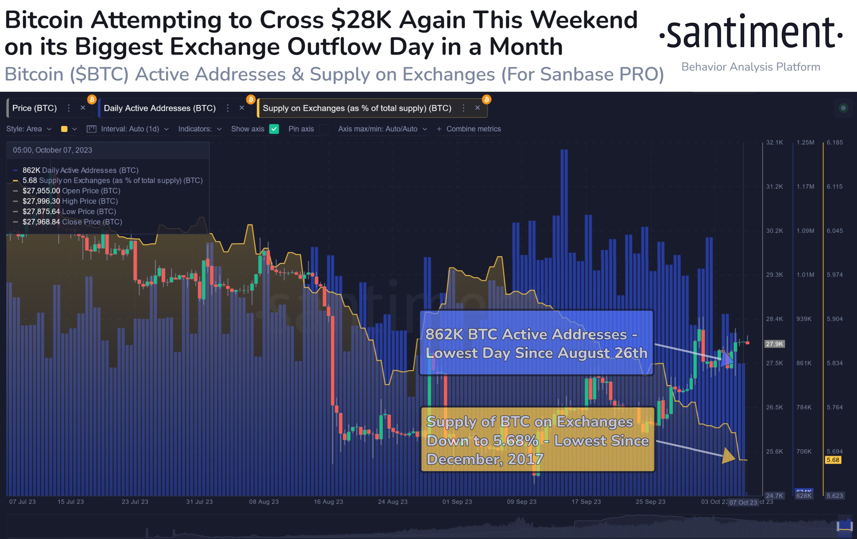
Now, here is a chart that shows the trend in the Bitcoin supply on exchanges over the past few months:

Bitcoin Supply on Exchanges & Active Addresses

From the graph, it’s visible that the Bitcoin supply on exchanges has observed a constant decline during the past month. This naturally suggests that the investors are transferring a net number of coins out of these platforms.

As mentioned before, if the investors are accumulating with these withdrawals, the price could feel a bullish impact, although it may only appear in the long term. Therefore, these outflows may not directly be relevant to the current price surge.

Another way to look at the net withdrawals, however, is that at the very least net deposits aren’t taking place currently. As is visible from the chart, the recovery rally at the end of August very quickly died out as investors transferred a large amount of BTC toward exchanges.

For now, it would appear that such a selloff isn’t taking place, which could potentially allow for the asset’s run to continue. There is another indicator highlighted in the graph, but unlike the supply on exchanges, this one doesn’t seem to be showing a positive trend.

This metric is the “daily active addresses,” which keeps track of the unique number of addresses that are participating in transaction activity on the blockchain. This indicator has now plunged toward the lowest levels since late August, implying that user interest in the asset is low currently.

Historically, rallies have only been sustainable when they have been able to amass a large amount of trader attention, as such moves typically require a high amount of fuel. At present, the current recovery move lacks such investor activity.

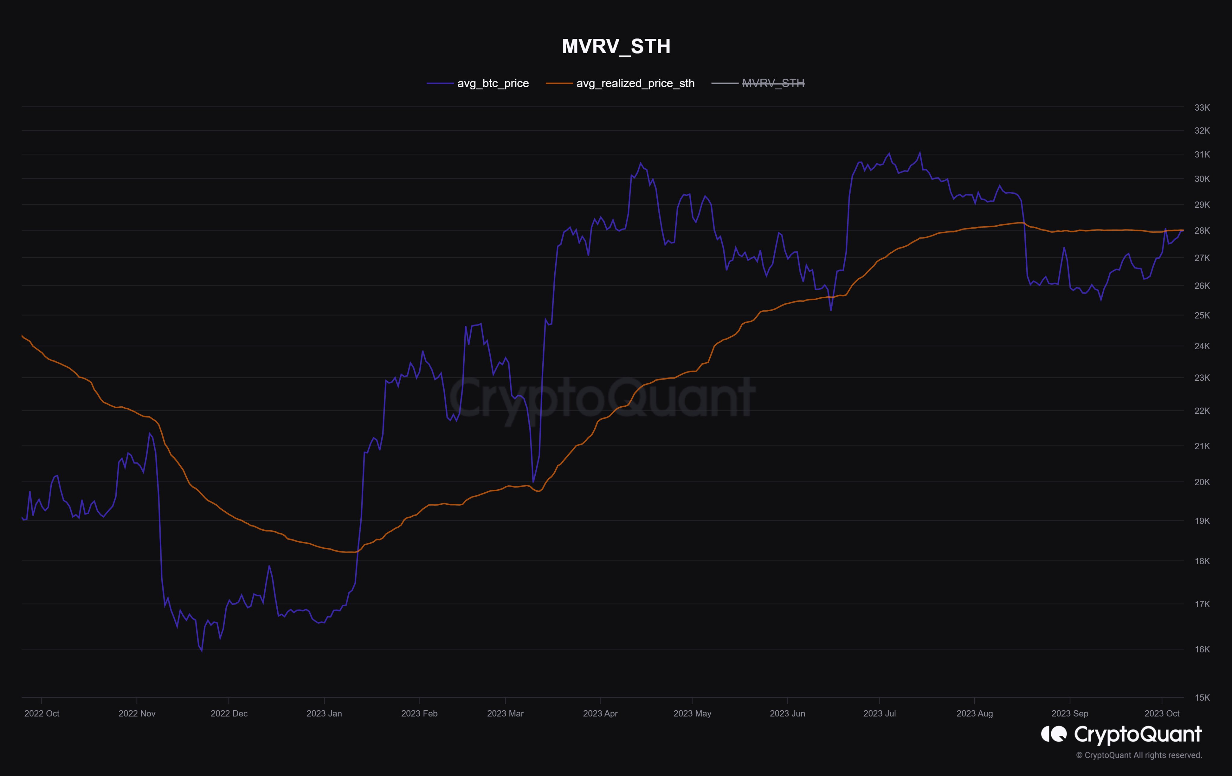
On top of this, the $27,900 level is currently a point of major resistance, as that’s where the average cost basis of the short-term holders lies, as CryptoQuant analyst Maartunn has pointed out.

Bitcoin Realized Price

All in all, it looks like a significant break above the $28,000 level could prove to be quite tricky for the cryptocurrency in the near future unless things can turn around fast in terms of user interest.

BTC Price

Bitcoin’s latest attempt may be ending in failure once again as its price has now retraced towards $27,600.

Bitcoin Price Chart

Bitcoin MVRV At Critical Support Line, Will Retest Be Successful?

On-chain data shows the Bitcoin Market Value to Realized Value (MVRV) ratio is nearing a retest that could be crucial for the asset.

Bitcoin MVRV Ratio Is Nearing In On The 1.2 Level

As an analyst in a CryptoQuant Quicktake post explained, the 1.2 level of the MVRV ratio has historically been a support line for the cryptocurrency. The “MVRV ratio” is an indicator that measures the ratio between the Bitcoin market cap and the realized cap.

The “realized cap” here refers to a capitalization model for BTC that assumes the real value of each coin in circulation isn’t the current spot price but rather the price at which the coin was last bought/transacted on the blockchain.

As the realized cap considers the cost basis or acquisition price of each investor in the market, the model essentially represents the total capital that the holders have put into the asset.

Thus, comparing the market cap against the realized cap in the MVRV ratio can provide hints about whether the investors are holding more or less value than they put in.

When the ratio’s value is greater than 1, it means that the market as a whole is sitting on some profits right now. Generally, the higher the MVRV goes above this mark, the more probable corrections become for the asset as investors look to harvest their gains.

On the contrary, the indicator below this mark can signal that BTC may be underpriced right now, as the average holder in the sector carries coins at a loss.

Now, here is a chart that shows the trend in the Bitcoin MVRV ratio over the last few years:

Bitcoin MVRV Ratio

As is visible in the above graph, the Bitcoin MVRV ratio has been above the 1 mark during the past few months. The metric broke above this line in January when the rally started. Besides a retest in March, the indicator has remained above this level since then, implying that the holders have enjoyed profits.

The 1 level has been important historically for the asset. Still, the quant notes that another value is notable: 1.2. This line has supported the asset a few times in the past, as the analyst has highlighted in the chart (the yellow boxes).

Most recently, Bitcoin found support at this level in June, where the cryptocurrency could propel itself back up with a sharp rally. The metric is heading down and again approaching a retest of this line, as its current value is 1.27.

Naturally, a successful retest could be positive news for Bitcoin, but a failure might lead to an extended drawdown for the asset’s price.

BTC Price

As the chart below shows, Bitcoin has continued to consolidate recently, with the asset’s price still trading around the $25,700 level.

Bitcoin Price Chart

Will Bitcoin Retest $20,500 Again? This Pattern May Suggest So

Bitcoin is forming a pattern that has historically led to the asset retesting a specific line. At present, this level would be found at $20,500.

Bitcoin Has Dropped Below The 200-Day SMA With The Recent Crash

A few days back, Bitcoin observed a sharp crash that took the cryptocurrency’s price toward the $26,000 mark. As this plummet was already significant, many have wondered whether this was it or if the drawdown will continue.

An analyst on X, Ali, shared a chart that may provide hints about where the asset could be heading next.

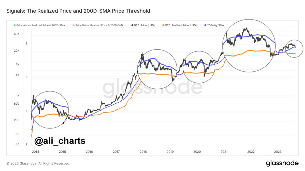
Bitcoin Realized Price

The analyst has attached the data for two Bitcoin-related metrics in the graph: the 200-day simple moving average (SMA) and the realized price. The chart shows that the BTC price has dropped below the 200-day SMA (colored in purple) with the latest crash.

According to the analyst, when the cryptocurrency’s price has crossed below this level during the past ten years, it has often retested the realized price (colored in orange).

The “realized price” here refers to the cost basis or the buying price of the average investor in the BTC market. This means that whenever the cryptocurrency dips below this level, the average holder enters a state of loss. On the other hand, breaks above the line imply a return to profits for most of the market.

Historically, this metric has had some interesting interactions with the spot price of the coin. During bullish periods, the line has generally supported the asset, while during bearish periods, it has acted as resistance.

The explanation behind these curious interactions may lie in how the investors’ minds work in each period. In bull markets, the average investor may think that the price will only go up, so whenever the asset drops to its buying price, they accumulate more of the asset.

Similarly, in bearish trends, the holders may believe the cryptocurrency will only go down, so the price they bought in (their break-even mark) would be the ideal exit opportunity.

This buying and selling may cause the level to act as support and resistance in the respective regimes. The latest example of this behavior was seen earlier in the year when Bitcoin rebounded off the line back in March.

As the asset now appears to have broken below the 200-day SMA, it may be heading towards a retest, as has often happened many times in the past.

Right now, the cost basis of the average investor is $20,500, which means that if BTC is going to touch this line again, a significant drawdown would need to occur.

If this scenario indeed plays out, then it’s possible that Bitcoin could find a rebound at the realized price once again. A retest failure, however, would be a very concerning sign, as it might signal the return of the bear market.

BTC Price

At the time of writing, Bitcoin is trading around $26,000, down 11% in the last week.

Bitcoin Price Chart

These Bitcoin Metrics Are At Important Retests, Will Bullish Trend Prevail?

On-chain data shows two Bitcoin indicators are currently retesting levels that have historically been relevant for the market’s course.

Bitcoin NUPL For Both Short-Term & Mid-Term Holders Is Neutral Currently

As pointed out by an analyst in a CryptoQuant post, the BTC NUPL has been retesting crucial levels recently. The “Net Unrealized Profit/Loss” (NUPL) is a metric that keeps track of the net amount of profit or loss that investors are holding currently.

This indicator works by looking through the on-chain history of each coin in circulation to see what price it was last moved at. If this previous transfer price for any coin was less than the current spot price of Bitcoin, then that particular coin is holding a profit right now.

The NUPL counts this profit that the coin is holding in the unrealized profit. Similarly, the loss that underwater coins are holding gets included in the unrealized loss. The metric then takes the difference between these two numbers to find the net profit/loss status of the entire market.

In the context of the current discussion, the entire market isn’t of interest, however, only specific sections of it are. In particular, two BTC cohorts called the “short-term holders” (STHs) and the “mid-term holders” (MTHs) are of relevance.

The STHs include all investors who bought their coins within the last six months, while the MTHs are those who have been holding their coins since at least six months ago and at most 2 years ago.

First, here is a chart that shows the trend in the Bitcoin NUPL specifically for the STHs:

Bitcoin NUPL

As displayed in the above graph, the Bitcoin STH NUPL has been positive throughout this rally that first started back in January of this year. Generally, this is the case in bullish trends, as the STHs are those who bought relatively recently, so any price rises immediately reflect on their profit/loss status.

What’s more significant, however, is the indicator’s relationship with the zero mark. At this line, the STHs as a whole are neutral, meaning that their unrealized losses equal their unrealized profits.

Usually, whenever the metric retests this line from above during bullish trends, it finds support and the price feels a bullish effect. This could be seen working in action during this rally alone, as the rebounds in March and June both occurred when the STH NUPL approached this line.

From the chart, it’s visible that the metric has once again fallen to this line recently. This retest may be quite important, as a plunge below could mean a reversal back toward a bearish regime.

In the below graph, it’s also visible that the MTH NUPL is retesting the same line, although this indicator is approaching it from the negative zone.

Bitcoin MTH NUPL

The MTHs had been sitting in losses until now, but they are on the verge of transitioning back into profits currently. If the metric can manage to break through the level, then it would be a positive sign for the rally, as the bullish trend has historically continued whenever these investors have come back above water.

The break-even line providing resistance to Bitcoin, however, is also a possibility, in which case the asset would feel a bearish effect. It now remains to be seen how this retest, as well as the one of the STH NUPL, would pan out in the coming days.

BTC Price

At the time of writing, Bitcoin is trading around $29,000, down 1% in the last week.

Bitcoin Price Chart

This Bitcoin Metric Is At A Crucial Junction, Will Bulls Find Victory?

On-chain data shows a Bitcoin indicator is currently retesting a crucial level that could decide the direction the market takes from here.

Bitcoin Short-Term Holder SOPR Has Plunged To A Value Of 1

As pointed out by an analyst in a CryptoQuant post, the short-term holders are currently selling at their break-even mark. The relevant indicator here is the “Spent Output Profit Ratio” (SOPR), which tells us whether Bitcoin investors are moving their coins at a profit or at a loss right now.

When the value of this metric is greater than 1, it means the average holder in the market is currently selling their coins at a profit. On the other hand, the indicator having values below this threshold suggests the market as a whole is realizing a net amount of loss.

The level at which SOPR becomes exactly equal to one implies that the loss realization is exactly equal to the profit realization right now, and hence, the average investor is just breaking even on their investment.

In the context of the current topic, the entire market isn’t of interest; only a segment of it: the “short-term holders” (STHs). The STHs include all BTC investors that bought their coins within the last 155 days.

Now, here is a chart that shows the trend in the 14-day moving average (MA) Bitcoin SOPR specifically for these STHs over the last few years:

Bitcoin STH SOPR

Historically, the Bitcoin STH SOPR has followed a curious pattern. During bullish periods, the indicator has generally stayed above the line where the metric’s value becomes 1. This makes sense, as rallies allow the STHs many profit-taking opportunities, so the majority should be selling at some gains.

What’s actually interesting, though, is that whenever the metric has dropped to the 1 line, it has provided support to the price (and has also made the indicator rebound back above it). Examples of this have been marked with the green arrows in the graph.

As already mentioned before, the 1 line signifies the level where the average STH is just breaking even, meaning that they are selling at the price at which they acquired their coins, that is, their cost basis.

The reason why this level acts as support during bullish trends is that the investors see their cost basis as a profitable buying opportunity (since they believe the price would go up in the near future). So, a large amount of buying takes place here.

In bear markets, the opposite behavior is seen; the level acts as resistance to the price since selling tends to happen at it. Because of this pattern, the indicator’s behavior about the 1 level can provide hints about whether a bullish or a bearish regime is active currently.

Recently, the indicator has once again dipped to this crucial level. If the Bitcoin rally is still on right now, then the Bitcoin STH SOPR should observe a rebound here. This has already happened once during this rally, as the price felt support at this level back in March.

If, however, the retest ends up failing, then it may mean that a transition back to a bearish period may have occurred for the cryptocurrency.

BTC Price

At the time of writing, Bitcoin is trading around $27,000, down 2% in the last week.

Bitcoin Price Chart

Bitcoin Puell Multiple Retests Downtrend Line, Will It Break Above This Time?

On-chain data shows the Bitcoin Puell Multiple is currently retesting the downtrend line, will the metric be able to break above it this time?

Bitcoin Puell Multiple Has Gone Up A Bit During Recent Days

As pointed out by an analyst in a CryptoQuant post, a trend reversal could be nearing in the BTC market.

The “Puell Multiple” is an indicator that measures the ratio between the current daily Bitcoin mining revenues (in USD) and the 365-day moving average of the same.

What this metric tells us is how much the BTC miners are making right now compared to the average during the last year.

When the value of the multiple is greater than 1, it means miners are raking in more profits compared to the mean for the past 365 days.

On the other hand, values below the threshold suggest miners are under pressure right now as their income is lesser than the last year average.

Historically, the crypto has tended to form cyclical bottoms whenever the indicator has declined below the 0.5 mark.

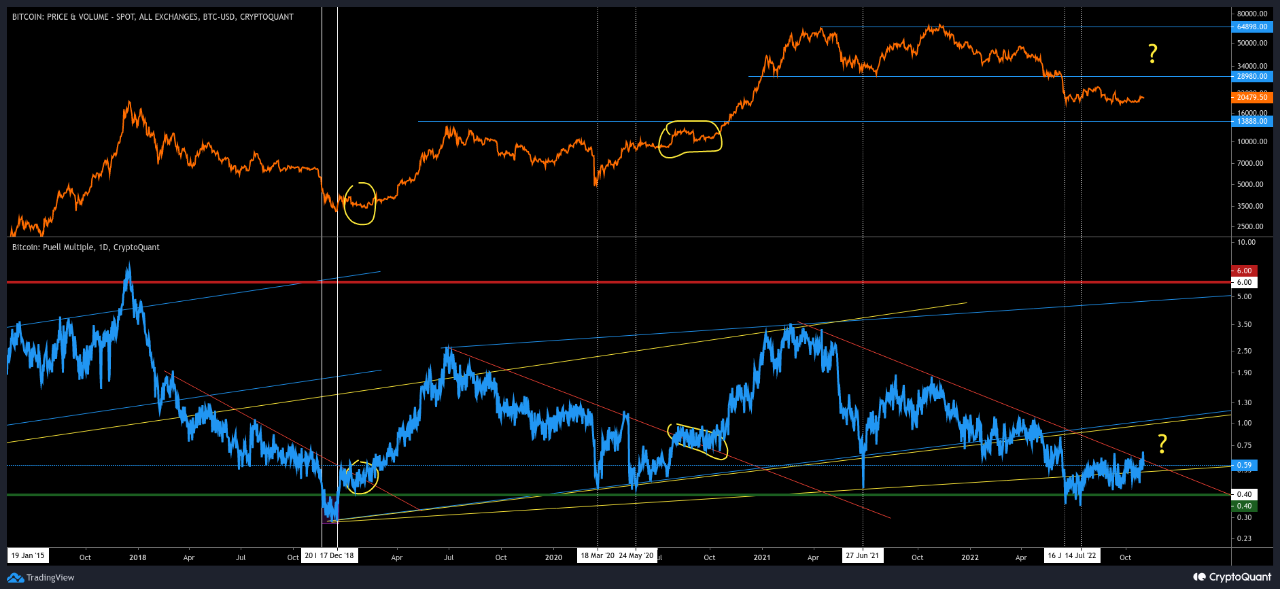
Now, here is a chart that shows the trend in the Bitcoin Puell Multiple over the last few years:

Bitcoin Puell Multiple

The value of the metric seems to have been slightly going up recently | Source: CryptoQuant

As you can see in the above graph, the Bitcoin Puell multiple sunk down a few months back, and entered into the historical buy zone.

Since then, the indicator has been on a gradual upwards trajectory, and is now retesting the “downtrend” line.

This downtrend line has been providing resistance to the metric since around a year ago. In the chart, the quant has also marked how the trend was like in the past whenever the indicator was on a downtrend.

It looks like the Bitcoin Puell Multiple found rejection multiple times from a similar downtrend line during both the 2018-19 bear and the 2020 COVID crash.

After forming the bottoms during these two periods, the metric eventually broke through the line and a bullish trend followed in the price of the crypto.

The analyst notes that this is now the third time that the Puell Multiple is retesting this level during the current bear, so it’s possible it might break through it this time.

If the historical trend is anything to go by, then the indicator breaking the line now may lead to a bullish reversal for Bitcoin.

BTC Price

At the time of writing, Bitcoin’s price floats around $20.1k, down 3% in the last week.

Bitcoin Price Chart

Looks like BTC has been going downhill | Source: BTCUSD on TradingView
Featured image from Maxim Hopman on Unsplash.com, charts from TradingView.com, CryptoQuant.com

Bitcoin aSOPR Fails Retest Of Historical Bull-Bear Junction

On-chain data shows the Bitcoin aSOPR indicator has found resistance at the historical junction between bull and bear markets.

Bitcoin aSOPR Fails Retest Of The “Value=1” Line

As pointed out by an analyst in a CryptoQuant post, the BTC aSOPR has been rejected from the breakeven mark recently.

The “Spent Output Profit Ratio” (or SOPR in short) is an indicator that tells us whether Bitcoin investors are selling at a loss or at a profit right now.

The metric works by looking at the on-chain history of each coin being sold to see what price it was last moved at.

If the previous selling price of any coin was less than the current value of BTC, then that particular coin has just been sold at a profit. While if it’s otherwise, then the coin realized some loss.

A modified version of this indicator, the “Adjusted SOPR” (aSOPR), excludes from its calculations all those coins that were held for less than 1 hour before being sold. The benefit of this modification is that it removes all noise from the data that wouldn’t have had any significant implications on the market.

Now, here is a chart that shows the trend in the Bitcoin aSOPR over the past coupe of years:

Looks like the value of the metric has been below one in recent days | Source: CryptoQuant

When the value of the aSOPR is greater than one, it means the average investor is selling at a profit right now. On the other hand, the metric being lesser than the threshold suggests the overall market is moving coins at a loss.

As you can see in the above graph, the analyst has marked the relevant zones of trend for the Bitcoin aSOPR.

It seems like during bull markets, the “1” value of the metric has acted as support, while during bears it has provided resistance.

The significance of this line is that its the breakeven mark for investors as at this value holders are just breaking even on their selling.

During bulls, investors think of this line as a good buying opportunity, but in bears they see it as an ideal selling point.

Recently, the aSOPR attempted a retest of this mark, however, it was rejected back into the loss zone. If the historical pattern is anything to go by, this current trend would mean Bitcoin is still stuck in a bear market.

BTC Price

At the time of writing, Bitcoin’s price floats around $24.5k, up 7% in the past week.

The value of the crypto has surged up during the past day | Source: BTCUSD on TradingView
Featured image from Peter Neumann on Unsplash.com, charts from TradingView.com, CryptoQuant.com