On-chain data shows new investors have been coming into Chainlink (LINK) as the MVRV Ratio signals a potential long-term opportunity for the asset.
Chainlink Has Seen Its Total Holder Count Reach A New High
In a new post on X, the analytics firm Santiment has discussed about the latest trend in the Total Amount of Holders metric for Chainlink. This indicator measures, as its name suggests, the total number of addresses on the LINK network that are carrying some non-zero balance.
Below is the chart shared by Santiment that shows how the value of the metric has changed during the past year.

As displayed in the graph, the Total Amount of Holders observed an inflection point earlier this year and has since been climbing up at a notable rate. This suggests that new non-empty wallets are popping up on the network.
This kind of trend can arise due to a number of reasons. Fresh investors coming into the space or old ones who sold before making a return naturally contribute to an increase in the indicator. Another factor could be existing users creating new wallets to distribute their holdings or for privacy purposes.
In general, all of these could be assumed to be occurring simultaneously to a degree whenever the Total Amount of Holders goes up. As such, the recent uptrend in the metric could indicate that some net adoption (that is, the influx of new investors) has steadily been taking place for Chainlink.
Over the past month, 7,903 new non-zero balance addresses have joined the chain, bringing the Total Amount of Holders to a fresh all-time high (ATH) of 769,380.
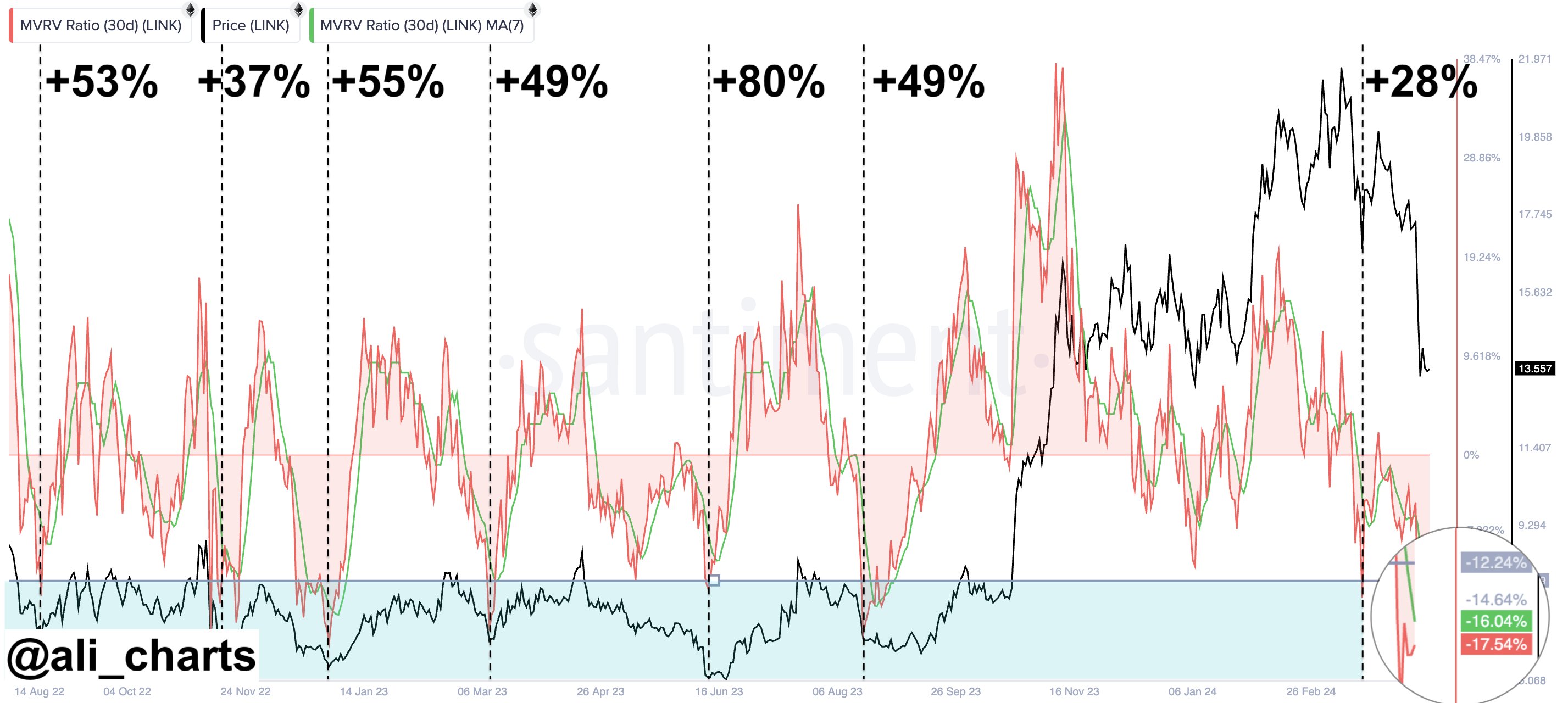
In the same chart, the analytics firm has also attached the data of another indicator: the Market Value to Realized Value (MVRV) Ratio. This metric basically compares how the value held by the BTC investors (the market cap) compares against the value put in by them (the realized cap).
In other words, the indicator tells us about the profit-loss balance of the holders. Here, the version of the MVRV Ratio that’s relevant is the 365-day version, capturing the situation of the investors who bought their coins within the past year.
From the graph, it’s visible that the 1-year MVRV Ratio of Chainlink is currently sitting at a negative 17.3%, an indication that these traders are, on average, holding a loss of 17.3%.
Generally, however, investors being underwater isn’t actually a bad thing for the cryptocurrency. This is because holders in profit are the ones more likely to participate in selling. As such, Santiment notes that the trend in the 365-day MVRV Ratio could suggest the asset’s “long-term investing timeframe is in an opportunity zone.”
LINK Price
At the time of writing, Chainlink is trading around $13.15, up more than 2% in the last seven days.